
Install Figma Charts — it’s free to try → See the gauge gallery →
A gauge spends an enormous amount of a design on a single number. Every other chart in this series earns its space by showing relationships — between categories, between two measures, across time — and a gauge shows one value against a fixed range. That is a genuinely bad trade most of the time, which is why data visualisation writing has been arguing against dashboard dials for twenty years, and the argument is mostly right.
Mostly. There is a real case for a gauge, and it is narrower and more specific than the dashboards that overuse it suggest: when the reader’s question is “are we within limits?” rather than “what is the number?”, and when the limits are real. This is what a gauge actually encodes, the three times it is the wrong tool, how to build one in Figma, what each library gives you — two of the five have no gauge category at all — and why the range you pick is doing more of the talking than the value.
Real plugin output: a Highcharts solid gauge captured from the editor. Every dial on this page is the library’s own drawing.
Everything below happens inside Figma Charts, a Figma plugin. It does not draw charts of its own: it runs the real JavaScript charting libraries — Google Charts, Highcharts, D3-based Nivo, ApexCharts and Apache ECharts — inside the plugin window, so the dial on your canvas is the library’s own output, with its own needle geometry and tick spacing.
Install Figma Charts from the Figma Community →
Press ⌘/ (Ctrl / on Windows), type Figma Charts, hit Enter, and pick Gauge from the category filter. There are 22 gauge examples, from a plain dial to a six-dial car instrument cluster.
A gauge answers “where does this value sit between two fixed ends?” — and, if it has coloured zones, “is that good?”
It encodes the value as an angle along an arc, which is a weak channel: people read angles less accurately than length or position, which is the same reason a pie chart loses to a bar chart. What a gauge adds to compensate is context that a bare number does not carry — the ends of the scale, the tick marks between them, and the coloured bands that say which parts of the range are acceptable. A gauge is not really a chart of a number. It is a chart of a threshold, with the number along for the ride.
Which is why almost every gauge in every library also prints the value in the middle. That centre readout is what readers actually take away, and being honest about it changes how you design the rest: the dial is there to say fine / getting close / over, and the text is there to say how much.
Four forms, all filed under Gauge in the plugin:
Use a gauge when the measure has a real maximum, when there are thresholds that mean something — an SLA, a capacity limit, a target, a safe operating range — and when one value is genuinely the subject rather than one of twenty tiles competing for attention.
Three cases where it is the wrong tool, in order of how often the mistake is made:
1. Your metric has no natural maximum. Revenue, sign-ups, sessions, tickets closed — these have no ceiling, so any maximum you put on the dial is invented, and the needle’s position is a statement about your invention rather than about the business. If you find yourself choosing a round number for the top of the scale because it makes the needle sit in a pleasing place, you have just discovered that this is not a gauge.
2. You are comparing more than a couple of things. Eight dials in a grid is eight separate scales the reader must re-learn, arranged so that no two values can be compared directly. The same eight numbers as a bar chart are comparable at a glance and take a quarter of the space. Gauges do not form a set; that is their central weakness on dashboards.
3. The story is the trend. A gauge is a snapshot with no memory. “CPU is at 71%” is much less useful than “CPU has climbed from 40% to 71% over an hour”, and only a line chart tells you the second one. If your reader is going to ask “is that normal?”, they are asking for history, and a dial cannot answer.
And a fourth worth sitting with: when the number alone would do the job. A large, well-set number with a label and a small change indicator is a legitimate design, uses a fraction of the space, and is read faster. Reach for the dial only when the thresholds have to be visible. If you cannot name the thresholds, you do not need the dial.
A gauge is the plugin’s only single-value shape: one label, one number. In the data table that is a single row — Memory, 70 — and there is nothing else to reshape, import or map.
Multi-dial gauges extend that in the obvious way: one row per dial. A three-ring gauge is three rows, a car instrument cluster is six, and a clock face is three — hour, minute, second. The plugin keeps each dial’s own configuration attached while you edit: the ring titles and their offsets, the per-dial detail formatters, the position of each readout. Change a value and only that value changes, which is worth saying because it is the kind of thing that quietly breaks in chart tooling — a multi-ring gauge that collapses into a donut on the first edit, or a clock whose three nameless dials suddenly acquire overlapping labels.
Two things to know before you connect anything:
Same single value, five different arguments about it. All are real gallery examples.
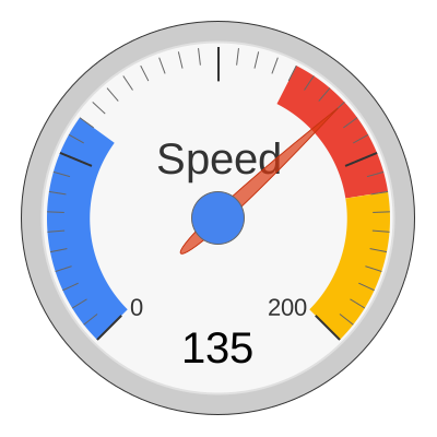
The needle dial with zones — the instrument-panel form, and the clearest illustration of what a gauge is actually for. Google expresses those bands in data units (redFrom: 160, redTo: 200), so they mean exactly what they say.
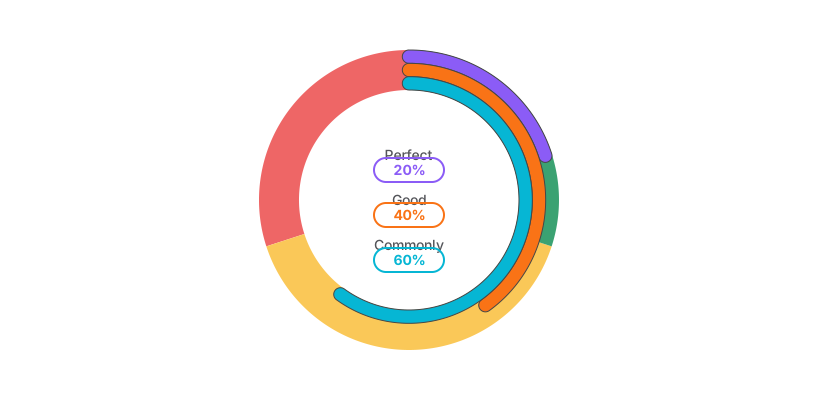
Concentric rings — several related measures in one dial. Each ring keeps its own title and readout offsets, and editing one value in the plugin’s data table leaves the others untouched.

Activity rings — the Apple-Watch pattern, and the one arrangement where nested rings are legitimate: each ring is its own metric against its own goal, so no cross-ring comparison is implied.

The VU meter — a narrow sweep over a scale that runs from −20 to +6 dB, with banded plot zones. Proof that a gauge does not need a 0–100 range; it needs a range someone can defend.
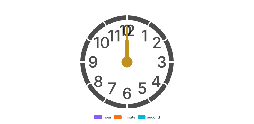
And a clock — three gauge series, one per hand, on one face. It is a reminder that a gauge is a coordinate system rather than a KPI widget, and the plugin handles all three hands as separate series in the data table.
Six screens, start to finish, captured from the plugin.
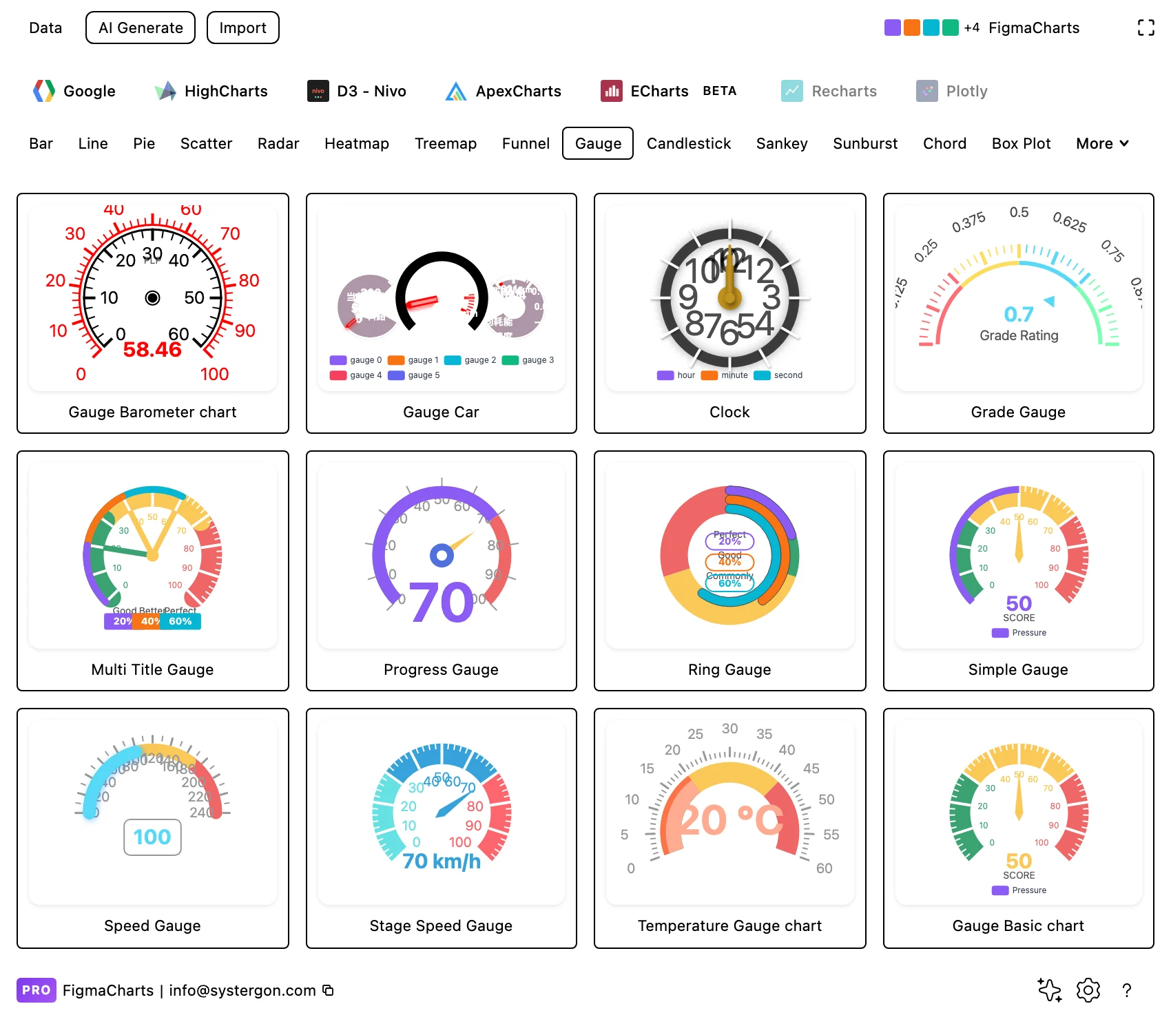
1. Filter to Gauge. Three libraries have the category — ECharts, Highcharts and Google Charts. ApexCharts and Nivo file their equivalents as radial bars under Radial.
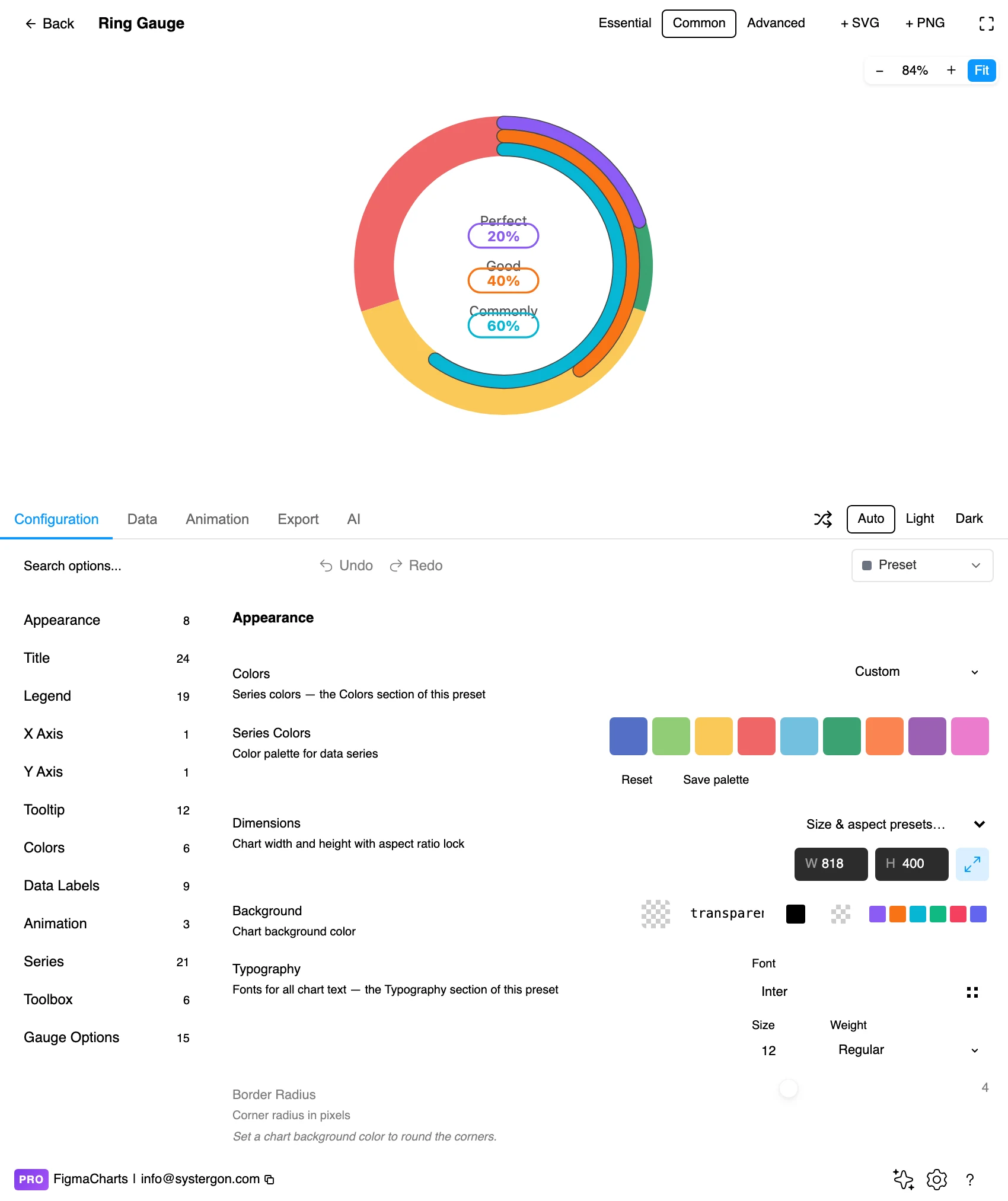
2. Pick the form first. Needle, progress arc, solid band or rings. It is a bigger decision than the palette: a needle needs a readable tick scale, an arc does not.
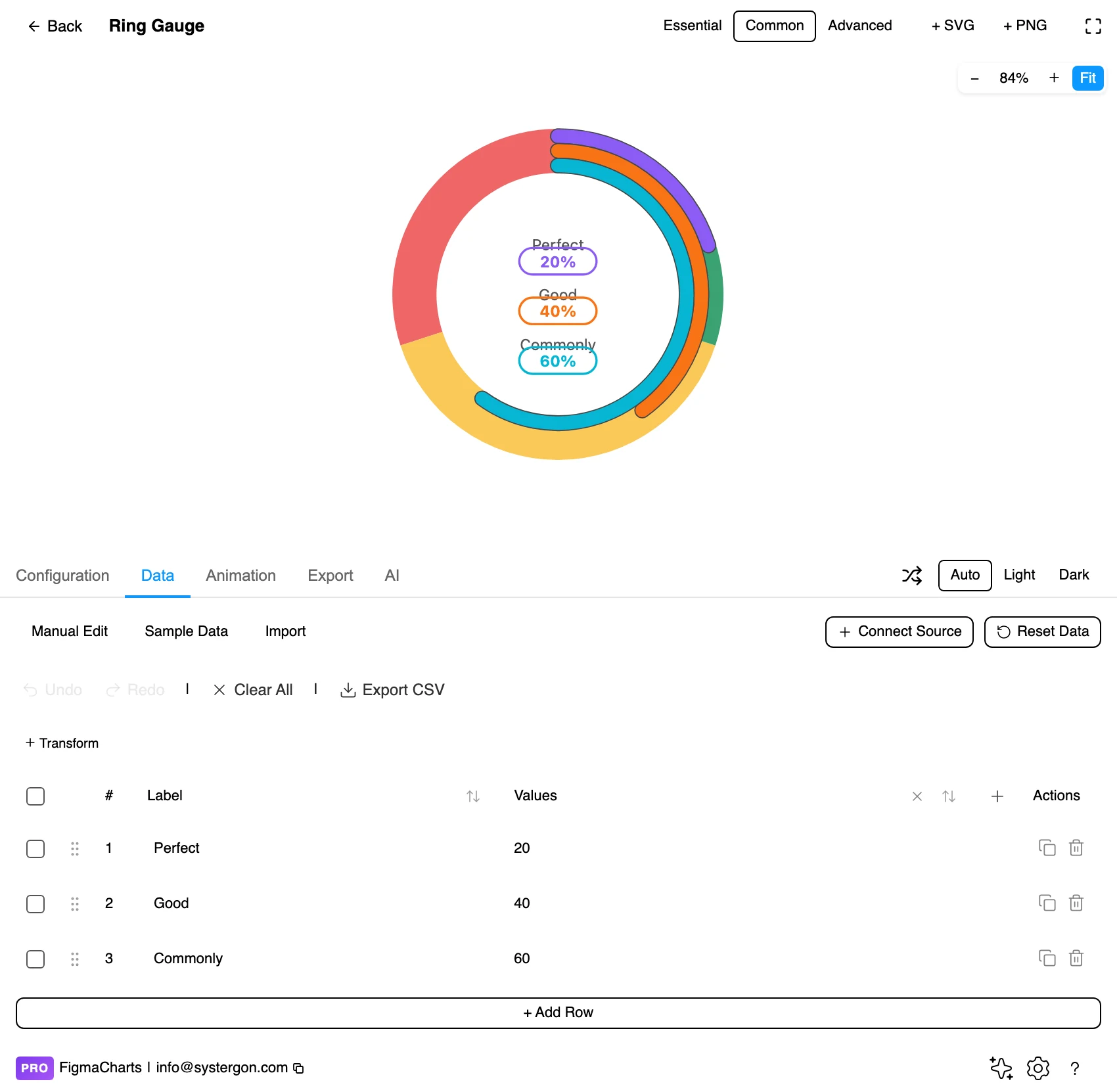
3. Your value. One row per dial — a single-value gauge is one row, a three-ring gauge is three. Per-dial titles and readout offsets survive an edit here.
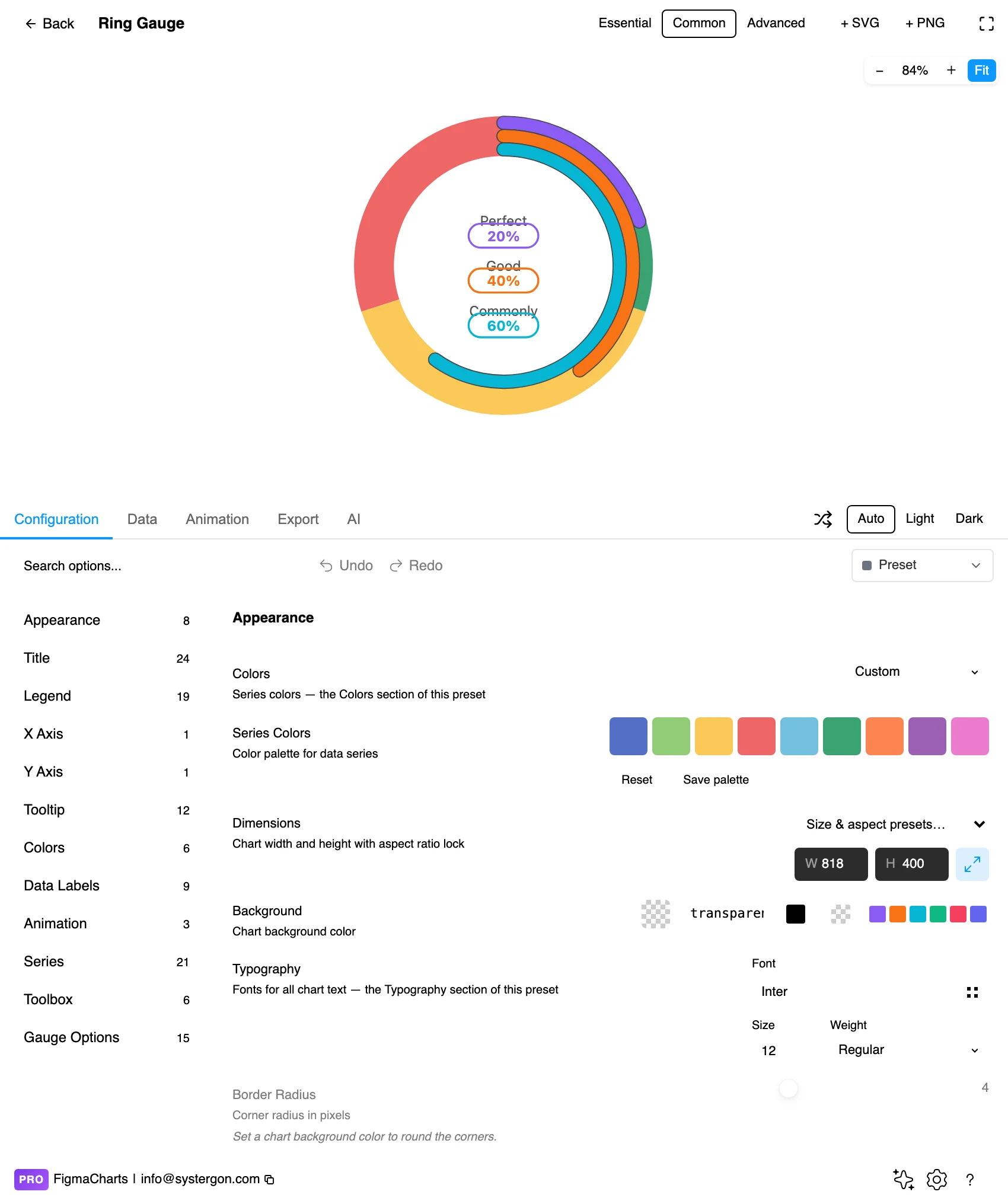
4. Range and zones. The minimum, the maximum and the coloured bands. Careful: ECharts expresses its zone stops as fractions of the range, so changing min or max moves every boundary with it.
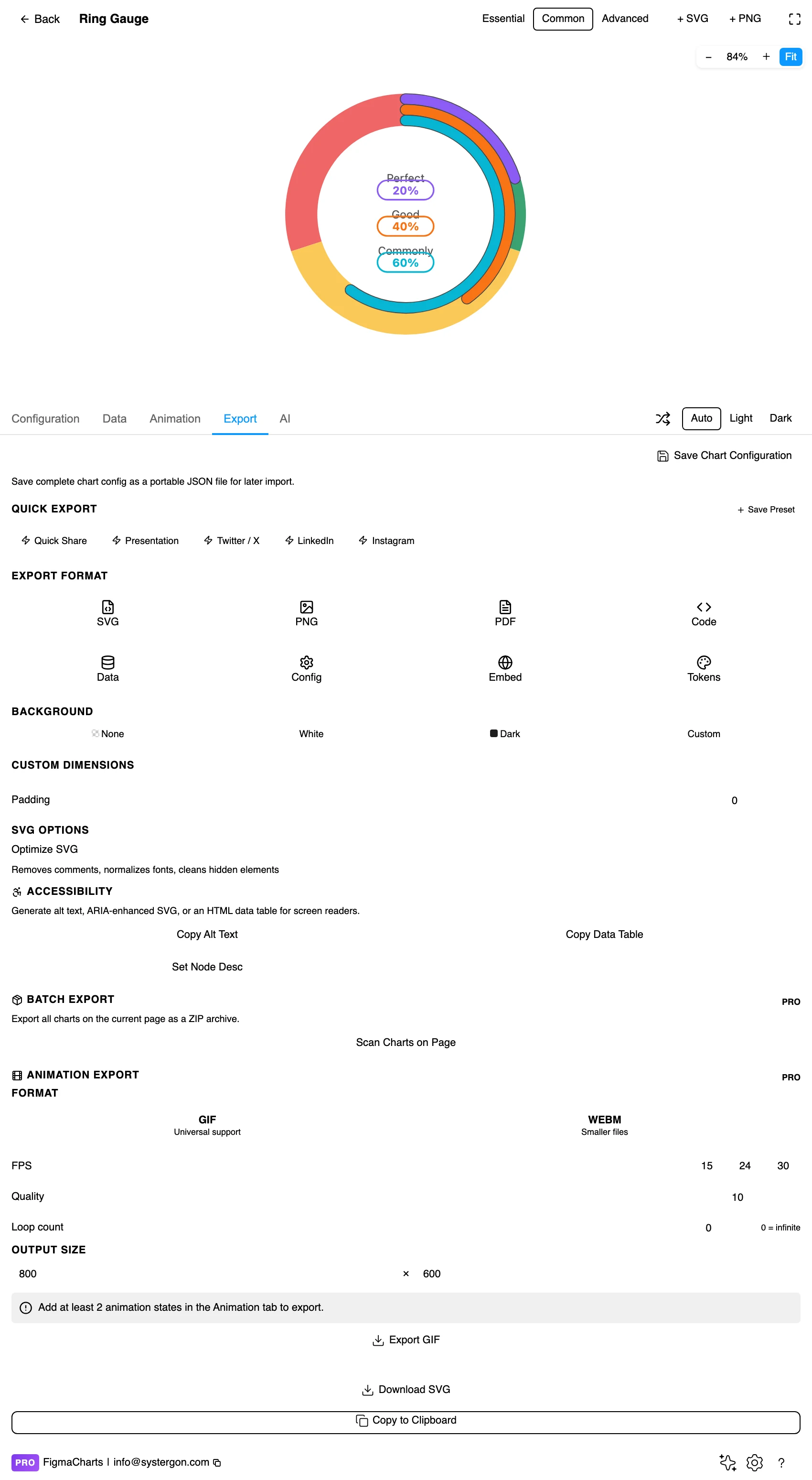
5. Export. Code for React, Vue 3, Angular, Svelte or vanilla JavaScript — or the Config alone, which is where the range, the zones and the readout format live.
6. Insert. SVG keeps the arc, the ticks, the needle and the centre readout as separate layers, so a gauge folds into an existing dashboard component cleanly.
Two shortcuts worth knowing. The Essential / Common / Advanced control in the editor header sets how much furniture the chart carries, and for a gauge, Essential is often exactly right — a dial with no title and no legend, ready to sit inside a card you have already designed. And if you want to change one element rather than hunt the option tree, turn on the Inspector and click the thing; it works on Highcharts and ApexCharts.
The 22 gauge examples come from three libraries, and the other two have no gauge category at all:
{value} km/h, a multi-title gauge with rounded progress arcs, a barometer, a two-dial temperature gauge, a working clock, and a six-series car instrument cluster. Its vocabulary is startAngle/endAngle for the sweep, min/max for the range, a colour-stop list for the zones, progress for a filled arc, pointer for the needle (or to hide it) and detail.formatter for the readout’s units.pane — a start and end angle, an inner and outer radius — which is why the half-circle solid gauge and the full 360° rings are the same construct with different numbers. It needs a commercial licence to ship in a commercial product.redFrom/redTo, yellowFrom/yellowTo, greenFrom/greenTo, plus min, max and tick counts. A speed gauge, a temperature gauge, a battery gauge and a multi-gauge dashboard — and that last one is worth noting, because its three dials (CPU, RAM, Disk) share one range and one set of zones, which is the one arrangement in which several gauges can honestly be compared. If all you want is a dial with a red band and no ceremony, this is the shortest path — with the linked-data caveat above.The rule that beats all of the above: if your engineers already use one of the five, design in that one. The chart you approve is then the chart they ship, because the export lists that library’s own npm package at the same major version the plugin rendered with. Choosing the right chart library covers the trade-offs in full.
Zones are the content; everything else is chrome. If your dial has a red band, that band is the most important object in the chart and should be the most visible. If it does not have one, ask what the dial is for.
Know how your library expresses those zones, because two of the three lie about it. Google takes them in data units — redFrom: 160, redTo: 200 means exactly what it says. Highcharts’ plot bands are in data units too. ECharts is the exception: its colour stops are fractions of the range, so a stop list of 0.3, 0.7 and 1 means the first 30% of the scale, then to 70%, then the rest. Change min or max and every boundary silently moves with it. If your amber band must start at 75 rather than at three quarters of the way round, you have to recompute the fraction whenever the range changes.
Prefer the progress arc to the needle at small sizes. A needle needs tick marks and a readable scale to mean anything, and below roughly 160px neither survives. A filled arc with a number in the middle degrades gracefully all the way down to a dashboard tile.
Put units in the readout — and know who can. ECharts formats the centre value with detail.formatter and Highcharts with dataLabels.format: {value} km/h, {value}°, {value}%. Google Charts has no formatter for the gauge readout, so the unit has to live in the label underneath it — call the row Memory (%) rather than Memory. A bare “71” in the middle of a dial is the most common piece of missing information in a gauge, and in two libraries out of three it costs one option to fix.
Choose the sweep deliberately. A half circle (180°) reads as a scale from left to right and suits a solid gauge under a headline. A three-quarter sweep is the instrument-panel convention. A full 360° is for rings, where the arc is showing a proportion of a whole rather than a position on a scale.
Keep the tick labels sparse. Ticks at every 5 units around a 0–200 dial produce a ring of numbers nobody reads. Label the ends, the thresholds, and nothing else — the thresholds are the only interior values that carry meaning.
For type and colour, bind them to your design system rather than picking by hand — the plugin can build a palette from your Figma colour variables and bind chart text to your text styles, which is covered in Your chart, your design system.
The range is the argument. This is the gauge’s equivalent of the truncated axis on a bar chart, and it is less well known because a gauge looks like an instrument rather than a claim. A value of 60 on a 0–200 dial sits a third of the way round and reads as comfortable; the same 60 on a 0–80 dial is nearly at the red line and reads as an emergency. Nothing about the data changed. Pick the maximum from something real — the physical limit, the contracted capacity, the target — and if no such number exists, that is the finding: this measure does not belong on a dial.
Zones borrowed from nowhere are decoration that reads as policy. Amber at 75% and red at 90% look authoritative on a page. If those numbers came from a design review rather than from operations, the chart is asserting a standard nobody agreed to, and someone will eventually make a decision on it.
Angle is imprecise, and that cuts both ways. Readers cannot reliably distinguish 68 from 72 on a dial, which is fine when the question is “are we in the green?” and not fine when the difference between those two numbers matters. If precision matters, the readout is doing the work, and you should design the readout first and the dial second.
A dial has no memory, so it cannot tell you the direction of travel. Sixty per cent falling is a different story from sixty per cent rising, and a gauge shows them identically. If direction matters, pair it with a sparkline or use a line chart with a threshold band instead.
Several dials are not a comparison. Each has its own scale, so equal needle angles across two dials mean nothing in common. When readers put four gauges side by side they will compare the angles anyway, because that is what side-by-side means. Either give every dial the same range — at which point a bullet chart or a bar chart does the job better — or separate them so they do not read as a set.
And the empty part of the arc is not “remaining”. On a progress gauge the unfilled portion looks like the work left to do, which is true only when the maximum is genuinely the target. Where the maximum is a capacity limit, the empty arc is headroom — the opposite meaning. Label it if there is any doubt.
A gauge concentrates two accessibility problems into a small space: colour carrying the meaning, and a value that may exist only as a graphic.
Do not let the zones be the only signal. Green-amber-red is the classic gauge palette and the classic failure for the roughly one in twelve men with a colour vision deficiency — red and green are precisely the pairing that collapses. Mark the thresholds with tick labels or a line as well as a colour, so “over the limit” is legible without hue.
Make the value real text. Inserting as SVG brings chart text in as real text layers rather than outlines, so the readout can be read by assistive technology and searched in the file — which makes the centre value the accessible version of the chart, built in. Gauges carry more heavily-styled labels than most types, so eyeball the readout once after inserting rather than assuming it landed.
Check contrast on the arc itself. Pale zone colours on a white card frequently fail against the background, and the thin unfilled portion of a progress arc is often the lowest-contrast element in a whole dashboard.
Give it a text equivalent. The Export tab has three buttons most people never notice: Copy Alt Text generates a description, Copy Data Table produces an HTML table of the underlying numbers, and Set Node Desc writes the description onto the Figma node so it travels with the design. For a gauge, the description should carry the threshold as well as the value — “71%, amber zone begins at 75%” — because the threshold is the point.
Because the chart was rendered by a real charting library, the handoff carries the chart rather than a picture of it. From the Export tab:
The whole of that, including the accessibility exports and the embed generator, is in From Figma to code.
Only when the measure has a real maximum and there are thresholds worth showing. If you cannot name the limit and the amber line, a large number with a label communicates the same thing faster and in a fraction of the space. The dial earns its area by making are we within limits? answerable at a glance — nothing else it does is worth the pixels.
Both show one value against thresholds and a target. A bullet chart lays it out linearly, so several of them stack into a comparable list and take a fraction of the height; a gauge wraps it round an arc, which is more evocative and much less compact. For one hero metric a gauge is defensible; for five KPIs a stack of bullet charts is better.
It depends on the library, and the difference matters. Google Charts takes them in data units — redFrom: 90, redTo: 100. Highcharts uses plot bands, also in data units. ECharts uses colour stops that are fractions of the range — 0.3 means 30% of the way from the minimum to the maximum — so changing min or max moves every boundary with it.
Yes, and the gallery has several: Highcharts’ Activity Rings, ECharts’ two-dial temperature gauge, its three-dial clock and its six-series car cluster, and Google’s multi-gauge dashboard. In the data table that is simply one row per dial. Just remember that dials with different ranges cannot be compared with each other — Google’s multi-gauge is the exception, because its dials all share one range and one set of zones.
Not under that name. Neither has a Gauge category; what they have is the radial bar — four examples in ApexCharts, one in Nivo, filed under Radial. It is an arc that fills to a percentage with a number in the middle, which covers most KPI-tile uses, but it gives you no needle, no tick scale and no threshold bands.
In ECharts and Highcharts, yes — a gauge takes a single value, so a linked cell is all it needs. Google gauges are the exception: they use a specialised data format, and the plugin refuses the connection with a message rather than letting it corrupt the chart. Build the dial in ECharts or Highcharts if it has to be live.
One you can defend from something outside the chart: a physical maximum, a contracted capacity, an SLA, a plan target. The needle’s position is entirely determined by the range, so an invented maximum is an invented conclusion. If nothing real supplies the number, the metric is not a gauge metric.
Insert as SVG and the arc, the ticks, the needle and the readout are all separate vector and text layers, which makes a gauge one of the easiest charts to fold into an existing dashboard component. Insert as PNG and you get a flat image at twice the pixel density. Either way the chart reopens in the editor with its settings intact.
Open the plugin, filter to Gauge, and before you pick a style, write down two numbers: the maximum, and the threshold that matters. If both come from somewhere real, build the dial — it will be a good chart. If you cannot source either of them, you have learned something more useful than a chart would have told you, and a large clear number will serve your reader better.
Install Figma Charts — it’s free to try → Browse all 45 chart types →