
Install Figma Charts — it’s free to try → See the pie chart gallery →
No chart type has been argued about more. The case against the pie chart is genuinely strong — it encodes value as angle, which people judge poorly, and it makes comparison between slices harder than a bar chart makes it. The case for it is narrower than its popularity suggests and stronger than its critics admit: a pie is the only common chart where the whole is visible as an object, and sometimes the whole is the point.
Real plugin output — a Highcharts pie captured from the editor. Every chart on this page came out of the plugin the same way.
So this page is a verdict rather than a tutorial with a tutorial attached. The case against, the three situations where a pie genuinely wins, the ceiling on slices, what the five libraries give you, and how to build one that does not mislead.
Everything below happens inside Figma Charts, a Figma plugin. It runs the real JavaScript charting libraries — Google Charts, Highcharts, D3-based Nivo, ApexCharts and Apache ECharts — inside the plugin window, so the pie on your canvas is the library’s own output, with its own label placement and its own start angle.
Install Figma Charts from the Figma Community →
Press ⌘/ (Ctrl / on Windows), type Figma Charts, hit Enter, and pick Pie from the category filter. There are 38 pie examples across the five libraries.
Angle is a weak channel. Ranked by how accurately people read them, position beats length, length beats angle, and angle beats area and colour. A pie asks readers to compare angles — and worse, angles at different orientations, since one slice starts at twelve o’clock and another starts halfway round.
Comparison degrades with distance. Two adjacent slices can be compared reasonably. Two slices on opposite sides of the circle cannot, because there is no shared baseline and no common edge to align them against. A bar chart has one baseline for every category, which is precisely why it wins on comparison.
Small slices become unreadable and unlabelable. Below about 5% a slice is a sliver, its label does not fit inside it, and the leader line pointing at it takes more room than the slice itself.
1. The whole is the subject. “This is all of our revenue, and here is how it divides” is a claim a pie makes structurally — the circle is the total, and the reader can see there is nothing outside it. A bar chart of the same numbers shows the parts and says nothing about whether they add up to everything.
2. One slice dominates and that is the message. “Three quarters of our traffic comes from one channel” is instantly legible as a pie and takes a moment of reading as a bar chart. Halves, thirds and quarters are the angles people can judge, because they are anchored to the geometry of the circle.
3. There are two or three parts. With two slices the comparison is trivially accurate; with three it is still fine. The pie’s weaknesses are all weaknesses at scale.
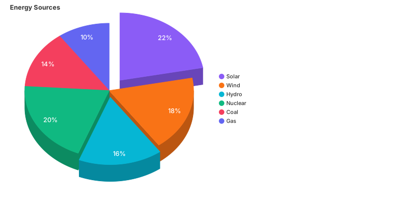
Exploding a slice pulls it out of the circle to emphasise it. It also breaks the one thing the pie had going for it — the intact whole — and makes the remaining angles harder to compare. Use it for one slice, never for all of them.

A variable-radius pie encodes a second variable in each slice’s radius. It is genuinely dense and genuinely hard to read: the eye reads slice area, which is now a product of two variables, so neither is legible on its own.

The 3D pie is the clearest example in this whole series of decoration that changes the numbers. Perspective enlarges the slices at the front and compresses those at the back, so two equal shares are drawn at different sizes. It is in the gallery because clients ask for it; it should not be in your design.
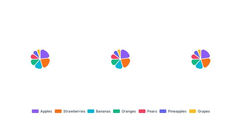
Label placement is the pie chart’s hardest layout problem. Aligning labels in columns with leader lines keeps small slices legible without the labels colliding — the fix worth reaching for before you consider dropping to a legend.

The polar area chart — Florence Nightingale’s rose — gives every segment the same angle and varies the radius instead. It is a different chart with a different failure mode: because area grows with the square of the radius, it exaggerates large values.
The practical limit is about five slices, and it comes from three constraints at once: labels stop fitting inside slices, adjacent hues stop being distinguishable, and small slices stop being comparable. Past five, group the tail into an explicit “Other” category — and label it honestly, because an unexplained “Other” that is larger than several named slices is a chart hiding its own subject.
If you cannot group the tail because every category matters, that is a sign the chart is wrong rather than the data. A sorted bar chart handles twenty categories without complaint; a pie cannot handle eight.
Almost every real dataset has a long tail: three categories that matter and eleven that do not. How you handle those eleven is the difference between a pie that communicates and a pie that decorates.
Group them, and name the group honestly. “Other (11 categories, none above 2%)” tells the reader exactly what has been folded away and lets them decide whether it matters. A bare “Other” invites the suspicion that something inconvenient is hiding in it.
Keep “Other” from being the biggest slice. If the grouped tail outweighs your largest named category, the chart is telling you the data is not concentrated enough for a pie. Either raise the threshold so more categories are named, or accept that the story is diffuse and use a ranked bar chart which can carry all fourteen.
Give it the neutral colour. “Other” is context, not a category, so it should be the greyest thing in the palette and it should sit last in the order — conventionally at the end of the sequence, just before the start angle comes round again.
Google Charts can do the grouping for you. Its pie takes a visibility threshold: slices below a proportion you set are combined automatically. That is convenient and worth a caution — an automatic threshold changes what is named as your data changes, so a chart that read clearly last quarter can quietly fold a newly-important category into the tail this quarter.
1. Comparing two pies. Two pies side by side is one of the most common charts in business decks and one of the least readable. The reader has to compare angles across two circles with no shared baseline and, usually, two different totals — so a slice that grew in absolute terms can shrink as a share, and the chart shows only the second thing while everyone reads the first. A grouped bar chart, or a 100% stacked bar per period, answers the question the two pies were asked.
2. Anything with a time axis. Shares over four quarters is four pies, and four pies is a memory test. Composition over time is what a stacked area chart or a 100% stacked bar chart exists for; both keep the periods adjacent and let the eye follow one band across.
3. Ranking. If the question is “which is biggest, and by how much?”, a pie answers the first half badly and the second half not at all. Rank comparisons want a common baseline. This is the case where the pie is not merely weaker than a bar chart — it is answering a different question from the one being asked.
It is worth being specific about the two-pie failure, because it is so widespread. Say Q1 revenue is £1m split 50/30/20, and Q4 revenue is £2m split 40/35/25. Product A grew from £500k to £800k — substantial growth — and its slice shrank from half the circle to 40%. Every reader who takes the visual at face value concludes A declined.
Pies show shares. Shares move when either the numerator or the denominator moves, and the chart cannot tell you which. If the totals differ between your two pies, you must either state the totals prominently, size the circles by total (which introduces area-comparison error), or use a chart that carries magnitude — which is to say, use bars.
Label the slices, do not legend them. Every lookup you remove is attention returned to the data. Percentage plus category name, on or beside each slice, is the target; leader lines are fine and much better than shrinking the type.
Give the two decimal places up. “24.7%” on a chart whose encoding cannot distinguish 24 from 26 is false precision. Round to whole percentages unless the difference between 24.7 and 24.9 genuinely matters — and if it does, you need a table, not a pie.
One accent, or a full palette, never half. Either every slice is a distinct hue (categorical data, no order implied) or one slice is accented and the rest are neutral greys (one thing is the subject). A palette where three slices share a colour family and two do not implies a grouping that is not in the data.
Mind the stroke. A hairline separator in the background colour between slices makes adjacent similar hues legible and costs nothing. A heavy stroke, on the other hand, eats the small slices — at 3px a 2% slice is mostly border.
Let the circle breathe. Pies are usually drawn too large for their frame, which pushes labels into the edges. The chart needs the same margin discipline as any other type, and the labels are part of the chart, not an overlay on it.
For type and colour, bind them to your design system rather than picking by hand — the plugin can build a palette from your Figma colour variables, covered in Your chart, your design system.
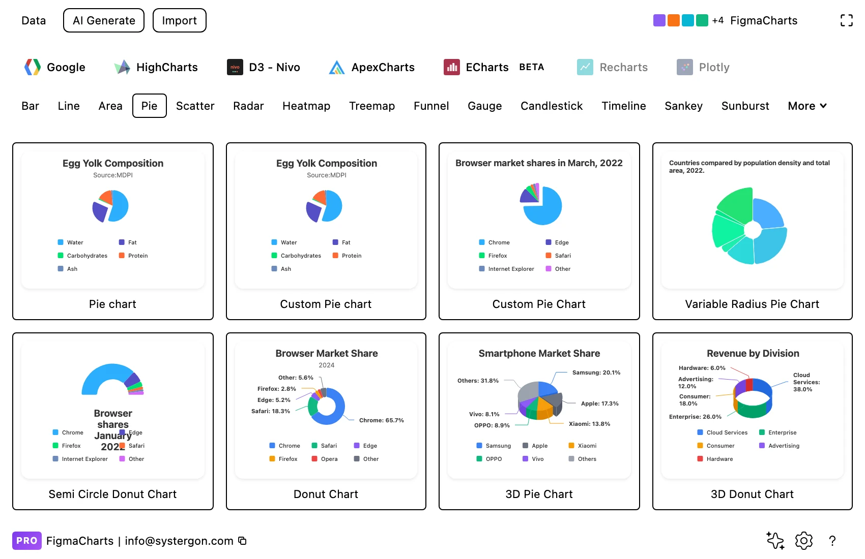
1. Pick a starting point. Library tab, then the Pie chip. Every tile is live output, so you are choosing a real layout — particularly the label strategy, which is the hardest thing to change later.
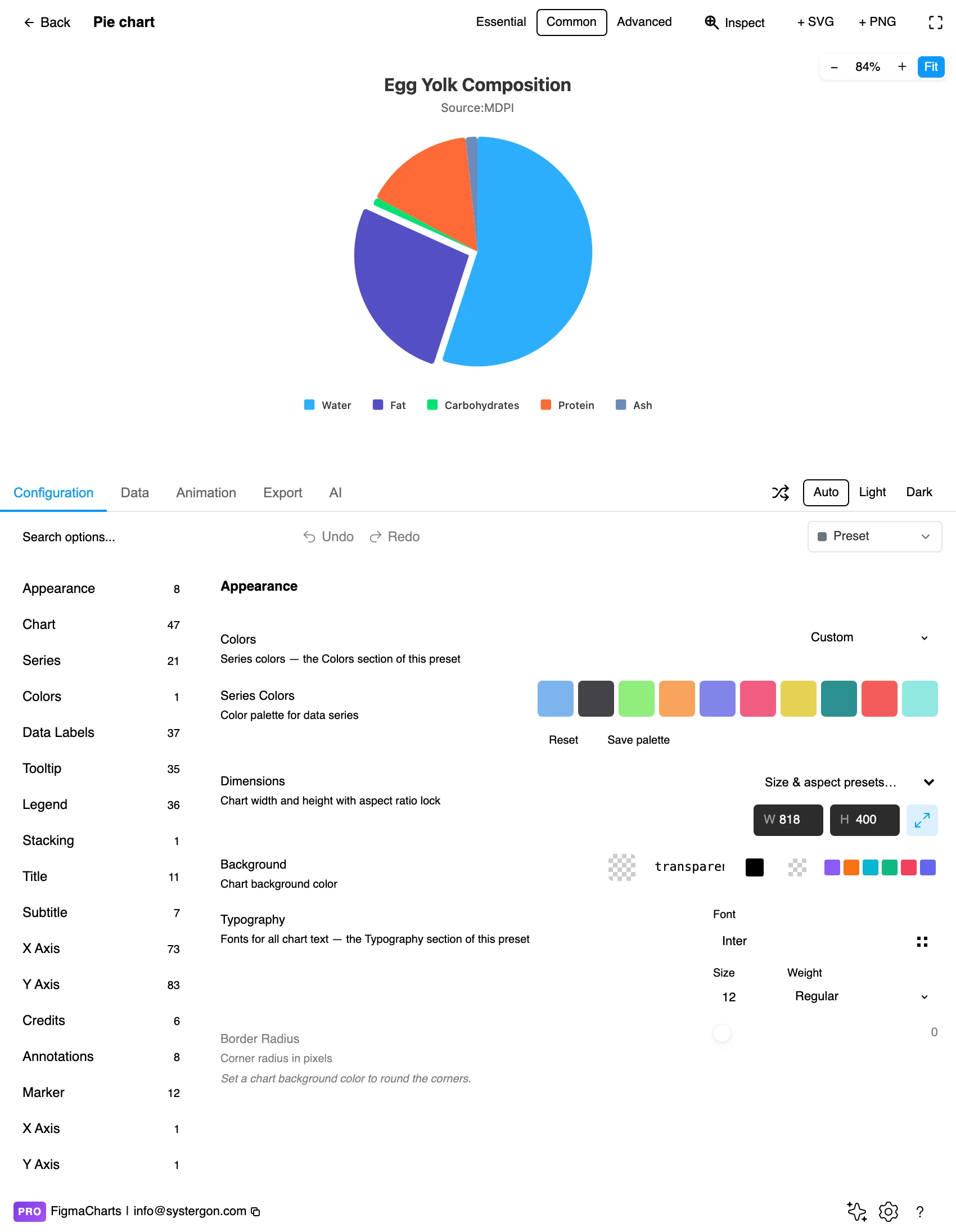
2. The editor. Live preview above, tabs below. For a pie the Essential / Common / Advanced control matters: Essential drops the title and legend, which is right for a card and wrong for a standalone chart where the labels are the only way to read it.
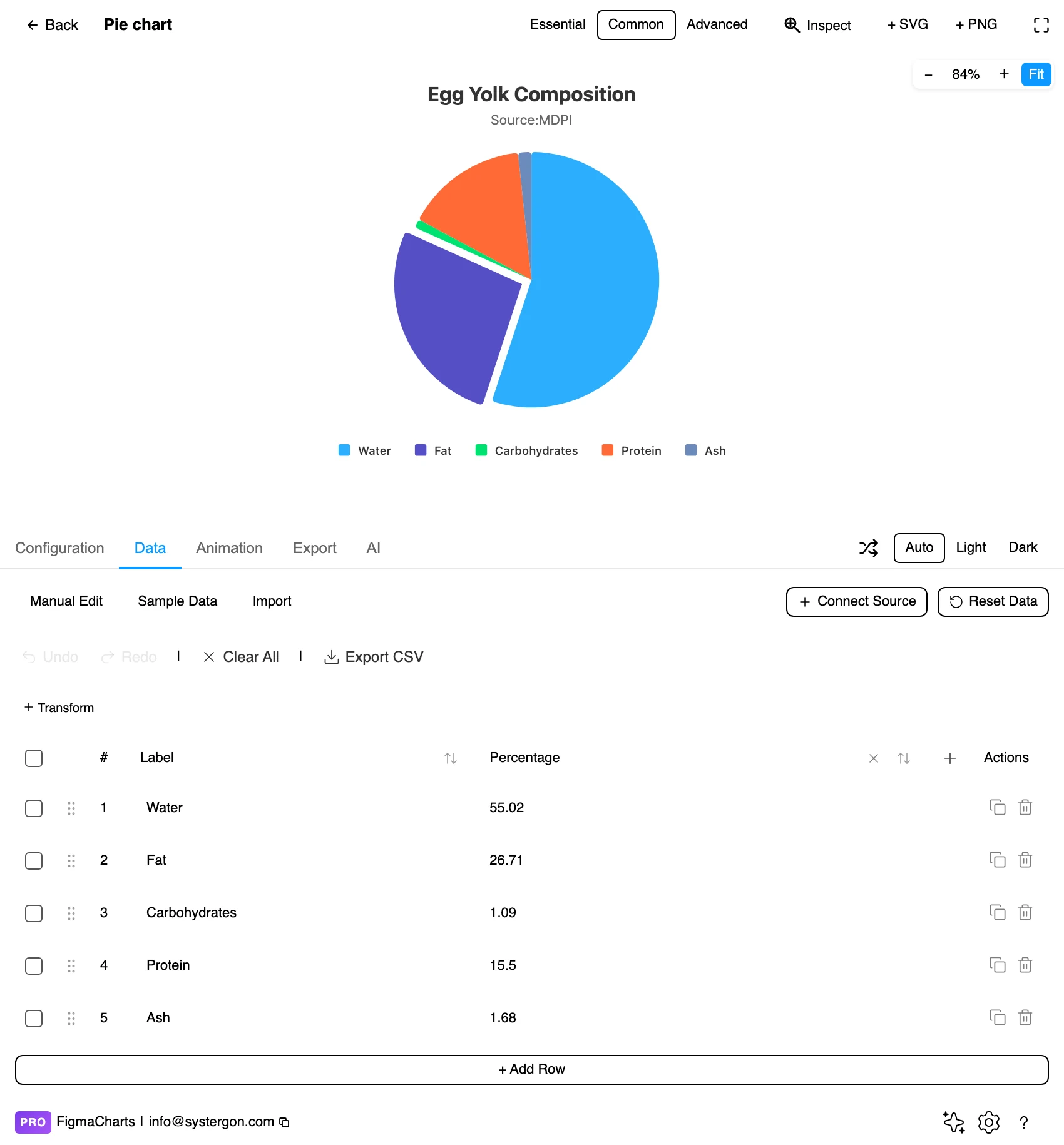
3. Your numbers. One label column, one value column — the simplest shape in the plugin. This is also where you decide the slice order, because slices are drawn in data order.
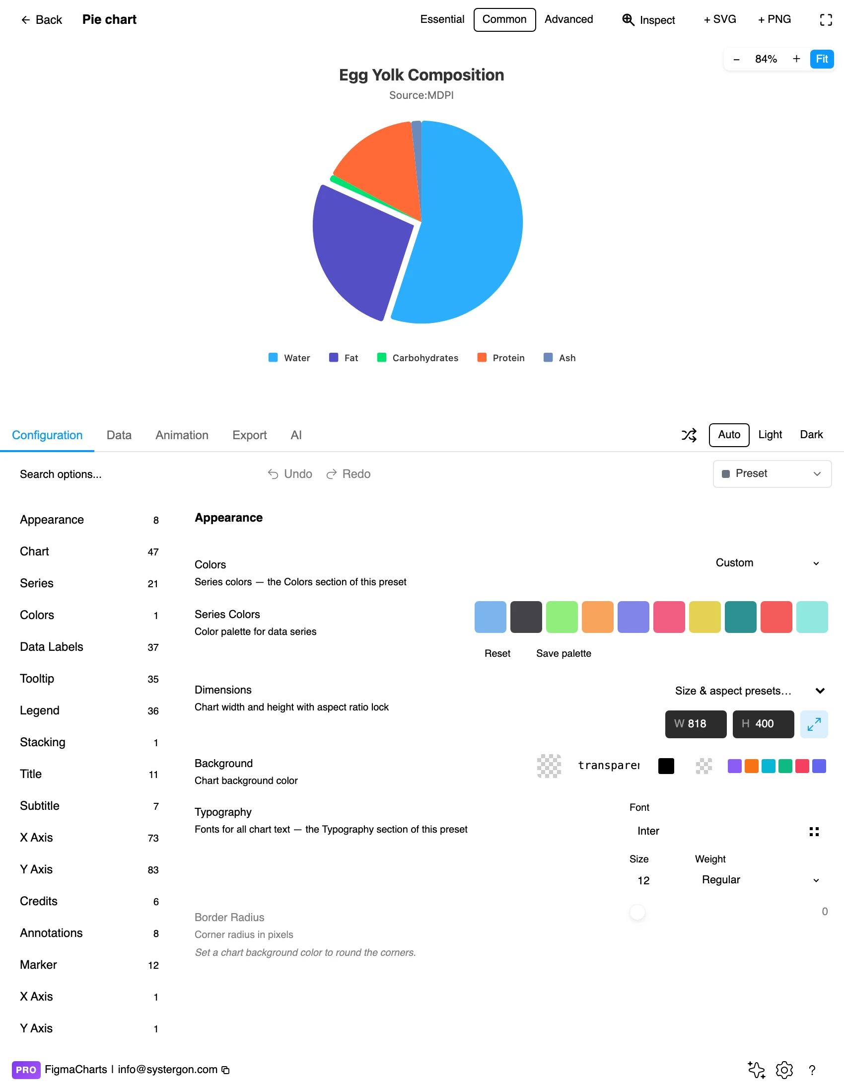
4. Configure. Start angle, label position, leader lines and the palette all live here. Sorting by value and starting the largest slice at twelve o’clock is the convention worth following.
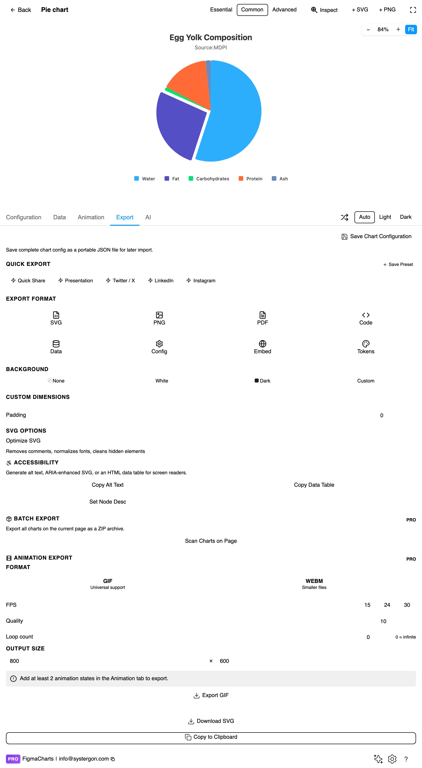
5. Export. A working component for React, Vue 3, Angular, Svelte or vanilla JavaScript, at the same major version the plugin rendered with.
6. Insert. SVG gives you each slice as its own vector shape — which makes a pie one of the most rewarding charts to insert as vector, since restyling one slice is a click.
Name and value, one row per slice. No axes, no series, nothing to reshape — which is why pies are the easiest charts to build from a two-column range in a spreadsheet.
Two cautions. The values should be parts of one whole: if they do not sum to something meaningful, the circle is asserting a total that does not exist. And percentages that do not add to 100 — because of rounding, overlapping categories or multi-select survey answers — break the chart’s central claim. Multi-select responses are the most common offender: people can pick three answers, so the “shares” sum to 240% and a pie of them is nonsense. Use a bar chart.
All five draw pies; the 38 examples split ECharts 18, Highcharts 8, Google 5, ApexCharts 4, Nivo 3.
Note also where the donut lives: only ApexCharts files it as its own category, while Highcharts, Google, ECharts and Nivo all keep their donuts inside Pie. That is a filing difference, not a capability one — see the donut post.
Start angle is rhetoric. The slice starting at twelve o’clock reads as the primary one. Rotating the pie changes which slice gets that position without changing a single number — the pie’s equivalent of a truncated axis, and much less noticed.
Sort order is the other half of that. Convention is largest first, clockwise from twelve. Deviating is allowed when the categories have a natural order, and suspicious otherwise.
3D is not a style. Perspective makes front slices larger and back slices smaller, so equal values are drawn unequal. There is no way to read a 3D pie accurately, which means the decision to use one is a decision that accuracy does not matter.
Colour has to work harder here than anywhere else. With five slices you need five hues that are distinguishable adjacent to each other and against the background, and that survive colour vision deficiency. This is the chart type where a sequential ramp is most tempting and least appropriate: the categories are not ordered, so a ramp implies a progression that does not exist.
Labels beat legends. A legend forces a lookup: read the colour, find it in the list, come back. Labels on or beside the slices remove that entirely. If the slices are too small for labels, the pie is too crowded — which is the same conclusion as the five-slice ceiling, arrived at from the other direction.
Never rely on colour alone. Direct labels solve this completely, and a pie usually has few enough slices to label. Where you must use a legend, order it to match the slice order rather than alphabetically.
Check adjacent hues, not just contrast against white. Two colours can each pass against the background and be indistinguishable from each other — which is the failure that matters when they share an edge.
Give it a text equivalent. The Export tab’s Copy Alt Text, Copy Data Table and Set Node Desc produce a description, a table of the underlying numbers, and a description attached to the Figma node. For a pie, include the percentages in the table — they are what the chart is actually communicating.
About five. Past that, labels stop fitting, adjacent hues stop being distinguishable, and small slices stop being comparable. Group the tail into an explicit “Other” — and if you cannot, the honest chart is a sorted bar chart.
Yes, in three situations: when the whole is the subject and the reader needs to see that the parts account for everything; when one slice dominates and that dominance is the message; and when there are only two or three parts. Outside those, a bar chart is more accurate.
No. Perspective enlarges the slices nearest the viewer and compresses those at the back, so equal shares are drawn at different sizes. It is decoration that changes the numbers — the plugin ships one because people ask, not because it is defensible.
At twelve o’clock, running clockwise, with the rest in descending order. The slice at twelve reads as primary, so that position is a rhetorical choice; making it the largest is the convention that surprises nobody.
A rose diagram: every segment gets an equal angle and the value is carried by the radius instead. ApexCharts ships one. It reads beautifully and exaggerates — area grows with the square of the radius, so a value twice as large occupies four times the ink.
No. If the categories overlap — multi-select survey answers are the classic case — the circle is asserting a whole that does not exist. Use a bar chart of the individual percentages.
A donut is a pie with a hole, and the hole is the reason to choose one: it is somewhere to put the total. If you have no total worth showing, the hole is just a hole. Only ApexCharts files donuts as their own category; the others keep them under Pie.
Insert as SVG and every slice is a separate vector shape with real text labels, which makes restyling or highlighting a single slice trivial on the canvas. Insert as PNG for a flat image at twice the pixel density.
Open the plugin, put your real shares into a pie, and count the slices. If there are more than five, you have already learned the most useful thing this page has to offer — and the fix is either an honest “Other” or a different chart.
Install Figma Charts — it’s free to try → Browse all 45 chart types →