
Install Figma Charts — it’s free to try → See the bar chart gallery →
The bar chart is the one to reach for when you are not sure. That is not a lack of ambition — it is the reason it is everywhere. Bars encode value as length from a common baseline, and length from a common baseline is the thing human vision judges most accurately. Better than angle, better than area, far better than colour intensity.
Every chart on this page is real output from the plugin — the same Highcharts, Google Charts, Nivo and ApexCharts builds that render inside Figma, captured from the editor rather than drawn for the article.
What follows is not a tour of one chart. The bar family has six or seven members, each answering a question the others answer badly, and most bar-chart mistakes are really a member mismatch — a stacked chart used where a grouped one was needed, a 100% stack hiding the volumes that mattered. So: the variants and what each is for, how to build one against your real numbers, what the five libraries give you, and the handful of ways a bar chart quietly misleads the person reading it.
Everything below happens inside Figma Charts, a Figma plugin. It does not draw charts of its own: it runs the real JavaScript charting libraries — Google Charts, Highcharts, D3-based Nivo, ApexCharts and Apache ECharts — inside the plugin window, so the bar chart on your canvas is the library’s own output, laid out by its own engine.
Install Figma Charts from the Figma Community →
Press ⌘/ (Ctrl / on Windows), type Figma Charts, hit Enter. Bar is the category the gallery opens on, so you are already looking at them — 97 bar examples across the five libraries.
Picking the right member of the family is most of the work. Each of these is a real example from the plugin’s gallery, and each is the correct answer to a different question.

Stacked — when the total is the subject and the parts are context. The bottom segment is the only one you can compare across categories, because it is the only one sharing a baseline.
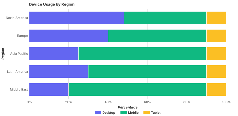
100% stacked — when composition is the subject and magnitude is not. Every bar is the same length by construction, so a category with three observations looks exactly as substantial as one with three thousand.

Lollipop — the same encoding with less ink. When you have many categories and the bars are so wide they read as a wall, a stem and a dot say the same thing with more air. Highcharts only.
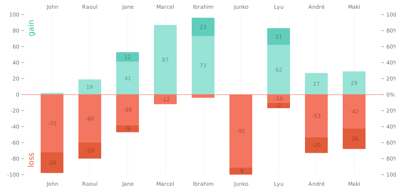
Diverging — when values run either side of a meaningful zero: agree against disagree, gain against loss, above target against below. The baseline moves into the middle and the reader compares outward in both directions.

Signed columns — for data that genuinely goes below zero. Note what the axis does here: it is the one case where the zero line sits inside the plot rather than at the bottom, and it must be drawn, not implied.
The plain bar chart at the top of this page is the sixth, and it is the one to use unless you can name why you need another. A grouped chart — several series side by side within each category — is the everyday alternative when you have two or three series and the reader needs to compare them within each group rather than across the whole.
Use a bar chart when you are comparing one measure across a set of named categories, when the categories are few enough to label, and when you want the reader to read differences rather than absorb an impression. Three cases where it is the wrong tool, in order of how often the mistake is made:
1. Your categories are actually a continuous variable. Response times, ages, prices, file sizes — these are measurements, not categories. Bucketing them and drawing bars produces a histogram, which looks like a bar chart and means something different: the x axis is a number line, the bars touch, and the bin width is a decision you have made and should disclose. Drawing it as an ordinary bar chart with gaps implies the categories are unrelated, which is false.
2. The x axis is time and you care about the shape. Twelve months of revenue as bars is legitimate, but bars emphasise each period as a separate thing to be compared. If the story is the trajectory — the rise, the dip, the recovery — a line chart tells it better, because a line is a shape and shapes are what convey trend. Use bars for time when the individual periods matter (“Q3 was the outlier”) and a line when the movement matters.
3. You have more than about twenty categories and no ordering. Past twenty bars the chart stops being a comparison and becomes a texture. If they can be sorted by value it can still work — a long sorted bar chart is a perfectly good ranking, and a lollipop chart handles the length better. If they cannot be sorted and cannot be filtered, the chart is a table with extra steps, and an actual table would serve the reader better.
A fourth, less obvious one: if every value is nearly identical, a bar chart makes that clear and boring, and the temptation is to truncate the axis to manufacture difference. That temptation is covered under reading it well, and it is the single most consequential mistake on this page.
Six screens, start to finish. These are captures of the plugin doing exactly this, not a reconstruction.
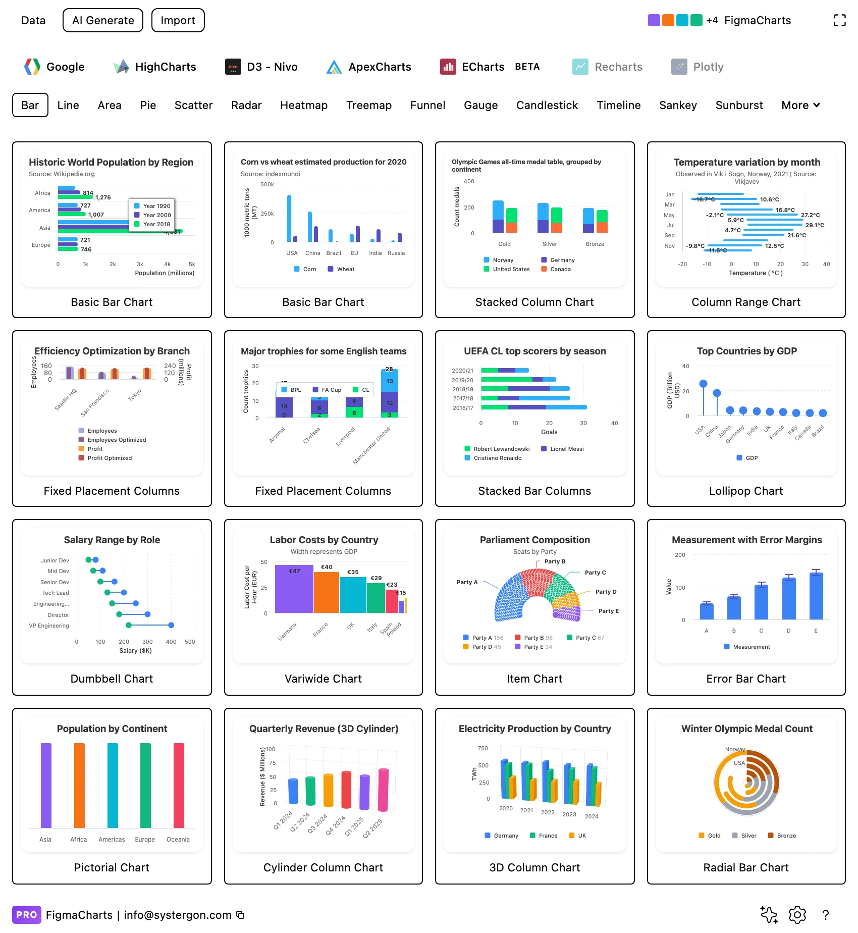
1. Pick a starting point. Choose the library tab first, then the Bar chip. Every tile is a live chart rather than a picture, so the tile is what you will get. Pick the one closest to your structure — plain, grouped, stacked — because restyling is cheap and restructuring is not.
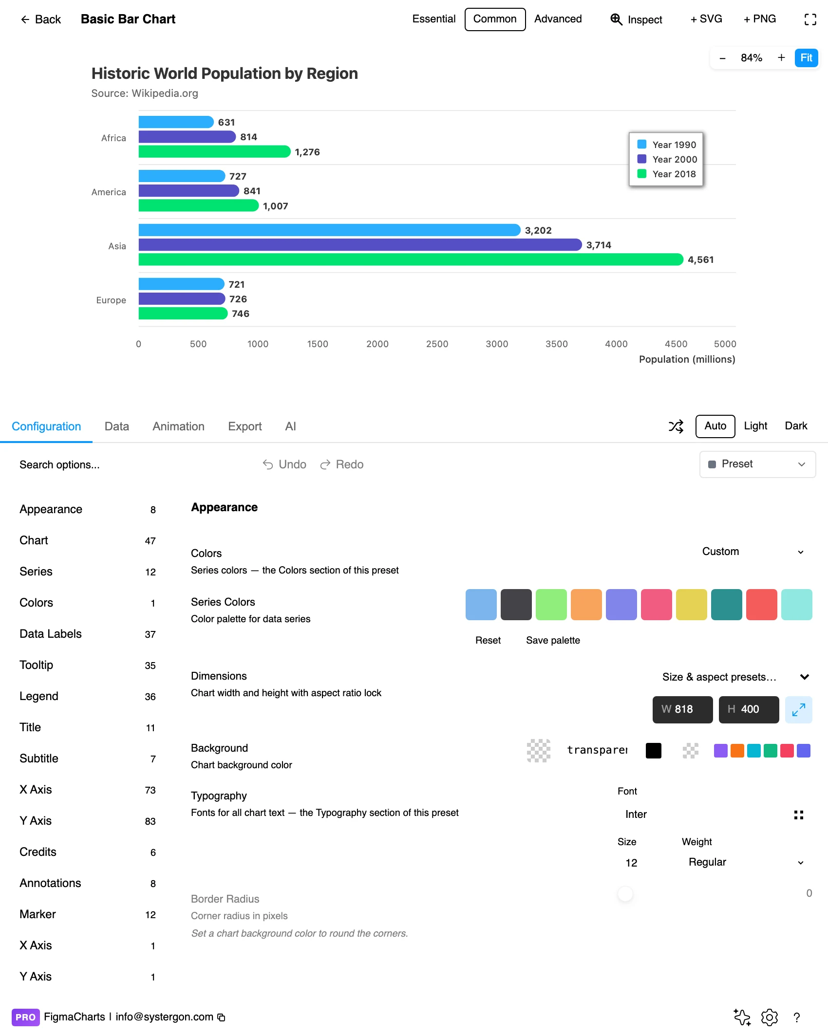
2. The editor. The chart at the top is live; the tabs below are Configuration, Data, Animation, Export and AI. The Essential / Common / Advanced control in the header sets how much furniture the chart carries — Essential strips the title, legend and axes for a dashboard tile.
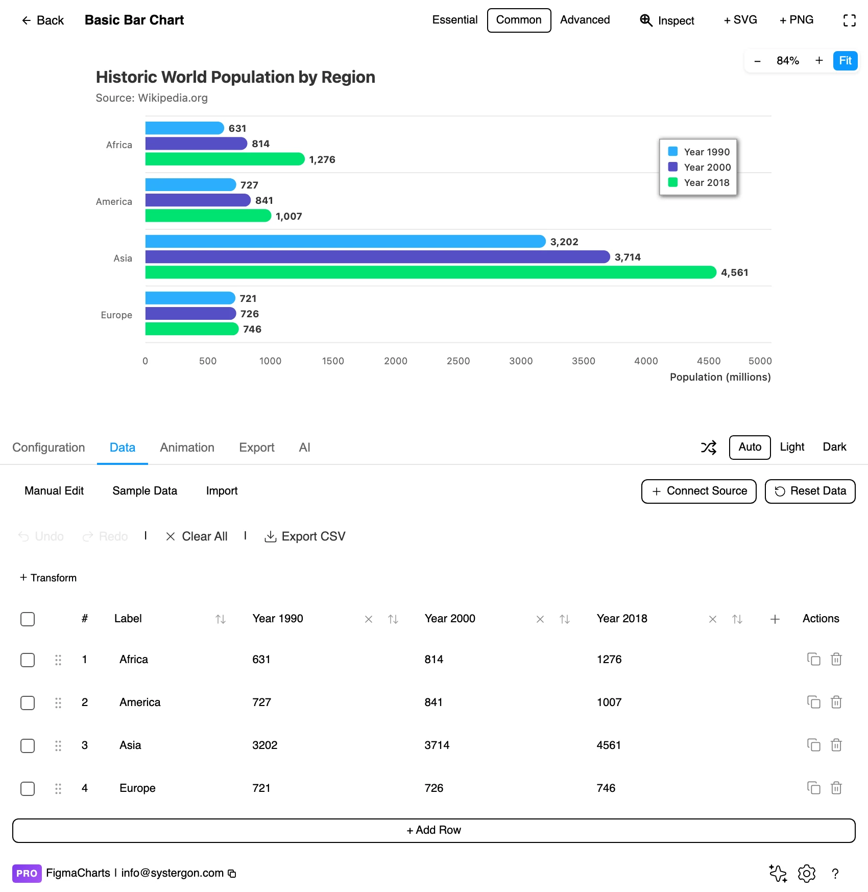
3. Put your real numbers in. Type them, paste from a spreadsheet with ⌘V, or connect a source. Do this before styling: real labels are longer than sample labels and real values have outliers, and both change the layout.
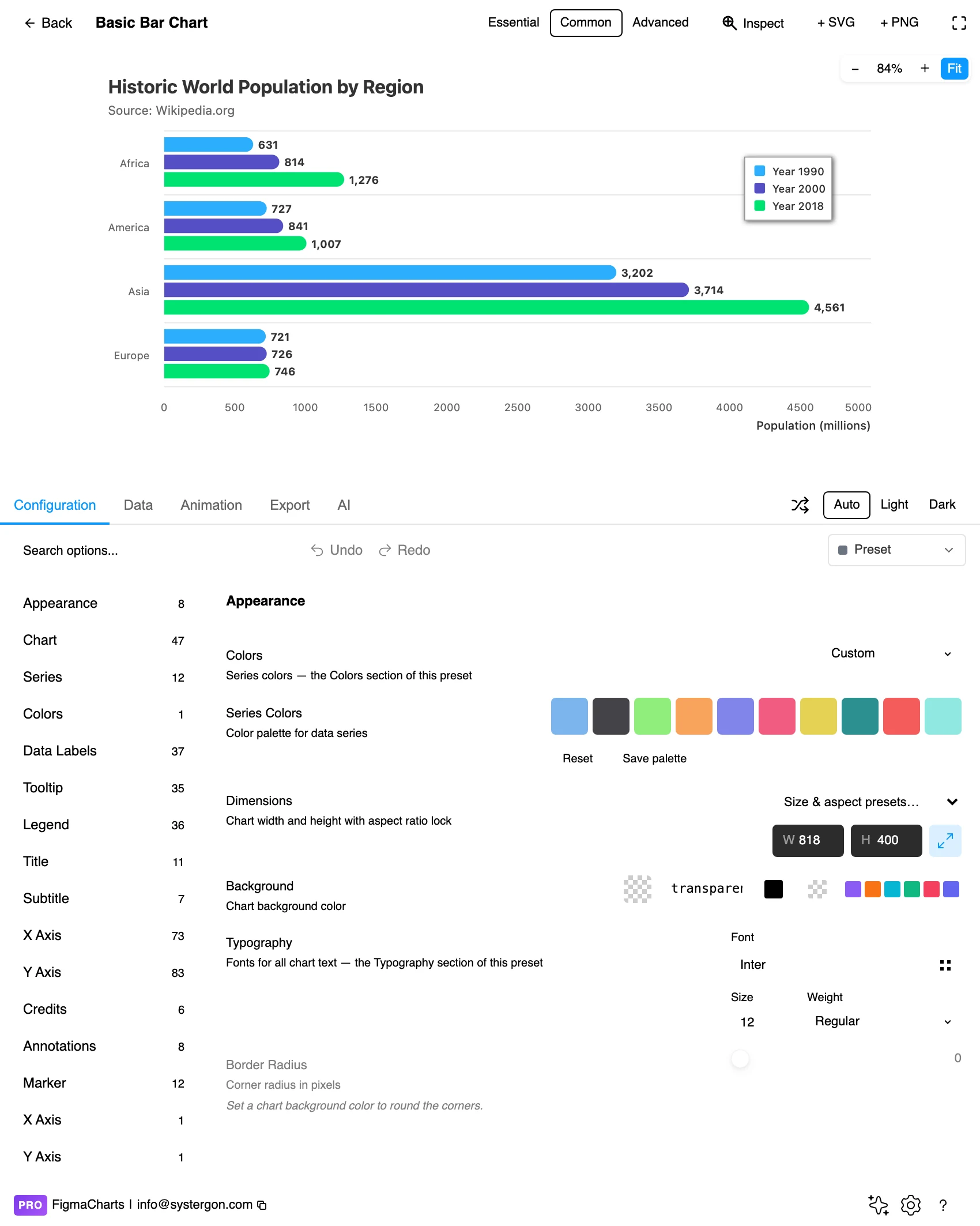
4. Configure. The left column is the option groups with a count each; searching beats hunting. Orientation, grouping and stacking all live here — and this is where you set the axis, which for a bar chart means checking it starts at zero.
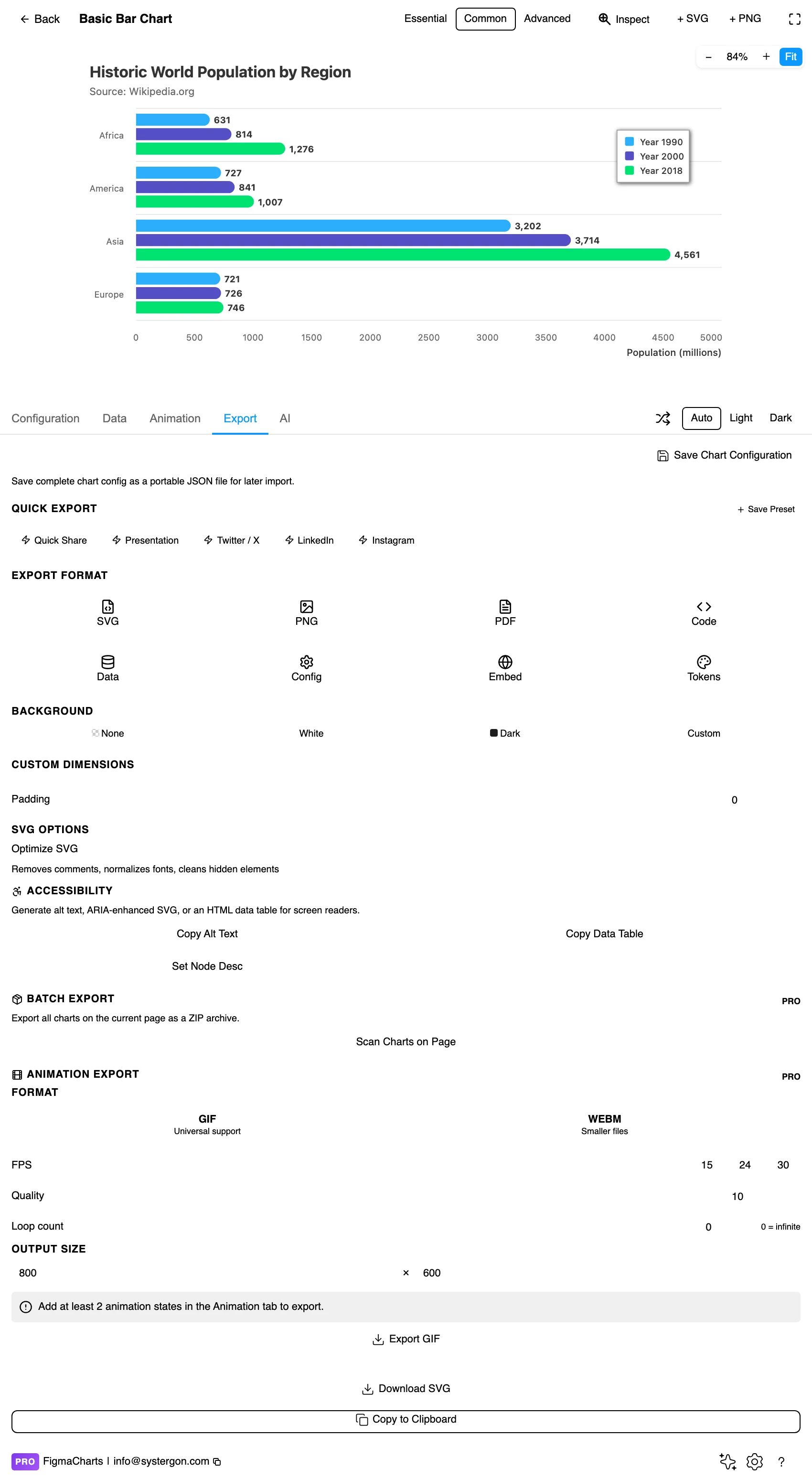
5. Export, if the chart is going to be built. Code writes a working component for React, Vue 3, Angular, Svelte or vanilla JavaScript, listing the library’s own npm packages at the version the plugin rendered with.
6. Insert. + SVG puts real vector and text layers on the canvas — every bar a shape you can select, restyle and prototype with. + PNG gives you a flat image at twice the pixel density.
A bar chart wants the cartesian shape, which is the plugin’s default and the one the ordinary data table is built for: one column of category names, then one or more columns of numbers, one per series. One numeric column gives you a plain bar chart; two or more give you a grouped or stacked one depending on a single configuration option. There is no nesting, no source-and-target, nothing to reshape.
It is also the shape every connector produces, which makes bar charts the easiest type to feed from real data. Paste from a spreadsheet, import a CSV, or connect a Google Sheet or an API — and unlike hierarchical or flow charts, bar charts accept a linked data source in every one of the five libraries.
One caution carried over from that connector work: in a column the plugin has judged numeric, a value that will not parse becomes 0 rather than a gap. A stray N/A in your revenue column draws a bar of length zero, which reads as a real measurement of nothing. Clear those cells before you connect.
All five draw bar charts, and the gallery holds 97 bar examples between them. They are not interchangeable:
The rule that beats all of the above: if your engineers already use one of the five, design in that one. The chart you approve is then the chart they ship, because the export lists that library’s own npm package at the same major version the plugin rendered with. Choosing the right chart library covers the trade-offs in full.
Colour is usually the wrong variable. In a single-series bar chart every bar is the same measure, so colouring each bar differently encodes nothing and invites the reader to look for a meaning that is not there. Use one colour. If you want to draw attention to one bar, colour that one and leave the rest neutral; a single accent against grey is the most effective emphasis in the whole chart vocabulary.
Gridlines should be quieter than the bars. They are a measuring aid, not content. A hairline in a light neutral is enough. Horizontal gridlines only, for vertical bars — vertical ones cross the bars and add nothing.
Data labels or an axis, rarely both. If exact values matter, put labels on the bars and consider dropping the value axis entirely. If the shape matters, keep the axis and skip the labels. Doing both is duplication that costs you the whitespace the chart needed.
Gap width is a real decision. Bars should be wider than the gaps between them — a common rule is a gap of about half a bar’s width. Too much space and the bars stop reading as a group; too little and the chart becomes a solid block.
Sort deliberately. Alphabetical order is almost never the most useful. Sort by value unless the categories have a natural order (months, sizes, stages), and if you sort by value, say so. For type and colour, bind them to your design system rather than picking by hand, which is covered in Your chart, your design system.
This is the section that matters most, because a bar chart is trusted. People read it quickly and believe what they read, so its distortions do real damage.
Truncating the value axis is the big one. A bar chart encodes value as length from a baseline, and that encoding is only true if the baseline is zero. Start the axis at 90 and a difference of 2% becomes a bar three times taller than its neighbour. The reader is not misreading the chart — the chart is lying, in exactly the visual channel it asked to be trusted on. If the differences are genuinely small and genuinely important, that is what a line chart, a dot plot or simply stating the numbers is for. Bar charts start at zero. There is no defensible exception.
Stacked bars only let you compare one series. In a stacked chart every segment after the first floats on the ones below it, so its start position varies from bar to bar. The bottom segment sits on the baseline and can be compared across categories; every segment above it cannot, because comparing two lengths that begin at different places is a task human vision is bad at. If your reader needs to compare the third segment across categories, use a grouped chart or small multiples instead.
100% stacked bars hide the totals entirely. Every bar is the same length by construction, so a category with three observations looks exactly as substantial as one with three thousand. They are legitimate for showing composition, but they should never be the only chart — pair them with something that shows magnitude.
Sorting is an argument. Sorting by value puts a claim in the chart: that ranking is what matters. That is often right, and it is never neutral. Be aware you are making it.
Aspect ratio changes the story. The same data in a tall narrow frame looks dramatic and in a short wide one looks flat. There is no correct answer, but there is an honest habit: pick the proportions before you see whether they flatter your argument.
A chart is one of the least accessible things you can put on a page, and bar charts are the easiest kind to fix.
Do not rely on colour alone to distinguish series. Around one in twelve men has some form of colour vision deficiency, and the classic red-versus-green pairing is the one that fails. In a grouped chart, order and position already do most of the work; add a direct label to the series rather than making the reader look between a legend and the bars.
Check contrast against the background, and against each other. Two colours can each pass contrast against white and still be indistinguishable from one another — which is the failure that matters in a legend. Test the small marks, not the large ones: a 4px legend swatch is a harder case than a full-height bar.
Give it a text equivalent. The Export tab has three buttons most people never notice: Copy Alt Text generates a description, Copy Data Table produces an HTML table of the underlying numbers, and Set Node Desc writes the description onto the Figma node so it travels with the design. The data table is the genuinely correct answer for chart accessibility — a screen reader user gets the data rather than a paraphrase of the picture.
Label the axis and its units. “Revenue” is not a unit. “Revenue (£000s)” is. This helps everyone, and it is the cheapest fix on this page.
Orientation, and nothing else. Columns are vertical, bars are horizontal. Most tools and most people use “bar chart” for both. Choose horizontal when your category labels are long or you have many categories, and vertical when you have a handful of short labels.
Yes. A bar encodes value as length from the baseline, so a non-zero baseline makes the lengths lie about the ratios between values. If your differences are too small to see against a zero baseline, that is information about your data, and a line chart or a dot plot is the honest way to show it.
Stack when the total is the point and the segments are context. Group when the reader needs to compare segments with each other. In a stacked chart only the bottom segment shares a baseline, so only that one can be compared reliably across categories.
The same comparison with less ink. A stem and a dot encode length exactly as a bar does, but at twenty or thirty categories the bars become a solid wall while the lollipops keep their air. It is a Highcharts-only variant in this plugin, alongside dumbbell, variwide and error bars.
About twenty is where a comparison becomes a texture. Beyond that, sort by value so it works as a ranking, switch to lollipops so the ink thins out, filter to the categories that matter, or group the tail into “Other” — and if none of those are honest, use a table.
Whichever one your engineers already use, because the export then matches production exactly. If nobody has an answer: ECharts for range (46 bar examples), Highcharts for lollipop, dumbbell, variwide and error bars, Nivo for the D3 look if you ship React, ApexCharts for a clean product dashboard, and Google Charts for plain and familiar.
Yes, and bar charts are the easiest type to connect — they take the ordinary cartesian shape and accept a linked source in all five libraries, which is not true of hierarchical or flow charts. Refresh is manual and happens while the plugin is open.
Insert as SVG and every bar, gridline and label is a real layer, with the text as real text. Insert as PNG and you get a flat image at twice the pixel density. Either way the chart reopens in the editor with its settings intact, and Update SVG replaces it in place.
Open the plugin, put your real numbers into the first bar chart you see, and look at what happens to the labels. That one step catches more design problems than any amount of planning — and once the chart survives its own data, the rest of this page is just refinement.
Install Figma Charts — it’s free to try → Browse all 45 chart types →