Install Figma Charts — it’s free to try → Read the help centre →
Your design system covers the button, the input, the card, the modal, the empty state and the toast. Every one of them pulls its colour from a variable and its type from a text style, and when the brand blue changes, all of them change.
Then there is the chart. The chart is a picture somebody drew, in colours they got from a colour picker, in whatever font was on the artboard that day. It is the one component in the file that does not know the design system exists — and it is usually the one component with eight colours in it.
This is how to stop that: pull your Figma colour variables and text styles into charts, save the result so the whole team picks it from one list, and push the resolved values back out as design tokens your engineers already consume.
Everything below happens inside Figma Charts, a Figma plugin. It runs the real JavaScript charting libraries — Google Charts, Highcharts, D3-based Nivo, ApexCharts and Apache ECharts — inside the plugin window, so what you style is the library’s own output rather than a drawing of it.
Install Figma Charts from the Figma Community →
Once it is installed there are two ways to open it, and the first is faster:
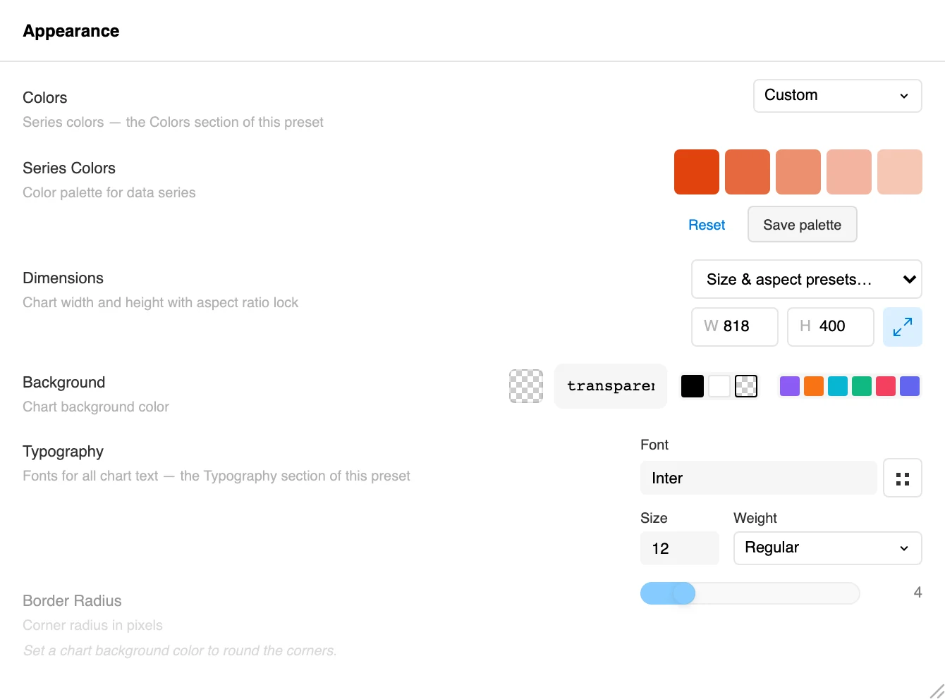
Open any chart and the styling lives in the Configuration tab, under Appearance.
It is not neglect. It is that a chart needs a kind of colour a design system usually has not defined.
Design systems are built around roles: primary, surface, danger, muted, a nine-step grey ramp. That vocabulary is perfect for interface chrome and useless for a chart with eight series, because a chart needs eight colours that are mutually distinguishable — not eight colours that mean eight things. Most systems have exactly one that reads as “a colour” and eight that read as “grey, slightly”.
So the designer opens the picker, invents seven more, and the chart becomes the one artefact in the file with unaccountable colours in it. Fixing that means two separate jobs, and it is worth naming them:
There are three separate preset systems and they are not peers. Confusing them is the single most common source of “why did that change?”
A palette will never touch your gridlines. A chart style may well touch your colours. That asymmetry is the whole story of the next section.
Apply a chart style and your carefully chosen colours sometimes survive and sometimes do not. That is not a bug and it is not random — there is a fixed order of precedence:
Two consequences worth internalising. First, if a style did recolour your chart, pick your palette again from the Colour palette control — because your explicit choice sits at the top of the order, it sticks from then on. Second, a chart style that carries no palette of its own leaves your colours completely untouched. That is deliberate: restyling one chart should not silently discard a palette chosen for the whole document.
The same order applies to pie, donut and Sankey charts, which some libraries colour through a separate setting entirely.
Mostly you do not have to do anything. When the plugin opens it reads the colour variable collections in your file and builds a palette from them, which appears in the palette list under a Figma group, named after the collection with (Auto) after it — Brand (Auto), Chart Colors (Auto).
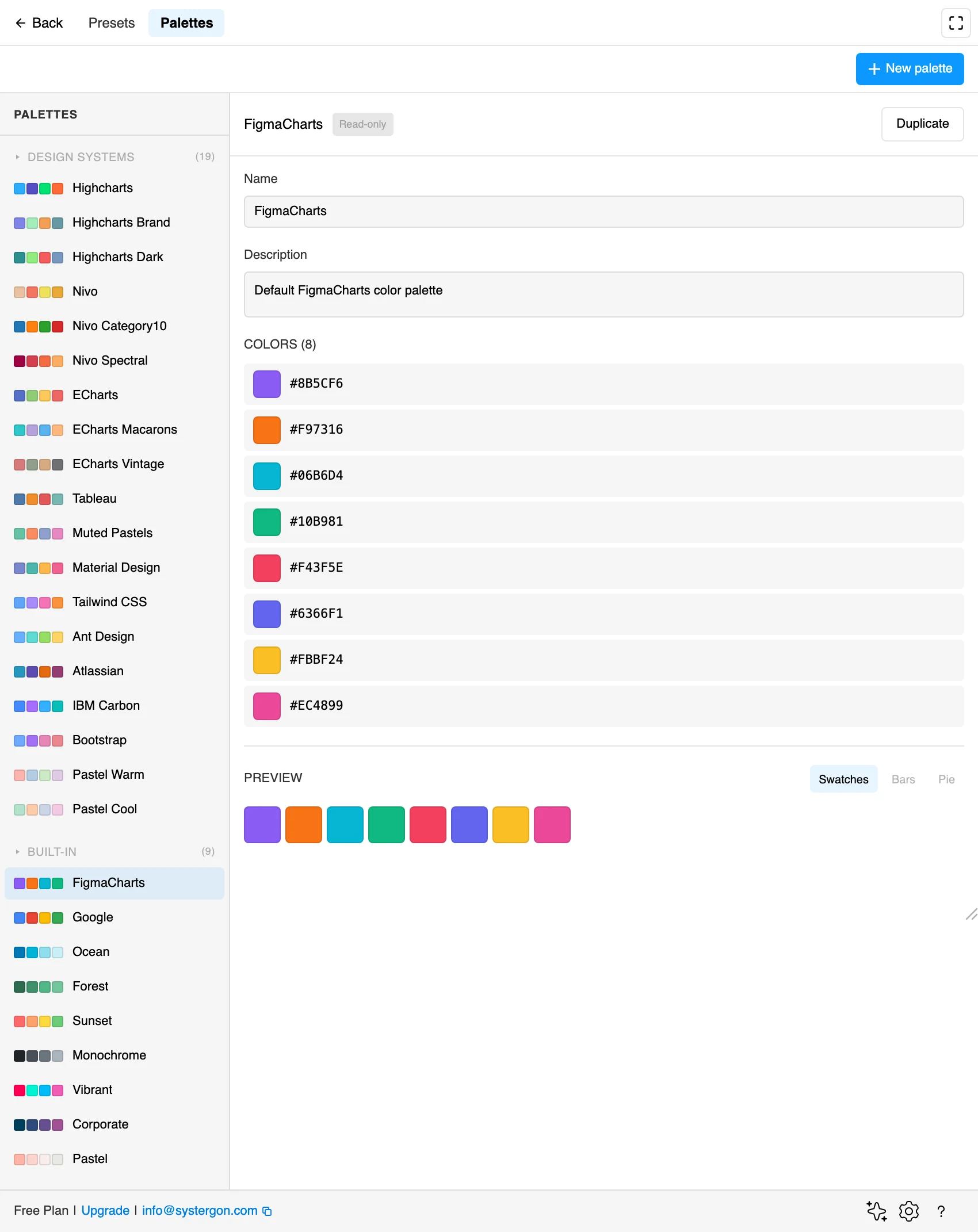
It picks one collection to build from, and how it picks is worth knowing, because it means you can get the palette you expected just by naming things well. Collections are scored on their name:
Which gives you a genuinely actionable trick: make a variable collection called Chart or Data Viz holding the eight colours you want charts to use, and the plugin will find it and prefer it over your grey ramp. You have documented your categorical palette as a first-class part of the system, and the tool picks it up for free.
Modes are handled too. If the chosen collection has a mode whose name contains “light” or “dark”, the plugin uses whichever matches the Figma theme you are working in; otherwise it uses the collection’s default mode. Naming your modes Light and Dark rather than Mode 1 and Mode 2 is the difference between that working and not.
When the automatic guess is not what you want — or you want the typography to come across at the same time — open the Chart Style picker and press Import from Figma at the foot of the list.
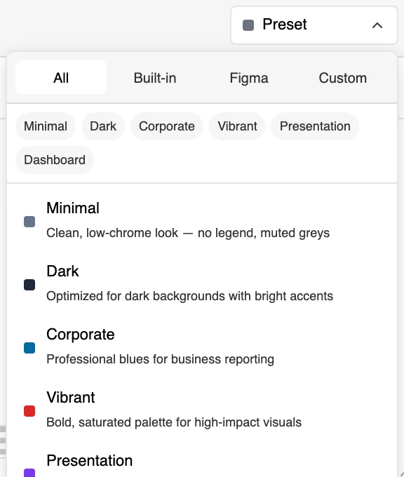
That importer gives you two tabs and a type control:
Brand/Primary, Brand/Accent set arrives as a group rather than a flat list.What it saves is a chart style, not merely a palette: colours and typography travelling together, applying to every chart type, filed under the picker’s Figma tab. That is the artefact you actually want a team to share — “our charts” as one click rather than a palette plus a font plus a note in Slack.
One distinction to keep straight: only colour variables are read automatically. Colour styles are available here, where you pick them by hand.
The typography half is the part that most often gets skipped, and it is the half that makes a chart look like it belongs.
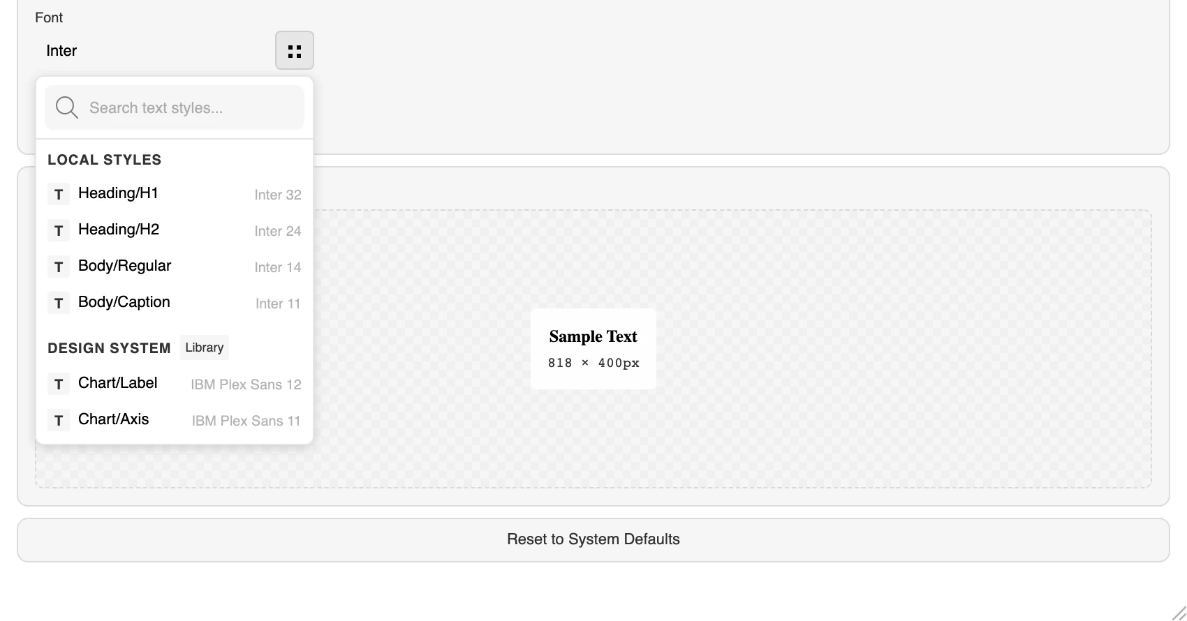
In the typography controls, choose a Figma text style instead of picking a font by name. The chart then uses the family, size and weight your system already defines, and the chart tells you which style it is bound to. You can bind different parts to different styles — a heading style on the title, a caption style on the axis labels — which is exactly how the rest of your file already works.
If you would rather set a whole scale at once without binding, there are eight typography presets: the FigmaCharts default plus Material, Tailwind, Atlassian, IBM Carbon, Apple HIG, Figma UI and a monospaced set.
Two things make this more than cosmetic:
The weight is where design-system type most often breaks, and the reason is mundane: weights become Figma style names. 400 is Regular, 500 Medium, 600 Semi Bold, 700 Bold — and chart titles use Semi Bold unless you say otherwise. If your brand family does not ship a Semi Bold, the title alone falls back to Regular and then to whatever Figma substitutes, which is why a chart sometimes looks right everywhere except its heading. Choose a weight the family genuinely has.
Two related things worth knowing. The font list in the plugin is Figma’s own, so anything selectable there is something Figma can render — but the preview may still show a substitute, and a note appears when it does. Judge the typeface on the canvas, not in the plugin window. And if one element needs to break from the rest, open its group — Title, say — turn off Use Global Typography, and set it there while everything else keeps following the global setting.
Before you build anything, it is worth knowing what ships, because one of them is often close enough. There are 28:
That last group is more useful than it sounds. Picking a library’s own palette makes a chart look like that library’s default — which is precisely what you want when you are designing a screen to match charts already in production that nobody has restyled.
Two rules govern how a palette lands on a chart:
Palettes are positional, and sometimes position is wrong. The series that means “us” should be brand blue whether it happens to be third or seventh; the series that means “churn” should probably be the red one regardless.
For that, leave the palette alone and open the Colors group in the configuration panel, where every series can be set individually. A colour you set by hand sticks until you pick a different palette — which is the behaviour you want, and also the trap: choosing a new palette afterwards is what wipes those overrides, not applying a chart style.
Read that against the precedence order above and it resolves cleanly. Hand-set series colours are the chart’s own colours, sitting at level two — safe from a style that carries no palette, overwritten by an explicit new palette choice at level one. So the working order is: pick the palette first, then override the one or two series that carry specific meaning, then style. Doing it the other way round loses the overrides and looks like a bug.
One more control in the same group is worth a sentence, because it is the one that decides whether a chart looks pasted on. Background sets the chart’s own fill — and leaving it transparent is usually right, because the chart is going onto a surface in Figma that already has a colour from your system. A white chart background on a warm-grey card is the most common way a well-styled chart still looks foreign.
Here is the uncomfortable part, and it is the reason the automatic palette is a starting point rather than an answer.
The auto-detected palette aims for eight colours and actively adjusts them — enforcing contrast between neighbours, spreading hues apart, varying brightness — because the raw contents of a variable collection almost never work as a categorical scale. A system with a brand blue, a success green, a danger red and a nine-step grey ramp has, for charting purposes, about three usable colours. Handing that to an eight-series chart produces four greys nobody can tell apart in a legend.
Categorical colour has requirements that role-based colour does not:
The practical answer is to treat your chart palette as a deliberate addition to the system — its own variable collection, eight colours, designed to be told apart — rather than something to be scavenged from the interface ramp. Name it Chart, and everything in the previous section starts working for you rather than against you.
A chart styled correctly once is worth nothing if the next person starts from the default. Both things you have built can be saved, and choosing between them is the decision that matters:
The caveat on chart styles is real: a style tuned for a bar chart may not suit a scatter. Gridline treatment, label placement and legend position do not always transfer. In practice most teams end up with one palette and a handful of styles — a dashboard tile style, a presentation style, a report style — rather than one style for everything.
Both live in the presets manager, which has separate Presets and Palettes tabs, and both can be edited, duplicated and deleted there.
Saved presets live with the Figma file, so anyone who opens it gets them — which is exactly right for a product file where the whole team is working, and a genuine limitation across files. There is no account-level library of styles. To carry a look into another file, export a chart that uses it and import it on the other side.
Saving your own presets needs a paid plan. Applying the 28 stock palettes and the built-in styles does not.
Once the chart is right, the values in it are worth something to your engineers — and the Export tab will hand them over in a form they already consume.
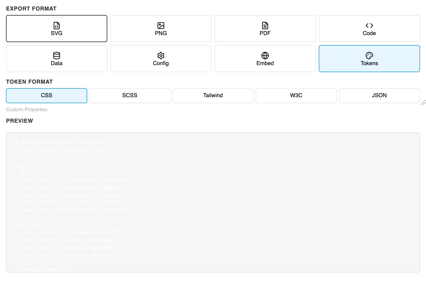
Five formats:
Tokens are one of eight export formats; From Figma to code covers the rest, including the config object that drops straight into an existing chart component.
What comes out is not just the palette. The export carries the series colours as named entries, the font family, and the size and weight for the title, data labels, axis and tooltip separately, plus the series border. In other words, it is the chart’s whole visual contract — the things that normally get lost between a screenshot and an implementation.
It is tempting to describe this as a live loop. It is not one, and it is better to know that now:
#2F7A68, not {color.brand.primary}.None of that undermines the workflow; it just means the source of truth stays in Figma, and the chart is a consumer of it that you refresh deliberately. Treat a saved chart style the way you treat a component: made once, updated on purpose.
Half an hour, and every chart in the file afterwards is a click:
Step five is the one people skip, and it is the one that catches the failure that would otherwise reach production — because a palette is only as good as the smallest mark you draw with it.
Install Figma Charts — it’s free to try → Which chart library should you use? →