Install Figma Charts — it’s free to try → Read the help centre →
Here is the handoff, as it usually happens. The designer exports a PNG and drops it in the ticket. The engineer opens it, squints, picks a charting library, and rebuilds the thing from scratch — guessing the tick interval, guessing the legend position, sampling the bar colour out of the screenshot with a colour picker. Two weeks later somebody notices the built chart and the mockup disagree, and one of them gets redone.
None of that is anyone’s fault. It happens because the artefact that crossed the boundary was a picture, and a picture is a lossy encoding of a chart. Everything that made the design a design — the axis configuration, the number formats, the label rotation threshold, the palette in series order — was thrown away at the border and reconstructed by hand on the other side.
Figma Charts exports eight things instead, and three of them are the chart itself rather than an image of it.
Everything below happens inside Figma Charts, a Figma plugin. It does not draw charts of its own: it runs the real JavaScript charting libraries — Google Charts, Highcharts, D3-based Nivo, ApexCharts and Apache ECharts — inside the plugin window. That matters here more than anywhere else, because it is what makes the export a chart rather than a description of one.
Install Figma Charts from the Figma Community →
Once installed, press ⌘/ (Ctrl / on Windows), type Figma Charts, hit Enter. Open a chart and the Export tab sits beside Configuration, Data and Animation.
They fall into three groups, and knowing which group you are in saves a lot of time:
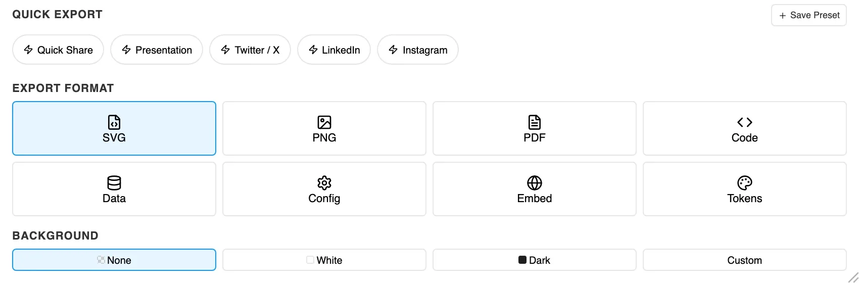
Pick a format and its own options appear underneath — PNG offers scale, PDF offers page size, Code offers a framework. Finish with Download for a file or Copy for the clipboard.
Choose Code and pick React, Vue 3, Vanilla, Angular or Svelte. What you get is a working component that renders the chart you designed, with your options inline — colours, fonts, axes, labels and all.
Coverage is not uniform, and the picker only offers what works for the library you are in:
The generated source lists the packages to install, and they are the chart library’s own — highcharts, apexcharts, echarts, @nivo/*, react-google-charts — plus the appropriate framework wrapper, such as highcharts-react-official, vue-echarts or ng-apexcharts.
And they are pinned to the same major version the plugin rendered with. That is the part that is easy to skim past and is doing most of the work. A chart designed against ECharts 6 and rebuilt against ECharts 5 is not the same chart — defaults move, options get renamed, layout changes. The version in the install line is load-bearing, not decoration.
Nothing in the output depends on Figma Charts. There is no SDK, no runtime, nothing to keep in step with the plugin — which also means the code keeps working long after anybody’s subscription lapses.
Config is the chart library’s own options object: the exact structure the plugin passed to the library to draw what you are looking at. No component wrapper, no framework opinion, no imports.
It is the right export whenever the receiving codebase already has a chart component. Your engineers have a <Chart> that handles sizing, theming, loading states and error boundaries, and they do not want a second one; they want the options object to feed it. Handing them a React component means they throw away the wrapper and keep the middle. Handing them the config means they paste the middle.
It is also the most durable thing in the list. Frameworks change; a library’s options object outlives them.
The practical test is a question worth asking your engineers once, because the answer holds for every chart afterwards: do you already have a chart component? If yes, they want Config and nothing else — a generated React component is a wrapper they will delete to get at the middle. If no, they want Code, because the wrapper is the part they would otherwise have to write, including the sizing behaviour and the ref handling that charting libraries all need and none of them document well.
Choose Embed for a snippet to paste into a web page, and you get a real choice with a real trade-off:
For a status page, an internal wiki or an email-adjacent context, static is almost always right. For a documentation site where the reader benefits from reading exact values off a tooltip, interactive earns its network request.
Choose Tokens and pick CSS (custom properties), SCSS (variables), Tailwind (a config extension), W3C (the standard design-token JSON that Style Dictionary and Tokens Studio read) or JSON (a flat object).
What comes out is not only the palette. The export carries the series colours as named entries, the font family, and separate size and weight for the title, data labels, axis and tooltip, plus the series border. In other words the chart’s whole visual contract, in the form your engineers already consume — which is how chart styling stops being a special case that lives outside the design system.
Worth knowing before you commit them: these are resolved values, not references. You get #2F7A68, not {color.brand.primary}. If your charts should track a variable that moves, the token file is a snapshot to regenerate rather than a live binding — the round trip has more on where that boundary sits.
Data exports the numbers as CSV, JSON or Excel, named after your chart. It exports the values, not the styling — use Config for the whole definition or Tokens for the look.
There is a faster route for CSV that is worth knowing because it sits outside the paywall entirely: the Export CSV button in the data table toolbar on the Data tab. Same numbers, no paid plan.
PDF gives you a print-ready page. Set Page size to Auto, A4, Letter or Custom and Orientation to Auto, Portrait or Landscape. Auto fits the page to the chart rather than the chart to the page, which is what you want for a figure going into a report and not what you want for a standalone handout.
Three settings apply across the picture formats and quietly decide whether the result drops cleanly into its destination.
Background is None, White, Dark or Custom. None gives you a transparent SVG or PNG, and it is usually the right answer — the chart is going onto a surface that already has a colour, and a white rectangle behind it is the most common reason a well-styled chart still looks pasted on.
Padding under Custom Dimensions adds breathing room inside the exported box, which matters when the destination has no layout of its own to provide it.
Optimize SVG removes comments, normalises fonts and cleans out hidden elements. Leave it on unless you have a reason: chart SVGs generated by a full charting library carry a surprising amount of scaffolding.
Tucked below the format options is an Accessibility block, and it is the most quietly valuable thing on the panel.
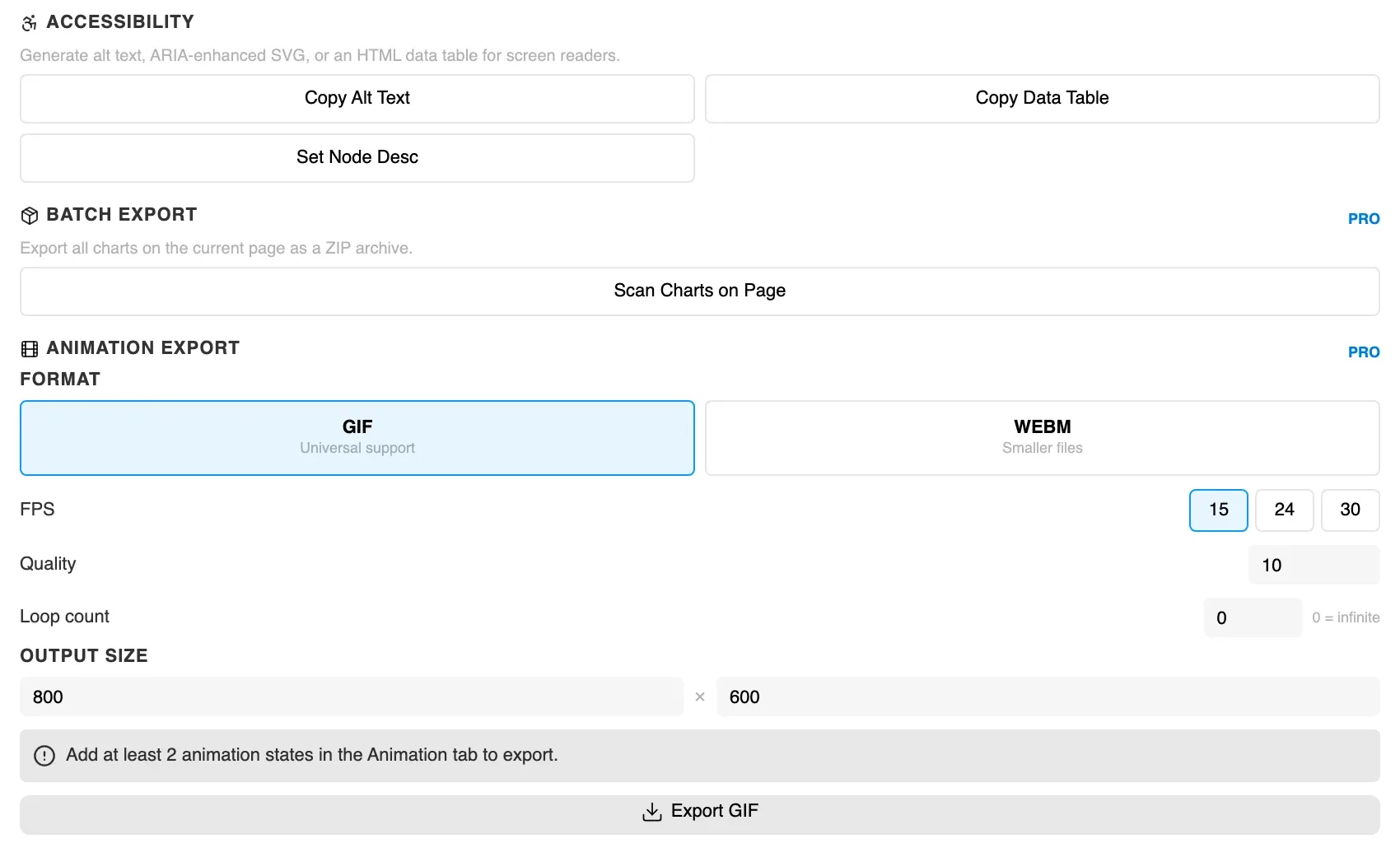
A chart is one of the least accessible things you can put on a page, and “we’ll add alt text later” is how it stays that way. Three buttons, at the moment you are already thinking about the chart, is a much better bargain than a remediation pass six months on.
Batch Export has one button — Scan Charts on Page — which finds every chart on the current page and exports them together as a ZIP. For a deck or a dashboard file with a dozen charts, that is the difference between a task and an afternoon.
Animation Export produces a GIF (universal support) or a WEBM (smaller files) from an animated chart, with FPS at 15, 24 or 30, a quality setting, a loop count where 0 means infinite, and an output size. It needs at least two animation states captured on the Animation tab first, and the panel says so rather than producing an empty file.
Both are PRO.
Along the top sits a Quick Export row: Quick Share, Presentation, Twitter / X, LinkedIn and Instagram, each a saved combination of format, size and background for that destination. Save Preset adds your own.
It sounds like a convenience and is really a consistency mechanism: if every chart that goes into the deck is exported through the same preset, they are the same size and the same background without anybody remembering to make them so.
The Export tab is not the only way out. In Settings → GitHub you can paste a personal access token, choose a repository and a folder, and then save charts straight there from the editor — and browse and reopen charts somebody else saved.
Two details make it usable rather than alarming. If someone has changed the same chart since you loaded it, the plugin tells you before writing instead of overwriting their version. And the token is stored on your machine and held in memory rather than written into the Figma file — though it is still worth giving it the narrowest scope that works, ideally access to the single repository you keep charts in.
This is the version-control answer for chart definitions: the config lives next to the code that renders it, with a history, rather than in a Figma file that only designers open.
Before anything crosses to engineering it usually has to land in the design file, and that is its own choice with its own consequences.
+ SVG is the normal case. Figma rebuilds the chart as layers — every bar, line, gridline and label is its own object, and the labels are real text you can select and edit. That is what makes the chart participate in the design rather than sit on top of it: you can restyle a series, nudge a label, or wire a bar into a prototype.
+ PNG draws it as a single rectangle with the image as its fill, at twice the pixel density so it stays sharp on a retina screen. Two cases genuinely call for it. Very dense charts — heatmaps and calendars with thousands of cells — land as an unwieldy pile of layers in SVG. And PNG freezes the typography, so nothing can be substituted or nudged later, which is occasionally exactly what you want.
Either way the chart is centred in your viewport with its proportions locked, and its settings travel with it, so Edit Chart reopens it and Update SVG or Update PNG replaces it in place. The plugin remembers which you chose and highlights the same button next time.
Switching is destructive. Pressing Update PNG on a chart inserted as SVG replaces the whole layer tree with a flat image; going back rebuilds it from scratch. Either direction loses anything you restyled inside the chart in Figma. Decide early, and if you are unsure, start with SVG — it is the one you can still do things to.
An honest accounting, because the gap between the preview and the artefact is where the remaining surprises live.
Interactivity does not survive an insert. Tooltips, hover highlights and click behaviour belong to the live chart; a Figma layer is a drawing. Anything actually drawn does come through — the legend, the axis labels, a data-zoom slider — but it is a picture of a slider, not a slider. This is the one thing to be explicit about with stakeholders, because a static mockup of an interactive chart invites a review conversation about behaviour that nobody has built yet.
Size comes from the settings, not from the preview. The chart is drawn at the Width and Height under Appearance — 818×400 unless you change them — regardless of how big the preview happens to be showing it. Zooming and panning the preview has no effect on what lands.
Fonts can be substituted. The plugin loads the chart’s fonts into Figma before inserting, but a font Figma cannot supply gets substituted — and because substitution changes label widths, it can change where labels collide and which ones get dropped. If the text looks off, that is the first thing to check.
The theme you see is the theme you get. The Auto / Light / Dark control beside the tabs changes the rendered chart, not just the preview chrome, so compare like with like before deciding a colour is wrong.
A failed preview still inserts. If the preview shows Preview failed with a banner, you are looking at the last chart that rendered cleanly — and that is what gets inserted. Fix the reported problem first rather than inserting and wondering why the result is one edit behind.
One deliberate limitation worth knowing about rather than filing as a bug: charts that could be dragged or scroll-zoomed on their own — ECharts treemaps and network graphs, Highcharts scatter plots, ApexCharts time series — have that behaviour switched off inside the preview on purpose. It stopped a stray drag from baking a half-panned chart into a file.
There is a ninth thing you can export that is not one of the eight formats: the chart itself, as a file. In the Export tab, Save chart downloads a document containing the chart type, your data, and every configuration and styling choice you made. On the home screen, Import opens it again exactly as you left it.
That makes it the simplest way to hand a chart to a colleague, and the obvious mechanism for a house set of chart templates in a shared folder — the thing teams usually try to achieve by duplicating a Figma file.
And it is the safe artefact to send. Saved files deliberately strip connection secrets: API keys, tokens and Authorization headers are removed before the file is written, so whoever opens it supplies their own credentials to refresh a live source. That is worth holding next to the opposite fact about live data — a connected source stores its credential inside the Figma file, where everyone who opens the file can use it. If you are sending a chart outside your team, send the file, not the Figma link.
The line is drawn in a specific place and it is worth stating plainly:
Figma Charts Pro is $38 a year. For a designer who hands over charts more than about twice, the code export alone is the argument — not because it saves you time, but because it saves the argument at review.
The point of all this is not that exporting is clever. It is that the thing crossing the boundary stops being a picture — and once it is the chart itself, there is nothing left for the two sides to disagree about.
Install Figma Charts — it’s free to try → Which chart library should you use? →