Install Figma Charts — it’s free to try → Read the help centre →
The dashboard looks superb in the mockup. Six categories, tidy round numbers, labels that happen to be one word each, a Y axis that tops out at a satisfying 100. Then it meets the actual data: forty-one categories, one of them called “Enterprise (EMEA, excl. UK)”, a value of −3, and an outlier eleven times the median that flattens everything else into a grey smear along the bottom.
Nothing was wrong with the design. It was just never tested against the thing it exists to display. This is how to build charts in Figma from your real numbers instead — a live Google Sheet, a REST API, an Airtable base or a Supabase table — and how the connection behaves afterwards, including the parts that will surprise you.
Everything below happens inside Figma Charts, a Figma plugin. It runs the real JavaScript charting libraries — Google Charts, Highcharts, D3-based Nivo, ApexCharts and Apache ECharts — inside the plugin window, so the chart on your canvas is the library’s own output rather than a drawing of one.
Install Figma Charts from the Figma Community →
Once it is installed there are two ways to open it, and the first is faster:
Open any chart from the gallery and you land in the editor, with a Data tab beside Configuration. That tab is where all of this lives.
Sample data is not neutral. It is quietly optimistic, and it hides the four things that actually break a chart:
Because Figma Charts runs the real library, all four of those surface at design time, in front of you, rather than in the built product. That is only worth anything if the numbers going in are the real ones.
The source picker offers eight, and it is worth being clear about what each actually is, because the distinction is not signposted in the UI:
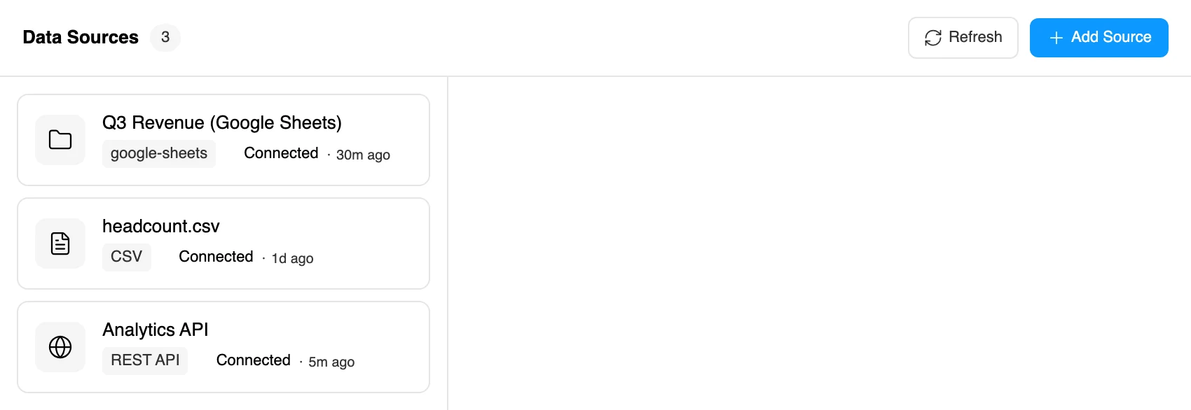
.xlsx. A snapshot.The four live ones fetch over the network every time you refresh. The other four re-read content that was stored inside your Figma file when you added them, so refreshing one returns exactly what it returned last time. They still appear in the source manager with a “Connected” badge and a last-sync time, which reads as more alive than it is — a CSV that says 1d ago is telling you when you uploaded it, not when it last changed.
If you want a chart that tracks a number as it moves, it has to be one of the first four.
This is the one most teams want, and it is deliberately the least ceremonious: no API key, no Google sign-in, no OAuth consent screen. The plugin has no Google account of its own. It reads the sheet the same way an anonymous visitor would, which means the sharing setting is doing all the work.
In Google Sheets, press Share and set access to Anyone with the link as Viewer. Copy the URL out of your browser’s address bar. Then in the plugin, on the chart’s Data tab, press Connect Source → Create New → Google Sheets.
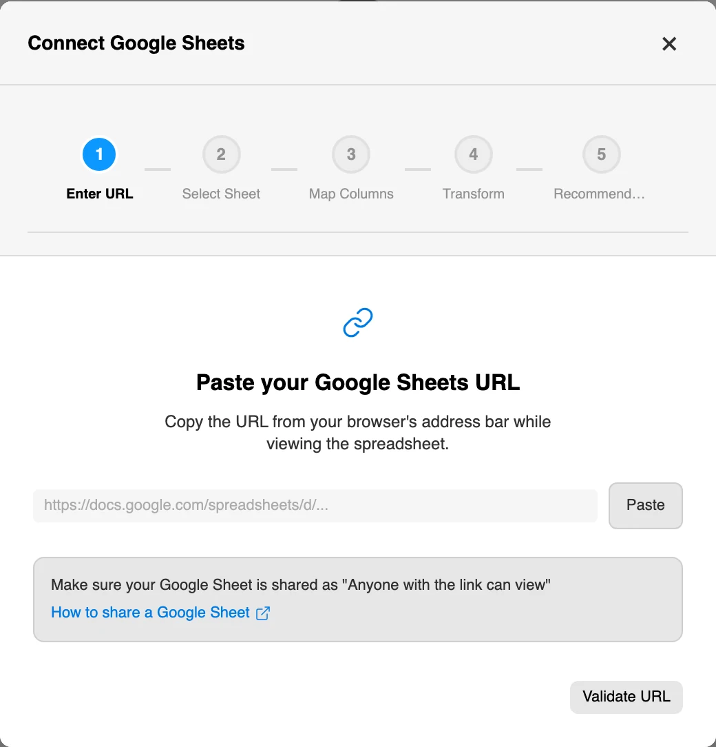
The wizard runs five steps — Enter URL, Select Sheet, Map Columns, Transform, Recommendations. Two things about that sequence are worth knowing before you start:
Published sheets work too. If someone used File → Share → Publish to web, paste that published link — the plugin recognises the format and reads the CSV directly.
Every connector converges on the same step, and it is the one that decides whether the chart is right: which column holds your labels, and which hold your data.
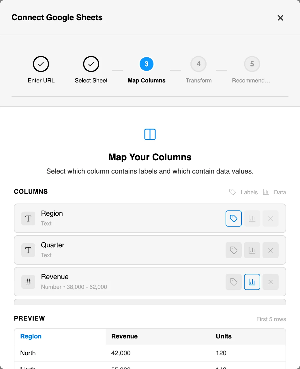
The wizard proposes a split and shows you why: each column carries its detected type and, for numeric columns, its actual range — Number · 38,000 – 62,000. That range is the most useful thing on the screen. It is your axis maximum, before you have drawn anything.
Two behaviours that save trouble:
The Transform step that follows creates calculated fields — an extra series derived from the ones you have. It is optional and it has a Skip button. Skip it the first time.
The proposed mapping is not a guess. The connector scores every column by the proportion of its non-empty cells that parse as a number, and decides from that. Knowing the rules means you can lay a sheet out that maps itself correctly first time:
$1,200 and 45% are read as 1200 and 45. You do not have to clean formatting out of a finance export.The one trap: inside a column that has already been judged numeric, a value that will not parse becomes 0 — it is not skipped, and it does not leave a gap. So a N/A, a TBC or an em dash sitting in a revenue column draws a bar at zero, which looks like a real measurement of nothing rather than missing data. If your source uses a placeholder for “no figure yet”, clear those cells before you connect: an empty cell is genuinely empty, a N/A is a lie the chart will tell confidently.
The other three live connectors follow the same shape: pick the type, hand over a credential, point the wizard at the rows, map the columns.
REST API. Enter the endpoint and choose GET or POST — POST gets a body field for the payload. Authentication is None, API Key (where you also name the header, such as X-API-Key) or Bearer Token. Then set the Data Path: the route to the array inside the response, written like data.results. You rarely have to type it — the wizard lists the arrays it found in the response and previews them, so clicking the right one is usually enough. Test & Preview shows the raw response if you need to confirm.
Airtable. Paste a Personal Access Token from your Airtable account settings, then the Base ID (it starts app) and the table’s ID or name. A View ID is optional and narrows the rows to that view — which is the tidiest way to chart a filtered subset without filtering in the plugin.
Supabase. Give the Project URL and an API Key — the anon key for public tables, the service_role key for private ones — then the Table Name. Limit and Order By are optional and both are worth setting: a chart of the most recent fifty rows is almost always what you meant.
Airtable and Supabase each offer Test Connection on their table step. Use it. A credential problem discovered on step two is a typo; the same problem discovered on step four is a debugging session.
This one deserves a plain statement rather than a footnote.
The credential you enter is saved with the data source inside the Figma file. It is written to the file’s plugin data, which means it travels with the file: anyone who can open the file can refresh the chart, and that is precisely why it works — a colleague opening your file gets a working, refreshable chart rather than a broken connection and a request for your token.
The trade-off is the obvious one. Treat that key the way you would treat anything else pasted into a shared Figma file:
Nothing here is unusual for a design-tool integration, but it is the kind of thing that is much better known than discovered.
Once a chart is linked, a strip appears at the top of its Data tab: the source name, and when it last synced — Updated 5 min ago, or Never synced if it has not run yet. Alongside it sit Refresh, Change and an unlink button.
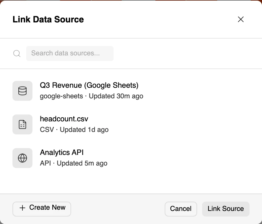
When the plugin notices the source no longer matches what your chart is showing, an amber Source data has changed warning appears and asks you to refresh. It does not refresh for you. Your chart is never rewritten behind your back — which matters when the file is a design review and the numbers on screen are the ones being discussed.
Now the part that surprises people: refresh is manual. There is no scheduler in the interface. The plugin carries the machinery for timed refreshes internally — intervals of five, fifteen and thirty minutes and an hour — but no screen in the shipped product exposes a control to set one, so in practice a linked chart updates when you press the button and not before.
And refreshing only happens while the plugin is open. A chart sitting on your canvas with the plugin closed is a picture: nothing is fetched, nothing changes, and nothing is quietly wrong. If you want the numbers current for a review, open the plugin and refresh before it starts.
Refreshing updates the chart in the editor. The frame already sitting on your canvas is a separate thing, and it does not move until you say so.
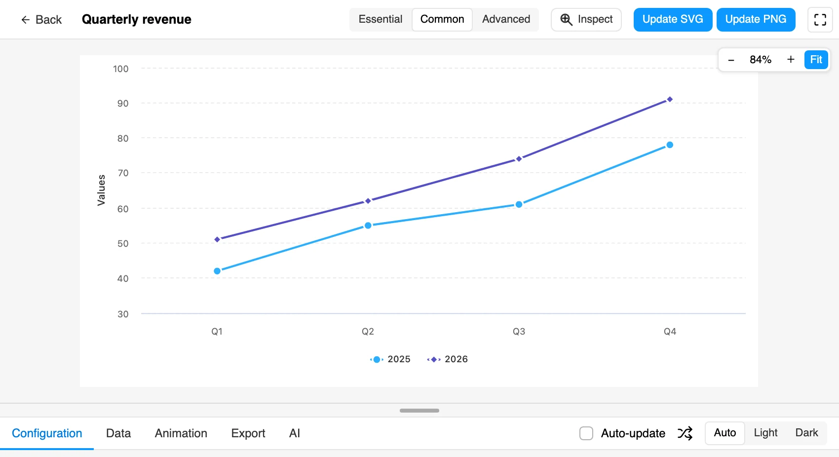
Select the chart on the canvas with the plugin open and it reopens in the editor with the data and settings it was inserted with. The insert buttons become Update SVG (or Update PNG, if that is how you inserted it), and pressing one replaces the chart in place — same position, size, rotation, name and parent frame. You do not get a second chart to align by hand.
There is also an Auto-update checkbox beside it, which live-syncs editor changes to the canvas while you work. It is off by default. Turn it on while you are iterating and off before a review, unless you want the board changing under discussion.
Two details worth carrying:
If what you want to show is the change itself rather than the latest figure, capture the before and after as snapshots instead — animated charts as native Figma prototypes covers that.
Someone will rename a column. Someone will delete the header row, or add a currency symbol to a numeric column, or reorder the tabs. Here is what actually happens.
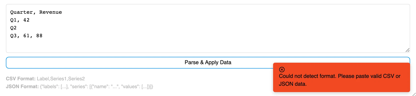
If the refresh returns something that is not valid chart data — no labels array, no series, an empty result — the plugin warns you once and keeps the last good version. It does not draw a broken chart, and it does not warn again on every subsequent attempt, so a source that has gone bad does not turn into a stream of toasts.
If the data is valid but does not suit this chart type, you get a specific refusal rather than a mangled chart: this chart type uses a specialised data format and cannot accept linked data sources.
That refusal is worth planning around, because it is not evenly distributed:
The pattern is consistent: anything whose data is a structure rather than a table — a hierarchy, a set of flows, a grid — is edited in the plugin rather than fed from a sheet. If a live Sankey is the requirement, that is a reason to build it in Highcharts.
Some charts need two or three unrelated pieces of data, and those can each be linked separately rather than crammed into one table:
Each part then refreshes on its own, which is genuinely useful when the categories live in one system and the numbers in another — a fixed list of teams from a sheet, live figures from an API.
Sources are saved into the Figma file, not into your account, so they are shared with everyone who opens it and they survive you closing the plugin.
To see them all, go back to the home screen and press Data. That lists every source in the file with its type, its last sync time and a preview of the data it returns, plus buttons to edit or delete. It is also where you add a source before you have a chart — finish the wizard there and it suggests chart types that suit what it just read.
One consequence worth planning for: because the sources belong to the file, duplicating a file duplicates its connections and its stored credentials. A template file with a live source in it will hand that source to everyone who duplicates it.
All seven connectors are PRO. Manual Entry is the free one — typing numbers into the table, pasting from a spreadsheet with ⌘V, and exporting the table as CSV are all ungated. Everything that reads a file or a service, including CSV and JSON import, needs a paid plan.
Figma Charts Pro is $38 a year. If you are evaluating, the honest test is to paste your real numbers into the table by hand on the free plan first. Most of the value in this post — discovering that your design breaks on forty-one categories — arrives the moment real numbers hit the chart, whether they arrived over the network or through the clipboard.
Step six is the whole point. Everything before it is plumbing; that step is where the design either survives contact with your data or gets rethought — which is much cheaper to discover in Figma than in a pull request.
Install Figma Charts — it’s free to try → Which chart library should you use? →