
Install Figma Charts — it’s free to try → See the line chart gallery →
A line chart is the only common chart whose subject is not a value. Bars are about magnitudes and pies are about shares; a line is about the shape between the points — the climb, the plateau, the drop that started in March. Nobody reads a line chart by looking up individual values. They read the slope.
Real plugin output: a Highcharts line chart captured from the editor, not an illustration of one.
That single fact decides everything else about the chart, and it is why a line chart forgives things a bar chart cannot and punishes things a bar chart shrugs off. This page is organised around the four decisions that actually change what a line says: where the axis starts, what happens to missing values, whether the line curves, and how many lines you allow.
Everything below happens inside Figma Charts, a Figma plugin. It does not draw charts of its own: it runs the real JavaScript charting libraries — Google Charts, Highcharts, D3-based Nivo, ApexCharts and Apache ECharts — inside the plugin window, so the line on your canvas is the library’s own output, with its own interpolation and its own tick spacing.
Install Figma Charts from the Figma Community →
Press ⌘/ (Ctrl / on Windows), type Figma Charts, hit Enter, and pick Line from the category filter.
A bar chart must start at zero, because a bar encodes value as length from the baseline and a truncated baseline makes the lengths lie. A line chart is under no such obligation, and insisting on zero is often the wrong call: a server response time that moves between 180ms and 220ms, plotted from zero, is a flat line across the top of an empty chart.
The reason the rule differs is that a line encodes value as position and change as slope, and slope survives truncation while length does not. What truncation does change is how dramatic the movement looks — so the honest habit is to choose a range that shows the variation with a little air around it, and then leave it alone across every chart in the same set.

Where a line chart can be more honest than a truncated bar chart: shaded bands put the thresholds into the plot itself, so a reader sees not just the movement but whether it is inside acceptable limits.
This is where line charts go wrong most often, and the failure is silent. If a value is missing and the data pipeline turns it into 0, the line does not break — it dives to the floor and comes back, and every reader interprets that as a real collapse. In this plugin the coercion is explicit: in a column judged numeric, a cell that will not parse becomes 0 rather than a gap. Clear those cells before you connect a source.
Once the data is honest about what is missing, there are three legitimate treatments and you should pick deliberately: break the line (the reader sees the hole and knows not to interpolate), bridge the gap with a visibly different segment such as a dashed connector (there is data either side and you are being explicit that the middle is inferred), or plot nothing for periods with no coverage at all. What you must never do is plot the gap as a value.
A straight segment between two points says “we measured here and here”. A smooth spline says “the underlying process moved like this” — which is a claim about values you did not measure, and frequently a false one. Splines overshoot: a curve fitted through a peak often rises above the highest measured value on its way in and out, inventing a maximum that does not exist in your data.

A stepped line is the honest shape for values that change discretely and hold: a price that was set on the first of the month, a headcount, a configuration. The step says the value did not drift between changes.
Use straight segments by default, splines only for genuinely continuous processes sampled densely, and steps whenever the value holds constant between changes.
Four is the working ceiling for lines that cross. Past that the chart becomes a spaghetti plot, the legend becomes a lookup task, and readers stop tracing individual series altogether. The alternatives are better than they sound: highlight one line and grey the rest, or split into small multiples — the same chart repeated per series, each small, sharing one axis range.

Two series on two different scales, which is the other way a line chart misleads. When the axes are independent the crossing points are an artefact of the scaling and mean nothing at all — a dual axis can be made to show correlation or contradiction by choice of range.
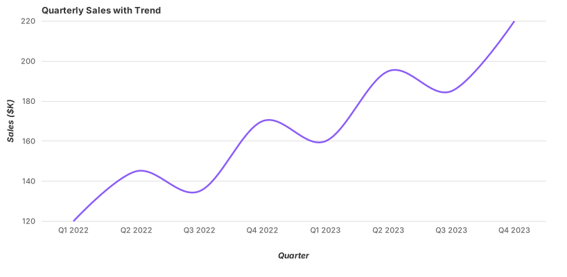
Google Charts computes a trendline from your data with a single option, which is the shortest path in the plugin to a chart that separates signal from noise.
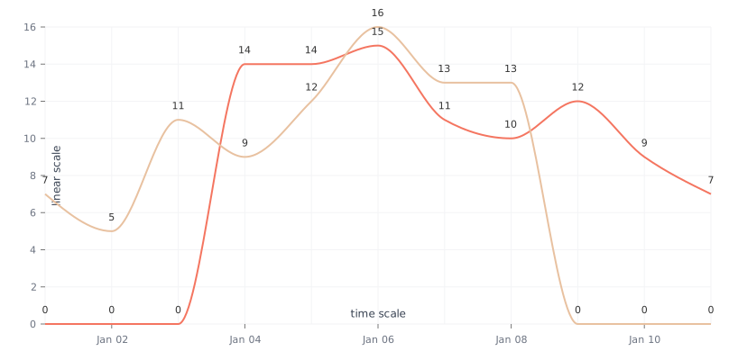
A real time axis, not an evenly-spaced list of labels. If your observations are irregular — daily then weekly then monthly — a category axis silently redistributes them into even spacing and flattens the actual pace of change.
A line chart needs an x axis with a meaningful order and, ideally, meaningful spacing. Three cases where it fails:
1. Your x axis is categorical. Products, regions, teams. Connecting them implies a progression from one category to the next, which does not exist — and the slope, the thing readers actually read, becomes meaningless. Sorted bars are the honest chart.
2. You have two or three points. A line between two measurements is a shape with no evidence behind it: it draws a straight trajectory through a period you did not observe, and readers extrapolate from it. State the numbers.
3. The individual periods are the subject. If the question is “how did each quarter do?” rather than “how did we move?”, bars keep each period as a separate comparable object. Lines subordinate the periods to the trajectory.
And one that catches people out: when the observations are irregular in time. A category axis spaces them evenly whatever their real dates, which speeds up sparse stretches and slows down dense ones. If the spacing matters, use a real time axis — every library here has one.
The ordinary cartesian shape: one column of labels — dates, periods, ordered categories — then one column of numbers per series. Two series is two columns. There is nothing to reshape, which is why line charts are among the easiest types to feed from a real source: paste from a spreadsheet, import a CSV, or connect a Google Sheet or an API, and it binds in all five libraries.
Two details worth knowing before you connect anything. Unparseable cells become 0, not gaps — the failure mode from decision two, and the reason to clean the source before binding it. And the label column is a label column: if your x values are real dates and the spacing between them matters, set the axis to a datetime type in the configuration rather than relying on the strings.
The line should be the heaviest thing in the chart. Gridlines are a measuring aid; if they compete with the data, they are wrong. A hairline in a light neutral, horizontal only.
Markers are for sparse data. With a dozen points, dots show where the measurements actually are. With three hundred they turn the line into a caterpillar — drop them, and let the path carry it.
Line weight carries hierarchy. In a multi-series chart, the series being discussed goes heavier and saturated; the context series go thin and grey. This is more effective than any palette choice, and it survives printing and colour blindness.
Give the ends room. Direct labels at the right edge need space that the default layout does not reserve. Widen the right margin before you place them, not after.
For type and colour, bind them to your design system rather than picking by hand — the plugin can build a palette from your Figma colour variables and bind chart text to your text styles, covered in Your chart, your design system.
Six screens, start to finish, captured from the plugin.
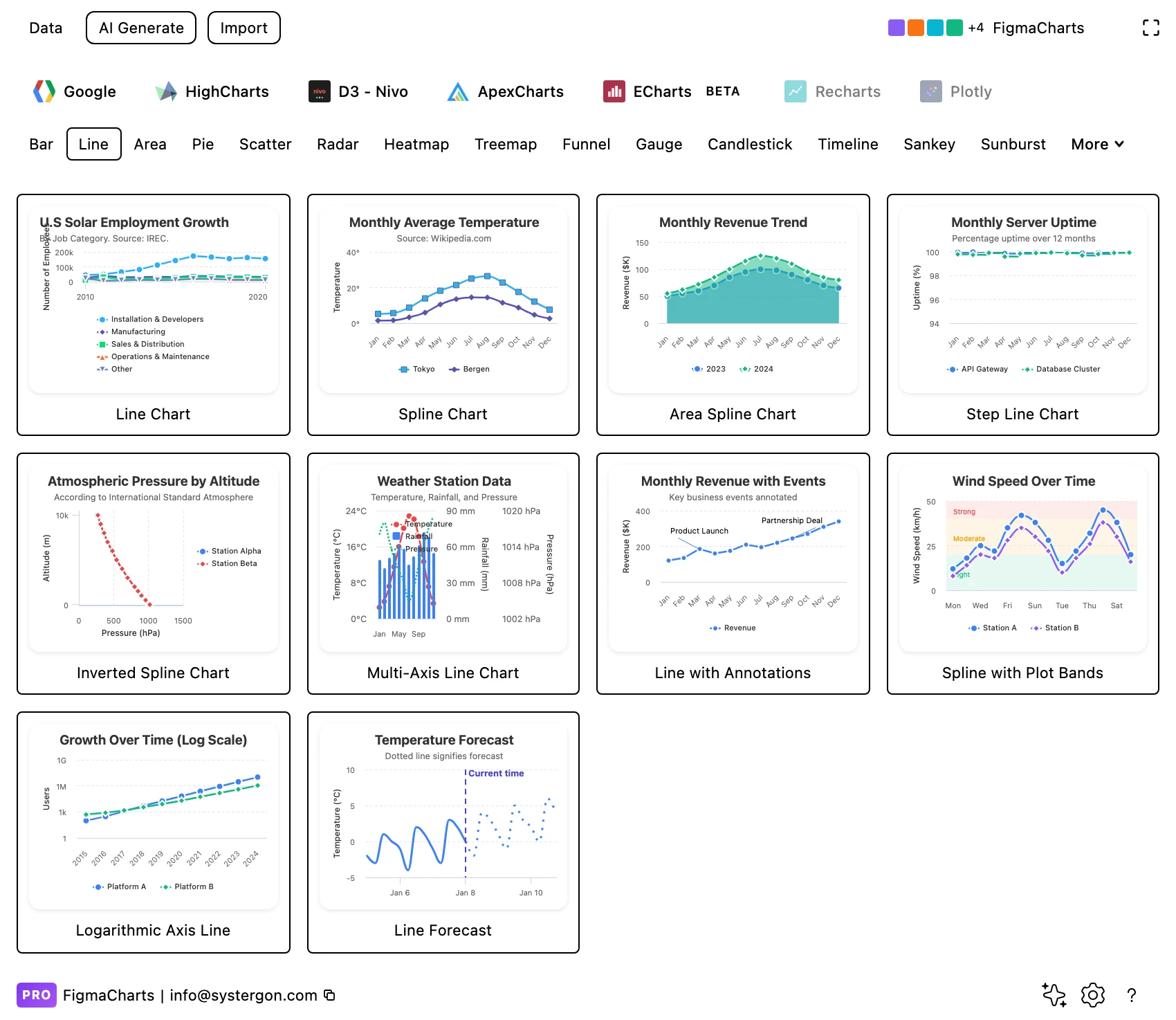
1. Pick a starting point. Library tab first, then the Line chip. Every tile is a live chart, so what you see is what you get — choose by structure (single series, multi series, stepped, dual axis) rather than by colour.
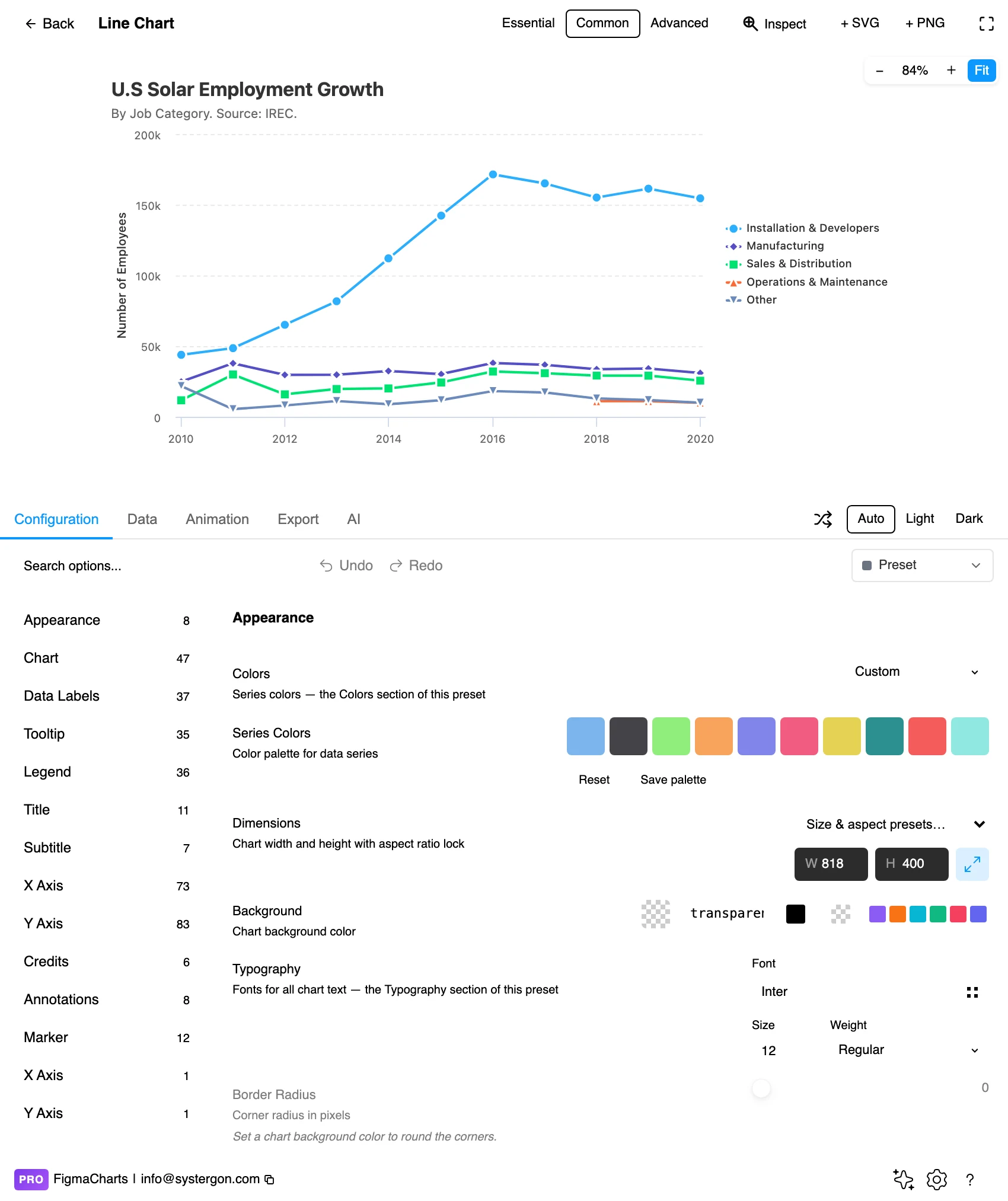
2. The editor. Live preview on top, tabs below. The Essential / Common / Advanced control decides how much furniture the chart carries — for a line chart in a dashboard tile, Essential drops the axes and gives you a sparkline.
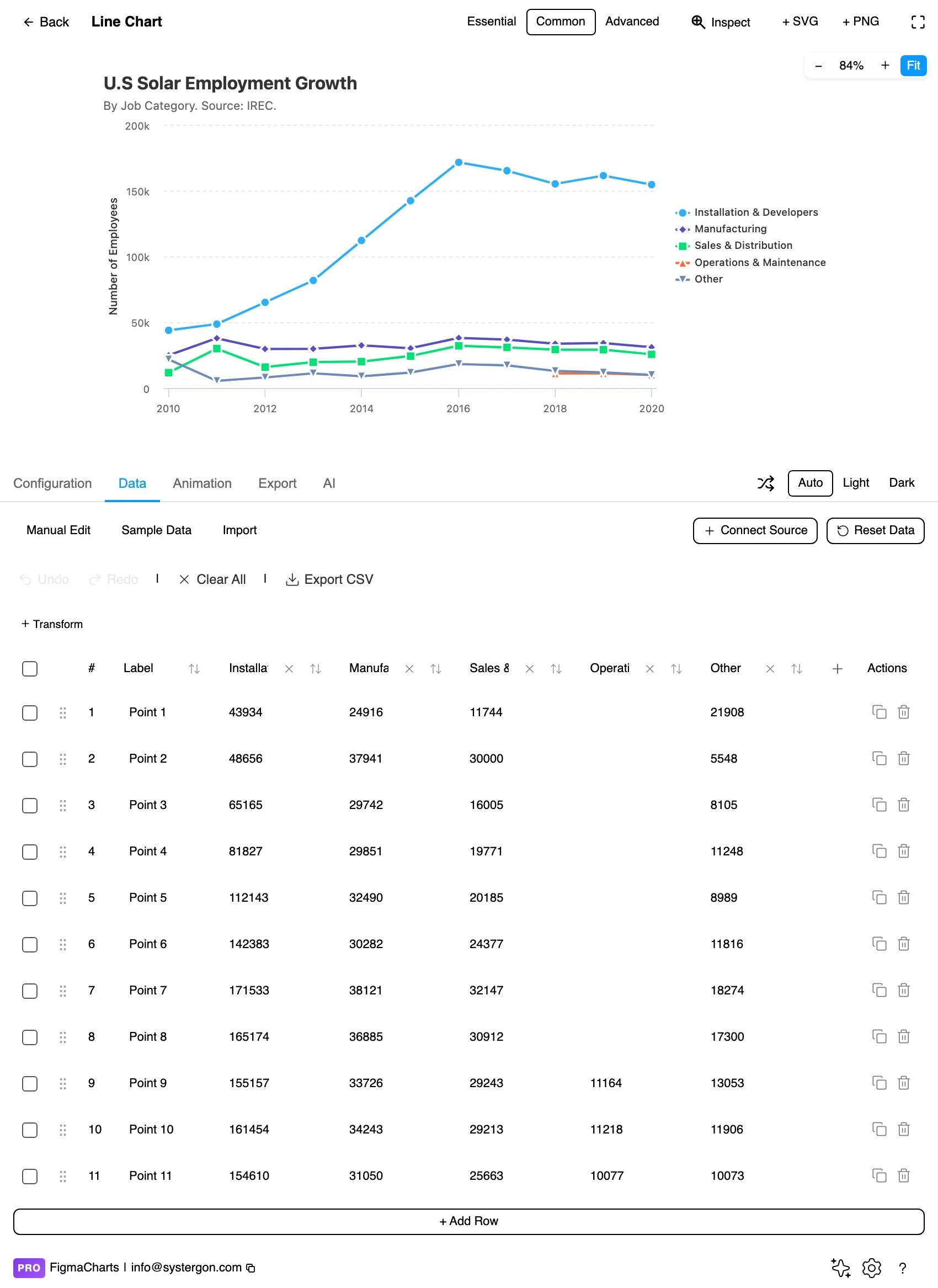
3. Your numbers. One label column, one column per series. Paste from a spreadsheet, import a CSV, or connect a live source — and check for the zeros discussed above before you trust the shape.
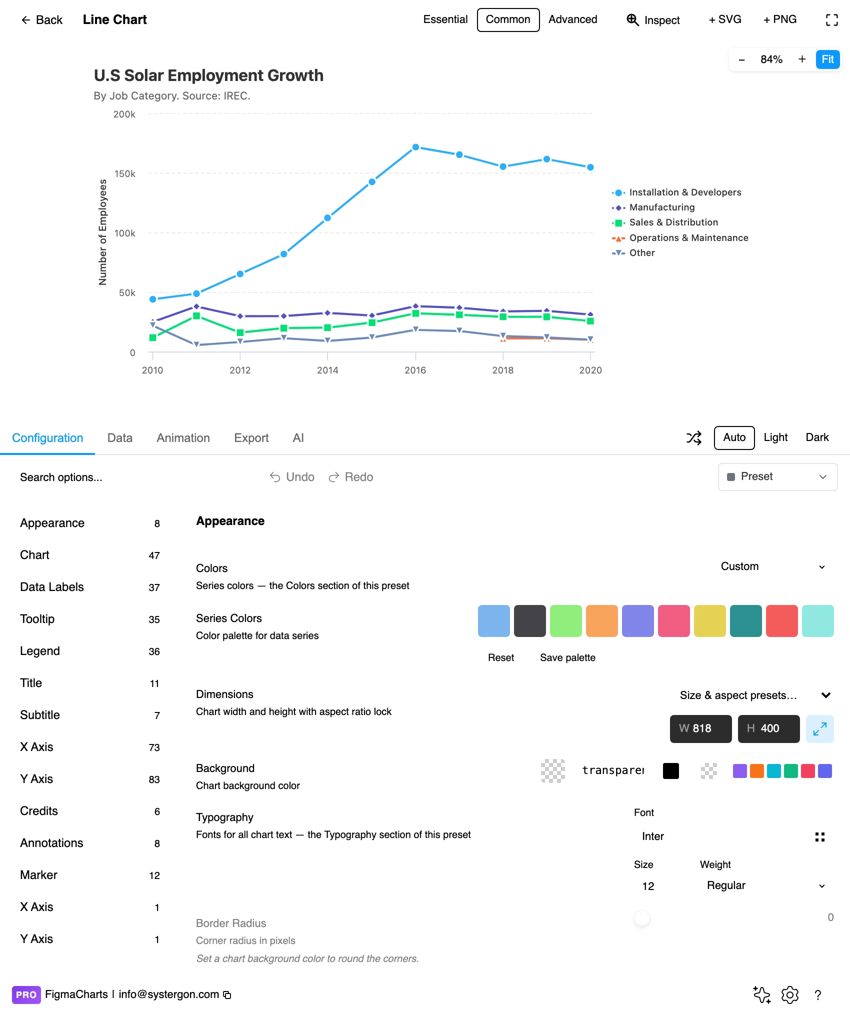
4. Configure. This is where the four decisions live: the axis range, the null handling, the curve type and the series styling. Search the options rather than hunting the tree.
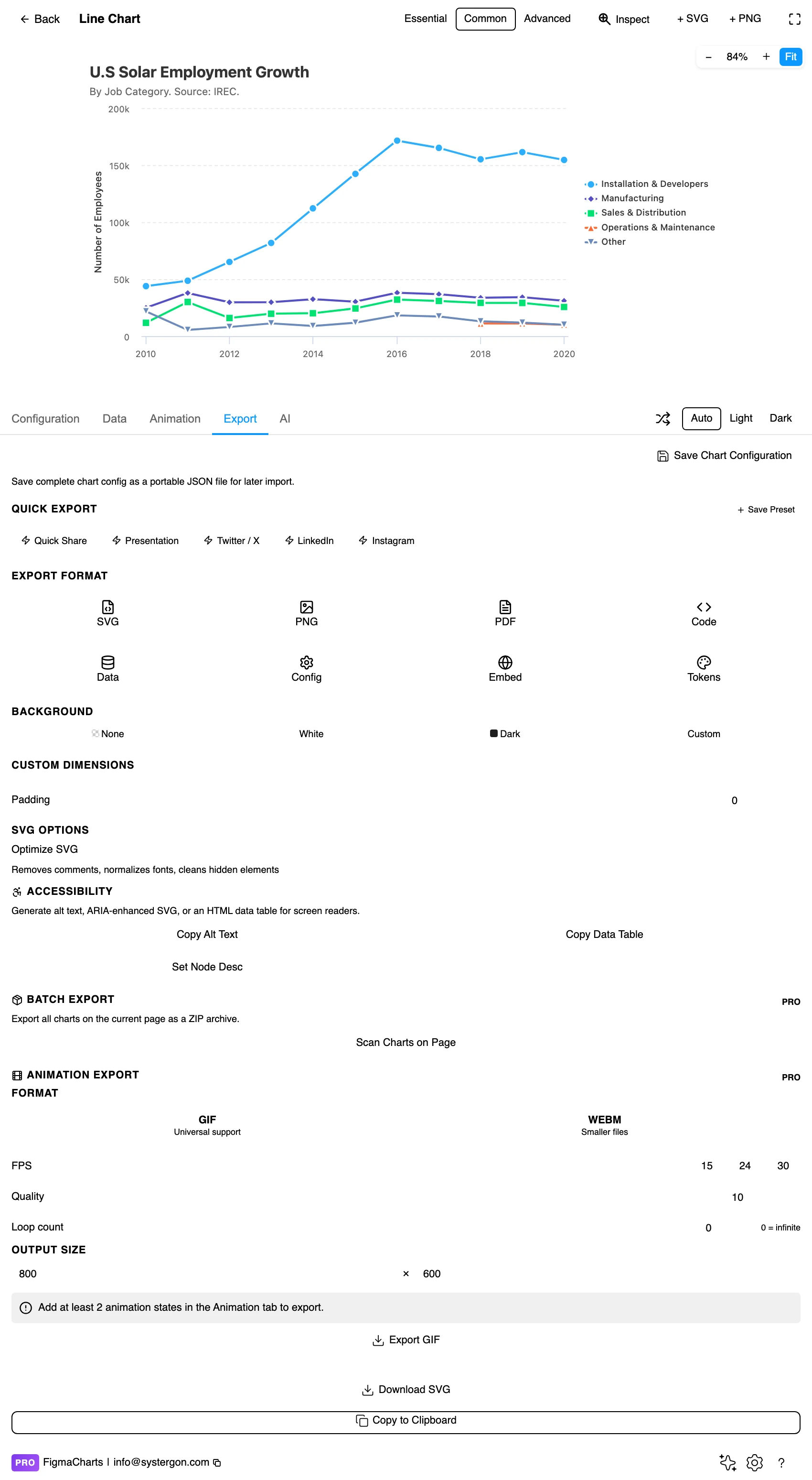
5. Export. A working component for React, Vue 3, Angular, Svelte or vanilla JavaScript, listing the library’s own npm packages at the version the plugin rendered with.
6. Insert. SVG gives you the line as a real vector path with real text labels; PNG gives you a flat image at twice the pixel density.
All five draw line charts, and there are 116 line examples in the gallery — the largest collection of any chart type in the plugin, which tells you something about how often this chart is the right answer. What differs between the libraries is what happens at the edges of the type:
The rule that beats all of them: design in whichever one your engineers already use, because the export then matches production exactly. Choosing the right chart library covers the trade-offs.
Aspect ratio is an argument. The same series in a tall narrow frame looks volatile and in a wide short one looks calm. The classical advice is to bank the average slope towards 45°, which is a good default precisely because it is not chosen to flatter the story.
A dual axis can prove anything. Two series on independent scales cross wherever the scaling makes them cross. If you must use one, say so loudly in the labels — and consider indexing both series to 100 at a common starting point instead, which puts them on one honest scale.
Interpolation is invention. Everything between two measured points is drawn by the library, not observed by you. With dense sampling that is harmless; with monthly points and a spline it is a claim about weeks nobody measured.
Zero still matters when the fill appears. The moment you fill the space under the line you have an area chart, and area encodes magnitude, so the zero-baseline rule comes back with it.
Three things a line chart does better than any other type, and all three are underused.
The sparkline. Strip the axes, the gridlines, the title and the legend, and a line chart still works — because the shape was the content all along. That is what the plugin’s Essential complexity mode produces, and it is the right chart for a dashboard tile, a table cell or a KPI card where the number is stated next to it and the line only has to say rising, falling, spiky, flat. No other chart type degrades this gracefully; a pie at that size is a coloured blob.
Small multiples. When you have eight series, the instinct is one chart with eight lines and the result is unreadable. Eight small charts in a grid, each with one line, all sharing an identical axis range, is legible at a glance and lets a reader compare shapes rather than trace paths. The shared range is the whole trick: per-panel ranges make every panel look equally dramatic and destroy the comparison.
Annotation. A line chart is the type where a single sentence pinned to a point does the most work — “pricing change”, “outage”, “campaign started”. Readers otherwise invent their own explanation for every inflection. Highcharts ships annotation examples in the gallery, and once the chart is inserted as SVG, a text layer on the Figma canvas does the same job for a slide.
Units belong in the axis title. “Revenue” is not a unit; “Revenue (£000s)” is. On a line chart this matters more than on a bar chart, because readers are reading slopes and a slope has units per period — the same climb means something different in thousands than in millions.
Beware the last point. The final observation carries disproportionate weight: readers extend it mentally into the future. If the last period is incomplete — a month still in progress, a partially-reported week — it will read as a collapse. Either exclude it, or mark it explicitly as partial.
Cumulative lines only ever go up. A running total is a legitimate chart and a rhetorically loaded one: it cannot fall, so it always looks like progress even while the underlying rate collapses. If the rate is the story, plot the rate.
Do not distinguish series by colour alone. Dash patterns, markers and direct labels at the end of each line all survive colour vision deficiency; a legend and five hues do not.
Label the lines directly where you can. A label at the right-hand end of each line removes the legend lookup entirely, and it is the single biggest readability improvement available to a multi-series line chart.
Give it a text equivalent. The Export tab’s Copy Alt Text, Copy Data Table and Set Node Desc buttons produce a description, an HTML table of the numbers, and a description written onto the Figma node so it travels with the design.
No — and often it should not. A line encodes change as slope, and slope survives a truncated axis where a bar’s length does not. Choose a range that shows the variation with some air around it, then keep that range consistent across related charts.
Never plot it as zero. Break the line so the gap is visible, or bridge it with a visually distinct segment if you want to signal “inferred”. Watch for numeric coercion in the data table — an unparseable cell becomes 0, which draws a dive to the floor that reads as a real collapse.
Usually not. A spline claims the process moved smoothly between your measurements, and it can overshoot — drawing a peak higher than any value you recorded. Use straight segments by default, splines for densely-sampled continuous processes, and stepped lines whenever a value holds constant between changes.
About four before it becomes spaghetti. Beyond that, highlight one and grey the rest, or use small multiples: the same chart repeated per series at small size with a shared axis range.
Rarely, and never silently. Independent scales mean the crossings are artefacts. Indexing both series to 100 at a common start puts them on one scale honestly and usually tells the story better.
Line when the movement is the story — the rise, the dip, the recovery. Bars when each period is a thing to be compared in its own right (“Q3 was the outlier”). Both are legitimate for time; they emphasise different questions.
Yes — line charts take the ordinary cartesian shape and accept a linked source in all five libraries. Refresh happens while the plugin is open.
Insert as SVG and the line is a real vector path, the labels real text, the gridlines real strokes. Insert as PNG for a flat image at twice the pixel density. Either way the chart reopens in the editor with its settings intact.
Open the plugin, drop your real series into a line chart, and then do one thing before styling anything: set the axis range and look at the shape twice, once with zero included and once without. The difference between those two pictures is the argument your chart is going to make, and it is better to choose it than to inherit it.
Install Figma Charts — it’s free to try → Browse all 45 chart types →