
Install Figma Charts — it’s free to try → See the stream gallery →
A streamgraph is a stacked area chart that has given up its baseline. Instead of resting on the axis, the bands float around a centre line, so nothing sits on the floor and every series is judged the same way: by thickness alone. That single change trades away the ability to read values and buys something specific in return — the shape of a mix changing over time, legible with far more series than a stacked area chart can carry.
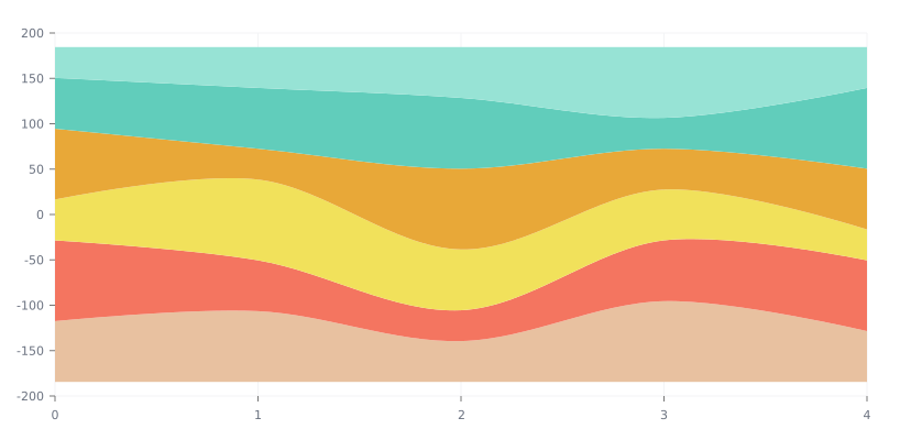
Real plugin output: a Highcharts streamgraph captured from the editor. Every chart on this page is the library’s own drawing.
It is an editorial chart. It is very good at “this got big, then it did not” and very bad at “how big exactly” — and knowing which of those your reader needs is the whole decision.
Everything below happens inside Figma Charts, a Figma plugin. It runs the real JavaScript charting libraries — Google Charts, Highcharts, D3-based Nivo, ApexCharts and Apache ECharts — inside the plugin window, so the bands on your canvas were laid out by the library’s own stacking algorithm.
Install Figma Charts from the Figma Community →
Press ⌘/ (Ctrl / on Windows), type Figma Charts, hit Enter, and pick Stream from the category filter — three examples, from Highcharts and Nivo. A fourth relative sits under its own chip, covered below.
In a stacked area chart the bottom band rests on zero, so it can be read precisely and everything above it cannot. A streamgraph removes that asymmetry by removing the floor entirely: the stack is centred, and the algorithm chooses offsets that minimise the overall “wiggle” so bands stay as smooth as possible.
What you gain: no band is privileged, so a small series in the middle is as readable as the largest one; many more series stay legible, because the layout is actively minimising distortion; and the silhouette of the whole — the total — becomes a shape in its own right.
What you lose: every value must now be judged as the thickness of a wavy band, which is harder than judging a length against a baseline; the vertical position of a band means nothing at all; and the total, while visible as an outline, cannot be measured against an axis.
One more property is worth naming because it is the reason the form looks the way it does: the bands are ordered, not ranked. Their sequence through the stack is a layout decision, so two adjacent bands have nothing in common except that the algorithm put them together — unlike a bump chart, where vertical position is the entire content.
That is a good trade for a chart that is showing composition over time to a general audience, and a poor one for anything anyone will quote a number from.

Dense — many series over many periods, which is the case the form was designed for. Note what stays readable: the overall envelope, the moments where one band swells, and roughly when each series appeared. Individual values are gone, and that is the deal.
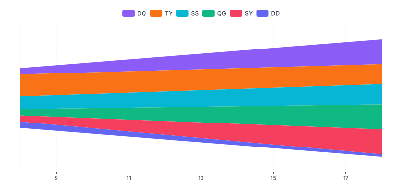
Nivo’s stream — the D3 look, with offset and order both configurable, and the cleanest default palette of the three. React-only export.
ECharts’ ThemeRiver — the same idea under a different name and its own category chip, with a real time axis and a legend. If you are already in ECharts, this is your streamgraph.
1. Anyone needs to read a value. The bands have no baseline and no measurable axis. If a number will be quoted from the chart, use a stacked area chart, or a line chart per series.
2. You have three or four series. With few series the wiggle is pure cost: a stacked area chart gives you a readable bottom band and a measurable total, and the layout has nothing to gain. The form starts earning its keep somewhere around eight series and gets better from there.
3. The total is the point. A streamgraph shows the total only as an envelope, which cannot be read against a scale. If the aggregate matters, put a plain line chart of the total above it.
And the case that catches people: when the series come and go. Streamgraphs handle new entrants gracefully — a band grows out of nothing — but when many series start and stop, the ordering algorithm reshuffles and a reader cannot follow any individual band. That is when the chart becomes decorative.
The streamgraph became widely known through two newspaper graphics — a history of box-office takings and a chart of listening habits — and both are worth understanding, because they define the conditions under which the chart works.
Both had many series: dozens of films, dozens of artists. Both had a long time axis, so each band had room to develop a shape. Both had series that entered and left naturally, which the floating baseline accommodates gracefully where a stacked area chart would produce a staircase of zero-height bands. And in both, the intended reading was narrative — this was big then, that took over — rather than quantitative.
Those four conditions are the checklist. A streamgraph with six series, eight periods and an audience of analysts is missing all of them, and will be a worse stacked area chart. With forty series, five years of weekly data and an audience reading for the story, it is doing something no other chart in this series can.
The stacked area chart keeps a real baseline, so the bottom series and the total are both readable. Prefer it whenever anyone will quote a number, and whenever you have few enough series that the stack stays legible.
Small multiples — one small chart per series, sharing an axis range — are the honest answer when the reader needs to compare individual series rather than absorb a mix. Twelve small line charts beat a twelve-band streamgraph for any question that starts “which of these…”.
A 100% stacked area chart answers the composition question directly: it shows share rather than volume, on a fixed 0–100% axis that can actually be read. If your interest is “how did the mix change?” rather than “how did the whole move?”, this is usually the better chart, and it is available in every library.
The streamgraph’s niche sits between them: too many series for a readable stack, too much interest in the total for a percentage chart, and an audience reading for shape.
Six screens, start to finish, captured from the plugin.
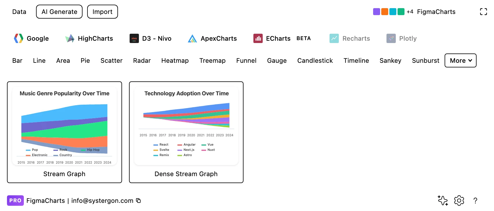
1. Filter to Stream. Highcharts and Nivo have the category; ECharts’ equivalent is under Theme River. Three examples between them.
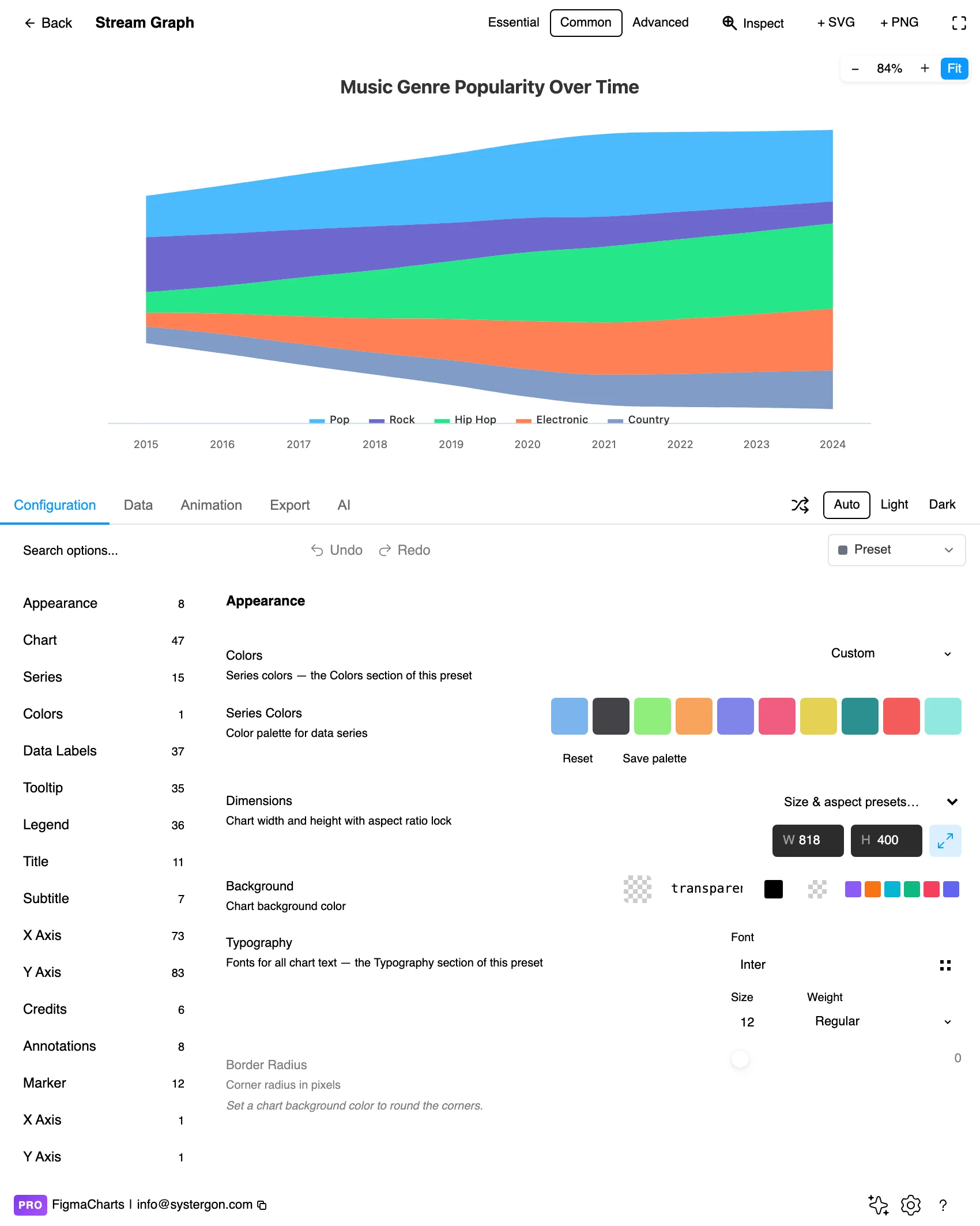
2. The editor. Live preview above, tabs below. Streamgraphs want width: the wiggle only reads as flow when the periods have room to breathe.
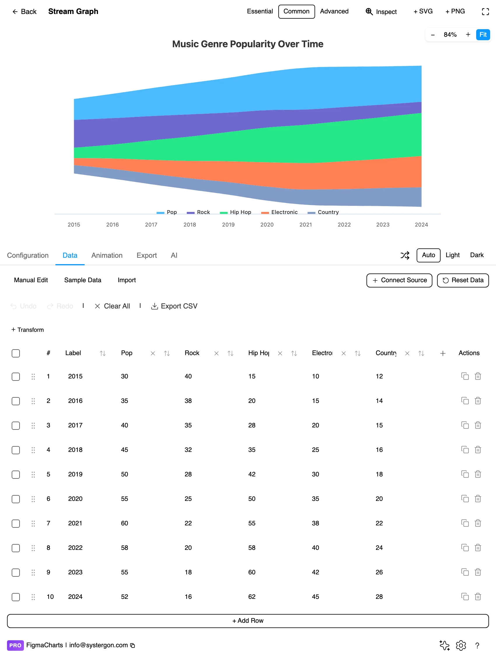
3. One column per series. The same cartesian shape a stacked area chart takes — a period label and a numeric column per series. The offset and ordering are configuration, not data.
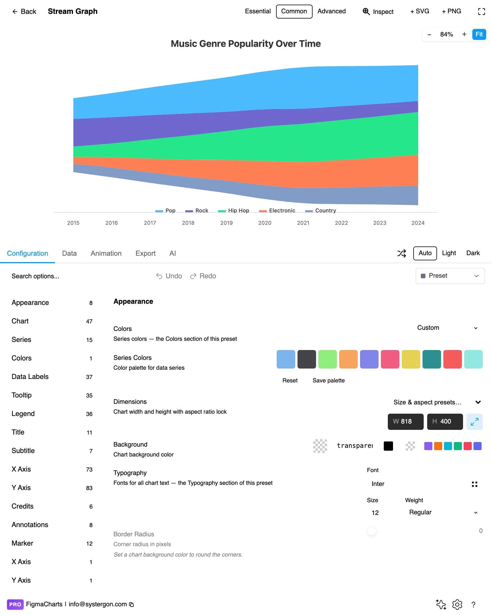
4. Offset and order. The two settings that define the chart: how the stack is centred, and in what order the bands are placed. Both change the picture substantially without touching a value.
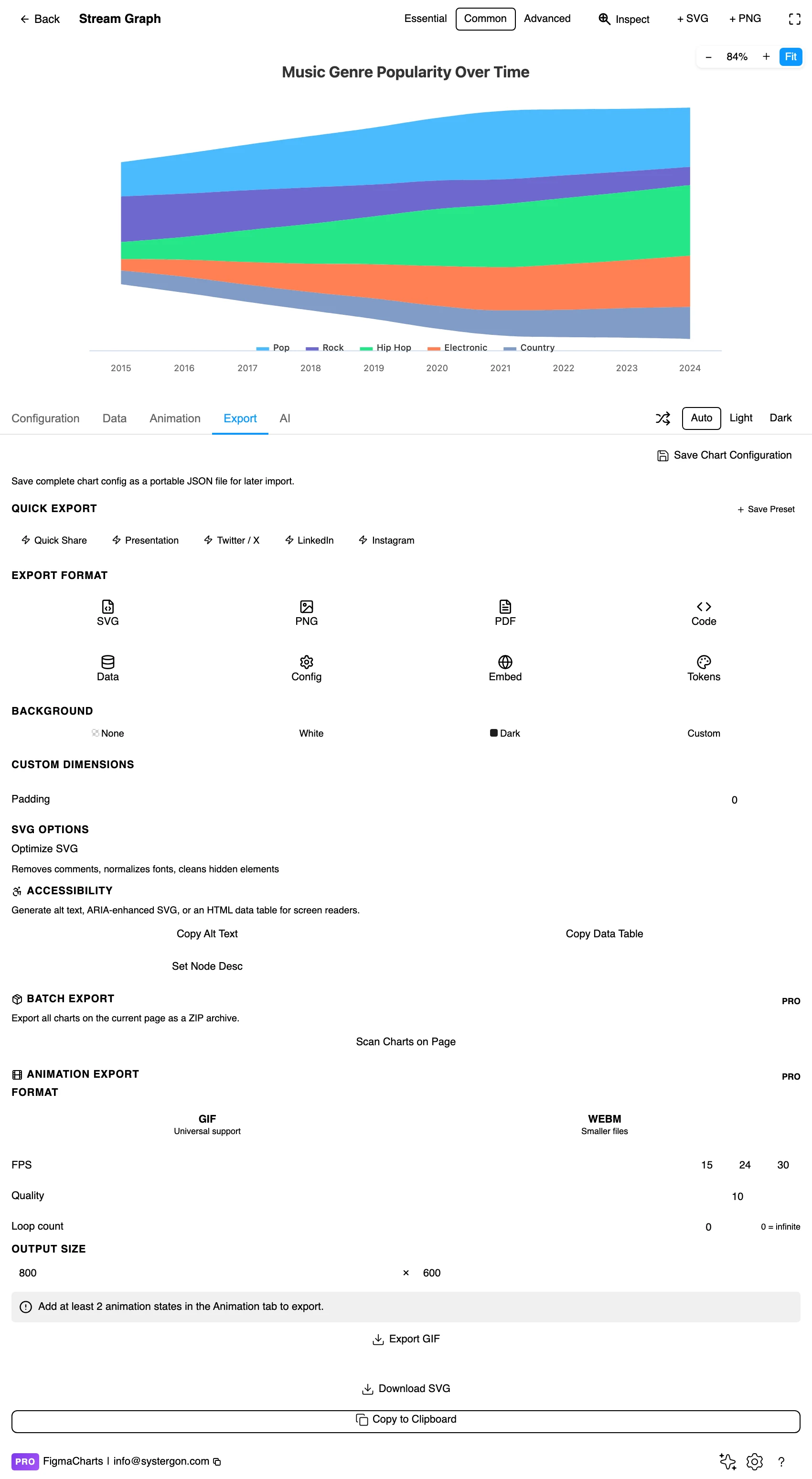
5. Export. A working component for React, Vue 3, Angular, Svelte or vanilla JavaScript — or the Config alone, which carries the stacking and ordering settings.
6. Insert. SVG gives you each band as its own vector shape, which makes labelling bands directly on the canvas practical — and direct labels are what this chart most needs.
Exactly the shape a stacked area chart takes: a label column of periods, then one numeric column per series. There is no special editor and nothing to reshape — which means you can try the same data as a stacked area chart and as a streamgraph and compare, and you should.
Three data properties matter more here than usual:
A practical consequence of the second point: fill your grid before you build. A pivot table with blanks where a series had no activity is the normal output of a database query and the wrong input for this chart — convert the blanks to zeros, and keep genuinely unknown periods out of the range entirely.
Streamgraphs take a linked data source like any cartesian chart — see live data from Google Sheets and APIs.
The Stream category holds three examples: Highcharts 2, Nivo 1. A fourth implementation sits under its own name.
As always: design in whichever library your engineers already use, because the export then matches production exactly. Choosing the right chart library covers the trade-offs.
Order the bands deliberately. Most implementations offer “inside-out” ordering, which places series that peak early towards the centre and later ones outward — it minimises crossing and produces the characteristic organic shape. Alphabetical ordering, by contrast, produces a chart that looks arbitrary because it is.
Label inside the bands. A legend forces the reader to hold eight colours in mind while scanning a shape. A name written into each band where it is thickest removes that entirely, and it is the single biggest improvement available to this chart.
Use a palette with an order. Because the bands are stacked in a sequence, an ordered palette — a ramp, or a hue rotation — helps the eye follow the arrangement. A random categorical palette fights the layout.
Keep the edges soft but the boundaries crisp. The band outlines are what let a reader separate one series from the next; a hairline in the background colour between bands does more for legibility than any amount of fill tuning.
Give it width. This chart is about flow over time. Compressed horizontally, the wiggle turns into noise and the shape stops reading as movement.
For type and colour, bind them to your design system rather than picking by hand — covered in Your chart, your design system.
Vertical position means nothing. A band near the top is not larger, earlier or more important — it is where the algorithm put it. Readers infer hierarchy from position in every other chart, and here that inference is simply wrong.
Thickness of a curved band is hard to judge. Human vision estimates the perpendicular distance between two curves rather than the vertical one, which systematically understates the thickness of steeply sloping bands. Every streamgraph is slightly wrong in the same direction, and there is no fix beyond not asking readers for precision.
The wiggle is a layout choice, not data. Changing the offset algorithm changes the entire silhouette without changing a single number. If a particular shape is going to be described in the text — “the surge in 2023” — check that it survives a different offset.
The envelope is a total you cannot measure. The outer edges show the aggregate rising and falling, which reads as authoritative and has no axis behind it. Pair the chart with the total if the total matters.
Small series can vanish and reappear. A band that thins to a hairline looks like an absence. If small series matter, group them into an explicit “other” band rather than letting them flicker.
A streamgraph in an interface can do things a static one cannot, and they address exactly the weaknesses listed above.
Hover to isolate. Fading every band except the one under the pointer turns an unreadable tangle into a single legible series, and it is the standard interaction for this chart. Design the resting state to be a shape and the hover state to be an answer.
A value readout, not a tooltip alone. Because thickness cannot be measured, the number has to come from somewhere. A persistent readout — series name, period, value — that updates on hover is better than a tooltip that vanishes.
Click to promote. Letting a reader pin one series, or switch the same data to a line chart of that series, resolves the “I need the actual numbers” problem without abandoning the overview.
The catch for design work: none of that survives insertion into Figma. An inserted SVG has no hover, no pinning and no readout, so a streamgraph in a slide or a spec has to earn its place on the static reading alone — which usually means direct labels and a companion chart carrying the numbers.
Direct labels, not a legend. The one accessibility measure that also improves the chart for everyone. Where a band is too thin to hold its name, a leader line to the margin works.
Adjacent bands need distinguishable colours. Only neighbours actually touch, so it is neighbour contrast — not contrast against the background — that decides whether the chart can be read without colour discrimination.
Do not put essential values only in tooltips. An inserted SVG has no hover. If the reader needs numbers, they belong in an accompanying table or a companion chart.
Give it a text equivalent. The Export tab’s Copy Alt Text, Copy Data Table and Set Node Desc produce a description, a table of the numbers and a description written onto the Figma node. For a streamgraph the useful description is the narrative — which series rose, which faded, when the mix turned — because that is what the chart was drawn to say.
The baseline. A stacked area chart rests on zero, so its bottom band is measurable and the rest are not; a streamgraph floats around a centre line, so no band is privileged and every value is judged by thickness. One is for reading values, the other for reading the shape of a mix.
With many series — roughly eight or more — over many periods, for an audience that needs the pattern rather than the numbers. Below that, a stacked area chart does the same job and stays readable.
Highcharts (2 examples) and Nivo (1) under the Stream category, and ECharts as ThemeRiver under its own chip. Google Charts and ApexCharts have no centred-stack option, so this one is genuinely unavailable there.
It is the offset algorithm that decides where each band sits vertically, chosen to minimise how much the bands have to move. It is a layout decision: change it and the silhouette changes completely while the data stays identical.
Inside-out ordering — early-peaking series towards the centre, later ones outward — produces the smoothest, most legible result and is the default in most implementations. Alphabetical ordering makes the chart look arbitrary.
Not reliably. There is no baseline to measure from, and the thickness of a sloping band is systematically underestimated by eye. If values matter, pair the chart with a table or use a stacked area chart instead.
No. Stacked layouts cannot represent a negative contribution, so negatives are dropped or drawn as nonsense. Split gains and losses into separate charts if you have both.
Yes — ECharts’ ThemeRiver is a streamgraph with a time axis and a legend, filed under its own category chip rather than under Stream. If your product is on ECharts, that is where to look; the reading, the strengths and the weaknesses are identical.
Insert as SVG and each band is its own vector shape, which makes direct labelling on the canvas straightforward — and direct labels are exactly what this chart needs. Insert as PNG for a flat image at twice the pixel density.
Open the plugin, filter to Stream, and put your series in — then draw the same data as a stacked area chart and put the two side by side. If the stacked version is readable, use it: it keeps a measurable baseline. If it is a tangle and the streamgraph is a shape you can describe in a sentence, you have found the case this chart exists for.
Install Figma Charts — it’s free to try → Browse all 45 chart types →