Install Figma Charts — it’s free to try → See the bump gallery →
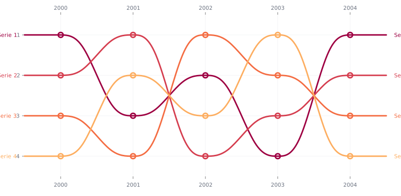
A bump chart plots rank over time: each competitor is a line, the vertical axis is position rather than value, and the lines cross whenever the order changes. It is the chart of league tables, chart positions, poll standings and market share leaderboards — and its whole design is built around making the crossings legible, because the crossings are the content.
Real plugin output: a Nivo bump chart captured from the editor. Every chart on this page is the library’s own drawing.
What it gains by plotting rank is legibility: positions are evenly spaced, so nothing is squashed and every series stays visible. What it loses is everything about magnitude — and that trade is the single thing to understand before using one.
Everything below happens inside Figma Charts, a Figma plugin. It runs the real JavaScript charting libraries — Google Charts, Highcharts, D3-based Nivo, ApexCharts and Apache ECharts — inside the plugin window, so the lines on your canvas are the library’s own curves.
Install Figma Charts from the Figma Community →
Press ⌘/ (Ctrl / on Windows), type Figma Charts, hit Enter, and pick Bump from the category filter. It is the smallest category in the plugin — one example — and there is a second bump chart filed elsewhere, which the library section covers.
Ranking is a lossy transformation, and it is worth seeing exactly what it discards.
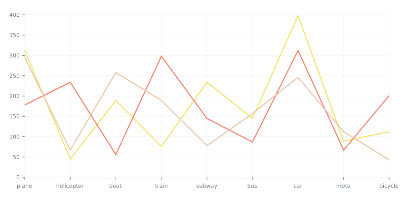
The same kind of data plotted as values rather than positions. Here the gaps are visible: a leader far ahead looks far ahead, and a cluster looks like a cluster. A bump chart of this data would space all of them evenly and say nothing about the distances.
Three specific losses:
There is a fourth, subtler loss: rank charts cannot show absence. A competitor that stops trading and one that falls to last place both leave the chart at the bottom, and only a label distinguishes them.
The corresponding gains are real: with ranks, no series is ever too small to see, the y axis needs no scale decision, and a change of order — the thing a league table is about — becomes a crossing that the eye catches immediately. Use a bump chart when position is genuinely the subject, and put the values somewhere else.
1. The magnitudes matter. If a reader will ask “by how much?”, the answer is not in the chart. A line chart of values answers it, and a slope chart answers it for two periods.
2. You have more than about ten entries. Every additional line adds crossings, and crossings are where the chart gets hard. Ten ranks is a readable ladder; thirty is a plait.
3. The order barely changes. A bump chart whose lines run parallel is a picture of stability, which is a legitimate finding and takes one sentence to state. The chart is worth its space when there is movement.
A fourth: when entries appear and disappear. A top-ten chart where the constituents change every period leaves lines starting and stopping in mid-air, and readers cannot tell whether a line ended because the entry left the top ten or because the data ended.
Everything difficult about this chart happens where two lines swap. Four decisions govern whether those moments read clearly.
Crossing angle. Two lines meeting at a shallow angle are ambiguous — the eye cannot tell which continued where. Wider period spacing steepens every crossing, so a bump chart with six periods across a wide frame is far more legible than the same data squeezed into a narrow one. Horizontal space is the cheapest fix available.
Curve type. A gentle S-curve between periods reads as a swap; a straight line reads as an instantaneous jump; a heavy curve overlaps its neighbours and reads as neither. Nivo’s default sits in the right place, and it is worth checking after any change to the frame proportions.
Line separation at the vertex. When two lines cross, one has to be on top, and most libraries draw in series order. If the crossing matters, put the series you are discussing last so it passes in front — the same trick as a combo chart’s draw order.
Markers as anchors. A filled circle at each vertex tells the reader exactly where a line was at that period, which resolves nearly every ambiguity a crossing creates. Without markers, a crossing is two curves and a guess.
The obvious objection to a bump chart — that it discards how much — has a well-known answer: the area bump, where each series is a band whose thickness encodes its value while its vertical position still encodes its rank. You get the ordering story and the size story in one picture.
It is not in the plugin as its own type, and it is worth knowing what it costs before you go looking. Bands must be stacked to avoid overlapping, so the vertical position becomes a stack offset rather than a clean row — which means the ranks are no longer evenly spaced and a thin band can be hard to follow between periods. In practice it is a streamgraph ordered by rank, and it inherits that chart’s strengths and weaknesses.
The simpler alternative, and usually the better one: keep the bump chart for position and put the values in the labels at each end — “1. Product A (42%)”. The chart shows the movement; the labels carry the magnitude; nobody has to decode a thickness.
Three cases where a bump chart is genuinely the right answer, all of which share a shape: a fixed set of competitors, a handful of periods, and an audience that cares about order.
Feature adoption ranking. Which features are most used, month by month. The values are usually so skewed that a value chart is dominated by the top one or two, while the ranking shows the movement underneath — a feature climbing from ninth to fourth is a story a log-scaled line chart tells badly.
Search or category leaderboards. Top queries, top categories, top sources. These have a natural cut-off, an audience that thinks in positions, and enough churn to make crossings meaningful.
Competitive tracking. Market position over quarters, where everyone in the room already knows the rough magnitudes and the argument is about who overtook whom. This is the case where the bump chart’s omission of magnitude is a feature: it keeps the conversation on the ordering.
Six screens, start to finish, captured from the plugin.
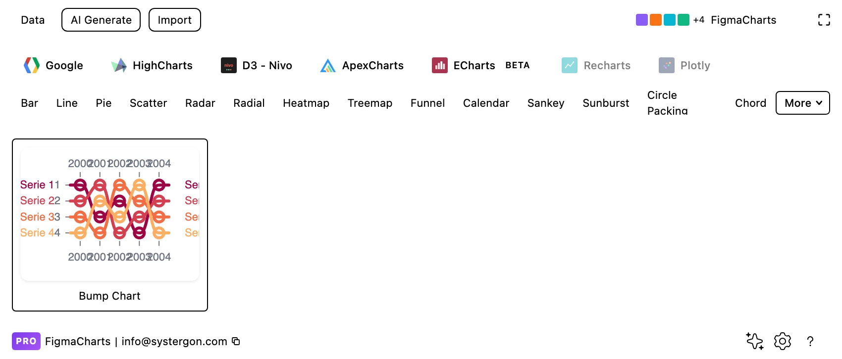
1. Filter to Bump. Nivo is the only library with the category, and it has one example — which is the whole chip.

2. The editor. Live preview above, tabs below. Check the height: a bump chart needs enough vertical room that adjacent ranks are clearly separated, and the number of rows is set by your data.
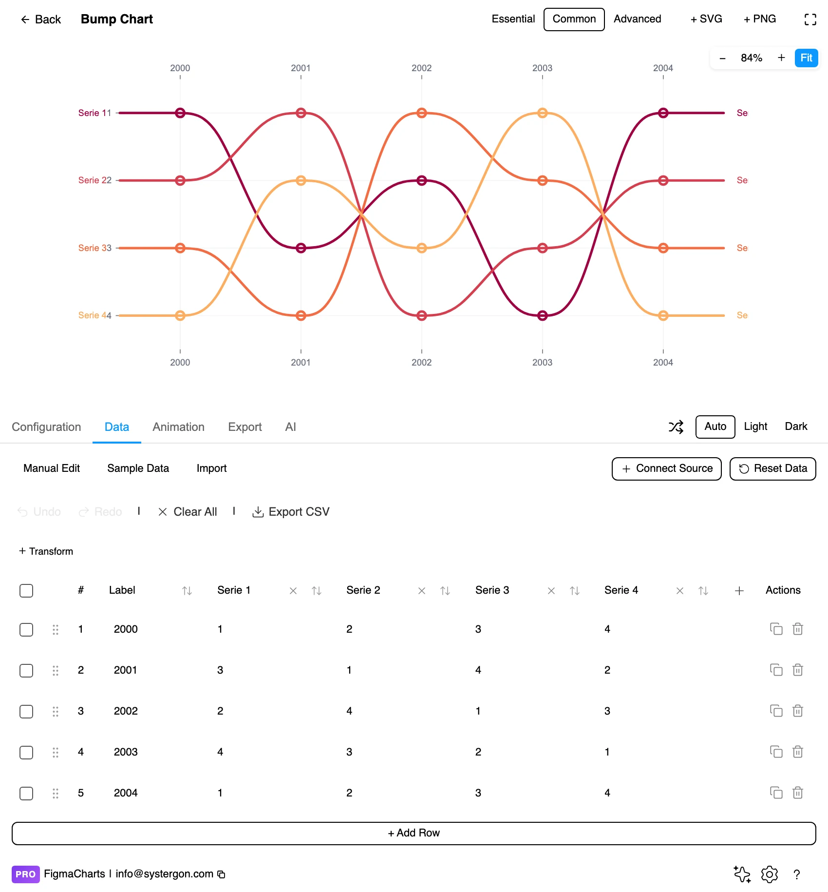
3. One row per period, one column per competitor. The values can be the ranks themselves or the underlying measures, depending on the library — Nivo takes explicit positions per period.
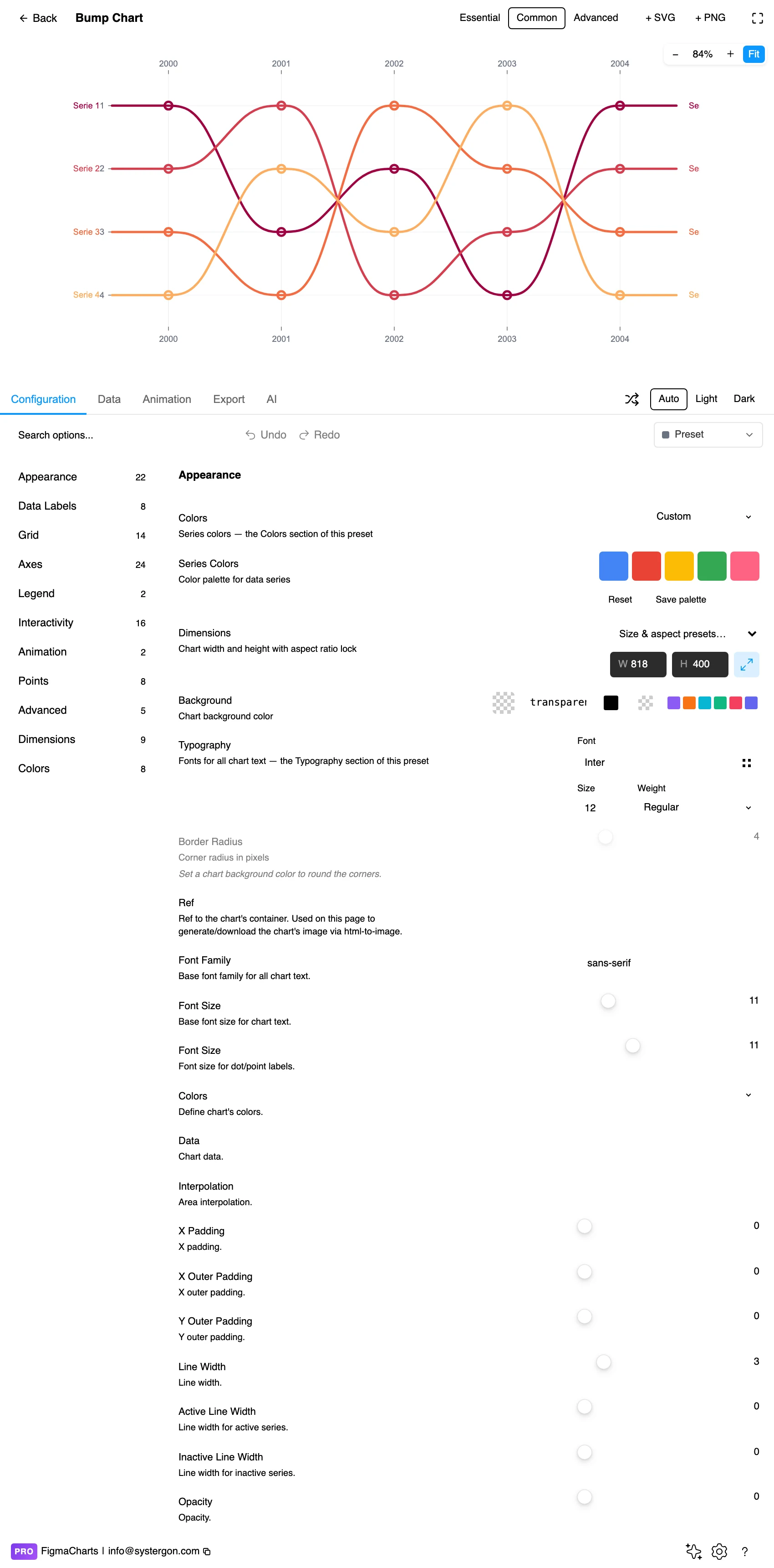
4. Configure. Line thickness, point size, the curve interpolation and the colour scheme. Interpolation matters more here than usual: it decides how a crossing is drawn.
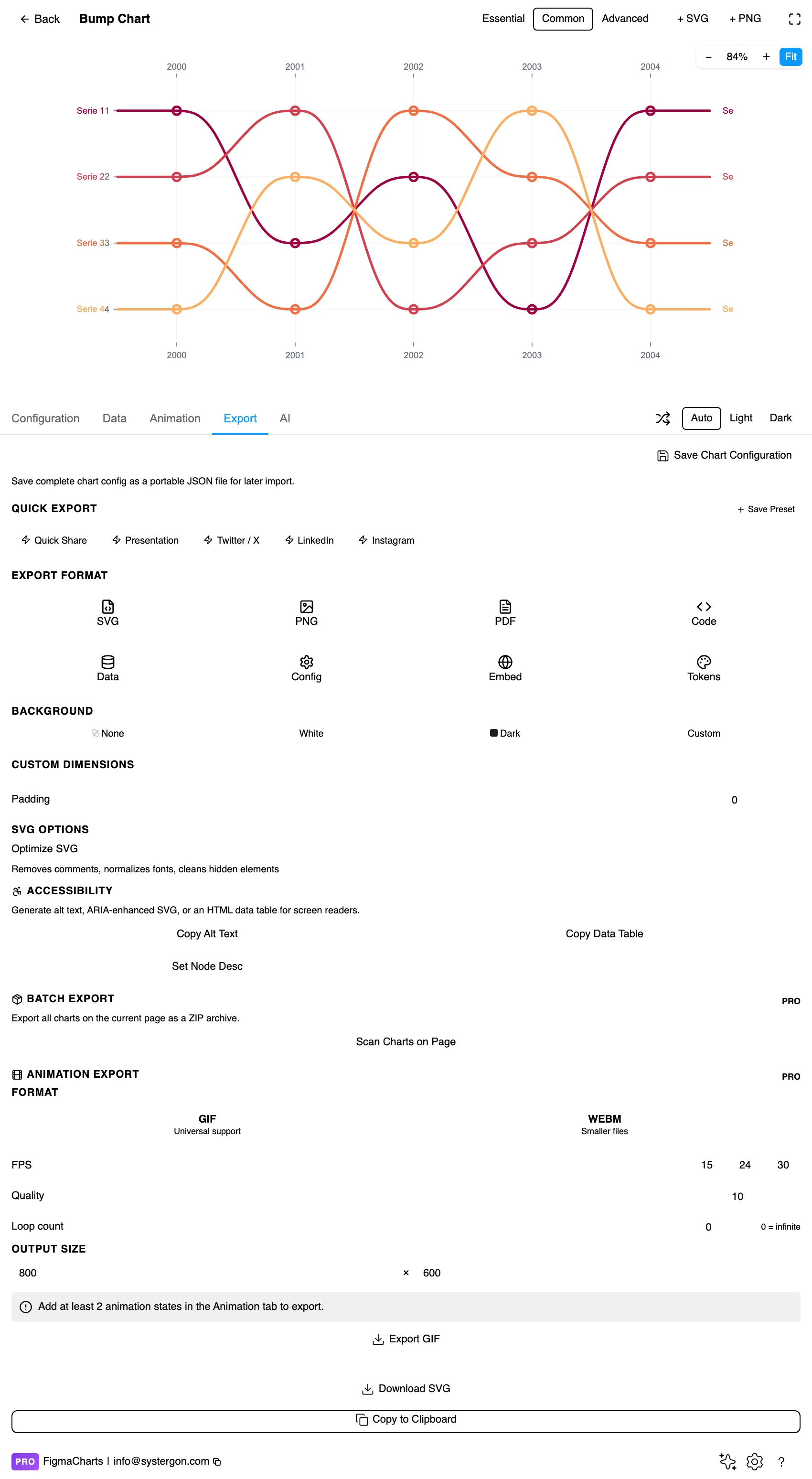
5. Export. Nivo exports to React, so this is one of the cases where the library choice constrains the handoff before the design does.
6. Insert. SVG keeps each line as a path and each label as text, so highlighting one competitor — the usual requirement — is a canvas operation.
A bump chart takes one row per period and one column per competitor, with the cell holding that competitor’s position in that period. That is the ordinary cartesian table, with one important difference: the numbers are ordinal, so the axis is usually inverted — rank 1 at the top.
You will usually be computing those ranks yourself, from values. Two decisions to make explicitly while you do:
Bump charts accept a linked source like any table-shaped chart — but since ranks are derived, the sensible pattern is to compute them in the sheet and link the result, so the ranking rule lives somewhere visible.
The Bump category holds one example, in Nivo — the narrowest chip in the plugin. As usual, that is not the whole picture.
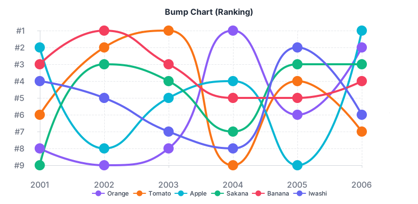
ECharts ships a bump chart too — a “Bump Chart (Ranking)” example — and files it under Line, because mechanically that is what it is: a line chart of ordinal positions with an inverted axis and heavy markers. Two libraries draw this chart; one chip holds it.
That last point is the practical one: a bump chart is a technique, not a feature. If your team’s library has no Bump category, you have lost nothing but a default.
As always: design in whichever library your engineers already use, because the export then matches production exactly. Choosing the right chart library covers the trade-offs.
Label both ends. Names at the left edge and the right edge remove the legend entirely and let a reader trace any line without holding a colour in mind. This is the single most valuable thing you can do to a bump chart.
Markers at every vertex. The points are where the ranks actually are; without them, a reader is estimating positions from a curve. Filled circles large enough to read at final size.
Highlight one, grey the rest. Bump charts are usually made to tell one competitor’s story. One saturated line against neutral greys does that instantly, and it fixes the crossing problem at the same time.
Curve gently, or not at all. Heavy smoothing makes crossings ambiguous — two curves that swap position blur into each other. A modest curve reads as movement; a straight segment reads as a jump.
Invert the axis and label it. Rank 1 belongs at the top, because that is how everyone reads a league table. And the axis should say “rank” explicitly, since the numbers look like values.
For type and colour, bind them to your design system rather than picking by hand — covered in Your chart, your design system.
Equal spacing between ranks is a fiction. The gap between first and second may be enormous and the gap between second and third negligible; the chart draws both as one row. Anyone reading movement as magnitude is reading something the chart never said.
A dramatic crossing can be a rounding error. Two entries a hair apart will swap places on noise, producing a visually striking crossing that means nothing. If small differences are common in your data, consider annotating the values at the crossings, or using a slope chart on the values instead.
Rank changes are zero-sum. Someone rises only if someone falls. That makes the chart good at competition and bad at growth: a market where everyone improved looks static, and a reader may conclude nothing happened.
Top-N cut-offs distort the edges. An entry hovering around tenth place will appear and disappear, and its absences look like collapses. Either extend the chart below the cut-off or mark the boundary explicitly.
Ties are invented order. Two identical values cannot share a row, so the chart shows a difference that is not in the data. Where ties are frequent, say how you broke them.
Because a bump chart is a technique, you can build one anywhere that draws lines. The recipe is short and worth having.
Rank your data first. One column per competitor, one row per period, each cell holding a position from 1 to N. Do this in the source, not in the chart, so the tie-break rule is visible and reviewable.
Invert the y axis and force integer ticks. Rank 1 at the top, one tick per position, no decimals — a bump chart with a “2.5th place” gridline has given the game away.
Set the axis range to the number of entries, with padding. Ranks 1 to 8 on an axis running 0.5 to 8.5 keeps the top and bottom lines off the frame edge, which is where they otherwise collide with the labels.
Turn markers on and thicken the lines. Bump charts use heavier strokes than ordinary line charts because the lines are the objects being tracked, not a trend being read.
Then label both ends and drop the legend. At that point you have the chart, and it will export cleanly from any of the five libraries rather than only from the two that ship an example.
Direct labels rather than a legend. With eight lines and eight colours, a legend is a memory test; names at the ends of the lines are readable without colour at all.
Vary line style as well as hue when more than a few series are shown together, and make the highlighted series heavier as well as more saturated.
Give it a text equivalent. The Export tab’s Copy Alt Text, Copy Data Table and Set Node Desc produce a description, a table of the underlying ranks and a description written onto the Figma node. For a bump chart the table is genuinely complete — a league table is what the chart was made from.
Showing how rankings change over time — league positions, chart placings, market-share order. Every competitor is a line, the axis is position rather than value, and the crossings are the story.
Magnitude, completely. First and second are one row apart whether the lead is 1% or 400%, and a market where everyone grew looks flat because nobody’s position moved. Put the values in a table or a companion chart.
Nivo has the only Bump category (one example), and ECharts ships a ranking bump chart filed under Line. Beyond that it is a technique rather than a feature: any line chart with an inverted integer axis and markers is a bump chart, so Highcharts, Google Charts and ApexCharts can all produce one.
About ten. Beyond that the crossings multiply faster than the lines and tracing an individual series becomes guesswork. Highlighting one and greying the rest extends the practical limit considerably.
Decide the rule and state it — alphabetical, previous rank, or a secondary measure. The chart cannot draw a tie, so it will render your tie-break as a genuine difference whether you chose one deliberately or not.
Either extend the chart below the cut-off so the line continues, or mark the boundary explicitly so a disappearing line reads as “left the top ten” rather than “stopped existing”.
A slope chart compares two periods and can plot values rather than ranks, so it keeps the magnitudes. A bump chart handles many periods and gives up the magnitudes. Two periods: slope. Many periods and position is the subject: bump.
Yes. Rank the data in the source, draw an ordinary line chart of those positions, invert the y axis, force integer ticks, turn on markers and label both ends. That is the whole recipe — the type is a convention rather than a capability, which is why only two libraries bother to ship an example.
Insert as SVG and every line is a path with its markers and labels as real layers — which suits the usual requirement of highlighting one competitor. Insert as PNG for a flat image at twice the pixel density.
Open the plugin, filter to Bump, and put your rankings in — then write the leader’s actual value next to the chart. If that number changes how the picture reads, your chart needs the values somewhere; if it does not, position really was the story and you have the right chart.
Install Figma Charts — it’s free to try → Browse all 45 chart types →