
Install Figma Charts — it’s free to try → See the area chart gallery →
An area chart is a line chart with the space underneath filled in, and that fill is not decoration. It is a claim: that the quantity accumulates — that the area under the curve means something you could add up. Get that right and the chart is more informative than the line it came from. Get it wrong and you have drawn a large coloured shape that asserts a total nobody can name.
Real plugin output: a Highcharts area chart captured from the editor, like every chart on this page.
There is a one-question test for whether you have earned the fill, and the rest of this page is what follows from it — the variants, the stacking trap, what the libraries give you (including the two that draw area charts without having an Area category), and how to build one that does not overstate its case.
Everything below happens inside Figma Charts, a Figma plugin. It runs the real JavaScript charting libraries — Google Charts, Highcharts, D3-based Nivo, ApexCharts and Apache ECharts — inside the plugin window, so the chart on your canvas is the library’s own output, with its own stacking and its own fill opacity.
Install Figma Charts from the Figma Community →
Press ⌘/ (Ctrl / on Windows), type Figma Charts, hit Enter, and pick Area from the category filter. The chip holds 19 examples — and, as the library section explains, that number understates what the plugin can actually draw, because two of the five libraries keep their area charts somewhere else entirely.
Does summing the values mean anything?
Downloads per day sum to total downloads — a real quantity, and the area under the curve is literally that number, so the fill is honest and informative. Conversion rate per day sums to nothing at all: adding Monday’s 4.1% to Tuesday’s 3.8% produces 7.9%, which is not a quantity that exists. Fill that and you have drawn a large shape whose size means nothing, and readers will read the size anyway.
The test is not about whether the data is a time series — a line chart and an area chart take exactly the same data. It is about whether the accumulated quantity is real. Rates, averages, indices, temperatures, percentages: line. Counts, volumes, revenue, minutes watched, tickets closed: area is available to you.
One consequence follows immediately, and it is the rule people most often break: an area chart must start at zero. A line may begin its axis wherever the data lives, because a line encodes change as slope. The moment you fill underneath, the shape’s size becomes the message, and a truncated baseline makes that size a lie. If your values sit between 180 and 220 and the fill flattens them into a solid block, the honest answer is a line chart, not a cropped area chart.

Stacked — the bands sit on top of each other and the top edge is the total. Only the bottom band sits on the baseline, so only the bottom band can be read accurately; every band above it is judged from a floor that moves.

Percentage stacked — every column is normalised to the full height, so this shows composition over time and hides volume entirely. Excellent for “the mix shifted”, silent about whether the business doubled or halved.

Area range — the fill sits between two series rather than between one series and the axis, so the shape encodes a band: minimum to maximum, confidence interval, forecast envelope. This is the one case where a filled shape carries uncertainty rather than volume, and Highcharts is the library for it.
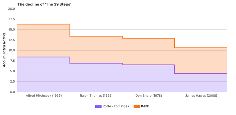
Stepped area — for quantities that change discretely and hold: headcount, price tiers, allocated capacity. The steps refuse to imply a smooth ramp between changes that did not happen gradually.
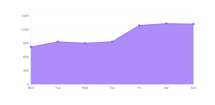
And an ECharts area chart — which you will not find under the Area chip, because ECharts files its six area examples under Line. More on that below; it is a filing difference, not a capability gap.
1. The values do not accumulate. The test above. Rates, ratios, percentages of something else, temperatures, indices — all of them are lines wearing an area chart’s clothes.
2. You have more than about four series and they overlap. Unstacked overlapping areas hide each other: a small series behind a large one is simply invisible, and transparency turns four fills into a muddy blend where no colour is its own. Either stack them (and accept that only the bottom band is readable), or use lines, or split into small multiples.
3. The individual values matter more than the volume. If a reader needs to know that Tuesday was 4,120 and Wednesday was 3,980, the fill is contributing nothing to that comparison and is actively adding ink between the reader and the numbers. Use a line, or bars.
A fourth worth flagging: when the series crosses zero. An area chart that dips below the baseline fills downward, and the two fills read as the same quantity in opposite directions — which is fine if that is what you mean, and confusing if the negative region is actually a different thing (a refund, a loss, an outflow). Label it explicitly.
Three relatives worth knowing, because two of them solve the stacked area chart’s problems and one of them is the most useful small chart you can put in a product.
The streamgraph takes a stacked area chart and floats it around a central axis instead of resting it on a baseline. Nothing sits on the floor, so no band is privileged — every band is judged by thickness alone. That is a fair trade when you have many series and the story is the ebb and flow of the mix rather than any individual value: it is an editorial chart, excellent at “this got big and then it did not”, poor at “how big exactly”. Nivo and Highcharts both have one, filed under Stream.
The theme river is ECharts’ version of the same idea with a time axis and its own category, and it is worth a look if you are already in that library.
The filled sparkline is the one to reach for most often. Strip the axes, the gridlines and the legend from a single-series area chart — the plugin’s Essential complexity mode does exactly this — and what remains is a small filled shape that says rising, falling, spiky, flat at a glance. In a KPI card next to the number, it is doing the job an axis-heavy chart would need ten times the space to do. This is the case where the fill earns its place at small size: a bare line at 40px tall reads as a thread, while a fill reads as a shape.
Every other chart type puts colours next to each other. An area chart puts them on top of each other, which is a harder problem, and it is where most area charts fall apart visually.
Overlapping fills blend. Two translucent series produce a third colour where they meet, and readers reasonably assume a third colour means a third thing. With three overlapping series you get four blended regions and a chart that appears to have seven categories. Stacking avoids the blending entirely, which is one more argument for stacking over overlapping whenever the values are additive.
Within a stack, use a palette with a clear order — a single-hue ramp from dark at the bottom to light at the top, or an ordered categorical set — because the bands themselves are ordered and a random palette fights that. Reserve saturation for the band you want read first; the bottom band gets the strongest colour by default, which conveniently matches the fact that it is the only one that can be read precisely.
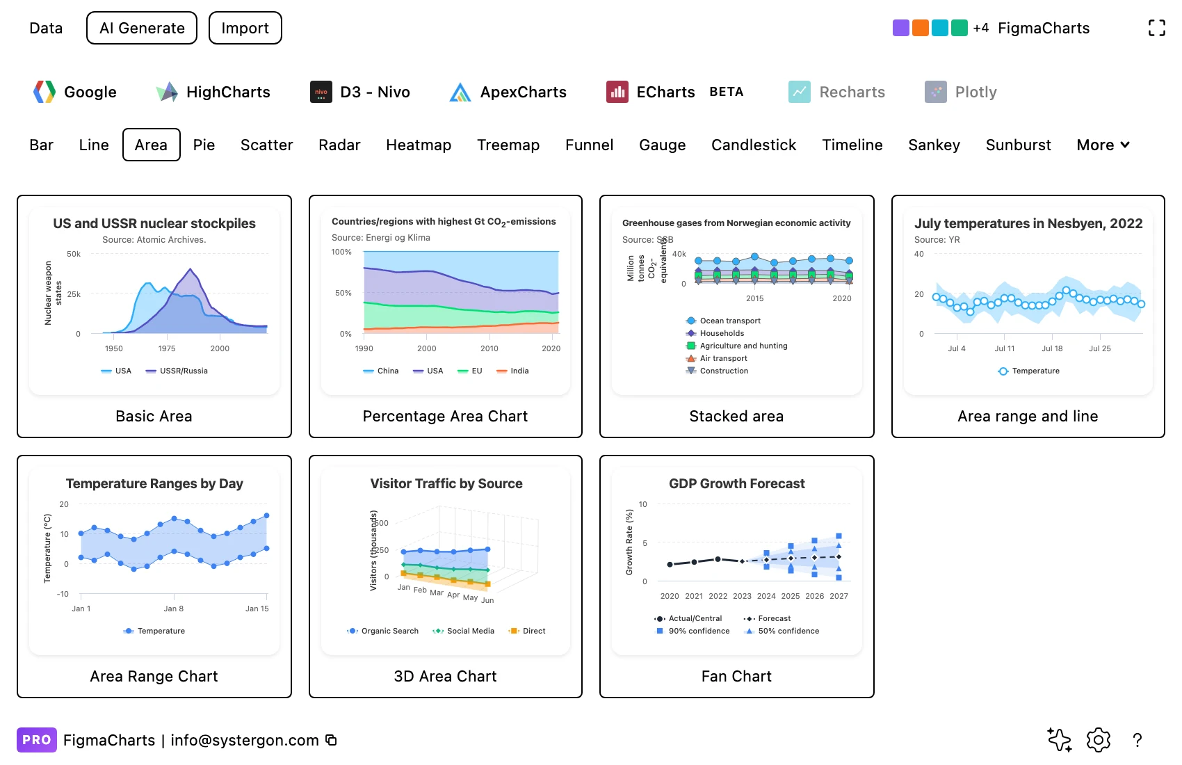
1. Pick a starting point. Library tab, then the Area chip. Choose by structure — single, stacked, percentage, range — because each of those answers a different question and they are not interchangeable.
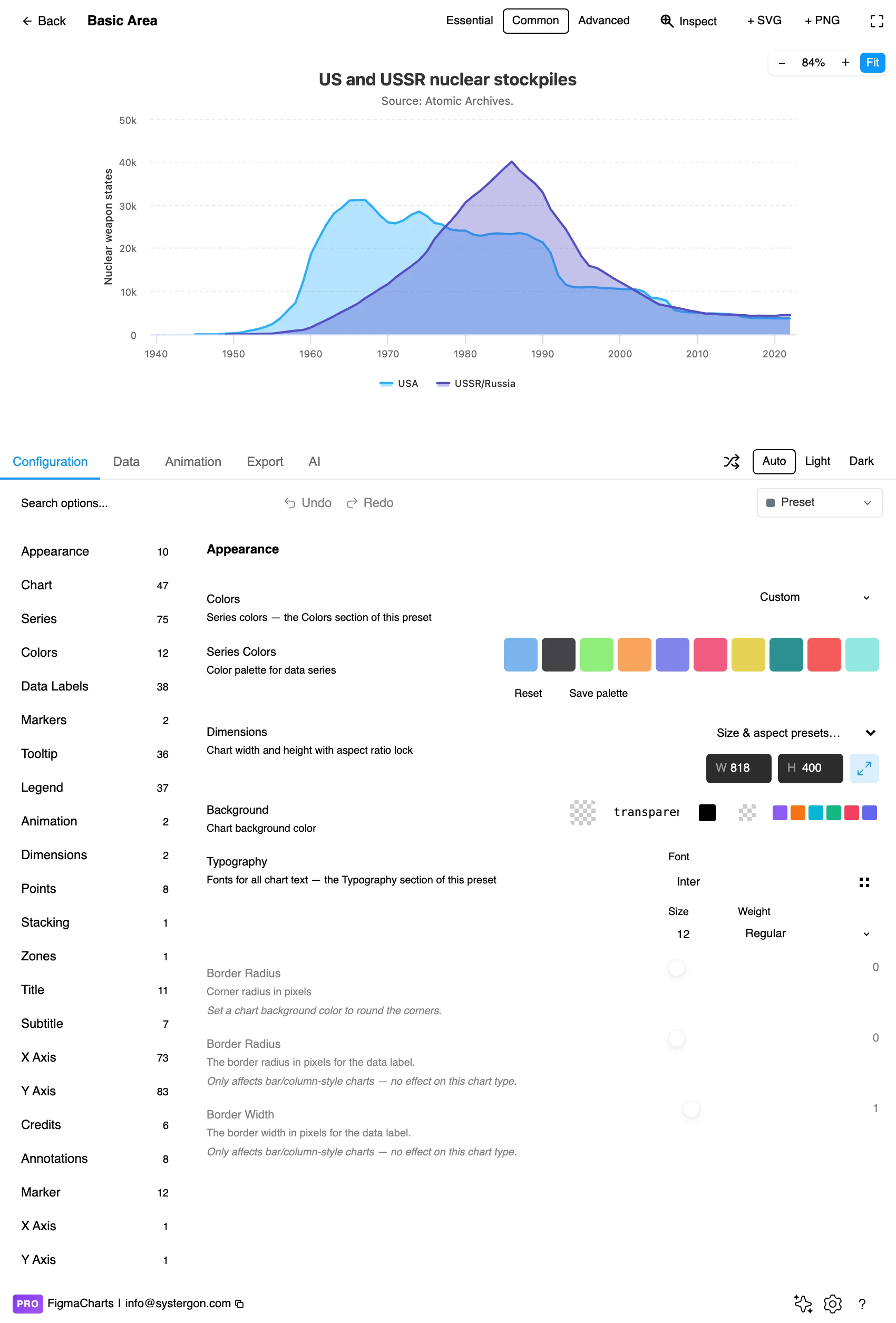
2. The editor. Live preview above, tabs below. The Essential / Common / Advanced control decides how much furniture the chart carries; Essential turns an area chart into a filled sparkline for a card.
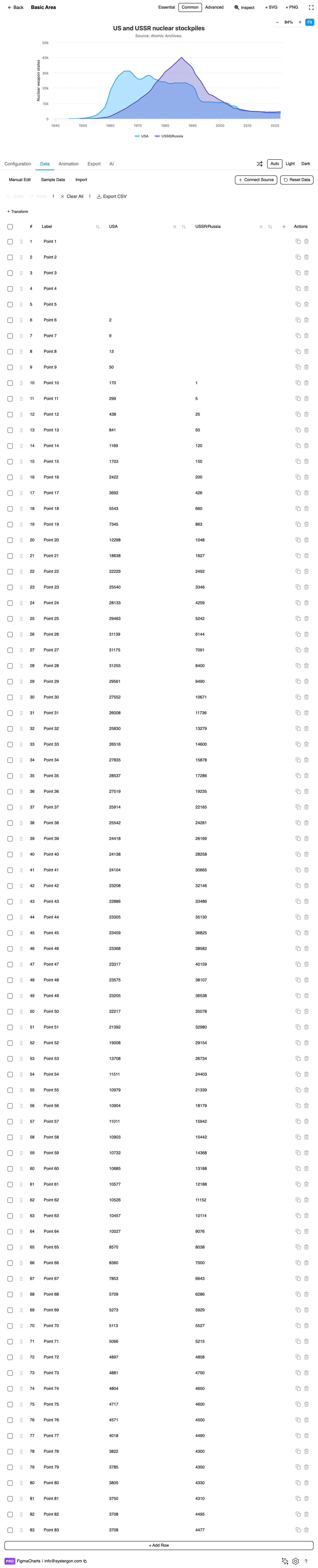
3. Your numbers. A label column and one column per series — the same cartesian shape a line or bar chart takes. Watch for unparseable cells: they become 0, and a zero in an area chart cuts the fill to the floor.
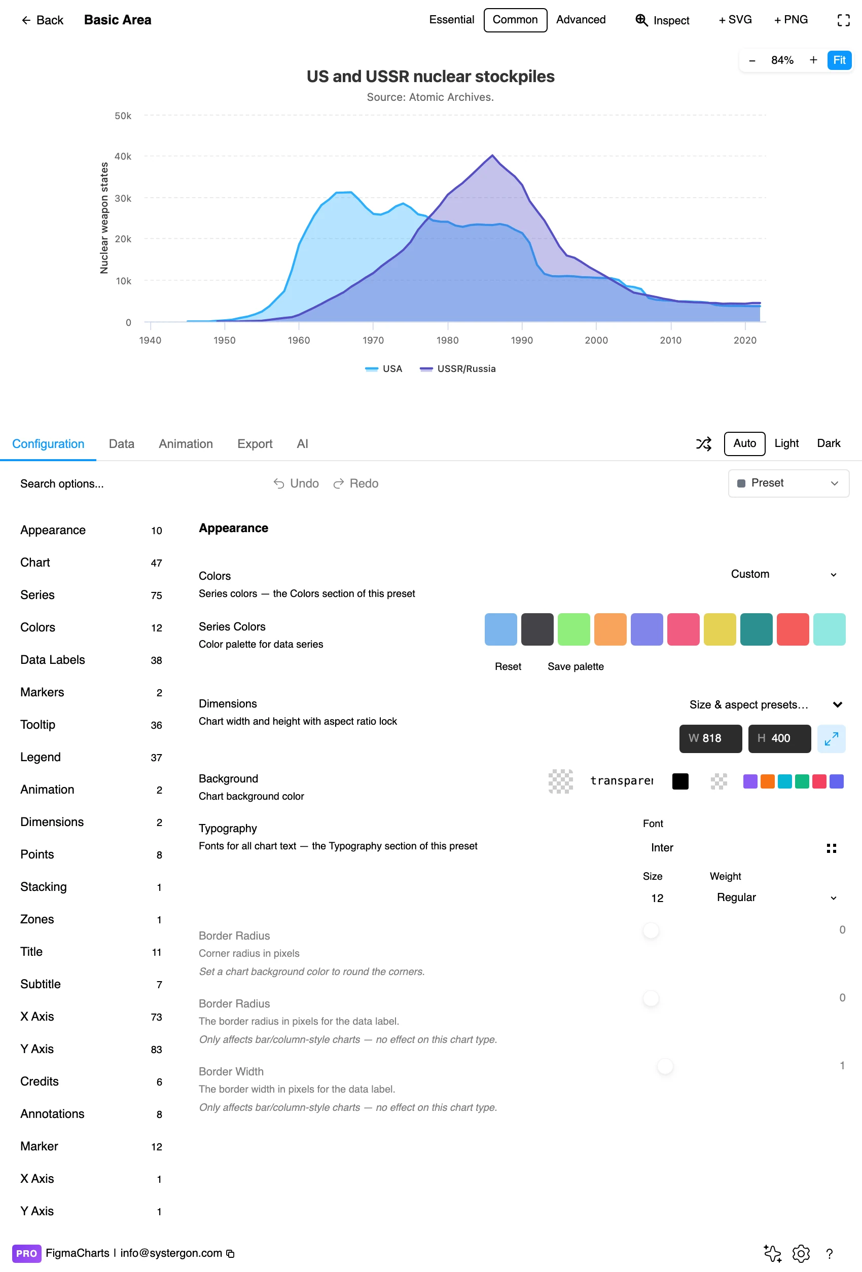
4. Configure. Stacking mode, fill opacity, the curve type and the axis range live here. For an area chart the axis range is the one to check first — it must include zero.
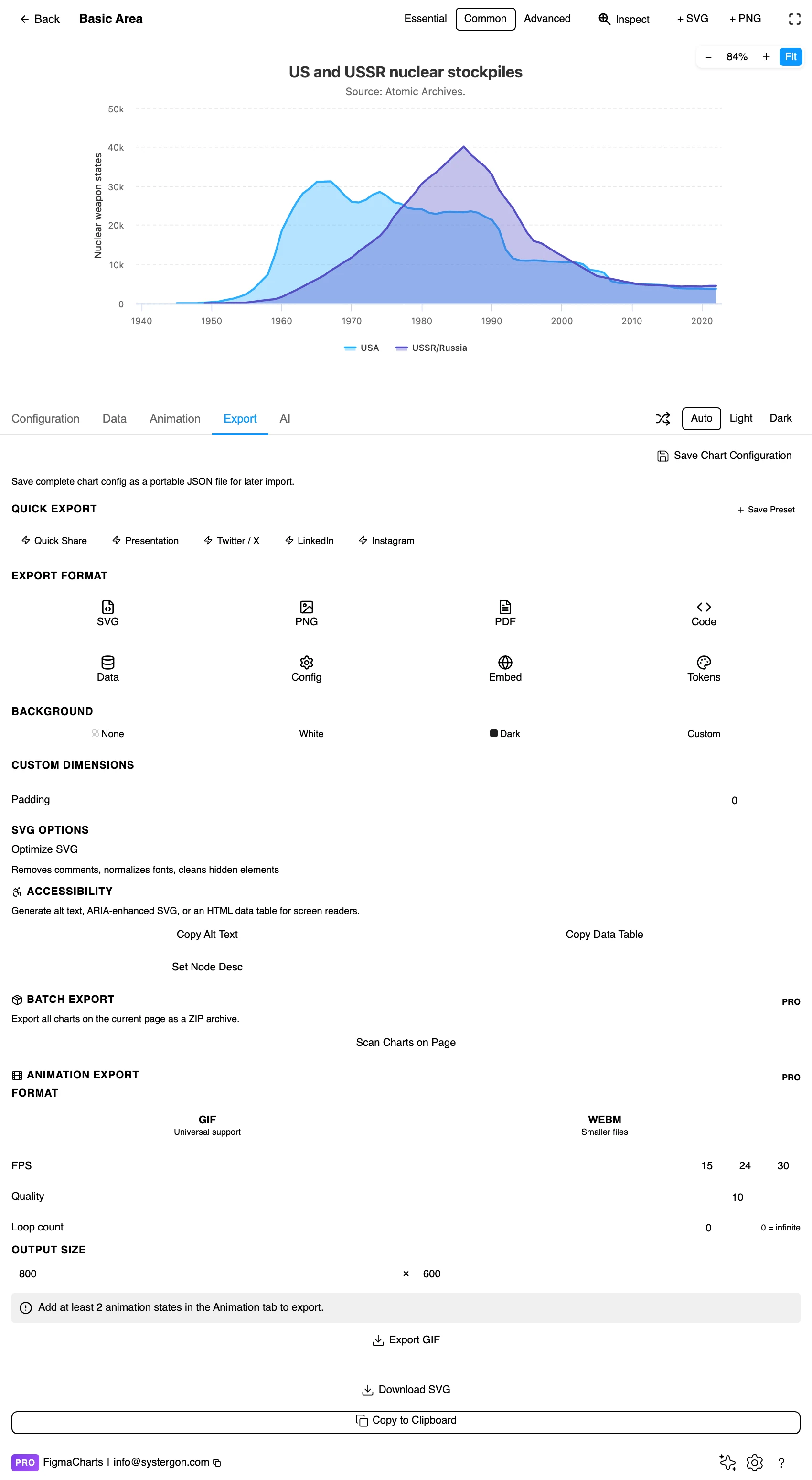
5. Export. A working component for React, Vue 3, Angular, Svelte or vanilla JavaScript, listing the library’s own packages at the version the plugin rendered with.
6. Insert. SVG gives you the fill as a real vector shape and the labels as real text — and because the fill is one path, restyling it on the canvas is a single click.
The ordinary cartesian shape: a label column, then one numeric column per series. Stacking is a configuration option rather than a different data shape, which is worth knowing because it means you can try stacked, percentage-stacked and overlapping views of the same table without touching the data.
Area charts accept a linked data source in every library that draws them, so a Google Sheet or an API can feed one directly — covered in live data from Google Sheets and APIs. The caution from that work applies with extra force here: an unparseable cell becomes 0, and in an area chart a zero does not leave a gap, it drags the fill down to the axis and back, drawing a canyon that looks like a real collapse in volume.
The Area category in the plugin holds 19 examples: Highcharts 7, Google Charts 6, ApexCharts 6. That is the chip. It is not the capability.
Nivo and ECharts both draw area charts and neither has an Area category, because both file them under Line: Nivo turns a line into an area with its enableArea property, and ECharts ships six area-* examples — one of which is pictured above. If you conclude from the empty chip that those libraries cannot fill a line, you have been misled by a filing decision.
enableArea. The D3 look, React-only export.As always: design in whichever library your engineers already use, because the export then matches production exactly. Choosing the right chart library covers the trade-offs.
Opacity is a decision about layering, not a mood. One series can take a solid fill. Two or three overlapping series need transparency in the region of 30–50% so the lower one stays visible — and past three, transparency stops rescuing anything, because every overlap produces a new blended colour that reads as a fourth category.
Keep the top edge crisp. The line at the top of the fill is where the value actually is; a stroke at full opacity over a translucent fill lets the reader trace the series precisely while the fill carries the volume.
Order the bands deliberately in a stack. The bottom band is the readable one, so put the series that matters most at the bottom — not the largest, not the alphabetically first. And keep that order stable across a set of charts, or readers will compare the wrong bands.
Gridlines behind the fill, not on top. A gridline drawn over a translucent area looks like a boundary in the data. Most libraries default correctly here; check it after you change the opacity.
For type and colour, bind them to your design system rather than picking by hand — the plugin can build a palette from your Figma colour variables, covered in Your chart, your design system.
Only the bottom band of a stack is readable. This is the stacked area chart’s central limitation and it is worth stating precisely: every band above the first is drawn on a floor that moves with the bands below it, so its thickness is the value but its position is not. Human vision is poor at judging the thickness of a wavy band. If a reader needs to compare the third series across time, give it its own chart.
A percentage stack hides the volume completely. Every point sums to 100%, so a business that tripled and a business that collapsed produce identical charts. Pair it with a total, or with a second chart that shows magnitude.
Big fills exaggerate. Area is a stronger visual signal than a line, so the same data feels more consequential filled than unfilled. That is exactly why the accumulation test matters — the fill should be earning that extra weight by carrying real meaning.
Smoothing invents volume. A spline through the tops of your values overshoots peaks, and in an area chart the overshoot is not just a wrong line — it is extra filled area, which is extra quantity that never existed.
Watch the last period. An incomplete final period drags the fill down and reads as a genuine drop in volume. Either exclude it or mark it as partial.
Do not distinguish bands by colour alone. In a stacked chart the bands touch, so direct labels inside or beside each band remove the legend lookup and survive colour vision deficiency. Pattern fills are the fallback where colour is unavoidable.
Check contrast between adjacent bands, not just against the background. Two translucent fills that each pass against white can be indistinguishable from each other where they meet, which is the only place it matters.
Give it a text equivalent. The Export tab’s Copy Alt Text, Copy Data Table and Set Node Desc produce a description, a table of the numbers, and a description written onto the Figma node. For a stacked area chart, the table is doing real work — it carries the per-series values that the upper bands make hard to read visually.
When summing the values means something. Downloads per day accumulate into total downloads, so the filled area is a real quantity; conversion rate per day accumulates into nothing, so the fill is decoration that implies volume. Same data shape, different claim.
Yes. A line may start its axis wherever the data lives because it encodes change as slope, but the moment you fill underneath, the size of the shape becomes the message and a truncated baseline makes that size wrong. If zero flattens your data, use a line.
Because every band above it rests on a floor that moves. The band’s thickness is its value, and judging the thickness of a wavy band is something human vision does badly. Give the series its own chart if it has to be compared precisely.
Showing how a mix shifts over time — and nothing else. Every point sums to the full height, so volume is invisible: growth and collapse look identical. Always pair it with something that carries magnitude.
Yes, and neither has an Area category. Both file them under Line: Nivo via its enableArea property, ECharts as six area-* examples. The Area chip in the gallery covers Highcharts, Google Charts and ApexCharts — 19 examples — but the capability is in all five.
An area range chart, where the fill sits between two series instead of between a series and the axis. Highcharts is the library for this in the plugin — it ships an area range, an area-range-and-line combination and a fan chart.
Four is comfortable, six is pushing it. The limit is not the drawing, it is the reading: past a handful of bands the middle ones become unreadable ribbons and the chart is decorative. Small multiples handle eight series where one stack cannot.
Insert as SVG and each fill is a vector path, the top edge a stroke, the labels real text — so restyling a band or adjusting its opacity is a click on the canvas. Insert as PNG for a flat image at twice the pixel density.
Open the plugin, put your real series into an area chart, and ask the one question: if I added every value up, would the answer be a thing? If yes, you have the right chart and the fill is doing work. If no, remove the fill and you have a better one.
Install Figma Charts — it’s free to try → Browse all 45 chart types →