
Install Figma Charts — it’s free to try → See the radial gallery →
A radial bar chart is a bar chart bent into a circle. Each bar becomes an arc, each category gets its own ring, and the value is read as how far round the arc travels. It is one of the most requested chart shapes in product design and one of the least accurate, for a reason that is easy to state and impossible to fix: an arc on an outer ring is physically longer than the same percentage on an inner one.
Real plugin output: an ApexCharts radial bar captured from the editor. Every chart on this page is the library’s own drawing.
Which does not make it useless — it makes it a progress chart rather than a comparison chart. This page is about that distinction, the one arrangement where radial bars genuinely beat straight ones, and how to design the KPI ring everyone actually wants when they ask for this.
Everything below happens inside Figma Charts, a Figma plugin. It runs the real JavaScript charting libraries — Google Charts, Highcharts, D3-based Nivo, ApexCharts and Apache ECharts — inside the plugin window, so the arcs on your canvas are the library’s own geometry.
Install Figma Charts from the Figma Community →
Press ⌘/ (Ctrl / on Windows), type Figma Charts, hit Enter, and pick Radial from the category filter. Five examples — ApexCharts 4, Nivo 1.
In a bar chart every bar starts on the same baseline and runs along the same axis, so two bars of equal length represent equal values. Bend that into rings and the property breaks: an arc sweeping 60% of a large outer circle covers considerably more distance and more ink than an arc sweeping 60% of a small inner one.
Three consequences follow, and they decide every appropriate use of the chart:
There is a fourth, quieter consequence: the inner ring has the least room and usually the smallest type, so whichever metric ends up innermost is the hardest to label. In a three-ring design that is a layout constraint before it is a data decision.
The escape from all three is to stop asking for comparison. When each ring is its own metric measured against its own maximum — a progress ring — nothing is being compared across rings and the distortion never arises.

Multiple rings — the arrangement people picture when they ask for this chart, and the one to be careful with. Three metrics each against their own target is legitimate; three categories being compared with each other is the unequal-arc problem in its purest form.

The single progress ring — one value against 100%, with the number in the middle. This is what a radial bar chart is genuinely good at, and it is the form most product dashboards actually need.

Semi-circle — half the sweep, which fits a wide shallow card and reads left to right like a scale. Same chart, better shape for a tile.
Nivo has a fifth, not pictured here: a radial bar with grouped arcs, so a single ring can carry several series at once. It is the most structurally ambitious of the set and, as with everything in Nivo, it exports to React only.
Use it when each ring is a separate metric against its own scale (progress towards a goal, capacity used, completion), when the value is a percentage of something bounded, and when the chart is decorative-but-informative furniture in a product — a KPI tile, an onboarding indicator, an activity ring.
Three cases where a straight bar chart is simply better:
1. Ranking categories. “Which region sold most?” needs a common baseline. Radial bars answer it inaccurately and prettily.
2. More than about four rings. Past that the inner rings become short arcs with nowhere to put a label, and the centre fills with text.
3. Values that exceed the maximum. An arc that wraps past 360° either overlaps itself or gets clipped, and both readings are wrong. If 120% of target is possible, use a bar or a bullet chart, which handles overshoot naturally.
And the honest fourth: when the request is really about aesthetics. That is a legitimate reason — product surfaces have to look like something — but it should be a decision rather than an accident, and it means keeping the number visible so nothing depends on reading the arc.
The most successful multi-ring design in the world is the Apple Watch activity ring, and it is worth understanding because it sidesteps every objection on this page.
Each ring has its own goal. Move, exercise and stand are three different measures against three different targets, so nothing is being compared between rings. The unequal-arc problem simply does not arise, because no comparison is invited.
Full is the only value that matters. The design is binary at heart — closed or not closed — and precise reading is never required. That is exactly the level of precision an arc can support.
Colour identifies, it does not rank. Three fixed hues, learned once, meaning ring identity rather than magnitude.
Overshoot is handled deliberately. Going past the goal wraps into a second lap with a visible overlap, which is a design decision rather than an accident of the renderer.
Copy that structure and radial bars are a good chart. Depart from it — three rings that are three regions’ sales, say — and every distortion returns at once. Highcharts’ Activity Rings example, filed under Gauge, is the ready-made version.
Four substitutions cover most of the cases where someone asks for a radial bar and needs something else.
“Compare these categories.” A sorted bar chart. Common baseline, accurate lengths, room for labels — and it handles twenty categories where a radial handles four.
“Show progress against targets for several metrics.” A stack of bullet charts. Same information, a fraction of the space, and they can be scanned in one pass.
“Show one number prominently.” A large number with a small progress ring or sparkline beside it. The number carries the fact; the graphic carries the context.
“Show composition.” A donut, not a radial bar. The two look similar and mean different things: a donut divides one whole into parts, a radial bar shows separate values each against their own scale. Mixing them up is the most common conceptual error with this chart.
Six screens, start to finish, captured from the plugin.
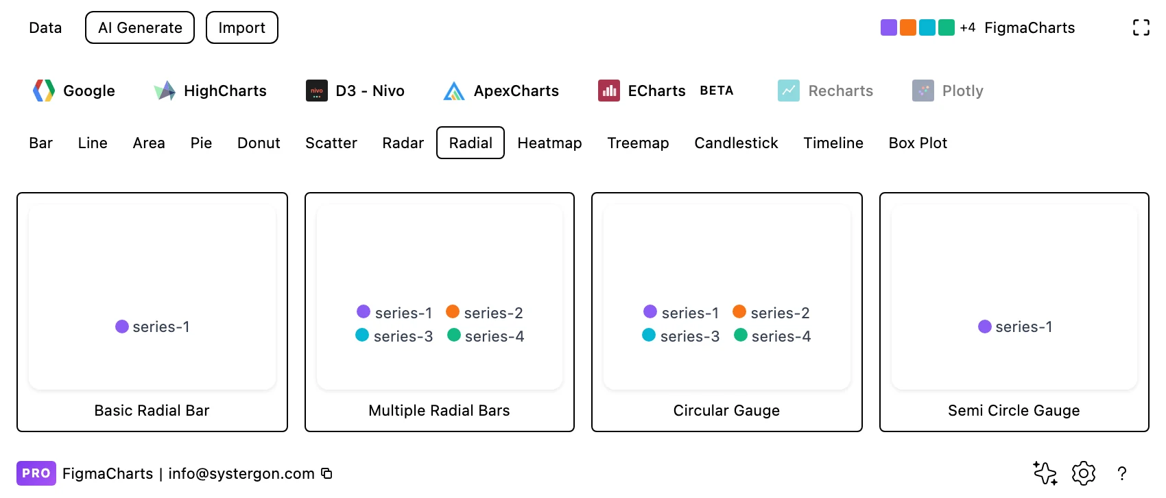
1. Filter to Radial. ApexCharts has four examples and Nivo one. Note that gauges live under their own chip — the two families overlap, and Apex files its circular gauges here.
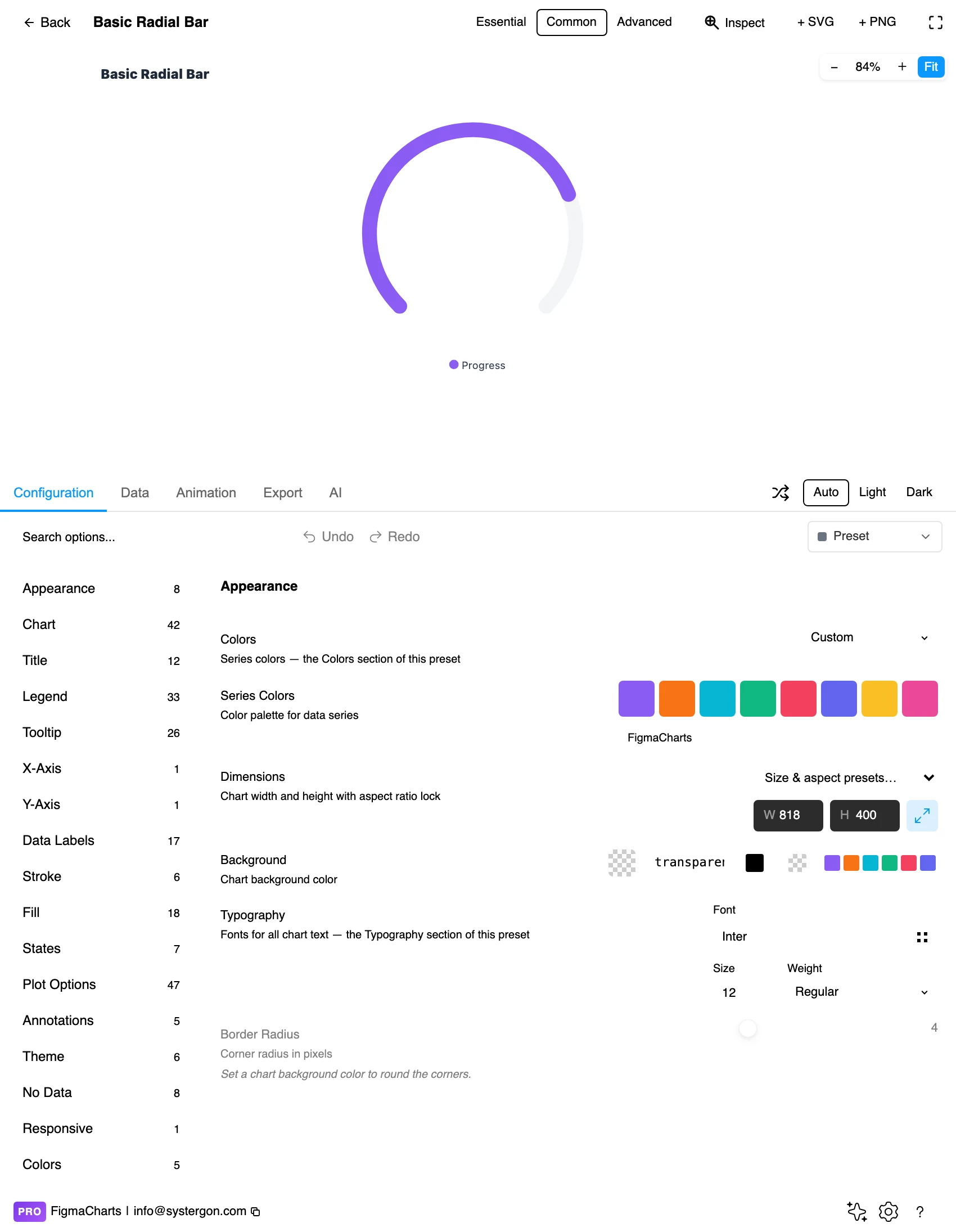
2. The editor. Live preview above, tabs below. Radial charts are square: set width and height together, because the ring diameter is the whole design.
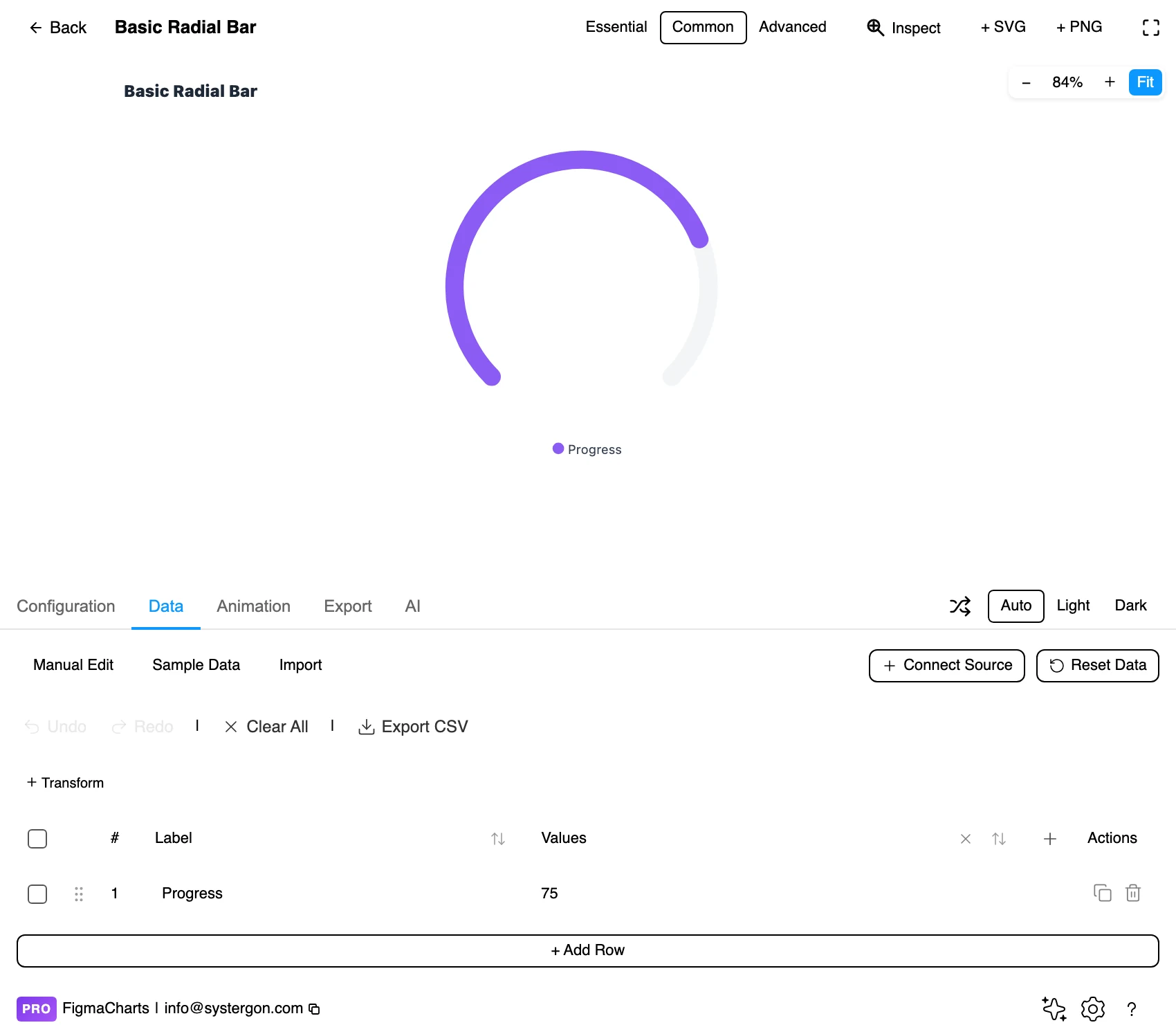
3. One row per ring. A label and a value — usually a percentage. The maximum is configuration rather than data, which is the setting that decides how full every ring looks.
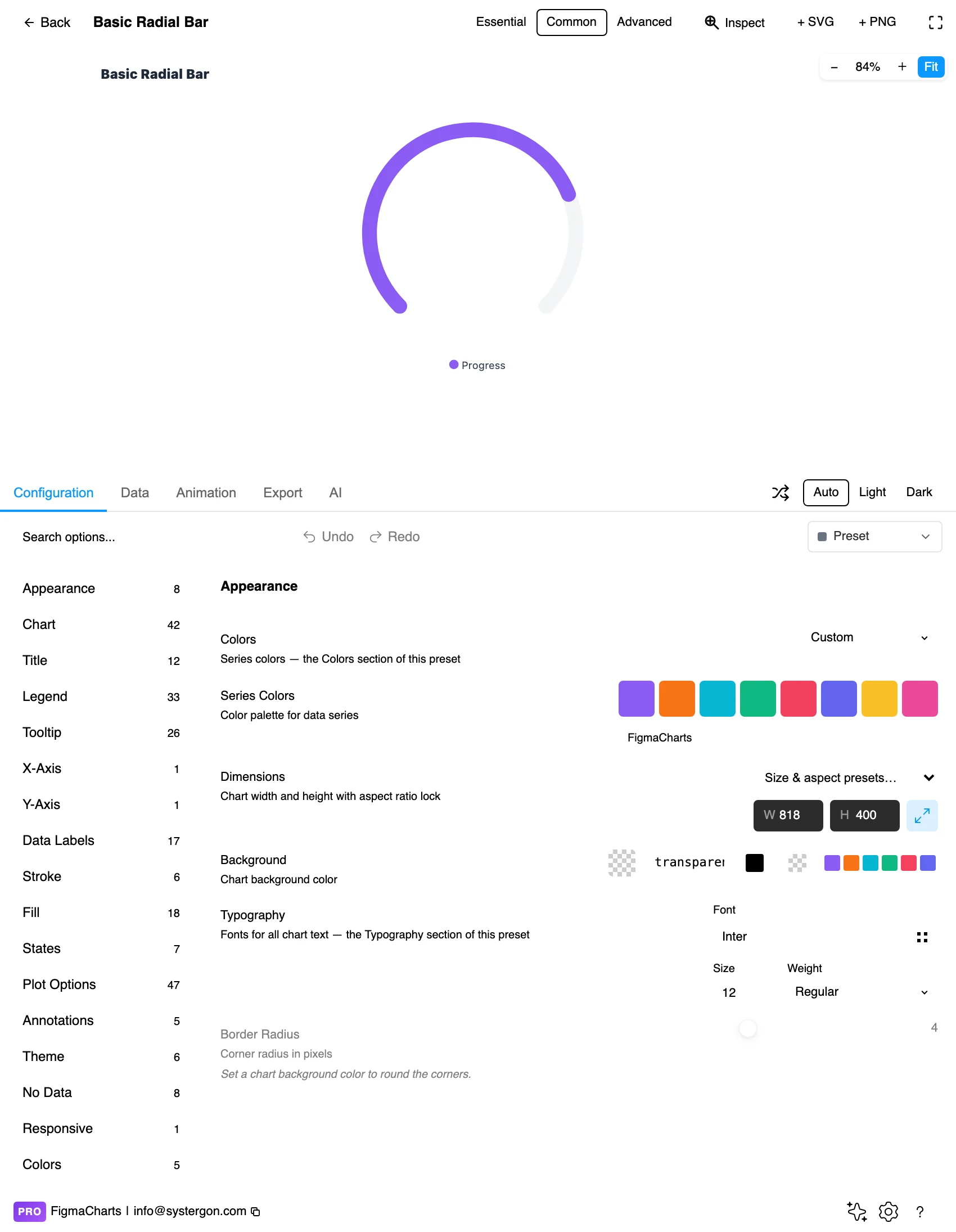
4. Configure. Start angle, ring thickness, track colour and the centre label. The track — the faint full circle behind each arc — is what tells the reader where 100% is, and it should never be switched off.
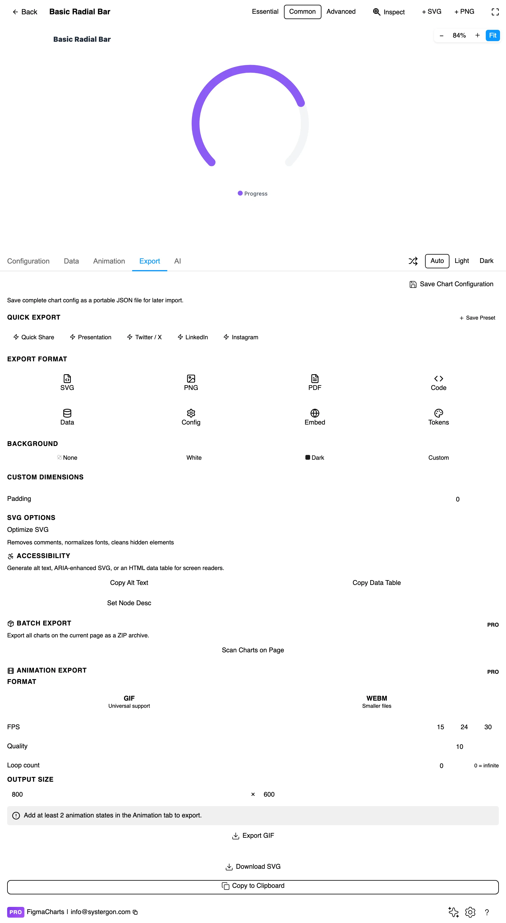
5. Export. A working component for React, Vue 3, Angular, Svelte or vanilla JavaScript, at the version the plugin rendered with.
6. Insert. SVG gives you each arc and the centre label as separate layers, which is exactly what a KPI tile component needs.
A label and a value per ring — the ordinary table, no special editor, and it accepts a linked data source like any cartesian chart. What is not in the data is the maximum: the scale each arc is drawn against lives in the configuration, which means a linked value will keep being drawn against whatever ceiling you set.
Two things to decide before building. What 100% means — a target, a capacity, a theoretical maximum — because a full ring reads as complete regardless of what you anchored it to. And what happens above it: values over the maximum are the most common way this chart breaks, and the fix is either clamping with an explicit marker or choosing a different chart.
The usual coercion caution applies with a specific symptom: an unparseable cell becomes 0, and a zero-value ring is drawn as an empty track — indistinguishable from a metric that genuinely has not started.
The Radial category holds five examples: ApexCharts 4, Nivo 1.
progress arcs do this job under the Gauge chip.Which makes the practical summary short: this is a two-library category with a third and fourth option hiding under Gauge. If you want a progress ring and your team is on Highcharts or ECharts, look there rather than concluding it cannot be done.
As always: design in whichever library your engineers already use, because the export then matches production exactly. Choosing the right chart library covers the trade-offs.
Always draw the track. The faint complete circle behind each arc is what makes the value readable — it shows where the maximum is. Without it, a 70% arc and a 90% arc look like two arcs of unknown scale.
Put the number in the middle. The centre is free space and the reader’s first fixation. A radial chart whose value is only in the arc has thrown away its best asset — and this is the same argument as the hole in a donut.
Rounded caps for progress, flat caps for measurement. A rounded end reads as “in progress”; a flat end reads as a precise stop. Pick to match the meaning, because readers do notice.
Start at twelve o’clock, run clockwise. It is the convention every progress indicator uses and the one readers expect. Deviating costs comprehension for no gain.
Thickness over count. Two thick rings read better than five thin ones. If you have five metrics, that is a stack of bullet charts, not a five-ring radial.
For type and colour, bind them to your design system rather than picking by hand — covered in Your chart, your design system.
Outer rings dominate. The core distortion, and worth repeating because no styling removes it: identical values on different rings are drawn at different lengths. Place the metric you want read first on the outside deliberately, and never present rings as a ranking.
The maximum is doing the talking. As with a gauge, where the scale ends decides how full everything looks. A ring drawn against “best month ever” and the same value drawn against “plan” are different charts of the same number.
A full ring reads as done. If your maximum is a stretch target rather than completion, a full circle still says finished. Label the maximum explicitly, or clamp and mark overshoot.
Angle judgements are worse than they feel. Readers reliably distinguish a quarter, a half and three quarters, and very little in between. Anything requiring more precision than that needs the number, which is why the centre label is not optional.
Colour per ring implies category. If the rings are one metric over three periods, three hues suggest three different things. Use one hue at different lightnesses when the rings are the same measure.
Radial bars almost always end up inside a card, and the card is the real design problem. Four decisions settle it.
Decide the hierarchy first. Number, label, ring — in that order of prominence for a metric people read; ring, number, label if the card is a status indicator people glance at. Both are valid; picking neither produces a tile where the ring and the number compete.
Size the ring to the card, not the data. A ring that fills its tile leaves nowhere for the label and crops on small screens. Roughly two thirds of the card’s shortest dimension is a safe starting point.
Keep the stroke weight constant across tiles. A dashboard of radial tiles with different ring thicknesses reads as different kinds of thing. Fix the weight in the component and let only the value change.
Design the empty and error states. Zero, no data and “still loading” all render as an empty track by default and mean three different things. A dashed track for no data and a skeleton for loading costs little and prevents the worst misreading this chart produces.
The centre number is the accessible version. Insert as SVG and it comes through as real text, so the value is available without reading an arc at all.
Track and arc need real contrast. A pale track against a pale arc is the commonest failure in this chart, and it removes the only reference point the reader has.
Do not rely on ring position to identify the metric. Label each ring directly, or provide a key in reading order — outermost first, which is not the order a legend defaults to.
Give it a text equivalent. The Export tab’s Copy Alt Text, Copy Data Table and Set Node Desc produce a description, a table of the numbers and a description written onto the Figma node. Include the maximum each ring is drawn against — without it, a percentage is not interpretable.
Yes, and that is the problem: bending it breaks the equal-baseline property. An arc on an outer ring is longer than the same percentage on an inner one, so rings cannot be compared with each other. It works when each ring is its own metric against its own maximum.
They overlap heavily — ApexCharts files its circular and semi-circle gauges under Radial. The distinction worth keeping: a gauge is about a threshold (are we in the green?), a radial bar is about progress towards a maximum (how far along are we?).
Three or four. Beyond that the inner rings are short arcs with no room for labels, and the centre fills with text. Five metrics belong in a stack of bullet charts, which compare accurately and take less space.
ApexCharts (4 examples) and Nivo (1) have the Radial category. Highcharts and ECharts do the same job under Gauge — Highcharts’ solid gauge and Activity Rings, ECharts’ gauges with progress arcs — so “no radial chip” does not mean no progress ring.
Nothing good: the arc either wraps and overlaps itself or is clipped, and both misread. Clamp at the maximum with an explicit overshoot marker, or use a bar or bullet chart, which handle values past the target naturally.
Rounded reads as “in progress”, flat reads as a precise measurement. It is a small signal and readers pick it up, so match it to whether the value is a snapshot of an ongoing thing or a final figure.
Yes — it takes an ordinary table of labels and values and accepts a linked source. Remember that the maximum lives in the configuration, so a live value keeps being drawn against whatever ceiling you set at design time.
They look similar and mean different things. A donut divides one whole into parts that sum to it; a radial bar shows separate values, each measured against its own maximum. Using a donut for progress means labelling the remainder as a category, and using a radial bar for composition means the arcs no longer add up to anything.
Insert as SVG and each arc, track and label is a separate layer — ideal for building a KPI tile component where the ring is one part of a card. Insert as PNG for a flat image at twice the pixel density.
Open the plugin, filter to Radial, and build the single-ring version first with the number in the middle. If the design still works when you cover the arc with your thumb, the chart is honest — the ring is carrying the impression and the number is carrying the fact. If covering the arc loses the meaning, you are asking readers to measure an angle, and a bar chart will do it better.
Install Figma Charts — it’s free to try → Browse all 45 chart types →