
Install Figma Charts — it’s free to try → See the bullet gallery →
A bullet chart was designed as a replacement for the dashboard gauge, and it is a straightforwardly better one. It carries the same information — a value, a target, and bands saying which parts of the range are good — in a horizontal strip roughly a tenth of the area, using length from a common baseline instead of angle. And because it is a strip, several of them stack into a list that can be scanned in one pass.
Real plugin output: a Highcharts bullet chart captured from the editor. Every chart on this page is the library’s own drawing.
The catch is that almost nobody recognises it. A gauge explains itself; a bullet chart has three encodings stacked in one bar and needs a moment or a caption. This page is about making that moment cheap.
Everything below happens inside Figma Charts, a Figma plugin. It runs the real JavaScript charting libraries — Google Charts, Highcharts, D3-based Nivo, ApexCharts and Apache ECharts — inside the plugin window, so the bars and markers on your canvas are the library’s own output.
Install Figma Charts from the Figma Community →
Press ⌘/ (Ctrl / on Windows), type Figma Charts, hit Enter, and pick Bullet from the category filter — three examples, from Highcharts and Nivo.
Every bullet chart has the same anatomy, and knowing the names makes the rest of this page easier:
Some implementations add a fourth element: a second, thinner comparative measure inside the same track — last period’s value behind this one. It is useful and it is the first thing to drop when space is tight, because two bars in one track is where the design starts asking too much.
That is the whole design, and each piece is doing a job the gauge does worse: the value is a length rather than an angle, the target is exact rather than implied by a coloured zone, and the bands are context that sits behind the data instead of competing with it.

Multiple targets — more than one comparison marker on the same bar: this year against plan and against last year, for instance. It is the cheapest way to add context, and two markers is the point at which it starts needing a legend.
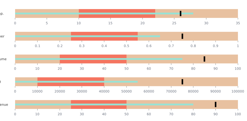
Nivo’s bullet — the D3 implementation, with ranges, measures and markers as separate arrays, which makes it the most flexible of the three and the most explicit about the anatomy above. React-only export.
1. There is no target. Strip out the comparison marker and a bullet chart is a bar chart with a decorative background. If nothing is being compared against, draw a bar.
2. The audience will see it once. Bullet charts repay familiarity: a team that reads the same dashboard weekly learns the encoding in a day. A general audience seeing one in a single slide will spend their attention decoding rather than reading, and a labelled bar with a target line does the job with no vocabulary.
3. The history matters. A bullet shows one moment. “Are we on track?” is often really “are we getting closer?”, and that is a line chart with a target band — or a bullet with a sparkline beside it, which is the standard compromise.
A fourth: when you have one metric and a lot of space. The bullet’s advantage is density. With a single KPI on a large card, a big number with a target underneath communicates faster, and the bullet’s compactness buys you nothing.
A single bullet is rarely the deliverable. What people actually want is a block of five or eight metrics that can be read in one pass, and the design of that block is where the chart succeeds or fails.
One axis for the group, or none at all. If every metric shares a scale — percentages of target, for instance — put one axis under the whole stack. If they do not, drop the axis entirely, normalise each bullet to percent-of-target, and put the raw number at the end of the bar. That second pattern is the one that makes mixed metrics legible together.
A fixed label column. Metric names left-aligned in their own column, bars starting at a common x position. Ragged label widths are what makes an otherwise good KPI strip feel unbuilt.
Group with whitespace, not rules. Four metrics, a gap, four more. Horizontal rules between bullets compete with the bars, which are themselves horizontal.
Order deliberately, and keep the order. By importance, by owner, by section of the business — anything except by current value, because a stack that re-sorts every week cannot be learned. Readers navigate a familiar dashboard by position.
Say what the bands mean, once. A one-line key above the block — “bands: below plan / on plan / ahead” — does the explaining for every bullet underneath, which is how you buy the recognisability the gauge gets for free.
The bullet chart was specified in the mid-2000s by Stephen Few as a direct response to dashboard gauges — the skeuomorphic dials that filled early business-intelligence tools. The brief was explicit: convey more information in less space, using encodings people read accurately, with no decoration at all.
That history explains the austerity, and it is worth respecting rather than designing away. The greyscale bands are grey on purpose, so the data is the most salient thing. The target is a plain tick because a shape is easier to locate than a colour change. The bar is thin because it must be distinguishable from the track it sits in. Every one of those choices is a legibility decision, and each is the first thing a designer is tempted to prettify.
The part of the original specification most often dropped is the comparison to context: a bullet without bands is just a bar with a tick, and without a target it is just a bar. Both simplifications are common, and both remove the reason the chart exists.
Six screens, start to finish, captured from the plugin.
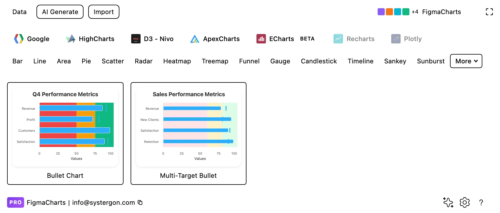
1. Filter to Bullet. Highcharts has two examples and Nivo one. It is a small category for a chart that deserves wider use.
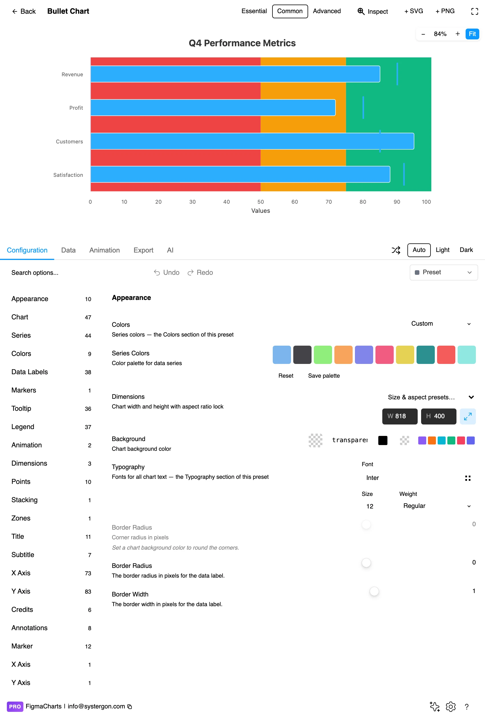
2. The editor. Live preview above, tabs below. Bullets are wide and short: set the aspect early, because the whole design depends on the bar having length to work with.
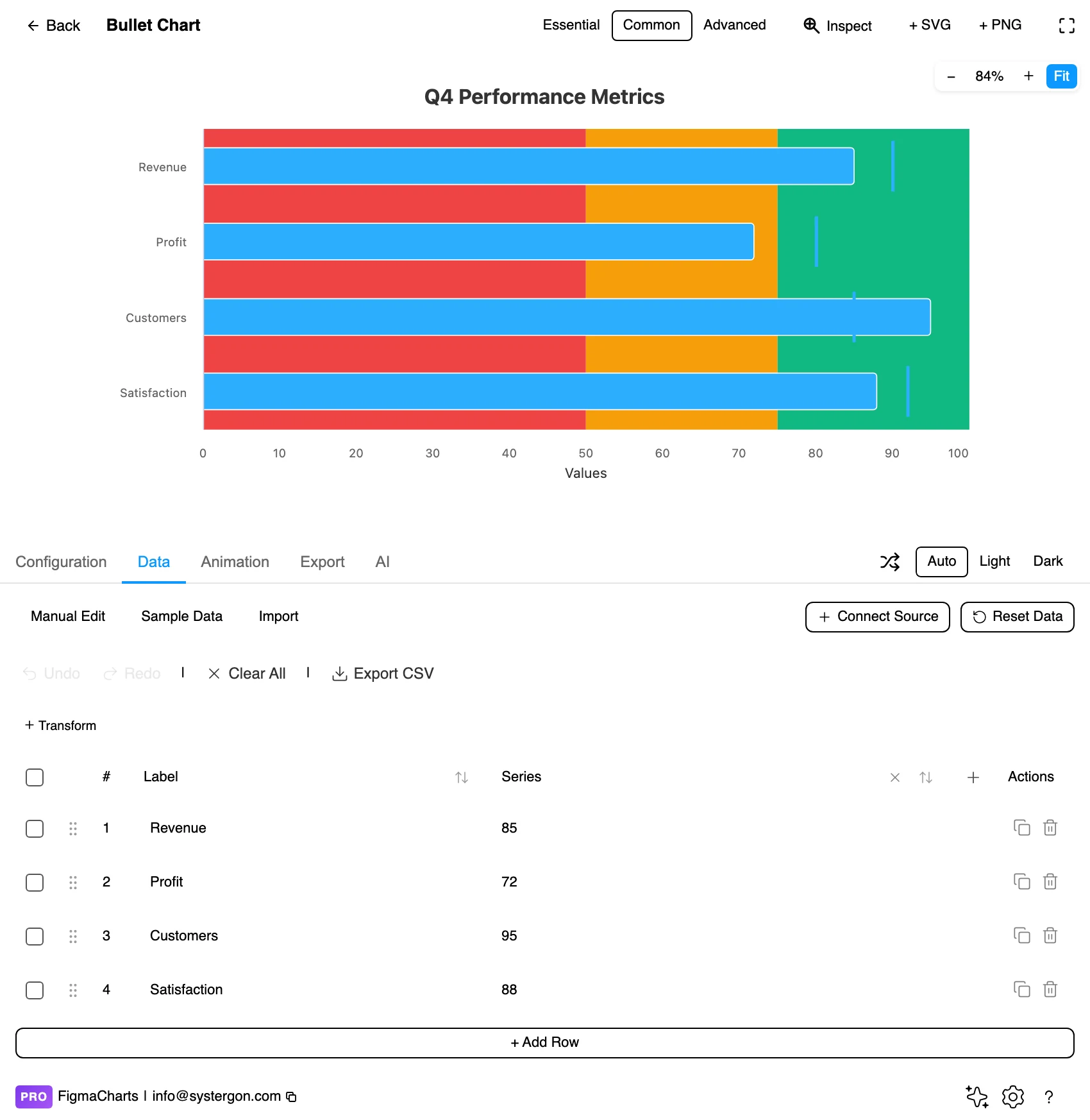
3. Value, target, ranges. Three different things in one row — which is why Nivo treats this as a JSON structure with separate arrays for ranges, measures and markers rather than a flat table.
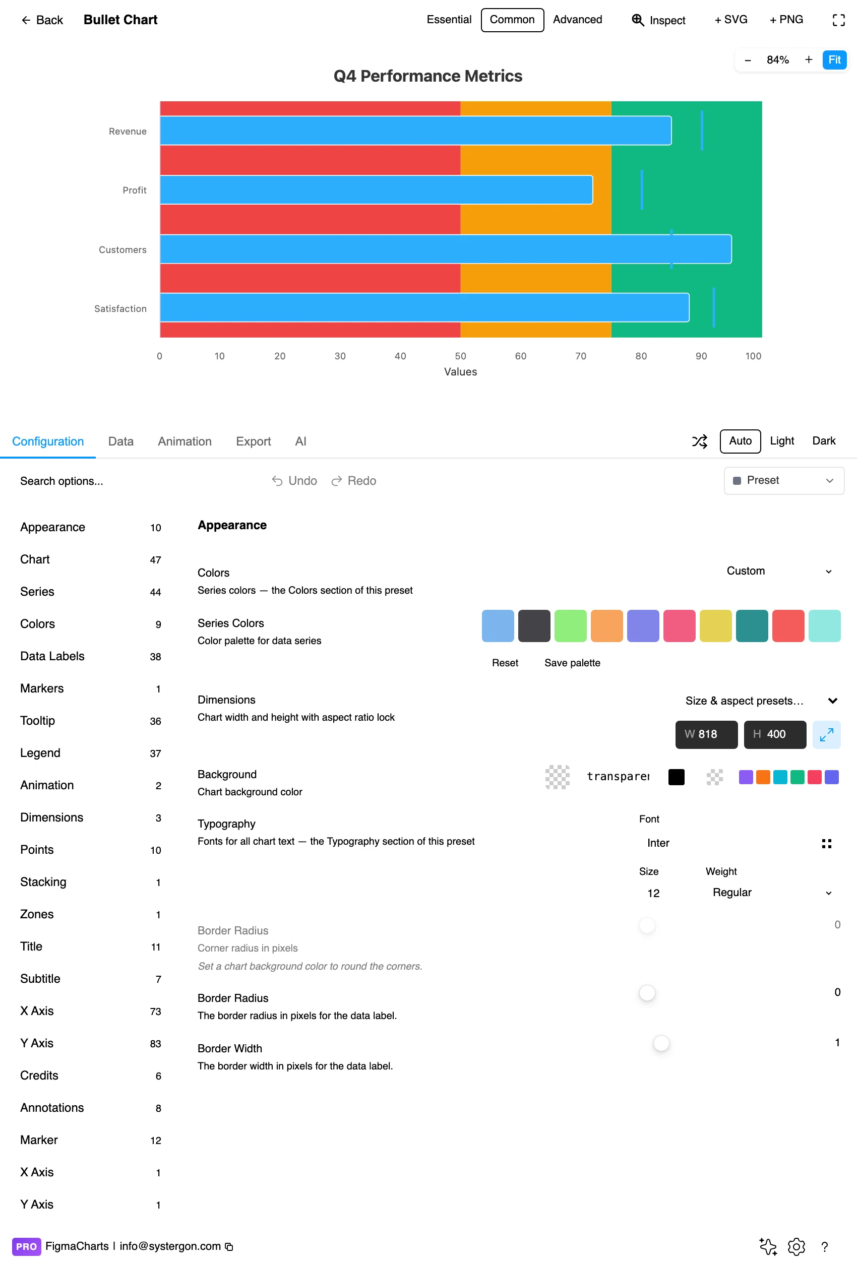
4. Configure. Band boundaries and colours, target marker style, bar thickness and the axis range. The band boundaries are the part that should come from policy rather than from taste.
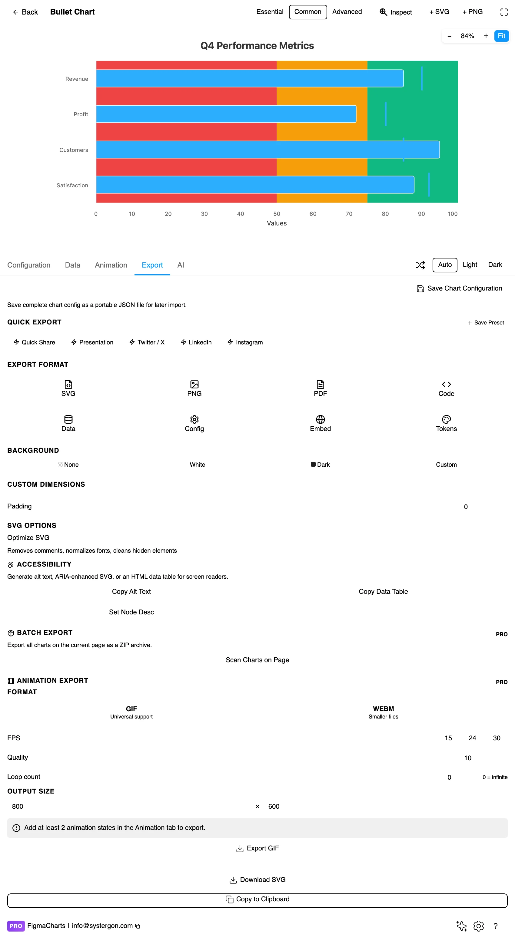
5. Export. A working component for React, Vue 3, Angular, Svelte or vanilla JavaScript — or the Config alone, which carries the band thresholds.

6. Insert. SVG gives you the bar, the marker and each band as separate layers — which matters here because a stack of bullets is usually assembled into a dashboard component afterwards.
Three things per row, which is why the plugin classifies bullet as a JSON shape rather than a table: the measure (one or more values), the markers (targets) and the ranges (the band boundaries). In Nivo that structure is edited as JSON directly; Highcharts takes the value and target on the series with the bands in the axis configuration.
Two consequences worth planning for. Nivo bullets cannot bind a live data source in the plugin — the connection is refused rather than corrupting the chart, because a flat range cannot express three parallel structures. And the band boundaries are configuration, not data, so a dashboard that pulls live numbers will keep whatever thresholds you set until someone changes them deliberately: a good thing, provided they came from somewhere real.
One more practical note: the target is data and the bands are policy, so they change on different schedules. Wire the target to the same source as the value; keep the band thresholds in the chart configuration where a change is deliberate and reviewable.
The most common data mistake is scale inconsistency. If you stack five bullets and each has its own axis maximum, the bars are not comparable even though they look it — which defeats the entire reason for stacking them.
The Bullet category holds three examples: Highcharts 2, Nivo 1.
markLine for the target is the usual route.As always: design in whichever library your engineers already use, because the export then matches production exactly. Choosing the right chart library covers the trade-offs.
Bands in greys, data in colour. This is the design’s central rule and the one most often broken. The qualitative ranges are context: two or three shades of a neutral, getting lighter as they improve. Colouring them red, amber and green turns the background into the loudest thing in the chart and defeats the purpose — the reader should see the bar first.
The target is a line, not a zone. A perpendicular tick, dark, thin, unmistakable. If it becomes a band, readers stop being able to tell whether the value has passed it.
Keep the bar thinner than the bands. The measure sits inside the range track, so it needs to read as a separate object — roughly a third of the track height is the convention, and it is what makes the two layers legible at once.
Label the axis once per group. In a stack of bullets sharing a scale, one axis at the bottom serves them all. Repeating it five times is noise.
Left-align the labels in their own column. Metric names in a fixed column at the left, bars starting at a common x position. That alignment is what turns a set of bullets into a scannable table — and it is worth doing on the canvas after inserting, if the library does not do it for you.
For type and colour, bind them to your design system rather than picking by hand — covered in Your chart, your design system.
The bands are a claim about policy. “Satisfactory” starting at 80% is a decision someone made, and printing it as a background band gives it the authority of a measurement. If the thresholds came from a design review rather than from operations, the chart is asserting a standard nobody agreed to — the same trap as a gauge’s coloured zones.
Different scales break the stack. Five bullets in a column look comparable. If each has its own maximum, a bar that reaches 80% of its own scale sits beside one that reaches 80% of a different scale, and the visual comparison is meaningless. Either share one axis, or separate the groups visibly.
The axis maximum is doing rhetoric. As with a gauge, where the scale ends determines how full every bar looks. Pick a maximum from something real — the target plus a margin, the capacity, the theoretical maximum — and keep it stable between reporting periods, or the same performance will appear to change.
One moment, no direction. A bullet cannot say whether a metric is improving. Readers infer momentum from a chart that has none, which is why a sparkline beside it is such a common pairing.
Multiple measures crowd fast. Two bars in one track — this year and last — is legible; three is a stack that needs a legend and starts to lose the design’s compactness.
Three of the five libraries have no bullet series, and the construction is simple enough that this should not decide your library.
Start with a horizontal bar chart, one bar per metric, with the axis running to your chosen maximum.
Add the bands as plot bands on the value axis — two or three greys behind the plot area. Every library here has axis plot bands, and because they are axis furniture they sit behind the data automatically.
Add the target as a marker. In ECharts a markLine per series does it; in ApexCharts an annotation or a second thin series; in Google Charts a second series drawn as a narrow bar. The requirement is a perpendicular tick, dark and thin.
Then thin the bar so it reads as sitting inside the band track rather than filling it, and you have a bullet chart that will export cleanly from a library that has never heard of one.
The greyscale bands are already accessible. Because the ranges vary in lightness rather than hue, they survive every form of colour vision deficiency — one of the few chart designs where the standard styling is the accessible styling.
Keep the target marker high-contrast. It is the smallest mark and the most important; it needs to be clearly darker than both the bar and the band behind it.
Print the value. A number at the end of each bar removes any dependence on judging length against a shared axis, and in a dense dashboard it is usually wanted anyway.
Give it a text equivalent. The Export tab’s Copy Alt Text, Copy Data Table and Set Node Desc produce a description, a table of the numbers and a description written onto the Figma node. For a bullet, the description should carry the target as well as the value — the comparison is the chart.
Showing one measure against a target, with bands giving qualitative context, in a compact horizontal strip. It was designed as a replacement for the dashboard gauge and uses length from a common baseline rather than angle, which people read more accurately.
A bullet in almost every case where you have more than one metric: it uses a fraction of the space, encodes the value more accurately, and stacks into a scannable list. A gauge wins on recognisability — readers need no explanation — and when a single dial is the hero of a screen.
Qualitative ranges — poor, satisfactory, good, or whatever your policy defines. They should be shades of a neutral, not a traffic-light palette, so the data stays the most visible thing in the chart.
Highcharts (2 examples, including multi-target) and Nivo (1, with the most explicit ranges-measures-markers model). ECharts, Google Charts and ApexCharts have no bullet type, but the chart assembles easily from a horizontal bar with plot bands and a target marker.
Yes — Highcharts ships a multi-target example, and it is a good way to show plan and prior-period side by side. Two markers is the practical limit before the bar needs a legend.
If they are stacked in a group, yes. Bars on different scales look comparable and are not, which removes the main reason for putting them in a column. Where metrics genuinely differ in scale, separate them visually or normalise to percentage-of-target.
Add a sparkline. A bullet is a snapshot with no memory, and the standard pairing is a bullet for the current standing plus a small line chart beside it for the trend.
Yes, and it takes four steps: a horizontal bar chart, greyscale plot bands on the value axis for the qualitative ranges, a perpendicular target marker (a markLine in ECharts, an annotation in ApexCharts) and a thinner bar so the measure reads as sitting inside the band track. The absence of a bullet series should not decide your library.
Insert as SVG and the bar, the target marker and each band arrive as separate layers, which is exactly what you want when assembling a stack of bullets into a dashboard component. Insert as PNG for a flat image at twice the pixel density.
Open the plugin, filter to Bullet, and build one for a metric you already have a target for — then stack three more beside it on the same axis. If the column reads at a glance, you have found the reason this chart exists, and you have replaced four gauges with something that fits in a sidebar.
Install Figma Charts — it’s free to try → Browse all 45 chart types →