
Install Figma Charts — it’s free to try → See the donut gallery →
Almost everything written about donut charts treats the hole as a style preference — a pie chart, but make it modern. It is not a style. The hole is the only structural difference between the two charts, and it exists to hold something: the total, the headline number, the thing the ring is dividing up. A donut with an empty middle is a pie chart that has thrown away the centre of its own circle, where the angles are easiest to read.
Real plugin output: an ApexCharts donut captured from the editor. Every chart on this page came out of the plugin the same way.
Which makes the design question specific rather than aesthetic: what goes in the hole? This page is about that, plus the inner radius, the concentric-ring trap, the failure mode unique to donuts, and where each of the five libraries keeps its donuts — because only one of them files them as their own chart type.
Everything below happens inside Figma Charts, a Figma plugin. It runs the real JavaScript charting libraries — Google Charts, Highcharts, D3-based Nivo, ApexCharts and Apache ECharts — inside the plugin window, so the ring on your canvas is the library’s own output, drawn with its own arc geometry.
Install Figma Charts from the Figma Community →
Press ⌘/ (Ctrl / on Windows), type Figma Charts, hit Enter, and look under both Donut and Pie — the reason for that is below, and it catches people out.
Three answers, in order of how often they are the right one.
The total. “£2.4m” in the middle of a ring divided by region is a chart doing two jobs at once: how much altogether, and how it splits. A pie can only do the second, and a bar chart can only do the second. This is the donut’s genuine advantage over both, and it is the reason to pick one.
The headline share. A single large number — “68%” — with the ring showing that share against the remainder. At this point you are close to a gauge, and the difference is worth knowing: a gauge is about a threshold, a donut is about a division.
A label that makes the categories legible. When the chart is small, the centre is the only place a caption fits without leader lines.
If none of those apply — if the middle is going to be empty — then the hole is costing you the most readable part of the circle and buying nothing. Draw a pie, or better, ask whether a bar chart answers the question more accurately.

The semi donut — half a ring, which fits a wide shallow card where a full circle wastes the corners. It also reads as a scale from left to right, which is why it is the shape dashboards reach for when the number is a proportion of a target.

Gradient fills. Worth one caution: a gradient across a slice makes the slice look larger at the light end and changes nothing about the value, so it is decoration that competes with the encoding. Use it when there is one slice, not five.

Highcharts draws donuts by setting an inner size on a pie — and files them under Pie, not Donut. This is the same chart type by another name.

Highcharts’ semi-circle donut, again under Pie. Note the label treatment: with half the circumference available, labels have to move outside or into the empty half.
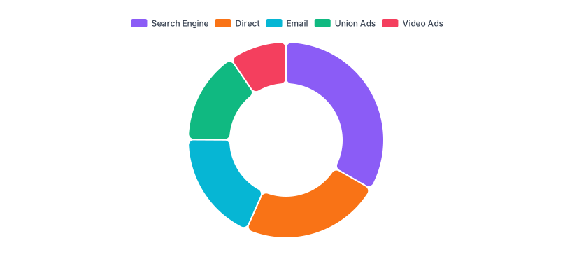
And ECharts’ doughnut — spelled the other way, filed under Pie, and shipping alongside a half-doughnut and a rounded-corner variant.
Too small and you have a pie with a suspicious dot in the middle. Too large and the ring becomes a thin band where small shares vanish and the labels have nowhere to sit. The working range is roughly 50–65% of the outer radius, and the right end of that range depends on what the hole is holding: a long total (“£2,412,908”) needs more room than a short percentage.
Two consequences people miss. First, as the hole grows, angle judgement gets worse — you are removing the part of the wedge where the angle is most visible, leaving the reader comparing arc lengths at the rim. Second, a thin ring at small sizes disappears: at 80px a 60% inner radius leaves a band a few pixels wide, and any share under about 8% becomes invisible. Design the tile size and the inner radius together.
The temptation with a donut is to nest another ring inside it — this year outside, last year inside — and it fails for a specific, structural reason: equal shares have unequal arc lengths at different radii. A 25% slice on the outer ring is physically longer than a 25% slice on the inner one, so the same value looks bigger on the outside. Readers compare lengths, because that is what the eye does with arcs, and they conclude the outer ring is larger everywhere.
Where nested rings do work is when they are not comparable by design — Apple-Watch style activity rings, where each ring is its own metric against its own goal and no cross-ring comparison is intended. That is a gauge pattern, and Highcharts files its Activity Rings example under Gauge for exactly that reason.
1. You are showing progress, not composition. A ring that fills to 68% of a target is a progress indicator, and it should be built as one — a radial bar or a gauge, where the remaining arc is explicitly “not yet” rather than a second category. Building it as a two-slice donut means labelling the remainder, and “Remaining: 32%” in a legend is a category that does not exist in your data.
2. You have more than about five segments. The hole does not raise the pie chart’s ceiling; it lowers it slightly, because the ring has less room for labels than a full circle does. Six or more segments in a donut means outside labels with leader lines, which need more space than the chart itself.
3. The comparison is between two donuts. Two rings side by side have the same problem as two pies: shares move when either the part or the whole moves, and the reader cannot tell which. If both donuts carry their totals in the middle you have mitigated it — which is, in fairness, one thing a donut does better than a pie — but a grouped bar chart still answers the question more directly.
Name and value, one row per segment — the simplest shape in the plugin, and identical to a pie’s. There are no axes, no series and nothing to reshape, so a two-column range pasted from a spreadsheet becomes a donut immediately.
The values must be parts of one whole, and the whole must be the thing in the middle. That sounds obvious written down and is the most common way a donut goes wrong in practice — see the centre-total trap below.
Donuts accept a linked data source in every library that draws them, so a Google Sheet or an API can drive one directly; that is covered in live data from Google Sheets and APIs. And the usual caution applies: in a column judged numeric, a cell that will not parse becomes 0, which in a donut means a segment that silently disappears from the ring while its label stays in the legend.
Most donuts end up in a card roughly 200–320px wide, and that constraint should drive the design rather than being discovered at the end.
Decide what survives. At tile size you can keep the ring, the centre number and about two labels. Everything else — the title, the legend, the per-segment percentages — is competing for space with the number that matters. The plugin’s Essential complexity mode strips the chart to roughly that state in one click, which is the right starting point for a card.
Check the smallest segment at the smallest size. A 4% share in a thin ring at 200px is a sliver a couple of pixels long. If your data routinely has small segments, either group them or accept that the ring is showing “one big thing and some others”, which may well be the message anyway.
Let the centre do the work. On a dashboard, the reader’s first fixation is the largest text. Making that the total — not the title — means the tile answers its own question before anyone parses the ring, and the ring becomes the supporting detail rather than the subject. This is the layout that makes donuts genuinely useful in products, and it is the reason to prefer one over a pie in a tile.
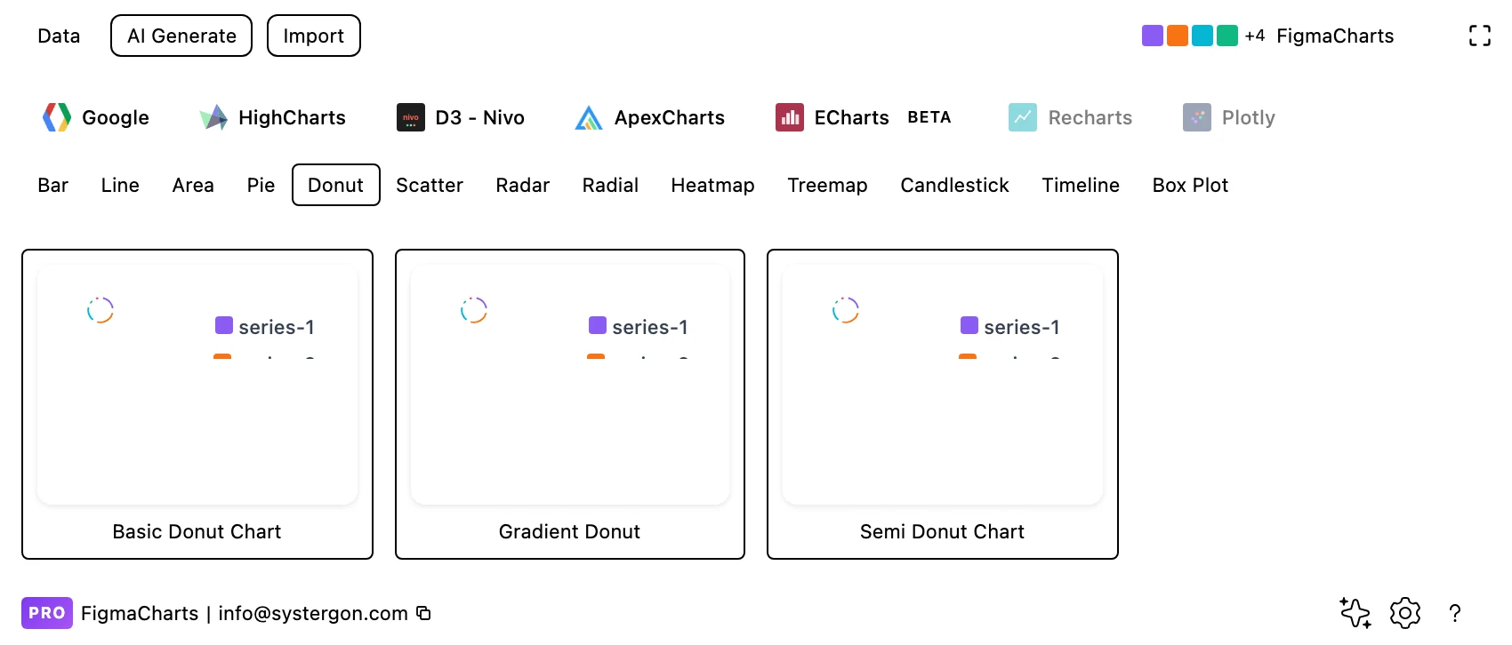
1. Pick a starting point. ApexCharts is the only library with a Donut chip — for the others, filter to Pie and look for the ones with a hole. Every tile is live output.
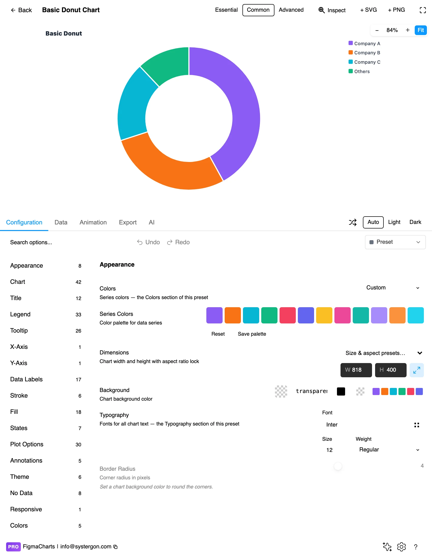
2. The editor. Live preview above, tabs below. For a donut, the first thing to check is whether the centre is empty — if it is, decide now what belongs there.
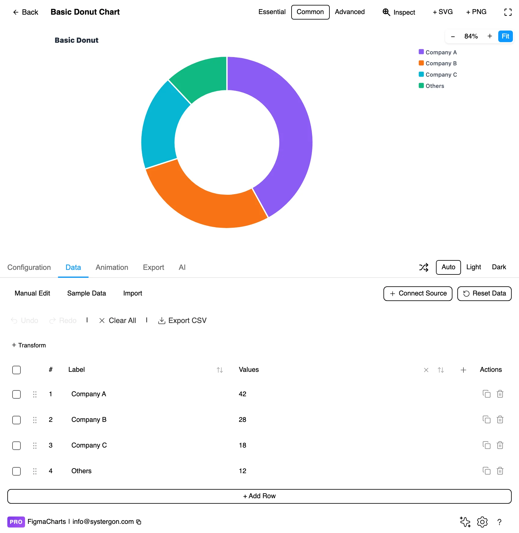
3. Your numbers. Name and value, one row per slice, exactly as a pie. Slices are drawn in data order, so this is where the ordering decision gets made.
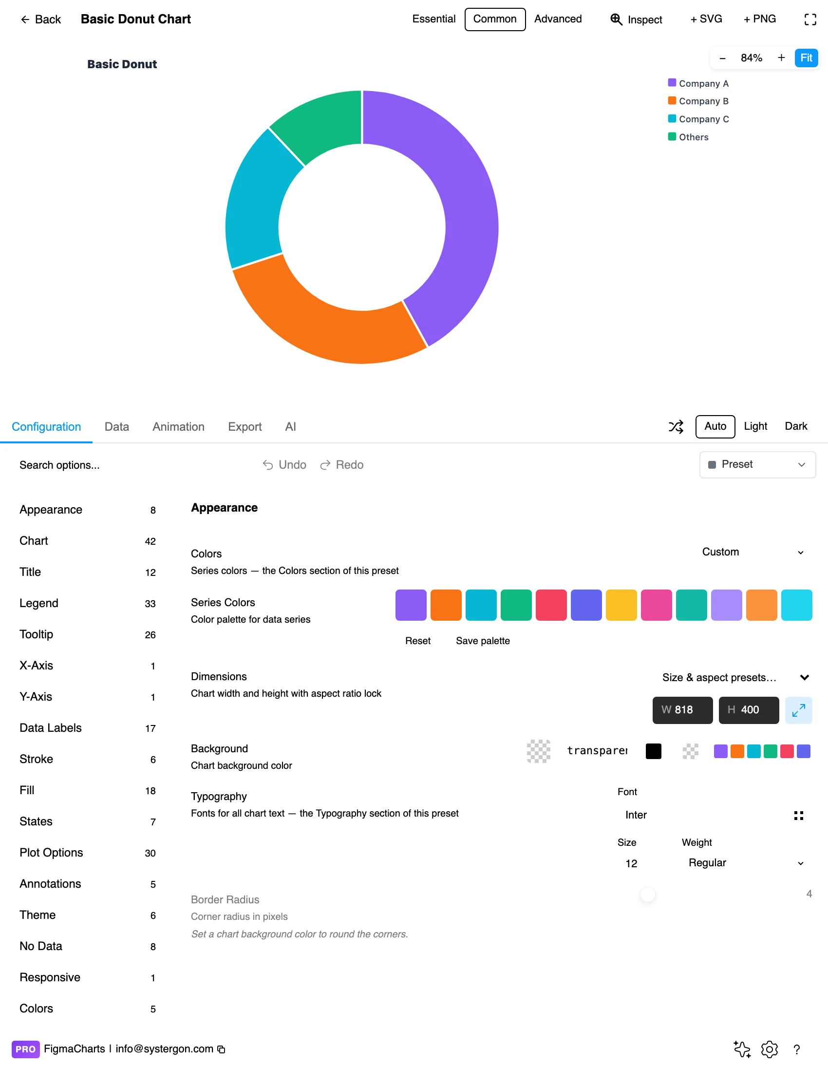
4. Configure. The inner radius, the start angle, the label mode and the centre label live here. This is the panel where a donut becomes a semi-donut, and where the total goes into the middle.
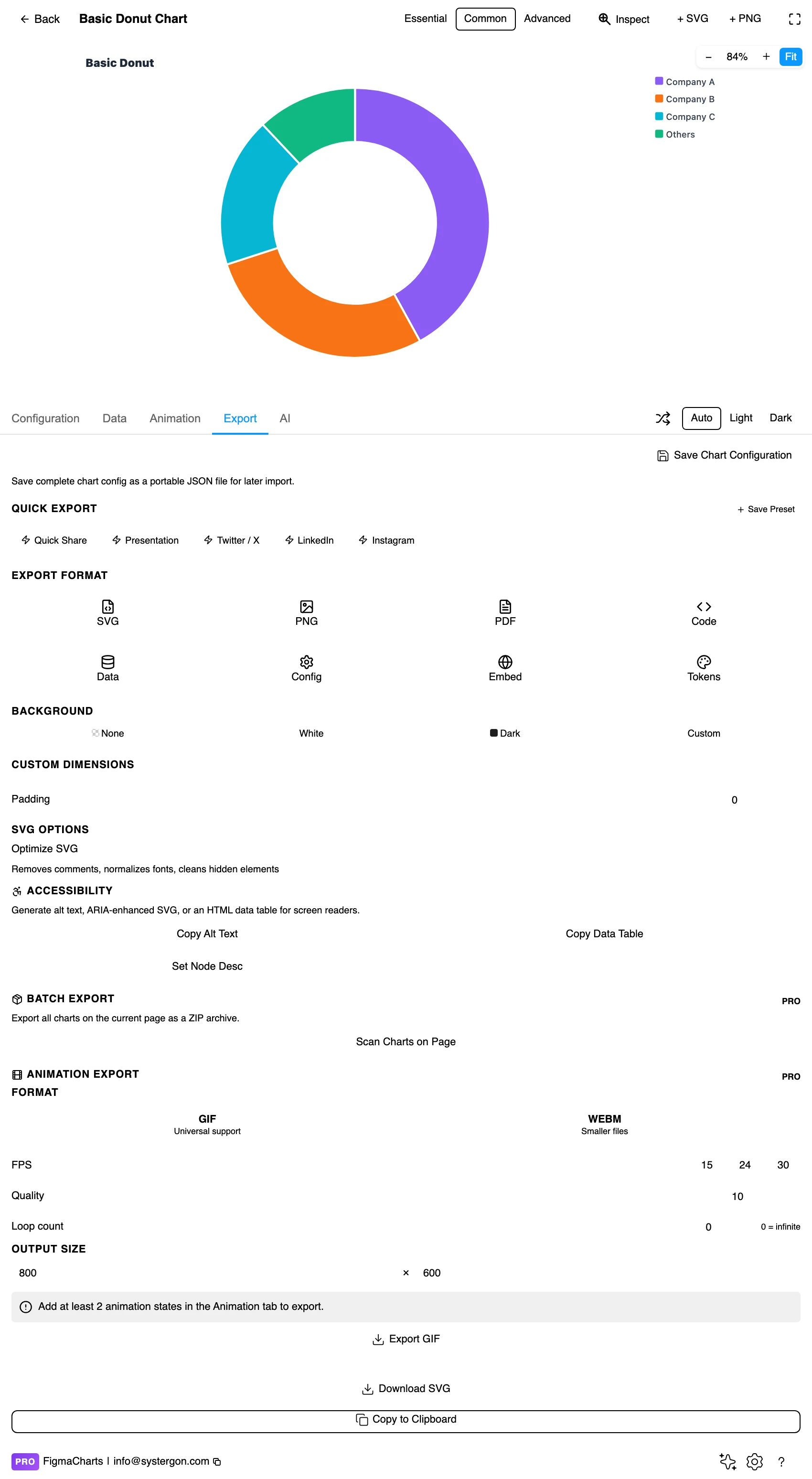
5. Export. A working component for React, Vue 3, Angular, Svelte or vanilla JavaScript at the version the plugin rendered with — including the inner-radius setting, which is otherwise the first thing to get lost in translation.
6. Insert. SVG gives you each arc as its own vector shape and the centre label as real text, so the KPI number can be swapped or restyled on the canvas without regenerating the chart.
This is the one piece of navigation worth knowing before you go looking. ApexCharts is the only library in the plugin with a Donut category — three examples: basic, gradient and semi. Every other library draws donuts and files them under Pie:
So the honest sentence is “ApexCharts is the only library with a Donut category”, and the false one — which is easy to reach from the chip counts alone — is “ApexCharts is the only library that can draw a donut”. All five can. If your team is on Highcharts, you are not choosing between a donut and your library; you are choosing an option on a pie.
As always: design in whichever library your engineers already use, because the export then matches production exactly. Choosing the right chart library covers the trade-offs.
The centre total can lie by scope. This is the donut’s own trap, and it is easy to walk into. The ring shows a division of one population; the number in the middle is read as the total of that population. If the centre carries a broader figure — total revenue, while the ring divides only the subset that came through paid channels — then every share the reader computes in their head is wrong, and nothing in the chart signals it. Whatever sits in the hole must be the sum of the ring.
All the pie chart’s limits still apply. Angle is a weak channel, distant slices cannot be compared, and about five slices is the ceiling. The hole does not fix any of that; it costs a little accuracy and buys a place to put a number.
Start angle is still rhetoric. The slice at twelve o’clock reads as primary. Convention is largest first, clockwise from the top.
Percentages should sum to 100. Overlapping categories — multi-select answers being the classic case — break the whole-circle claim just as thoroughly in a donut as in a pie.
Type the centre like a headline, not a label. It is the biggest thing in the chart and the first thing read; give it the weight and size that implies, and put its qualifier (“total revenue”, “of target”) underneath in a smaller neutral.
Separate the arcs with a hairline in the background colour. Two adjacent similar hues need a boundary, and at donut scale a 1–2px gap is plenty; heavier strokes eat the small shares.
Label outside, or not at all. Labels inside a ring segment only fit when the ring is thick and the share is large. Outside labels with short leader lines are more reliable, and for a dashboard tile the honest answer is often to label nothing and let the centre number plus a two-item legend carry it.
Keep the ring thickness constant. Some libraries can vary a segment’s outer radius by value, which turns a donut into a two-variable chart where the reader cannot separate the angle from the radius. If a second measure matters that much, it deserves its own chart.
Round caps are a strong style signal. ECharts ships a rounded-corner doughnut, and rounded ends read as “progress” rather than “composition” — which is a useful signal if it is a progress ring and a misleading one if the slices are categories.
For type and colour, bind them to your design system rather than picking by hand — the plugin can build a palette from your Figma colour variables and bind chart text to your text styles, covered in Your chart, your design system.
The centre number is the accessible version of the chart. Insert as SVG and it comes through as real text, which means it is selectable, searchable and available to assistive technology — so the most important quantity in the chart is not locked inside a picture.
Do not rely on colour alone for the segments. Direct labels are best; where a legend is unavoidable, order it to match the ring order rather than alphabetically, so a reader can walk the two in step.
Check contrast at ring thickness. A colour that passes as a large fill can fail as a 12px band, and thin rings are exactly what dashboard tiles produce.
Give it a text equivalent. The Export tab’s Copy Alt Text, Copy Data Table and Set Node Desc produce a description, a table of the numbers and a description attached to the Figma node.
The hole, and the hole is the reason to choose one. It is somewhere to put the total or the headline share, which lets the chart answer “how much altogether?” and “how does it divide?” at the same time. If the middle stays empty, you have given up the most readable part of the circle for nothing.
All five. Only ApexCharts gives Donut its own category (three examples); Highcharts, ECharts, Google Charts and Nivo all draw donuts and file them under Pie. Look in both chips before concluding a library cannot do it.
Between about 50% and 65% of the outer radius. Smaller reads as a pie with a dot in it; larger leaves a thin band where small shares disappear and labels have nowhere to sit. Size the hole to fit what is going in it.
Not for comparison. Equal shares occupy longer arcs on the outer ring than the inner one, so the same value looks bigger outside. Nested rings work only when each ring is its own metric with its own goal, which is an activity-ring pattern — and Highcharts files that under Gauge.
The sum of the ring, or a share derived from it, or nothing — in which case use a pie. The one rule: whatever is in the hole must describe the same population the ring divides, or every proportion the reader infers is wrong.
Same data, different frame. Half a ring fits a wide shallow card and reads left-to-right like a scale, which suits proportions of a target. ApexCharts and Highcharts both ship one.
About five, exactly as a pie — the hole does not raise the ceiling. Beyond that, group the tail into a labelled “Other” or switch to a ranked bar chart.
Insert as SVG and each arc is a vector shape and the centre label is real text, so you can restyle a segment or replace the KPI number on the canvas. Insert as PNG for a flat image at twice the pixel density.
Open the plugin, build a donut, and write the number that belongs in the middle before you style anything else. If you cannot name it — if there is no total, no headline share, nothing the ring adds up to — then you have discovered that this chart wanted to be a pie, or more likely a bar chart, and you have saved yourself the ring.
Install Figma Charts — it’s free to try → Browse all 45 chart types →