Install Figma Charts — it’s free to try → See the histogram gallery →
A histogram looks like a bar chart and is a different thing. A bar chart compares categories that you chose; a histogram shows the shape of a distribution that you did not choose — where the values pile up, how far they spread, whether there are two humps instead of one. The bars touch because the axis is a number line rather than a list, and that single detail is what separates the two charts.
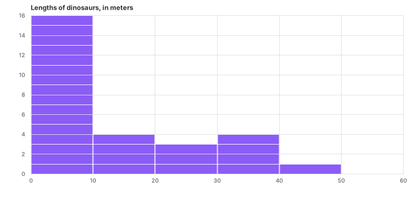
Real plugin output: a Google Charts histogram captured from the editor. Every chart on this page is the library’s own drawing.
It also has a parameter no other chart has: the bin width. Change it and the same data produces a different picture — smooth or spiky, one peak or three — without a single value changing. This page is mostly about that, plus what to do when the distribution is the finding.
Everything below happens inside Figma Charts, a Figma plugin. It runs the real JavaScript charting libraries — Google Charts, Highcharts, D3-based Nivo, ApexCharts and Apache ECharts — inside the plugin window, so the bins on your canvas were computed by the library itself.
Install Figma Charts from the Figma Community →
Press ⌘/ (Ctrl / on Windows), type Figma Charts, hit Enter, and pick Histogram from the category filter. There are 7 histogram examples — Google Charts 5 and Highcharts 2 — which makes this one of the narrower categories in the plugin, and the reason is worth knowing: a histogram is mechanically a bar chart with the gaps closed and the bins computed, so several libraries treat it as a configuration of an existing type rather than a type of its own.
Four differences, and every one of them is load-bearing:
If you find yourself drawing a “histogram” of revenue by region, you have a bar chart. If you are drawing revenue-per-order across ten thousand orders, you have a histogram, and the question it answers is different: not which is biggest, but what typical looks like and how much variation there is around it.
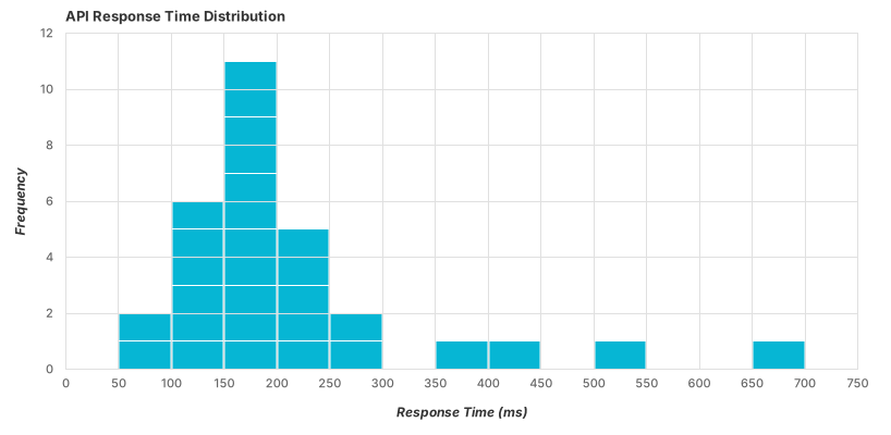
The classic engineering case — response times, which are almost always right-skewed: a tall pile of fast responses and a long tail of slow ones. The tail is the part that matters and the part an average hides completely.
With percentiles marked — the honest companion to the skewed distribution above. If a reader is going to act on this chart, the p95 line is more useful than the mean, and marking it removes the temptation to quote the average.
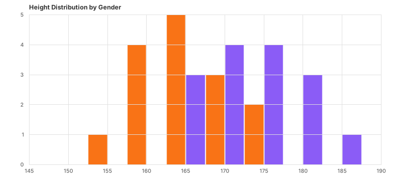
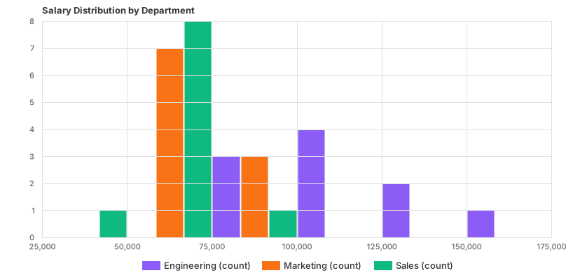
Two distributions overlaid — before and after, control and variant. This is where a histogram becomes an argument rather than a description, and it needs transparency to work: opaque bars hide whichever series is drawn second.

Highcharts computes the bins for you — its histogram is a derived series attached to a source series of raw values, which is why its examples ship the underlying scatter alongside. You supply observations; the library decides the intervals unless you override them.

With a normal curve overlaid — useful when the question is “is this distribution normal?”, and misleading when the answer is no and the curve is drawn anyway. The curve is a model, not a measurement; label it as one.
Everything else on this page is detail next to this. Too few bins and real structure disappears into a smooth mound; too many and random noise looks like structure. The same measurements can be made to show one peak or three, and neither picture is a lie about the numbers — they are answers to different questions about resolution.
Three practical rules:
And one specific trap: a spike in the first bin usually means zeros. Missing values coerced to 0 — which the plugin does with unparseable numeric cells — pile up at the left edge and look exactly like a real cluster of very small measurements.
1. You have few observations. Below about thirty values the bars are counting noise, and the shape changes completely with one more data point. Plot the individual values instead — a strip plot or dot plot shows all of them and pretends nothing.
2. You need to compare more than two distributions. Overlaid histograms turn into mud past two series. Small multiples work, and a box plot per group works better when the comparison is about position and spread rather than shape.
3. The x axis is categorical. Then it is a bar chart, the bars should have gaps, and the order is yours to choose.
A fourth: when the distribution is extremely skewed. One value ten thousand times larger than the rest gives you a chart with one tall bar at the left and a very long empty axis. A logarithmic x axis fixes it honestly, and clipping the tail does not — if you clip, say how many observations are outside the frame.
The reason to draw a distribution rather than summarise it is that the shape carries a diagnosis. Four are worth recognising on sight.
Symmetric and single-peaked. The textbook case, and the only one where the mean, the median and the mode agree — which is why summary statistics behave well here and badly everywhere else. Heights, measurement errors, manufacturing tolerances.
Right-skewed. A tall pile near the left and a long tail to the right: response times, incomes, order values, time-to-resolution. The mean sits well above the typical value, so quoting an average describes almost nobody. Percentiles are the honest summary, which is why the percentile-marked example above exists.
Bimodal. Two peaks, which nearly always means two populations have been mixed — mobile users and desktop users, weekday and weekend traffic, two versions of a product. This is the single most valuable finding a histogram produces, and it is invisible in every summary statistic: a mean between the two peaks describes a value almost nothing in the data actually takes.
Uniform or spiky. A flat distribution usually means the thing is generated rather than measured, and isolated spikes usually mean rounding, defaults or data entry — a pile at exactly 60 minutes, at 0, at 100. Those spikes are worth investigating before they are styled.
Three neighbours solve problems a histogram struggles with, and all three are in the plugin.
The box plot compresses a distribution into five numbers, which makes comparing eight groups easy and hides the shape completely — including bimodality. Use it when position and spread are the question and you already know the shape is unremarkable.
The strip or swarm plot draws every observation. With a few hundred points it shows the shape and the individual values at once, with no bin decision at all, which makes it the honest choice for small samples where a histogram would be counting noise.
The cumulative distribution — a line rising from 0% to 100% — answers “what fraction is under this threshold?” directly, which is usually the real question behind an SLA conversation. It needs no bins, so it cannot be accused of manufacturing its own shape, and it is drawn as an ordinary line chart from sorted values.
Six screens, start to finish, captured from the plugin.
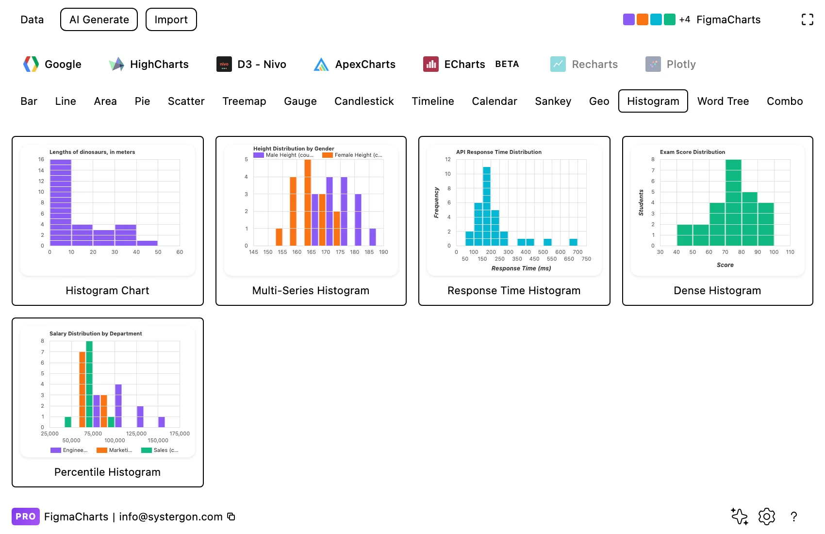
1. Filter to Histogram. Two libraries have the category — Google Charts with five examples and Highcharts with two. Both compute bins from raw values rather than expecting pre-counted bins.
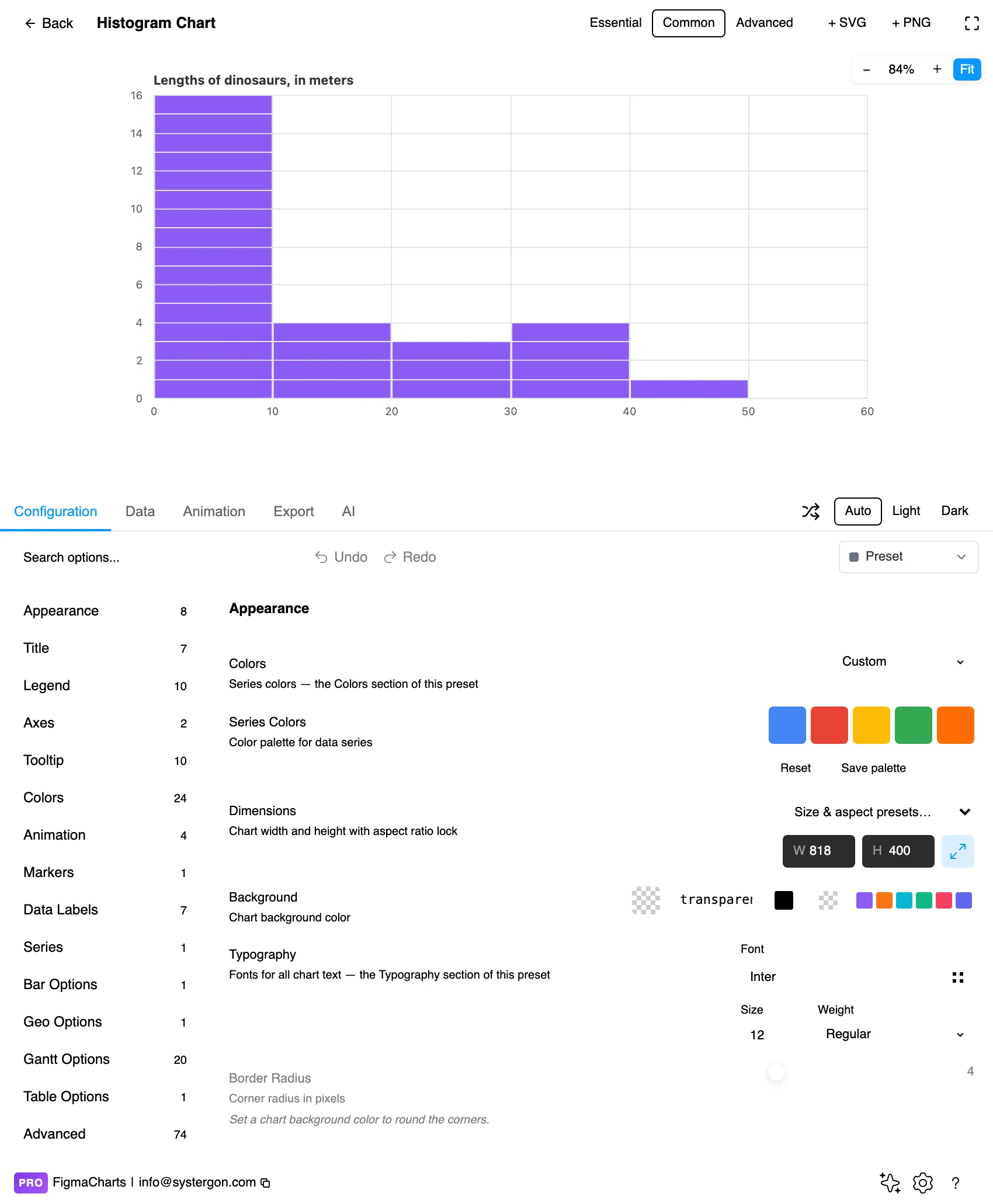
2. The editor. Live preview above, tabs below. Set the width you will actually ship at before choosing bins: the same bin count reads differently at 400px and 900px.
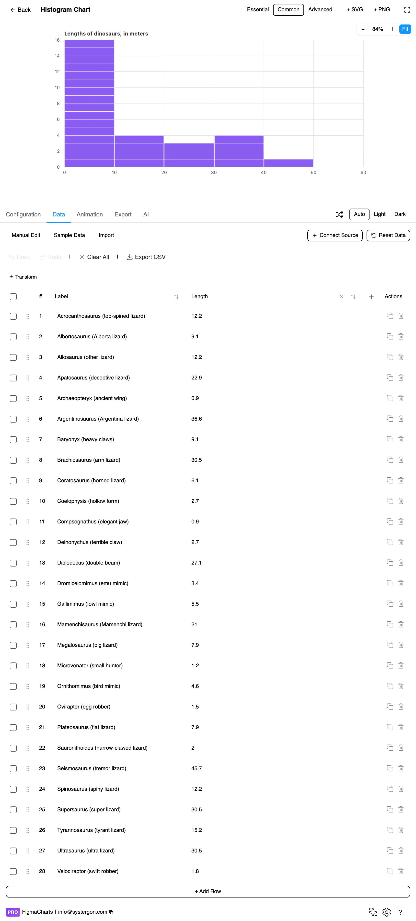
3. Raw values, not counts. This is the step people get wrong: the table holds your observations, one per row, and the library does the counting. If you already have bin counts, you have a bar chart with the gaps removed.
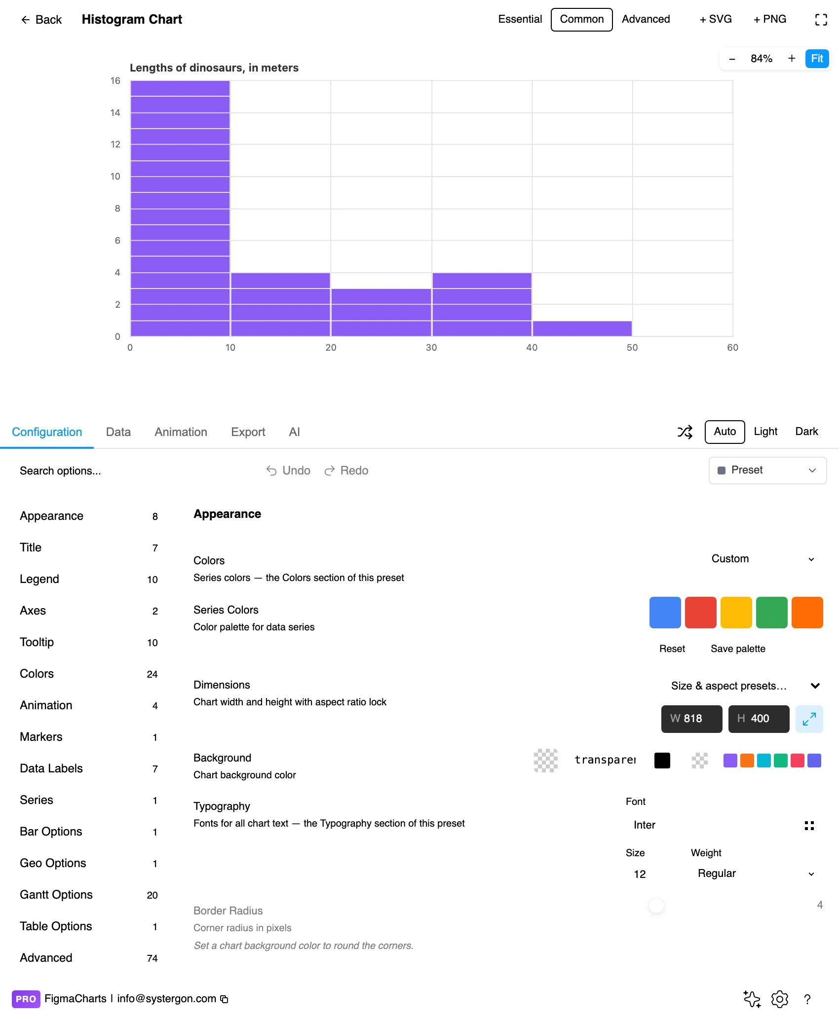
4. Bins. Bin count or bin width, plus the axis range. This is the panel where the chart is actually made — everything else is styling.
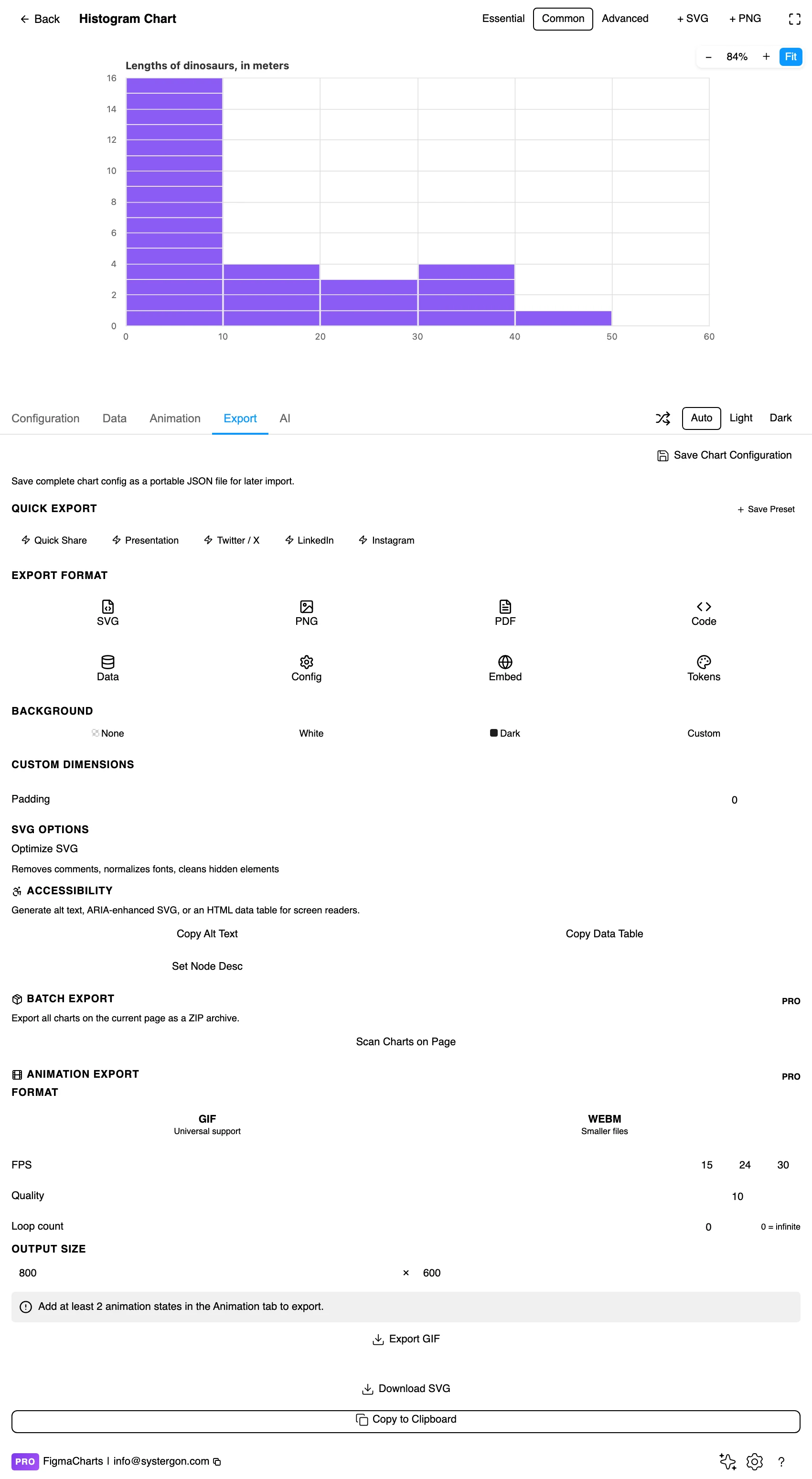
5. Export. A working component for React, Vue 3, Angular, Svelte or vanilla JavaScript — and for a histogram, check that the exported config carries your bin settings rather than the library defaults.

6. Insert. SVG keeps each bin as a rectangle and the axis as real text, so marking a percentile or shading a region is a canvas operation.
One column of numbers — the observations themselves, one per row. That is the whole shape, and it is unusual in this series: nearly every other chart type takes summarised data, and a histogram takes the raw material.
Both libraries compute the bins. Google Charts buckets the values you give it; Highcharts attaches a histogram series to a source series and derives the bins from that, which is why its gallery examples ship the underlying scatter of raw points alongside the bars. Either way, the counting happens in the chart, not in your spreadsheet — so changing the bin width never means re-preparing the data.
Histograms accept a linked data source, so a column of measurements from a Sheet or an API can drive one directly — see live data from Google Sheets and APIs. Watch the coercion caution: unparseable cells become 0 and pile into the leftmost bin, which is indistinguishable from a real cluster of tiny values.
Only two of the five have a Histogram category, and the 7 examples split Google Charts 5, Highcharts 2.
As always: design in whichever library your engineers already use, because the export then matches production exactly. Choosing the right chart library covers the trade-offs.
No gaps between bars. This is the one styling rule that carries meaning rather than taste. A hairline separator in the background colour is acceptable; a real gap turns your continuous axis into a categorical one visually.
One colour. Every bar is the same measure, so per-bar colour encodes nothing. The exception is deliberate emphasis — shading the bins beyond a threshold, for instance — which is a second variable and should be legible as one.
Label the axis with the unit and the bin width. “Response time (ms, 50ms bins)” tells the reader everything they need to reproduce the chart.
Mark the summary statistics you want read. A median line, a p95 line, a target threshold — these turn a description into a decision aid, and they are far more useful on a histogram than a legend.
Give the tail room. Skewed data tempts you to crop, and cropping is the one change that alters the conclusion. If the tail is long, use a log axis or an explicit “12 values above 2,000ms not shown” note.
For type and colour, bind them to your design system rather than picking by hand — covered in Your chart, your design system.
Bin width can manufacture or erase a finding. The second mode that disappears at coarse bins, the “gap” that is really two adjacent empty intervals — both are artefacts of resolution. Always check a feature at more than one width before building a decision on it.
The average is usually the wrong summary. Skewed distributions — response times, incomes, order values, almost everything measured in the wild — have means pulled far from the typical value by the tail. That is precisely why the histogram exists: it shows the shape the average conceals. Having drawn one, do not then quote the mean as though it described the middle.
Frequency versus density. With unequal bin widths, bar height must be frequency density (count divided by width), not raw count, or wide bins look tall for no reason. Equal bins avoid the problem entirely, which is a good argument for them.
Counts hide sample size. Two histograms with identical shapes may summarise fifty observations and fifty thousand. If you are comparing distributions, state the counts.
A fitted curve is a claim. An overlaid normal curve says “this is normally distributed”. If it clearly is not — if the data is skewed or bimodal — the curve is a decoration that flatters a model rather than describing your data.
Do not rely on overlay transparency alone. Two overlaid distributions distinguished only by translucent colour fail for readers with colour vision deficiency and print badly. Outlines with different stroke patterns, or small multiples, work for everyone.
Mark thresholds with lines and labels, not just colour. A shaded “over SLA” region needs its boundary labelled with the value.
Give it a text equivalent. The Export tab’s Copy Alt Text, Copy Data Table and Set Node Desc produce a description, a table of the numbers and a description attached to the Figma node. For a histogram, a summary sentence carries more than a bin-by-bin table: the median, the spread, the shape, the tail.
A bar chart compares categories you chose and its bars have gaps; a histogram shows the distribution of a continuous measurement, its x axis is a number line, and its bars touch. Reordering a bar chart is often useful; reordering a histogram is meaningless.
Enough to show structure, few enough to avoid noise — and the honest method is to try at least three widths. A feature that survives all three is in the data; one that appears at a single width is an artefact of the setting. Prefer round boundaries and state the width on the chart.
Raw values, one observation per row. Both libraries that have this category compute the bins themselves — Google buckets the values, Highcharts derives a histogram series from a source series. If you already have counts, you are drawing a bar chart with no gaps.
Google Charts (5 examples) and Highcharts (2) have the category. ECharts builds one with a custom series filed under Scatter. For ApexCharts and Nivo, bin the data yourself and draw a zero-gap bar chart.
Most often because missing values became zeros. In a column judged numeric, a cell that will not parse becomes 0, and those pile into the leftmost bin looking exactly like a real cluster of very small values. Clean the source before binding it.
Yes. The bars encode counts as length from a baseline, so the zero-baseline rule applies exactly as it does to a bar chart.
Two is the limit for overlaying, and it needs transparency plus distinct outlines. Beyond two, use small multiples with a shared axis range, or switch to box plots, which compare position and spread compactly at the cost of hiding shape.
Insert as SVG and each bin is a real rectangle with real axis text, so shading a region or adding a percentile line happens on the canvas. Insert as PNG for a flat image at twice the pixel density.
Open the plugin, filter to Histogram, and put a column of real measurements in — then change the bin width three times and watch what survives. Whatever is still there at every width is the finding, and it is usually more interesting than the average anybody was about to quote.
Install Figma Charts — it’s free to try → Browse all 45 chart types →