
Install Figma Charts — it’s free to try → See the scatter gallery →
Every other chart in this series summarises. A bar chart gives you one number per category, a line gives you one number per period, a pie gives you one number per slice. A scatter plot summarises nothing: it puts a mark at every single observation and lets the reader do the seeing. That is why it is the chart statisticians reach for first and the chart dashboards reach for last — it is the most honest thing you can draw, and honesty is not always what a dashboard wants.
It is also the chart most likely to be drawn for the wrong reason: a cloud of points looks analytical, and looking analytical is not the same as answering a question. This is what a scatter plot is actually for, when it is the wrong tool, how to build one in Figma against your real numbers — including the one structural thing about scatter data that catches people out — what each of the five libraries gives you, and the ways a scatter plot misleads readers who trust it.
Real plugin output: a Highcharts scatter captured from the editor. Every chart on this page came out of the plugin the same way, which is the point — these are the marks the library actually draws, not an illustration of them.
Everything below happens inside Figma Charts, a Figma plugin. It does not draw charts of its own: it runs the real JavaScript charting libraries — Google Charts, Highcharts, D3-based Nivo, ApexCharts and Apache ECharts — inside the plugin window, so the scatter plot on your canvas is the library’s own output, positioned by its own engine.
Install Figma Charts from the Figma Community →
Press ⌘/ (Ctrl / on Windows), type Figma Charts, hit Enter, and pick Scatter from the category filter. There are 52 scatter examples across the five libraries to start from.
A scatter plot answers “do these two measures move together?” — and, just as importantly, it answers “no” clearly, which almost no other chart type does well.
One measure goes on each axis. Every observation becomes a mark at its own coordinates, and nothing is averaged or bucketed on the way in. Four things it shows that a summary chart destroys:
The family has three close members worth naming, because in this plugin they are all filed under Scatter rather than getting chips of their own. A bubble chart is a scatter plot with a third variable mapped to the marker’s area. A dot plot is a scatter with one categorical axis. And a strip plot is what you get when you jitter a categorical scatter so the overlapping points separate. All three are the same object with a different question attached.
Use a scatter plot when both variables are continuous measurements, when you have enough observations for a shape to exist — twenty is thin, a hundred is comfortable — and when the reader is being asked to look rather than to read off a value. Three cases where it is the wrong tool, in order of how often the mistake is made:
1. One of your axes is a category. Products, regions, teams, plan tiers. Plotting them against a measure gives you something that looks like a scatter and behaves like a badly-drawn bar chart: the horizontal position carries no magnitude, so the eye is left comparing vertical positions across arbitrary columns. If you genuinely want every observation shown against a category — all the response times per region, not the average — that is a strip plot or a swarm, and the honest version of it needs jitter so the points stop hiding behind each other. Highcharts has jitter built into its scatter options and ships an example using it; Nivo has a dedicated swarm plot.
2. The x axis is time. Time is ordered and continuous, and the whole point of ordering is that consecutive observations belong next to each other. Drawing time as a scatter throws away the connection between them; a line chart keeps it. The exception that proves the rule is when time is not really the variable — a punch card, where hour-of-day meets day-of-week and the marker size carries volume, is a scatter and should be. ECharts ships two of those.
3. You have five observations. A scatter plot asks the reader to construct the relationship themselves, and with very few points there is no cloud to construct it from — two points near each other are not a cluster, and one point away from the rest is not an outlier. Below about twenty observations, state the relationship in a sentence and show the numbers.
A fourth, subtler failure: when you have so many points that the plot is a solid block. Fifty thousand marks in a 600px frame is not a distribution, it is a rectangle of ink. That has real fixes — transparency, smaller markers, sampling, or binning into a heatmap — and they are covered under styling, because getting this wrong is the single most common way a scatter plot fails silently.
A scatter point is a pair. That sounds trivial, and it is the one structural fact that separates this chart from every other type in the series: a bar, a line and a pie all take a list of labelled values, while a scatter takes a list of coordinates. Two columns of numbers, one row per observation — and both columns are data, neither is a caption.
The plugin’s Data tab is built around the labelled-value shape — a label column and one or more value columns — which suits four chart families out of five and is awkward for this one. So for ECharts scatter charts it swaps the table for a JSON editor, and says why in the panel: Scatter points as [x, y] coordinate pairs. You type pairs, the pairs are stored, and nothing in between reinterprets them.
In the other four libraries a scatter opens in the ordinary table, where the y values are a column you can edit and the x values arrive as row labels — captions rather than coordinates. So if the x coordinates carry meaning, and in a scatter plot they always do, work in ECharts, where the editor is built for pairs. Use one of the other four when the example you want only exists there, and get the data right before you start rearranging it.
One caution carried over from the connectors: in a column the plugin has judged numeric, a value that will not parse becomes 0 rather than a gap — which in a scatter plot puts a point on the axis, looking exactly like a real observation.
The fastest honest route is five steps:
[x, y] per observation. In the other four it is the table, with the caveats above. Either way, do it before styling: real data has outliers that change the axis ranges, and axis ranges change every spacing decision you are about to make.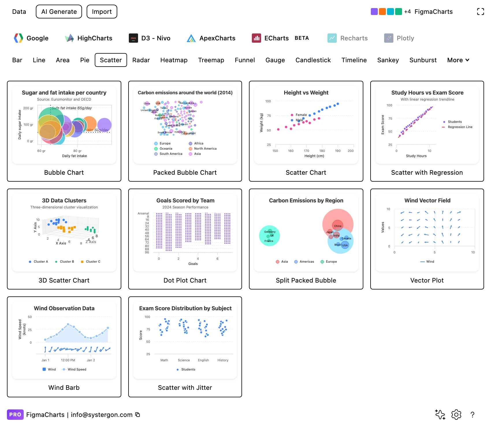
1. Filter to Scatter. Library tab first, then the chip. Every tile is live output — and the Scatter chip is where the bubbles, dot plots and jittered strip plots live too, because none of those has a category of its own.
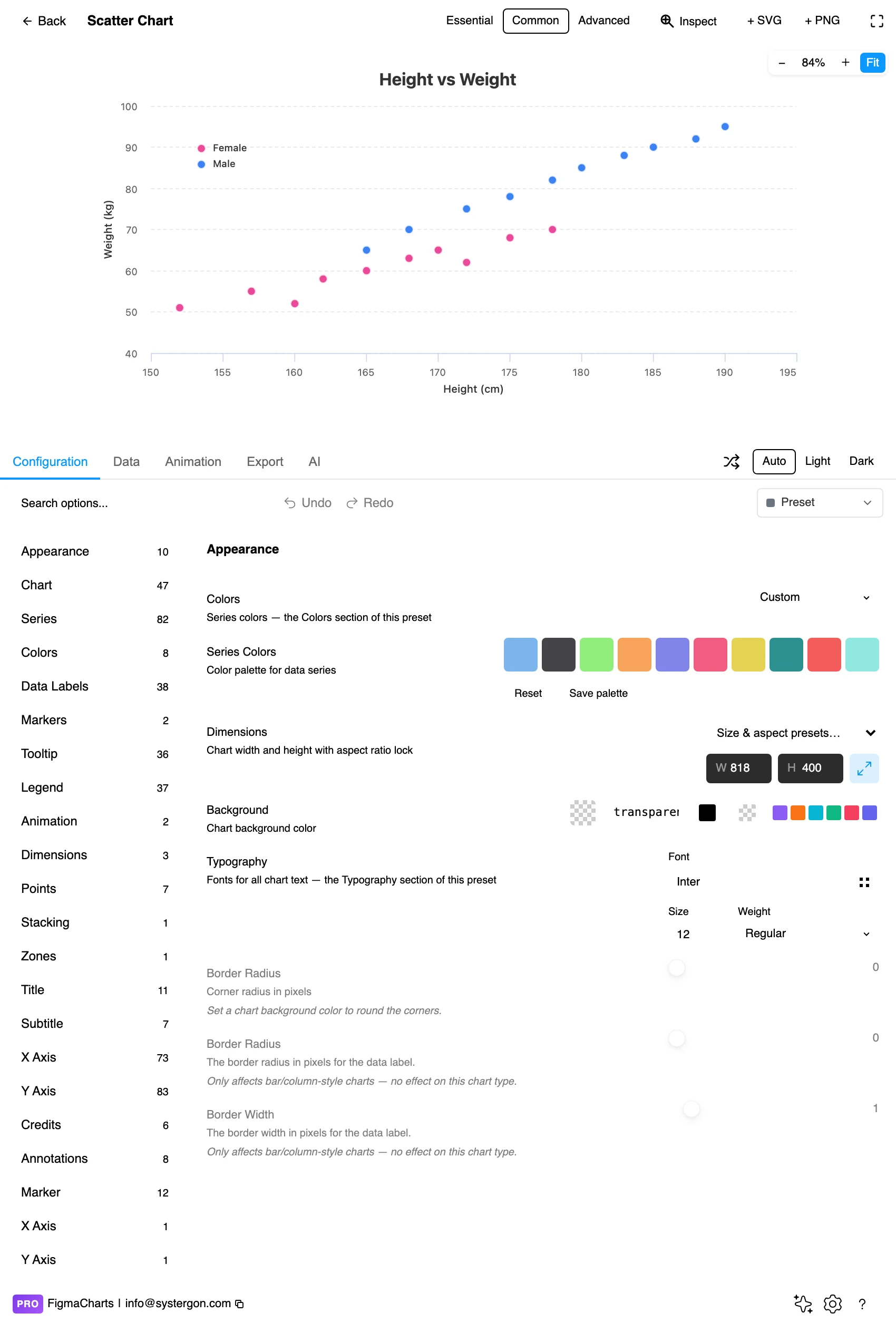
2. The editor. Live preview above, tabs below. For a scatter, resist styling until the points are in — the marker size that looks right for 30 sample points is wrong for 3,000 real ones.
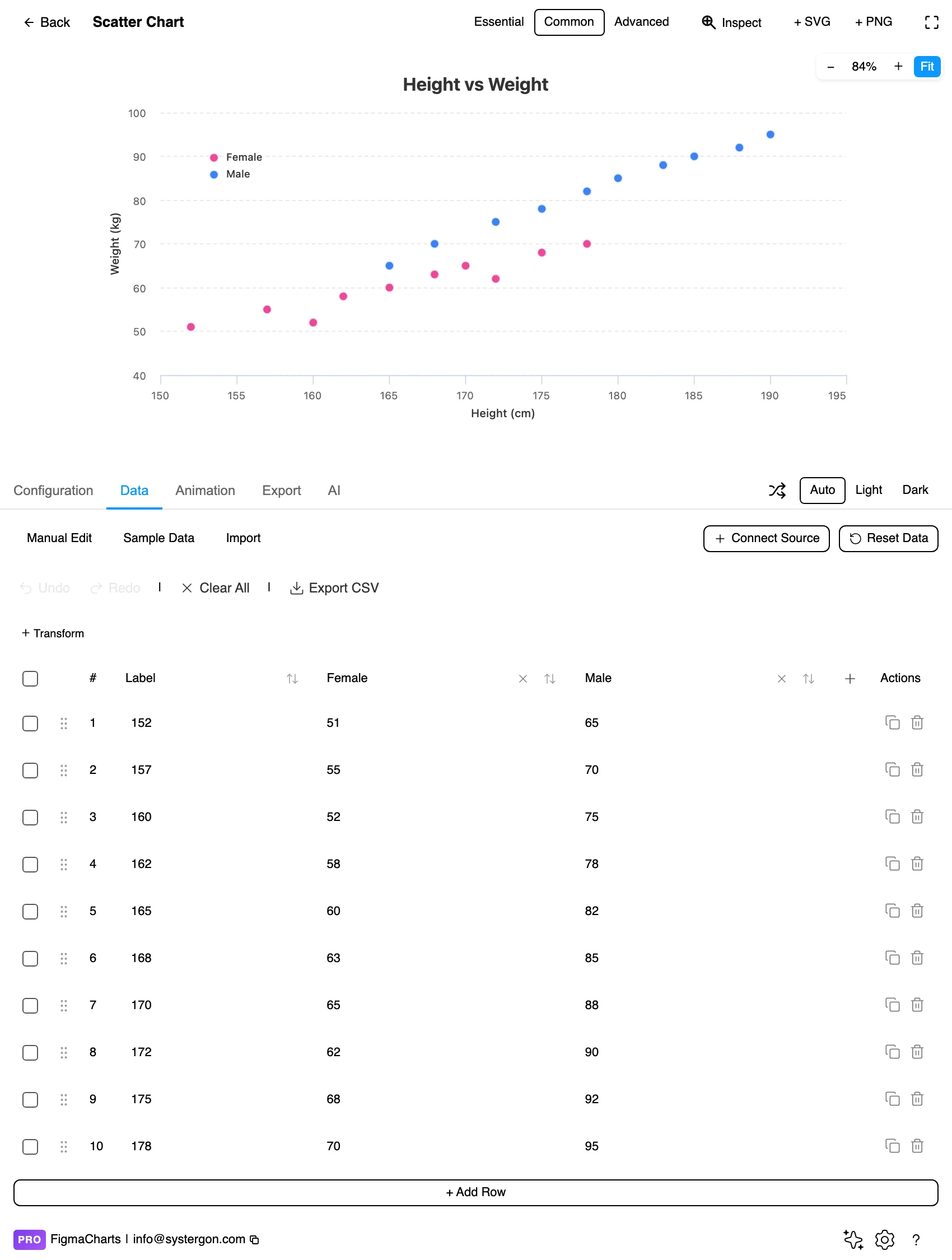
3. Your pairs. This is the step that behaves differently for this chart type. In ECharts a scatter opens a JSON editor so the points stay [x, y] pairs; in the other four it opens the ordinary table, where the y values are editable and the x values arrive as row labels.
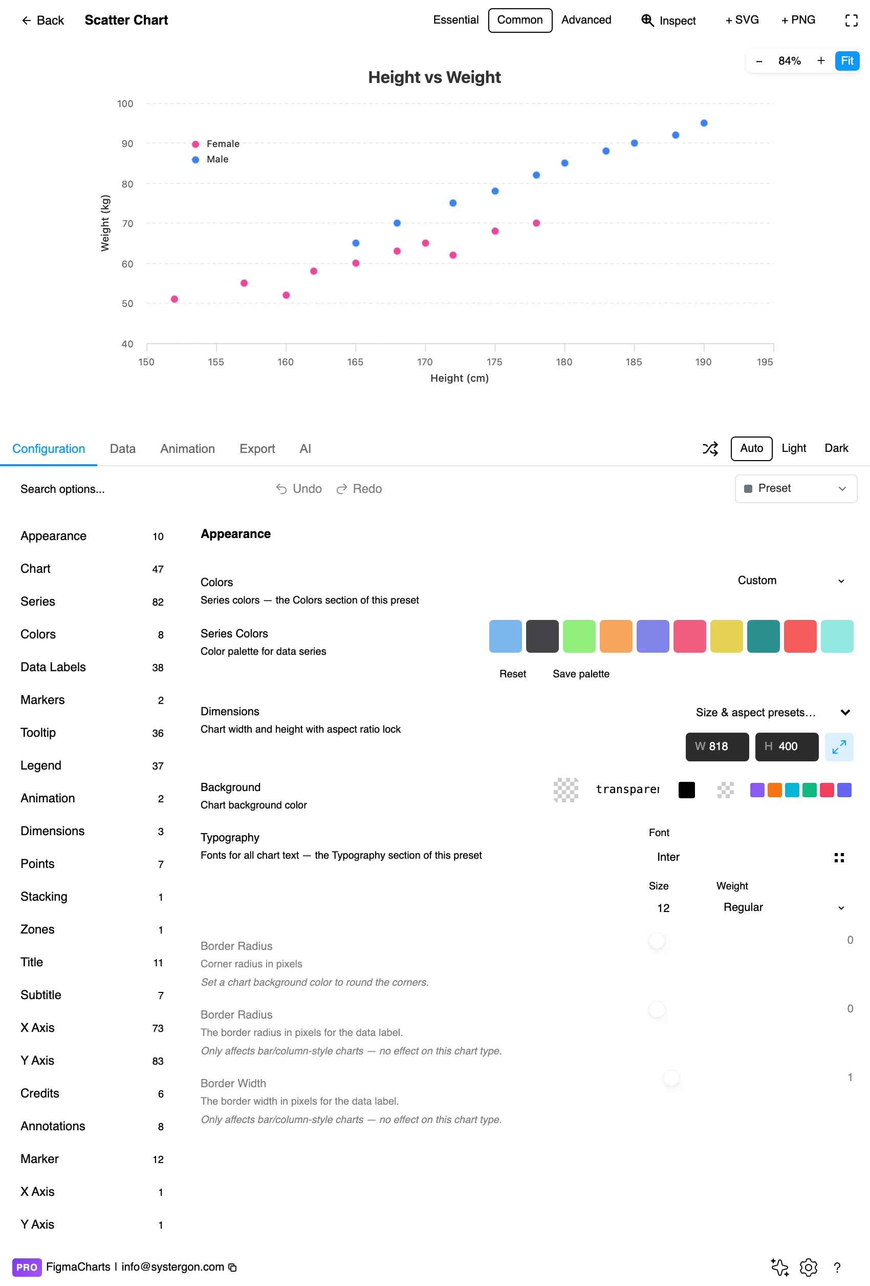
4. Fix the overplotting. Marker size and opacity live here, and they are the decision that determines whether the chart is readable at all. Search the options rather than hunting the tree.
5. Export. A working component for React, Vue 3, Angular, Svelte or vanilla JavaScript — or the Config alone, which for a scatter is the honest way to hand over point coordinates exactly as drawn.
6. Insert. SVG keeps every marker as a vector shape, which is what you want for a scatter — a few thousand points survive as real geometry and stay crisp at any zoom.
Two shortcuts worth knowing. The Essential / Common / Advanced control in the editor header sets how much furniture the chart carries — and scatter plots are the type where Essential is most often wrong, because a scatter without axis labels and units is a decorative cloud. And if you want to change one element rather than hunt the option tree, turn on the Inspector and click the thing; it filters the configuration panel to that element. The Inspector works on Highcharts and ApexCharts.
Everything in the Scatter category is the same object with a different question attached. These are all real examples from the gallery.

Bubble — a scatter with a third variable mapped to marker area. Note that area, not diameter, carries the value: doubling a radius quadruples the ink, and every library here gets that right by default. There is no Bubble category in the plugin; bubbles live here.

Dot plot — one axis is categorical. The horizontal position no longer carries magnitude, so this is a distribution shown per category rather than a relationship between two measures.

Jittered — the fix for a categorical scatter where identical values stack invisibly on one line. A small random offset separates them, and Highcharts exposes it directly as a jitter option on the series.
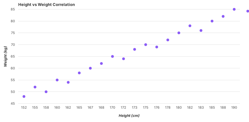
With a fitted trendline — Google Charts computes this from your data with a single trendlines option. Worth contrasting with Highcharts’ regression example, whose “trendline” is a two-point line with hand-authored endpoints: it looks identical and will not follow your numbers when you swap them in.
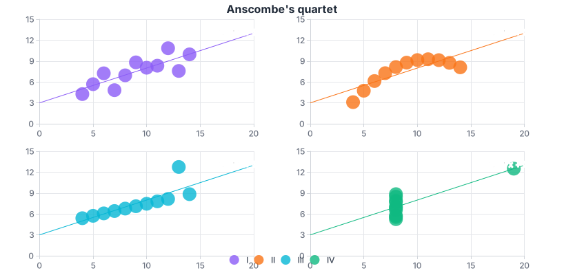
Anscombe’s quartet — four datasets with identical means, variances and correlation coefficients, and four completely different pictures. It ships in the ECharts gallery, and it is the single best argument for drawing the points instead of reporting the statistics.
All five draw scatter plots, and unusually for this series all five give it a category of its own. The 52 examples are distributed very unevenly, and the distribution tells you where the thinking has gone:
trendlines option and the fit is drawn, linear, exponential or polynomial. Its bubble chart takes the five-column id/x/y/group/size shape.One caution about trendlines, since three of these libraries appear to offer them. Google’s is a genuine fit calculated from your data. ECharts’ four regression examples are genuine fits too. Highcharts’ Scatter with Regression example is a straight line drawn between two hand-authored endpoints — it looks like a regression and it is a decoration. Swap in your own numbers and that line will not follow them. A trendline you drew is not a trendline you fitted, and only one of those belongs in a chart that is making an argument.
The rule that beats all of the above: if your engineers already use one of the five, design in that one. The chart you approve is then the chart they ship, because the export lists that library’s own npm package at the same major version the plugin rendered with. Choosing the right chart library covers the trade-offs in full.
A scatter plot has fewer elements than most charts and more ways to ruin them, because every decision is about legibility under crowding.
Marker size and opacity are one decision, not two. Large opaque markers read beautifully at thirty points and become a solid mass at three thousand, so start from your actual point count. A few hundred points want small markers at around 40–60% opacity, so overlap darkens rather than hides and density becomes a visible variable. Thousands want smaller markers still; tens of thousands want a different chart.
Overlap is information, so let it show. The single most common scatter failure is opaque markers stacked on each other: ten identical observations and one look the same, and the chart quietly under-reports its own most common value. Transparency is the cheapest fix. Jitter — a small random offset — is the right fix when values are discrete or categorical, and Highcharts exposes it directly.
Colour should mean group membership, or nothing. In a single-group scatter, one colour. When colour encodes a category, keep it to about five groups — past that a reader cannot hold the legend in their head while scanning a cloud. A continuous third variable needs a sequential scale and a legend that shows the range.
Bubble sizes must scale by area, not diameter. Doubling a radius quadruples the area, so diameter-scaled bubbles overstate the largest values fourfold. The libraries get this right by default; the risk is what happens afterwards, when someone resizes the marker layers by hand in Figma.
Gridlines quieter than the data, and both axes labelled with units. A scatter plot has two measured axes, which means two chances to leave the reader guessing. “Revenue” and “Sessions” are not units; “Revenue (£000s)” and “Sessions per week” are.
Aim for a roughly square plot area. A scatter plot has no natural orientation, and stretching one axis rotates the apparent slope of the cloud — a wide frame flattens a relationship, a tall one steepens it. Square is the neutral default, and any departure from it is an argument you are making with the frame rather than the data.
For type and colour, bind them to your design system rather than picking by hand — the plugin can build a palette from your Figma colour variables and bind chart text to your text styles, which is covered in Your chart, your design system.
A scatter plot is the most honest chart type and it is not a safe one. It hands the reader raw observations and lets them draw the conclusion, and readers draw conclusions that are not there.
Correlation is not causation, and a scatter plot is where the confusion is manufactured. Two measures rising together is compatible with x causing y, y causing x, both being driven by something you have not plotted, or coincidence — and the picture looks identical in all four cases. A tilted cloud is evidence that something is worth investigating. It is not a finding, and a title that states it as one (“Faster load times drive conversion”) is doing the reader’s thinking badly on their behalf.
Summary statistics hide the shape, which is the whole argument for this chart. Anscombe’s quartet — four datasets with identical means, variances and correlation coefficients, and four completely different pictures — is in the ECharts gallery in this plugin, and is worth opening once. One is a clean linear relationship, one a curve, one a straight line with a single point dragging it, and one a vertical stack whose outlier invents the correlation single-handed. All four report the same numbers.
A fitted line is a claim about the future, and the fit type is part of the claim. Linear says “this rate continues”. Polynomial says “this curve continues”, which is a much bigger promise, and a high-order polynomial can be made to pass through almost any set of points while predicting nothing at all. Fit the simplest curve that describes the data, and be suspicious when a wiggly one fits perfectly — that is usually the model memorising your noise.
The axis range is a rhetorical device here too. Unlike a bar chart, a scatter plot has no obligation to start at zero — nothing is encoded as length from a baseline, and forcing zero onto a cloud of values between 180 and 220 wastes the entire plot area. But the reverse trick is live: cropping to the tightest possible range magnifies scatter into a dramatic pattern. Choose a range that shows the data with a little air around it, and keep it stable across a set of charts that are meant to be compared.
Clipped outliers are edits. Setting an axis maximum that leaves points outside the frame silently removes observations, and the removed ones are exactly the observations most likely to matter. If an outlier is distorting the view, say so in the chart — annotate it, or break the axis explicitly — rather than letting it fall off the edge.
Groups can reverse the story. A relationship that is positive within every group can be negative overall when the groups are pooled — Simpson’s paradox, and a scatter plot is one of the few charts that can show it happening. If you have a grouping variable, colour by it before you conclude anything about the pooled cloud.
And zero is a value. Unparsed cells in a numeric column arrive as 0 rather than as gaps, which in a scatter plot draws a suspiciously straight line of points along an axis. If you see one, the fix is in the data, not the chart.
Scatter plots are among the hardest charts to make accessible, because their content is thousands of small marks with no text.
Distinguish groups by shape as well as colour. This is the one chart type where marker symbol is genuinely load-bearing: circle, triangle, square and diamond survive every form of colour vision deficiency and survive printing. Around one in twelve men has some form of colour vision deficiency, and small marks are the worst case for it — two colours that are clearly different in a legend swatch can be indistinguishable at 4px.
Test contrast at marker size, not swatch size. A semi-transparent marker over a gridline is a different contrast problem from a solid bar on a background, and it is the one you shipped. If markers sit at 50% opacity, check them at 50% opacity.
Do not hide the values in the tooltip. A scatter plot exported to SVG has no hover, and a hover-only chart excludes keyboard and screen-reader users entirely. Anything essential — the outlier’s identity, the axis units, the group names — belongs on the canvas, as a direct label or an annotation.
Give it a text equivalent. The Export tab has three buttons most people never notice: Copy Alt Text generates a description, Copy Data Table produces an HTML table of the underlying numbers, and Set Node Desc writes the description onto the Figma node so it travels with the design. For a scatter plot the data table is not a nicety — a paraphrase of a point cloud (“a positive correlation”) is exactly the summarising that the chart exists to avoid, so a screen-reader user who gets only the paraphrase gets the conclusion without the evidence.
Because the chart was rendered by a real charting library, the handoff carries the chart rather than a picture of it. From the Export tab:
The whole of that, including the accessibility exports and the embed generator, is in From Figma to code.
A third variable. A scatter plot uses position on two axes; a bubble chart adds marker area as a third measure, and adding a categorical column for colour makes four. In this plugin bubbles do not have a category of their own — they sit under Scatter, and Google, Highcharts, ECharts and ApexCharts each ship at least one.
No, and usually it should not. The zero-baseline rule exists because bars encode value as length from a baseline; a scatter encodes value as position, so a range that fits the data with a little air around it is both legitimate and clearer. What is not legitimate is cropping the range so tightly that ordinary variation looks like a dramatic pattern.
Three fixes, in order: reduce opacity so overlap darkens instead of hiding, reduce marker size, then jitter — a small random offset that separates identical or discrete values. Highcharts exposes jitter directly in its scatter options, and ECharts ships a jittering example. If none of the three work, you have too many points for a scatter and should bin them into a heatmap.
It depends on the frame, not on a number: too many is the moment the cloud stops having visible density. In a typical 600–800px plot area a few thousand semi-transparent points still read. Beyond that, use ECharts’ large-scale scatter, sample the data and say that you did, or switch to a density representation.
Yes, and it matters which library. Google Charts computes one from your data with a single trendlines option (linear, exponential or polynomial). ECharts ships four fitted regression examples — linear, exponential, logarithmic and polynomial. Highcharts’ regression example in the gallery is a hand-drawn line between two endpoints, so it will not follow your numbers when you swap them in.
Because a scatter point is an [x, y] pair and a two-column table cannot hold one without deciding that one of the columns is a label. For ECharts scatter charts the plugin swaps in a JSON editor so your pairs stay pairs. In the other four libraries a scatter opens in the ordinary table, where the y values are editable and the x values behave as row labels.
You can, and the result is a dot plot or a strip plot rather than a scatter. It works well — every observation instead of an average — but it needs jitter, because a categorical axis stacks identical values on one line. Highcharts ships both a dot plot and a jittered example; Nivo has a dedicated swarm plot.
Insert as SVG and every marker, gridline and label is a real layer, with the text as real text. Insert as PNG and you get a flat image at twice the pixel density. Either way the chart reopens in the editor with its settings intact, and Update SVG replaces it in place.
Open the plugin, filter to Scatter, and put your real pairs into an ECharts example — then look at the middle of the cloud rather than the edges. Most of the design decisions on this page are settled by what you see there: whether the points are hiding behind each other, whether there is one group or three, and whether the relationship you expected is actually in the picture.
Install Figma Charts — it’s free to try → Browse all 45 chart types →