Install Figma Charts — it’s free to try → See the map gallery →
A map is the most persuasive chart you can put in a deck and the one most likely to be answering a question nobody asked. It is persuasive because everyone can read it without instruction, and misleading because the sizes on it are geography, not data — the largest shape on a world map of customers is usually Russia, whatever your customers are doing.
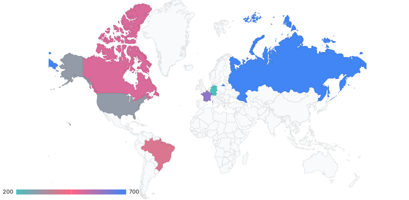
Real plugin output: a Google Charts geo chart captured from the editor. Every map on this page is the library’s own drawing.
This page is about when the geography is genuinely the variable, how to normalise so the map is showing your data rather than population density, and one practical constraint specific to this plugin: of the five libraries, only one will actually render you a map.
Everything below happens inside Figma Charts, a Figma plugin. It runs the real JavaScript charting libraries — Google Charts, Highcharts, D3-based Nivo, ApexCharts and Apache ECharts — inside the plugin window, so the map on your canvas is the library’s own projection and its own region shapes.
Install Figma Charts from the Figma Community →
Press ⌘/ (Ctrl / on Windows), type Figma Charts, hit Enter, and pick Geo from the category filter. There are five examples, all Google Charts — and that is not an accident of filing, as the library section explains.
The choropleth colours regions — countries, states, counties — by a value. Its claim is that the region is the unit of analysis: every point inside a border is treated identically, and the border is assumed to matter. That is true for anything administered regionally (tax, policy, shipping zones, sales territories) and false for anything that happens to people (customers, incidents, usage), where the borders are arbitrary containers.
The point map puts a marker at a coordinate, sized or coloured by a value. Its claim is that the location is a fact about the observation: this store, this incident, this office. Points do not inherit the area distortion of regions, and they bring their own problem — overlap in dense cities.
There is a third form worth naming because people reach for it and the plugin cannot draw it: the flow map, with arcs between origins and destinations. ECharts has examples — airline routes, bus lines — and they are among the map examples that need geographic data the plugin does not bundle. For flows between a handful of places, a Sankey diagram carries the quantities better anyway; the map adds beauty and subtracts precision.
Choosing between them is not a style decision. If you can only get data at country level, you have a choropleth; if you have coordinates, you probably want points, and aggregating them up to regions throws information away.
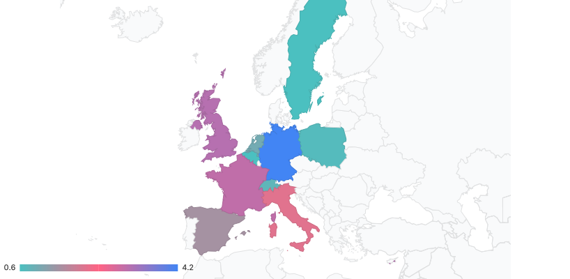
Region-scoped — a continent rather than the world. Scoping is the first thing to do when your data is regional: a world map to show European sales spends nine tenths of its area on countries with no data.
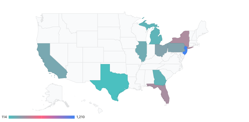
Sub-national — states, provinces, departments. This is where the area-versus-importance problem is sharpest: the largest states on a US map are the emptiest, and a map of customers reliably looks like a map of land.
Markers — the point-map form, with size carrying the value. It sidesteps region-area distortion entirely, and it needs a plan for overlapping cities.
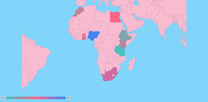
Another scope — every continent and most countries are available as a scope, and choosing the tightest one that contains your data is the single biggest improvement available to most maps.
This is the rule that decides whether a map is informative or decorative.
Absolute counts on a choropleth — customers, orders, incidents, cases — will correlate almost perfectly with how many people live in each region. The map will show that California is bigger than Wyoming, which everyone knew. To make the map about your data, divide by something: per capita, per customer, per thousand sessions, as a share of the regional total.
Two supporting habits. Say what the denominator is, in the legend — “orders per 1,000 residents” is a different map from “orders” and readers must not have to guess which they are looking at. And watch small denominators: rates computed over tiny populations swing wildly, so the most extreme colours on a per-capita map are frequently the least reliable numbers on it.
If normalising makes the map boring, that is a finding: it means the geography was not the story, and a ranked bar chart of the top regions will say more in less space.
1. The geography is not the variable. If the reader’s question is “which regions are biggest?”, that is a ranking, and a bar chart answers it precisely. A map answers “where” — use it when spatial pattern, adjacency or clustering is the point.
2. You have a handful of regions. Six countries is six bars. A map of six shaded countries in a mostly-empty frame is a decorative device with a legend attached.
3. The interesting places are small. City-states, capitals and dense urban areas carry enormous weight and almost no pixels. If your data is about cities, a map at country resolution hides it entirely — use points, or a table.
And the honest fourth: when the map is there to look impressive. Maps are the most requested chart in executive decks and frequently the least informative. The test is whether removing the geography would lose anything.
Half the maps a product designer is asked for are not countries: delivery zones, sales territories, store catchments, a warehouse floor, a stadium, a seating plan. No charting library ships those, and the workaround is worth knowing because it produces better results than forcing the data onto a country map.
Draw the geography in Figma, chart the numbers separately. A vector outline of your zones as a Figma component, filled from a colour scale you also use in a legend, is a map — and it is fully editable, which a rendered chart is not. The plugin’s job in that arrangement is the supporting chart: the ranked bar of zones, the trend per territory.
Or invert the problem and use a tile map. If the regions are administrative but the shapes are unhelpful — small dense areas that vanish — a grid of equal tiles arranged in roughly the right relative positions keeps the spatial intuition and gives every region the same weight. It is a design decision rather than a chart type, and it is why the hexagonal tilemap exists.
What not to do is stretch the data to fit an available map. Assigning territory numbers to whichever country each territory mostly sits in produces a chart that is precise about the wrong thing, and readers will quote it.
Every map has a granularity decision, and it is usually made by whatever the data happened to arrive as. Three things to weigh.
Coarser is more reliable. Country-level rates are computed over big denominators and move slowly; postcode-level rates over small ones swing wildly and produce extreme colours that mean very little. If the fine-grained map looks dramatic, check the sample sizes behind the darkest cells.
Finer is more actionable — when the action is local. A national map cannot tell a field team where to go. If someone will act on the map, its resolution should match the unit they can act on.
Mixed resolutions are a trap. Countries for most of the world and states for the US, on one map, means two different denominators and two different visual weights carrying one colour scale. Split it into two maps, or aggregate up.
Six screens, start to finish, captured from the plugin.
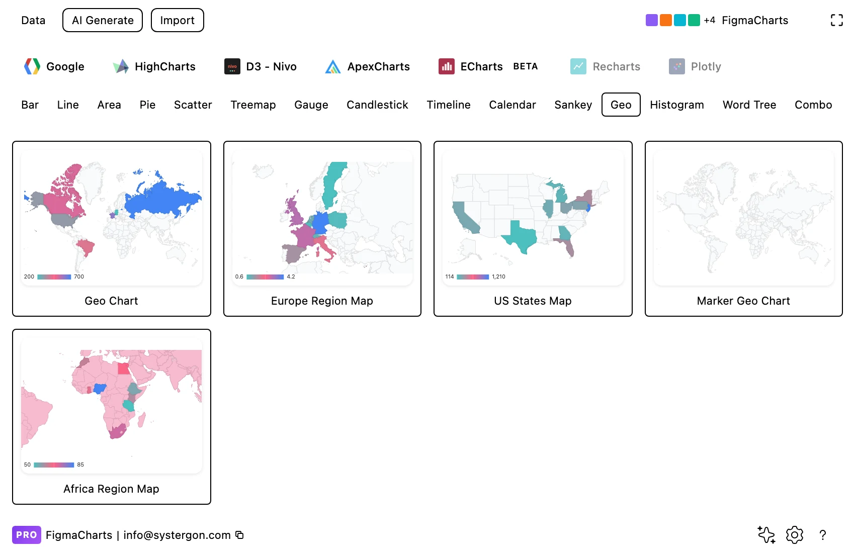
1. Filter to Geo. Every example here is Google Charts — world, continent, country scopes and a marker map.
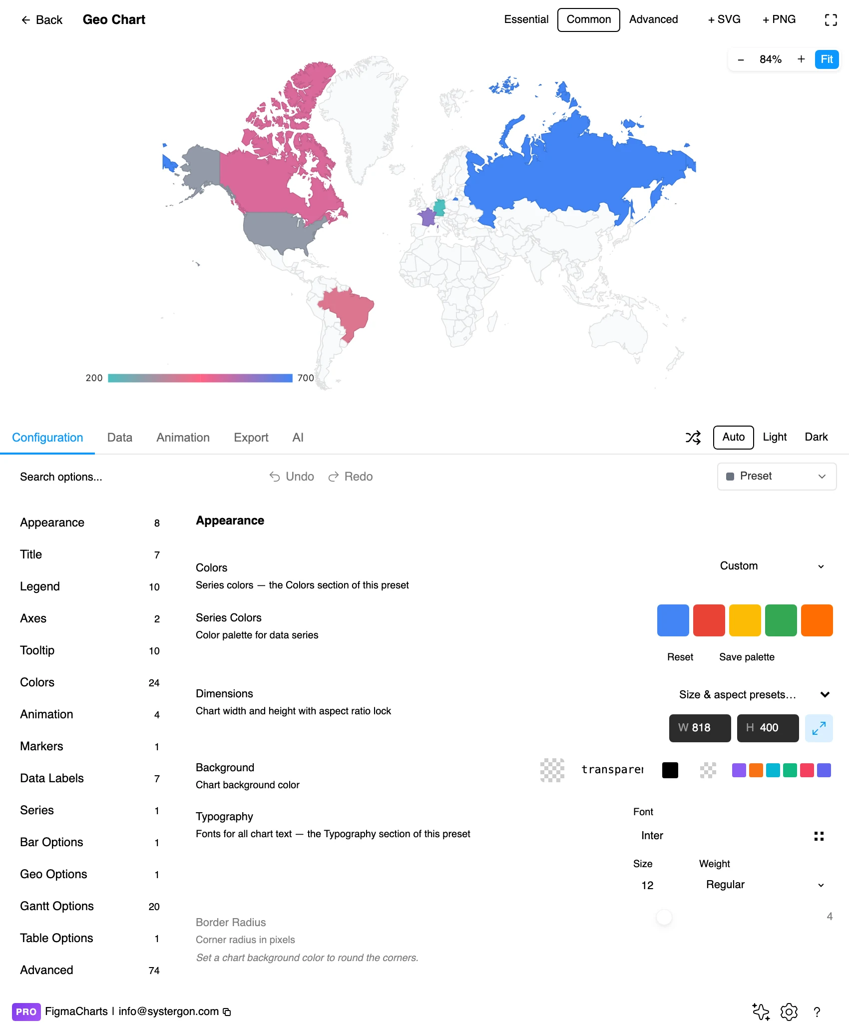
2. The editor. Live preview above, tabs below. Maps have a fixed aspect ratio in practice: setting a width sets the height, so plan the frame around the scope you chose.
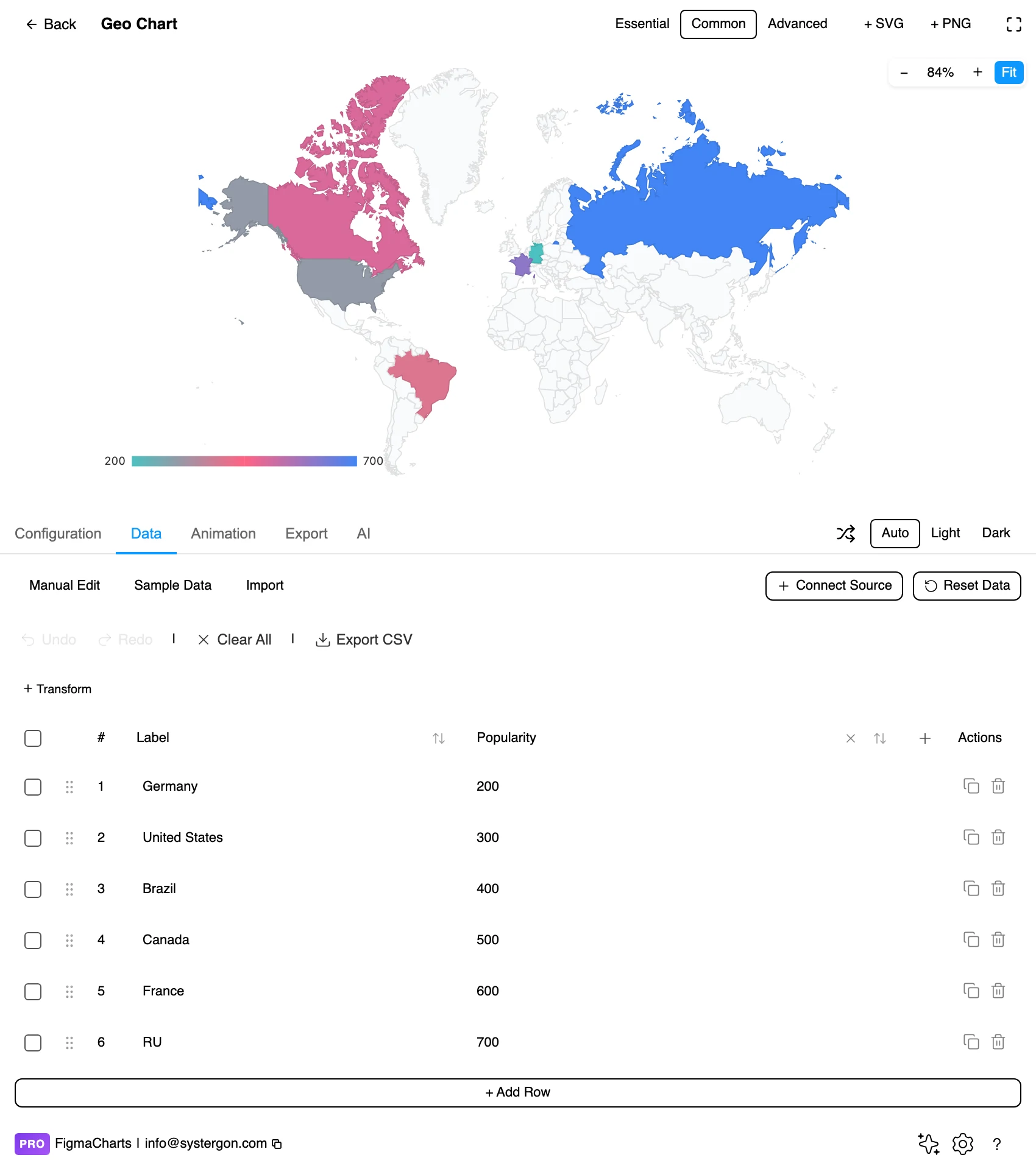
3. Regions and values. One row per region — a name or an ISO code, and a number. Codes beat names: “GB” is unambiguous where “UK”, “United Kingdom” and “Great Britain” are three strings for one place, and an unmatched name simply does not colour.
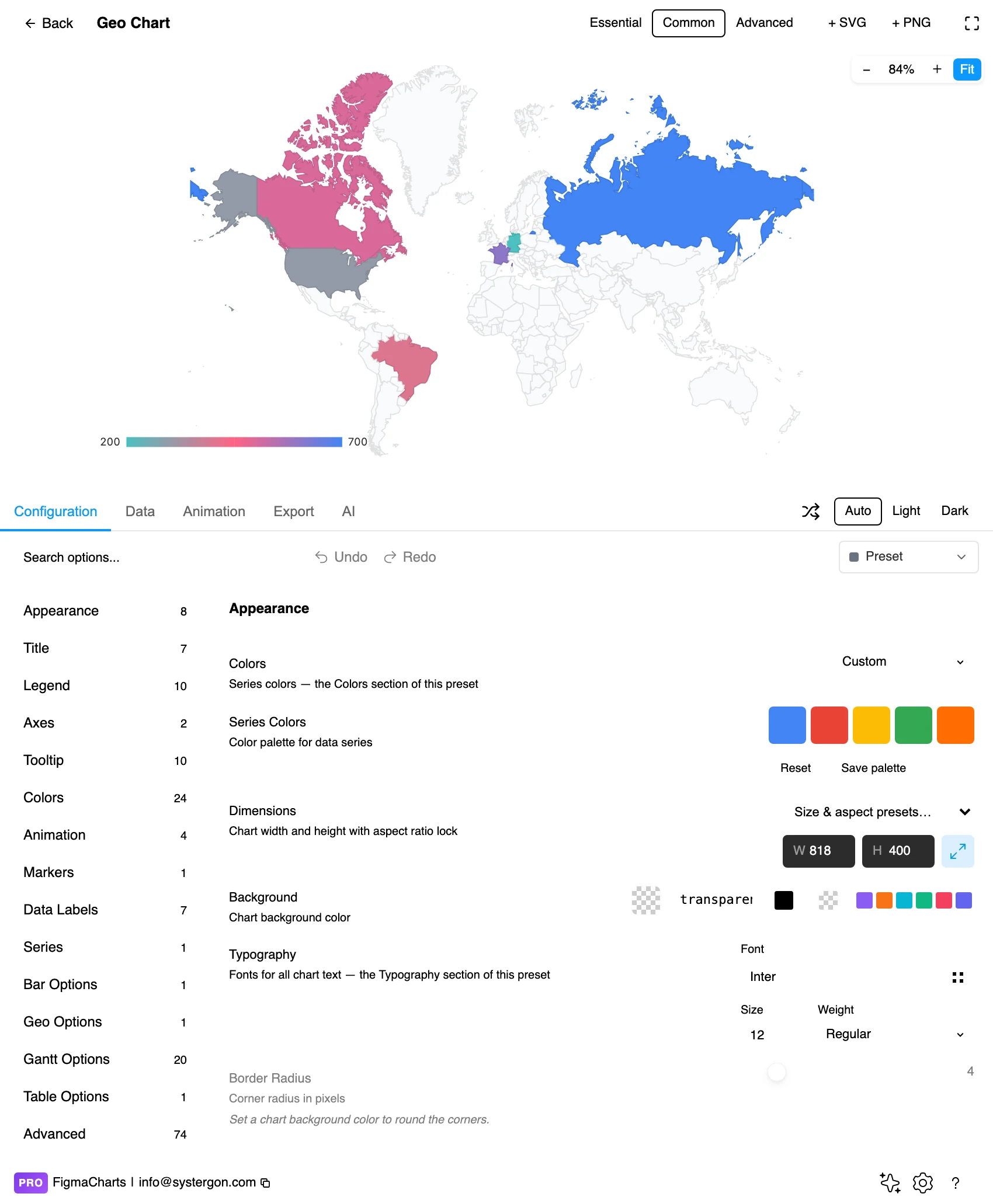
4. Scope and scale. The region to display, the colour ramp and its range, and whether the chart draws regions or markers. Scoping tightly is the biggest single improvement available here.
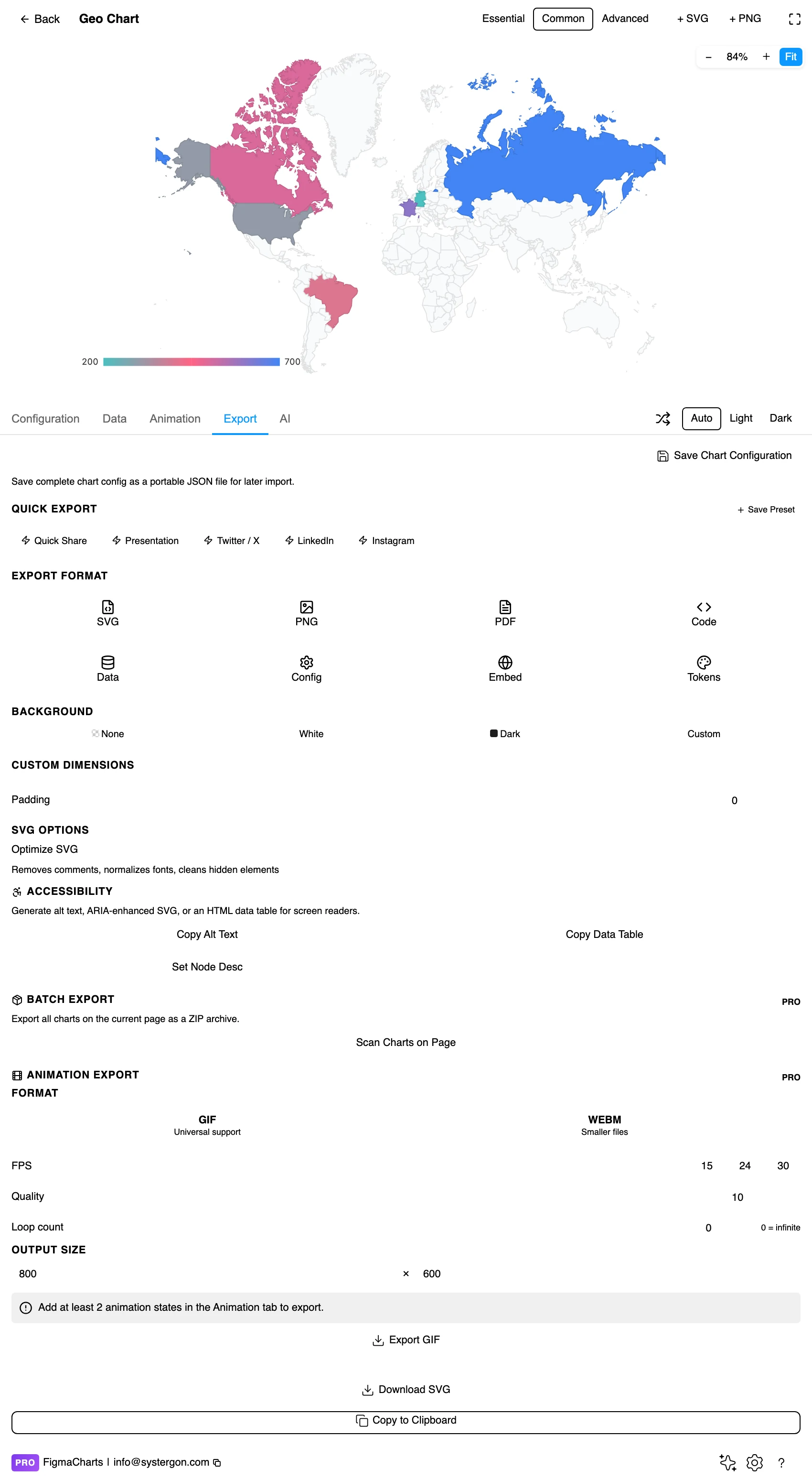
5. Export. A working component for React, Vue 3, Angular, Svelte or vanilla JavaScript, at the version the plugin rendered with.
6. Insert. SVG gives you every region as its own vector path — which makes an inserted map genuinely useful in Figma: you can select one country and restyle it, or delete the regions you do not need.
One row per place and one value. For a choropleth the place is a region identifier — ISO country code, state code, or a name the library can resolve. For a point map it is a latitude and longitude, or a place name the library geocodes.
The plugin classifies geo as a JSON shape, because the underlying formats vary so much between libraries: a Nivo choropleth wants GeoJSON features alongside the values, which is a structure a table cannot express, so it is edited as JSON. Google’s geo chart is the simplest of them — region and value, in the ordinary table.
Two practical notes. Nivo maps cannot bind a linked data source in the plugin, for the same structural reason. And matching is the failure mode to watch: an unrecognised region code is silently left uncoloured, so a map with three missing countries looks like a map where three countries scored zero.
This is the type where the plugin’s constraints matter most, and they are worth stating plainly.
So the practical answer in this plugin is Google Charts, and it is a good one for the common cases: shaded regions with a colour scale, and simple marker maps. If your design needs custom geography — sales territories, delivery zones, a floor plan — the honest route is to draw it in Figma and use a chart for the numbers beside it.
As always: design in whichever library your engineers already use, because the export then matches production exactly. Choosing the right chart library covers the trade-offs.
Scope tightly. The most common map mistake is a world map for regional data. Every empty region is wasted area and a reader has to hunt for the part that matters.
Sequential ramp, and four to six steps. Same rules as any heatmap: single hue, lightness increasing with value, banded rather than continuous when readers are comparing regions to each other. Diverging only when there is a real midpoint — change versus last year, above and below target.
Give unmatched regions their own treatment. A neutral grey with a legend entry reading “no data” keeps them from being read as zero.
Borders quiet, labels sparse. Thin, low-contrast borders let the fill carry the value. Label only the regions the argument needs; a fully labelled map is a reference document, not a chart.
For point maps, use area and transparency. Marker area should be proportional to the value, never diameter, and semi-transparent fills let overlapping cities show density rather than hiding each other.
For type and colour, bind them to your design system rather than picking by hand — covered in Your chart, your design system.
Area is not importance. The fundamental distortion of every choropleth: large sparsely-populated regions dominate the picture, small dense ones vanish. Readers weigh by ink. A cartogram or a tile map — Highcharts’ hexagonal tilemap is one, filed under Heatmap — gives every region equal visual weight and trades away geographic realism to do it.
Projections distort. Web maps are typically Mercator, which inflates high latitudes enormously: Greenland appears comparable to Africa and is a fourteenth of its size. If your data spans latitudes, the projection is silently reweighting it.
Borders imply homogeneity. A single colour across a country asserts that the value is uniform inside it. National figures hide regional variation that is often larger than the differences between countries.
The colour break points are an argument. Quantile breaks, equal intervals and hand-set thresholds produce visibly different maps from identical data. State the method, and prefer round, explicable break points over an algorithm’s.
Missing is not zero. An uncoloured region should mean “no data” and must be visually distinct from the bottom of the scale — the same trap as a calendar heatmap, and just as easy to walk into.
On most charts the legend identifies series. On a map it defines the entire encoding, and three details decide whether a reader can use it.
Show the break points, not just the ends. A gradient bar labelled only “low” and “high” cannot be read back to a number. Banded scales with labelled thresholds — under 5%, 5–10%, over 10% — let a reader convert a colour into a value, which is the difference between a chart and an impression.
State the unit and the denominator. “Orders per 1,000 residents” is the whole claim of the map compressed into four words, and it is the thing most often left off.
Include the no-data swatch. If some regions are uncoloured, the legend has to say so, or the reader will assume the palest fill and the empty fill mean the same thing.
Lightness, not hue. A single-hue sequential ramp works for every form of colour vision deficiency. Red-to-green regional maps are the classic failure.
Do not put essential values only in a tooltip. An inserted SVG has no hover, so a map without labels or an accompanying table is a picture. Pair the map with a small ranked list of the top regions — it fixes the accessibility problem and the precision problem at once.
Give it a text equivalent. The Export tab’s Copy Alt Text, Copy Data Table and Set Node Desc produce a description, a table of the underlying numbers and a description written onto the Figma node. For a map the table is the accessible version, and it is also the version that lets anyone check the claim.
In practice, Google Charts — five examples covering world, continent, country and marker maps. ECharts has map examples but they need GeoJSON that the plugin does not bundle, so they show a “preview needs map data” placeholder. Highcharts has the map module loaded but ships no map examples. Nivo has a choropleth in the library and none in the plugin. ApexCharts has no map type.
Regions when the boundary is the unit of analysis — anything administered or reported regionally. Markers when the location is a fact about each observation, such as stores or incidents. If you have coordinates, aggregating them to regions throws away information.
Because it is plotting absolute counts. Divide by something — per capita, per customer, per thousand sessions — and state the denominator in the legend. If normalising makes the map uninteresting, the geography was not the story.
Almost always because the identifier did not match. Use ISO codes rather than names, and give unmatched regions an explicit “no data” treatment so they cannot be read as zeros.
With markers, sized by area rather than diameter and drawn semi-transparent so overlapping cities read as density. Choropleths at country resolution hide urban patterns completely.
Both give every region equal or value-proportional visual weight instead of geographic area, which fixes the “big empty regions dominate” problem at the cost of looking less like a map. Highcharts’ hexagonal tilemap — filed under Heatmap — is the version available here.
Google’s geo chart takes the ordinary table, so a linked Sheet of region codes and values works. Nivo maps cannot bind a source in the plugin, because their GeoJSON structure is not something the connector can produce.
Insert as SVG and every region is its own vector path — you can select a country, restyle it, or delete regions you do not need, which makes an inserted map unusually useful as a design asset. Insert as PNG for a flat image at twice the pixel density.
Open the plugin, filter to Geo, and put your regional numbers in — then do one test before styling anything: divide every value by the region’s population and look again. If the map changes, the first version was a population map and the second is your data. If it barely changes, you have learned that geography is not the variable, and a ranked bar chart will make the point faster.
Install Figma Charts — it’s free to try → Browse all 45 chart types →