Install Figma Charts — it’s free to try → See the calendar gallery →
A calendar heatmap draws a year as a grid of days — weeks across, weekdays down, one cell per date, colour carrying the value. Everyone has read one: it is the shape of the GitHub contribution graph. What makes it worth more than a line chart of the same numbers is that it exposes the two rhythms a time series hides: the weekly cycle and the annual one, both visible at once, without any analysis.
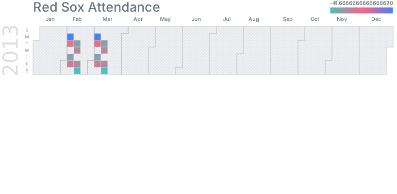
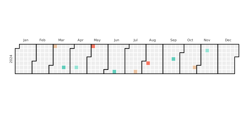
Real plugin output: a Google Charts calendar captured from the editor. Every chart on this page is the library’s own drawing.
It is also the chart where “no data” and “a value of zero” look most alike, and where a colour scale does the most damage per pixel. This page covers both, plus the filing quirk that sends people looking in the wrong category.
Everything below happens inside Figma Charts, a Figma plugin. It runs the real JavaScript charting libraries — Google Charts, Highcharts, D3-based Nivo, ApexCharts and Apache ECharts — inside the plugin window, so the grid on your canvas is the library’s own layout.
Install Figma Charts from the Figma Community →
Press ⌘/ (Ctrl / on Windows), type Figma Charts, hit Enter, and pick Calendar from the category filter — then look under Heatmap as well, because that is where two libraries keep theirs. The library section explains.
The grid is the argument. Because every column is a week and every row is a weekday, two patterns become shapes rather than statistics:
Two more things fall out of the layout for free. Streaks and gaps are visible as runs of colour — which is why the form is used for habit tracking. And single unusual days stay visible as themselves rather than being absorbed into a weekly total.
A fourth reading is available if you look for it: the shape of the working year. Public holidays, shutdown weeks and the pattern of leave show up as pale columns in an otherwise dark grid, which is often the fastest way to spot that a metric is driven by staffing rather than demand.
What you give up is precision. Colour is the least accurate encoding, so a calendar answers “when” and “roughly how much”. If a reader needs to compare Tuesday with Thursday exactly, this is the wrong chart — and the right one is a bar chart of those two days.
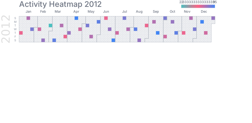
The full year — the canonical form: 52 or 53 week columns, seven weekday rows, one cell per day. It fits a wide layout and it is the version most readers already know how to read.
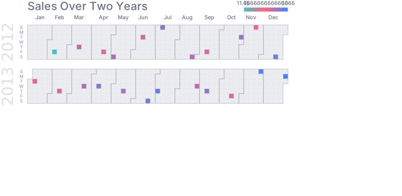
Multiple years stacked — the comparison version. Year-over-year seasonality becomes vertical alignment: the same week in three consecutive years sits in one column. It only works if every year shares one colour scale.
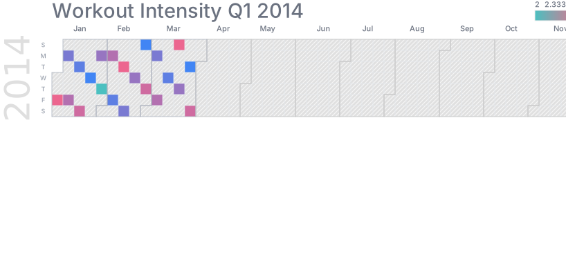
With a custom scale — the setting that matters most. Whether the ramp is one hue or three, continuous or banded, decides how much of the variation a reader can actually see.
Nivo’s calendar — the D3 look, with month boundaries drawn as gaps rather than lines, which is the cleaner treatment when the grid is dense. React-only export.
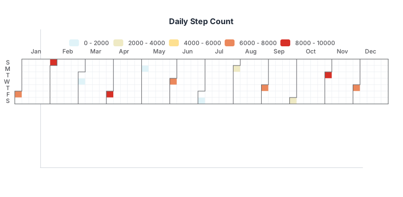
And ECharts’ calendar heatmap — which you will not find under Calendar. ECharts builds it as a heatmap on a calendar coordinate system, so its four calendar examples carry the Heatmap chip instead. Highcharts does the same with its one.
This is the failure that matters most, because the two look identical unless you make them different.
A calendar covers every date in its range whether you have data for it or not. If your source only contains days where something happened, every other day is missing — and most implementations will draw missing days in the palest colour of the scale, which is exactly how a genuine zero is drawn. A reader cannot distinguish “no deployments that day” from “we were not collecting data yet”.
Three fixes, in order of honesty:
The plugin’s numeric coercion makes this sharper: a cell that will not parse becomes 0, which on a calendar is a real, coloured, plausible-looking day of no activity.
1. Your data is not daily. The unit of the chart is one day per cell. Weekly or monthly data leaves you drawing seven identical cells per week, which is a bar chart with extra steps and a false impression of daily resolution.
2. You need to read values. Colour cannot be read to two significant figures. Pair the calendar with a line chart, or put the numbers in the cells if the range is short enough to allow it.
3. The range is under about two months. Below that there is no annual shape and barely a weekly one, and a plain bar chart of days is more readable and more precise.
A fourth: when a handful of days dominate. One Black Friday at fifty times the daily norm flattens the entire rest of the year into the bottom of the scale. That has fixes — a log scale, a capped scale with the outlier annotated, banded steps — and it must be handled deliberately or the chart shows one day and 364 shades of nothing.
The best-known calendar heatmap in the world is a product feature rather than an analysis, and it is worth studying because the design decisions behind it are all deliberate.
It uses five steps, not a gradient. Levels rather than a continuous ramp, so a reader can say “that is a level-three day” and compare it to another one across the year. Precision was traded away on purpose.
It caps the top level. A day with two hundred commits and a day with twenty share the darkest square, which stops a single unusual day from flattening the rest. That is a defensible cap because the chart is about consistency rather than volume — and it would be indefensible in a revenue chart.
It shows a rolling year, not a calendar year. The range ends today and starts twelve months ago, which keeps the most recent weeks at the right-hand edge where the eye lands. A January-to-December grid puts the current month somewhere in the middle for most of the year.
The empty state is the point. Long pale stretches read as absence, which is the honest reading only because every day in range genuinely has a value of zero rather than being missing. The pattern works precisely because that distinction was handled.
A calendar heatmap rarely stands alone in a serious analysis, because it trades precision for pattern. Three pairings do most of the work.
With a line chart. The calendar shows the rhythm, the line shows the level. Together they answer “when” and “how much”, and they share a date range so the reader can move between them.
With a weekday bar chart. If the weekly banding turns out to be the finding, prove it: seven bars of the average by weekday states it precisely, where the calendar only suggests it.
With a month-by-year matrix. For multi-year seasonality, a twelve-by-N heatmap of months against years is more compact than stacked calendars and much easier to compare down a column — the calendar is better for streaks, the matrix for seasons.
Six screens, start to finish, captured from the plugin.
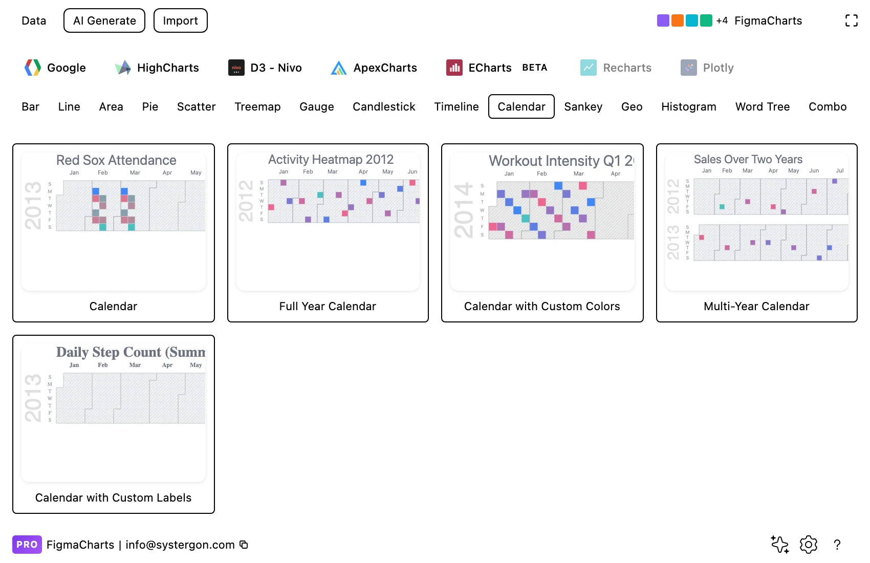
1. Filter to Calendar. Google Charts and Nivo have the category. ECharts and Highcharts keep their calendar heatmaps under Heatmap, so check both chips before deciding a library cannot do this.
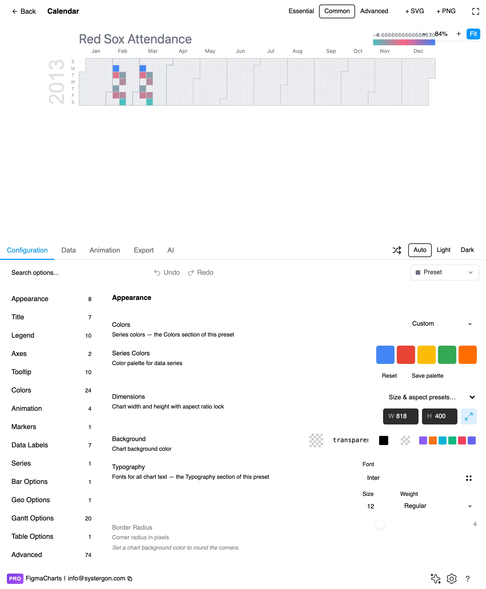
2. The editor. Live preview above, tabs below. Calendars are wide: set the output width early, because cell size is the whole readability budget.
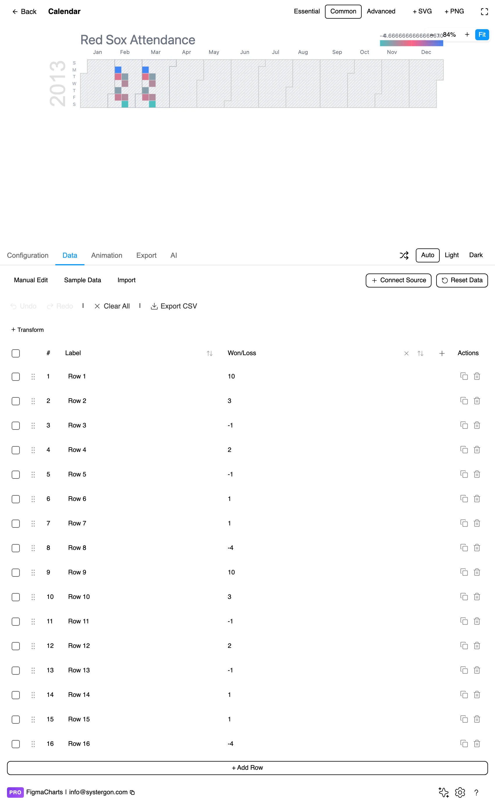
3. Date and value. One row per day — a date and a number. In ECharts the plugin provides a dedicated calendar editor for exactly this shape; elsewhere it is the ordinary table.
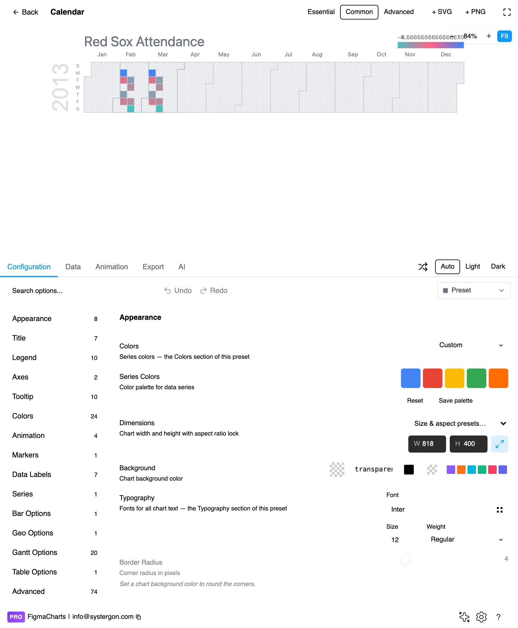
4. The colour scale and the range. Which dates are covered, which week the row order starts on, and how values map to colour. This panel is where the chart is actually made.
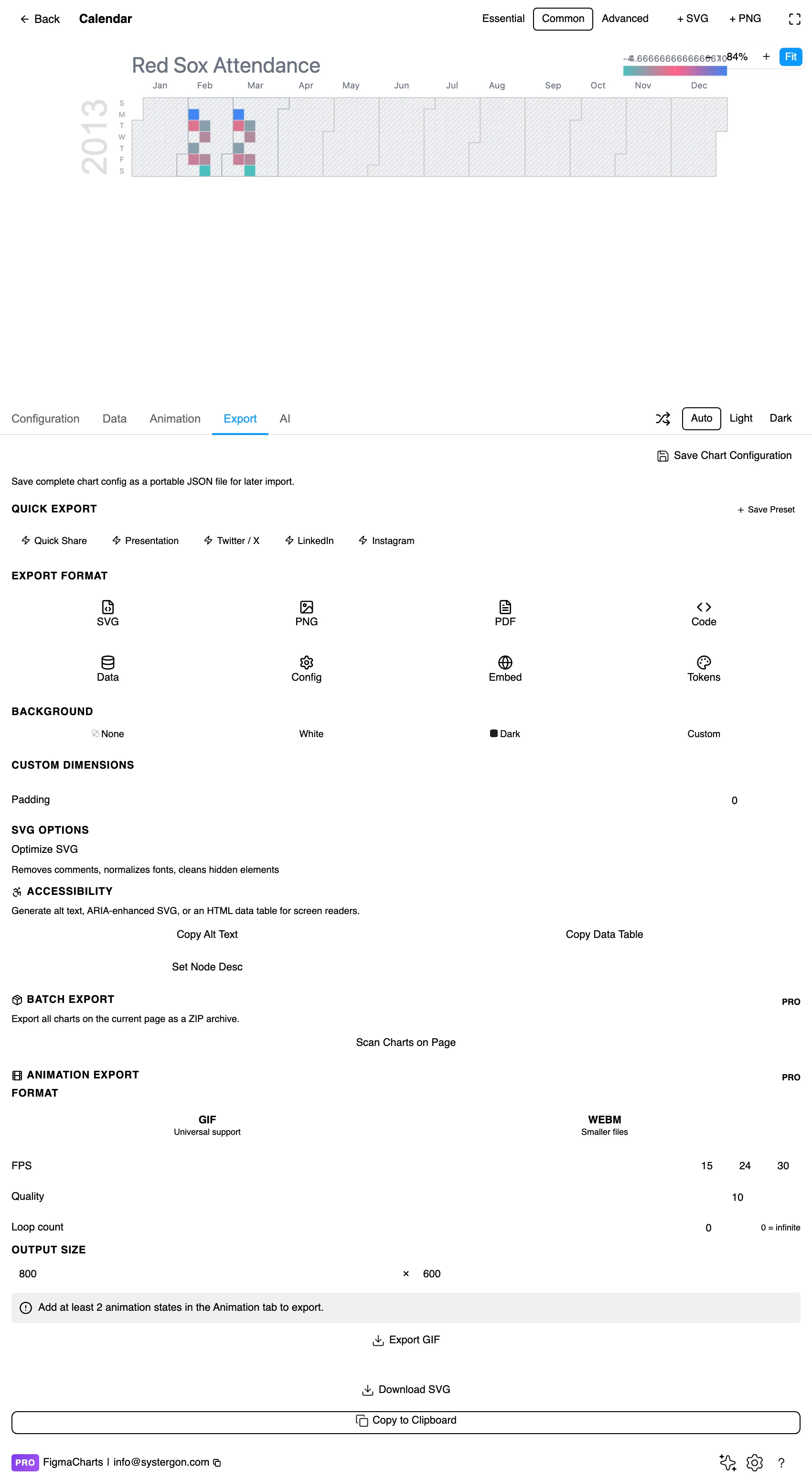
5. Export. A working component for React, Vue 3, Angular, Svelte or vanilla JavaScript — or the Config alone, which carries the colour stops and the date range.
6. Insert. SVG gives you every day as a real rectangle, so annotating a specific date — a launch, an outage — is a canvas operation.
The plugin treats calendar as its own shape: date-value pairs, one row per day. In ECharts that opens a dedicated calendar editor built for date-and-number rows; in Google Charts and Nivo it is the ordinary table.
Two constraints worth planning around. Google Charts and ECharts calendars cannot bind a live data source — the plugin refuses the connection rather than corrupting the chart, because both expect a specialised date structure. Nivo’s calendar is not restricted. And the date format has to parse: mixed formats and localised month names fail silently, which on a calendar means days quietly dropping out of the grid rather than throwing an error.
Aggregation is your job, not the chart’s. If your source has one row per event, you need one row per day with the count — a calendar draws what you give it and will happily plot the last event of each day as though it were the day’s total.
The Calendar category holds six examples: Google Charts 5, Nivo 1. That is the chip, and it understates the plugin badly.
ECharts and Highcharts both draw calendar heatmaps and neither appears in this category, because both build the chart as a heatmap on a calendar coordinate system — so their examples carry the Heatmap chip. ECharts has four (including horizontal and vertical layouts) and Highcharts has one. Four libraries can draw this chart; two chips hold them.
As always: design in whichever library your engineers already use, because the export then matches production exactly. Choosing the right chart library covers the trade-offs.
Sequential scale, four or five steps. A calendar is the one heatmap where banded colours usually beat a continuous ramp: readers are counting shades (“a dark day, a mid day”) rather than measuring them, and four or five steps are memorable where a gradient is not. That is exactly what the GitHub graph does.
Square cells with a hairline gap. Rectangular cells make the weekly banding read as stripes; a one or two pixel gap keeps each day a discrete object rather than a continuous field.
Label months, not weeks. Twelve labels along the top orient the reader; 52 week numbers do not. Weekday labels on the left need only Mon, Wed, Fri to be legible.
Mind the week start. Sunday-first is the US convention, Monday-first is the ISO and European one, and the choice moves the weekend band from the edges to the bottom. If your audience is international, Monday-first keeps the weekend contiguous, which is what makes the weekly rhythm legible.
Keep the legend. A calendar without a colour key is decorative. Even the GitHub graph keeps its “Less → More” ramp, and that is with a scale readers have seen thousands of times.
For type and colour, bind them to your design system rather than picking by hand — covered in Your chart, your design system.
The scale maximum decides everything. Anchor the ramp to the highest day and one outlier flattens the year; cap it at a percentile and the top days all look the same. Both are defensible, and the choice must be disclosed — “capped at the 95th percentile” in the legend is enough.
Blank is ambiguous by default. Covered above, and worth repeating because it is the one thing readers cannot recover from: no data and zero must look different.
Weekly banding can be an artefact of collection. A five-day pattern in a chart of support tickets might be customer behaviour — or it might be that nobody triages at weekends and Monday carries three days of backlog. The chart shows the recorded date, not the event date.
Years are not the same length. A 53-week year, a leap day, and the fact that a year does not start on a Monday all mean stacked years do not align perfectly. Compare shapes across years, not individual columns.
Colour intensity is not proportional. A day twice as dark is not twice the value — it is one or two steps up a scale you designed. Readers will infer proportionality anyway, which is why the numbers belong somewhere: a tooltip in a product, a caption on a slide.
Vary lightness, not just hue. A single-hue ramp from pale to dark is readable with any form of colour vision deficiency, because lightness is the channel everyone shares. Multi-hue calendar scales are the ones that fail.
Do not let the smallest cells carry the meaning. A year of days at 8px each is at the edge of legibility; below that, group into weeks or shorten the range.
Give it a text equivalent. The Export tab’s Copy Alt Text, Copy Data Table and Set Node Desc produce a description, a table of the numbers and a description written onto the Figma node. For a calendar, the useful description is the pattern rather than the days — “weekday activity three times weekend, with a two-week gap in August” carries more than 365 rows.
Showing the weekly and annual rhythms of a daily series at the same time, plus streaks, gaps and individual unusual days. It answers “when” well and “how much” roughly.
Four of the five — but only two carry the Calendar chip. Google Charts (5 examples) and Nivo (1) are under Calendar; ECharts (4) and Highcharts (1) file theirs under Heatmap, because they build the chart as a heatmap on a calendar coordinate system. ApexCharts has none.
Give them no fill — an empty cell with a hairline outline — so they are visibly different from a genuine zero, which sits at the bottom of the colour scale. Alternatively, restrict the date range to the period you actually cover.
Monday for ISO and most of Europe, Sunday for the US convention. Monday-first keeps Saturday and Sunday adjacent at the bottom of the grid, which makes the weekend band read as one thing — usually the better choice for an international audience.
Four or five banded steps beat a continuous gradient here. Readers are counting shades rather than measuring them, and a small number of distinct levels is far easier to hold in mind — which is why the best-known calendar heatmap in the world uses five.
Cap the scale at a percentile and annotate the outlier, or use a logarithmic mapping, or band the scale. What you must not do is leave the ramp anchored to the outlier, which turns the rest of the year into a single pale shade.
In Nivo, yes. Google Charts and ECharts calendars cannot bind a linked source in the plugin — both expect a specialised date structure, so the connection is refused with a message rather than producing a broken chart.
Insert as SVG and every day is a real rectangle with the month and weekday labels as real text, so a launch date or an outage can be annotated on the canvas. Insert as PNG for a flat image at twice the pixel density.
Open the plugin, filter to Calendar — and to Heatmap, if your library is ECharts or Highcharts — and put a year of daily values in. Then check one thing before styling: are the blank days genuinely zero, or genuinely unknown? Everything else on this page is craft; that one is the difference between a chart that informs and a chart that quietly invents 90 days of inactivity.
Install Figma Charts — it’s free to try → Browse all 45 chart types →