
Install Figma Charts — it’s free to try → See the heatmap gallery →
A heatmap makes a deliberate trade that no other chart makes so openly. Colour is the least accurate thing human vision judges — worse than length, worse than position, worse than angle — and a heatmap encodes every one of its values in colour anyway. What it buys with that sacrifice is scale: a grid of four hundred cells is legible at a glance in a way that four hundred bars never could be, because you are no longer reading values, you are reading a pattern.
Which means a heatmap is only worth drawing when there is a pattern to see, and whether there is one depends almost entirely on a decision most people make by accident: the order of the rows and columns. This is what a heatmap is for, when it is the wrong tool, how to build one in Figma against your real numbers, what each library gives you — including the one that cannot draw a matrix heatmap at all — and how to choose a colour scale that is not lying to your reader.
Real plugin output: a Highcharts heatmap captured from the editor. Every chart on this page is the library’s own drawing, not an illustration of one.
Everything below happens inside Figma Charts, a Figma plugin. It does not draw charts of its own: it runs the real JavaScript charting libraries — Google Charts, Highcharts, D3-based Nivo, ApexCharts and Apache ECharts — inside the plugin window, so the heatmap on your canvas is the library’s own output, coloured by its own scale.
Install Figma Charts from the Figma Community →
Press ⌘/ (Ctrl / on Windows), type Figma Charts, hit Enter, and pick Heatmap from the category filter. There are 18 heatmap examples waiting, and they are not evenly spread — see library by library.
A heatmap answers “where are the hot spots?” — across two dimensions at once, for far more cells than you could ever label.
Every cell sits at the intersection of a row and a column, and its colour carries the value. That is the entire grammar. Because position is doing the categorising and colour is doing the measuring, you can scale a heatmap to hundreds of cells without the chart falling apart: ECharts ships one in this plugin with 20,000 data points in it, and it still reads.
What you give up is precision. A reader can tell you a cell is darker than its neighbour; they cannot tell you it is 18% larger, and they will not reliably rank two cells from opposite corners of the grid. If your reader needs to compare individual values, you want a bar chart or a table — and if they need to compare a few values inside a big grid, the right answer is often a heatmap with the numbers printed in the cells, which is a table that has been made scannable.
Four members of the family, all of which the plugin files under Heatmap:
Use a heatmap when you have two categorical dimensions and one measure, when the grid is large enough that reading every value is not the goal, and when the thing you want the reader to notice is a region — a hot row, a cold block, a diagonal.
Three cases where it is the wrong tool, in order of how often the mistake is made:
1. You have a handful of values. A 3×4 heatmap is twelve numbers rendered in the least precise encoding available, and it will be read more slowly and less accurately than the same twelve numbers in a table. The heatmap earns its imprecision at scale; below about thirty cells it is paying the cost without collecting the benefit.
2. The comparison that matters is within one row. If your reader’s real question is “which region sold most in March?”, they are comparing values along a single line, and grouped bars do that better than any colour scale can. Heatmaps are for questions that span the whole grid: which regions and which months, together, are unusual.
3. Your grid is mostly empty. Sparse matrices make bad heatmaps, because the eye reads the blank cells as a pattern of their own — and if you fill the gaps with the scale’s lowest colour instead, you have silently claimed that missing data is a measured zero. When most intersections have no observation, a scatter plot or a ranked bar chart of the pairs that do exist tells the truth more cheaply.
A fourth, which is really a warning: when one value is enormously larger than the rest. A single outlier stretches the colour scale until every other cell is the same pale shade, and the chart quietly becomes a picture of one number. That has fixes — capping, banding, a log scale, annotating the outlier — and they are in reading it well.
A heatmap is the plugin’s one matrix shape: two sets of categories and a value at each intersection. There are two honest ways to write that down, and the plugin uses both.
In ECharts, a heatmap opens a dedicated grid editor rather than the ordinary data table. It has three sections — X-Axis and Y-Axis for the two sets of category names, and Values for the cells themselves — and each section can be connected to its own data source independently, so your column headers can come from one place and your numbers from another. Two things it does for you are worth knowing: it writes the cell values back as the [x, y, value] triplets ECharts expects, and it rescales the colour legend’s maximum to your new data, so the scale stops being anchored to whatever the sample chart’s biggest number was.
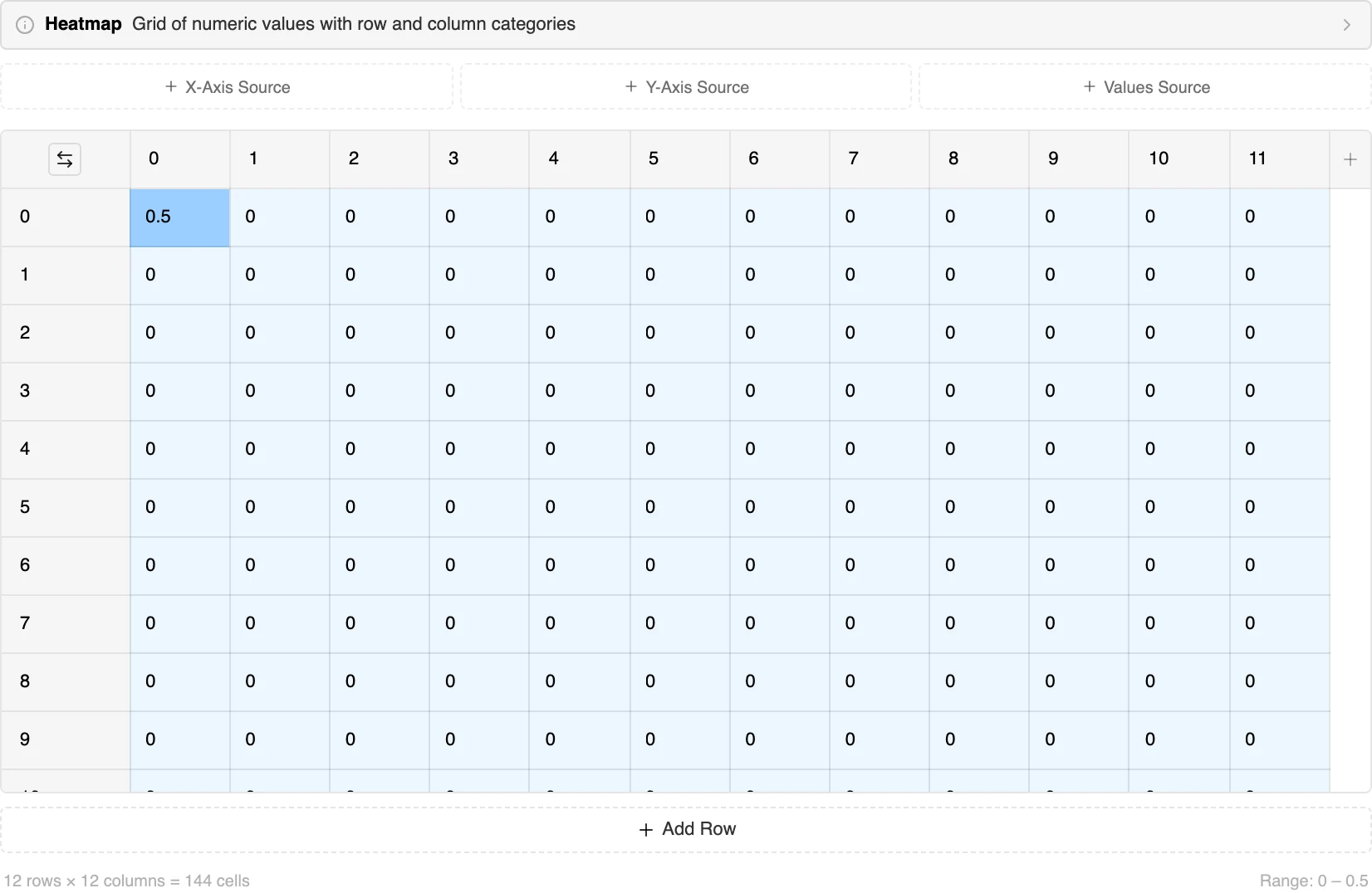
Three smaller things in that editor earn their place. The cells are tinted by value as you type, so the pattern appears in the editor before you look at the chart. The footer reports the grid as rows × columns = cells alongside the current value range, which is the number your colour scale is about to be built on. And the corner button transposes the whole grid — swapping rows for columns — which is the one-click fix for a heatmap whose column labels are too long to read.
In ApexCharts and Nivo the same matrix arrives as an ordinary table — one row per heatmap row, one column per heatmap column, which is exactly how you would type it into a spreadsheet. That is the shape most people already have, and pasting a block of cells from Sheets or Excel lands correctly.
Two cautions, both worth more than they look:
The grid is the constant; what changes is the shape of the cells, the colour scale and what the two axes mean. All five are real gallery examples.
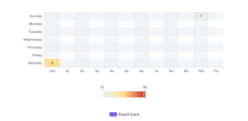
The matrix heatmap — two categorical axes, colour carrying the value. This is the default meaning of the word, and ECharts is the library with a purpose-built grid editor for its data.

The correlation matrix — and the clearest example of a diverging scale in the plugin: its colour axis runs from −1 in red through white at zero to +1 in blue. Correlation has a meaningful midpoint, which is exactly when a diverging scale is correct.

The tilemap — same idea, hexagonal cells. Highcharts is the only library here that draws one, and the honeycomb layout is the standard way to give geographic regions equal visual weight regardless of their real size.
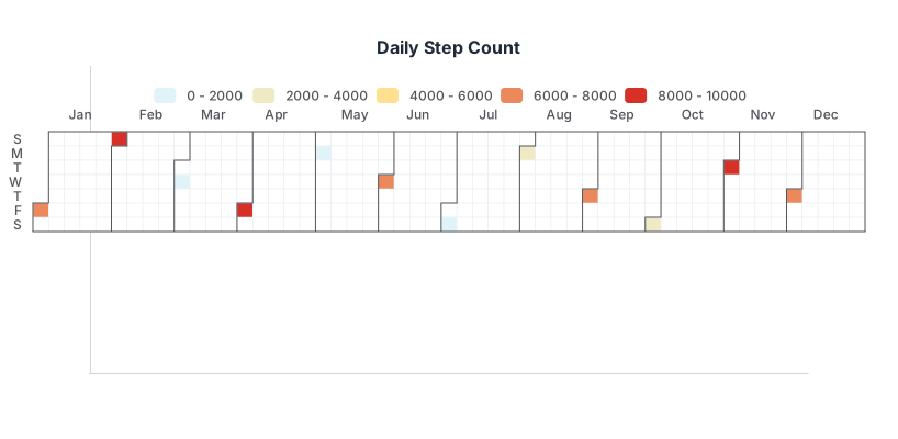
The calendar heatmap — the grid is days, laid out as weeks against weekdays. Note where it lives: ECharts and Highcharts file theirs under Heatmap, while Google and Nivo file theirs under Calendar. Look in both.
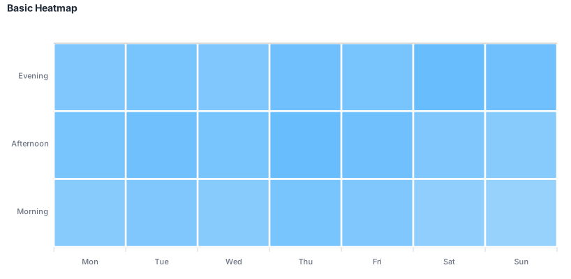
ApexCharts’ heatmap — rows as series, columns as categories, which is the same shape you would type into a spreadsheet. It is also the one non-ECharts library whose heatmap data survives a round trip through the ordinary table editor unchanged.
Six screens, start to finish, captured from the plugin doing exactly this.
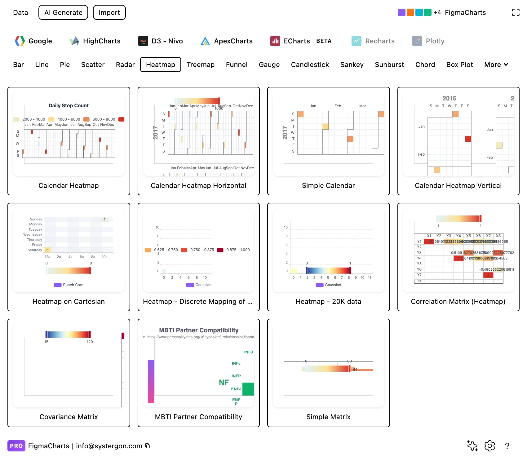
1. Filter to Heatmap. Library tab, then the chip — and remember that four libraries have one and Google Charts does not.
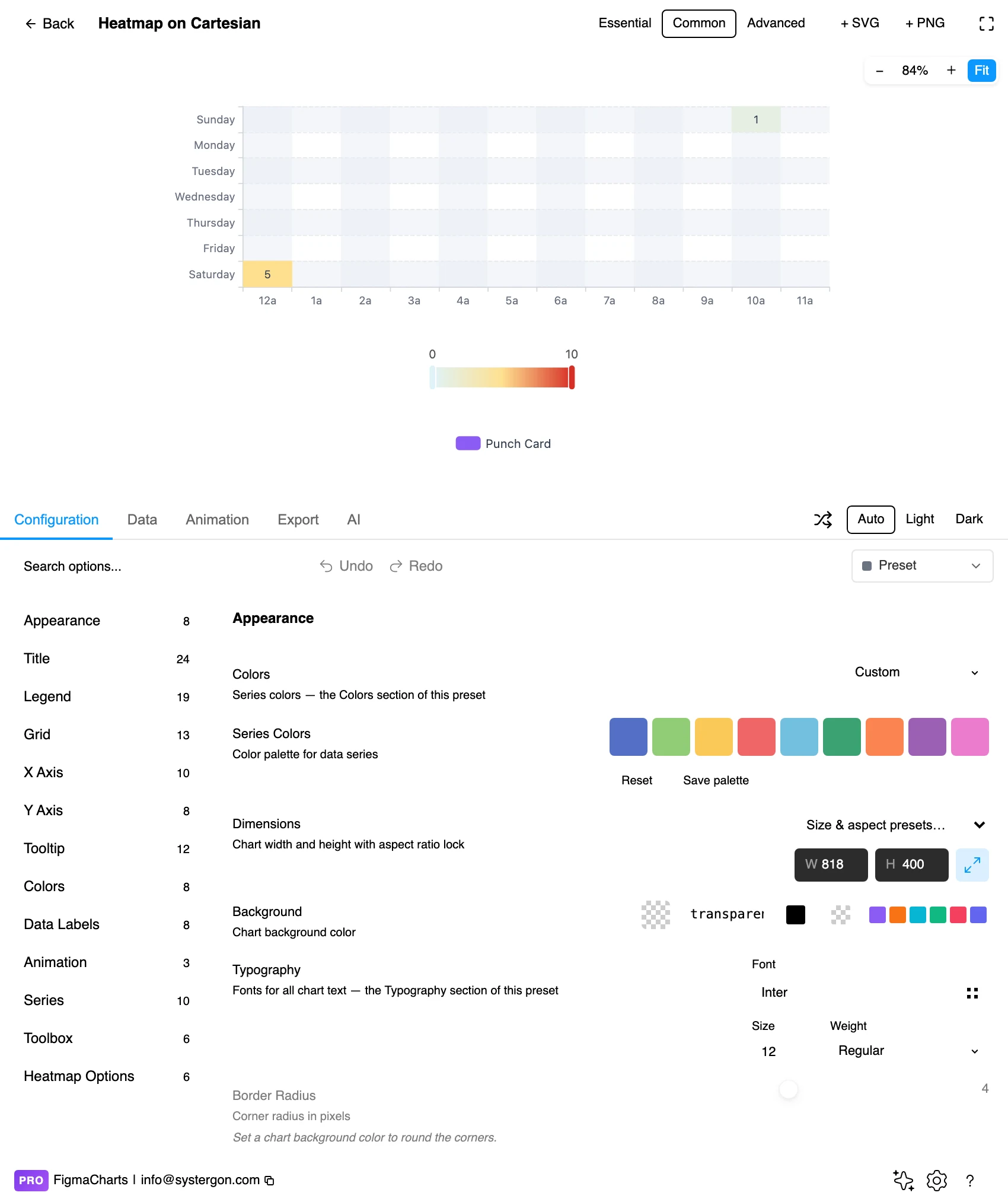
2. The editor. Live preview above, tabs below. For a heatmap the legend is the one piece of furniture you cannot drop, because the colour scale is the axis.
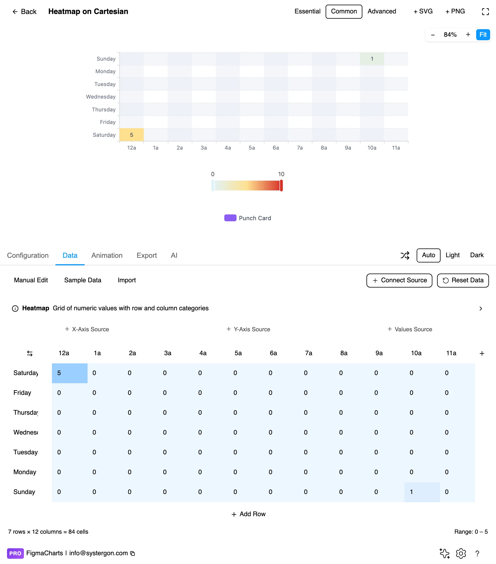
3. The grid editor. This is the heatmap’s own editor, and only ECharts gets it: X-axis and Y-axis categories, a grid of values, each section separately connectable to a data source. The cells tint as you type and the footer reports the grid size and the live value range.
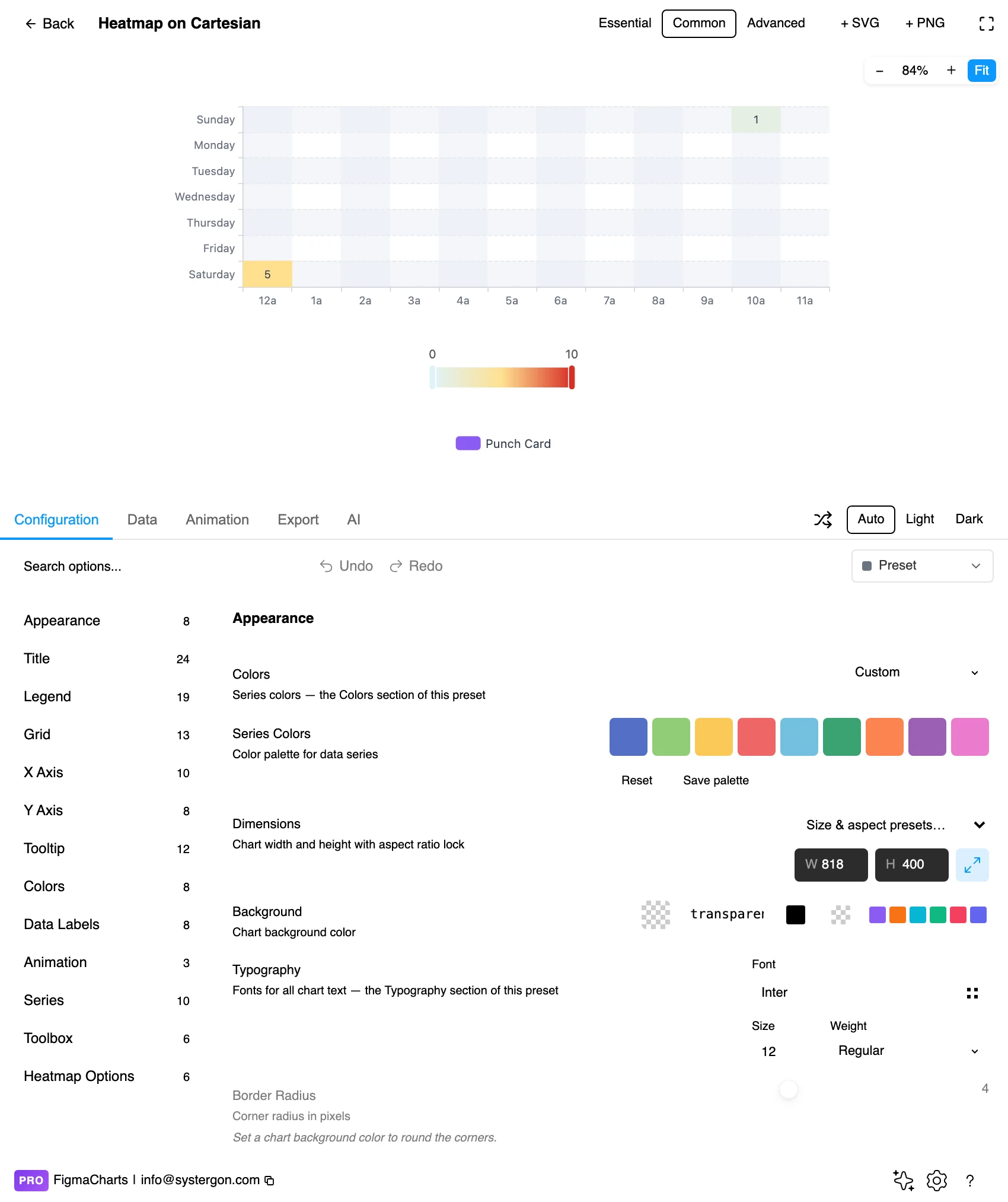
4. The colour scale. Sequential or diverging, continuous or banded, and the range it maps across — the most consequential settings in the chart all live in this panel.
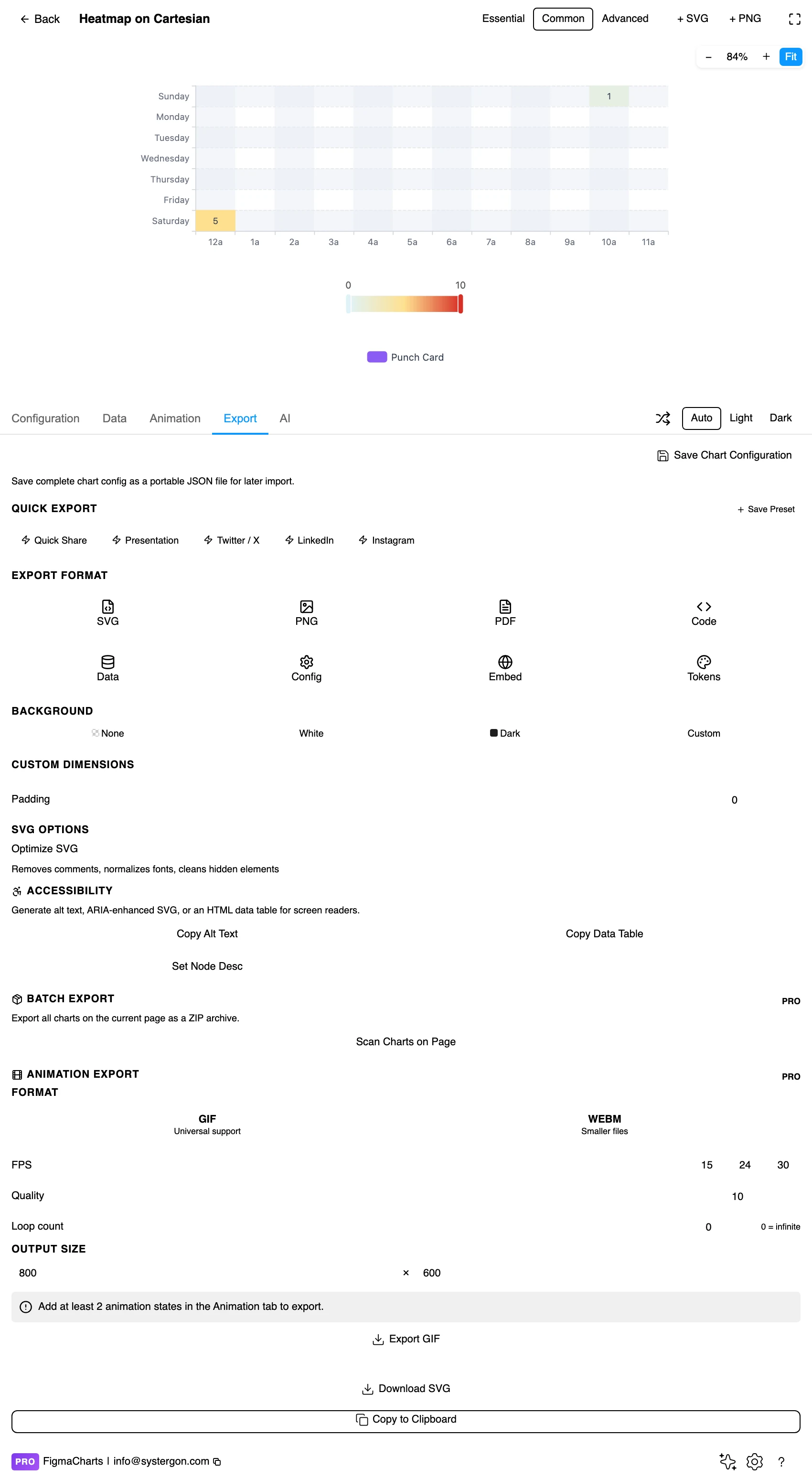
5. Export. Code for React, Vue 3, Angular, Svelte or vanilla JavaScript — or the Config alone, which carries the colour stops that are otherwise the first thing re-invented badly.
6. Insert. SVG gives you every cell as a real rectangle, so annotating one cell on the canvas is a click.
Two shortcuts worth knowing. The Essential / Common / Advanced control in the editor header sets how much furniture the chart carries — and for a heatmap, Essential drops the colour legend, which is the one piece of furniture a heatmap genuinely cannot do without. And if you want to change one element rather than hunt the option tree, turn on the Inspector and click the thing; it works on Highcharts and ApexCharts.
This is the chart type with the most lopsided coverage in the plugin, and one genuine gap. The 18 examples break down like this:
One piece of taxonomy that will save you a search: calendar heatmaps are split across two categories. ECharts’ four and Highcharts’ one sit under Heatmap, because that is what they are made of; Google’s five and Nivo’s one sit under Calendar. Look in both.
The rule that beats all of the above: if your engineers already use one of the five, design in that one. The chart you approve is then the chart they ship, because the export lists that library’s own npm package at the same major version the plugin rendered with. Choosing the right chart library covers the trade-offs in full.
Nearly every styling decision in a heatmap is a colour decision, and the colour scale is the chart’s axis. Design it with the seriousness you would give an axis.
Sequential for magnitude, diverging for a meaningful middle. If your values run from low to high — counts, durations, revenue — use a single-hue sequential ramp where lightness increases monotonically with value. If they run either side of a natural centre — correlation around zero, change against a target, profit and loss — use a diverging scale with a neutral midpoint and two hues, like the −1 to +1 red-white-blue in the Highcharts correlation example. Using a diverging scale for sequential data invents a boundary that does not exist in your numbers.
Do not use a rainbow. It is the most common heatmap failure and the hardest to unsee once you know: a rainbow ramp is not monotonic in lightness, so it manufactures edges wherever the hue changes fastest and flattens differences elsewhere. Readers see banding that is in the palette rather than the data. Perceptually uniform ramps — viridis and its relatives — exist precisely to fix this, and every library here can take an explicit list of stops if its default scheme is not one.
Consider banding the scale on purpose. A continuous ramp is honest about magnitude and hard to read precisely; discrete steps — five or six bands with labelled thresholds — are easier to read off and easier to remember, at the cost of inventing boundaries. ECharts ships a discrete-mapping example for exactly this. Choose deliberately: continuous when the pattern matters, banded when the categories of value matter (“under SLA / at SLA / over SLA”).
Give the cells a hairline gap. A one or two pixel gap between cells stops the grid reading as a continuous field and makes the individual cell the unit again. It also gives you somewhere for the row and column structure to breathe.
Label the cells when the grid is small enough. Under about fifty cells, printing the value inside each one costs nothing and turns an imprecise chart into a precise one that still shows the pattern. Above that, labels become noise — and that is the point at which colour is doing the work alone.
Square cells, sensible labels. Cells should be close to square unless one dimension genuinely deserves more room; long column labels want rotation or, better, a transpose — the grid editor has a button for it — so they become row labels with a whole line each. For type and colour, bind them to your design system rather than picking by hand — the plugin can build a palette from your Figma colour variables, which is covered in Your chart, your design system.
The order of the rows and columns is the design. This is the single most consequential thing on this page. A heatmap has no inherent order — unlike a line chart, whose x axis is fixed by time, you are free to arrange the rows however you like, and the arrangement determines whether a pattern is visible at all. Alphabetical order is the default in most tools and it is almost always the worst one: it scatters related rows across the grid and turns a block structure into confetti. Sort by a row total, by the value of a key column, or by similarity so that rows which behave alike sit together. Do that and clusters appear as blocks; leave it alphabetical and the same data looks like noise. Both pictures are “accurate”; only one is informative.
One outlier can eat the entire scale. Because the colour ramp stretches from your minimum to your maximum, a single value ten times larger than the rest compresses everything else into the bottom of the ramp, and the chart becomes a map of one cell. The fixes are all legitimate provided you disclose them: cap the scale at a percentile and mark the cells that exceed it, use a logarithmic mapping, or band the scale. What is not legitimate is quietly clipping the value.
Two heatmaps side by side need the same scale. Small multiples are one of the best uses of this chart type — the same grid for each quarter, or each cohort — and they only work if every panel shares one colour scale and one legend. Per-panel scales make every panel look equally intense, which is precisely the comparison the reader thinks they are making and precisely the one they are not.
Colour reads as importance, and area amplifies it. A large block of mid-tone cells will dominate a reader’s attention over a single dark one, regardless of the values. If the important finding is one cell, annotate it — a heatmap does not have a natural way to say “look here”, so add one.
Dark should mean more. It is a convention rather than a law, but it is a strong one, and inverting it — pale for high values on a white background — costs your reader a conscious translation on every cell. If your palette forces a light-for-high ramp, say so in the legend and expect it to be misread anyway.
And a correlation matrix is symmetric. Every value appears twice, mirrored across a diagonal of perfect self-correlation, which means half the chart is redundant and the diagonal is decoration. Showing only the lower triangle is not a trick; it is removing a duplicate.
A heatmap encodes everything in colour, which makes it the hardest chart type in this series to make accessible — and the most rewarding to get right, because the fixes are concrete.
Choose a colour-vision-safe ramp. Around one in twelve men has some form of colour vision deficiency, and the classic red-to-green diverging scale is precisely the pairing that fails. Red-to-blue, as in the Highcharts correlation example, survives it. Single-hue sequential ramps are the safest of all, because they vary in lightness rather than hue — and lightness is the one channel everybody reads.
Print the values where you can. A labelled cell is readable without colour vision at all. On a small grid this removes the accessibility problem rather than mitigating it.
Check contrast of the labels against the cells, at both ends of the scale. Text that passes over a pale cell will fail over the dark end of the same ramp. Either switch the label colour by threshold or choose a ramp whose range keeps one text colour legible throughout.
Give it a text equivalent. The Export tab has three buttons most people never notice: Copy Alt Text generates a description, Copy Data Table produces an HTML table of the underlying numbers, and Set Node Desc writes the description onto the Figma node so it travels with the design. For a heatmap the data table is the genuinely correct answer — a matrix is a table, so the accessible version loses nothing but the colour.
Because the chart was rendered by a real charting library, the handoff carries the chart rather than a picture of it. From the Export tab:
The whole of that, including the accessibility exports and the embed generator, is in From Figma to code.
Not a matrix heatmap — Google Charts has no heatmap chart type, and the plugin ships none. It does have the Calendar chart, five examples of it, which is a calendar heatmap of days. For a rows-and-columns heatmap, use ECharts, Highcharts, ApexCharts or Nivo.
Sequential — one hue, lightness rising with value — whenever your values simply go from low to high. Diverging, with a neutral midpoint, only when there is a meaningful centre such as zero, a target or a baseline. Avoid rainbow ramps: they are not monotonic in lightness, so they invent edges the data does not have.
Many more than a bar chart — hundreds of cells is normal and ECharts ships a 20,000-point example. The real limit is the labels: once your row and column names no longer fit legibly, the chart stops being readable even though the pattern is still there. Transpose, abbreviate, or group.
Because in ECharts the plugin gives heatmaps a purpose-built matrix editor: X-axis categories, Y-axis categories and a grid of values, each section connectable to its own source. It writes your values back as the [x, y, value] triplets ECharts expects and rescales the colour legend to your data. In ApexCharts and Nivo the same matrix is edited as an ordinary table.
Almost always, and rarely alphabetically. Row and column order is what makes a pattern visible — sort by totals, by a key column, or by similarity so that rows behaving alike sit together. Alphabetical order scatters related rows across the grid and hides the block structure that is the reason to draw a heatmap at all.
Not like a zero. Give missing intersections no fill (or a distinct neutral) so they read as absent rather than measured, and watch for the plugin’s numeric coercion — a cell that will not parse becomes 0, which lands at the bottom of your colour scale looking exactly like a real minimum.
A heatmap whose grid is the calendar: weeks across, weekdays down, one cell per day. It is split across two categories in the plugin — ECharts’ four and Highcharts’ one are under Heatmap, Google’s five and Nivo’s one are under Calendar. Look in both before concluding a library cannot do it.
Insert as SVG and every cell is a real rectangle and every label real text, which makes a heatmap one of the most rewarding types to insert as vector — you can restyle individual cells to annotate a finding. Insert as PNG and you get a flat image at twice the pixel density. Either way the chart reopens in the editor with its settings intact.
Open the plugin, filter to Heatmap, put your real values into an ECharts example — and then, before touching a single colour, sort the rows by their totals and look again. If a pattern appears, you have the right chart. If nothing appears after a couple of orderings, the honest conclusion is that there is no two-dimensional pattern to show, and that is worth knowing before you spend an afternoon on the palette.
Install Figma Charts — it’s free to try → Browse all 45 chart types →