
Install Figma Charts — it’s free to try → See the Sankey gallery →
A Sankey diagram is the chart for a question the others cannot answer: where did it all go? Not how much of each thing there is — that is a bar chart — but how a quantity moved from one set of places to another, splitting and recombining on the way, with every stream’s width proportional to how much travelled along it.
Real plugin output: a Highcharts Sankey captured from the editor. Every diagram on this page is the library’s own layout, not an illustration of one.
The form carries one promise that gives it all its authority: conservation. What arrives at a node leaves it. When that is true of your data the diagram is unusually persuasive, because the reader can follow a quantity through a whole system without doing arithmetic. When it is not true, the picture still looks authoritative — which is the problem this page spends most of its time on.
Everything below happens inside Figma Charts, a Figma plugin. It runs the real JavaScript charting libraries — Google Charts, Highcharts, D3-based Nivo, ApexCharts and Apache ECharts — inside the plugin window, so the ribbons on your canvas were routed by the library’s own layout algorithm.
Install Figma Charts from the Figma Community →
Press ⌘/ (Ctrl / on Windows), type Figma Charts, hit Enter, and pick Sankey from the category filter. There are 17 Sankey examples across four libraries.
Three structural claims come with the form:
It is worth naming the fourth property too, because it is the one that makes a Sankey worth the space: a node can have many inputs and many outputs. That is the entire difference from a funnel, and it is why the diagram can answer questions about a system rather than a sequence — which sources feed which destinations, which stage is the bottleneck, where a stream that looks small at the start becomes large by the end.
If your data does not conserve — if the numbers at each stage come from different sources, or count different things — the diagram will still draw, and it will look like a system. That is the single most common way a Sankey misleads.
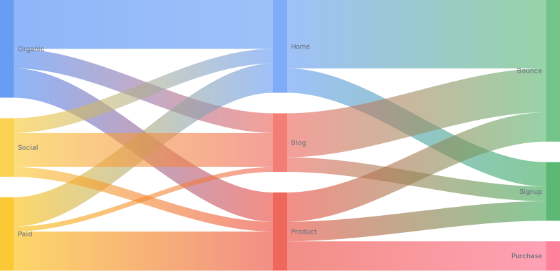
Multi-level — three or more columns of nodes, so the quantity is followed through several stages. This is where the form earns its keep: any single stage could be a bar chart, but the path through all of them could not.
Gradient links — each ribbon fades from its source colour to its target colour, which makes it much easier to trace where a stream came from in a busy diagram. It is the most useful piece of Sankey styling available and it is off by default nearly everywhere.

Vertical — the same diagram flowing top to bottom, which suits long node labels (they get a whole line each) and narrow layouts. Worth trying whenever horizontal labels are being truncated.

ECharts’ vertical orientation — the same idea with node alignment controls, so you can pin nodes left, right or justified. Node alignment is a layout decision that changes how obvious the stages are.
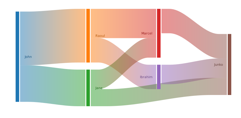
Nivo’s Sankey — the D3 look, with generous node padding and label placement outside the nodes. React-only export.
1. Your flows do not conserve. The test: pick any middle node and add up what enters and what leaves. If they differ and you cannot name the difference, the diagram is inventing a system. Fix the data, add an explicit loss stream, or use a different chart.
2. The process has loops. Sankeys are acyclic: a quantity that returns to an earlier stage — a retry, a return, a re-subscription — cannot be drawn, because the layout has nowhere to put a backwards ribbon. Libraries either drop the loop silently or produce something unreadable. A chord diagram or a network graph handles cycles; a Sankey cannot.
3. You have more than a couple of dozen flows. Every crossing ribbon costs legibility, and the number of crossings grows much faster than the number of links. Past roughly 25–30 links the diagram becomes a woven mat where individual paths cannot be followed — which is precisely the thing it existed to allow.
And a fourth: when a single path is the story. If your quantity moves through one sequence of stages without splitting, that is a funnel, and a funnel says it more compactly. Reach for the Sankey when the paths diverge.
The canonical Sankey is an energy flow — primary sources on the left, end uses on the right, and a large stream peeling off to “rejected energy”. It is worth studying not for the subject but for the technique, because it solves the problem most business Sankeys get wrong.
Energy diagrams conserve exactly, and they achieve it by giving loss a name. Nothing disappears between stages; what does not reach a useful end is drawn as its own ribbon into a labelled sink. That single move turns an inconsistency into information: instead of a diagram where the numbers quietly fail to add up, you get one whose largest stream is often the waste — which is usually the finding.
The same technique fixes most conversion diagrams. Users who enter a flow and do not complete it have gone somewhere: abandoned, errored, timed out, chosen another path. Drawing those as explicit ribbons into named sinks makes the diagram conserve, and it converts “40% did not convert” into a picture of where they went. If you cannot name the sinks, that is worth knowing before the diagram is presented rather than during.
The most common modern use is a product flow: pages, screens or events, with users flowing between them. It is a good use, and the data behind it has a specific hazard.
Sessions are not people, and steps are not stages. Event data is a sequence per session, and turning it into a Sankey means deciding what a “stage” is: the first three events? every event? a fixed funnel with everything else dropped? Each choice produces a different diagram from the same logs, and the diagram does not disclose which one you made. State it in the caption — “first four events per session, sessions with fewer excluded” — because the reader cannot infer it.
Repeat visits create false loops. A user who returns to a screen produces a backwards flow, which a Sankey cannot draw. The usual fix is to make each stage’s nodes unique — “Home (1)”, “Home (2)” — which is honest and makes the diagram wider, or to collapse repeats, which is also honest and should be said.
And the long tail is most of the paths. Real journey data has a handful of common routes and thousands of one-off ones. A Sankey of everything is a grey mat; a Sankey of the top twenty paths plus an aggregated “other” stream is readable and truthful, provided the aggregate is drawn rather than dropped.
Six screens, start to finish, captured from the plugin.
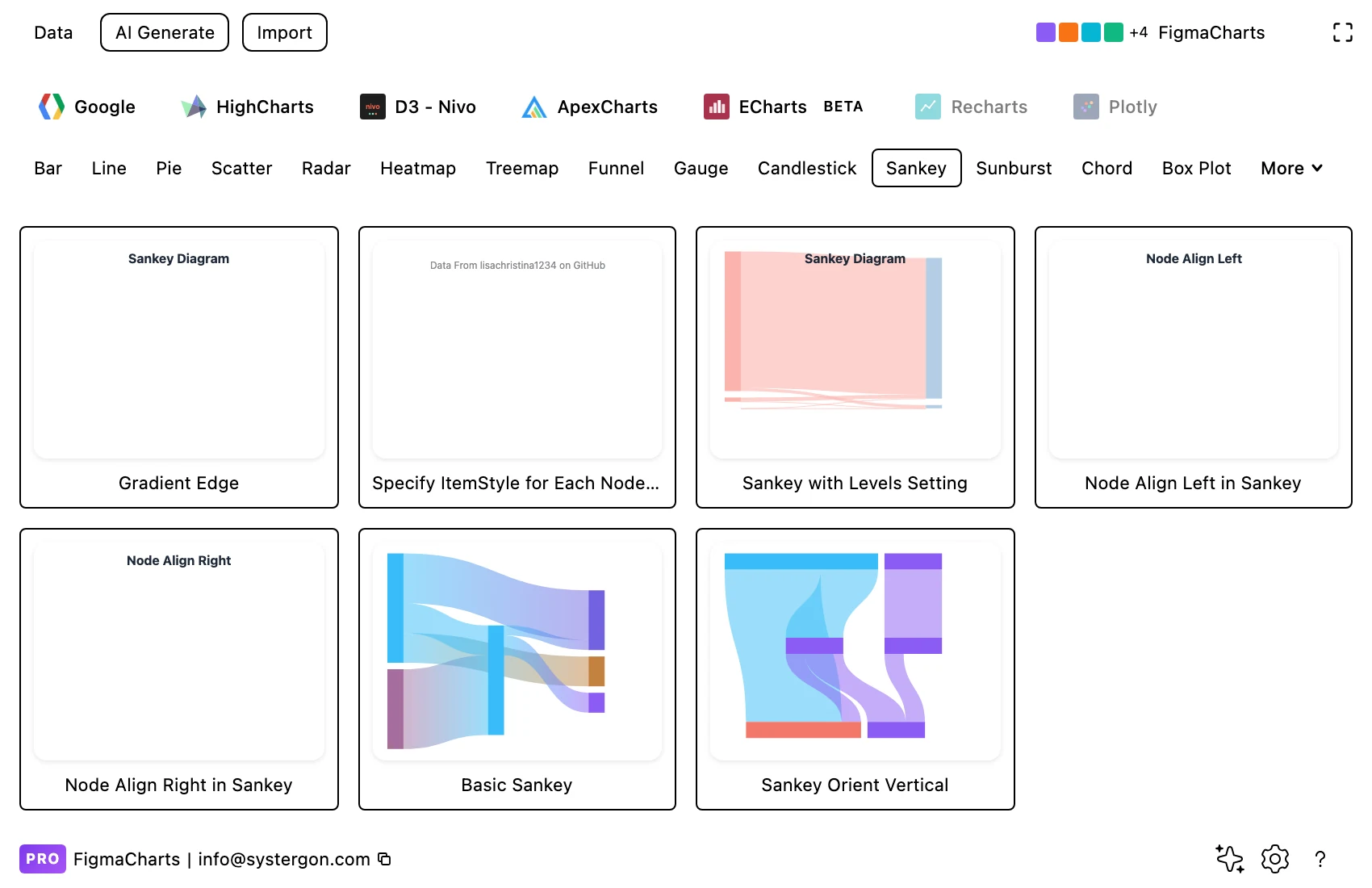
1. Filter to Sankey. Four libraries have one — ECharts, Google Charts, Highcharts and Nivo. ApexCharts has no Sankey at all.
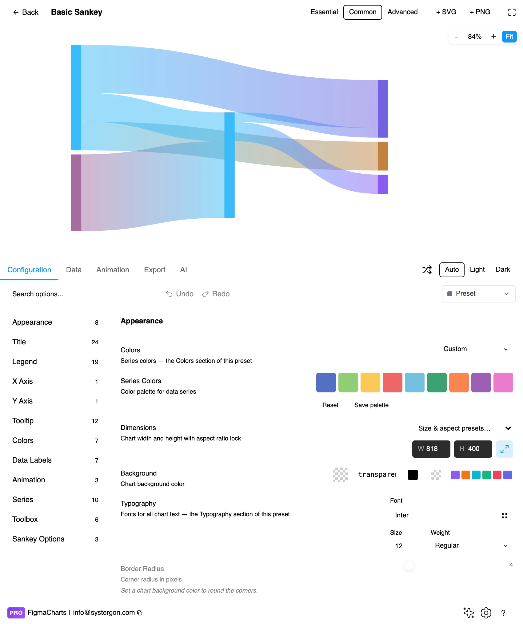
2. The editor. Live preview above, tabs below. Sankeys are worth previewing at final size early — node labels are the first thing to collide, and they collide at the size you ship, not the size you designed at.
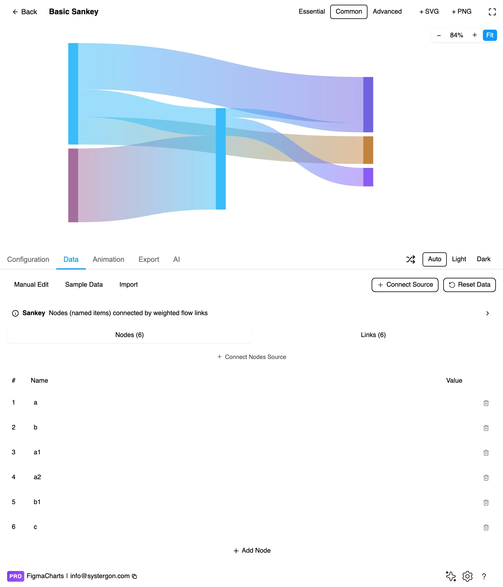
3. Nodes and links. Sankey gets its own editor in ECharts, split in two: a list of nodes (the names), and a list of links — source, target, value. Each section can be connected to its own data source, which suits the common case where the nodes are a reference list and the links come from a query.
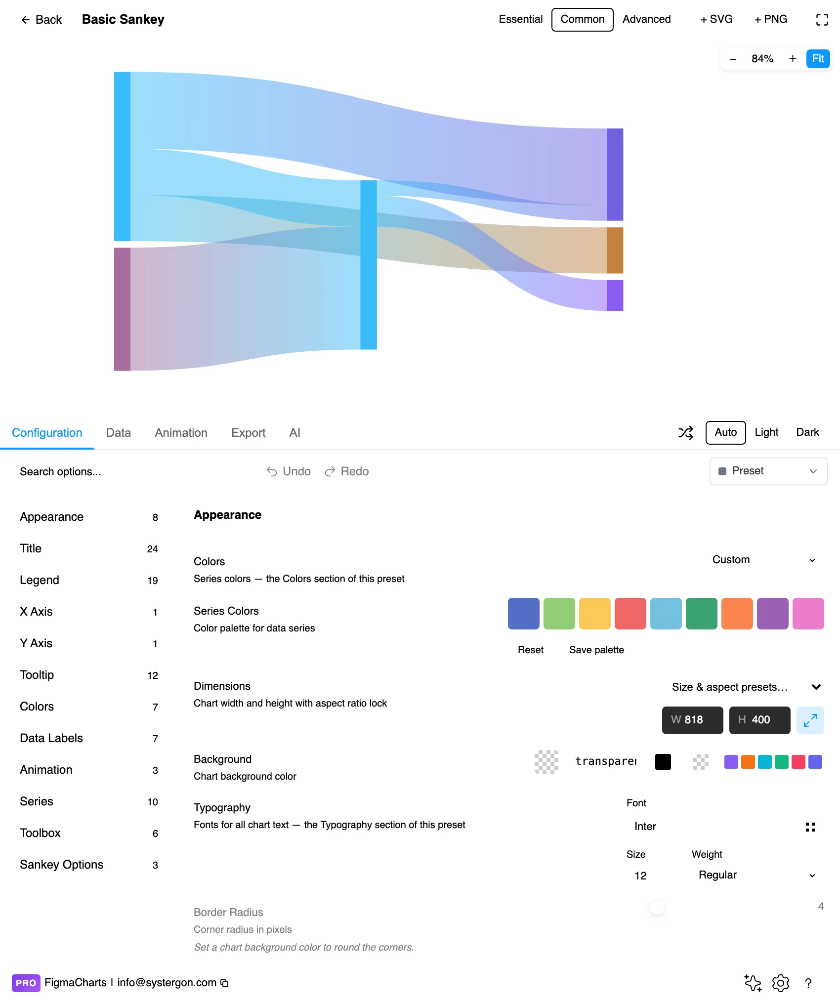
4. Configure. Node alignment, node padding and width, link opacity and curvature, and label placement. Turning on gradient links usually does more for legibility than any other single option here.
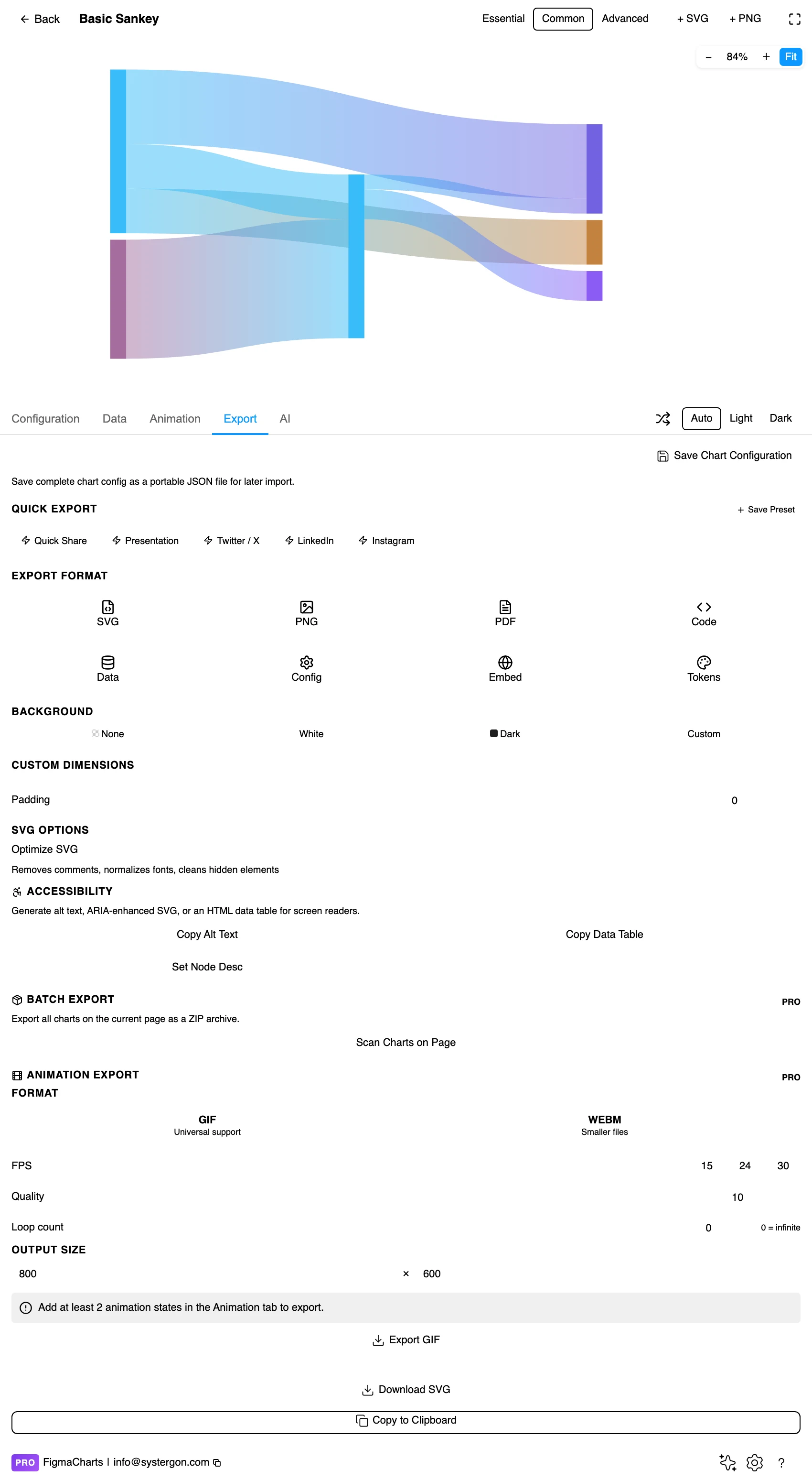
5. Export. Code for React, Vue 3, Angular, Svelte or vanilla JavaScript — or the Config alone, which carries the node ordering that the layout depends on.
6. Insert. SVG gives you every ribbon as a vector path and every node label as real text — which matters here more than for most types, because Sankey labels almost always need nudging once they are on the canvas.
A Sankey takes node-link data, which is two tables rather than one:
GROUP BY source, target query produces, which is why Sankeys are easier to feed from a database than from a spreadsheet.The plugin gives ECharts Sankeys a dedicated node-link editor with those two sections; Nivo edits the same structure as JSON; Highcharts and Google Charts take it through the ordinary table as source/target/value rows.
Sankeys cannot bind a live data source in Nivo, Google Charts or ECharts. The plugin refuses the connection rather than corrupting the diagram, because those libraries expect a specialised structure the connector cannot fill. Plan for that if the diagram needs to refresh — see live data from Google Sheets and APIs.
One structural caution: node names are identifiers, not labels. Two nodes with the same name are the same node, so a “Paid” node in stage one and a “Paid” node in stage three will merge into one and produce a link that jumps backwards — the loop problem, arrived at by accident. Suffix them (“Paid (acquisition)”, “Paid (retention)”) when a stage repeats a name.
The 17 examples split ECharts 7, Google Charts 5, Highcharts 4, Nivo 1 — and ApexCharts has no Sankey at all, which is a genuine gap rather than a filing difference.
As always: design in whichever library your engineers already use, because the export then matches production exactly. Choosing the right chart library covers the trade-offs.
Colour the links by source. The reader’s question is almost always “where did this come from?” or “where did it go?”, and colouring ribbons by their origin answers the first at a glance. Gradient links answer both at once, which is why they are worth the extra option.
Give links transparency, nodes none. Overlapping ribbons at 40–60% opacity let the reader see crossings instead of a single opaque mat; solid nodes keep the structure crisp.
Order nodes to reduce crossings. Most libraries let you set node order within a column, and a few minutes spent reordering can halve the number of crossings. This is the highest-value manual intervention available in a Sankey, and no algorithm does it as well as a person who knows the domain.
Put the values in the labels. “Organic — 12,400” costs nothing and removes the need to judge ribbon thickness precisely, which the reader cannot do anyway beyond “thicker” and “much thicker”.
Mind the thin flows. Below a couple of pixels a ribbon is a hairline that reads as a rule rather than a quantity. Set a threshold and group the remainder into an explicit “Other” stream, so the small paths are represented rather than invisible.
For type and colour, bind them to your design system rather than picking by hand — covered in Your chart, your design system.
Authority without conservation. The diagram looks like a system diagram, so readers assume the numbers reconcile. If your stages were measured differently — sessions here, users there, orders at the end — the ribbons are joining quantities that are not the same quantity, and nothing in the picture reveals it.
Node vertical position means nothing. The layout algorithm places nodes to minimise crossings, so a node near the top is not more important, earlier or larger. Readers infer hierarchy from vertical order anyway. If a particular node deserves prominence, place it deliberately and say why.
Crossings are noise, not data. A ribbon that crosses another does not signify a relationship; it signifies that the algorithm could not avoid it. Diagrams with many crossings read as complicated systems even when the underlying flow is simple.
Curvature exaggerates. Strongly curved ribbons cover more area than straight ones carrying the same quantity, so a heavily-curved layout gives more visual weight to flows that happen to be routed awkwardly.
Aggregate flows hide their composition. One thick ribbon from “Marketing” to “Signup” may be twenty campaigns of wildly different quality. That is a legitimate simplification and it should be a stated one — a Sankey is a summary, and the level of aggregation is a choice the reader cannot see.
Label every node with its value. This is the single most effective accessibility measure for a Sankey, because it converts a chart read entirely by width and colour into one that can be read as text.
Do not rely on hover to identify a ribbon. An inserted SVG has no tooltips. If a flow matters enough to be asked about, it needs a label or an annotation on the canvas.
Check link colours against the background and each other. Translucent overlapping ribbons produce blended colours, and the blends need to remain distinguishable from the pure colours they came from.
Give it a text equivalent. The Export tab’s Copy Alt Text, Copy Data Table and Set Node Desc produce a description, a table of the underlying numbers and a description written onto the Figma node. For a Sankey the table is the link list — source, target, value — which is a complete, accessible statement of the diagram.
Following a quantity through a system as it splits and recombines — energy through an economy, budget through departments, users through paths. Width is quantity, and the whole diagram rests on conservation: what enters a node leaves it.
A funnel is one path with stages that only shrink. A Sankey allows the flow to split, merge and end up in several different places. If your process has one route, a funnel is more compact; if it branches, only a Sankey can show it.
No. Sankey layouts are acyclic — there is nowhere to route a ribbon backwards. Returning customers, retries and re-subscriptions cannot be drawn. A chord diagram or a network graph handles cycles.
Roughly 25–30 links before crossings make individual paths impossible to follow. Beyond that, aggregate the small flows into an explicit “Other” stream, or split the diagram by stage.
Because node names are identifiers. The same name in two stages is the same node, so a repeated name creates a link that jumps backwards through the diagram. Suffix repeated names by stage.
Four of the five: ECharts (7 examples), Google Charts (5), Highcharts (4) and Nivo (1). ApexCharts has none. ECharts gives it the most layout control and a dedicated node-link editor in the plugin.
Not in Nivo, Google Charts or ECharts — the plugin blocks the connection because those Sankeys expect a specialised node-link structure the connector cannot produce. It tells you rather than drawing something broken.
Insert as SVG and every ribbon is a vector path and every label real text, which is the practical reason to insert vector here: Sankey labels nearly always need nudging, and on the canvas that is a drag rather than a re-render.
Open the plugin, filter to Sankey, and before you style anything, do the conservation check on your own data: pick a middle node, add up what goes in and what comes out, and see whether they match. If they do, you have a diagram that will carry an argument. If they do not, you have found something more valuable than a chart — a number nobody had reconciled.
Install Figma Charts — it’s free to try → Browse all 45 chart types →