
Install Figma Charts — it’s free to try → See the Venn gallery →
A Venn diagram shows how sets overlap. Almost everyone has drawn one on a whiteboard, and almost nobody draws one with real numbers — which is the interesting part, because a data Venn diagram has a constraint that a whiteboard sketch does not: the areas have to be right, and quite often no arrangement of circles exists that makes them right.
Real plugin output: a Highcharts Venn diagram captured from the editor. Every chart on this page is the library’s own drawing.
This page is about the difference between the schematic version and the proportional one, the three-set ceiling, when an Euler diagram is the honest alternative, and what to do when your set sizes cannot be drawn at all.
Everything below happens inside Figma Charts, a Figma plugin. It runs the real JavaScript charting libraries — Google Charts, Highcharts, D3-based Nivo, ApexCharts and Apache ECharts — inside the plugin window, so the circles on your canvas are positioned by the library’s own solver.
Install Figma Charts from the Figma Community →
Press ⌘/ (Ctrl / on Windows), type Figma Charts, hit Enter, and pick Venn from the category filter. Two examples, both Highcharts — it is the only library here with the type.
The schematic Venn is the one from school: two or three equal circles overlapping in a fixed pattern, with labels in the regions. It is a diagram of logic — these categories can overlap, here is where — and its sizes mean nothing. It is a perfectly good illustration and it is not a chart.
The proportional (area-proportional) Venn sizes each circle by its set’s membership and positions the circles so that every overlap region has the right area too. Now it is a chart: the picture encodes quantities and can be read.
The distinction matters because readers cannot tell them apart. Put real category names on a schematic diagram and everyone will read the sizes as data — which is why, if you are drawing sets with actual counts, you want the proportional version or an explicit note that the sizes are illustrative.
Here is the fact that makes this chart type genuinely difficult, and it is a geometric one rather than a software limitation.
With two circles, any set of numbers can be drawn: pick two radii and slide the circles until the overlap is right. With three, the solver has three sizes and three pairwise overlaps and a triple overlap to satisfy simultaneously using only three radii and three positions — and for many combinations of real numbers, no solution exists. The library does the best it can and produces a picture whose regions are approximately right, or visibly wrong.
With four or more sets, circles cannot even represent all the possible regions — a four-circle diagram cannot produce all fifteen intersections. That is why four-set diagrams use ellipses or irregular shapes, and why they stop being readable at the same time.
Three practical consequences:

An Euler diagram — the honest relative. Where a Venn insists on drawing every possible intersection, an Euler draws only the ones that exist, which makes four sets tractable: empty combinations simply do not appear. Highcharts’ Venn series produces both, and this is the mode to reach for when a strict Venn will not solve.
1. You have more than three sets. Covered above — the geometry runs out before the data does. Use an UpSet plot or a table of intersections.
2. The intersections are what matter. If your reader needs to compare the sizes of overlaps precisely, they are comparing lens-shaped areas, which is the hardest area judgement there is. A bar chart of intersection sizes answers it exactly.
3. The sets are wildly different in size. A set of 10,000 and a set of 12 produce a circle and a dot, and the small set’s overlaps become invisible. Proportionality is honest and, past about a 50:1 ratio, unreadable.
A fourth, more common than it should be: when the categories are not sets at all. Venn diagrams are for membership — each item is in or out of each set. Stages of a process, parts of a whole and points in time are none of those, and drawing them as overlapping circles asserts a relationship that does not exist.
Set analysis is common and Venn diagrams cover a narrow slice of it. Three alternatives handle the rest, and all three are available in the plugin.
A bar chart of intersection sizes. One bar per region — A only, B only, A∩B — sorted descending. It scales to any number of sets, encodes with length rather than area, and is exact. What it loses is the instant visual grasp of “these overlap a lot”, which is the only thing a Venn does better.
An UpSet-style layout. The same bar chart, with a dot matrix underneath showing which sets each bar belongs to. It is the standard in fields that genuinely analyse set intersections, it reads cleanly at ten sets, and you build it here as a bar chart plus a hand-drawn matrix on the canvas.
A matrix heatmap of pairwise overlaps. Sets on both axes, colour for the size of each pairwise intersection. It answers “which two sets overlap most?” instantly and says nothing about triple intersections — which is often the right trade.
The general rule: Venn for two or three sets and a general audience; bars or UpSet for four or more and an analytical one.
Three cases, all sharing the same shape: few sets, and an audience that needs the relationship rather than the numbers.
Audience overlap. Customers who use feature A, feature B, or both. The overlap region is usually the finding, and it is the one number everyone in the room wants.
Eligibility and criteria. Who qualifies under two or three rules, and how many meet all of them. A proportional Venn makes “almost nobody meets all three” visible instantly, which a table of counts does not.
Explaining a concept. Here the schematic version is right and the sizes should be equal: you are drawing the logic of the categories rather than their populations. Just say so, because readers assume otherwise.
Six screens, start to finish, captured from the plugin.
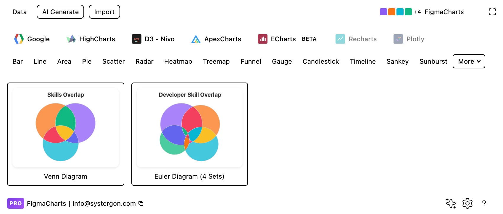
1. Filter to Venn. Two examples, both Highcharts: a standard Venn and a four-set Euler diagram.
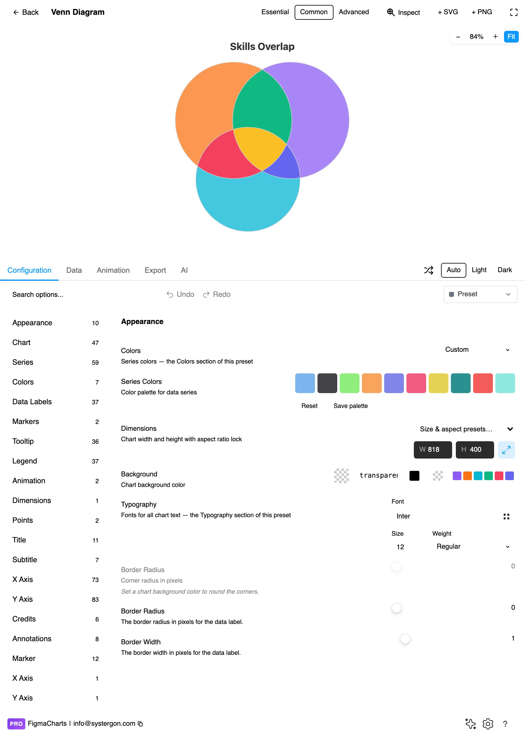
2. The editor. Live preview above, tabs below. The layout is solved from your numbers, so change the data before you spend time on styling — the whole arrangement will move.
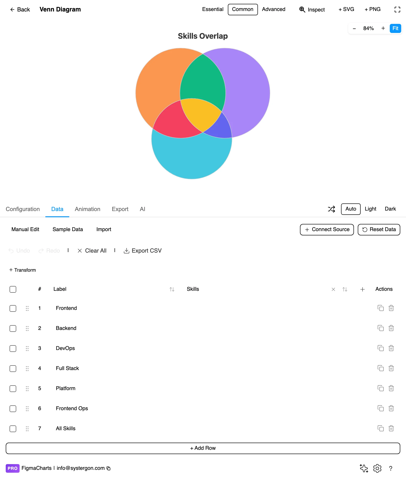
3. Sets and intersections. One row per region: each individual set with its size, then each combination with the size of that overlap. This is the step where the data has to be right, because the solver takes your intersection values literally.
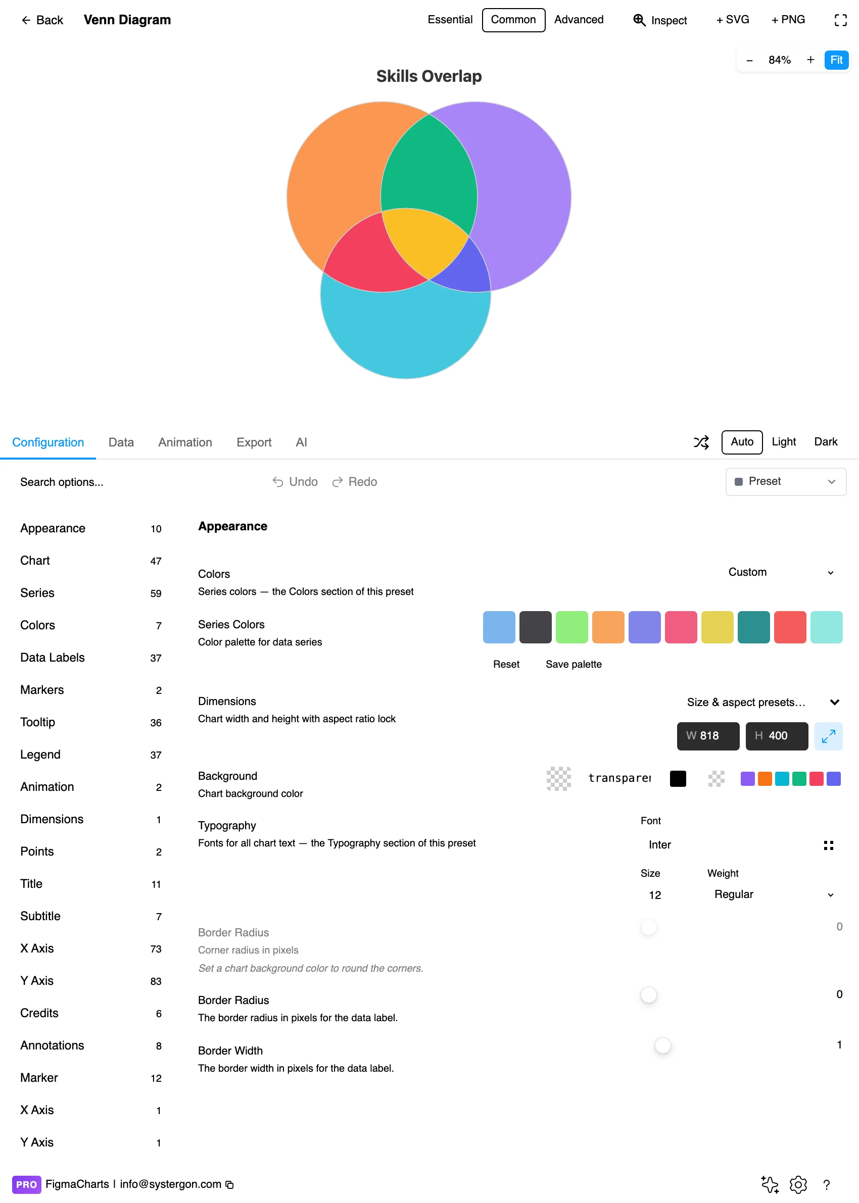
4. Configure. Fill opacity, borders, label placement and the colour per set. Opacity is the important one — the overlaps read as blends, and that is how the reader identifies them.
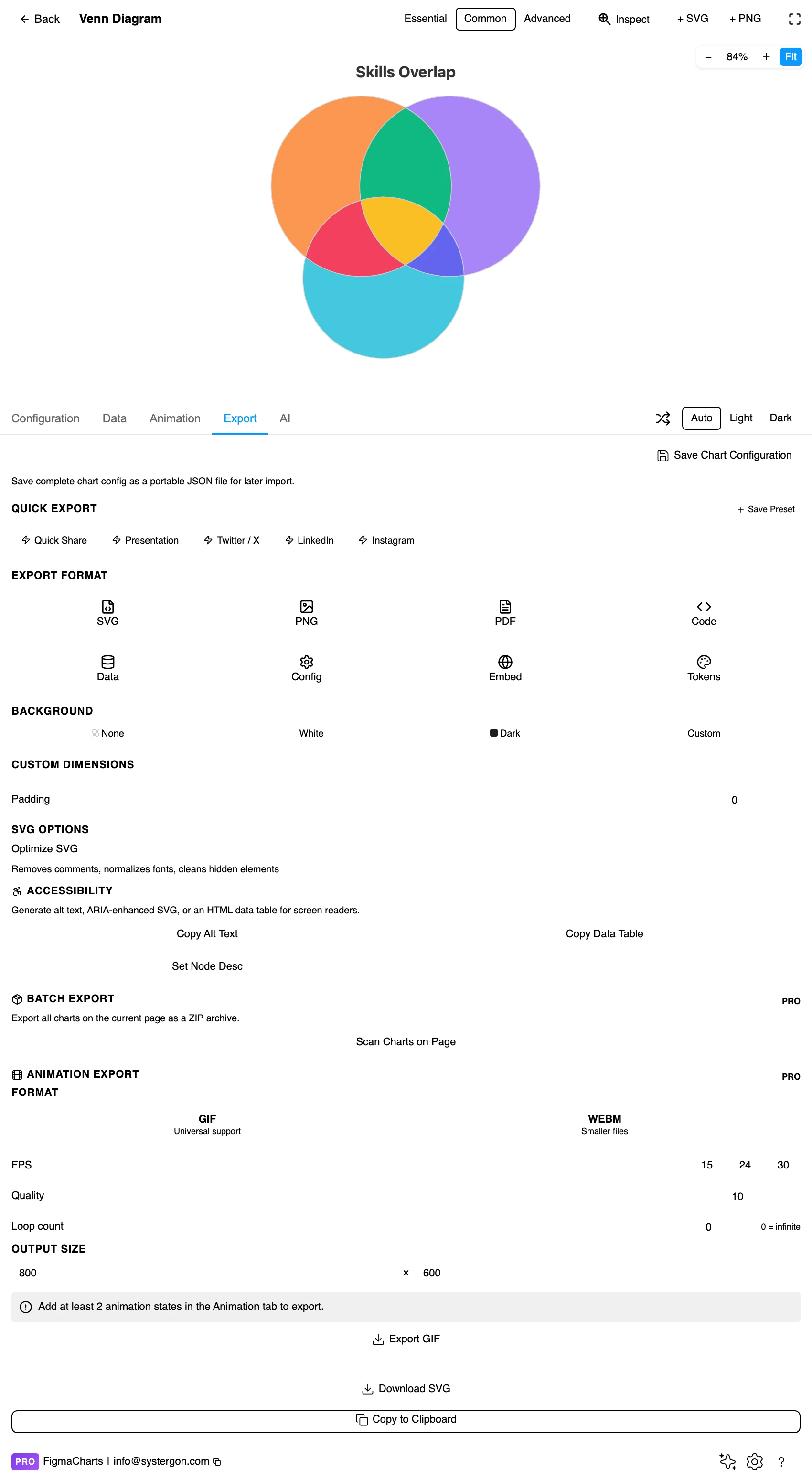
5. Export. A working component for React, Vue 3, Angular, Svelte or vanilla JavaScript, at the version the plugin rendered with.
6. Insert. SVG gives you each circle as a vector shape with real text labels — and because a Venn is three shapes and some words, an inserted one is unusually easy to finish by hand.
One row per region, not per set. That means the individual sets (A, B, C) with their totals, and then every intersection you want represented (A∩B, A∩C, B∩C, A∩B∩C) with its size. There is no special editor; it is the ordinary table.
Two things catch people out. Decide whether your set sizes are inclusive. If “A = 500” includes the 120 that are also in B, the solver expects that; if it means “A only”, your diagram will be wrong in every region. Libraries differ, so check one intersection against the rendering before trusting the rest.
And an unparseable cell becomes 0, which in a Venn means an intersection the solver treats as empty — producing two circles that do not touch and a diagram asserting the sets are disjoint.
The Venn category holds two examples, both Highcharts, and this is a genuine single-library type in the plugin.
The good news is that a two- or three-set Venn is also one of the easiest things to draw by hand in Figma — three ellipses, blend modes, and text. The plugin’s advantage is that the sizes are solved from your data, which hand-drawing cannot do; so the sensible workflow for a proportional Venn is to render it here, insert as SVG, and then restyle the shapes on the canvas.
As always: design in whichever library your engineers already use, because the export then matches production exactly. Choosing the right chart library covers the trade-offs.
Transparency is the encoding. Overlaps should read as the two colours blended, which is how a reader identifies which region they are looking at. Around 50–60% opacity with a multiply-style blend is the usual sweet spot; opaque circles hide whichever is drawn second.
Label the regions, not just the circles. The interesting numbers are in the overlaps, and a diagram whose only labels are the set names makes the reader infer them. Put the count in each region where it fits.
Two hues, not three, for a two-set diagram. The overlap generates its own third colour; adding a third hue for the intersection means four colours for three regions and reads as four categories.
Keep the strokes light. Heavy outlines fight the blended fills and make small regions look like separate objects.
Give the labels room outside the shapes when the circles are small — leader lines to labels in the margin beat text crammed into a lens.
For type and colour, bind them to your design system rather than picking by hand — covered in Your chart, your design system.
More Venn diagrams are wrong in the data than in the drawing, and the errors are specific enough to check for.
Double-counting. If your source is three separate queries — users of A, users of B, users of both — make sure the third is genuinely a subset of the other two and not a separately-counted population. Overlaps computed from different snapshots do not reconcile.
The universe. A Venn shows the sets and their overlaps, and usually says nothing about everyone outside them. If 90% of your users are in none of the three sets, the diagram represents a tenth of the population and reads as though it represents all of it. State the total, or draw a bounding rectangle for the universe — which is what a formal Venn diagram does and what most chart libraries omit.
Order of magnitude. Sanity-check that the sum of the exclusive regions plus the shared ones equals the total you expect. This catches inclusive-versus-exclusive confusion in one line of arithmetic, and it is the check that would prevent most published Venn errors.
Areas are approximate for three sets. The solver is minimising error, not achieving accuracy, so the drawn overlap may be visibly different from your number. Always print the counts.
Circle area is judged badly anyway. Readers underestimate large circles relative to small ones, so even a mathematically perfect proportional Venn overstates the small sets.
Lens-shaped regions are worse. Comparing two crescents or two lenses is harder than comparing two circles, and the intersections are usually the point.
Empty regions look meaningful. In a strict Venn every possible intersection is drawn whether or not anything is in it, so a region with zero members still occupies space — which is exactly what an Euler diagram fixes by omitting it.
Position implies nothing. Which circle sits left or top is a solver artefact, not a statement about the sets.
A Venn is three shapes and some words, which makes it the chart in this series most worth finishing on the canvas after inserting. Four moves cover it.
Set the blend mode. Figma’s multiply blend on the circle fills produces cleaner overlap colours than an opacity stack, and it keeps the region colours predictable rather than depending on draw order.
Move labels off the shapes. Region counts sit best just inside each area for the large regions and outside with a short leader for the small ones. This is fiddly in a chart library and trivial on a canvas.
Add the totals. A line under each set name giving its full size — “Feature A — 4,120 users” — turns the diagram into something quotable.
Keep the solved geometry. The one thing not to touch is the position and size of the circles: those came from your numbers. Nudging a circle to make the layout tidier silently changes the data the diagram claims.
Blended overlaps are a colour-vision hazard. Two hues that are distinguishable on their own can produce a blend that matches one of them. Test the overlap colours, not just the fills.
Numbers in the regions solve most of it. A labelled diagram can be read without judging any area at all, which is the strongest accessibility measure available here.
Do not rely on hover. An inserted SVG has no tooltips, so region counts must be on the canvas.
Give it a text equivalent. The Export tab’s Copy Alt Text, Copy Data Table and Set Node Desc produce a description, a table of the numbers and a description written onto the Figma node. For a Venn, that table — region by region — is more precise than the diagram and worth publishing beside it.
A Venn draws every possible intersection whether or not it contains anything; an Euler draws only the regions that exist. That makes Euler diagrams far more practical for four or more sets, and Highcharts’ Venn series produces both.
Two exactly, three approximately, four only as an Euler diagram with ellipses — and beyond that the geometry runs out entirely. For many sets, use an UpSet plot: a bar chart of intersection sizes with a matrix showing which sets each bar covers.
Because for three circles there is often no arrangement that satisfies every region simultaneously. The solver minimises the error and produces the closest picture it can. Print the counts in the regions so the numbers are exact even when the areas are not.
Highcharts only — two examples. No Venn type exists in Google Charts, ECharts, Nivo or ApexCharts, though a two- or three-set diagram is straightforward to draw by hand in Figma once you know the sizes.
Check before you trust the drawing. If “A = 500” is the whole set including its intersections, the solver expects that; if it means A-only, every region will be wrong. Verify one intersection against the rendered diagram before believing the rest.
No — that is a pie or a stacked bar. Venn diagrams are about membership, where an item can be in several sets at once. If your categories are mutually exclusive, nothing overlaps and the diagram has nothing to say.
Beyond about a 50:1 ratio, honestly you do not: the small circle becomes a dot and its overlaps vanish. Either drop proportionality and label the regions with counts — stating that sizes are schematic — or use a bar chart of the intersections.
You can draw the circles by hand; you cannot solve their sizes and positions by hand with any accuracy. The sensible workflow is to render one here so the solver does the geometry from your numbers, insert it as SVG, and then restyle the shapes on the canvas — moving a circle afterwards changes what the diagram claims, so that is the one thing to leave alone.
Insert as SVG and each circle is a vector shape with real text — which makes this one of the most rewarding charts to render here and finish by hand: the solver gets the sizes right, and you get full control of the styling. Insert as PNG for a flat image at twice the pixel density.
Open the plugin, filter to Venn, and put in two sets with their overlap — that case always solves exactly. Then add the third set and compare the drawn regions with your numbers. If they match, you have a proportional diagram worth publishing; if they do not, you have discovered the geometry problem first-hand, and labelling the regions is the fix.
Install Figma Charts — it’s free to try → Browse all 45 chart types →