
Install Figma Charts — it’s free to try → See the treemap gallery →
A treemap answers a question no flat chart can: how does this whole divide, and how do its parts divide? It fills a rectangle with smaller rectangles whose areas are proportional to their values, nests them by category, and lets you see a hundred items and their groupings in the space a bar chart would spend on twelve.
Real plugin output: a Highcharts treemap captured from the editor. Every chart on this page is the library’s own drawing, not an illustration of one.
The price is precision. Area is a weak channel — people judge it worse than length and worse than position — and rectangles of different shapes make it worse still, because a tall thin rectangle and a short wide one of identical area do not look identical. So a treemap is a chart for structure and scale, not for reading values, and most treemap mistakes come from forgetting which of those two it is good at.
Everything below happens inside Figma Charts, a Figma plugin. It runs the real JavaScript charting libraries — Google Charts, Highcharts, D3-based Nivo, ApexCharts and Apache ECharts — inside the plugin window, so the tiling on your canvas is the library’s own layout algorithm, not an approximation of one.
Install Figma Charts from the Figma Community →
Press ⌘/ (Ctrl / on Windows), type Figma Charts, hit Enter, and pick Treemap from the category filter. There are 18 treemap examples, and all five libraries have one — unusual for a hierarchical type.
Three claims are baked into the form, and all three have to be true of your data:
There is also a fourth thing worth stating, because it is what people expect a treemap to do and it does not: a treemap cannot show change over time. It is a snapshot of one distribution. Two treemaps side by side are as hard to compare as two pies — the tiling rearranges, so the same item lands somewhere else — and animating between them moves every rectangle at once. If the question is “how did the mix shift?”, a stacked area chart answers it and a treemap does not.
When all three hold, a treemap does something genuinely hard: it shows a hierarchy and a distribution at the same time, at a scale where a bar chart would need a scrollbar.

Nested — the parent groups are drawn as containers with their own headers, which is what turns a treemap from a rectangle-packing exercise into a chart about structure. If your hierarchy has two levels, show both.

With a colour axis — size carries one measure and colour carries a second. This is the treemap’s best trick: revenue as area, growth as colour, so “big and shrinking” becomes visible as a large red block. Use a diverging scale only when the second measure has a meaningful midpoint.
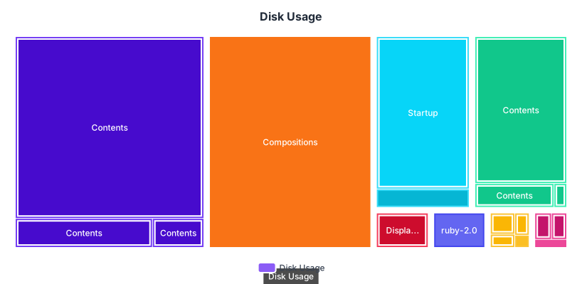
Disk usage — the original application, and still the clearest demonstration of why the form exists. Thousands of files, a deep folder hierarchy, and the answer to “what is filling my drive?” visible without reading a single number.
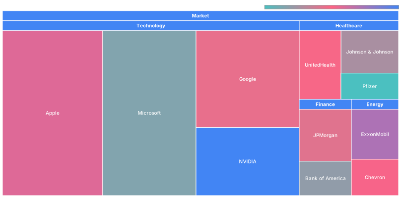
Market sectors — the financial-dashboard convention, where the hierarchy is sector then company. Google’s treemap is the most restrained of the five, which suits a chart that is already dense.

Distributed colouring — ApexCharts gives each block its own colour rather than colouring by group. It looks lively and it encodes nothing: if colour is not carrying a variable, one hue with the labels doing the work is more honest.
1. Your values can be negative. Area cannot represent a negative number. If your dataset includes losses or declines, a treemap cannot show them and will usually drop them silently — which is worse than refusing.
2. You have fewer than about fifteen items. With eight categories a sorted bar chart is more accurate, more familiar and easier to label. The treemap earns its imprecision by handling scale; below that it is paying the cost without collecting the benefit.
3. The reader needs to compare specific items. Two rectangles of similar size and different aspect ratio, sitting in different corners, cannot be reliably ranked by eye. If the question is “is A bigger than B?”, that is a bar chart question.
And a fourth that catches people out: when the distribution is flat. A treemap of forty roughly-equal values is a grid of near-identical rectangles — visually inert, and the layout algorithm’s arbitrary ordering becomes the most salient thing on screen. Treemaps want skew: a few big things, many small ones.
A treemap has to turn a list of values into rectangles that fill a space exactly, and there is more than one way to do that. The differences are invisible in a tutorial and obvious in a real chart.
Slice-and-dice cuts the rectangle in one direction per level: all the top-level blocks as vertical strips, their children as horizontal bands inside them. It preserves order perfectly — the first item is always leftmost — and produces terrible aspect ratios, long thin slivers that are almost impossible to compare.
Squarified layouts, which every library here uses by default, greedily arrange blocks to keep each one as close to square as possible. Comparison gets much better and strict ordering is sacrificed: an item can move a long way when a neighbour changes.
Two practical consequences. First, if your reader needs to find a specific item repeatedly — a named product, their own team — a squarified treemap will move it between updates, and you should either fix the order or provide search. Second, the near-square blocks are what makes area judgement tolerable at all, so overriding the layout for aesthetic reasons usually costs accuracy.
A treemap in a live interface has three requirements that a static one does not, and they are worth designing before the visual style.
Drill-down. The honest answer to a deep hierarchy is not more nesting, it is descending: click a block, the treemap re-tiles to that subtree, a breadcrumb records where you are. ECharts ships this behaviour in its gallery, and it turns the depth limit from a hard ceiling into a navigation question.
A minimum block size. Decide what happens to items too small to draw — aggregate them into an “Other” block, or drop them with a stated threshold. Deciding by default means the layout decides, and the layout will silently omit them.
A plan for the tooltip’s absence. On the canvas and in an exported SVG there is no hover, so anything the tooltip was carrying — exact values, full names truncated in the block — has to be somewhere else. This is the difference between a treemap that works in Figma and one that only worked in the browser.
Six screens, start to finish, captured from the plugin.
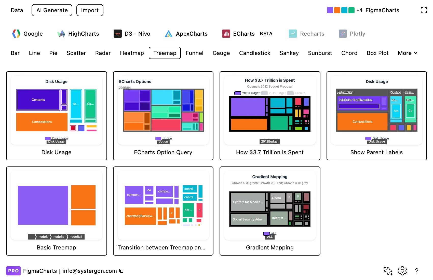
1. Filter to Treemap. All five libraries have one, which is unusual for a hierarchical chart. Pick by structure — flat, nested, or coloured by a second measure.
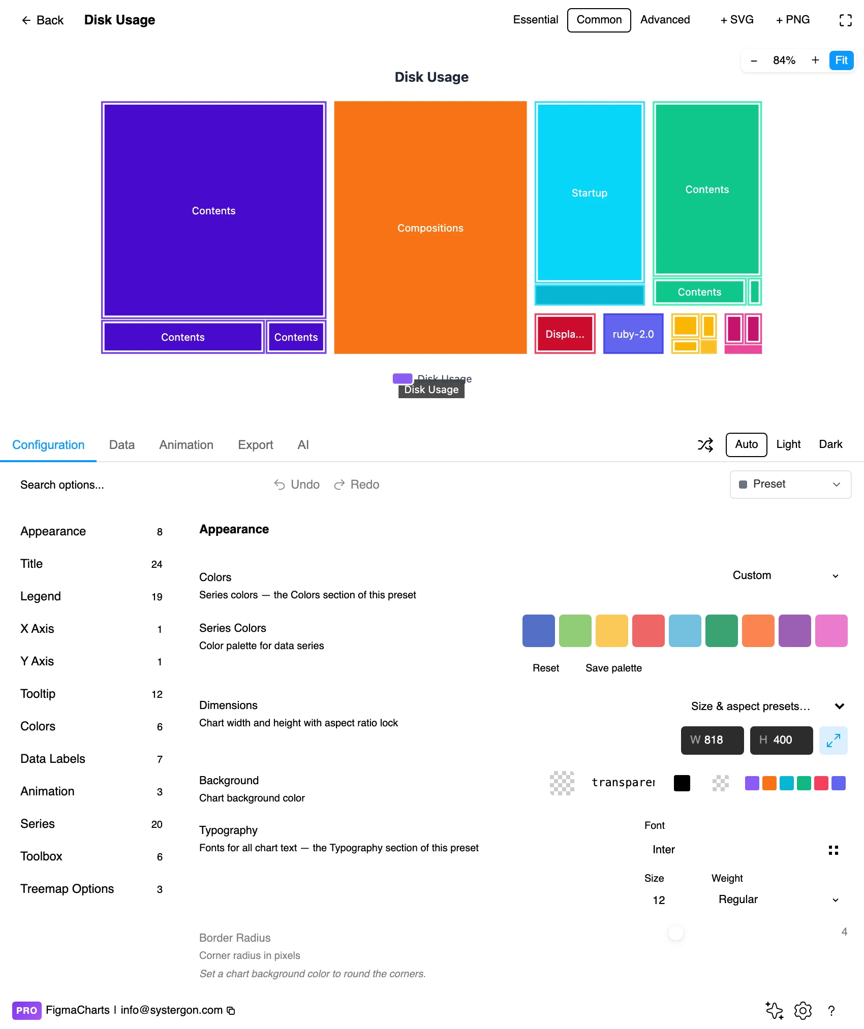
2. The editor. Live preview above, tabs below. Treemaps are worth previewing at their final size early: label legibility is entirely a function of how big the smallest block ends up.
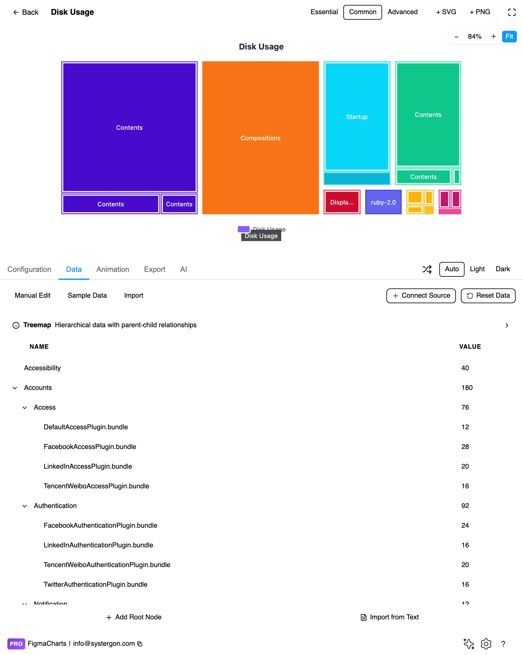
3. The hierarchy editor. This is the treemap’s own editor and only ECharts gets it: a tree of nodes with names, values and children, rather than a flat table. It is the right shape for the data — a treemap is a hierarchy, and a two-column table cannot express one.
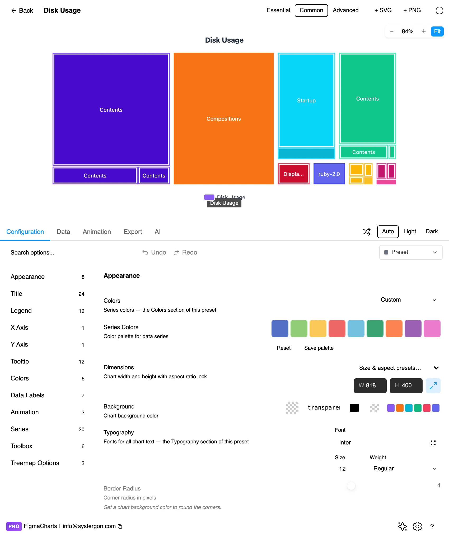
4. Configure. The layout algorithm, the label rules, the level styling and — if you are using one — the colour axis. Turning on parent labels is usually the single biggest legibility win.
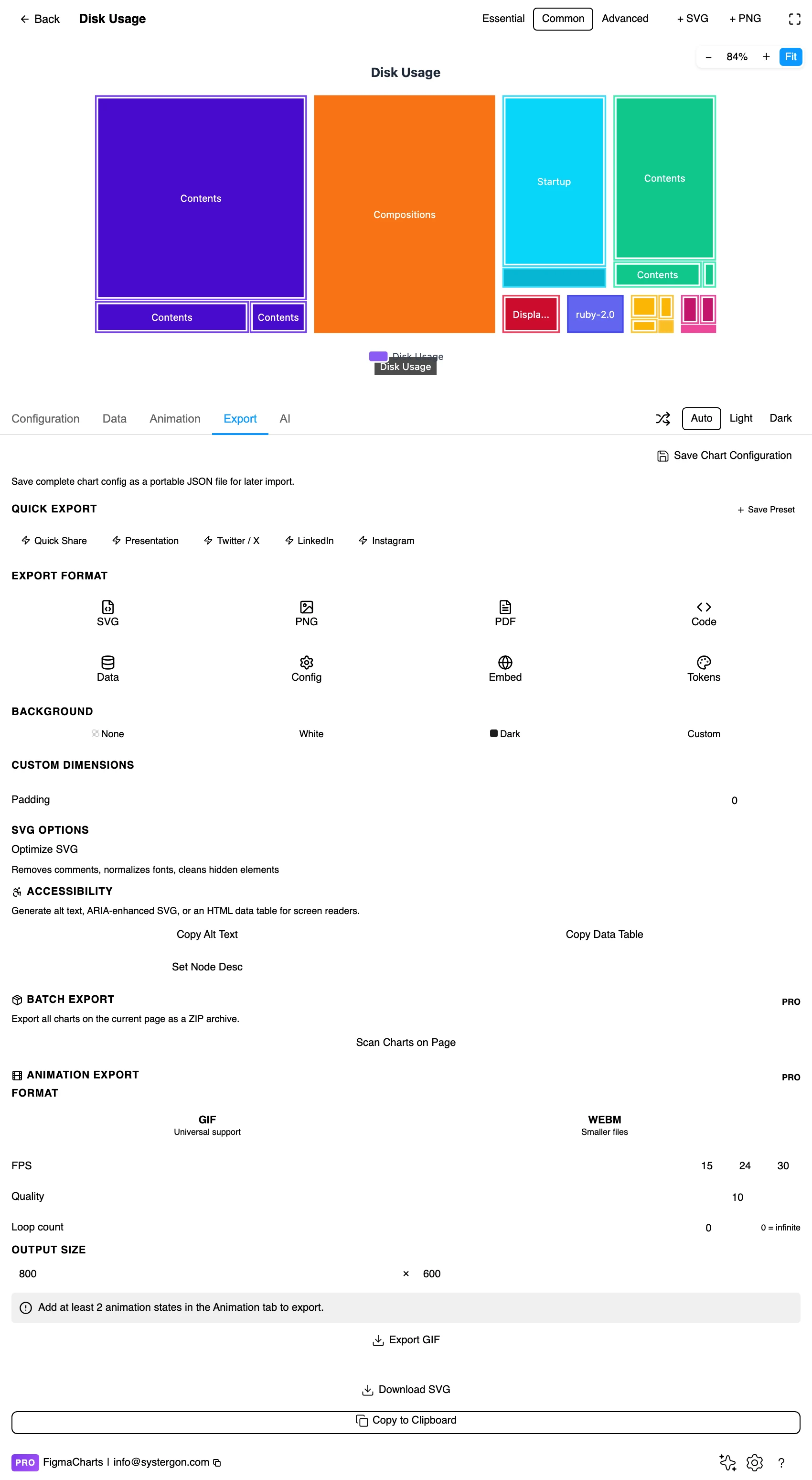
5. Export. Code for React, Vue 3, Angular, Svelte or vanilla JavaScript — or the Config alone, which carries the nesting rules and level styles.
6. Insert. SVG gives you every block as a real rectangle with real text, so highlighting one item or re-labelling a group happens on the canvas.
A treemap takes hierarchical data: a tree of { name, value, children } rather than rows and columns. That is a genuinely different shape from everything in the cartesian family, and it has consequences worth knowing before you start.
In ECharts the plugin gives it a dedicated hierarchy editor — a tree you expand and edit node by node, which matches the data instead of flattening it. In Nivo the same structure is edited as JSON. In Highcharts, Google Charts and ApexCharts, treemap data arrives in the ordinary table, with the parent expressed as a column.
Treemaps cannot bind a live data source in Nivo, Google Charts or ECharts. The plugin blocks the connection rather than corrupting the chart, and tells you why: those libraries expect a specialised data format that the connector cannot fill. Highcharts and ApexCharts treemaps are not restricted. If your treemap has to refresh from a Sheet, that is the constraint to design around — see live data from Google Sheets and APIs.
And the usual numeric caution applies with a twist: a cell that will not parse becomes 0, and a zero-value node in a treemap is a rectangle with no area — it vanishes from the picture while remaining in your data, which is a silent way to lose an item.
The 18 examples split ECharts 7, Google Charts 5, Highcharts 3, ApexCharts 2, Nivo 1.
Two close relatives are worth knowing when you find a treemap is not quite right: the sunburst, which shows the same hierarchy radially and makes depth clearer at the cost of area accuracy, and circle packing, which trades away the space-filling property in exchange for much clearer nesting.
As always: design in whichever library your engineers already use, because the export then matches production exactly. Choosing the right chart library covers the trade-offs.
Colour by group, or by a second measure, never by index. Giving every block its own hue — the distributed style above — makes a lively picture in which colour means nothing. Either colour by parent, so the groups read as groups, or map colour to a second variable and provide a legend.
Label what fits, and only what fits. Treemaps degrade badly when labels are forced into blocks too small for them. Set a threshold: label the blocks above a size, leave the rest to the tooltip or an accompanying table.
Give the levels different weights. Parent headers in a heavier, larger type over child labels in a lighter one makes the hierarchy legible instantly. Same-size labels at both levels is the most common reason a nested treemap reads as a flat one.
Use padding to show nesting. A few pixels of gap around each group, slightly more than the gap between siblings, is what makes containment visible. Without it, a nested treemap and a flat treemap look identical.
Sort matters more than it looks. Most layout algorithms place the largest block top-left and work outward, which readers learn quickly. Keep that convention unless you have a reason; a treemap with an arbitrary arrangement wastes the one positional cue it has.
For type and colour, bind them to your design system rather than picking by hand — covered in Your chart, your design system.
Aspect ratio distorts area judgement. This is the treemap’s built-in distortion. Two rectangles with the same area but different proportions do not look the same size — long thin ones read as smaller. Squarified layouts exist precisely to minimise this, and they cannot eliminate it. It is why a treemap is a chart for “this dominates” rather than “this is 12% larger”.
The layout is not stable across updates. Add one item or change one value and the algorithm may re-tile the whole rectangle, so a treemap in a live dashboard can rearrange itself between refreshes. Readers who have learned where something sits will lose it. If stability matters, fix the ordering explicitly.
Depth beyond two levels stops being readable. Three or four levels of nesting produce blocks whose parents are no longer visually identifiable. Two levels plus colour is the practical ceiling; deeper hierarchies want a sunburst, an icicle or an interactive drill-down.
Small values disappear entirely. Below a fraction of a percent, a block is a sliver or nothing. A long tail is invisible rather than small — if the tail matters, aggregate it into an explicit “Other” block so its total is at least present.
Colour and area compete. When both are mapped to variables, a large pale block and a small saturated one are hard to rank on either dimension. That is the cost of the two-variable trick, and it is worth paying only when the second variable genuinely changes the story.
Area alone is not an accessible encoding. Labels with values inside the larger blocks give everyone the numbers, and they are the difference between a chart and a picture of one.
Check label contrast against every block colour. A treemap fills the whole frame with colour, so label text sits on the data rather than the background — and one text colour will not clear contrast on both the darkest and lightest blocks. Either switch text colour by block luminance, or constrain the palette so one text colour works throughout.
Do not rely on hover. An inserted SVG has no tooltips, so anything essential — the values, the group names — must be on the canvas.
Give it a text equivalent. The Export tab’s Copy Alt Text, Copy Data Table and Set Node Desc produce a description, a table of the underlying numbers and a description written onto the Figma node. For a treemap the table is the accessible version of the hierarchy, and it carries the long tail the picture cannot.
Showing a hierarchy and a distribution together at scale — a hundred items and their groupings in one frame. It is good at “these few things dominate” and poor at “A is slightly bigger than B”, because area is a weak channel and differing rectangle shapes make it weaker.
No. There is no negative area. If your data includes losses or declines, use a bar chart — or split the data and show gains and losses as two charts, labelled as such.
Two comfortably. Beyond that the parents stop being visually identifiable and the labels stop fitting. For deeper hierarchies, use a sunburst, an icicle chart, or a treemap with interactive drill-down — ECharts ships the drill-down version.
Both show a hierarchy as part-to-whole. A treemap fills the space, so it handles many items and reads well in a rectangle; a sunburst makes depth clearer and handles fewer items. ECharts even ships a transition between the two, which is the fastest way to see the trade-off.
Because their area rounded to nothing. Anything below a fraction of a percent is a sliver at typical sizes. Aggregate the tail into an explicit “Other” block so its total is visible, and say how many items it contains.
Yes, and it is the treemap’s best feature: size for one variable, colour for another. Highcharts ships a treemap with a continuous colour axis for exactly this. Use a diverging scale only where the second measure has a real midpoint, such as growth around zero.
In Highcharts and ApexCharts, yes. In Nivo, Google Charts and ECharts the plugin blocks the connection, because those treemaps expect a specialised hierarchical format the connector cannot produce — you get a message rather than a broken chart.
Insert as SVG and every block is a real rectangle and every label real text, so you can highlight one item, re-colour a group or annotate a block on the canvas. Insert as PNG for a flat image at twice the pixel density.
Open the plugin, filter to Treemap, and put your real hierarchy in — then check two things before styling anything: whether any value is negative, and whether the distribution is skewed enough for the picture to have a shape. Those two answers decide whether this is your chart, and both take ten seconds to check.
Install Figma Charts — it’s free to try → Browse all 45 chart types →