Install Figma Charts — it’s free to try → See the sunburst gallery →
A sunburst is a hierarchy drawn in polar coordinates: the root at the centre, each level a ring further out, each segment’s angle its share of its parent. It is the same data a treemap shows and a different reading — a treemap is optimised for comparing sizes, a sunburst for seeing depth and lineage. You can follow a path from the centre outward and watch a category divide.
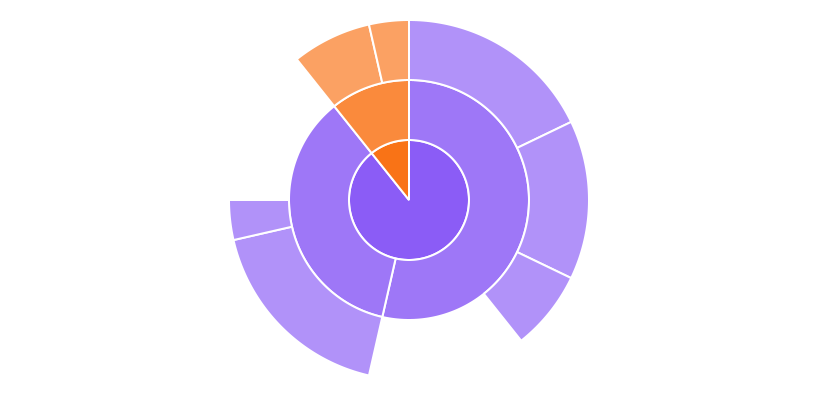
Real plugin output: an ECharts sunburst captured from the editor. Every chart on this page is the library’s own drawing.
It also has a distortion nobody mentions: the same share occupies more ink the further out it sits, because circumference grows with radius. This page is about when the radial reading is worth that, how deep you can go before it stops working, and what to do about labels — which is where most sunbursts actually fail.
Everything below happens inside Figma Charts, a Figma plugin. It runs the real JavaScript charting libraries — Google Charts, Highcharts, D3-based Nivo, ApexCharts and Apache ECharts — inside the plugin window, so the rings on your canvas are the library’s own layout.
Install Figma Charts from the Figma Community →
Press ⌘/ (Ctrl / on Windows), type Figma Charts, hit Enter, and pick Sunburst from the category filter. There are 9 examples — ECharts 6, Highcharts 2, Nivo 1.
Three rules define the form, and all three follow from the geometry:
That last property is the reason to choose a sunburst over a treemap. A treemap nests rectangles and needs padding, headers or colour to signal parentage; a sunburst makes it geometric — the parent is literally the arc you are standing on.

Multi-level — three rings out from the centre, which is about the practical limit before the outer segments become slivers. Note how much easier the hierarchy is to trace here than in a nested treemap of the same data.
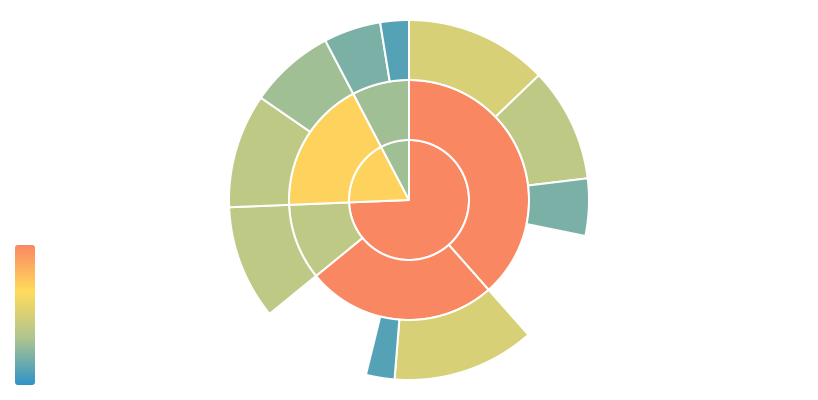
Coloured by a second measure — angle carries size while colour carries something else: growth, margin, risk. It is the same two-variable trick a treemap colour axis provides, and it works better here because the segments are more regular in shape.
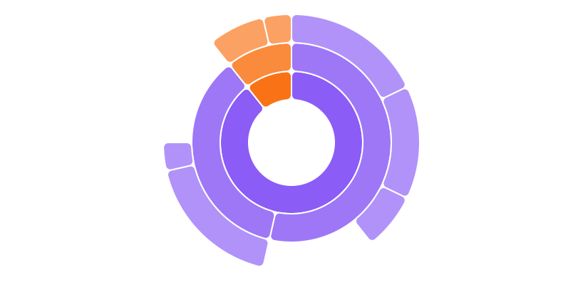
Rounded corners and gaps — a styling choice with a real effect: separating the segments makes the ring structure read as discrete steps rather than a continuous wheel, which helps when levels are hard to distinguish.

Highcharts’ sunburst — with drill-down: clicking a segment re-roots the chart at that node. For deep hierarchies this is the answer to the depth limit, and it converts a crowded chart into a navigable one.
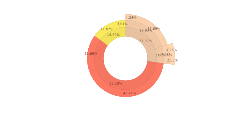
Nivo’s sunburst — the D3 look, with good default arc padding and inherited colour so children take a tint of their parent’s hue. That inheritance is the single most useful colour strategy for this chart. React-only export.
1. Your hierarchy is deeper than about four levels. Each ring is thinner than the last in angular terms — the segments subdivide — and past four levels the outer ring is a band of unlabelable slivers. Use drill-down, or an icicle chart, which lays the same hierarchy out rectangularly and scales to depth much better.
2. Comparing sizes is the main task. Angle is a weaker channel than length, and the radial distortion below makes cross-ring comparison unreliable. If the question is “which of these is biggest?”, use a bar chart; if it is “how does the whole divide?”, a treemap uses the space better.
3. You have one level. A one-ring sunburst is a donut chart with extra steps — and the donut post covers what to put in the middle.
A fourth, which is about audience: when the chart must be read at a glance. Sunbursts reward study. On a slide that gets eight seconds, a ranked bar of the top categories communicates more.
Five charts in this plugin show the same nested data, and picking between them is a question about what the reader has to do rather than what looks best.
Treemap — space-filling rectangles. Best at comparing quantities and handling hundreds of items; weakest at showing which parent a leaf belongs to. Choose it when the sizes are the subject.
Sunburst — the same nesting in rings. Best at showing depth and lineage; weaker at comparison because of the radial distortion. Choose it when the structure is the subject.
Icicle — the sunburst unrolled into rectangles, with depth running down or across. It keeps the lineage clarity, drops the radial distortion, scales to more levels, and gives labels a horizontal line to sit on. It is frequently the right answer when a sunburst gets too deep, and Nivo is the library that has one.
Tree — nodes and edges rather than nested areas. It shows structure and relationships but not proportion: no quantity is encoded at all unless you add it separately. ECharts ships seven layouts including radial.
Circle packing — nested circles. The clearest nesting of the five and the least space-efficient, because circles cannot tile. Good for a small hierarchy where the structure is the whole point.
The depth limit is the sunburst’s real constraint, and there are only three ways round it.
Truncate and aggregate. Show three levels and fold everything below into its third-level parent, with a note saying so. This keeps the chart honest and readable, and it is usually the right choice for a static design.
Drill down. Make the chart navigable: clicking a segment re-roots the sunburst at that node, with a breadcrumb recording the path. Highcharts ships this behaviour, and it converts the depth problem into a navigation problem — a much better one to have. The catch for design work is that an inserted SVG has no interaction, so the drill-down states have to be designed as separate frames.
Change chart. Past four levels, an icicle or an indented tree simply works better. There is no prize for making the sunburst cope.
One thing to avoid: shrinking the ring widths to fit more levels. It buys a level and costs every label, and a sunburst whose outer rings cannot be labelled has stopped being a chart and become a texture.
Six screens, start to finish, captured from the plugin.
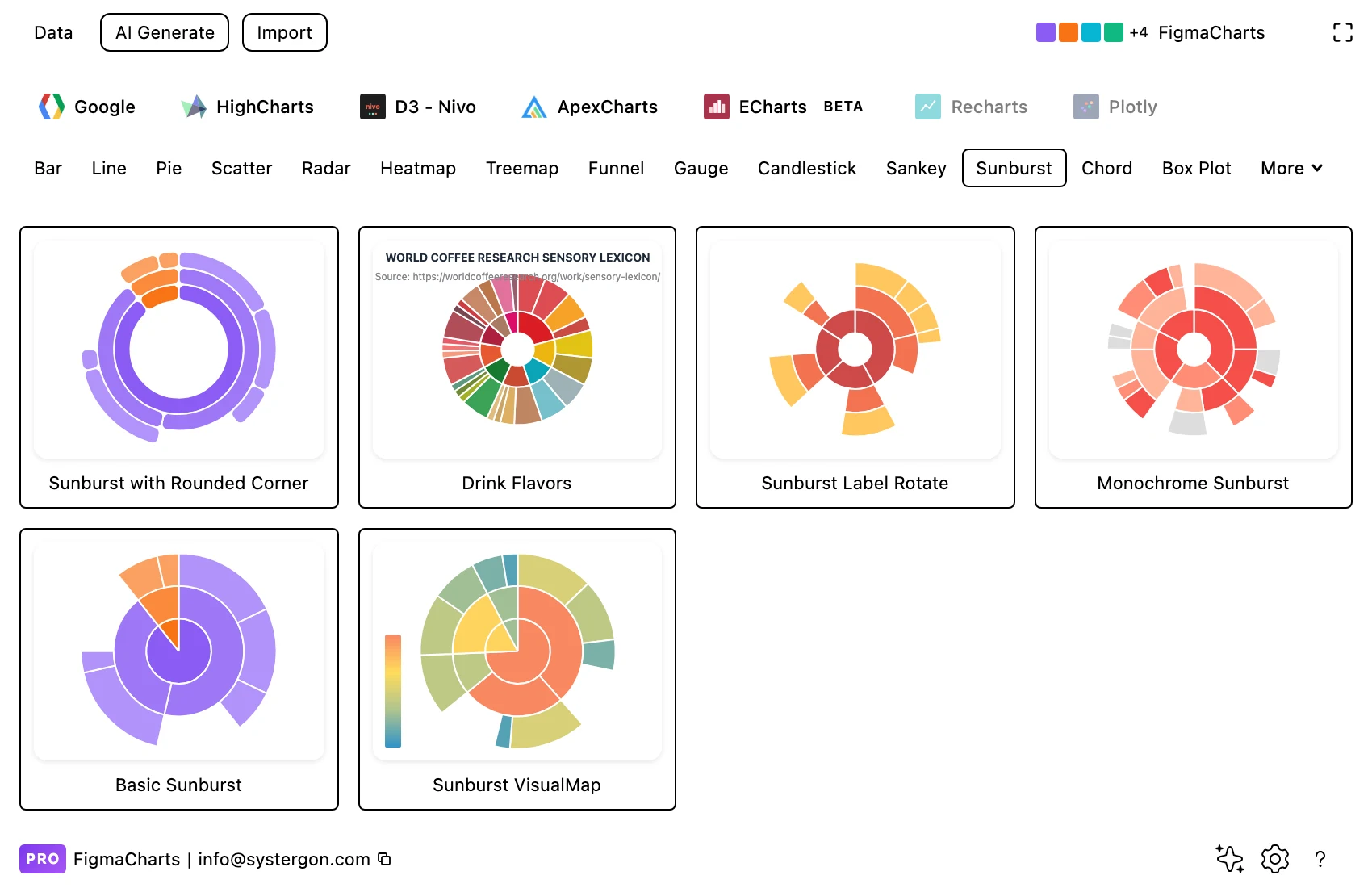
1. Filter to Sunburst. Three libraries have it — ECharts with six examples, Highcharts with two, Nivo with one.
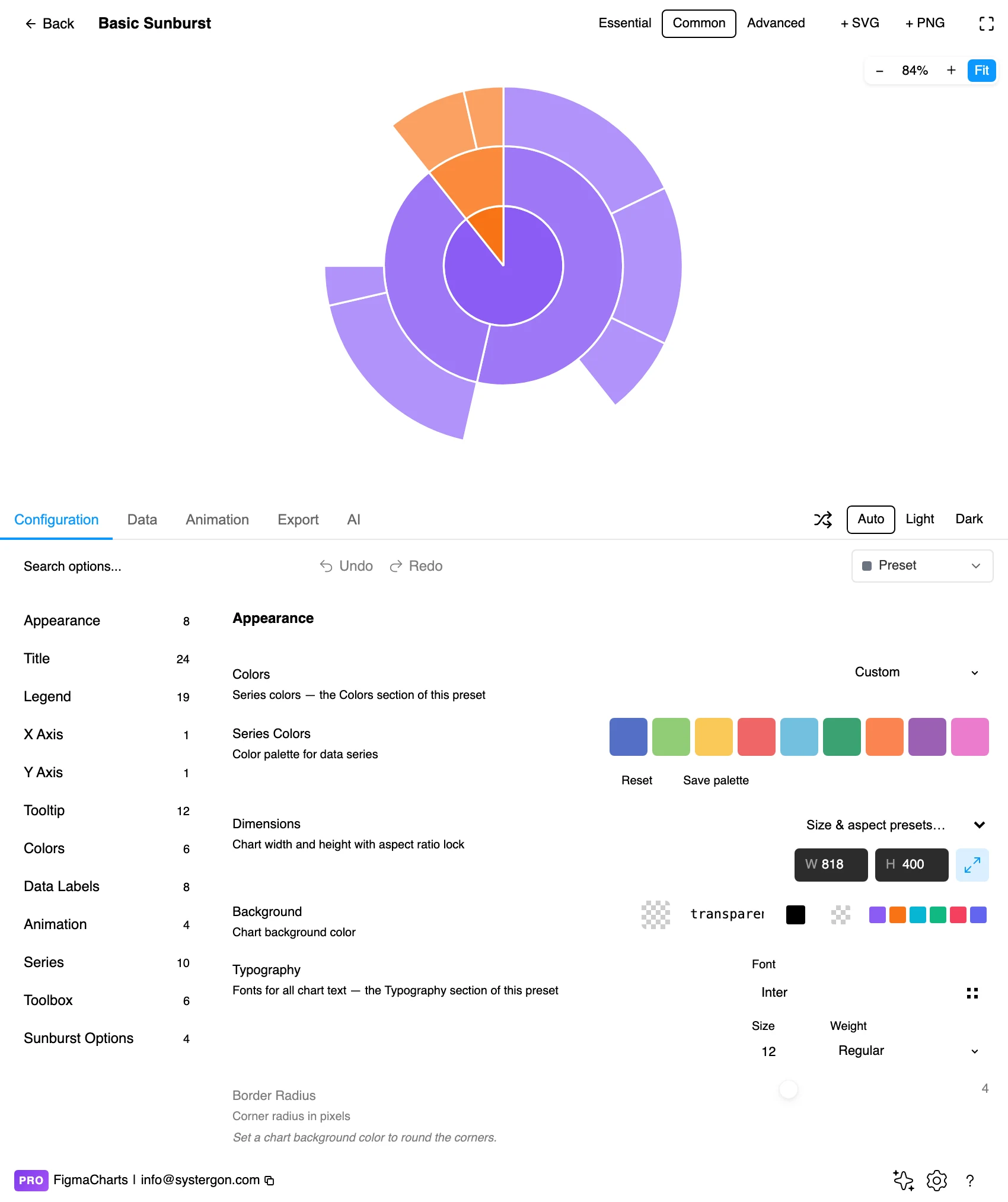
2. The editor. Live preview above, tabs below. Sunbursts are square: they want equal width and height, so set the frame before you tune anything else.
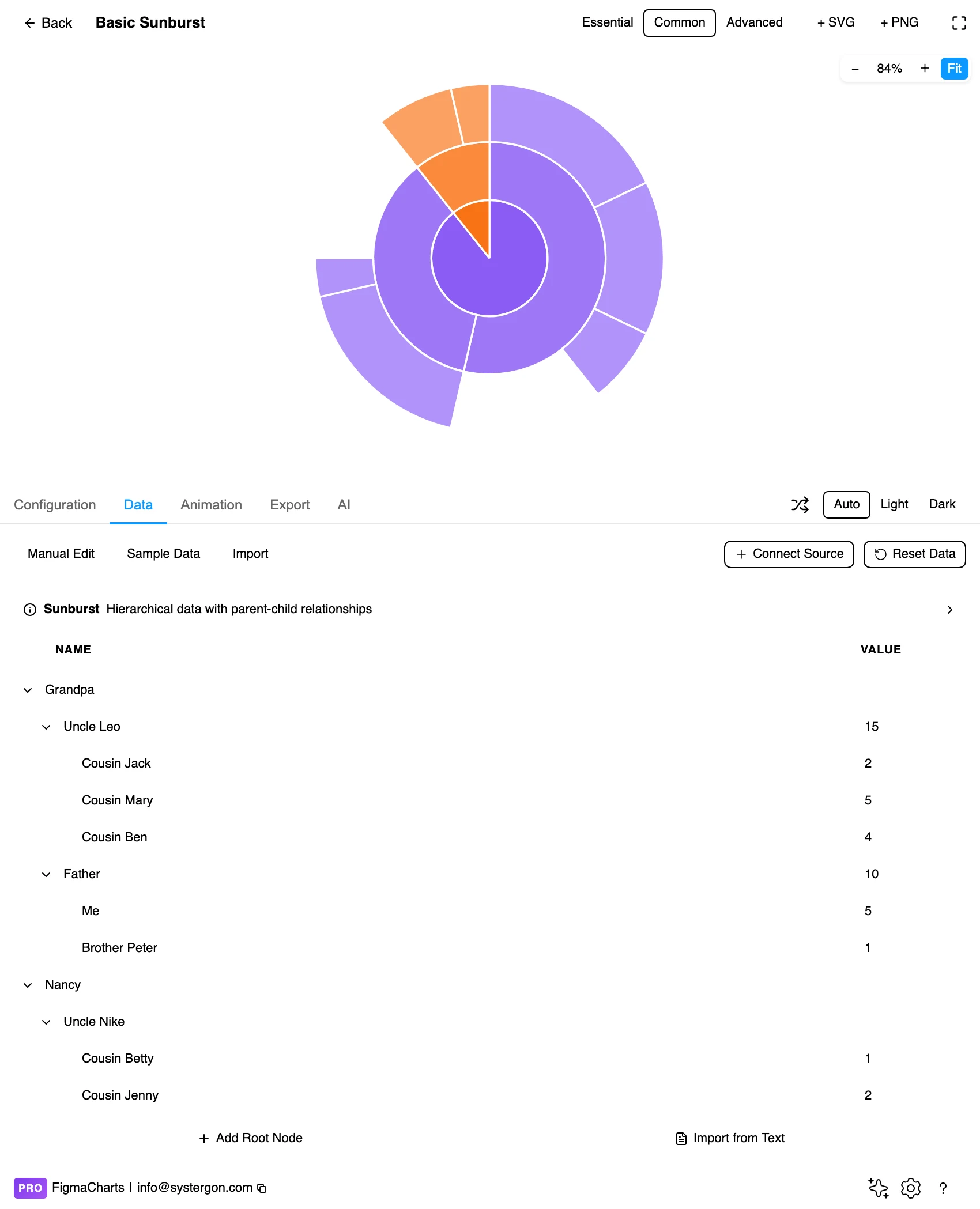
3. The hierarchy editor. Same tree editor the treemap uses, and for the same reason — the data is nested name / value / children, which a flat table cannot express. ECharts gets this editor in the plugin; Nivo edits the structure as JSON.
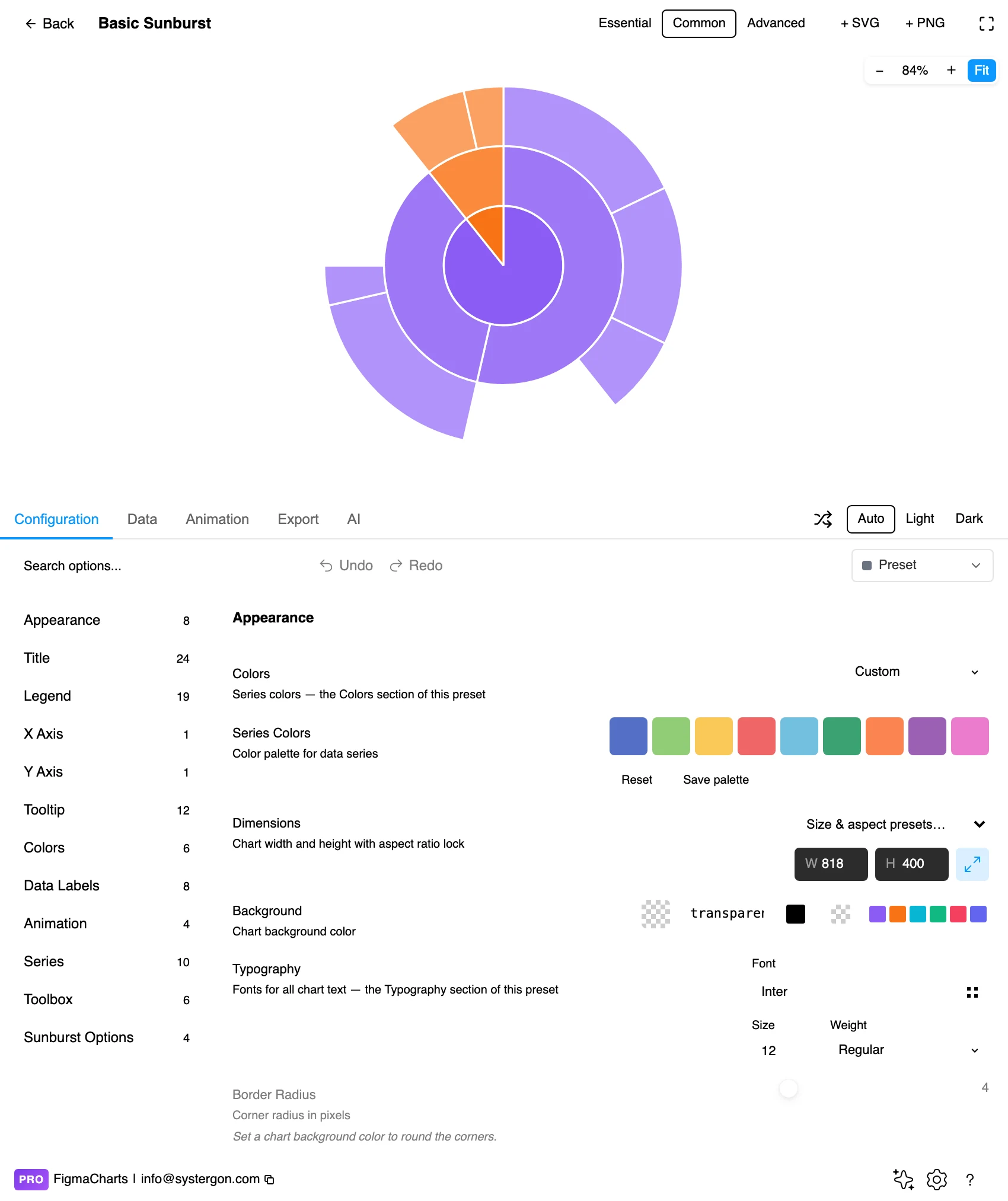
4. Configure. Ring radii, label rotation, level-by-level styling and the colour strategy. Label rotation is the setting that decides whether the outer ring is readable.
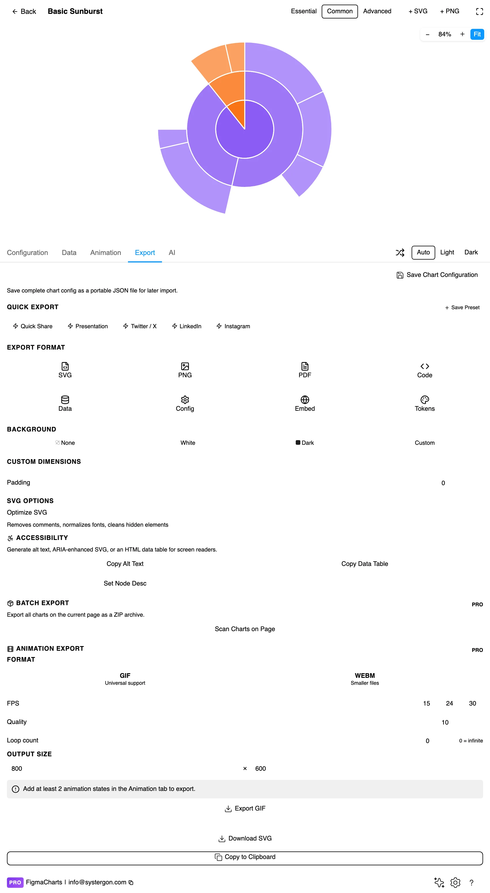
5. Export. A working component for React, Vue 3, Angular, Svelte or vanilla JavaScript — or the Config alone, which carries the per-level styling.

6. Insert. SVG gives you every arc as its own vector path, so one branch can be pulled out, recoloured or annotated on the canvas.
Hierarchical: a tree of { name, value, children }, exactly as a treemap takes. Leaf values roll up, so a parent’s angle is the sum of its children — and if you supply both a parent value and children that do not sum to it, libraries differ in what they believe, which is a good reason to supply values only at the leaves.
In ECharts the plugin provides its hierarchy editor for this shape; in Nivo the same structure is edited as JSON. And as with treemaps, sunbursts cannot bind a live data source in ECharts or Nivo — the connection is refused rather than corrupting the chart, because a hierarchy is not something the connector can build from a flat range.
Two data properties to check before building. Values must be non-negative, since there is no negative angle. And every node needs a parent path: an orphan is either dropped or attached to the root, and both are silent.
The 9 examples split ECharts 6, Highcharts 2, Nivo 1 — and Google Charts and ApexCharts have none.
As always: design in whichever library your engineers already use, because the export then matches production exactly. Choosing the right chart library covers the trade-offs.
Inherit colour down the branches. Give each top-level category a hue and let its descendants take lighter or darker tints of it. This is the strategy that makes a sunburst legible: colour says which branch, position says where in it, and no legend is needed for the outer rings.
Rotate labels along the arc, or drop them. Tangential labels follow the ring and stay readable; horizontal labels on a narrow outer segment do not fit at all. Every library exposes a rotation mode — and the honest option, once segments are under a few degrees, is no label plus an annotation for the ones that matter.
Keep the centre. A small empty hub gives the root somewhere to live and stops the innermost ring converging into a point. It is also where a total belongs, exactly as in a donut.
Thin the outer rings, thicken the inner ones. Equal ring widths give the most area to the level with the least aggregated meaning. Tapering the widths outward keeps the emphasis where the structure is.
Gaps between segments, not borders. A one or two pixel gap in the background colour separates arcs without the visual weight of an outline, which matters when the outer ring has forty segments.
For type and colour, bind them to your design system rather than picking by hand — covered in Your chart, your design system.
The same share is bigger further out. This is the sunburst’s built-in distortion and the mirror image of the concentric-ring problem in donut charts: an arc at a large radius covers more area and more length than an identical angle near the centre. Readers judge by ink, so outer segments look more significant than inner ones of the same proportion. Nothing fixes it; knowing it stops you drawing conclusions from cross-ring comparisons.
Angles at depth are hard. By the third ring most segments are a few degrees wide, and distinguishing 4° from 6° is not something vision does. Treat the deep rings as texture and structure, not as measurements.
Rotation makes labels harder to compare. Text set along an arc is readable individually and hard to scan as a set, because each label sits at a different angle. Where a reader needs to compare names, a rectangular layout is kinder.
Missing intermediate levels silently restructure the tree. If some branches are three deep and others two, the shallower ones end early and their outer ring is empty — which reads as missing data rather than a shallower branch. Pad explicitly if the depths differ for structural reasons.
Order around the circle is a choice. Alphabetical, by value, or by a domain sequence — whichever you pick, the reader will infer meaning from adjacency. Sorting by value makes the largest branch start at twelve o’clock and reads as a ranking, which is usually what you want.
Three cases where the radial reading earns its place over a treemap, all of which share a property: the hierarchy is shallow, and the path matters more than the exact sizes.
Composition of a budget or a bill. Total in the centre, departments in the first ring, line items in the second. A reader can follow any cost inward to see what it is part of, which is the question people actually ask of a budget chart.
Traffic or funnel paths. Entry points in the first ring, next steps outward. The sunburst shows both the split at each stage and the relative size of each route — and because children fill their parent’s arc, a drop-off is visible as a gap rather than needing to be computed.
Taxonomy audits. Content categories, product hierarchies, permission trees. Here the finding is usually structural — a category with one child, a level that is barely used — and the sunburst shows lopsided structure at a glance in a way a table of counts does not.
The common thread is that nobody is being asked to compare a segment in ring three with a different segment in ring two. Where that comparison is the task, use a treemap or a bar chart and keep the sunburst for the overview.
Do not rely on hue alone to separate branches. With inherited tints the lightness difference between a parent and its children can be small; make sure adjacent branches differ in more than saturation.
Label the levels somewhere. A reader who cannot infer that ring two is “product family” and ring three is “SKU” is missing the chart’s structure. A short caption naming the levels costs a line and explains the whole graphic.
Do not put essential values only in a tooltip. An inserted SVG has no hover, so anything a reader must know belongs on the canvas or in an accompanying table.
Give it a text equivalent. The Export tab’s Copy Alt Text, Copy Data Table and Set Node Desc produce a description, a table of the underlying numbers and a description written onto the Figma node. For a sunburst the table is the honest version of the hierarchy, and it carries the deep levels the picture cannot.
Same data, different strengths. A treemap fills the space and is better for comparing sizes and handling many items; a sunburst makes depth and lineage obvious and handles fewer items. If the reader needs to see structure, choose the sunburst; if they need to compare quantities, choose the treemap.
Three comfortably, four at a push. Each ring subdivides the one before it, so the outer segments become slivers that cannot be labelled. For deeper trees, use drill-down — Highcharts ships it — or an icicle chart, which handles depth far better.
Because circumference grows with radius, so an identical share covers more ink further from the centre. It is the chart’s built-in distortion, and it means comparisons across rings are unreliable even when the angles are identical.
ECharts (6 examples, the most per-level control), Highcharts (2, with drill-down) and Nivo (1, with inherited colour). Google Charts and ApexCharts have no sunburst — a treemap is the nearest hierarchy chart there.
Because the data is nested rather than tabular: name, value and children. ECharts sunbursts get the plugin’s hierarchy editor; Nivo edits the same structure as JSON. Neither can bind a live data source, because a connector cannot build a hierarchy out of a flat range.
Put them on the leaves and let them roll up. Supplying both a parent value and children that do not sum to it produces library-dependent behaviour — some trust the parent, some the children — and neither will tell you which it chose.
By branch, with children inheriting a tint of their parent’s hue. That makes lineage visible without a legend. Reserve an independent colour scale for the case where colour is carrying a second measure, and then say so in a legend.
Insert as SVG and every arc is its own vector path with the labels as real text, so a branch can be isolated, recoloured or pulled out for emphasis. Insert as PNG for a flat image at twice the pixel density.
Open the plugin, filter to Sunburst, and put your hierarchy in — then count the rings. If there are three or fewer and the outer segments can hold a label, you have the right chart. If there are five, you have learned that this data wants drill-down or an icicle chart, and you have learned it in ten seconds rather than after an afternoon of styling.
Install Figma Charts — it’s free to try → Browse all 45 chart types →