
Install Figma Charts — it’s free to try → See the radar gallery →
A radar chart turns a row of numbers into a shape. Several measures radiate from a centre, each value is plotted along its own spoke, and the points are joined into a polygon — so an entity becomes a silhouette you can recognise and compare. That is a real cognitive trick, and it comes with a real catch: the shape depends on the order of the spokes, and the order is usually arbitrary.
Real plugin output: a Highcharts radar captured from the editor. Every chart on this page is the library’s own drawing, not an illustration of one.
Reorder the axes and the same data produces a different silhouette — spikier, rounder, larger-looking — without a single value changing. So this page is organised around one distinction that decides whether a radar chart is honest: whether the circle is real, or whether you invented it.
Everything below happens inside Figma Charts, a Figma plugin. It runs the real JavaScript charting libraries — Google Charts, Highcharts, D3-based Nivo, ApexCharts and Apache ECharts — inside the plugin window, so the polygon on your canvas is the library’s own geometry.
Install Figma Charts from the Figma Community →
Press ⌘/ (Ctrl / on Windows), type Figma Charts, hit Enter, and pick Radar from the category filter. There are 14 radar examples across four libraries — Google Charts is the one that cannot draw this chart at all.
Sometimes the dimension genuinely wraps around. Compass direction does: north is adjacent to north-east on one side and north-west on the other, and 359° is next to 1°. Hours of the day do. Months do, if you care about seasons. When the dimension is genuinely circular, a radar chart is not a stylistic choice — it is the correct coordinate system, and every criticism below evaporates because the axis order is fixed by the world rather than by you.

The wind rose — frequency of wind by compass direction. The angular axis is real, the order is not negotiable, and the shape means something: a prevailing wind is a genuine bulge. This is the radar chart at its most defensible, and it is why the form was invented.
The other legitimate case is a profile against a shared frame: the same five or six measures, on the same scales, compared across two or three entities. Skill assessments, product feature coverage, evaluation scorecards. Here the axis order is still arbitrary, but every silhouette is distorted the same way, so comparing them to each other remains valid even though reading any one of them precisely does not.
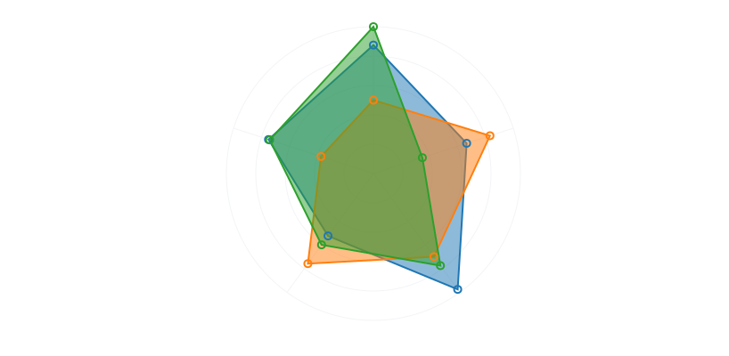
Filled — the standard treatment, and the one that most exaggerates. Filling the polygon makes area the dominant visual signal, and area on a radar chart is not a meaningful quantity: it depends on the axis order and it grows with the square of the values.

Spider web — polygonal gridlines instead of circular ones, which makes it easier to trace a single ring around the chart and read off a level. Purely a gridline choice, and a genuinely useful one when readers need to compare values against a threshold.

ApexCharts’ polygon radar — the same idea with a cleaner default palette and thinner strokes. At three series this is about as busy as a radar chart can get before the outlines stop being separable.
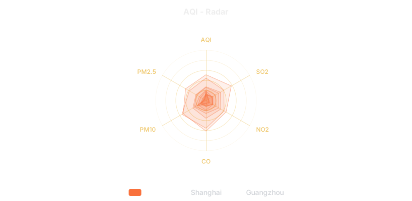
ECharts’ AQI radar — several pollutants per city, with per-axis maxima. Note the per-axis scaling: each spoke has its own maximum, which is what makes the comparison possible and also what makes the shape meaningless as a shape.
1. The axes are unrelated measures on unrelated scales. Revenue in millions, headcount in tens, satisfaction out of five. Normalising them onto one polygon implies they are commensurable — that being “far out” on revenue is the same kind of thing as being far out on satisfaction. Nothing in the chart says how each axis was scaled, so the reader cannot check.
2. You have more than three series. Overlapping polygons occlude each other. Three filled shapes on one radar is already a stack of translucent layers where the innermost is barely visible; four is a mess. The fix is small multiples — one radar per entity, same axes, same ranges, arranged in a grid — which keeps the silhouette-recognition benefit and drops the overlap problem entirely.
3. Precise values matter. Reading a value on a radar means judging a distance from the centre along a spoke, at an angle, against circular gridlines. It is one of the least precise reading tasks in the whole chart vocabulary. If your reader needs numbers, a table or a bar chart is not a compromise, it is the right answer.
And the one that decides most cases: if the axes could be shuffled without anyone noticing, the shape is an artefact. Try it — reorder your dimensions and look again. If the silhouette changed and you cannot say which order is correct, you have learned that the shape is not evidence.
Most radar charts that fail in review fail for the same reason — too many overlapping polygons — and the same fix works nearly every time: stop overlaying and start repeating.
One radar per entity, laid out in a grid, every chart sharing the same axes in the same order with the same maxima. Each polygon is now unobstructed, so the silhouette-recognition that made you want a radar in the first place actually works — and comparison becomes a matter of scanning shapes across a grid rather than untangling layers. Eight products in a 4×2 grid is legible; eight products on one radar is not a chart.
Two rules make it work. The maxima must be identical across every panel, or the shapes are drawn to different scales and comparison is meaningless — this is the same trap as per-panel colour scales in a heatmap. And the axis order must be identical, for the reason this whole page is about. Once both hold, small multiples of radars are one of the better ways to compare profiles, and one of the least used.
The commonest real-world radar is a scorecard: five to eight criteria, each scored out of the same maximum, one or two entities plotted. It is worth being precise about what that chart can and cannot support, because it is usually being used to justify a decision.
It can support “these two are differently shaped”. A candidate strong on three criteria and weak on two produces a visibly different silhouette from one who is even across all five, and that difference is real and worth showing.
It cannot support “this one is better”. That claim needs the criteria to be weighted, and a radar weights every axis identically by construction — each gets the same angular slice regardless of importance. If three of your five criteria are decisive and two are tie-breakers, the chart is quietly telling the reader they all matter equally.
And it cannot support “by this much”. The area difference between two polygons is not proportional to anything. If a total score matters, state it as a number next to the chart — the radar shows the profile, the number carries the magnitude.
Six screens, start to finish, captured from the plugin.
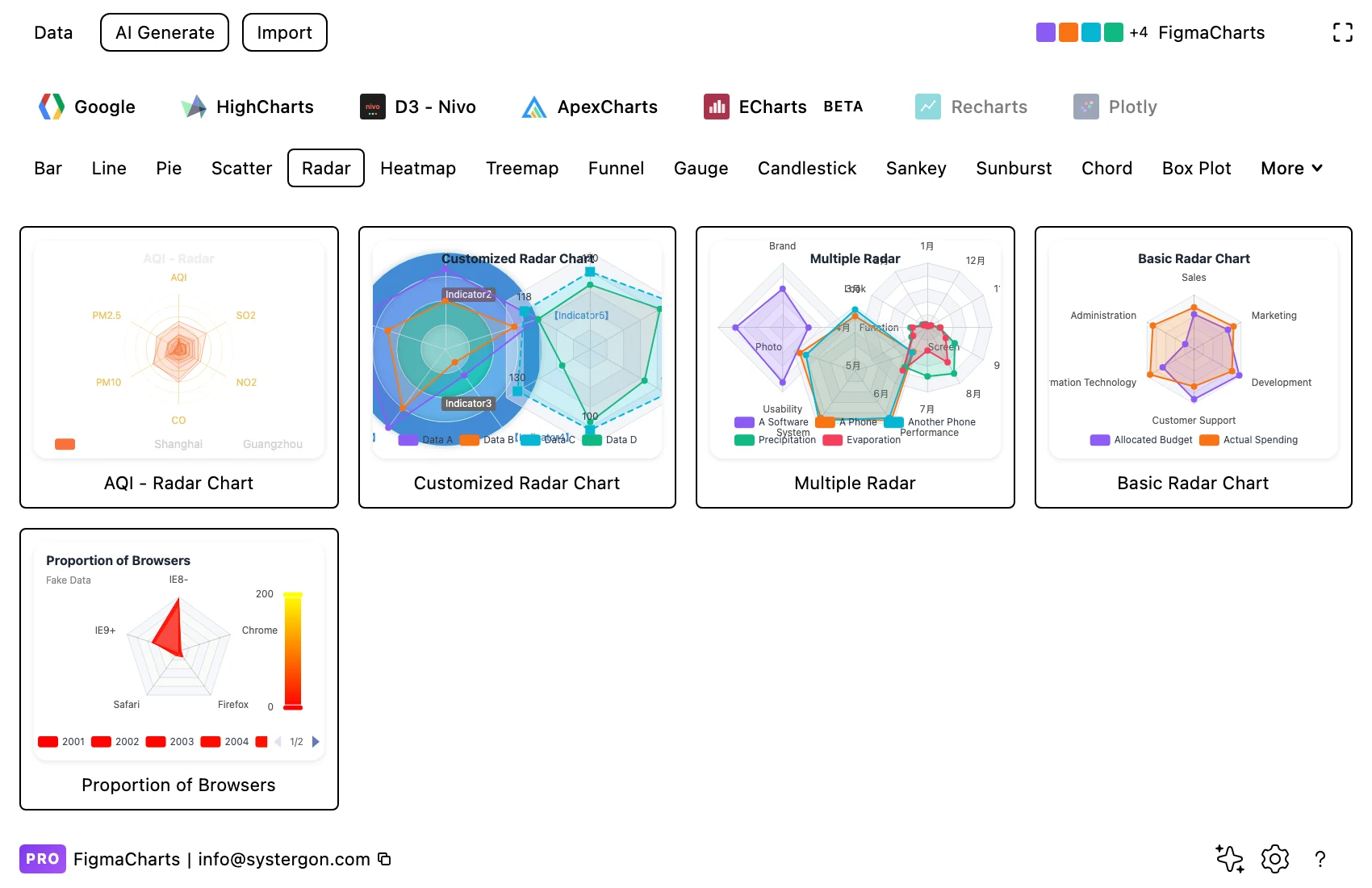
1. Filter to Radar. Four libraries have it — ECharts, Highcharts, ApexCharts and Nivo. Google Charts has no radar chart type at all.
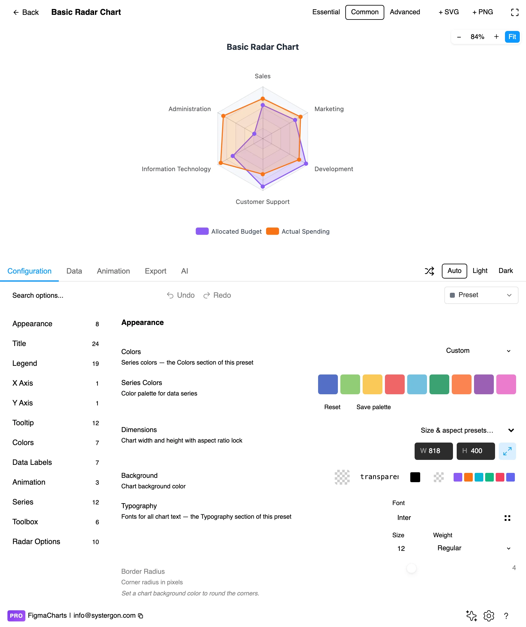
2. The editor. Live preview above, tabs below. For a radar, check the number of series before anything else — the sample charts often ship with two or three, and your data may want fewer.
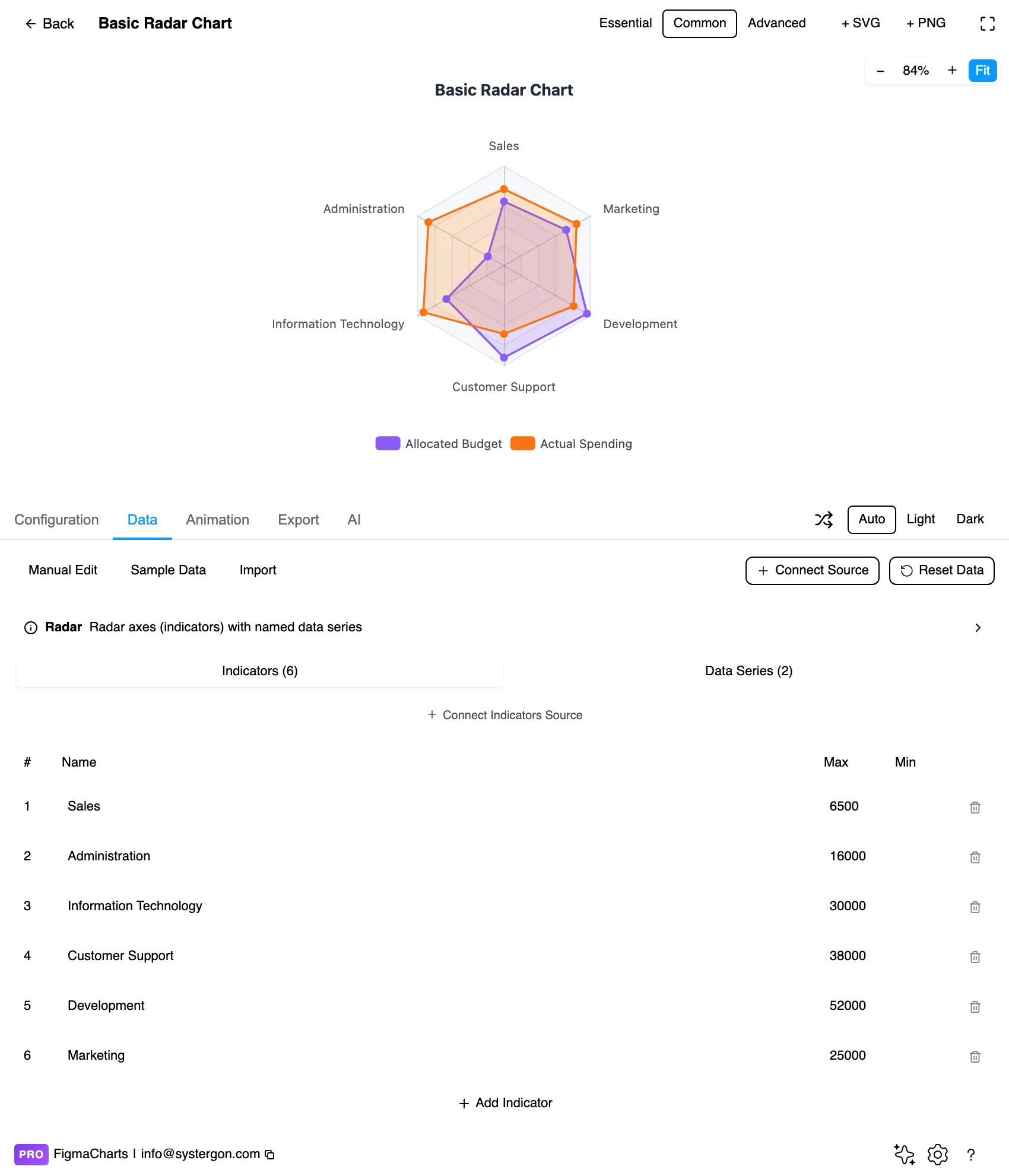
3. Indicators and data. Radar gets its own editor in ECharts, split into two sections: the indicators — the axis names with their maximum (and optionally minimum) — and the data, one named row per series with a value per axis. Those maxima are the most consequential numbers in the chart.
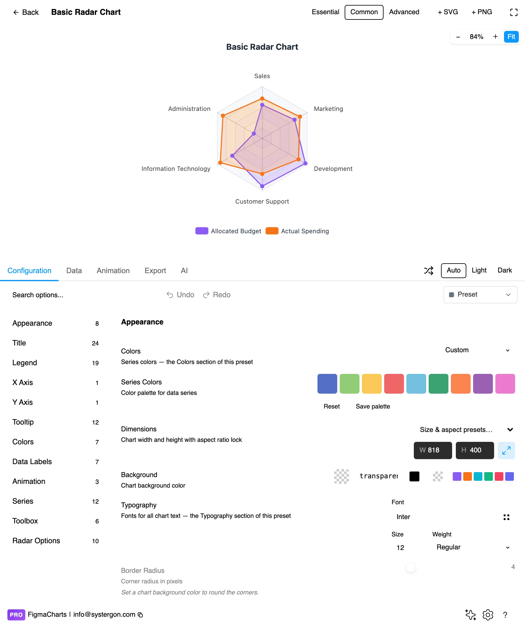
4. Configure. Gridline shape (circular or polygonal), the fill opacity, the starting angle and the tick levels. This is also where you decide whether to fill the polygons at all.
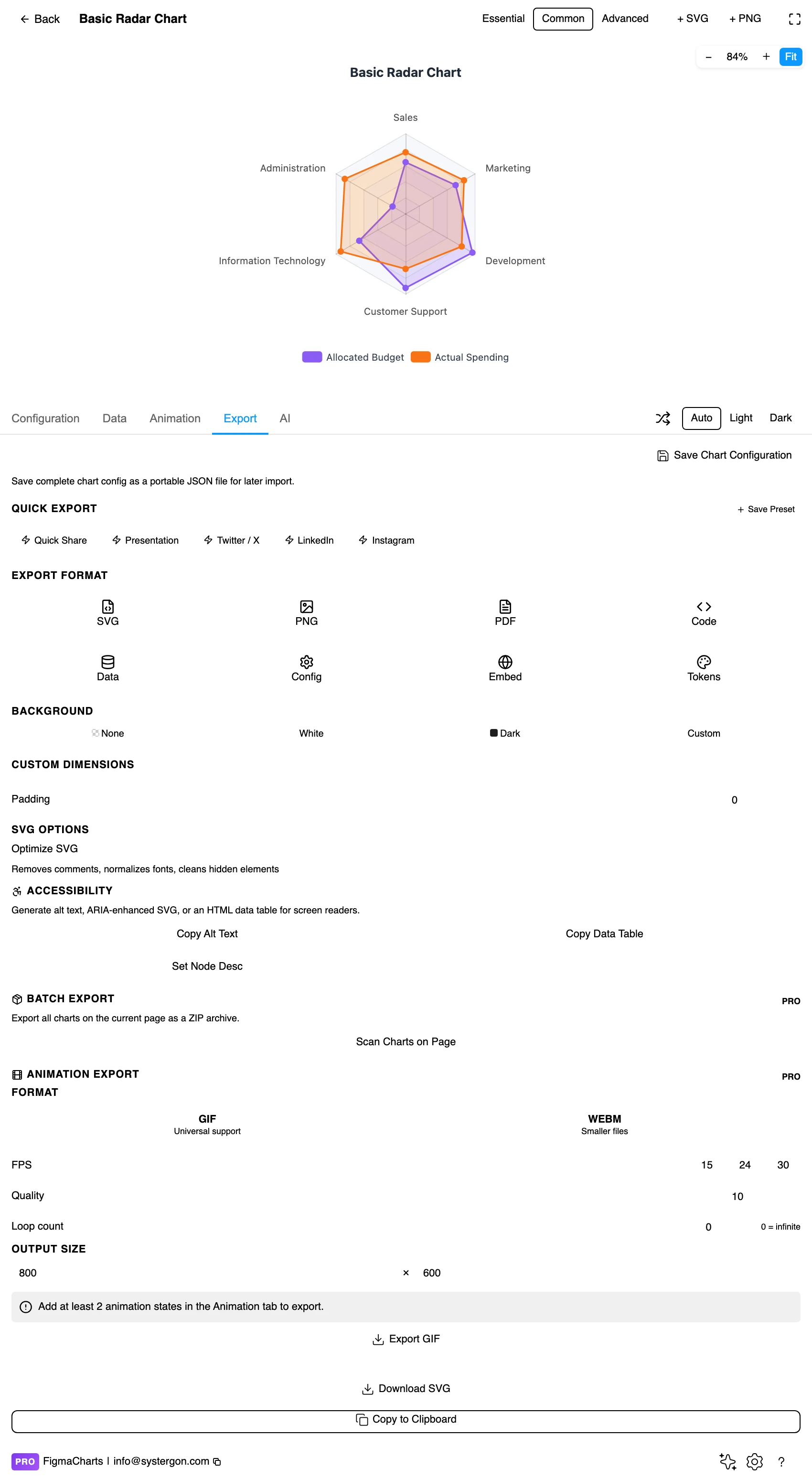
5. Export. Code for React, Vue 3, Angular, Svelte or vanilla JavaScript — or the Config alone, which carries the indicator maxima that define the whole geometry.
6. Insert. SVG keeps each polygon as a vector path and each axis label as real text, so a radar drops into a comparison layout on the canvas and can be restyled per series.
Radar is the plugin’s indicator shape, and it is genuinely two datasets rather than one:
In ECharts the plugin gives radar its own two-section editor for exactly this reason; in the other libraries the data arrives in the ordinary table with the axes as columns. Either way, radar charts can bind a live data source — unlike hierarchical and flow types, they are not restricted, so a Sheet or an API can drive one. That is covered in live data from Google Sheets and APIs.
The maxima deserve more attention than they usually get. A radar chart with per-axis maxima is really several independent scales drawn to look like one, and where those maxima come from decides the shape. Set them from something external — a target, a theoretical maximum, a benchmark — and the polygon means something. Set them from the data itself and the shape re-scales every time the data changes, so today’s silhouette cannot be compared with last month’s.
The 14 examples split ECharts 5, Highcharts 4, ApexCharts 3, Nivo 2 — and Google Charts has no radar chart at all, which is a genuine capability gap rather than a filing difference. If your team is standardised on Google Charts, the substitute is a grouped bar chart or a set of small multiples.
A relative worth knowing: parallel coordinates shows the same data — many measures, several entities — on straight parallel axes instead of radial ones. It gives up the memorable silhouette and gains honest per-axis scales and no area distortion. When a radar chart is rejected in review, that is usually the chart that replaces it.
As always: design in whichever library your engineers already use, because the export then matches production exactly. Choosing the right chart library covers the trade-offs.
Outline before fill. An unfilled radar with a strong stroke is easier to read with two or three series, because the polygons no longer occlude each other. If you do fill, keep it under about 25% opacity and keep the stroke at full strength — the line is where the values are.
Label the axes at the rim, and include units. Axis labels on a radar are the only thing telling the reader what each spoke measures, and they are also the first thing to get clipped by the frame. Reserve the margin before you place them.
Show the tick values on one spoke, not all of them. Rings labelled on every axis produce a chart made of numbers. One labelled spoke plus the ring gridlines gives the same information with a fraction of the ink.
Polygonal gridlines for comparison, circular for shape. Straight gridlines between axes make it easier to judge whether a point is above or below a level; circular ones emphasise the silhouette. Choose according to which reading you want.
Keep the axis order fixed across a set. If you publish several radars, the order must be identical in all of them, or the silhouettes cannot be compared — which is the only reason to use radars in a set at all.
For type and colour, bind them to your design system rather than picking by hand — covered in Your chart, your design system.
Area is not a quantity. The filled area of a radar polygon has no interpretation: it depends on the axis order, and because it is a polygon inscribed in a circle, doubling every value roughly quadruples it. Readers nonetheless read area as “how much”, which is why a filled radar systematically exaggerates high scorers.
The silhouette is a function of the order. Two high values next to each other make a wing; the same two values on opposite spokes make a symmetrical bulge. Nothing about the data changed. If the order is arbitrary, so is the shape — and the shape is what people remember.
Per-axis maxima hide their own scaling. A point three-quarters of the way out means “75% of this axis’s maximum”, and each axis may have a different one. Two spokes at the same radius can represent wildly different real quantities, and the chart does not say so.
Occlusion favours the last series drawn. With filled polygons, the series drawn last sits on top and reads as dominant. Draw order is a rhetorical choice; make it deliberately, and consider unfilled outlines instead.
Missing values close the polygon incorrectly. A missing measure usually renders as zero — and in this plugin an unparseable numeric cell becomes 0 — which pulls the outline to the centre and reads as a genuine weakness rather than an absence.
Series need more than colour. Dash patterns on the strokes and markers at the vertices distinguish series without hue, which matters here because filled radars put translucent colours on top of each other — the hardest case for anyone with a colour vision deficiency.
Axis labels need room and contrast. They sit at the extremes of the chart where they compete with the frame; small type at the rim is the most common accessibility failure in radar charts.
Give it a text equivalent. The Export tab’s Copy Alt Text, Copy Data Table and Set Node Desc produce a description, a table of the numbers and a description attached to the Figma node. For radar the table matters more than for most types, because the values are precisely what the visual encoding cannot convey.
Two cases. When the angular dimension is genuinely circular — compass direction, hours, months — because then the axis order is fixed by the world. And when you are comparing two or three entities across the same five to eight measures on comparable scales, where the silhouette is a memorable summary rather than a measuring device.
Because the polygon is drawn by joining adjacent spokes, so adjacency is part of the shape. Neighbouring high values make a wing; separated ones make a symmetrical bulge. If nothing dictates the order, the shape is an artefact — and it is the thing readers remember.
Three at most, and two is more comfortable. Beyond that the polygons occlude each other. Small multiples — one radar per entity, identical axes and ranges — scale to as many entities as you like.
Only with one series. Filling makes area the dominant signal, and area on a radar is not a meaningful quantity: it depends on axis order and grows with the square of the values. With two or three series, use strokes.
No — it has no radar chart type at all, and the plugin ships none. The other four libraries all have one, 14 examples between them. On Google Charts, use a grouped bar chart or small multiples instead.
The axes: one row each, with a name and a maximum (and optionally a minimum). They define the frame, and where those maxima come from decides the shape. Take them from a target or a benchmark rather than from the data, or every refresh re-scales the chart and today’s silhouette cannot be compared with last month’s.
Parallel coordinates show the same data on straight axes: no area distortion, honest per-axis scales, and it handles many more entities. It loses the memorable silhouette. If your radar is being used to measure rather than to characterise, parallel coordinates is the better chart.
Insert as SVG and each series is a vector path with real text labels, so restyling one series or relabelling an axis happens on the canvas. Insert as PNG for a flat image at twice the pixel density.
Open the plugin, filter to Radar, put your measures in — and then do the test that decides everything: shuffle the axis order and look again. If the chart still says what you meant, the order was carrying meaning and you have the right chart. If the silhouette changed and you cannot defend one order over another, the shape was decoration, and small multiples of bars will tell the truth better.
Install Figma Charts — it’s free to try → Browse all 45 chart types →