Install Figma Charts — it’s free to try → See the graph gallery →
The Graph category is the largest single-library collection in this plugin: fourteen node-and-edge charts, all ECharts. It is also the answer to a question the network diagram post raises and cannot settle — if you need serious node-link work, where is the depth? It is here, under a chip most people never open.
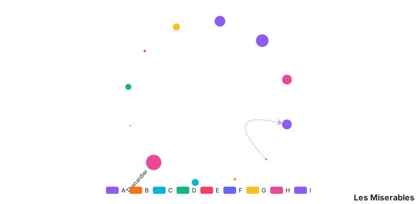
Real plugin output: the Les Misérables co-occurrence network, captured from the editor. Every chart on this page is the library’s own drawing.
What makes the collection worth knowing is that it covers four different layout strategies, not one. Force-directed is the famous one and the least controllable; the other three are deterministic, and they are what you actually want for most design work.
Everything below happens inside Figma Charts, a Figma plugin. It runs the real JavaScript charting libraries — Google Charts, Highcharts, D3-based Nivo, ApexCharts and Apache ECharts — inside the plugin window, so the layouts on your canvas are ECharts’ own.
Install Figma Charts from the Figma Community →
Press ⌘/ (Ctrl / on Windows), type Figma Charts, hit Enter, and pick Graph from the category filter. Fourteen examples, all ECharts — and if you also want Highcharts’ deterministic alternatives, they are under Network.
This is the practical content of the category, and choosing among them decides almost everything about the result.
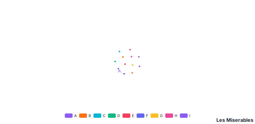
Force — nodes repel, edges pull, the simulation settles. It reveals clusters and it is non-deterministic: run it twice, get two pictures. Excellent for exploring, awkward for a design that has to be reproducible.
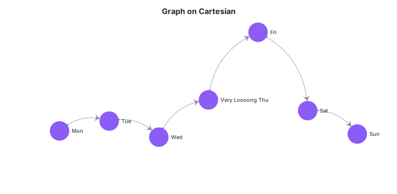
Cartesian — nodes placed at real x and y values, edges drawn between them. Now position is data again: time on one axis, magnitude on the other, relationships as connections. This is the layout that turns a network diagram back into a chart, and it is badly underused.
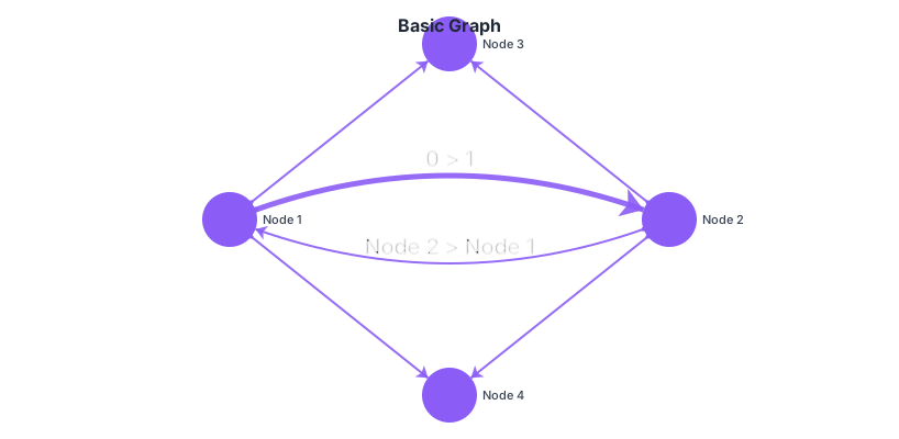
None — you supply the coordinates and the library draws exactly that. Fully deterministic, fully controllable, and the right choice when the arrangement carries meaning you already know: a schematic, an architecture diagram, a floor plan.
Circular — nodes arranged around a ring with edges crossing the middle. Deterministic like the chord diagram it resembles, and it handles dense dependency structures far better than a force layout because nothing overlaps by accident.
Force layouts are what people picture when they hear “network diagram”, and they have one real strength: with no knowledge of the data, they surface clusters. That is genuinely useful during exploration.
For anything you will ship, the objections stack up: the arrangement changes on every render, so two versions of the same chart look like different data; proximity looks meaningful and is not; and readers cannot be told where to look, because nothing is where you left it.
The three deterministic layouts fix all of that at the cost of requiring you to decide something — which is usually a decision worth making:
Force layouts are for finding structure. Deterministic layouts are for showing it.
1. The structure is a hierarchy. One parent per node means a tree, which is deterministic and far more readable. ECharts has seven tree layouts one chip away.
2. The structure is a flow. Quantity moving through stages is a Sankey. A graph can draw it and will not show the magnitudes as clearly.
3. You have thousands of nodes. Every node-link layout degrades into a hairball eventually. ECharts handles large graphs better than most — and the honest move past a few hundred nodes is still to aggregate, filter, or switch to an adjacency matrix.
A fourth: when nobody will interact with it. Graph charts are exploration instruments. In a static design, the version that communicates is nearly always a filtered subgraph with labels, not the whole thing.
Node-link diagrams are the chart type where the useful findings are usually computed rather than seen, and knowing the standard measures changes what you ask for.
Degree — how many connections a node has. The simplest measure and the one worth encoding as node size by default: it makes hubs findable without any analysis.
Betweenness — how often a node sits on the shortest path between two others. High-betweenness nodes are bridges: remove them and the graph fragments. In an organisation or a dependency structure, these are the single points of failure, and they are frequently not the biggest nodes.
Clustering — whether a node’s neighbours are also connected to each other. Tight clusters are communities; a node with many connections that never touch is a broker.
Components — how many disconnected pieces the graph has. A graph that looks like one system may be three, and nothing in a force layout announces it.
The practical point for design: ask for these as columns in the node data. Once degree or betweenness is a field, it can drive size and colour, and the visual arrangement stops carrying the whole burden of the analysis.
Six screens, start to finish, captured from the plugin.
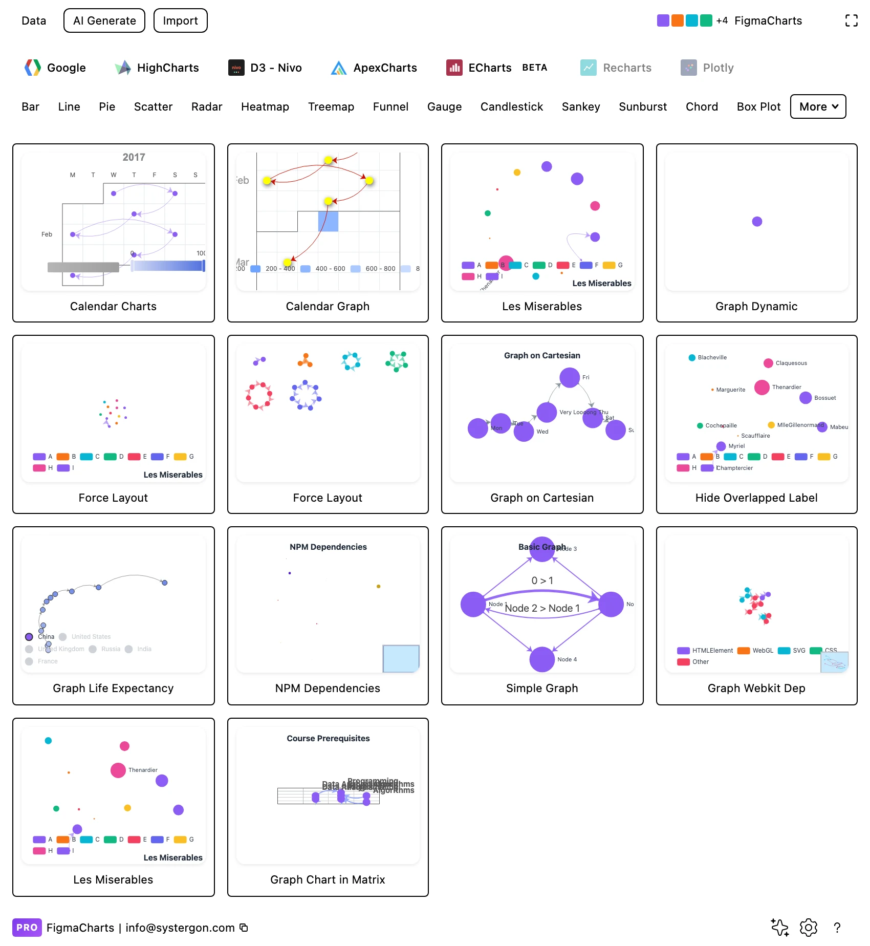
1. Filter to Graph. Fourteen ECharts examples — the deepest single-library category in the plugin. Pick by layout strategy rather than by subject.
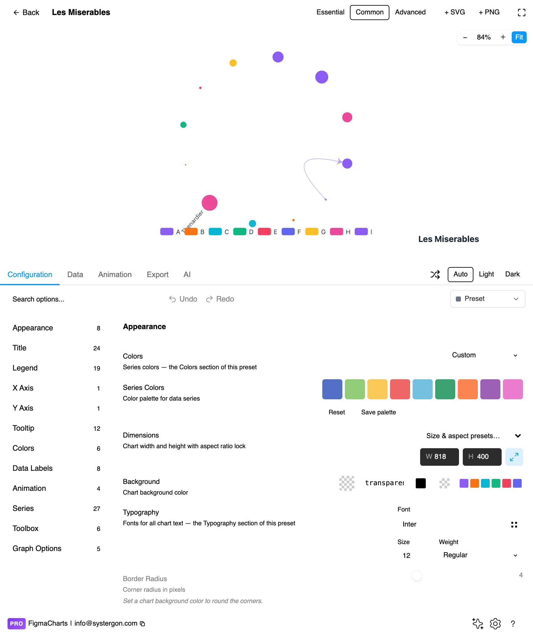
2. The editor. Live preview above, tabs below. With a force layout, let the simulation settle before judging anything — the first second is not the result.
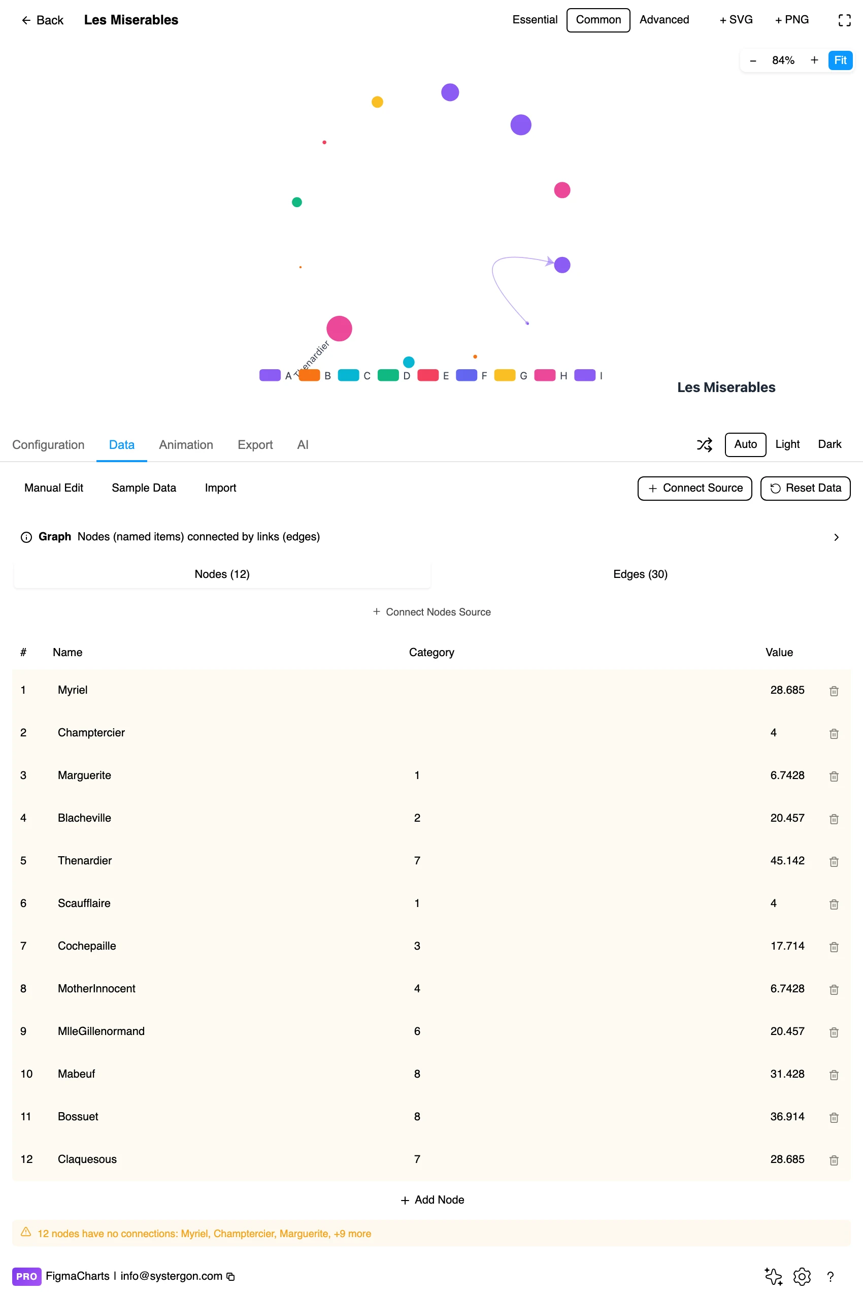
3. Nodes and links. The plugin gives ECharts graphs the node-link editor: a list of nodes with names and optional categories, and a list of source-target links with optional weights. Same editor a Sankey uses.
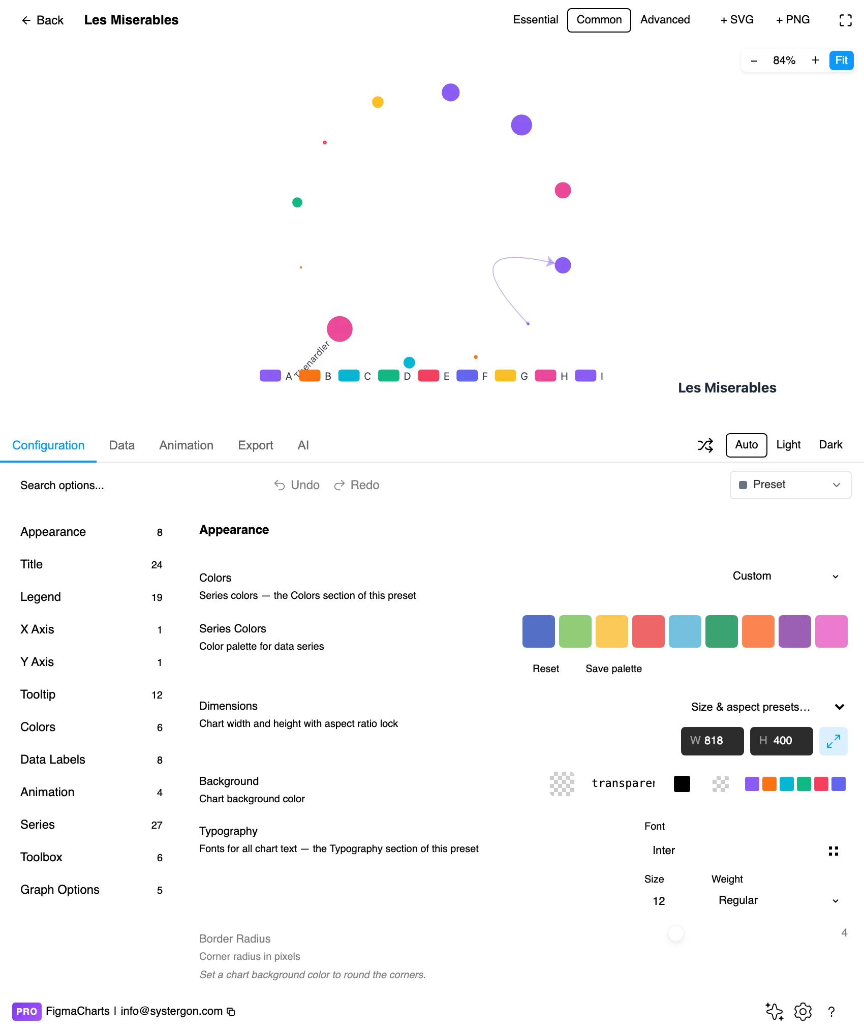
4. Choose the layout. This panel is where the chart is decided — force, circular, none or cartesian, plus repulsion, edge length, label overlap handling and node sizing.
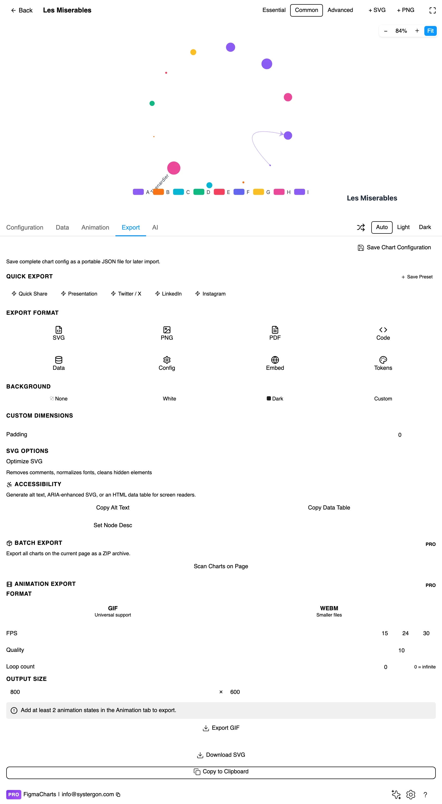
5. Export. A working component for React, Vue 3, Angular, Svelte or vanilla JavaScript — and note that a force layout re-runs on load, so the exported chart will not reproduce this arrangement.
6. Insert. SVG freezes the layout you approved into real vector layers — the only way to keep a force-directed arrangement, and the reason to insert vector for this chart type.
Node-link: a list of nodes (name, optional category, optional value, optional fixed coordinates) and a list of links (source, target, optional weight). The plugin provides the node-link editor for it, and unlike Sankeys and Nivo networks, graph charts carry no link-incompatibility restriction in the registry — so a query result can feed one.
Three fields do most of the work and are easy to overlook:
And the usual caution with a specific symptom: a link naming a node that does not exist is either dropped or auto-created depending on settings — so a typo in a source name silently adds a phantom node with one edge.
The Graph category is ECharts only — fourteen examples, and that is not an accident of filing: it reflects that ECharts has the most developed node-link implementation of the five.
So the practical summary: node-link work in this plugin means ECharts or Highcharts, and the split between the Graph and Network chips is the single most misleading piece of filing in the catalogue — the two chips hold one family, and the bigger half is the one nobody looks under.
As always: design in whichever library your engineers already use, because the export then matches production exactly. Choosing the right chart library covers the trade-offs.
Every dense graph has the same failure: the labels collide long before the nodes do, and a diagram whose nodes are unnamed is a picture of connectivity in the abstract.
ECharts exposes label-overlap handling for exactly this, and there are four workable strategies:
Threshold by importance. Label nodes above a degree or value threshold and leave the rest unnamed. Ten labels on a hundred-node graph is a chart; a hundred is a wall.
Let the library hide collisions. Automatic overlap avoidance drops labels that cannot be placed — which is tidy, and means the visible labels are chosen by geometry rather than by significance. Acceptable for exploration, poor for a designed figure.
Label on the canvas. Insert as SVG with labels off, then add exactly the ones the argument needs as Figma text. This is the approach that produces publishable network graphics, and it is how most of the good ones are made.
Or restructure. If everything must be labelled, the graph is too big — aggregate nodes into groups and label those instead.
Size nodes by degree. It makes hubs findable instantly and costs nothing, since the value is already implicit in the link list.
Colour by category, with a legend. ECharts’ category field is built for this, and a graph with four coloured groups is a different chart from a monochrome one — the question changes from “what is connected?” to “do these groups behave differently?”
Edges thin and translucent. They outnumber nodes; drawn at full strength they become the picture. Weight by value only when the weights vary enough to read.
Curve edges slightly in dense graphs. A small curvature separates the two edges between a pair of nodes and reduces the visual noise of many straight lines converging.
Give it more room than feels necessary. Force layouts expand to fill their frame, so a graph in a cramped box settles tighter and reads as denser than the same data given space.
For type and colour, bind them to your design system rather than picking by hand — covered in Your chart, your design system.
Most graph charts spend all their design effort on the nodes and treat edges as connective tissue. Three things an edge can encode, all supported here and all underused:
Weight as thickness. How strong the relationship is — how many co-occurrences, how much traffic, how many shared members. Without it, a graph says only that two things are connected, which is usually the least interesting part.
Direction as curvature or arrowheads. A dependency runs one way, and the difference between “A depends on B” and the reverse is the whole content in a dependency graph. Curved edges let both directions between a pair be drawn separately rather than overlapping.
Category as colour. Different kinds of relationship — reports-to versus collaborates-with, imports versus extends — drawn as different edge colours, which turns one graph into several overlaid.
The caution: edges outnumber nodes, so each of these adds visual load quickly. One edge encoding at a time is usually the limit before the diagram becomes a fabric.
Graph charts degrade in a particular way. Up to roughly thirty nodes, a force layout with a sensible repulsion produces something readable. Between thirty and a hundred, it depends almost entirely on how sparse the edges are — a hundred nodes in a tree-like structure is fine, a hundred nodes averaging six connections each is a grey mat. Past a hundred and fifty, no amount of tuning saves it; the picture becomes a texture that says “this is complicated” and nothing further.
Three ways out, in increasing order of effort:
Filter by edge weight. Drop every relationship below a threshold and re-render. Most graphs are dominated by a small number of strong links plus a long tail of weak ones, and the tail is what causes the mat. This costs nothing but a line in the data.
Aggregate into groups. Roll individual nodes into teams, modules, regions — whatever your categories are — and draw the graph of groups with edges weighted by how many underlying links they represent. Ten group nodes with thick edges usually carry more of the story than two hundred individual ones.
Change chart type. An adjacency matrix, a chord diagram or a Sankey handles density far better than a node-link picture; the plugin has the last two. If the question is “how much flows between these” rather than “what is the shape of this network”, the graph chart was the wrong reach in the first place.
Do the filtering in the data before you render. Trying to rescue a dense graph with layout settings and node sizes wastes an afternoon and produces a slightly prettier mat.
In force layouts, position is not data. Distance, direction and adjacency are all simulation artefacts. In cartesian and fixed layouts they are data — which is why saying which layout you used matters.
Clusters may be packing. Visual grouping in a force layout is suggestive; if clusters are the finding, compute them and colour by the result.
Edge crossings mean nothing. They are what the algorithm could not avoid.
Node size needs a stated basis. Degree, betweenness, a business value — all plausible, all different. An unlabelled size encoding invites the reader to assume importance.
Filtered graphs look complete. Any thresholding — dropping weak edges, hiding single-connection nodes — produces a picture that shows no sign of what was removed. Report the counts.
Almost everything published about node-link charts assumes interaction. For a chart going into a document, four moves turn an exploration artefact into a figure.
Filter to the subgraph the text discusses. The two-hop neighbourhood of a node is nearly always more informative than the whole graph, and it can be labelled.
Freeze and fix the layout. Run the force layout, pick the arrangement you like, then capture the coordinates and switch to the fixed layout — or simply insert as SVG. Either way the diagram stops changing between renders, which matters as soon as it appears twice in one document.
Label deliberately, on the canvas. Turn chart labels off, insert as SVG, then add the names the argument needs as Figma text. This is how publishable network graphics are made.
Report what was removed. “312 nodes, 894 edges; edges below weight 3 and single-connection nodes not shown” is one line and it is the difference between a filtered chart and a misleading one.
Do not rely on colour for categories. ECharts’ node symbols can vary by category too, and shape survives where hue does not.
Label what matters, directly. An inserted SVG has no hover, so a graph whose identities live in tooltips is an abstract picture on the canvas.
Keep edges visible without dominating. Too faint and the structure disappears for readers with low contrast sensitivity; too strong and the nodes are lost.
Give it a text equivalent. The Export tab’s Copy Alt Text, Copy Data Table and Set Node Desc produce a description, a table of the underlying data and a description written onto the Figma node. For a graph the meaningful description is structural — node and edge counts, the hubs, the number of clusters — since the arrangement itself is not the content.
Filing, not substance. Graph holds ECharts’ fourteen node-link charts; Network holds Highcharts’ four and Nivo’s one. They are one family split across two chips, and the deeper collection is the one under Graph.
Force for exploring, because it surfaces clusters with no input from you. Cartesian when the nodes have real coordinates, so position carries data. Fixed positions when you know the arrangement you want. Circular when you need determinism and the nodes have no natural position.
Because the force layout is a simulation seeded randomly. Insert as SVG to freeze the arrangement you approved, or switch to a deterministic layout — and remember that an exported chart re-runs the simulation on load.
Label only the important nodes — a degree threshold is the usual rule — or turn labels off in the chart and add exactly the ones you need as Figma text after inserting. Automatic overlap avoidance works, and it chooses which labels survive by geometry rather than by importance.
ECharts graphs carry no link-incompatibility restriction in the plugin, unlike Sankeys and Nivo networks — so a node-link query result can drive one, provided the data arrives in that shape.
ECharts copes with more than most, and the readable limit is unchanged: a few hundred before a static diagram becomes a hairball. Aggregate into groups, filter by edge weight, or extract the subgraph around the node you care about.
Yes — supply x and y on the nodes and use the “none” layout, and the library draws exactly what you specify. That converts the chart into a diagram with a data source, which is often what an architecture or schematic drawing actually needs.
One thing at a time. Thickness for weight is the most valuable — without it the chart says only that two nodes are connected. Direction matters in dependency structures and needs arrowheads or curvature. Colour can carry relationship type. Edges outnumber nodes, so two encodings at once usually turns the diagram into fabric.
Insert as SVG and every node and edge is a real vector layer — the only way to preserve a force-directed arrangement, and the basis for the label-on-the-canvas workflow that produces publishable network graphics. Insert as PNG for a flat image at twice the pixel density.
Open the plugin, filter to Graph, and open the same dataset in a force layout and then in a circular one. The force version will look more impressive and the circular one will be the same picture every time you render it — and for anything that has to be reviewed, revised and shipped, that reproducibility is worth more than the organic shape.
Install Figma Charts — it’s free to try → Browse all 45 chart types →