Install Figma Charts — it’s free to try → See the chord gallery →
A chord diagram is a matrix drawn as a circle. Every entity gets an arc on the circumference, every relationship becomes a ribbon crossing the middle, and the ribbon’s width is the size of the relationship at each end. It is the chart for connections that go both ways — migration between countries, transfers between teams, trade between regions — which is precisely the case a Sankey cannot draw, because a Sankey cannot loop back.
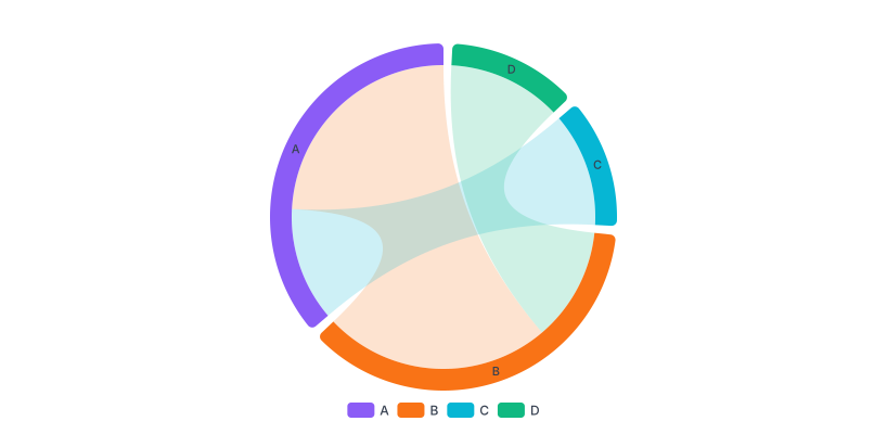
Real plugin output: an ECharts chord diagram captured from the editor. Every chart on this page is the library’s own drawing.
It is also deterministic, which makes it the sane alternative to a force-directed network graph: the same data always produces the same picture, because you choose the order round the circle. This page is about that ordering, how many entities the circle can hold, and how to keep a ribbon’s two ends honest when the flow is asymmetric.
Everything below happens inside Figma Charts, a Figma plugin. It runs the real JavaScript charting libraries — Google Charts, Highcharts, D3-based Nivo, ApexCharts and Apache ECharts — inside the plugin window, so the ribbons on your canvas are the library’s own geometry.
Install Figma Charts from the Figma Community →
Press ⌘/ (Ctrl / on Windows), type Figma Charts, hit Enter, and pick Chord from the category filter. Five examples — ECharts 4, Nivo 1.
Three elements, and the third is where the information is:
One consequence worth noticing early: because every ribbon touches the circumference twice, each relationship consumes arc space at both ends. An entity with many relationships gets a long arc regardless of the size of any single one, which is why the arcs read as “how connected” rather than “how big”.
That last property is what a chord diagram has and nothing else here does: a Sankey shows direction but cannot show a two-way relationship as one object, and a network graph shows the connection but not its magnitude at each end.
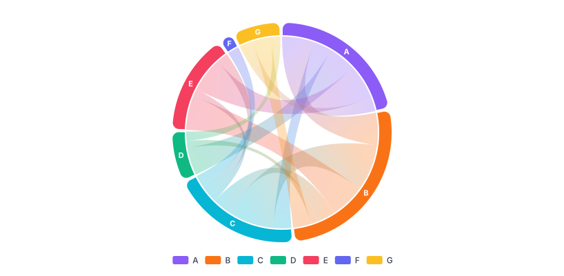
Styled ribbons — colouring the ribbons by source arc is the standard treatment, and it is what makes a busy chord readable: every ribbon leaving an entity shares its colour, so the eye can follow one participant’s relationships without tracing.
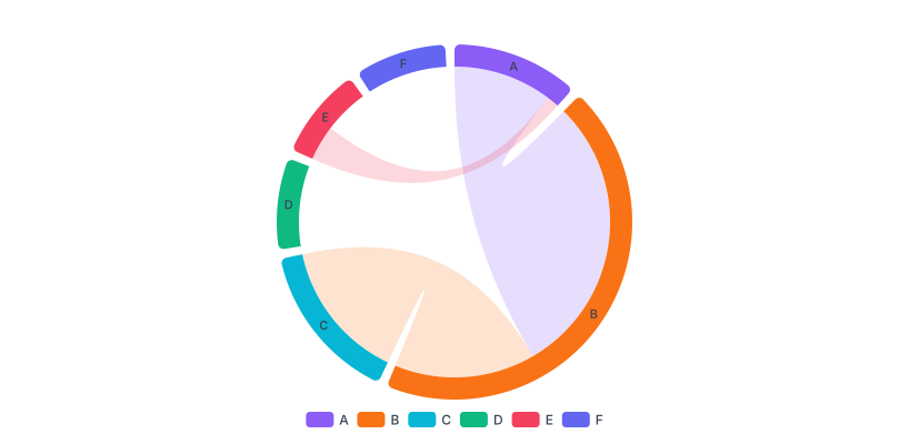
With a minimum angle — forcing tiny entities to occupy a readable minimum arc. It keeps small participants visible and, unavoidably, it makes their arcs no longer proportional. A useful setting to know about and one to disclose if you use it.
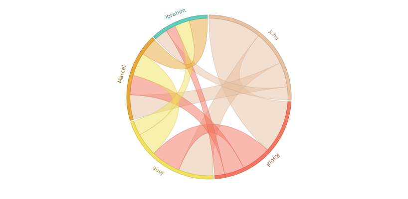
Nivo’s chord — the D3 implementation, taking a square matrix directly rather than a link list, with arc padding and ribbon opacity exposed. React-only export.
Use it when the relationships are bidirectional, the entity count is small — six to about fifteen — every entity relates to several others, and the reader cares about the overall pattern of exchange rather than any single number.
Three cases where something else is better:
1. The flow only goes one way. Stages of a process, budget to departments, users through a funnel — that is a Sankey, which lays direction out along an axis and is far easier to follow.
2. You have more than about fifteen entities. The arcs get thin, the labels start rotating and the ribbons fill the circle until it reads as a ball of wool. Aggregate the small participants into an “other” arc.
3. Precise values matter. Ribbon widths at a curve are hard to judge, and the two ends differ. If someone will quote a number from the chart, put a matrix table beside it — which is, after all, what the chart is drawn from.
A fourth: when the matrix is sparse. A chord diagram with four ribbons among twelve entities is mostly empty circle. Sparse relationships are better shown as a network diagram or a simple list — and the check takes seconds, since the emptiness is visible in the matrix before you draw anything.
The most useful habit with this chart is to look at the underlying matrix before drawing anything, because the matrix answers three questions the circle cannot.
Is it sparse? Count the filled cells. A matrix that is mostly empty produces a nearly empty circle, and the relationships that do exist are better listed than drawn.
Is it symmetric? If every A→B equals its B→A, all your ribbons will be even and the chart’s best feature — the taper — carries nothing. That is fine, and it means a simpler chart may do.
Does the diagonal dominate? Self-flows are usually the largest numbers in the matrix and almost never the point.
An adjacency heatmap of the same matrix takes a minute to build in the plugin and tells you all three at once. It is also a perfectly good final chart: for lookup and precision it beats the chord diagram outright, and the two make a strong pair — the circle for the pattern, the matrix for the numbers.
Three cases, all sharing the same shape: a closed set of participants, mutual exchange, and an audience interested in the pattern rather than the values.
Movement between places. Migration between regions, transfers between offices, routes between airports. The asymmetry — more people left than arrived — is exactly what the tapering ribbon shows.
Exchange between categories. Which product lines customers switch between, which teams hand work to which, which channels users move across. The diagonal (people who stayed) is the thing to strip out first.
Co-occurrence. Tags used together, characters appearing in the same scenes, skills held by the same people. Here the matrix is symmetric by definition, every ribbon is even, and the chart is doing pure pattern work — which is also when a chord looks its best.
Six screens, start to finish, captured from the plugin.
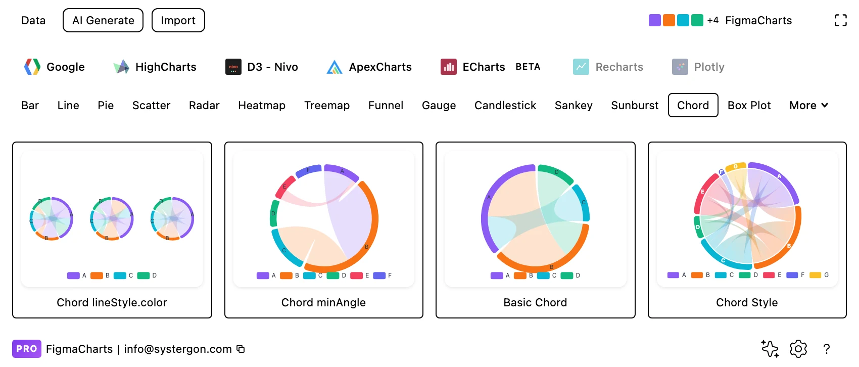
1. Filter to Chord. ECharts has four examples and Nivo one. Highcharts’ dependency wheel — a close relative — is under Network.
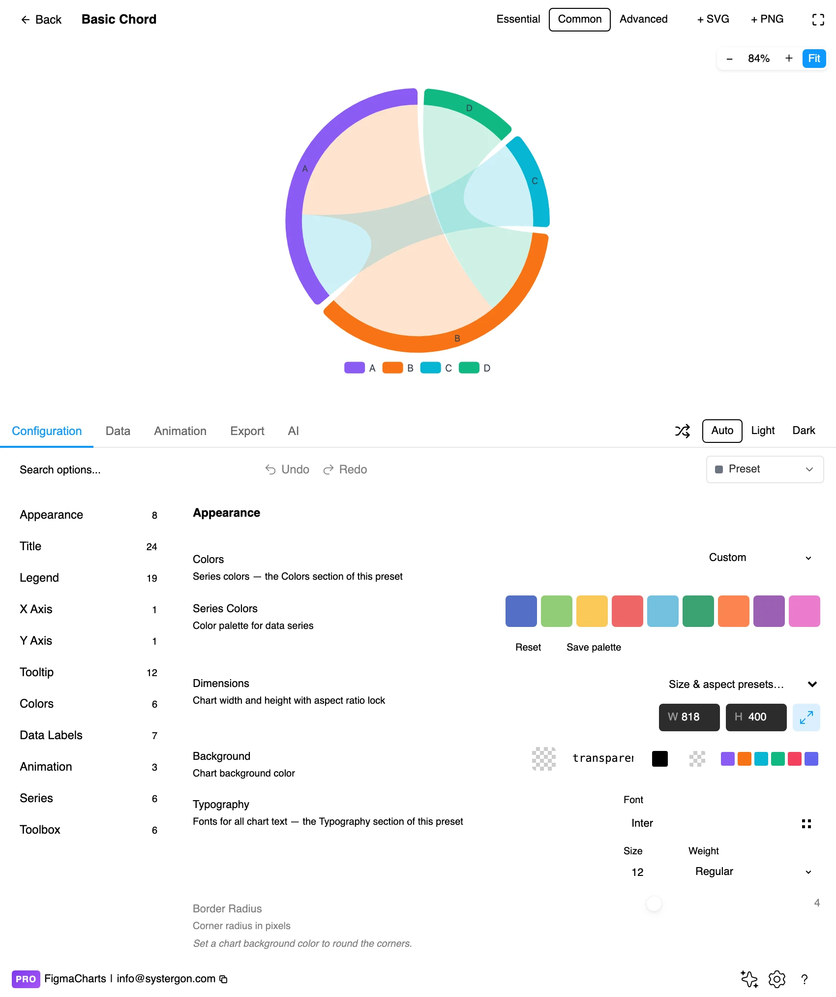
2. The editor. Live preview above, tabs below. Chords want a square frame and generous margins, because the labels sit outside the circle and are the first thing to be clipped.
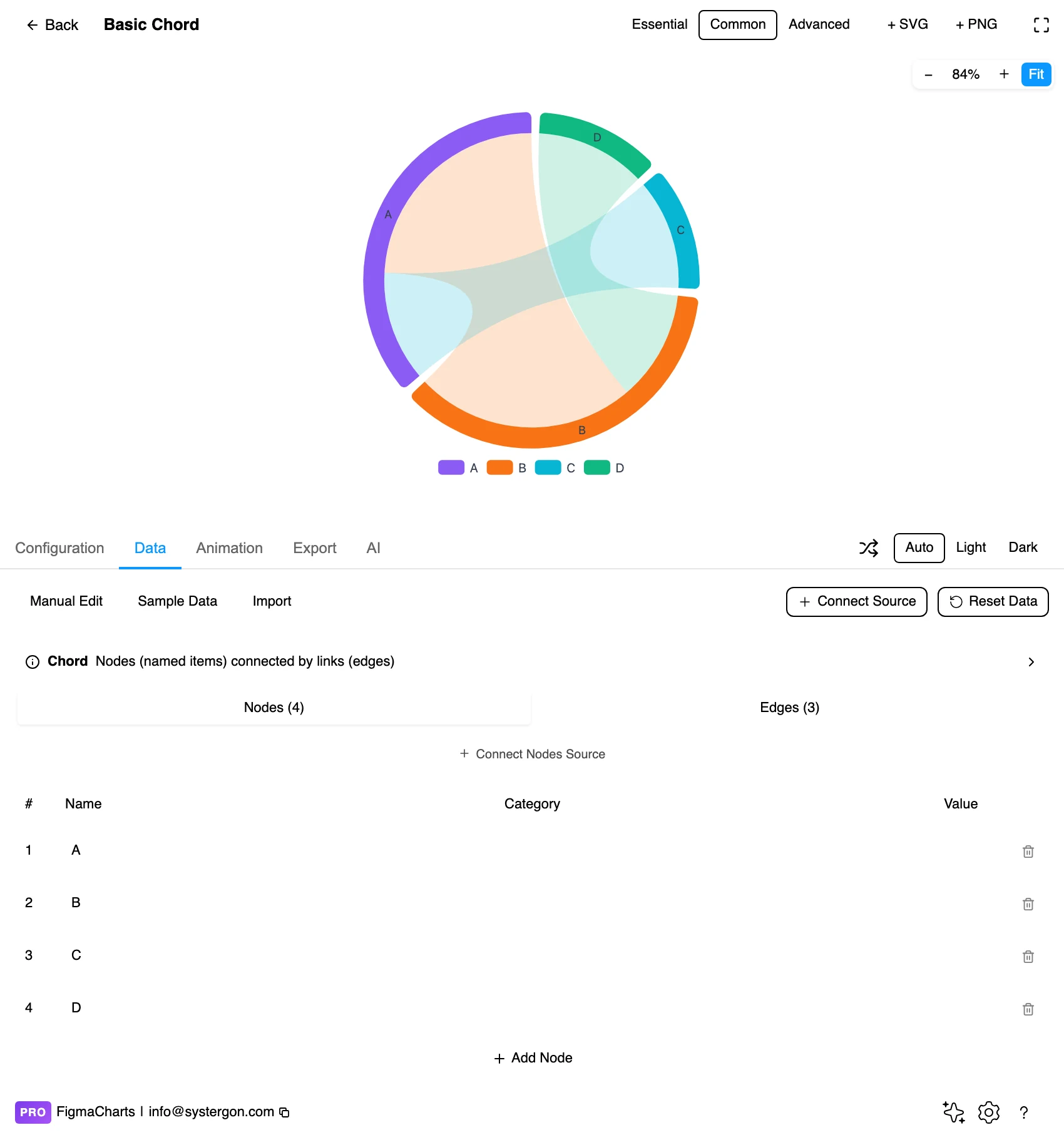
3. Nodes and links. The plugin gives ECharts chords the node-link editor — a list of entities and a list of source-target-value relationships, the same shape a Sankey takes. Nivo takes the square matrix directly as JSON.
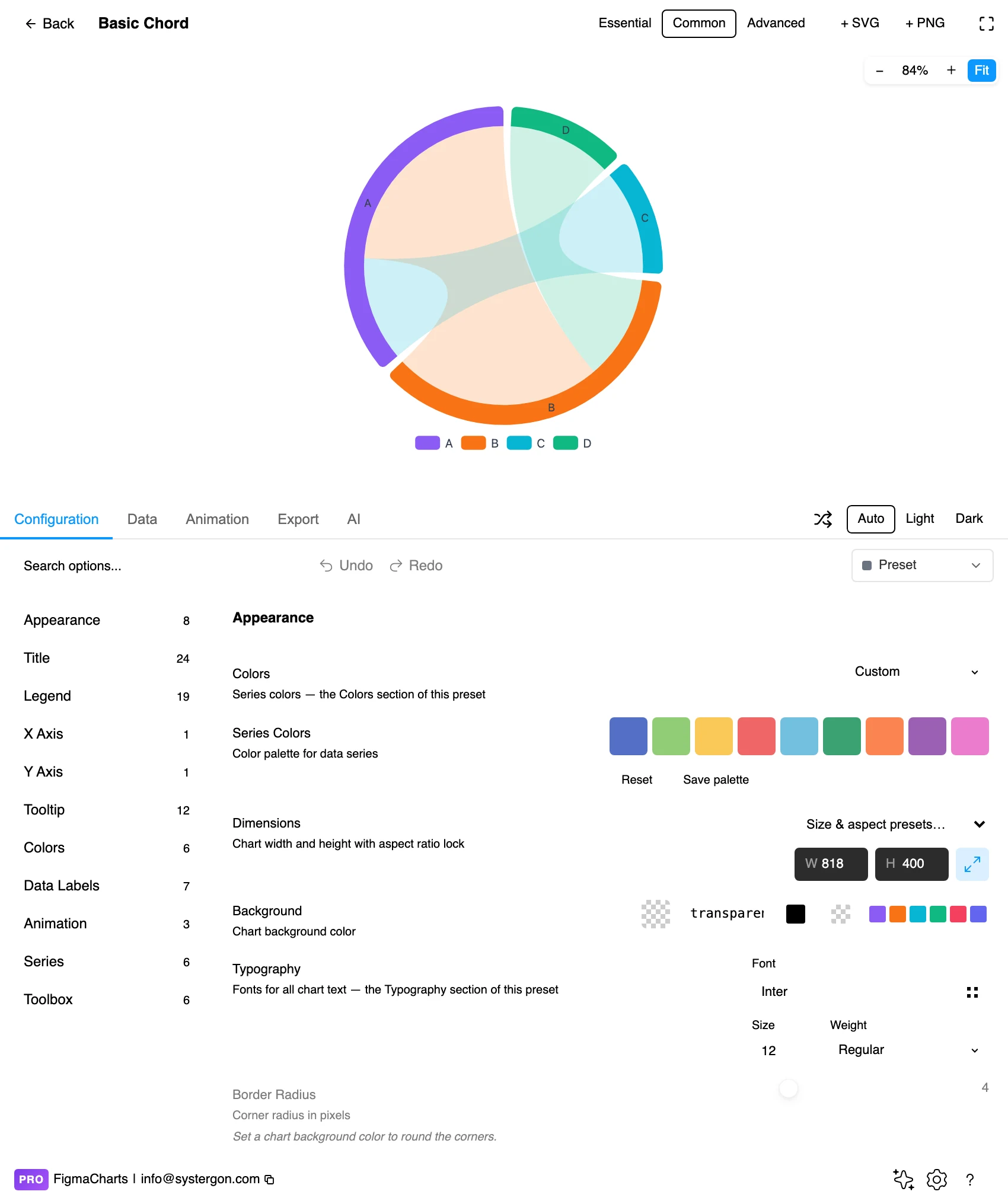
4. Configure. Arc padding, ribbon opacity, the minimum angle and the ordering around the circle. Ordering is the setting that determines how many ribbons cross.
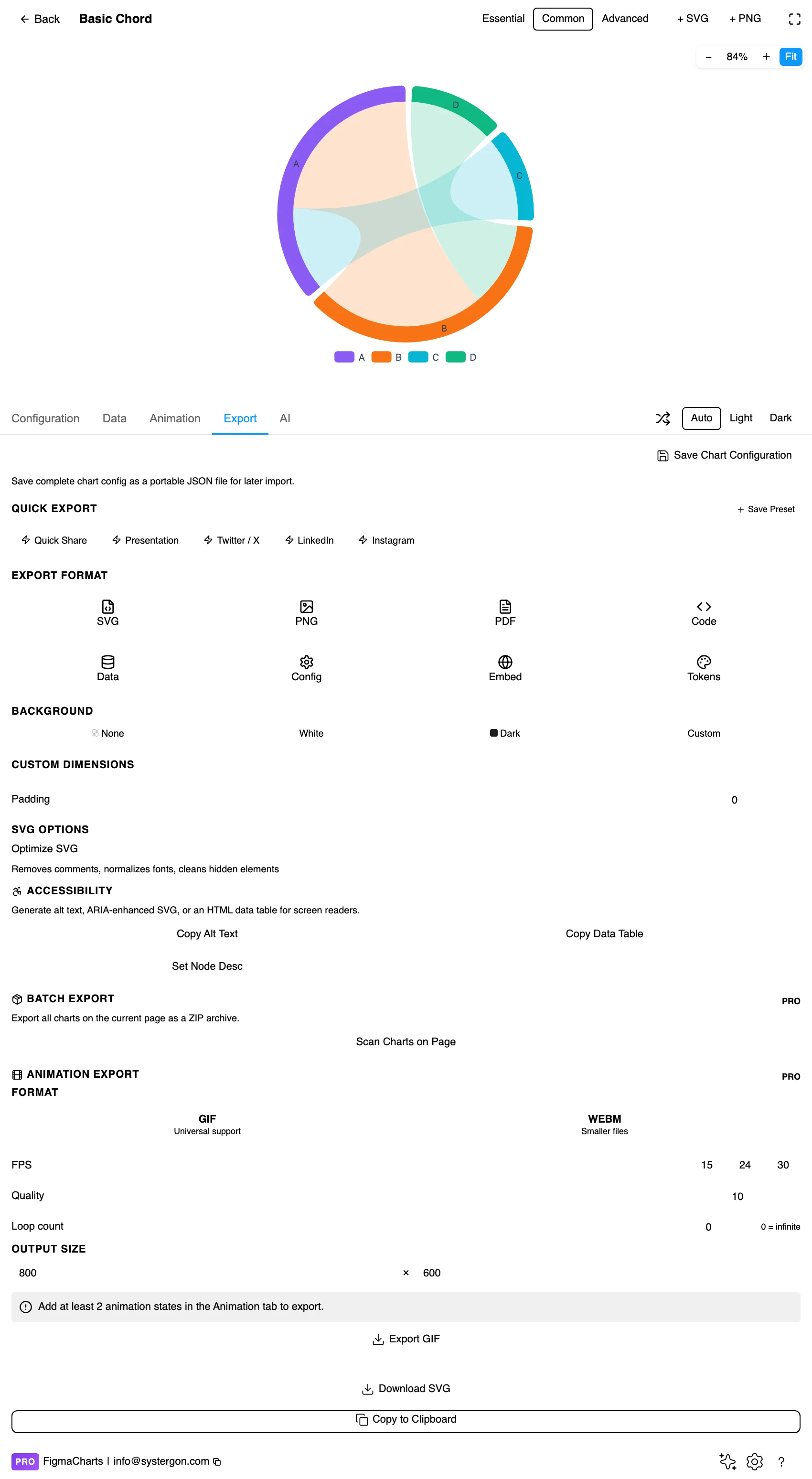
5. Export. A working component for React, Vue 3, Angular, Svelte or vanilla JavaScript, at the version the plugin rendered with.
6. Insert. SVG keeps every ribbon and arc as a vector shape, so one participant’s relationships can be isolated or highlighted on the canvas.
Underneath, a chord diagram is a square matrix: rows and columns are the same set of entities, and each cell is the flow from the row to the column. Libraries accept it in two forms, and the plugin exposes both — ECharts chords use the node-link editor (a list of entities plus source-target-value rows, exactly as a Sankey), while Nivo takes the matrix itself as JSON.
Three decisions to make in the data before you build:
As with the other node-link types, expect to prepare this data in a query rather than a spreadsheet — a chord diagram is a GROUP BY source, target away from most databases.
The Chord category holds five examples: ECharts 4, Nivo 1.
As always: design in whichever library your engineers already use, because the export then matches production exactly. Choosing the right chart library covers the trade-offs.
A chord diagram’s one real layout decision is the sequence of arcs around the circumference, and unlike a force layout it is entirely yours. It determines how many ribbons cross, which is what separates a legible chart from a ball of wool.
By size — largest arc at twelve o’clock, descending clockwise. Predictable, easy to explain, and it puts the busiest participants next to each other where their ribbons are shortest.
By group — regions together, departments together. Cross-group ribbons then span the circle and within-group ones stay short, which makes the group structure visible as a pattern of long and short chords.
By similarity — entities that exchange heavily placed adjacent, minimising ribbon length overall. It produces the tidiest chart and the least explicable ordering, so it needs a caption.
Whatever you choose, keep it fixed across versions. The chart’s advantage over a force layout is that it can be learned; re-sorting it every month throws that away.
Colour ribbons by source. It is the difference between following a participant’s outgoing relationships instantly and tracing each ribbon by hand. Gradient ribbons — source colour fading to target colour — are better still where the library supports them.
Ribbons translucent, arcs solid. Overlapping ribbons at 50–70% opacity let the reader see crossings; solid arcs keep the frame crisp.
Pad the arcs. A small gap between adjacent arcs separates entities that would otherwise read as one continuous band.
Labels outside, radial, and short. Long entity names rotated around a circle are the commonest legibility failure here. Abbreviate, or use a legend for the full names.
Consider hiding the smallest ribbons. Below a couple of pixels a ribbon is a thread that adds visual noise and carries no readable value. Setting a threshold and noting it (“flows under 1% not shown”) usually reveals the structure that the hairlines were hiding.
Leave room. The circle plus its labels needs a square frame with real margins; chords cropped at the edges lose their labels first and their arcs second.
For type and colour, bind them to your design system rather than picking by hand — covered in Your chart, your design system.
Arc length is a total, not a value. A large arc means high total involvement, which combines everything in and out. Readers see a big arc as a big number without knowing which number.
Ribbon width differs at each end — on purpose. That taper is the asymmetry, and it is easy to misread as a drawing artefact. If asymmetry matters, say so in the caption; if it does not exist in your data, the even ribbons will look deliberate rather than accidental.
Crossings are not relationships. Two ribbons crossing in the middle have nothing to do with each other; they are two chords sharing a circle.
The minimum-angle setting breaks proportionality. Any entity boosted to a visible minimum is no longer drawn to scale, and nothing in the chart says which ones were adjusted.
Self-flows distort everything. If the diagonal is included, the largest ribbons are usually entities looping back to themselves, which is rarely the story anyone wanted.
A chord diagram works hardest when it stops trying to show everything at once. The standard move — in products through interaction, in static design through a second frame — is to foreground a single entity.
Mute everything else. Keep the muted ribbons visible at low opacity so the reader still sees the whole, but drop them well behind the highlighted set. The full picture becomes context rather than competition.
Label the endpoints of the highlighted ribbons only. With one participant selected there is suddenly room for real labels and values on each of its relationships, which is what the reader wanted from the beginning.
Keep the geometry fixed. Do not re-order the circle when highlighting — the arcs must stay where they were so a reader can move between states. This is the advantage a chord has over a force layout and it is easy to throw away.
In Figma this is a natural fit: insert as SVG, duplicate the frame per participant, and mute the ribbons on each copy. A five-frame prototype of the same chord diagram communicates far more than one dense static circle.
Do not rely on ribbon colour alone. With ten entities the palette is doing heavy work; direct arc labels are what make the chart readable without it.
Keep the labels horizontal where you can. Rotated text around a circle is slower for everyone. Entities at the top and bottom can often take horizontal labels even when the sides cannot.
Do not hide values in tooltips. An inserted SVG has no hover; a chord diagram without an accompanying table is a picture of a matrix.
Give it a text equivalent. The Export tab’s Copy Alt Text, Copy Data Table and Set Node Desc produce a description, a table of the underlying numbers and a description written onto the Figma node. For a chord the table is the matrix, which makes it an unusually complete substitute.
Relationships that go both ways between a small set of entities — migration, trade, transfers, co-occurrence. Arcs are the entities, ribbons are the relationships, and the width of a ribbon at each end is the flow measured from that end.
Sankey when the flow is one-directional and passes through stages — it lays direction along an axis and is much easier to follow. Chord when relationships are mutual and everything connects to everything, which a Sankey cannot draw at all because it cannot loop back.
Six to about fifteen. Below six the circle is mostly empty and a table would do; above fifteen the arcs thin, labels rotate and ribbons fill the middle. Aggregate the small participants into an “other” arc.
ECharts (4 examples, with the node-link editor in the plugin) and Nivo (1, taking a matrix directly). Highcharts’ dependency wheel is the same chart under another name, filed under Network. Google Charts and ApexCharts have nothing comparable.
Because the relationship is asymmetric: more flowed one way than the other. That taper is the chart’s most information-dense feature, not a rendering artefact.
Usually not. The diagonal of the matrix — things that stayed where they were — is typically far larger than any cross-flow and will dominate the diagram. Exclude it and say so in the caption.
By size for predictability, by group to make cluster structure visible, or by similarity for the fewest crossings. Whichever you pick, keep it stable between versions — a chord diagram’s advantage over a force-directed graph is that it can be learned.
Often, yes — and always as a check before building. An adjacency heatmap of the same matrix is deterministic, scales to far more entities, and supports exact lookup. The chord wins on pattern and on showing asymmetry as a single object; the heatmap wins on precision. Publishing both is usually the strongest answer.
Insert as SVG and every arc and ribbon is a vector shape, so one participant’s relationships can be highlighted and the rest muted — which is usually how a chord diagram earns its place in a presentation. Insert as PNG for a flat image at twice the pixel density.
Open the plugin, filter to Chord, and put your matrix in — then check the diagonal before anything else. If self-flows are included they will be the biggest ribbons in the chart and the least interesting thing in your data, and removing them usually turns an impenetrable circle into a diagram that says something.
Install Figma Charts — it’s free to try → Browse all 45 chart types →