
Install Figma Charts — it’s free to try → See the network gallery →
A network diagram draws things as nodes and their relationships as edges. It is the only chart in this series where the layout is computed rather than measured — positions come from a physics simulation, not from your data — and that single fact explains both why network diagrams are so compelling and why so many of them say nothing.
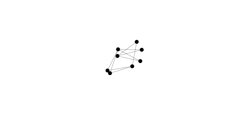
Real plugin output: a Highcharts network graph captured from the editor. Every chart on this page is the library’s own drawing.
Run the same data twice and you get two different pictures. Nothing about the arrangement is a claim about the world, and readers will read one anyway. This page is about when a node-link view is genuinely the right answer, the deterministic alternatives when it is not, and how to keep a hundred-node graph from becoming a hairball.
Everything below happens inside Figma Charts, a Figma plugin. It runs the real JavaScript charting libraries — Google Charts, Highcharts, D3-based Nivo, ApexCharts and Apache ECharts — inside the plugin window, so the layout on your canvas is the library’s own simulation output.
Install Figma Charts from the Figma Community →
Press ⌘/ (Ctrl / on Windows), type Figma Charts, hit Enter, and pick Network from the category filter — then look under Graph too, because that is where the largest collection lives. The library section explains.
In every other chart, position encodes value. In a force-directed network diagram, position is the output of a simulation: nodes repel each other, edges act as springs, and the algorithm settles into a local minimum that depends on the random starting positions. Three consequences follow, and they are worth stating before any design decision.
There is one honourable exception: a graph laid out on real coordinates. If your nodes have positions that mean something — stations on a map, machines in a plant, components on a board — then position is data again and every objection above evaporates. ECharts supports exactly this with graphs on cartesian coordinates, and it is worth reaching for whenever the nodes have a genuine location.
What is data: which nodes are connected, how many connections each has, and any value you have mapped to node size or edge thickness. Design so that those are what a reader takes away, and treat the arrangement as scaffolding.

Force-directed — the familiar form, with node size carrying degree or importance. Good for a few dozen nodes where the shape of the community is the finding, and unreliable for anything requiring precision.

The dependency wheel — nodes arranged around a circle, relationships drawn as chords across it. This is deterministic: the same data always produces the same picture, so it can be compared between versions and learned by a reader.

The arc diagram — nodes on a line, edges as arcs above it. Also deterministic, and the layout you can actually order: sort the nodes by size, by cluster or by name and the ordering becomes information rather than an artefact.
Nivo’s network — the D3 look with a live force simulation and configurable repulsion and link distance. React-only export.
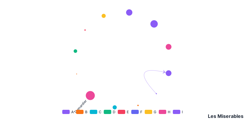
And the biggest set is filed elsewhere — ECharts keeps its 14 node-link charts under a Graph chip: force layouts, graphs on cartesian coordinates, dependency structures and the classic Les Misérables co-occurrence network shown here.
1. You have more than about a hundred nodes. Past that, a force layout produces a hairball: a dense centre no reader can enter and a fringe of stragglers. The information is still in there and nobody can extract it. Filter to a subgraph, aggregate nodes into groups, or use a matrix.
2. The question is about pairs. “Is A connected to B, and how strongly?” is answered instantly by an adjacency matrix heatmap — rows and columns of nodes, colour for the relationship — and slowly, if at all, by hunting through a hairball. Matrices scale to hundreds of nodes and stay deterministic.
3. The structure is really a hierarchy or a flow. A tree wants a tree layout, which is deterministic and readable; a quantity moving between stages wants a Sankey. Both are node-link diagrams with the arbitrariness removed by a constraint.
A fourth, which is the honest one: when the diagram is there because it looks sophisticated. Network diagrams are the most impressive-looking and least frequently informative charts in common use. The test is whether you can state the finding in a sentence — and if you can, whether the diagram shows it better than that sentence does.
The most useful thing to know about network diagrams is when to abandon them, and the alternative is nearly always the same: an adjacency matrix — nodes down the rows, the same nodes across the columns, and a coloured cell wherever a relationship exists.
It is a heatmap, and it inherits every one of that chart’s properties. It is deterministic, so it looks the same every time. It scales to hundreds of nodes without becoming a hairball, because cells never overlap. Pair lookup is instant: find the row, find the column. And the row and column order is yours to choose, which converts the network’s worst property — arbitrary arrangement — into its best: sort by cluster and communities appear as blocks along the diagonal.
What you lose is path-following. A matrix cannot show a route through three hops, and it does not produce the recognisable shape people remember. So the practical rule is: node-link for structure and storytelling, matrix for lookup and density — and for a large graph, both, side by side.
When the force layout has collapsed into an unreadable ball, these are the moves, roughly in order of how much they cost.
Filter by edge weight. Drop the weakest relationships. Most networks are mostly noise, and a threshold often reveals the structure that was always there. State the threshold.
Filter by degree. Remove the single-connection fringe, which contributes nothing but circumference.
Aggregate the nodes. People into teams, files into packages, SKUs into families. This is usually the single biggest improvement available, and it keeps every edge in play.
Extract the ego network. Pick the node the reader cares about and show only what is within one or two hops of it. Far more useful than the whole graph, and much easier to label.
Switch to a deterministic layout. An arc diagram with a chosen ordering, or a dependency wheel, both of which put the arbitrariness back under your control.
Show the numbers instead. A ranked table of the top nodes by degree, plus a sentence about the structure, beats an unreadable picture. It is not a defeat — the diagram was never going to be read.
Six screens, start to finish, captured from the plugin.
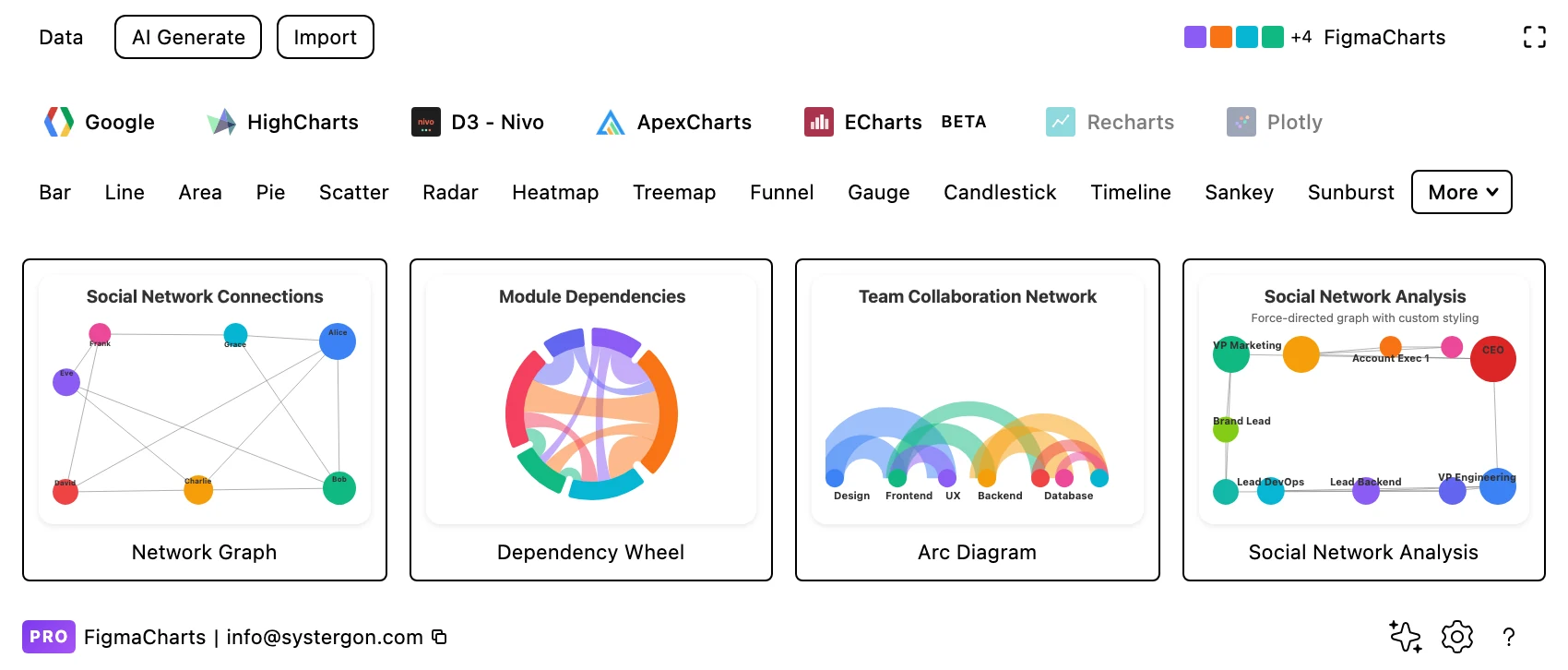
1. Filter to Network. Highcharts has four examples — the force graph, the dependency wheel, the arc diagram and a social network — and Nivo one. ECharts’ 14 are under Graph.
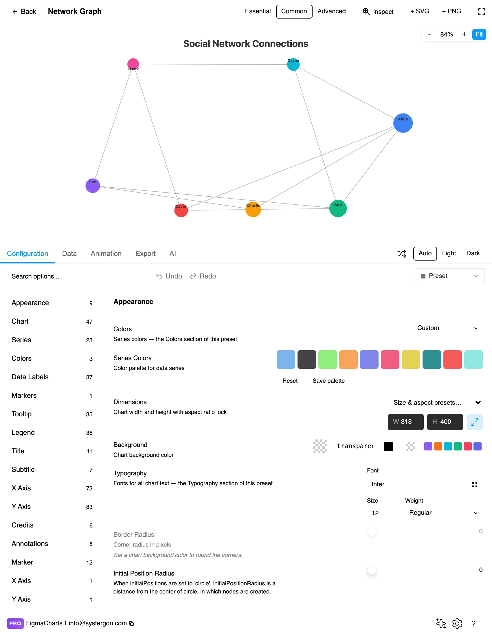
2. The editor. Live preview above, tabs below. Give the layout a moment to settle before judging it — the first frames of a force simulation are not the result.
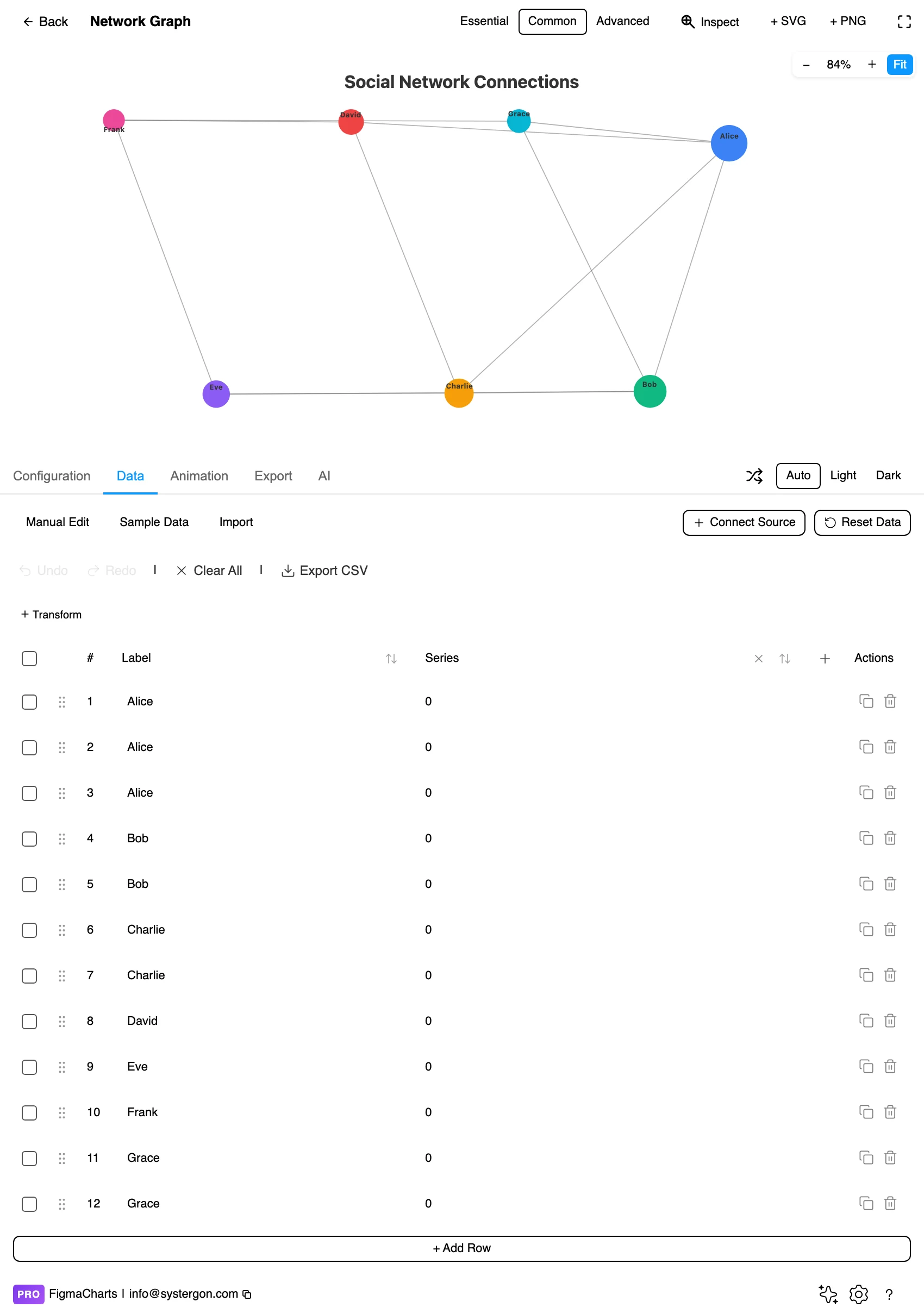
3. Nodes and links. Two lists: the nodes with their names, and the links as source-target pairs with an optional weight. This is the same node-link editor a Sankey uses, and the same shape a graph query produces.
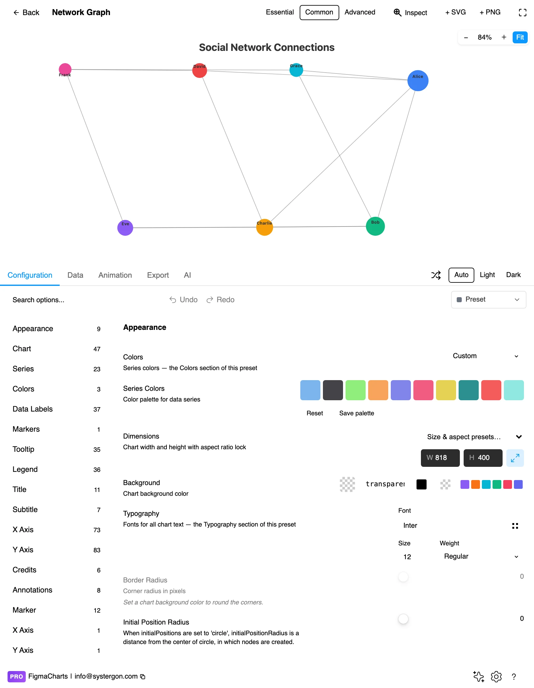
4. Tune the physics. Repulsion, link length, gravity and friction. These do not change the data at all — they change how much space the layout uses and how tight the clusters look, which is precisely why the arrangement should not be read as a finding.
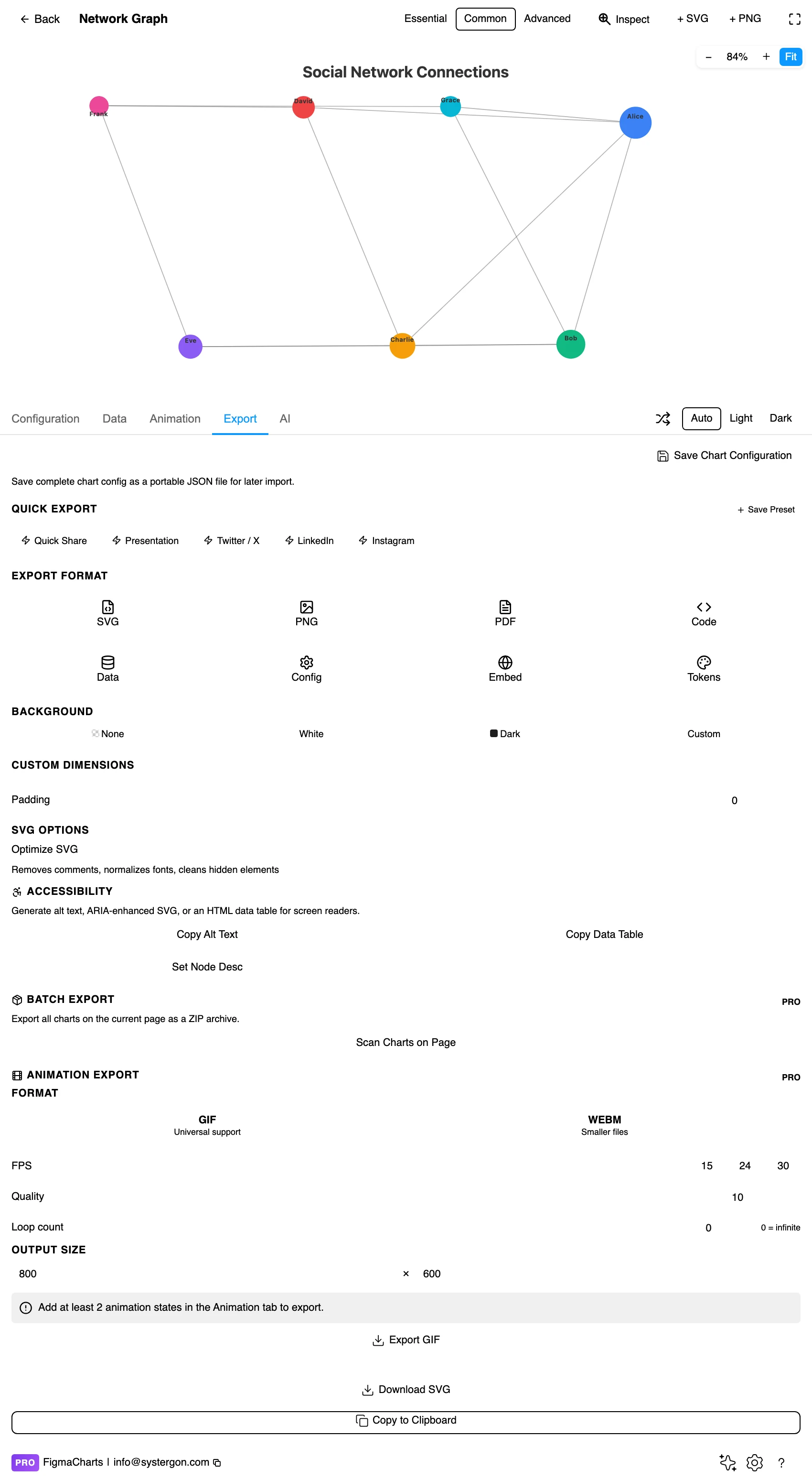
5. Export. A working component for React, Vue 3, Angular, Svelte or vanilla JavaScript — and note that the exported chart will re-run the simulation, so it will not reproduce this exact arrangement.
6. Insert. SVG freezes the layout you approved into real vector layers — which for this chart type is the main reason to insert vector: it is the only way to keep the arrangement you actually looked at.
Node-link, in two tables: nodes (a name, optionally a group and a value) and links (source, target, optional weight). It is the shape a GROUP BY source, target query returns, which makes networks easier to feed from a database than from a spreadsheet.
Three data decisions shape the picture more than any styling option:
In the plugin, Nivo networks cannot bind a live data source, for the same structural reason as Sankeys: a connector cannot build a node-link structure from a flat range.
The Network category holds five examples: Highcharts 4, Nivo 1. That is not where most of the node-link charts in this plugin are.
ECharts has 14 graph examples under its own Graph chip — force layouts, dynamic graphs, graphs on cartesian coordinates, dependency structures, label-overlap handling and two versions of the Les Misérables co-occurrence network. Same family, different chip, and by far the deepest set. If you are choosing a library for network work, that is the fact that matters.
As always: design in whichever library your engineers already use, because the export then matches production exactly. Choosing the right chart library covers the trade-offs.
Size nodes by something real. Degree — the number of connections — is the usual choice and it makes hubs visible immediately. Sizing by area rather than diameter, as always.
Colour by group, and keep the groups few. Community, team, package, category. Colour is the only channel that survives a dense layout, so spend it on the one grouping that matters.
Edges quiet and thin. Edges outnumber nodes and will dominate if drawn at full strength. Low opacity, hairline weight, and let the nodes carry the emphasis. Weight-by-value only when the weights vary enough to be legible.
Give the whole thing more room than feels necessary. Force layouts expand to fill the space they are given, and a graph drawn into a cramped frame settles tighter and reads as denser than the same data in a generous one. Frame size is therefore a styling decision that changes the apparent finding.
Label the hubs, not everything. Ten labels on a hundred-node graph is a chart; a hundred labels is a wall of text with dots behind it. Label by degree threshold and let the rest be structure.
Freeze what you approve. Because the layout is non-deterministic, the arrangement you signed off exists only until the next render. Inserting as SVG is what preserves it — and if the chart will be re-rendered in production, tell the engineers that positions will differ.
For type and colour, bind them to your design system rather than picking by hand — covered in Your chart, your design system.
Apparent clusters may be layout artefacts. Force algorithms pack nodes into available space, so visual grouping is suggestive rather than conclusive. If clusters are the finding, compute them — a community-detection result mapped to colour is a claim you can defend; a visual grouping is not.
Distance means nothing quantitative. There is no scale. Two nodes twice as far apart are not half as related; the springs simply settled there.
Hairballs hide their own density. Once edges overlap heavily, adding more data does not change the picture, so a graph that looks “complex” may be showing a fraction of what is there. Report the node and edge counts in the caption.
Isolated nodes read as unimportant. A node with one connection sits at the fringe by construction, which is a statement about its degree, not its significance — the single most important customer in a dataset can be a lonely dot.
Direction gets lost. Undirected rendering of a directed relationship is the commonest factual error here: “A depends on B” and “B depends on A” are very different claims and identical lines.
Do not rely on colour to convey grouping. Node shape, a ring around the node, or grouped labels all work where hue does not — and colour is doing a lot of work in a dense graph.
Never leave the identities in a tooltip alone. An inserted SVG has no hover, so an unlabelled network is an abstract picture. Label the nodes that matter, and provide the node and edge lists as a table.
Give it a text equivalent. The Export tab’s Copy Alt Text, Copy Data Table and Set Node Desc produce a description, a table of the underlying data and a description written onto the Figma node. For a network the meaningful description is structural — how many nodes and edges, which are the hubs, how many clusters — because the arrangement itself is not the content.
Because a force-directed layout is a simulation seeded with random positions. The connections are your data; the arrangement is computed. Insert as SVG to freeze the version you approved, and expect a re-render in production to differ.
About a hundred before it becomes a hairball, and fewer if the edges are dense. Beyond that, filter to a subgraph, aggregate nodes into groups, or switch to an adjacency matrix, which scales far better and is deterministic.
Highcharts (4 under Network, including the deterministic dependency wheel and arc diagram), Nivo (1) and ECharts, whose 14 examples sit under a separate Graph chip — the deepest set in the plugin. Google Charts and ApexCharts have no general network type.
Deterministic layouts: an arc diagram (nodes on a line, edges as arcs, and you choose the order), a dependency wheel (nodes on a circle, chords across), or an adjacency matrix. All three give the same picture every time, which means a reader can learn them and two versions can be compared.
Only weakly in a force layout — arrowheads at this density are hard to see. If direction is essential, use an arc diagram where edges above and below the line can encode it, or a Sankey if the relationship is a flow.
Yes — degree, or a value you care about, scaled by area. An unsized network wastes the one channel that survives a crowded layout, and hubs are usually the first thing a reader wants to find.
Not in Nivo — the plugin refuses the connection because a node-link structure cannot be built from a flat range. Where a live graph matters, plan for the data to be prepared as nodes and links before it reaches the chart.
A circular layout: every node sits on the circumference and every relationship is drawn as a chord across the middle, with thickness carrying weight. It is deterministic and compact, and it handles a few dozen nodes with dense relationships better than a force layout does — which is why it is the standard picture for module dependencies. Highcharts ships one.
Insert as SVG and every node and edge is a real vector layer — which is the main reason to insert vector here, because it is the only way to keep the exact arrangement you approved. Insert as PNG for a flat image at twice the pixel density.
Open the plugin, filter to Network, and put your nodes and links in — then render it twice. If the two pictures tell the same story, the structure is strong enough to survive the layout and you have a chart. If they look like different datasets, what you have is an illustration, and the finding you were going to claim belongs in a matrix, a ranked list of hubs, or a sentence.
Install Figma Charts — it’s free to try → Browse all 45 chart types →