Install Figma Charts — it’s free to try → See the combo gallery →
A combo chart puts two different kinds of mark in one frame — bars and a line, most often — and it exists because two measures can share an x axis while playing completely different roles. Volume as bars, price as a line. Actuals as bars, target as a line. Counts as bars, a rate as a line. The mark type is doing the explaining: this is a quantity, and that is a trend.
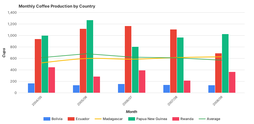
Real plugin output: a Google Charts combo captured from the editor. Every chart on this page is the library’s own drawing.
It is also the chart most often used to smuggle a second axis into a design, and a second axis can make any two series look related. So this page has a strict shape: what a combo legitimately does, the one rule for the second axis, and how to build one in the libraries that do not have a Combo category at all — which is four of the five.
Everything below happens inside Figma Charts, a Figma plugin. It runs the real JavaScript charting libraries — Google Charts, Highcharts, D3-based Nivo, ApexCharts and Apache ECharts — inside the plugin window, so the chart on your canvas is the library’s own composition of series types.
Install Figma Charts from the Figma Community →
Press ⌘/ (Ctrl / on Windows), type Figma Charts, hit Enter, and pick Combo from the category filter — where you will find five examples, all Google Charts. That is a filing fact rather than a capability fact, and the library section is where it gets interesting.
A combo chart works when the two series are doing different jobs. Three pairings account for nearly every good one:
The common thread: the line is the series you would never draw as a bar, because it is not a quantity that accumulates. When both series are quantities of the same kind, you do not want a combo — you want grouped bars, which compare like with like on one scale.
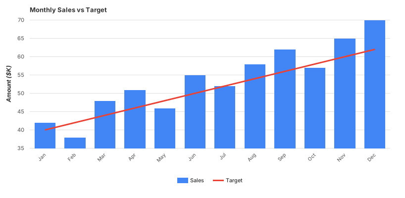
Bars with a trend line — the line here is derived from the bars rather than being a second measure. Google computes it, which makes this the cheapest honest way to separate signal from month-to-month noise.
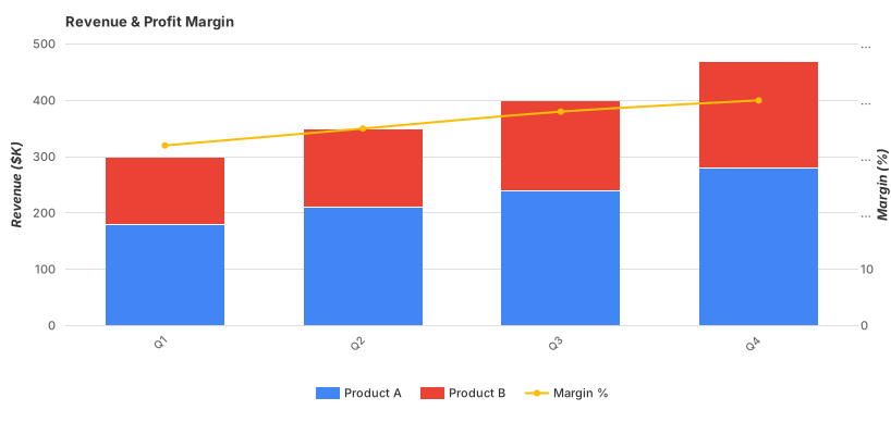
Stacked bars with a line — components below, a total or a rate above. Note the reading hazard this creates: only the bottom segment of the stack shares a baseline, so the line is the only series in the chart whose values can be read precisely at every point.
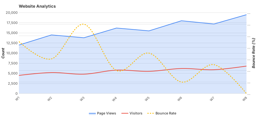
Line and area — the fill carries a range or a cumulative quantity while the line carries the headline series. This is the pairing to use when you want context behind a metric rather than a second metric beside it.
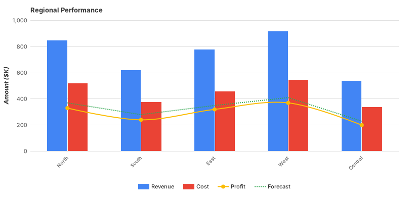
Three mark types at once — and the point at which a combo chart starts costing more than it earns. Every additional mark type is another convention the reader has to hold, and the third one rarely pays for itself.
Most combo charts need a second y axis, because a count and a percentage do not share a scale. That is legitimate — and it comes with a hazard that no other chart type has quite so sharply: with two independent axes, you choose where the series cross. Scale one axis differently and two series that appeared to move together now appear to diverge. Nothing in the chart tells the reader that the crossing points are an artefact of two scaling decisions.
The rule that keeps it honest: a second axis is for a second unit, never for a second range.
If your two series are both revenue — one large, one small — a second axis is a way of making the small one look as big as the large one, and the fix is either one axis (accepting that the small series is small) or two charts. If one series is pounds and the other is a percentage, they genuinely cannot share a scale and the second axis is doing real work.
Two supporting habits. Colour the axis labels to match their series, so a reader can tell at a glance which scale belongs to which line. And state both units in the axis titles — a bare number on each side is where dual-axis charts start misleading people who are skimming.
1. Both series are the same kind of quantity. Then the comparison is like-for-like and grouped bars or two lines do it without asking the reader to decode two mark types.
2. The relationship is the actual subject. If the question is “do these two move together?”, a combo chart answers it with a visual coincidence that you controlled. A scatter plot of one against the other answers it with evidence.
3. There are more than two series. Two mark types and two axes is already a lot of convention. A third series — especially a third mark type — turns the chart into a puzzle, and the usual honest replacement is two stacked charts sharing an x axis.
A fourth, which is really about audience: when the chart will be read in three seconds. Combos reward study. On a wall display or a summary slide, one measure drawn well beats two measures drawn together.
One combo is common enough to have its own name and its own category in the plugin: the Pareto chart — bars sorted descending, with a cumulative percentage line climbing across them, and a reference at 80%. It answers “how few causes account for most of the effect?”, which is a question a plain bar chart cannot answer without the reader doing running arithmetic.
It is worth studying as the model combo, because every part of it earns its place. The bars are counts, so they are bars. The line is a cumulative percentage, so it is a line and it belongs on a second axis running 0–100% — a genuine second unit, not a rescaled second range. The sort order is mandatory rather than stylistic: an unsorted Pareto produces a wandering cumulative line that means nothing. And the 80% gridline turns the chart into a decision aid: everything left of where the line crosses it is the short list.
Highcharts files it as its own type in the plugin, built from a pareto series plus a column series — which is to say, a combo. If you are designing a defect analysis, a support-ticket breakdown or a cost review, this is the shape to reach for rather than assembling one from scratch.
The other everyday combo is actuals as bars against a target as a line, and it is worth knowing when a different chart does it better, because this pairing has good competition.
A line target works when the target moves. Monthly quotas that change, a rolling baseline, last year’s values as a shape — these are genuinely a series, and drawing them as a line lets the reader see both the target’s trajectory and the gap.
A flat line target is a threshold, and a threshold is better drawn as a rule. If the target is the same number every period, a single horizontal reference line with a label costs one option and does not add a series to the legend. Most libraries have plot lines for exactly this; a full second series is more machinery than the job needs.
When there is one measure and one target, use a bullet chart. A bullet chart shows a value, a target marker and qualitative bands in a fraction of the space, and it stacks cleanly for several metrics. A combo is the right answer when there are many periods; a bullet is the right answer when there are many metrics.
Six screens, start to finish, captured from the plugin.
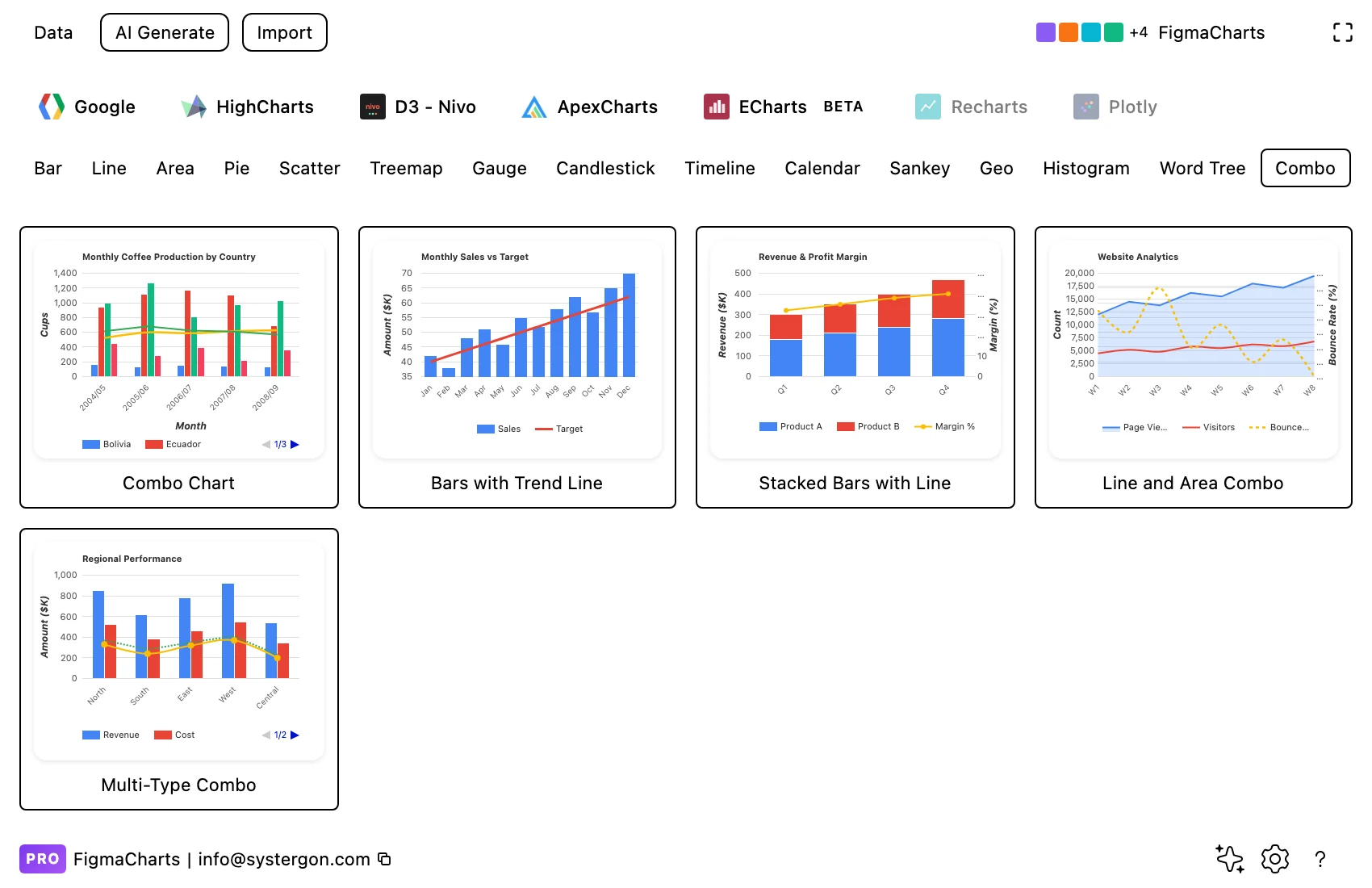
1. Filter to Combo. Google Charts is the only library with the category — five examples covering the useful pairings.
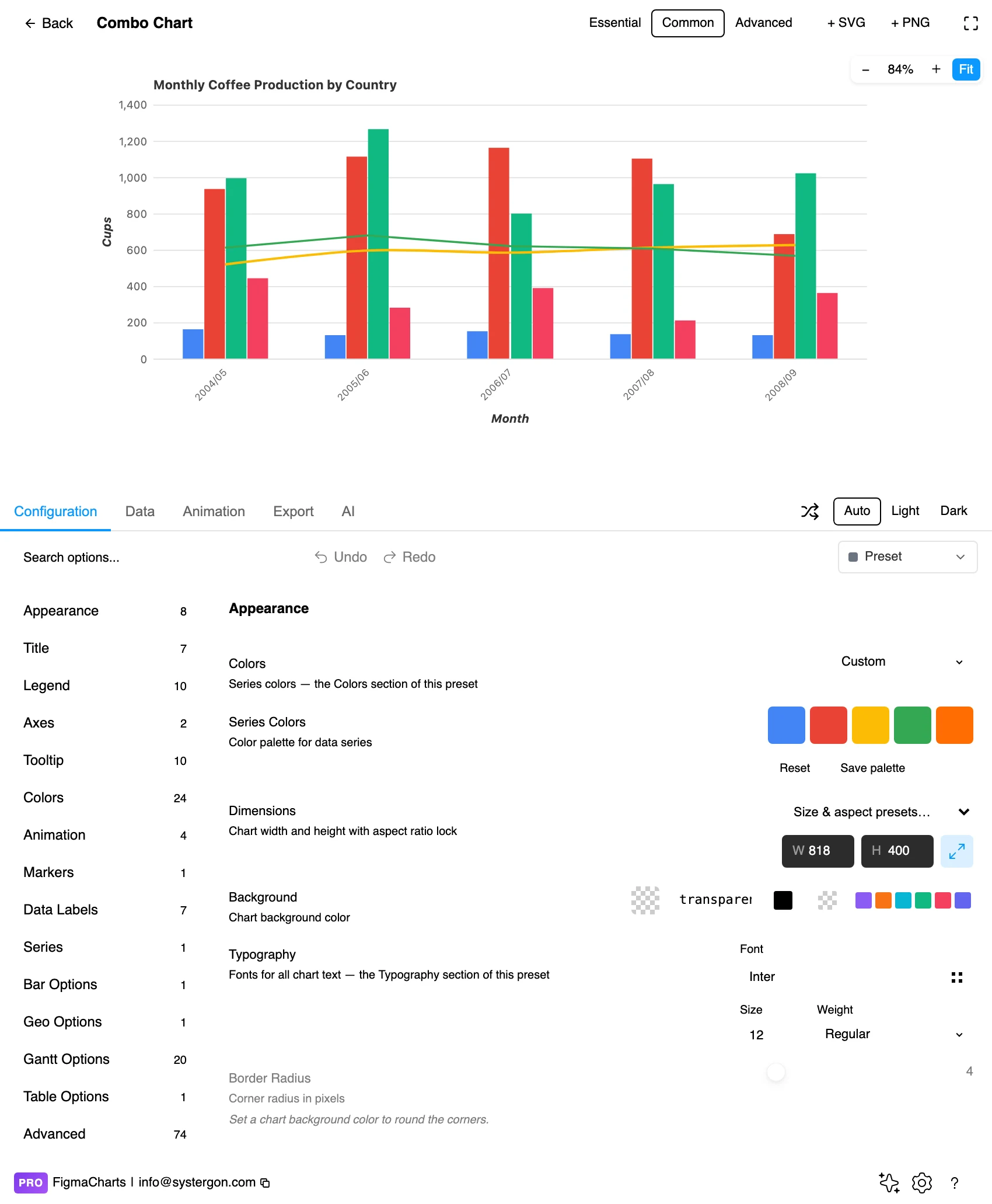
2. The editor. Live preview above, tabs below. With a combo, check the legend first: it is the only thing telling the reader which series is which mark type.
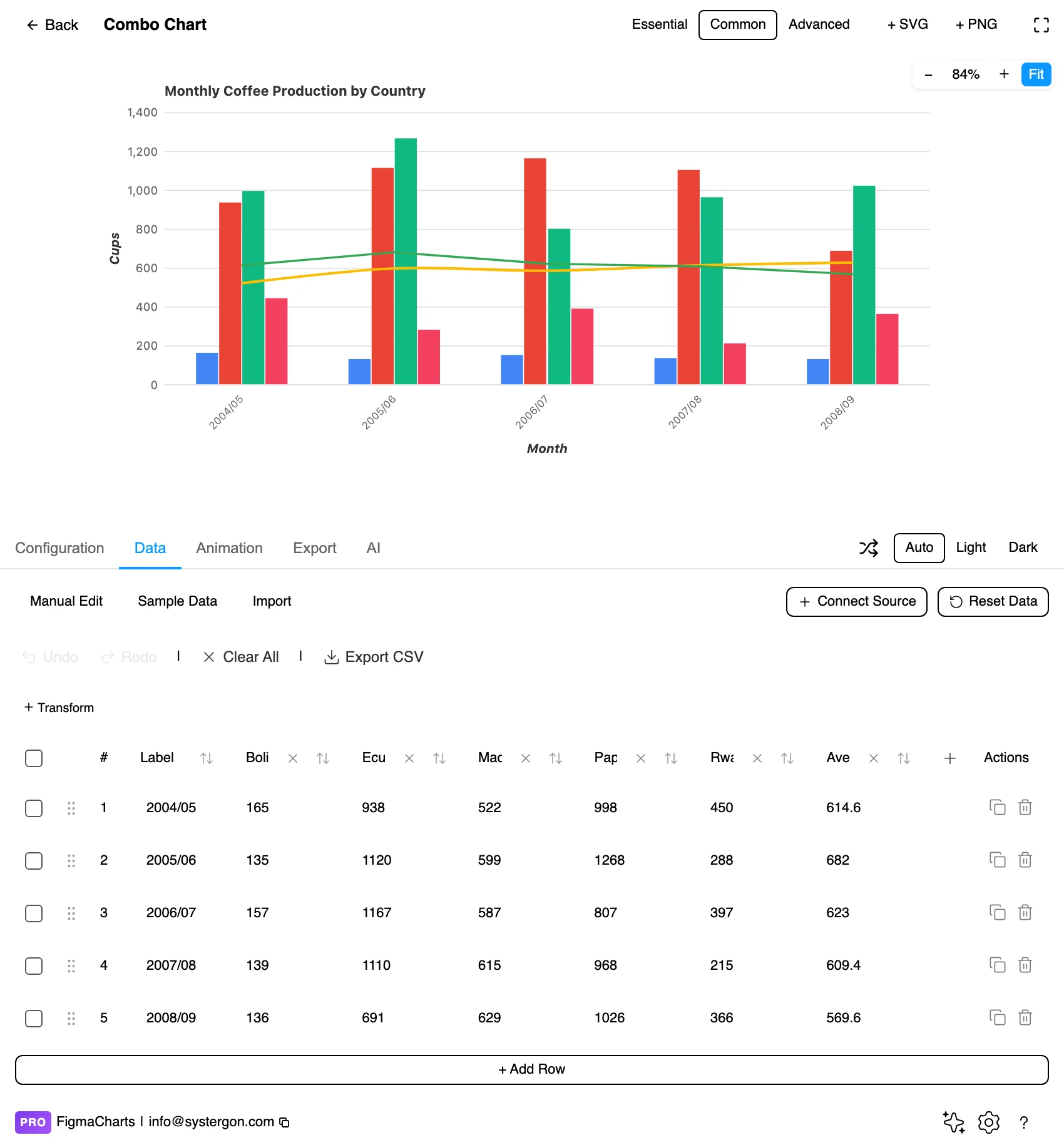
3. One column per series. The data shape is the ordinary cartesian table — a label column and a numeric column per series. Which series becomes a line rather than a bar is a configuration decision, not a data one.
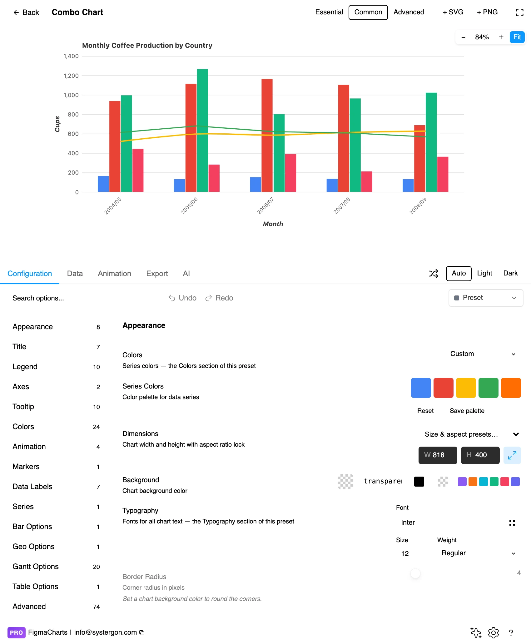
4. Assign the mark types. This is the panel that makes it a combo: each series gets a type, and any series can be moved to the second axis. Set the axis titles here too, with units.
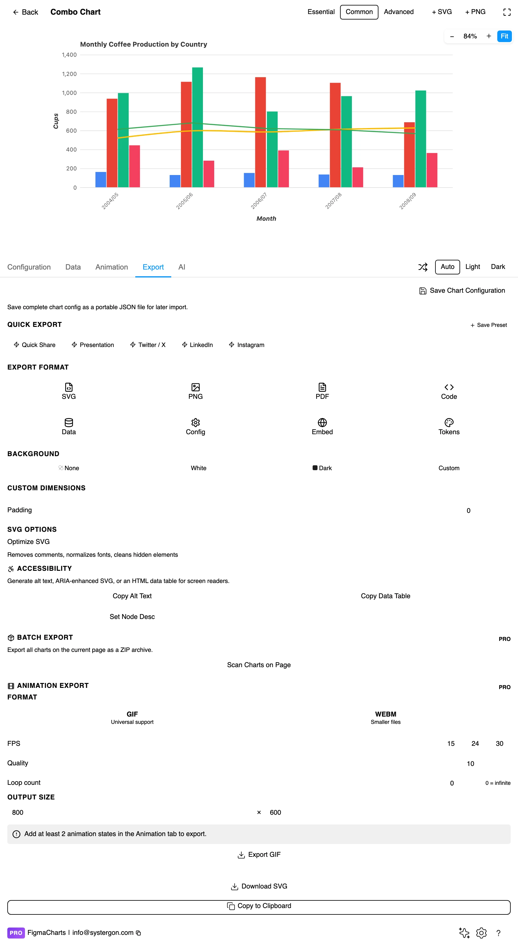
5. Export. A working component for React, Vue 3, Angular, Svelte or vanilla JavaScript — the per-series type overrides travel in the config, which is exactly the part a hand rebuild tends to lose.
6. Insert. SVG keeps the bars as rectangles and the line as a path, so the two series can be restyled independently on the canvas.
The ordinary cartesian table: one label column, then one numeric column per series. Nothing about the data says “this one is a line” — that is a per-series setting in the configuration, which is why any multi-series chart can become a combo without touching the data.
Combo charts accept a linked data source, so a Sheet with a date column and two measures drives one directly — see live data from Google Sheets and APIs. One caution specific to this type: because the series usually have very different magnitudes, an unparseable cell becoming 0 is easy to miss in the small-magnitude series — a rate line dropping to the axis for one period reads as a genuine collapse.
The Combo category holds five examples, all Google Charts. Taken at face value that reads as “only Google Charts can mix bars and lines”, and that is false — it is one of the clearest chip-versus-capability cases in the whole plugin.
Highcharts mixes series types freely, and the gallery proves it in charts filed under other categories: its multi-axis line example is a spline plus column, its Pareto chart is a pareto line plus column, its error-bar chart is a column plus errorbar, and its bell-curve histogram combines three types in one frame. ApexCharts does the same: its “Line & Column Mix”, “Line & Area Mix” and “Multiple Y-Axis” examples are all combos, filed under Line. ECharts mixes types as a matter of course. Nivo is the genuine constraint of the five: its charts are separate React components, so combining a bar and a line means composing two of them yourself.
type overrides plus multiple axes; the most control, commercial licence to ship commercially.So the honest sentence is “Google Charts is the only library with a Combo category”. Four of the five will draw you a combo; in three of them you build it by setting a type on a series.
Bars behind, line in front. The line is the series being read for shape, and a line hidden behind a bar is a line the reader will lose. Every library draws series in order; put the line last.
Give the line a different hue family, not a different shade. The mark types are already doing the separating; a genuinely distinct colour lets the legend and the axis labels agree with each other at a glance.
Keep the bars quieter than you would alone. A full-strength bar series plus a full-strength line competes for the same attention. Muting the bars slightly is usually right, because they are the context and the line is the argument — if it is the other way round, mute the line instead, but pick one.
Markers on the line, if the periods matter. With a bar per period, the line’s vertices should sit above the bar centres; markers make that alignment visible and reassure the reader the two series are on the same x positions.
One gridline set, tied to the primary axis. Two sets of gridlines from two axes is the fastest way to make a combo unreadable. Draw the primary axis gridlines and let the secondary axis carry ticks and labels only.
For type and colour, bind them to your design system rather than picking by hand — covered in Your chart, your design system.
The crossing point is a choice, not a fact. With two independent axes, where the line crosses the bars is determined by the two ranges you set. Readers treat crossings as events. If your chart has a memorable crossing, check whether it survives a different but equally reasonable pair of ranges.
Two axes invite two conclusions. The same chart can be made to show “costs are rising faster than revenue” or “revenue is comfortably ahead of costs” by rescaling one side. If the relationship between the two series is genuinely the point, index both to 100 at a common start and use one axis — that comparison is honest and needs no second scale.
Stacked bars plus a line hides which values are readable. In that combination only the bottom stack segment and the line have fixed baselines. It is a common and useful chart; just do not expect readers to compare middle segments across periods.
A trend line is a model. Where the line is computed rather than measured — a moving average, a fitted trend — say so in the legend. Otherwise readers count it as a second observation of reality.
Mark type implies aggregation. Bars read as things that sum; lines read as things that continue. Drawing a rate as bars invites addition, and drawing a count as a line invites interpolation between periods that were counted discretely.
The mark types are an accessibility win — use them as one. A bar and a line are distinguishable without colour, which is more than most multi-series charts can say. Keep that property by not adding a second bar series in a different hue.
Label the axes with units, and match label colour to series. For a reader who cannot rely on hue, the units are the fallback that identifies which axis belongs to which series.
Direct labels beat a legend. A short label at the end of the line and a value on the final bar removes the lookup entirely.
Give it a text equivalent. The Export tab’s Copy Alt Text, Copy Data Table and Set Node Desc produce a description, a table of the numbers and a description written onto the Figma node. For a combo, make sure the table carries both units — that is the information the dual axis was compressing.
When two series share an x axis but play different roles — a quantity and a rate, an actual and a target, components and a total. If both series are the same kind of quantity, grouped bars or two lines communicate better.
For a second unit, yes. For a second range of the same unit, no — that is using the axis to make a small series look large. When the relationship between two same-unit series is the point, index both to 100 at a common start and keep one axis.
Four of the five. Google Charts has the only Combo category (5 examples); Highcharts, ApexCharts and ECharts all support per-series type overrides and ship mixed-type examples filed under other categories. Nivo is the exception — its charts are separate components, so you compose them in React.
The one you would never draw as a bar: the rate, the target, the moving average, the index. Bars imply a quantity that accumulates; lines imply a value that continues.
You can, and the plugin ships an example. Each additional mark type is another convention for the reader to hold, and the third rarely earns it. Two stacked charts sharing an x axis usually communicates better.
Series draw order: put the line last so it renders in front, and mute the bars slightly so the line reads as the foreground. Markers on the line vertices help confirm the alignment with the bar centres.
Yes — it takes the ordinary cartesian shape, so a linked Sheet or API drives it like any bar or line chart. Watch for unparseable cells becoming zero: on the small-magnitude series, one zero reads as a genuine collapse.
Insert as SVG and the bars arrive as rectangles and the line as a path, so the two series can be restyled independently — useful when the line needs to become an annotation. Insert as PNG for a flat image at twice the pixel density.
Open the plugin, filter to Combo, and put your two series in — then ask the only question that matters: are these two different kinds of number? If one is a count and the other is a rate, you have a combo chart and the second axis is honest work. If they are both counts, close the second axis and draw them on one scale, even if the smaller one turns out to be small.
Install Figma Charts — it’s free to try → Browse all 45 chart types →