Install Figma Charts — it’s free to try → See the Voronoi gallery →
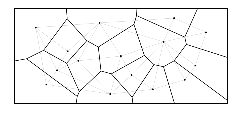
A Voronoi diagram takes a set of points and divides the space around them into cells, where each cell contains everywhere that is closer to that point than to any other. It is not a chart of values — it is a chart of proximity, and it answers a question no other chart in this series can: which thing is nearest, and how much territory does it own?
Real plugin output: a Nivo Voronoi captured from the editor. Every chart on this page is the library’s own drawing.
That makes it the odd one out here: a piece of computational geometry that happens to be shipped as a chart type. This page is about the questions it genuinely answers — catchments, coverage, nearest-neighbour regions — and about its quiet second career as an interaction layer that users never see.
Everything below happens inside Figma Charts, a Figma plugin. It runs the real JavaScript charting libraries — Google Charts, Highcharts, D3-based Nivo, ApexCharts and Apache ECharts — inside the plugin window, so the tessellation on your canvas is the library’s own computation.
Install Figma Charts from the Figma Community →
Press ⌘/ (Ctrl / on Windows), type Figma Charts, hit Enter, and pick Voronoi from the category filter. One example, from Nivo — the only library here with the type.
Three properties define the diagram, and each is worth stating precisely because the chart is easy to admire and easy to misread:
Once those are clear, the useful readings follow: large cells are sparse regions (nothing else nearby), small cells are crowded ones, and the boundaries are catchment lines you could actually draw on a map.

The same points, without the tessellation — a scatter plot shows where things are; the Voronoi adds what each one is nearest to. If the question is about position or correlation, the scatter is the chart; if it is about territory, the cells are.
Catchment areas. Given the locations of stores, clinics, depots or transmitters, the cells are the areas each one serves under a nearest-facility assumption. It is the standard first-pass answer to “which site covers where?” and it takes seconds compared with a proper routing model.
Coverage gaps. An unusually large cell is a region far from everything, which is precisely what a network-planning conversation is looking for. The diagram makes the gap a shape rather than an intuition.
Spatial competition. With competitor locations as the points, the cells approximate territory, and the boundaries are where the choice flips. Crude as an economic model, immediately legible as a picture.
And the invisible use: hit targets. In interactive scatter plots, a Voronoi computed over the data points defines which point the cursor is nearest to — so hovering anywhere in the chart highlights the closest mark rather than requiring a hit on a 4px dot. Most people who benefit from this have never seen the diagram; it is a layer, not a graphic. If you are designing a dense interactive scatter, it is the technique that makes it usable.
1. Distance is not the relationship. The cells assume nearest-by-straight-line matters. For travel time, road networks or service capacity, straight-line distance is a poor proxy and the diagram will assert boundaries that do not exist on the ground.
2. Your points have no spatial meaning. A Voronoi over arbitrary x and y values produces a beautiful pattern encoding nothing. It is a genuinely common decorative misuse.
3. The values matter more than the positions. If each point carries a quantity, the cells will not show it — you can colour them by value, but the cell sizes will keep suggesting a different story.
A fourth: when you need capacity-aware areas. Real catchments depend on how much each site can serve, which a plain Voronoi ignores entirely — every point gets whatever territory geometry gives it. Weighted variants exist and are not what a chart library ships.
A Voronoi is one of a small set of related constructions, and knowing the neighbours helps you ask for the right one.
The Delaunay triangulation is its dual: connect every pair of points whose cells share a boundary and you get a mesh of triangles. Same information, inverted — the Voronoi shows territories, the Delaunay shows neighbour relationships. If your question is “which sites are adjacent?” rather than “what does each cover?”, that is the one you want, and it is what most implementations compute first.
The convex hull is the outline of the whole point set — the smallest polygon containing every point. It answers “what area do these cover in total?”, which is often the follow-up question after looking at a tessellation.
A distance surface — a heatmap where colour is the distance to the nearest point — answers the coverage question continuously rather than as hard boundaries. It is less crisp and considerably more honest about the fact that being just inside a cell boundary is not meaningfully different from being just outside it.
That last one is worth remembering. A Voronoi draws sharp lines through what is really a gradient, and the sharpness is a property of the construction rather than of the world.
Six screens, start to finish, captured from the plugin.
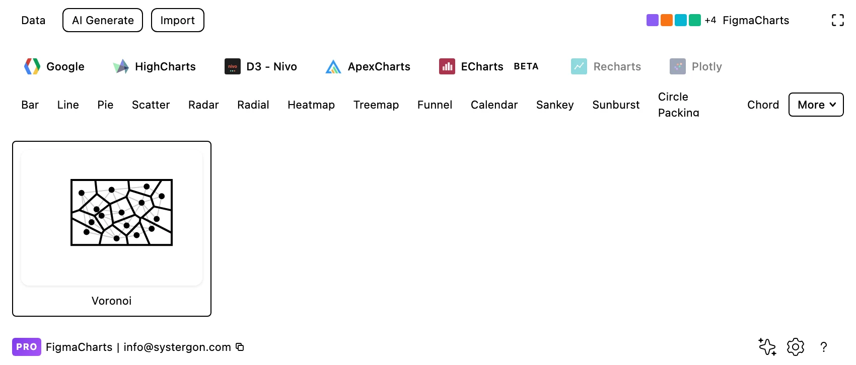
1. Filter to Voronoi. Nivo has the only example — one of several D3 techniques that reached this plugin through Nivo and nowhere else.
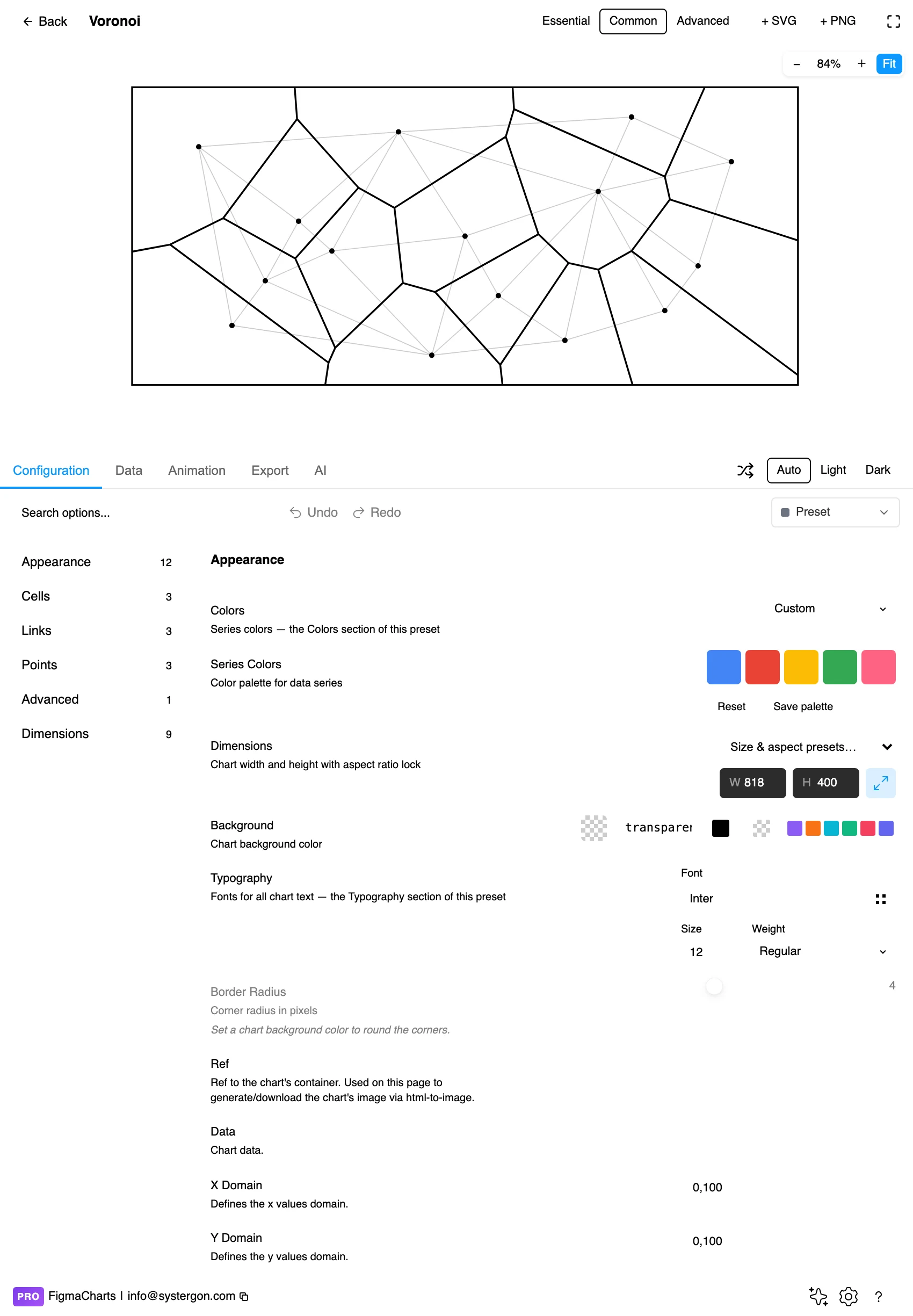
2. The editor. Live preview above, tabs below. The tessellation fills whatever frame it is given, so the aspect ratio changes every cell — set the frame before judging the shapes.
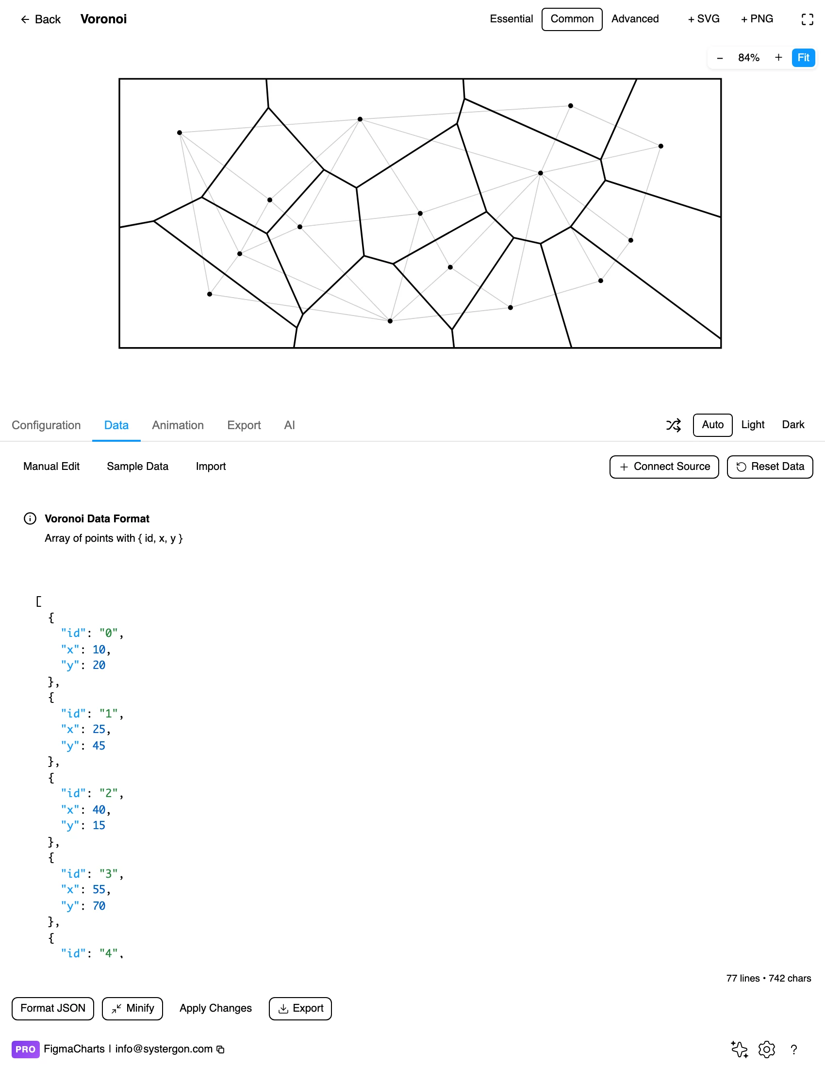
3. Points, as coordinates. An id and an x/y pair per point — edited as JSON in Nivo. The cells are computed, not supplied: you give positions, the library gives you the tessellation.
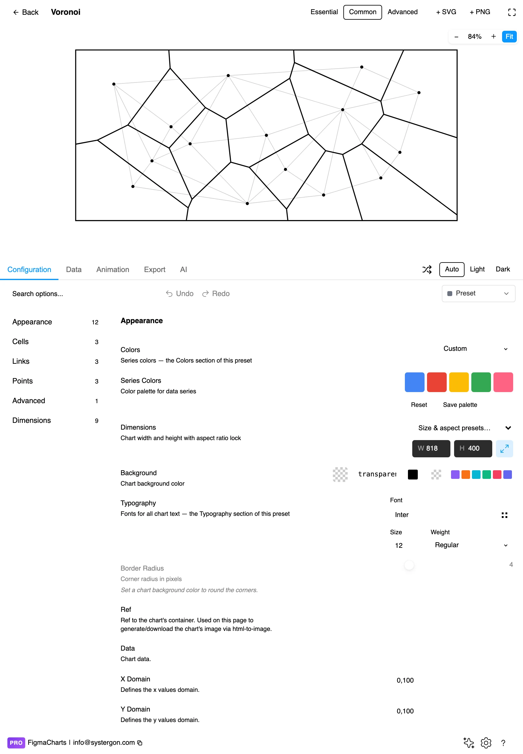
4. Configure. Cell borders, link lines, point markers and the bounding box. Showing the points themselves is usually essential — a tessellation with no visible sites is a pattern.
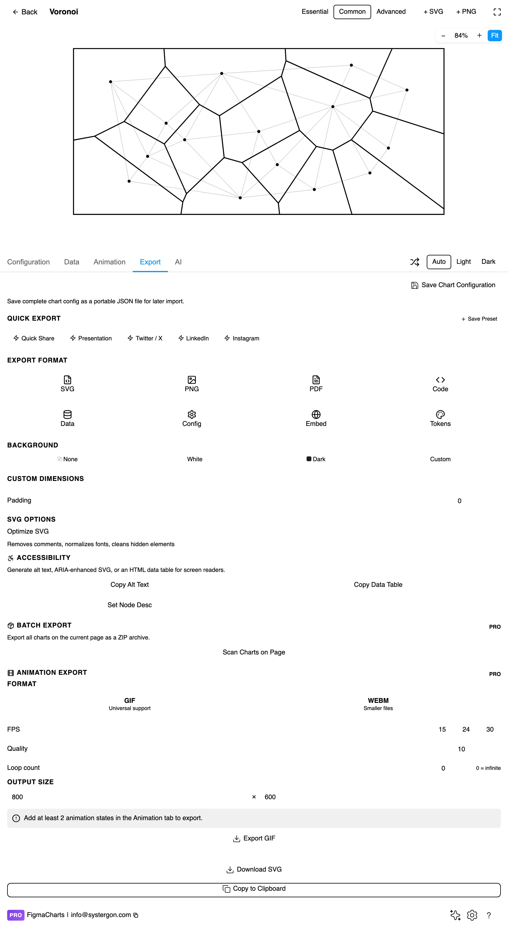
5. Export. Nivo exports to React — and for a Voronoi the more common handoff is the geometry itself, since the cells are frequently used as hit areas rather than as a visible chart.
6. Insert. SVG gives you every cell as its own vector polygon — which is exactly what you want, because a Voronoi in a design is usually a set of shapes to be filled, labelled or clipped by hand.
A list of points: an identifier and a pair of coordinates each. The plugin classifies it as a JSON shape, edited directly rather than in a table, and Nivo Voronoi charts cannot bind a live data source — the connection is refused rather than producing a structure the chart cannot use.
Two things follow from the fact that the cells are computed. You do not supply the polygons, so there is nothing to get wrong there — and equally, nothing to adjust: if a boundary looks wrong, the fix is in the points or in the assumption that straight-line distance is the right measure.
And the bounding box matters. Cells at the edge of the diagram are clipped by the frame rather than by another point, so their size is an artefact of where you drew the boundary. On a map that boundary should be a real one — a coastline, a service area — not the edge of the canvas.
The Voronoi category holds one example, in Nivo, and no other library in the plugin has the type.
Which points at how this technique is usually used in production: as geometry rather than as a chart. A library computes the cells, and the application uses them for hit-testing, for clipping images, or for drawing regions on a map. The plugin’s version is useful for exactly one thing that code path does not give you — a designed, editable picture of the tessellation, with every cell arriving in Figma as a vector polygon.
As always: design in whichever library your engineers already use, because the export then matches production exactly. Choosing the right chart library covers the trade-offs.
Because a Voronoi arrives as a set of polygons, it is the chart in this series most often used as raw material rather than as a graphic. Three things designers do with it:
Clip images into cells. A tessellation over a set of positions, with each cell masking a photograph, produces the mosaic layout that turns up in editorial design — and the geometry is computed rather than drawn, so it fits the underlying data.
Build organic-looking grids. Randomly placed points give irregular cells that read as natural rather than laid out. Useful for backgrounds, texture and diagrams that should not look like a spreadsheet.
Draw territory maps. Cells filled by category with the points labelled is a serviceable coverage map when you have positions and no boundary data — and it takes minutes rather than needing GIS files.
All three are legitimate, and only the third is a chart. The distinction to hold on to: if the positions are not real, the picture is decoration — a good-looking pattern, and it should not be captioned as though it showed something.
Show the points. The sites are what the cells are about; a tessellation without visible generators is a pattern rather than a diagram. Small solid dots are enough.
Thin borders, or none. Heavy cell outlines dominate the picture. Where cells are filled by category, a hairline in the background colour is plenty; where they are unfilled, the borders are the whole drawing and should be crisp but light.
Colour by category, not by cell. Giving every cell its own hue encodes nothing. Colour is available for a real attribute of each site — type, owner, status — and used that way the map becomes informative.
Label the sites, not the cells. The point has a name; the cell is derived. Labels sit best beside their points, which also keeps them away from the awkward angles of the boundaries.
Give the frame meaning. Since edge cells are clipped by the boundary, make that boundary a deliberate shape — a region outline, a card edge — rather than an arbitrary rectangle.
For type and colour, bind them to your design system rather than picking by hand — covered in Your chart, your design system.
It is worth being explicit about where the information in this chart actually lives, because the cells are so visually dominant that they look like the content.
You supply positions. The library supplies everything else. Cell shapes, boundaries, areas and adjacencies are all computed from the points, which means none of them can be edited independently — and any of them that looks wrong is telling you something about the points or about the frame.
So data quality is entirely about the coordinates. Two sites recorded at the same location produce a degenerate cell; a site with a transposed latitude and longitude lands in the sea and steals territory from half the map; a missing coordinate silently removes a site and hands its area to its neighbours. None of these produce an error — they produce a plausible diagram.
The check that catches all three: count the cells and compare with the number of sites you expect. It takes a second and it is the only validation this chart type really needs.
Cell size means isolation, not importance. The biggest cell belongs to the most remote point. Readers consistently read big as significant, and here it means the opposite of busy.
Edge cells are artefacts. They are bounded by the frame, so their size depends on where you stopped drawing. Never compare an edge cell’s area with an interior one.
Straight-line distance is an assumption. Rivers, roads, borders and opening hours all break it. The diagram states the boundary with a confidence the underlying model does not have.
Adding one point rearranges the neighbourhood. Voronoi cells are not stable: a new site changes the boundaries of every cell around it. Two versions of the same map are not comparable cell by cell.
The tessellation always looks complete. Every part of the frame belongs to some point, including regions where no site is remotely close — which is exactly the coverage gap you were looking for, drawn as though it were served.
Most Voronoi diagrams that reach a decision-maker are catchment maps, and three practices keep them from overstating what they know.
Say the assumption out loud. “Nearest site by straight-line distance” in the caption is accurate and sets expectations. Readers otherwise assume travel time, which is what they actually care about and what the diagram does not model.
Bound it with something real. Clip the tessellation to a service region, a country outline or a coverage area rather than to the canvas. Edge cells are otherwise sized by the frame, and on a map that reads as territory that does not exist.
Mark the sparse areas. If the point of the map is coverage, annotate the large cells with the distance from their site to the far corner. That converts “this cell is big” into “this area is 40km from anything”, which is the number that gets acted on.
Do those three and the diagram is a defensible first-pass analysis. Skip them and it is an authoritative-looking picture of an assumption.
Do not rely on fill colour alone to distinguish categories of site; label the points, since they are few and named.
Keep boundary contrast adequate. The edges carry the entire structure, and light hairlines on a pale fill are the commonest failure here.
Explain the encoding in a caption. “Each region is closer to its marked site than to any other” is one sentence and makes the diagram legible to someone meeting it for the first time — which, for this chart, is nearly everyone.
Give it a text equivalent. The Export tab’s Copy Alt Text, Copy Data Table and Set Node Desc produce a description, a table of the underlying points and a description written onto the Figma node. For a Voronoi the useful text is the list of sites plus the finding — which areas are furthest from any of them.
A division of space into cells, one per point, where every position in a cell is closer to that point than to any other. The boundaries are the lines equidistant between neighbouring points.
How isolated its point is — a large cell means nothing else is nearby. It does not mean the point is important, large or busy, which is the most common misreading.
Nivo only in this plugin. Voronoi tessellation is a geometry routine rather than a charting primitive, so most libraries leave it to a separate module — and in production it is more often used as an invisible interaction layer than as a visible chart.
Catchment areas from site locations, coverage-gap analysis, rough territory maps — and, invisibly, as hit-testing geometry in interactive scatter plots, so that hovering anywhere selects the nearest point rather than requiring a hit on a tiny dot.
Not with a plain Voronoi — every point gets whatever territory the geometry gives it, regardless of how much it can serve. Weighted variants exist mathematically and are not what chart libraries ship.
Because they are bounded by the frame rather than by another point, so their size is an artefact of where the drawing stops. Give the boundary a real meaning — a region outline — or exclude the edge cells from any comparison.
Both, depending on the points. Over real positions it is a genuine spatial analysis; over arbitrary coordinates it is an attractive pattern encoding nothing. The difference is invisible to the reader, so caption accordingly.
The Voronoi’s dual: connect every pair of points whose cells touch and you get a mesh of triangles showing which sites are neighbours. Same information seen the other way round — the Voronoi shows territory, the Delaunay shows adjacency. Most implementations compute one from the other.
Insert as SVG and every cell is a vector polygon — which is the main reason to make one here: the cells become shapes you can fill, clip images into, label or restyle, with the geometry computed from your real points. Insert as PNG for a flat image at twice the pixel density.
Open the plugin, filter to Voronoi, and put in a set of real locations — stores, offices, sensors. Then look for the biggest cell. That cell is the part of your territory furthest from anything you own, which is a finding that no table of coordinates would have handed you, and the reason this piece of geometry earns a place in a chart library at all.
Install Figma Charts — it’s free to try → Browse all 45 chart types →