Install Figma Charts — it’s free to try → See the timeline gallery →
The Timeline category holds two different charts, and most confusion about the type comes from not noticing. One plots events — moments on a time axis, each with a label. The other plots durations — bars that start and end, one row per thing, which everyone outside charting calls a Gantt chart. They share an x axis and nothing else.
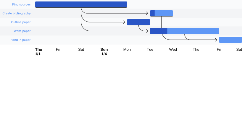
Real plugin output: a Google Charts Gantt captured from the editor. Every chart on this page is the library’s own drawing.
Knowing which one you need decides the data shape, the library and half the layout. This page separates them, then covers what both have in common: a time axis that lies about elapsed time more easily than any other axis in charting.
Everything below happens inside Figma Charts, a Figma plugin. It runs the real JavaScript charting libraries — Google Charts, Highcharts, D3-based Nivo, ApexCharts and Apache ECharts — inside the plugin window, so the bars and markers on your canvas are the library’s own output.
Install Figma Charts from the Figma Community →
Press ⌘/ (Ctrl / on Windows), type Figma Charts, hit Enter, and pick Timeline from the category filter. There are 13 examples — Google Charts 6, Highcharts 4 and ApexCharts 3.
The event timeline answers “when did things happen, and in what order?”. Each item is a moment: a release, an incident, a funding round, a policy change. The design problem is labelling — events cluster, and labels collide long before the markers do.
The duration chart — Gantt, X-range, range bar — answers “what is running when, and what overlaps?”. Each item is a bar from a start to an end, on its own row. The design problem is density: one row per task means the chart grows downward without limit, and the useful information is in the overlaps.
There is a third thing people call a timeline and it is neither: a process diagram with ordered steps and no real dates. Those are better drawn as a stepped sequence or a funnel, because putting them on a time axis promises durations you do not have.
The tell is your data. If each record has one date, you want an event timeline. If each record has two dates, you want a duration chart. That distinction runs through everything below.
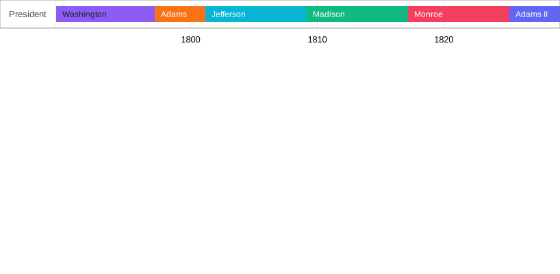
Event timeline, labelled — each entry is a period or a moment with its name written into the bar. Google’s timeline is really a duration chart with strong labelling, which is why it reads well for terms of office, project phases and version histories.
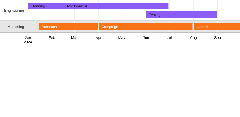
Grouped — multiple entries sharing a row when they do not overlap, which is the compression that makes long timelines readable. It also introduces the reading hazard: two bars on one row are not the same thing, they are two things that happened to fit.

X-range — Highcharts’ name for a duration chart. One row per category, bars from start to end, and partial-completion shading available. It is the most configurable of the duration charts here.

Gantt — the project-management form, with dependencies between tasks. Note what that adds: arrows encoding “this cannot start until that finishes”, which is a second data structure on top of the durations.

ApexCharts’ timeline — built on its range-bar type, with clean defaults. Worth knowing this exists, because ApexCharts is missing from the catalogue’s list for this category and it ships three examples.
Every timeline rests on a time axis, and there are two ways to draw one:
A true time scale places each event at its real position, so the gaps between events are proportional to elapsed time. Four events in a week and one three years later look exactly like that — a cluster and a long empty stretch. Honest, and often ugly.
A category axis spaces events evenly regardless of date. Tidy, readable, and it silently rewrites your history: a decade of steady progress and a frantic fortnight are drawn identically.
Neither is wrong, and the choice must be deliberate. The rule of thumb: if the pace is part of the story, use a real time scale — and if you use an even-spaced axis, drop the dates into the labels so a reader can reconstruct the truth.
The same applies to duration charts, with an extra trap: weekends and non-working days. A project Gantt drawn on a continuous calendar shows tasks stretching across weekends they were never worked on; one drawn on working days compresses real elapsed time. Pick one, and say which in the axis title.
1. You have a value per period, not events. Monthly revenue is a line chart or a bar chart. A timeline plots occurrences and spans, not measurements.
2. Everything happens at once. Twenty events in three days on a five-year axis is a single black smudge with twenty labels pointing at it. Either zoom to the cluster and note the wider context in a caption, or aggregate into counts per period and draw a bar chart.
3. You have hundreds of rows. A Gantt with three hundred tasks is a project plan, not a chart — it belongs in a tool with scrolling, filtering and collapsing. For a design, summarise: group by workstream, show the phases, and put the task detail elsewhere.
A fourth worth naming: when the sequence matters but the dates do not. A process with six ordered stages and no meaningful timing is a funnel or a simple stepped diagram. Putting it on a date axis invites questions about durations you cannot answer.
Event timelines fail at the labels, always. The markers fit; the words do not. Four techniques, in the order worth trying them.
Alternate above and below the axis. Doubling the label lanes is the cheapest fix and it costs nothing analytically — the marker still sits at its true date, and only the text moves. Most timeline implementations do this by default.
Stagger the distance. Two lanes above and two below, with leader lines of different lengths, quadruples the capacity. Past that the leaders start crossing and the chart is telling the reader to give up.
Group the cluster. Five events in one week become one marker labelled “5 releases” with the detail in a caption or a sidebar. This is honest compression, and it keeps the wider shape readable.
Break the axis. When the data is one dense recent period and one distant anchor, an explicit axis break — drawn as a break, not as silent even spacing — keeps both visible while admitting the gap. It is the one case where a discontinuous axis is the honest choice.
Duration charts have the opposite problem: the labels are fine and the structure overwhelms. Three things separate a readable one from a wall of bars.
Group before you sort. Rows grouped by workstream, with a header row per group, let a reader find their own area immediately. A flat list sorted by start date is optimised for the scheduler and nobody else.
Show the critical few, not the complete plan. A chart in a deck has a different job from a chart in a planning tool: it is arguing that a schedule is feasible, or that a dependency is the bottleneck. Ten bars making that argument beat two hundred bars containing it.
Separate plan from actual visually. Two bars per row — a light planned bar with a solid actual bar inside or beneath it — turns a schedule into a status report, and it is the single most useful addition to a project Gantt. Highcharts’ X-range partial-completion shading does a compact version of the same thing.
Six screens, start to finish, captured from the plugin.
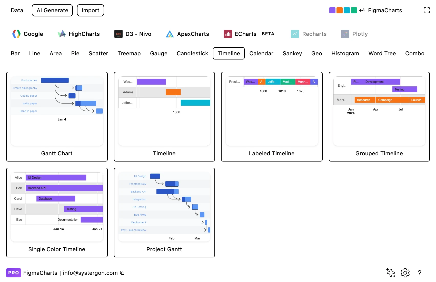
1. Filter to Timeline. Three libraries have the category — Google Charts, Highcharts and ApexCharts. Pick by kind first: event timeline or duration chart.
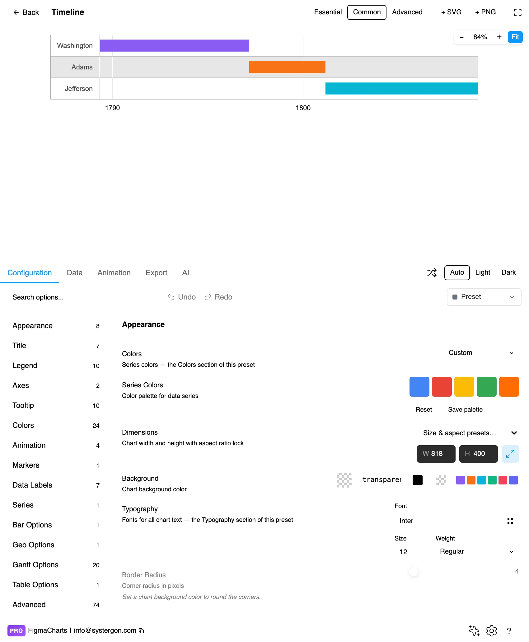
2. The editor. Live preview above, tabs below. Timelines are the type most likely to need a custom height, because one row per item means the chart grows with the data.
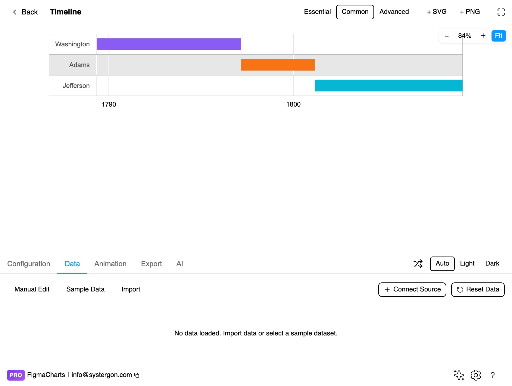
3. Dates as data. A duration chart needs a label plus a start and an end per row; an event timeline needs a label and one date. Getting the date format right here is most of the work — a date the library cannot parse silently becomes nothing useful.
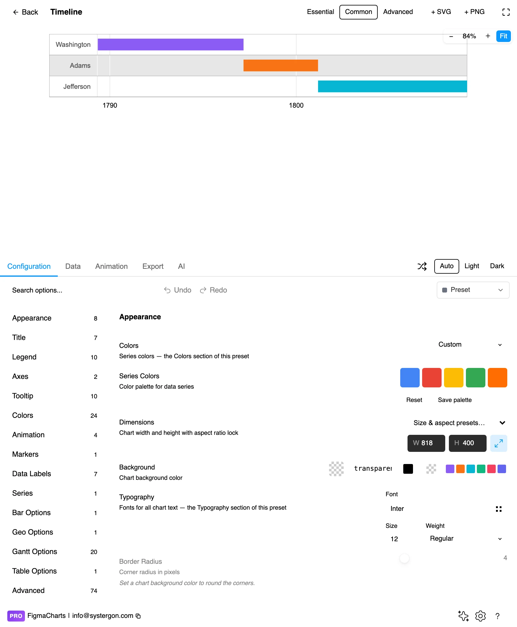
4. Configure. Axis type and range, row height, bar labels and colours. This is where you choose between a true time scale and an evenly-spaced axis.
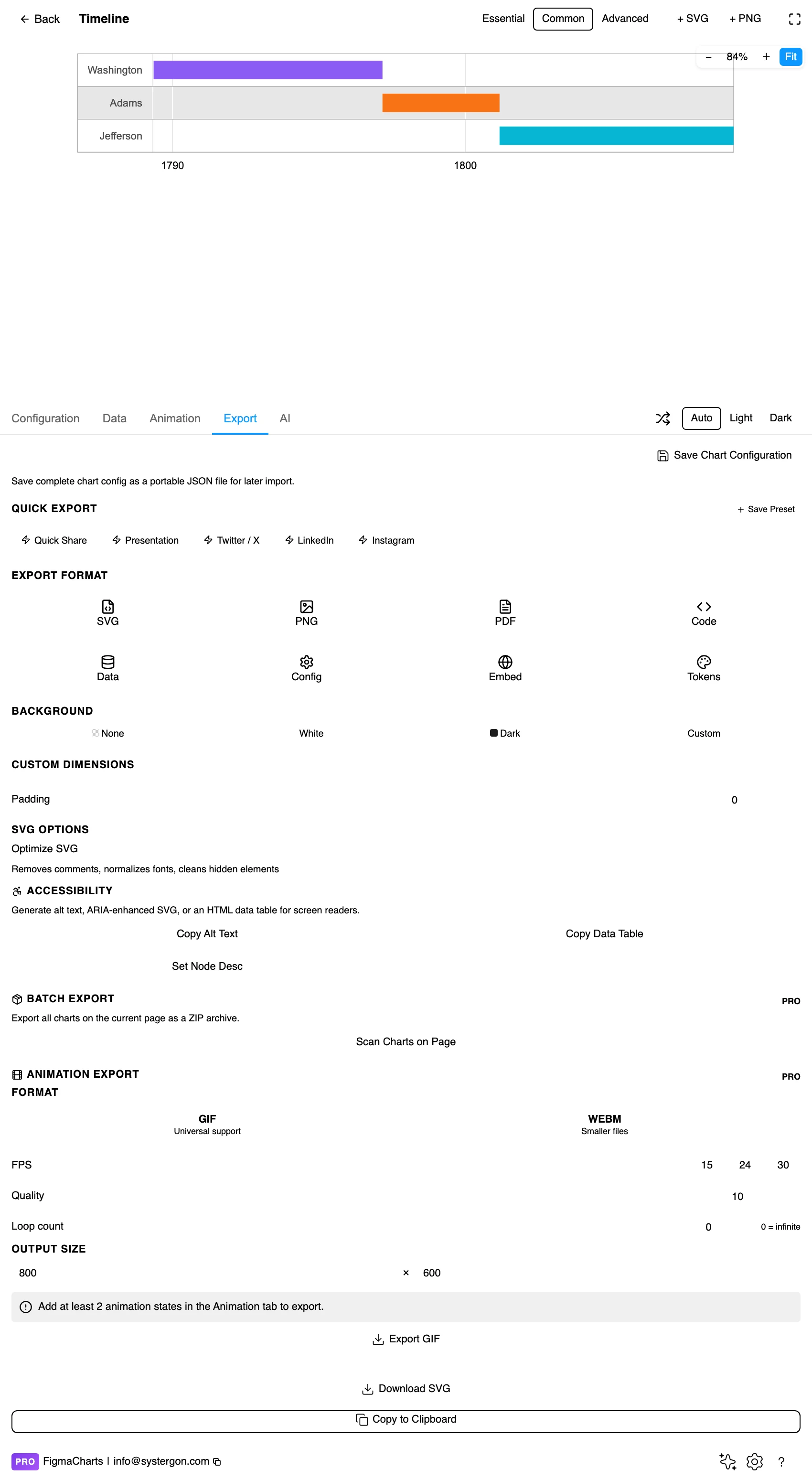
5. Export. A working component for React, Vue 3, Angular, Svelte or vanilla JavaScript, at the version the plugin rendered with.
6. Insert. SVG keeps every bar and label as real layers — which matters here because timeline labels almost always need hand-nudging once the real names are in.
Timelines take the ordinary table — there is no special editor for this type — but the columns differ by kind:
Timelines accept a linked data source, so a project tracker exported to a Sheet can drive one — see live data from Google Sheets and APIs. Two cautions specific to dates. Date parsing is the failure point: mixed formats, text like “TBD” and localised month names all break silently rather than loudly. And an unparseable numeric cell becomes 0, which on a date axis lands at the epoch — a bar starting in 1970 is the classic symptom.
The 13 examples split Google Charts 6, Highcharts 4, ApexCharts 3. Note that last one: the catalogue lists this category as Google and Highcharts only, and ApexCharts ships three timeline examples — built on its range-bar type, which is why they are easy to miss.
As always: design in whichever library your engineers already use, because the export then matches production exactly. Choosing the right chart library covers the trade-offs.
More timeline charts fail on data preparation than on design, and the failures are specific enough to list.
Mixed formats in one column. A spreadsheet where some rows are 2026-03-14, some are 14/03/2026 and one is March will parse partially — and partial parsing is worse than none, because the rows that worked look authoritative next to the rows that landed at the epoch.
Open-ended durations. Tasks with no end date are the norm in real trackers, and a duration chart needs two dates. Decide the convention before you build: clamp to today, extend to the axis edge with a distinct fill, or exclude and note the count. Leaving the cell empty produces a zero-length bar that disappears while its label stays.
Time zones and all-day events. A date without a time is midnight somewhere, and an event at 23:00 in one zone is the next day in another. It rarely matters for a project plan and it matters a great deal for an incident timeline, where the ordering is the whole point.
Durations that are not durations. “Three days of effort” spread across two weeks is not a two-week bar. If your data records effort rather than elapsed span, a duration chart will overstate every task, and the honest chart is a bar chart of effort.
Row height is the readability control. Duration charts fail by being cramped. Give each row enough height for its label at full size, and if that makes the chart too tall, the answer is fewer rows — grouped or filtered — not smaller text.
Label inside the bar when it fits, outside when it does not. A truncated label inside a bar is worse than a short label beside it. For bars that are too short for either, a leader line to a label in the margin keeps the chart honest.
Colour by category, not by row. Giving every task its own hue means colour encodes nothing. Use it for workstream, owner or status — something a reader can look up — and keep it to a handful of values.
Mark today. A vertical “now” line turns a plan into a status report, and it is one option in every library that draws these.
Let the axis breathe at both ends. A bar that touches the frame edge reads as continuing beyond it. Pad the range, or truncate deliberately and mark the cut.
For type and colour, bind them to your design system rather than picking by hand — covered in Your chart, your design system.
Even spacing rewrites history. The single biggest distortion available to a timeline: five evenly-spaced events that actually occurred across a decade and a fortnight. If you cannot use a true time scale, put the dates in the labels.
Bar length is duration, and readers compare it. That is fine when the durations are real and misleading when the ends are estimates — a planned task drawn identically to a completed one asserts a precision the plan does not have. Distinguish actual from planned by fill or pattern.
Grouped rows imply relationship. Two bars sharing a row read as the same thing happening twice. If they are unrelated items packed to save space, say so — or give them their own rows.
Dependencies are claims about causality. A Gantt arrow says “this cannot start until that finishes”. Drawn from a scheduling tool, that is accurate; drawn by hand to tidy the layout, it invents a constraint someone will plan around.
The end of the axis is not the end of the project. Charts get cropped to the reporting period, and a task running past the right edge disappears rather than continuing. Mark overruns explicitly.
Do not rely on colour for status. Complete, in progress and blocked need pattern, position or text as well as hue — especially since the conventional palette for status is red, amber and green.
Keep labels as text, not inside the bar graphics. Inserting as SVG keeps chart text as real text layers, which is what makes a timeline searchable in a Figma file and readable to assistive technology.
Give it a text equivalent. The Export tab’s Copy Alt Text, Copy Data Table and Set Node Desc produce a description, a table of the underlying rows and a description written onto the Figma node. A timeline’s table — item, start, end — is a complete substitute for the picture, which is not true of most chart types.
A timeline plots events — one date each. A Gantt plots durations — a start and an end each, one row per task, usually with dependencies. Both live under the Timeline category in the plugin, and the tell is whether your records have one date or two.
Google Charts (6 examples, including Gantt), Highcharts (4: timeline, X-range, Gantt, inverted) and ApexCharts (3, built on range bars). ECharts and Nivo have no Timeline category — note that ECharts’ “timeline” feature is a playback control for animating between datasets, not this chart.
If the pace of events matters, yes — a true time scale shows clusters and quiet stretches as they were. If you use even spacing for legibility, put the dates into the labels so the reader can reconstruct the intervals.
Decide whether the axis counts calendar days or working days, and say which. A continuous calendar shows tasks spanning weekends nobody worked; a working-day axis compresses real elapsed time. Both are defensible; silently mixing them is not.
As many as fit at a readable row height — which in a designed chart is usually twenty or thirty. Beyond that you are designing a project tool rather than a chart, and the honest move is to group by workstream and put task detail elsewhere.
Because they were not parsed as dates. Mixed formats, localised month names and placeholder text all fail silently, and an unparseable numeric cell becomes 0 — which on a date axis is the Unix epoch. Normalise the source before binding it.
Yes — Highcharts’ X-range supports partial-completion shading, and Gantt implementations generally support a percent-complete value. Distinguishing planned from actual is the more important version of this: draw them differently rather than relying on the reader to know.
Insert as SVG and every bar, marker and label is a real layer — which matters more here than for most types, because timeline labels almost always need nudging once the real names are in. Insert as PNG for a flat image at twice the pixel density.
Open the plugin, filter to Timeline, and answer one question before anything else: does each of your records have one date or two? One date is an event timeline; two is a duration chart. Everything else on this page — the library, the data shape, the layout — follows from that answer, and getting it wrong is the reason most timeline redesigns happen.
Install Figma Charts — it’s free to try → Browse all 45 chart types →