Install Figma Charts — it’s free to try → See the theme river gallery →
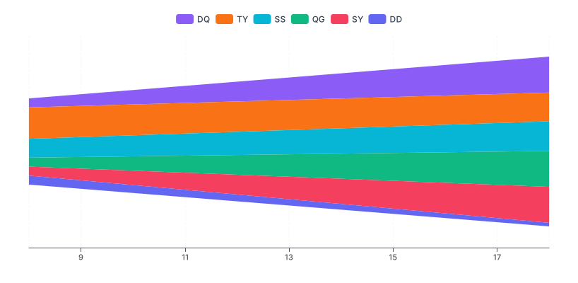
A theme river is ECharts’ streamgraph: bands of colour flowing left to right around a floating centre line, each band a category, thickness carrying the value. Same chart, different name, its own category chip — and two things the generic streamgraph does not always come with: a real time axis and a proper legend.
Real plugin output: an ECharts ThemeRiver captured from the editor. Every chart on this page is the library’s own drawing.
Those two additions matter more than the name does. A time axis means the horizontal spacing reflects real dates rather than evenly-spaced periods, and a legend means the bands can be identified without labelling each one in place. This page covers what is specific to this implementation; the general argument for and against the form is in the streamgraph post.
Everything below happens inside Figma Charts, a Figma plugin. It runs the real JavaScript charting libraries — Google Charts, Highcharts, D3-based Nivo, ApexCharts and Apache ECharts — inside the plugin window, so the bands on your canvas are ECharts’ own stacking.
Install Figma Charts from the Figma Community →
Press ⌘/ (Ctrl / on Windows), type Figma Charts, hit Enter, and pick Theme River from the category filter. Two examples, both ECharts — and the closely related Stream chip holds Highcharts’ and Nivo’s versions of the same idea.
Three things distinguish this implementation from a plain streamgraph, and each is a reason to prefer it:
date, value, category — the long format a database produces. Categories are discovered from the data rather than declared as separate series.The trade-off is that the long format means every category needs a row for every date where you want it drawn, including zeros — and missing rows produce pinched bands rather than errors.
The music-listening case — the dataset the form is famous for, and a good demonstration of what it does well: many categories over a long period, where the finding is which bands swell and fade rather than any individual number.

Highcharts’ streamgraph, under the Stream chip — the same chart from the wide data format, one series per category. If your data is already columnar, this is the shorter path; if it is long-format rows, the theme river takes it directly.
Use it when you have many categories over many time periods, the data is in long format, the audience wants the shape of a mix changing, and no one will quote a number from it.
Three cases where something else is better:
1. Few categories. With three or four bands, a stacked area chart keeps a real baseline, so the bottom band and the total are both measurable. The floating baseline only pays for itself at scale.
2. Values will be read. Band thickness on a curved band is not measurable, and there is no axis to measure against. If numbers matter, use a stacked area chart or put a table beside it.
3. The total is the subject. The envelope shows the total rising and falling with no scale behind it. A line chart of the total above the river is the standard fix.
A fourth: when the series start and stop constantly. Bands appearing and disappearing reorder the stack and make individual categories impossible to follow, which is when the chart becomes decorative.
The name is not ECharts’ invention. ThemeRiver was an academic visualisation technique published in the late 1990s for showing how themes in a document collection change over time — news coverage, in the original work — and the paper’s argument is still the best justification for the form.
The claim was that a stacked area chart’s fixed baseline privileges one series arbitrarily, while a floating baseline treats every theme equally, so the reader compares thicknesses and sees the mix change as a flow. That is exactly the trade the modern streamgraph makes, and it explains why the technique keeps reappearing in editorial contexts and rarely in analytical ones: it was designed for corpora of documents, where nobody was ever going to read a value off the chart.
Two things worth taking from that lineage. First, the form assumes many categories — it was built for dozens of themes, not four. Second, it assumes the reader wants a narrative: what rose, what faded, when the subject changed. Used for a handful of series with numbers attached, it is being asked to do a job it was explicitly designed not to do.
Six screens, start to finish, captured from the plugin.
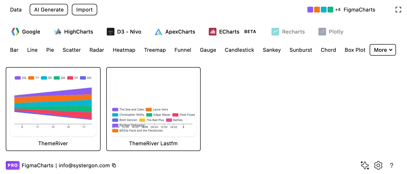
1. Filter to Theme River. Two ECharts examples. For Highcharts’ and Nivo’s equivalents, look under Stream.
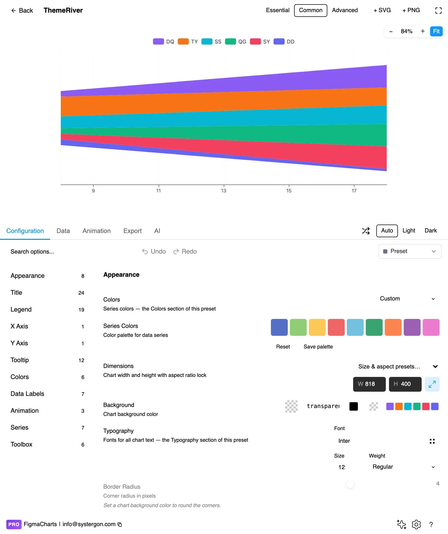
2. The editor. Live preview above, tabs below. Theme rivers want width — the flow reads as flow only when the periods have room, and a compressed one turns into noise.
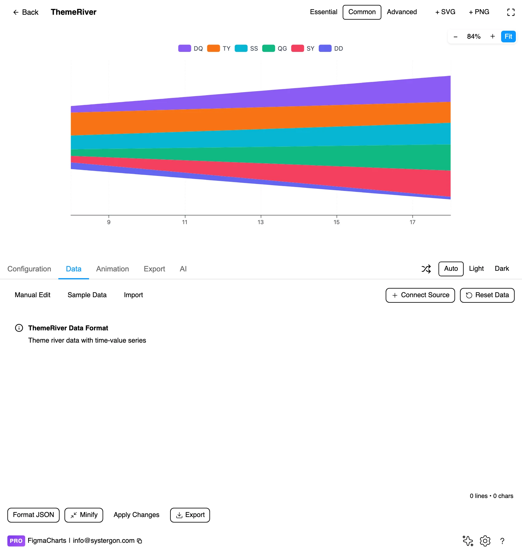
3. Long-format rows. Date, value, category — one row per category per period. It is the shape a database query returns, which makes this the easiest member of the family to feed from a real source.
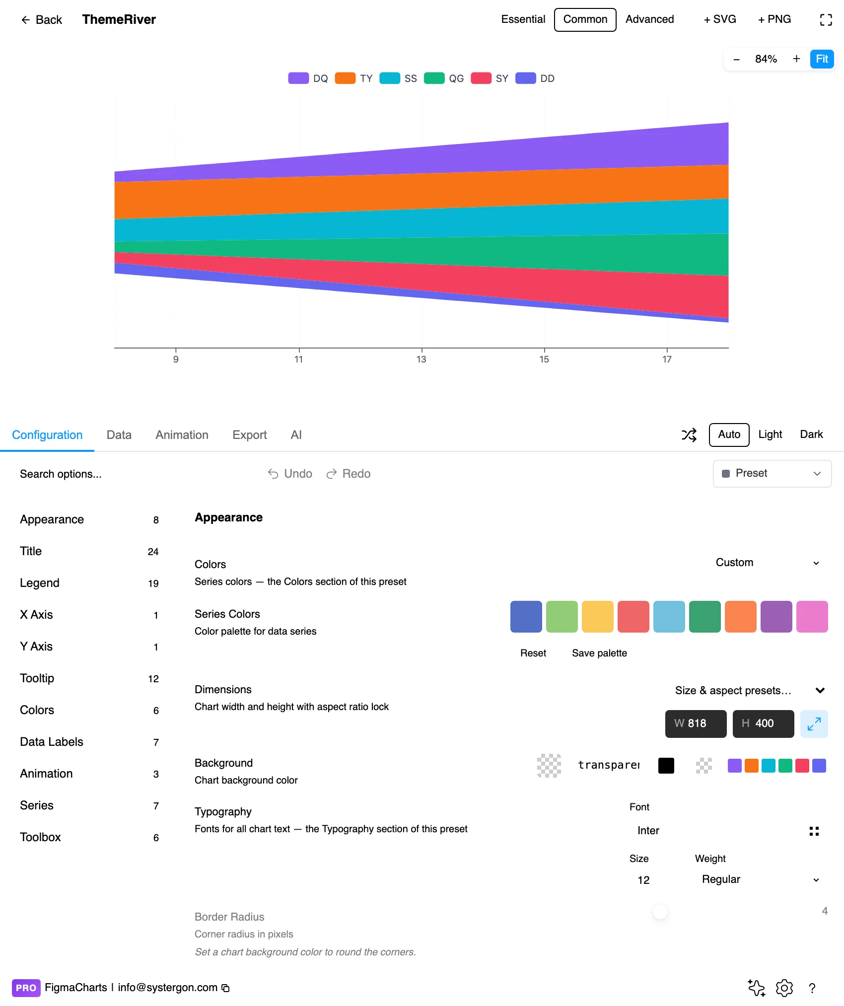
4. Configure. The time axis, the legend, band colours and label placement. The axis type is the setting worth checking — a real date axis is what distinguishes this from an evenly-spaced stack.
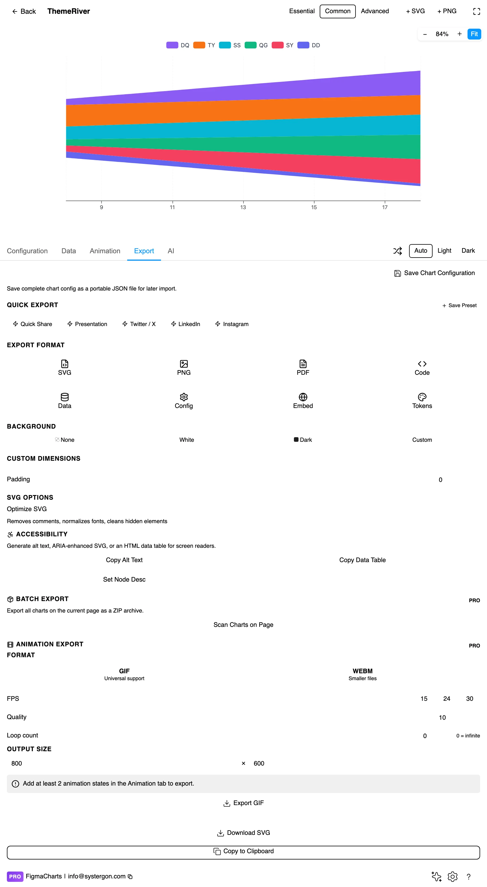
5. Export. A working component for React, Vue 3, Angular, Svelte or vanilla JavaScript, at the version the plugin rendered with.
6. Insert. SVG gives you each band as its own vector shape — which is what makes direct labelling practical, and direct labels are what this chart most needs once the legend is gone.
Rows of date, value, category. There is no special editor — it is the ordinary table — and theme rivers accept a linked data source, so a query result can drive one directly. That combination makes this the most connectable member of the streamgraph family in the plugin.
Three data rules follow from the long format:
And the coercion caution with its specific symptom here: an unparseable value becomes 0, which pinches a band to nothing for one period and reopens it — a shape that reads as a real collapse and recovery.
The Theme River category holds two examples, both ECharts. The family is larger than the chip:
So: three libraries, two chips, one chart. The name is the only real difference, and which chip you look under should be decided by the format your data already has.
As always: design in whichever library your engineers already use, because the export then matches production exactly. Choosing the right chart library covers the trade-offs.
Label inside the bands. A legend of twelve colours is a memory test; a name written into each band where it is thickest removes the lookup entirely and is the single biggest improvement available.
Use an ordered palette. The bands are stacked in a sequence, so a ramp or a rotation helps the eye follow the arrangement where a random categorical palette fights it.
Hairline separators. A one-pixel gap in the background colour between bands is what lets a reader separate adjacent categories — more effective than adjusting the fills.
Give it width, and label the time axis properly. This chart is about flow over time; the axis is the one piece of quantitative furniture it has, and it should carry real dates.
Keep the total somewhere. A small line chart of the aggregate above the river costs little and supplies the scale the envelope cannot.
For type and colour, bind them to your design system rather than picking by hand — covered in Your chart, your design system.
A theme river with a legend and no in-place labels is a colour-matching exercise. Four approaches, in the order worth trying them.
Label inside the band at its thickest point. The standard solution and the best one: each band names itself where it has the most room, and the legend becomes redundant.
Label at the left or right edge. Where bands enter or leave, a name at the boundary works and keeps the interior clean — useful when the bands are thin throughout.
Label only the ones you discuss. Four labelled bands among twenty tells the reader which four matter, and the rest are context. This is usually the right answer for a figure in a document.
Leader lines to the margin. The fallback when nothing fits. It works and it costs horizontal space, which this chart type never has to spare.
Whichever you choose, do it after inserting as SVG rather than fighting the chart’s label placement — the bands are vector shapes and the labels are text, so positioning them by hand takes minutes and produces a better result than any automatic rule.
The order the bands stack in changes the picture completely, and it is the setting most people never touch. Three orderings worth knowing:
By total size. Largest band at the centre or the bottom, smallest at the edges. Predictable, stable, and the right default when the reader is comparing magnitudes.
By onset — the “inside-out” ordering. Bands that appear early sit near the centre and later arrivals stack outward, so the shape reads chronologically as well as by volume. This is the ordering from the original streamgraph work and the reason those charts look organic rather than layered; if your data is about things appearing over time — new products, new topics, new regions — it is almost always the better choice.
By an external grouping. All the bands of one kind together, then the next kind, so related categories form a contiguous block that can be read as a group even without labels. Useful when the categories have a natural hierarchy the chart cannot otherwise show.
Whatever you pick, keep it fixed across a set of charts. Two theme rivers of the same data with different orderings look like different datasets, and readers comparing them will draw conclusions from an artefact of the sort. If the ordering is doing work — and inside-out ordering does a lot — say so in the caption in one clause: “bands ordered by first appearance”.
Vertical position means nothing. A band near the top is not larger or earlier; it is where the stacking put it.
Thickness on a curve is underestimated. The eye judges the perpendicular gap between two curves rather than the vertical one, so steeply sloping bands read as thinner than they are.
The envelope is an unmeasurable total. It rises and falls authoritatively with no axis behind it.
The offset is a layout choice. Changing how the stack is centred changes the entire silhouette without changing a value — so a shape you describe in the text should be checked against a different offset before you rely on it.
Small categories flicker. A band that thins to a hairline reads as an absence. Group the small categories into an explicit “other” rather than letting them wink in and out.
The theme river’s data shape is the one genuinely practical difference from the other streamgraphs here, and it is worth dwelling on because it changes the workflow.
Wide format — one column per category, one row per date — is what a spreadsheet produces and what Highcharts and Nivo expect. Adding a category means adding a column, which means editing the chart configuration as well as the data.
Long format — one row per category per date — is what a database returns from a GROUP BY, and it is what the theme river takes directly. Adding a category means adding rows; the chart discovers it and the legend updates itself.
For anything driven by a query, that difference is substantial: the chart adapts to whatever categories exist in the data rather than requiring the series list to be maintained alongside it. It is also why this is the member of the family that binds most naturally to a live source.
The cost is that you must fill the grid. Wide format makes a gap obvious — an empty cell in a column. Long format simply has no row, and a missing row pinches the band without any signal that something is absent.
Direct labels, not the legend. The accessibility fix and the readability fix are the same one here.
Neighbouring bands need distinguishable colours — only adjacent bands actually touch, so it is neighbour contrast that decides legibility.
Do not leave values only in tooltips. An inserted SVG has none.
Give it a text equivalent. The Export tab’s Copy Alt Text, Copy Data Table and Set Node Desc produce a description, a table of the numbers and a description written onto the Figma node. For a theme river the useful description is the narrative: which categories rose, which faded, when the mix turned.
Yes — ECharts’ name for it, with its own category chip. The differences are practical rather than conceptual: a long-format data shape, a real time axis and a legend.
Rows of date, value and category — the long format a database query returns. Highcharts’ and Nivo’s streamgraphs take the wide format instead, one column per category, so the shape your data already has is a reasonable way to choose between them.
When you have many categories — roughly eight or more — over a long period, and the audience needs the pattern rather than the numbers. With few categories, a stacked area chart keeps a measurable baseline and is the better chart.
ECharts (2 examples, as Theme River) plus Highcharts (2) and Nivo (1) under the Stream chip. Google Charts and ApexCharts cannot centre a stack, so they have no equivalent.
No. Stacked layouts cannot represent a negative contribution, so negatives are dropped or drawn as nonsense.
Almost always a missing row for that period, or a value that failed to parse and became zero. The long format needs a row per category per period, with real zeros where the category was absent.
Yes — theme rivers take the ordinary table and accept a linked source, which with the long-format shape makes them the easiest member of this family to wire to a query.
Inside each band at its thickest point, which makes the legend redundant — or, for a figure in a document, label only the three or four bands the text discusses and leave the rest as context. Do it after inserting as SVG: the bands are vector shapes and the labels are text, so placing them by hand beats any automatic rule.
Centred — the symmetric, wiggling baseline — is what makes this a theme river rather than a stacked area chart, and it is the right choice when the story is about shifting composition over time. Flip to a flat baseline the moment anyone needs to read a value off the vertical axis, because a moving baseline makes every band except the bottom one impossible to measure. The two charts are the same data and answer different questions; pick by which question the caption asks.
Insert as SVG and each band is its own vector shape, which makes direct labelling on the canvas practical — and direct labels are exactly what this chart needs once you drop the legend. Insert as PNG for a flat image at twice the pixel density.
Open the plugin, filter to Theme River, and put a long-format query result straight in — date, value, category. Then draw the same data as a stacked area chart. If the stack is readable, use it, because it keeps a baseline. If it is a tangle and the river is a shape you can describe in a sentence, you have found the case this chart exists for.
Install Figma Charts — it’s free to try → Browse all 45 chart types →