Install Figma Charts — it’s free to try → See the parallel gallery →
A parallel coordinates plot shows many measures at once by giving each its own vertical axis, side by side, and drawing every observation as a line threading across all of them. It is the chart a radar chart should have been: same job — comparing entities across several dimensions — without the area distortion, without the arbitrary circle, and with axes you can actually scale independently and honestly.
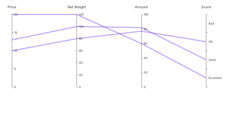
Real plugin output: an ECharts parallel coordinates plot captured from the editor. Every chart on this page is the library’s own drawing.
It is also the most analyst-facing chart in this series. It rewards interaction, it punishes crowding, and the order of the axes changes what a reader can see. This page is about making one that works on a static page as well as it does in a tool.
Everything below happens inside Figma Charts, a Figma plugin. It runs the real JavaScript charting libraries — Google Charts, Highcharts, D3-based Nivo, ApexCharts and Apache ECharts — inside the plugin window, so the lines on your canvas are the library’s own layout.
Install Figma Charts from the Figma Community →
Press ⌘/ (Ctrl / on Windows), type Figma Charts, hit Enter, and pick Parallel from the category filter. Six examples — ECharts 4, Highcharts 1, Nivo 1.
Each vertical line is a variable, scaled to its own range. Each polyline crossing them is one observation — a car, a city, a customer — passing through its value on each axis. That is the whole grammar, and three patterns fall out of it:
That third property is what makes the chart worth its difficulty: it is the only chart here where a reader can pick out one observation and follow it through eight variables without losing it.
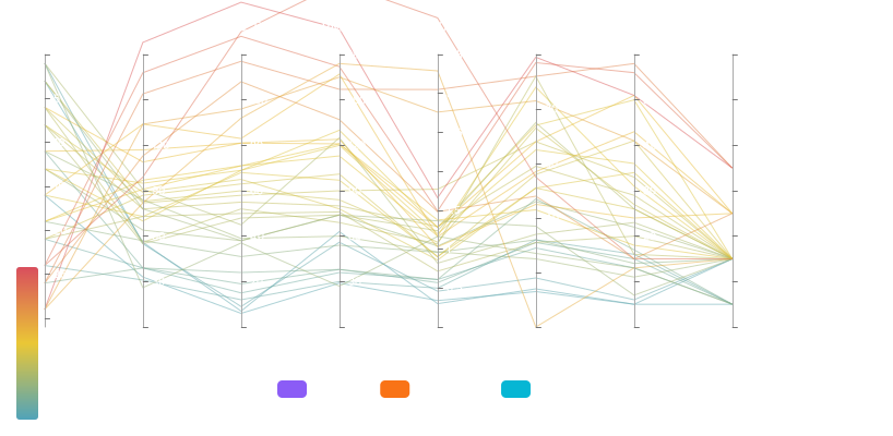
Many observations — air-quality readings across several pollutants. At this density individual lines stop being traceable and the chart becomes a picture of the bundle: where it is tight, where it splits, where strands break away.
With colour carrying a category — the standard way to make a dense plot readable. Once colour encodes a group, the question becomes whether the groups take different paths, which is answerable at a glance even when individual lines are not.

Highcharts’ version — built on its ordinary axis machinery with a parallel-coordinates mode, which means the axes take the same formatting options as any other chart. Fewer observations, more control per axis.

Nivo’s version — the D3 look, with per-axis tick control and support for both linear and point scales, so a categorical variable can sit alongside numeric ones. React-only export.
A parallel plot shows relationships between adjacent axes clearly and relationships between distant ones barely at all — because correlation is read from the pattern of lines between two neighbours. That makes the ordering of the axes the single most consequential choice in the chart, and it is entirely yours.
Three approaches:
By hypothesis. Put the two variables you think are related next to each other, so the reader can see whether they are. This is the honest version of a chart designed to make an argument — and the argument is visible rather than hidden.
By correlation. Order the axes so that strongly-related variables are adjacent, which minimises crossings and produces the tidiest chart. It is the version an analyst wants, and it needs a caption because the ordering itself is a finding.
By domain sequence. Stages of a process, steps in a pipeline, months. When the variables have a natural order, use it — the chart then reads left to right as a progression, which is a different and legitimate reading.
What to avoid is leaving the order as whatever your data source happened to produce, because readers will infer meaning from adjacency whether or not you put any there.
1. You have hundreds of observations and no interaction. Static parallel plots saturate: past a few hundred lines the chart is a solid band and no individual path can be followed. Colour by group, sample, or accept it is showing distribution rather than observations.
2. Two variables are the whole question. If the relationship between exactly two measures is what matters, a scatter plot answers it far more precisely — position on two axes beats a line between two axes.
3. The audience is general. This chart takes a minute to learn. In a room that has never seen one, small multiples of bar charts communicate the same comparisons without a lesson.
A fourth: when the variables are not comparable in kind. Each axis is independently scaled, which is honest and means a line’s vertical position on one axis has no relationship to its position on the next. Readers sometimes read a “high line” as high overall; there is no such thing.
Parallel coordinates have one structural weakness — only adjacent axes show relationships — and one standard alternative fixes it completely: the scatter matrix, a grid of small scatter plots showing every pair of variables at once. ECharts ships one in this category.
What it gives you is completeness: with six variables you get fifteen pairwise views, so no relationship is hidden by ordering. Each panel is a proper scatter plot, so correlation is read from position rather than from line slope — a stronger encoding.
What it costs is the observation. You can no longer follow a single item across all the variables, which is the parallel plot’s best trick; each panel shows two dimensions and the identity of the points is lost between panels.
So the two are complements rather than substitutes. The usual analytical sequence is: scatter matrix first, to find which pairs are related; parallel coordinates second, with the axes ordered by what the matrix revealed, to follow individual observations through the relationships you found. Publishing both is a legitimate and often excellent answer.
Six screens, start to finish, captured from the plugin.
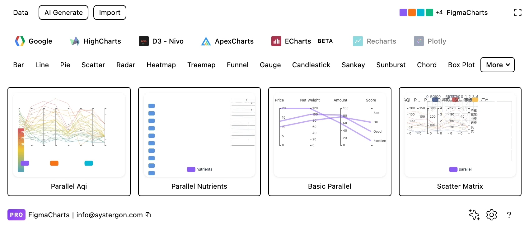
1. Filter to Parallel. Three libraries have it — ECharts with four examples, Highcharts and Nivo with one each.
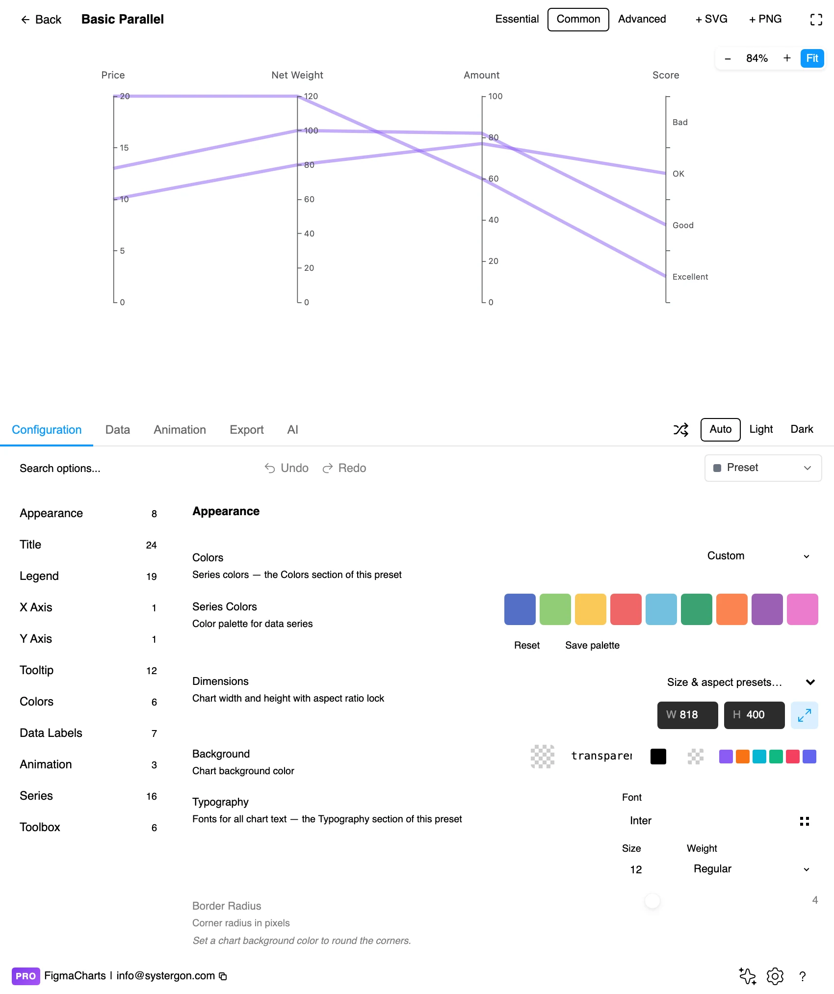
2. The editor. Live preview above, tabs below. These charts want width: each axis needs horizontal room, and cramming eight axes into a narrow frame makes every relationship harder to see.
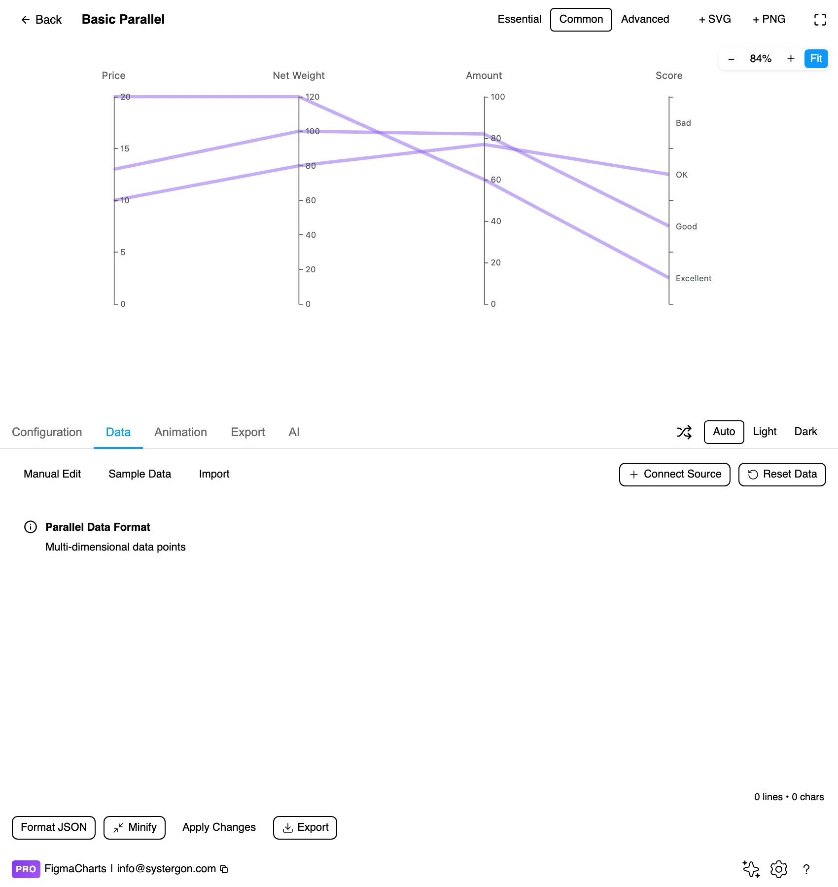
3. One row per observation. A column per variable, with the axis definitions carrying each one’s range. ECharts edits this as JSON in the plugin, because the axis definitions travel alongside the data.
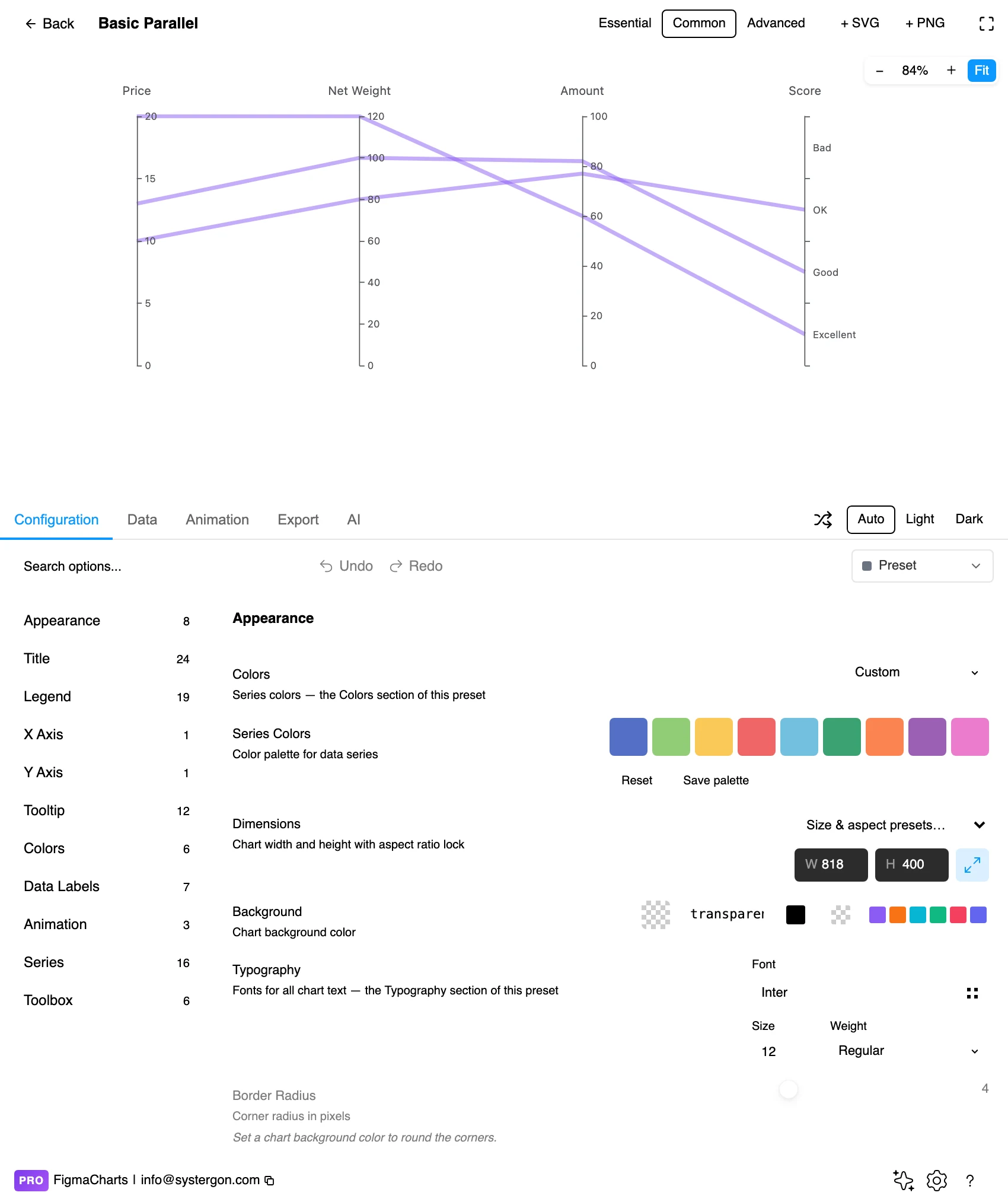
4. Configure. Axis order, per-axis ranges, line opacity and colour mapping. Opacity is the setting that decides whether a dense plot reads as a bundle or as mud.
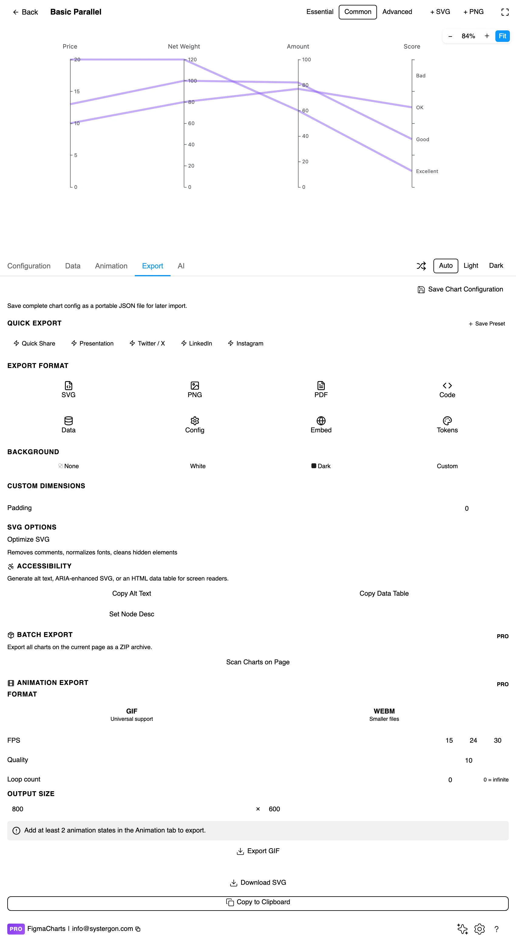
5. Export. A working component for React, Vue 3, Angular, Svelte or vanilla JavaScript — and for this chart the config carries the axis definitions, which are most of the work.
6. Insert. SVG keeps every polyline as a vector path, so highlighting one observation — the usual requirement — is a canvas operation.
One row per observation and one column per variable — conceptually a plain table. In practice the plugin treats parallel as a JSON shape, because each axis carries its own definition (name, range, type, whether it is categorical) alongside the values, and that structure does not flatten into a grid.
Two consequences. ECharts parallel plots are edited as JSON in the plugin rather than in the table. And parallel plots cannot bind a live data source in ECharts or Nivo — the connection is refused rather than producing a chart with mismatched axes.
Two data decisions matter more than usual. Per-axis ranges: leave them to the data and the chart rescales whenever the data changes, so today’s picture cannot be compared with last month’s. Fix them to something external where you can. And missing values — a row with a gap either breaks its polyline or gets dropped, and both are silent. Filter deliberately.
The Parallel category holds six examples: ECharts 4, Highcharts 1, Nivo 1.
As always: design in whichever library your engineers already use, because the export then matches production exactly. Choosing the right chart library covers the trade-offs.
The interaction that makes this chart famous is brushing: drag a range on any axis and only the lines passing through it stay highlighted, the rest fading back. It turns the plot into a query interface — “show me the cars with high mileage and low price” is two drags — and it is why parallel coordinates persist in analytical tools despite the learning curve.
An inserted SVG has none of that. Three ways to keep the value in a static design:
Pre-brush it. Filter the data to the subset the chart is about before rendering, and say so in the caption. A parallel plot of forty selected observations is far more readable than one of four thousand with a note saying “interactively filterable”.
Colour the selection. Draw everything, but highlight the group being discussed and mute the rest. The context stays visible and the argument is legible.
Prototype the states. Insert several SVGs — one per brush — and wire them as frames. For a design deliverable this communicates the interaction better than a single dense chart plus a description.
Line opacity is the density control. With a hundred lines, 20–40% opacity turns overlap into visible density; at full opacity the last-drawn lines simply hide the rest.
Colour by group, not by observation. A distinct colour per line is meaningless past a handful; colour per category answers “do these groups behave differently?”, which is the question the chart is best at.
Label each axis with its unit and range. Every axis is independently scaled, so an unlabelled one is unreadable — and the range endpoints matter as much as the name.
Keep axis spacing even and generous. The relationships live in the space between axes, so squeezing them compresses exactly the information the reader needs.
Consider inverting an axis where “good” is low — price, latency, error rate. Flipping those so that good is always up makes the desirable observations read as a single high bundle, which is a legitimate and enormously helpful convention as long as the axis says so.
For type and colour, bind them to your design system rather than picking by hand — covered in Your chart, your design system.
Every axis is scaled independently, which is the chart’s central convenience and its quietest distortion. Three decisions to make deliberately:
Min-max to the data, or to a fixed range? Scaling to the observed range fills each axis and makes every variable look equally variable — including one that barely moves. Fixing the range to something external (a specification, a target band, a theoretical maximum) preserves the fact that a variable is stable, and it lets two charts be compared.
Where to clip outliers. One extreme value stretches its axis and compresses everything else into a band. Capping at a percentile with a marked overflow keeps the rest readable; silently clipping removes observations from a chart whose whole purpose is showing individual observations.
Whether to transform. A log scale on a skewed axis makes the bundle legible and changes what “halfway up” means. It is legitimate and it needs saying on the axis, because a reader tracing a line has no way to detect it.
Only adjacent axes show relationships. Variables three axes apart may be strongly related and the chart will not show it. Reordering is not cosmetic — it determines which relationships are visible at all.
Vertical position is per-axis and means nothing across axes. A line high on axis one and high on axis two is not “high” in any combined sense; the two axes have different units and ranges.
Scaling choices change the picture. Min-max scaling to each variable’s own range is standard and makes every variable look equally variable. If one measure barely moves, that fact disappears.
Line crossings are not events. A crossing between two axes indicates the two observations swap relative position, nothing more.
Overplotting hides the majority. In a saturated chart the visible lines are the ones drawn last. Ordering the draw sequence — or drawing the highlighted group last — is a decision, and leaving it to the data order is a silent one.
Three settings where parallel coordinates beat everything else available, all sharing the same shape: several variables, an audience willing to learn a chart, and a question about trade-offs.
Choosing between options with many criteria. Vendors, candidate designs, configurations, plans. Each option is a line; the trade-offs are visible as crossings, and the option that is decent on everything looks different from the one that is excellent on two things and poor on three.
Understanding a design space. Simulation results, model runs, pricing scenarios. Here the value is in the bundle’s shape: which combinations of settings are achievable, where the space is empty, which constraints bind.
Quality and specification review. Measurements against tolerances, with each axis carrying an acceptable band. Items that leave the band on any axis stand out immediately, and you can follow them across the other axes to see what else went wrong — which is exactly the question a failure review asks.
What all three have in common: nobody needs to read a precise value. They need to see which things are alike, which are unusual and how the criteria trade against each other — and that is what this chart is unusually good at.
Do not rely on colour alone for groups. With a handful of categories, line style helps; with more, small multiples — one panel per group, same axes — is more accessible and usually more readable.
Label the axis endpoints. The minimum and maximum on each axis are what make a position interpretable, and they are the first thing omitted.
Do not hide identities in tooltips. A static export has no hover, so any observation worth discussing needs a label or an annotation.
Give it a text equivalent. The Export tab’s Copy Alt Text, Copy Data Table and Set Node Desc produce a description, a table of the numbers and a description written onto the Figma node. For a multivariate chart the table is the honest version, and the useful description is the pattern: which variables move together, which oppose, which observations depart.
Comparing many observations across several variables at once. Each axis is one variable, each line is one observation, and the patterns between adjacent axes show how the variables relate.
Parallel coordinates, in almost every analytical case. Same job, but no area distortion, no arbitrary circular arrangement, honest per-axis scales, and it handles far more observations. The radar keeps one advantage: a memorable silhouette for two or three entities.
Because relationships are only visible between adjacent axes. Two related variables placed at opposite ends of the chart will show nothing. Ordering by hypothesis, by correlation or by domain sequence are all defensible; leaving the source order is not.
A few dozen if individual lines must be traceable; a few hundred if the chart is showing the shape of a bundle. Beyond that, colour by group and treat it as a distribution, or filter before rendering.
ECharts (4 examples, with axis brushing and the best density handling), Highcharts (1, on its standard axis machinery) and Nivo (1, supporting categorical axes). Google Charts and ApexCharts have none.
In a live ECharts chart, yes — brushing is its signature interaction. An inserted SVG has no interaction, so for static work either pre-filter the data, highlight the group you are discussing, or prototype the brush states as separate frames.
It is a good convention: flip price, latency and error rate so that desirable values are always up, and the best observations read as one high bundle. Just make sure each inverted axis says so, or the reader will misread every line on it.
Use them in sequence. A scatter matrix shows every pair of variables, so nothing is hidden by axis ordering — it is the better tool for finding which relationships exist. Parallel coordinates then let you follow individual observations across all the variables at once, which the matrix cannot. ECharts ships both.
Insert as SVG and every polyline is a vector path with the axes as real text, so highlighting one observation or annotating an outlier is a canvas operation. Insert as PNG for a flat image at twice the pixel density.
Open the plugin, filter to Parallel, and put six variables in — then reorder the axes twice and watch what appears. Relationships that were invisible become obvious when the two variables become neighbours, and that experience is the fastest way to understand both what this chart can do and why the ordering is the design.
Install Figma Charts — it’s free to try → Browse all 45 chart types →