Install Figma Charts — it’s free to try → See the custom gallery →
The Custom category is the escape hatch. Every other chart type in this plugin is a named thing with rules; a custom series is a function that draws whatever you tell it to, positioned by the chart’s own coordinate system. It is where the chart library stops being a set of charts and becomes a drawing API with axes attached.
Real plugin output: an ECharts custom-series chart captured from the editor. Every chart on this page is the library’s own drawing.
Eleven examples ship here, and they are worth browsing even if you never write one, because they show what the plugin can produce when no standard type fits — flame graphs, confusion matrices, a periodic table, polar heatmaps. This page is about when reaching for the escape hatch is right, and what it costs.
Everything below happens inside Figma Charts, a Figma plugin. It runs the real JavaScript charting libraries — Google Charts, Highcharts, D3-based Nivo, ApexCharts and Apache ECharts — inside the plugin window, so a custom chart is genuinely running its own render function rather than being approximated.
Install Figma Charts from the Figma Community →
Press ⌘/ (Ctrl / on Windows), type Figma Charts, hit Enter, and pick Custom from the category filter. Eleven examples, all ECharts.
In ECharts, a custom series hands you a renderItem function. For every data item, the library calls it with the item’s values and the coordinate system, and you return shapes — rectangles, polygons, arcs, text — positioned wherever the maths says they belong.
Three things you keep, which is why this beats drawing from scratch:
What you take on is the drawing itself — which is why the examples in this category look like small pieces of software rather than configurations.

A flame graph — the standard profiling view: stacked bars where width is time and depth is the call stack. It is an icicle chart with domain-specific behaviour, and it is the clearest example of the escape hatch used properly: a real chart type that no library ships.
A confusion matrix — predicted against actual, with counts in the cells. Close to a heatmap and different in the details that matter to the people reading it: the diagonal, the totals and the per-cell text.

A periodic table — a fixed layout with data mapped onto it. The general pattern here is worth noting: any diagram with known positions and variable values can be built this way, from seating plans to floor layouts to stadium maps.
A polar heatmap — a heatmap wrapped onto a circular coordinate system, which is the right shape for anything cyclical: hours of the day, months, compass direction.
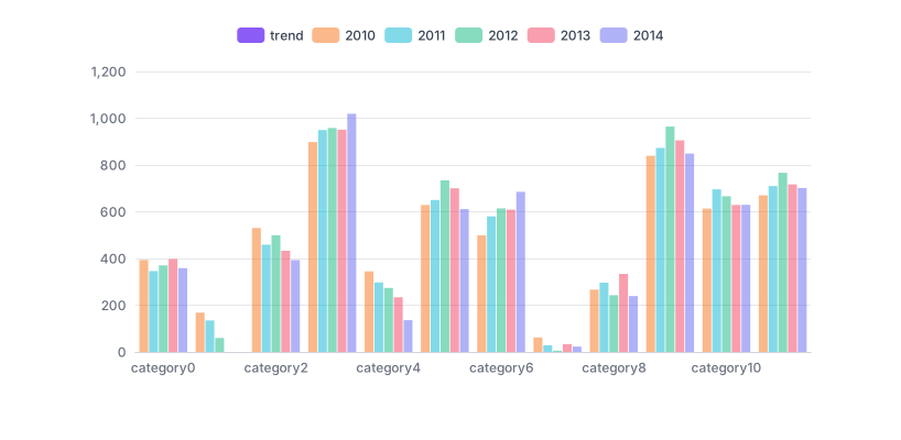
A bar-and-trend hybrid — a reminder that many custom series are not exotic at all. This is a combination the built-in types nearly support, built explicitly to control exactly how the two marks relate.
Use it when the chart you need genuinely does not exist — a domain-specific layout, a diagram with fixed positions and variable data, or a combination of marks no built-in series produces.
Three cases where you should not:
1. A standard type is nearly right. “A bar chart, but the bars are rounded” is a styling option, not a custom series. The maintenance cost of custom rendering is real and permanent.
2. You want it to look different. Custom series are for charts that work differently. Appearance is what the styling options are for, and a custom mark that a reader has never seen has to be learned.
3. Nobody on the team can maintain it. A render function is code, and it will need changing when the design does. A chart nobody can edit is a picture with extra steps.
A fourth, specific to design work: when a Figma component would do. If the “chart’s” positions are fixed and the data is a handful of numbers — a seating plan, an office map with occupancy — building it as a Figma component with variants is faster, more editable and does not need a chart library at all.
The examples in this category look unrelated and are mostly four repeatable ideas.
Fixed layout, variable data. The periodic table is the clearest case: positions are known in advance and the data colours and labels them. Seating plans, floor maps, keyboard heatmaps, org grids and stadium diagrams are all this pattern.
A standard chart with a non-standard mark. A bar chart whose bars are arrows, a scatter whose points are wedges. The coordinate system does the work; the render function just draws something else at each position.
A coordinate system used unusually. The polar heatmap is a heatmap on circular axes. Any built-in coordinate system — polar, calendar, single-axis — can host marks it was not designed for, which is a large space with very few charts in it.
A domain chart nobody ships. Flame graphs, confusion matrices, Gantt-like schedules with unusual rules. These are genuine chart types with established conventions in their own fields and no representation in general-purpose libraries.
Recognising which pattern a request falls into is most of the work. The first two are cheap; the fourth is a small project.
Six screens, start to finish, captured from the plugin.
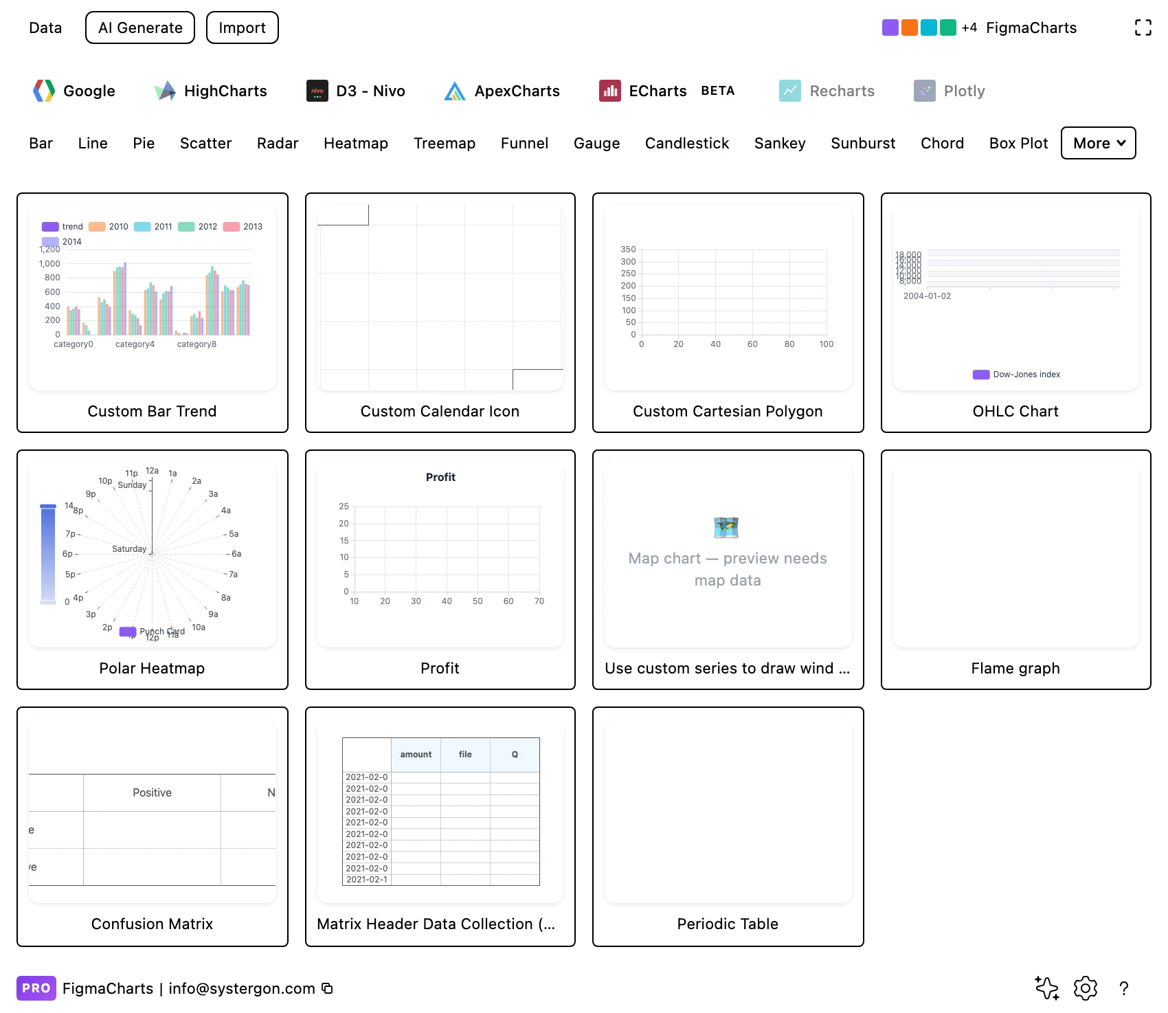
1. Filter to Custom. Eleven ECharts examples. Browse them even if you will not write one — several are ideas you can lift into a standard chart.
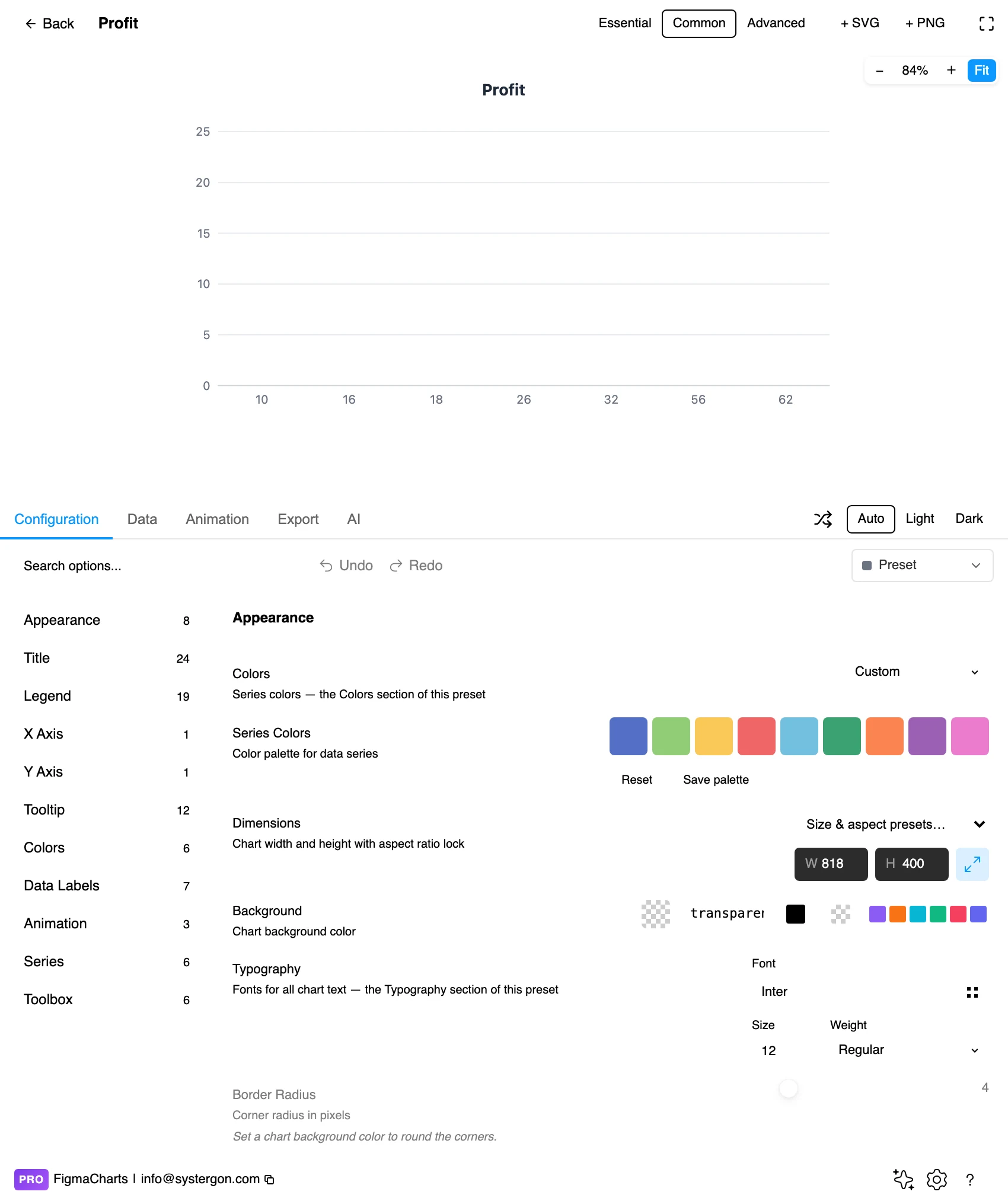
2. The editor. Live preview above, tabs below. A custom series renders exactly as it would in production, because it is the same code running — which makes this a genuine preview rather than an approximation.
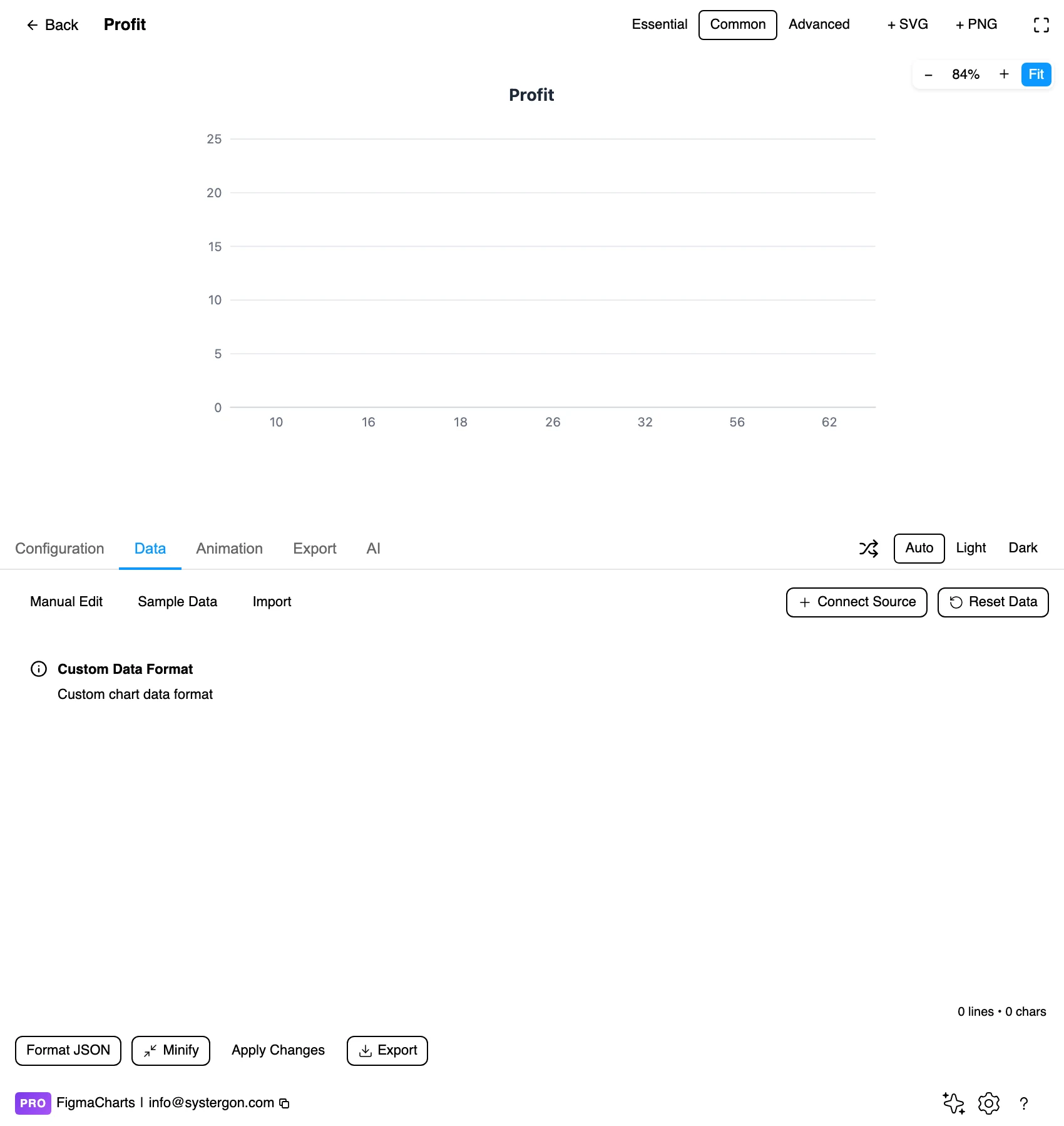
3. JSON, necessarily. Custom charts are edited as JSON in the plugin: the render function defines what the fields mean, so no table layout could describe them. This is the one chart type where the data and the drawing logic are inseparable.
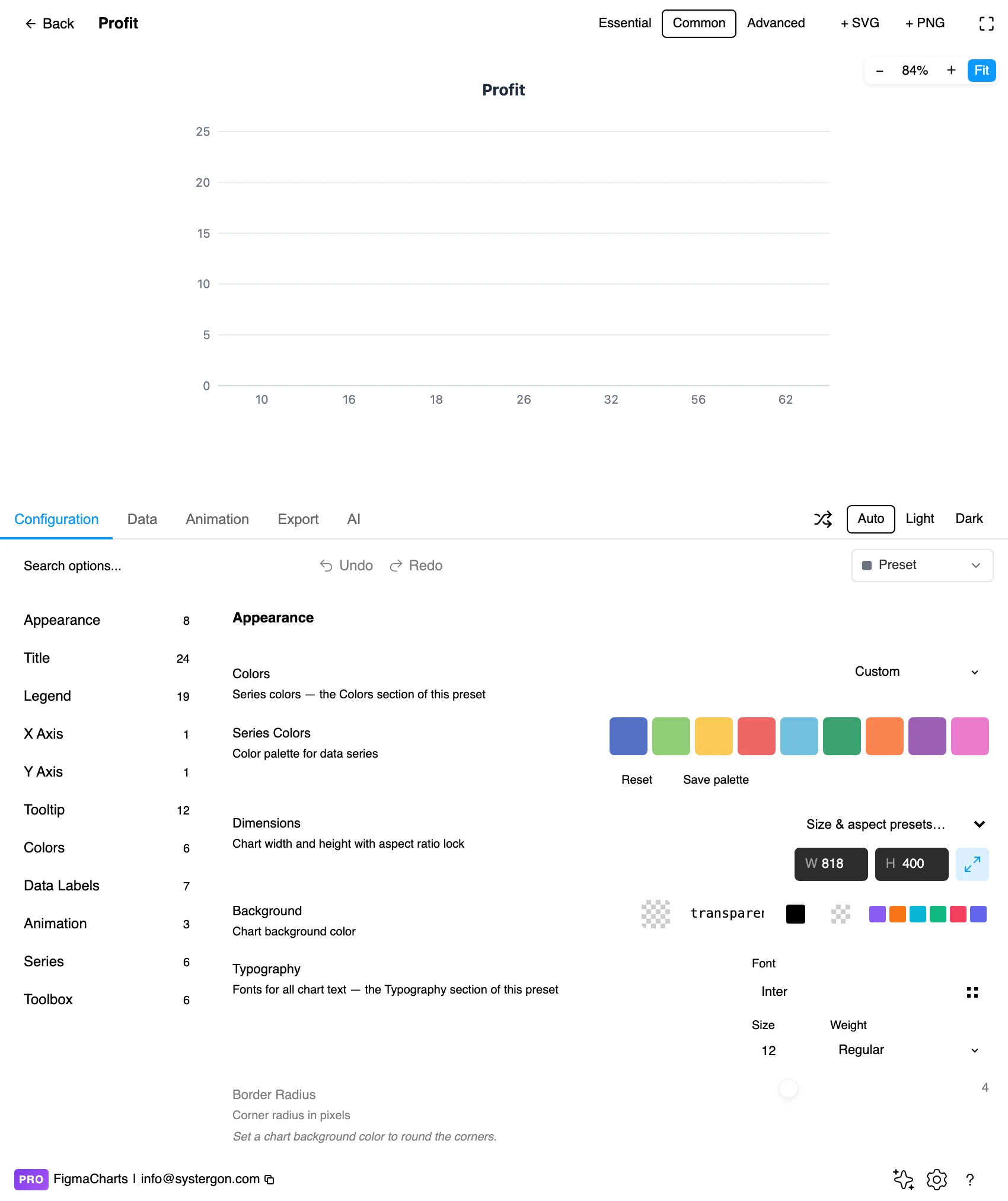
4. Configure what still applies. Axes, tooltips, legends, colours and animation all work as normal — the custom part is the mark, not the chart around it.
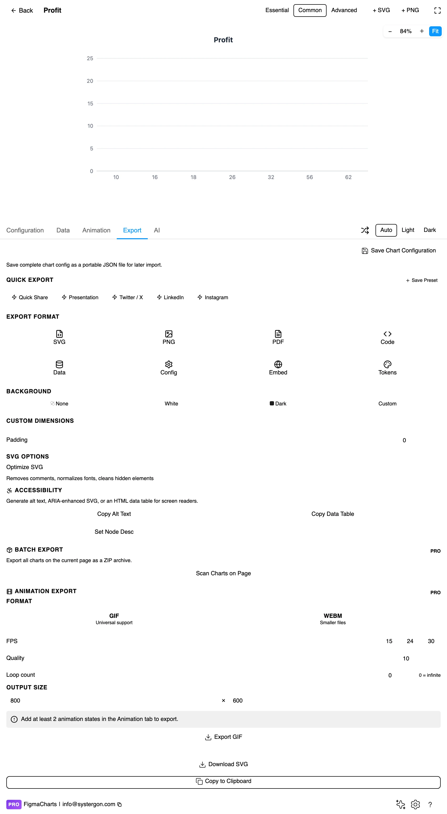
5. Export. The Config export matters more here than anywhere else, because it carries the render function — which is the actual work. Hand a developer the config and they have the chart.
6. Insert. SVG turns whatever the render function drew into ordinary Figma vectors — which is how a custom chart becomes a design asset rather than a running component.
Whatever the render function expects — which is why the plugin treats custom charts as a JSON shape and edits them as JSON, and why they cannot bind a live data source: nothing generic can know what your fields mean.
Two consequences worth planning for. The data and the drawing are coupled: changing the shape of one means changing the other, so a custom chart is a small piece of software rather than a configuration. And the examples are the documentation — starting from an existing custom example and modifying it is far more practical than writing a render function from nothing.
The Custom category is ECharts only — eleven examples, and the capability differs sharply across the five libraries.
renderItem is a documented, supported API with coordinate-system helpers, and the eleven examples here show its range.So the practical rule: if a project needs genuinely custom marks, that is an argument for ECharts or Nivo — and it is one of the few chart-type considerations that should influence a library choice, because the alternative is building the visualisation outside the chart library entirely.
As always: design in whichever library your engineers already use, because the export then matches production exactly. Choosing the right chart library covers the trade-offs.
You are unlikely to write a render function. The category is still useful, in three specific ways.
As a feasibility check. When you have designed something no standard chart produces, these examples tell you whether it is buildable in the library your team uses — and “yes, as a custom series” is a very different answer from “no”.
As a source of layouts. The periodic table example is a general technique: fixed positions, variable data. Once you have seen it, seating charts, floor plans, stadium maps and process diagrams stop looking like custom development and start looking like a known pattern.
As vector raw material. Render one, insert as SVG, and you have a complex diagram as editable Figma shapes — positioned by real data and finished by hand. For a one-off graphic that is often faster than either building it in code or drawing it from scratch.
The one thing to be careful of when specifying one: a custom series is a build cost every time it changes. Designing something that needs a new render function is a decision to write and maintain code, and it should be made deliberately rather than discovered in implementation.
Keep the chart furniture standard. Custom marks inside a conventional frame — normal axes, normal legend, normal tooltip — are far easier to read than a wholly bespoke graphic. Spend the novelty on the mark, not on the surroundings.
Explain the mark once. Any encoding a reader has not seen needs a sentence: “each block is a function; width is time spent”. Without it, a custom chart is a puzzle.
Reuse the design system anyway. Colours, type and spacing should come from the same tokens as every other chart, or the custom one reads as a foreign object on the page.
Design the degenerate cases. Standard charts handle no data, one point and enormous outliers with defined behaviour; a render function does whatever you wrote. Specify the empty state.
For type and colour, bind them to your design system rather than picking by hand — covered in Your chart, your design system.
If you are designing a chart that will need a custom series, the handoff carries more than usual, because there is no chart type name to lean on. Five things to include:
The encoding, stated in words. “Each block is one function call; horizontal position is start time, width is duration, vertical position is stack depth.” A developer can build from that sentence; they cannot build from a picture.
The coordinate system. Cartesian with a time axis, polar, calendar, or none. This determines which library features come free and is the first thing an implementer needs.
The data structure. What each item contains and in what order — because the render function reads positional values, not named fields, in most implementations.
The degenerate cases. No data, one item, an item ten times larger than the rest, a label too long for its shape. Standard charts have answers; yours will do whatever was written.
What is interaction and what is static. If the design assumes hover to explain the marks, say so — and design the static version too, because it is what ends up in the document.
Novel encodings have no conventions. Readers bring expectations to bars and lines and none at all to a mark they have not seen, so anything unexplained is guessed at.
Custom does not mean validated. Nothing checks that your render function encodes the data faithfully. A standard bar chart cannot accidentally draw a bar of the wrong length; a custom one can.
Beautiful is persuasive. Bespoke visualisations carry authority because they look like effort. That is a reason to be more careful about the encoding, not less.
Interaction may be doing the work. Many custom charts are legible only because hovering explains them — and an inserted SVG has no hover. If the static version needs labels the live one does not, add them.
Maintenance drift is real. A render function written once and left alone will eventually disagree with the data it is fed, and nothing will announce it.
A custom series is code, and code has a lifecycle that a configuration does not. Four costs worth pricing before specifying one.
It will not adapt. Built-in types handle a new category, a longer label or an unexpected zero because someone thought about those cases. A render function does exactly what it was written to do, and the first surprising dataset is when you find out what was assumed.
It has no accessibility defaults. Standard series emit sensible structure; custom marks emit whatever you drew. The text alternative becomes entirely your responsibility.
It ages with the library. Render APIs are stable but not frozen, and a custom chart is the thing most likely to need attention at a major version upgrade.
It concentrates knowledge. One person writes it, understands it and eventually leaves. A configuration can be read by anyone; a render function is a small piece of specialist code in a codebase that may contain no other.
None of that argues against custom charts — it argues for using them where the alternative is no chart at all, and for reaching for configuration everywhere else.
Explain the encoding in text. The single most important measure for a chart type nobody has seen before.
Do not rely on interaction. Anything essential must be visible in the static rendering.
Keep text as text. Custom render functions can draw labels as paths; keeping them as text elements is what makes an inserted SVG readable in Figma and by assistive technology.
Give it a text equivalent. The Export tab’s Copy Alt Text, Copy Data Table and Set Node Desc produce a description, a table of the underlying numbers and a description written onto the Figma node — and for a bespoke chart the table matters more than usual, because no reader can fall back on knowing the type.
A chart whose marks are drawn by a function you supply, positioned by the library’s coordinate system. In ECharts that is a custom series with a renderItem function; you keep the axes, tooltips, legend and data pipeline and take over the drawing.
When the chart genuinely does not exist as a standard type — a domain-specific layout, a diagram with fixed positions and variable data, or a mark combination no built-in series produces. Not for styling differences, which are configuration.
ECharts has the most structured support and the eleven examples here. Highcharts has a renderer API for drawing arbitrary shapes onto a chart. Nivo takes custom layer components, which is idiomatic React. ApexCharts and Google Charts offer formatters and annotations but no general custom mark.
Because the render function defines what the data fields mean, so no table layout could label the columns. For the same reason custom charts cannot bind a live data source — a connector has no way to know what your structure requires.
In ECharts, yes — it is built as a custom series, and it is the clearest example of the escape hatch used well: a genuine chart type, standard in profiling tools, that no charting library ships as a built-in.
You can use the eleven examples as they are, edit their data and restyle them — which covers more ground than it sounds, since several are general techniques with specific data. Writing a new render function is development work.
The Config export. For a custom chart it carries the render function itself, which is the actual work — far more useful than a screenshot and a description.
The encoding in words (“each block is one call; width is duration; vertical position is stack depth”), the coordinate system, the data structure item by item, the degenerate cases — no data, one item, a huge outlier — and which parts depend on interaction. There is no chart type name to lean on, so the specification carries everything.
Insert as SVG and whatever the render function drew arrives as ordinary vector shapes — which is the most practical use of this category for design work: a complex, data-positioned diagram that you can then finish by hand. Insert as PNG for a flat image at twice the pixel density.
Open the plugin, filter to Custom, and look at the periodic table example — not for the chemistry, but for the pattern: a fixed layout with data mapped onto it. Most of the “we need something bespoke” requests a designer receives are that pattern, and recognising it turns an open-ended custom build into a known technique with a working example already in the gallery.
Install Figma Charts — it’s free to try → Browse all 45 chart types →