Install Figma Charts — it’s free to try → See the icicle gallery →
An icicle chart is a sunburst that has been unrolled. Same hierarchy, same proportions, same one-level-per-band structure — but laid out in rectangles along a straight axis instead of rings around a centre. That single change fixes the two things that limit a sunburst: depth stops being expensive, and labels get a straight line to sit on.
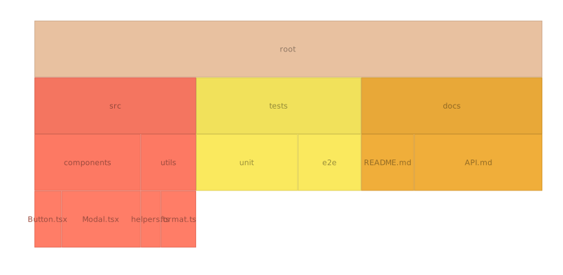
Real plugin output: a Nivo icicle chart captured from the editor. Every chart on this page is the library’s own drawing.
It is the least glamorous member of the hierarchy family and frequently the most useful one. This page is about when to reach for it over its two better-known siblings, and why it is the only one of the three that scales to a deep tree.
Everything below happens inside Figma Charts, a Figma plugin. It runs the real JavaScript charting libraries — Google Charts, Highcharts, D3-based Nivo, ApexCharts and Apache ECharts — inside the plugin window, so the bands on your canvas are the library’s own layout.
Install Figma Charts from the Figma Community →
Press ⌘/ (Ctrl / on Windows), type Figma Charts, hit Enter, and pick Icicle from the category filter. One example, from Nivo — the narrowest chip in the hierarchy family and, as the library section explains, not the whole story.
The three hierarchy charts encode the same thing differently, and the differences are entirely geometric:
Two practical consequences follow, and they are the reason to choose it. Labels work. A rectangle gives text a horizontal baseline; a sunburst segment gives it an arc, and rotated text is slower to read and harder to fit. Depth scales linearly. A seven-level tree is seven bands — tall, but readable — where a seven-ring sunburst is unusable by ring four.
What you give up is the compact, memorable circular silhouette. An icicle looks like a chart; a sunburst looks like a graphic.
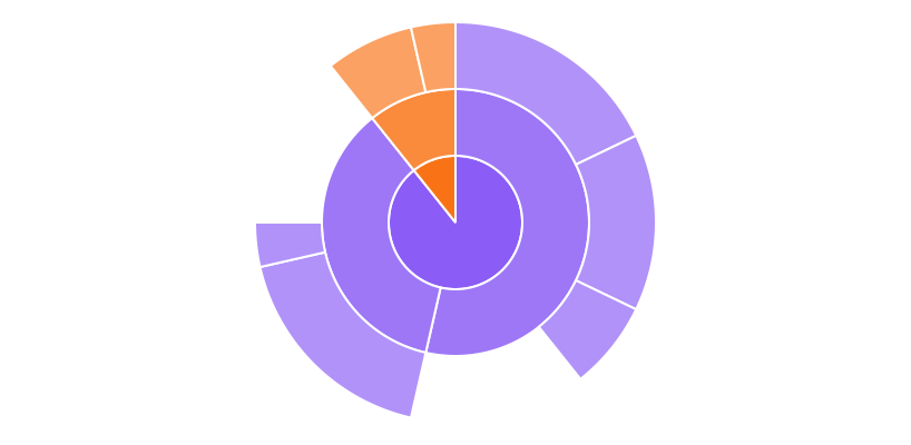
The sunburst — the icicle rolled up. Beautiful, compact, and it runs out of room after three or four levels because each ring divides the one before it while its labels have to bend.

The treemap — the space-filling option. It handles far more items than either of the other two and asks the reader to work out the nesting from padding and colour rather than from position.
Because an icicle looks like a diagram, readers sometimes treat it as one — a picture of structure with no quantities in it. It is not: every band’s width is proportional to its value, and the widths are the difference between this chart and a tree diagram.
That has two consequences worth designing around. First, a node with no value cannot be drawn. If your hierarchy is structural — a menu, an org chart, a schema — with nothing to size the bands by, you want a tree diagram instead, which encodes structure alone.
Second, the widths must sum honestly. Children fill their parent exactly, so a parent whose children do not account for all of it either gets padded or silently rescaled, depending on the library. Where a parent legitimately has un-attributed value — “other”, “unclassified” — make it an explicit child rather than leaving the gap for the renderer to interpret.
Use it when the hierarchy is deep, the labels matter, and the reader needs to trace paths from root to leaf — which is nearly every technical hierarchy: file systems, code call trees, org structures, taxonomies, navigation.
Three cases where something else wins:
1. Space is tight. An icicle is a tall or wide rectangle with a lot of it given over to structure. A treemap fits the same data into a compact square.
2. You have hundreds of leaves. Each band divides the width among its members, so a level with two hundred nodes produces slivers exactly as a sunburst would. Depth is what icicles handle well; breadth is what treemaps handle well.
3. The chart is decorative. If the job is to make a page look considered, a sunburst is more striking. That is a legitimate requirement and an icicle will not meet it.
A fourth: when quantities are the subject. Band length encodes value, which is better than angle and worse than a bar chart’s common baseline. If someone will rank the items, put a sorted bar chart beside it.
Three domains reach for this layout by default, and looking at why explains the chart.
Performance profiling. Flame graphs — the standard way to visualise where a program spends its time — are icicle charts: each band is a level of the call stack, each block’s width is time spent, and children are the functions a function called. The layout was chosen because call stacks are deep and function names are long, which is exactly the case icicles handle and sunbursts do not.
File systems and storage. Directory trees are deep, names are long, and the question is “what is taking the space, and where does it live?”. An icicle answers both at once; a treemap answers the first and makes the reader work for the second.
Navigation and taxonomy audits. Site sections, category trees and permission hierarchies. Here the finding is usually structural — a section with one child, a level that carries almost nothing — and lopsided structure is glaringly obvious in a banded layout.
The common thread is depth plus long labels. Whenever those two appear together, the icicle is the member of the family to reach for.
Icicles scale further than sunbursts and they still run out eventually — and the standard fix is the same: click a band to re-root the chart there, with a breadcrumb recording the path. Nivo supports it, and every flame-graph tool in existence uses it.
For design work, two consequences follow. A static icicle should be shallower than an interactive one: pick the depth where the bottom band still holds labels, and aggregate below it. And if the design depends on drilling in, the deliverable is a set of frames, not one chart — insert as SVG, duplicate per level, and prototype the transitions.
There is one static trick worth knowing: truncate depth per branch rather than globally. Some branches are genuinely three deep and some are seven; cutting everything at three wastes the shallow ones and cutting at seven makes the chart unreadable. Aggregating each branch at the point where its children stop being labelable produces a ragged bottom edge and a chart that uses every band it draws.
Six screens, start to finish, captured from the plugin.
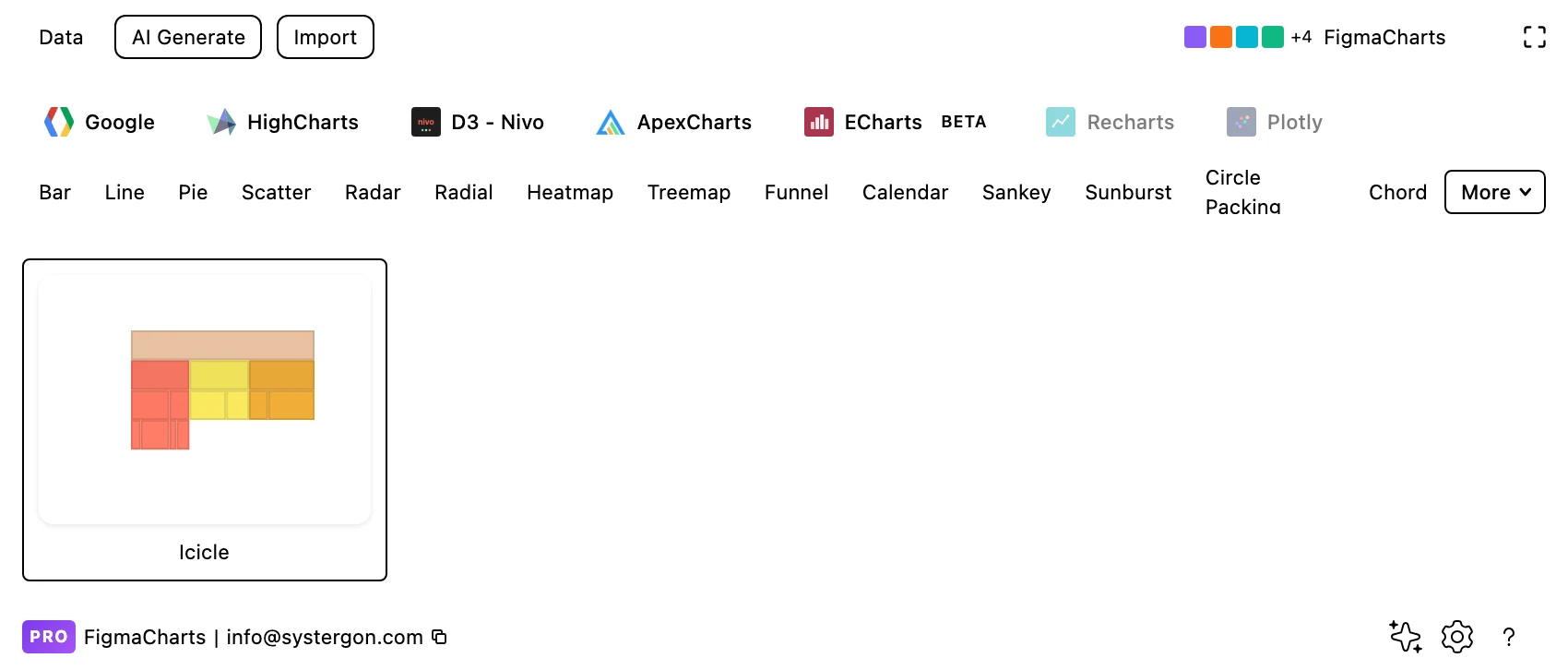
1. Filter to Icicle. Nivo has the only example. If your library is elsewhere, see the library section — the same layout appears under other names.
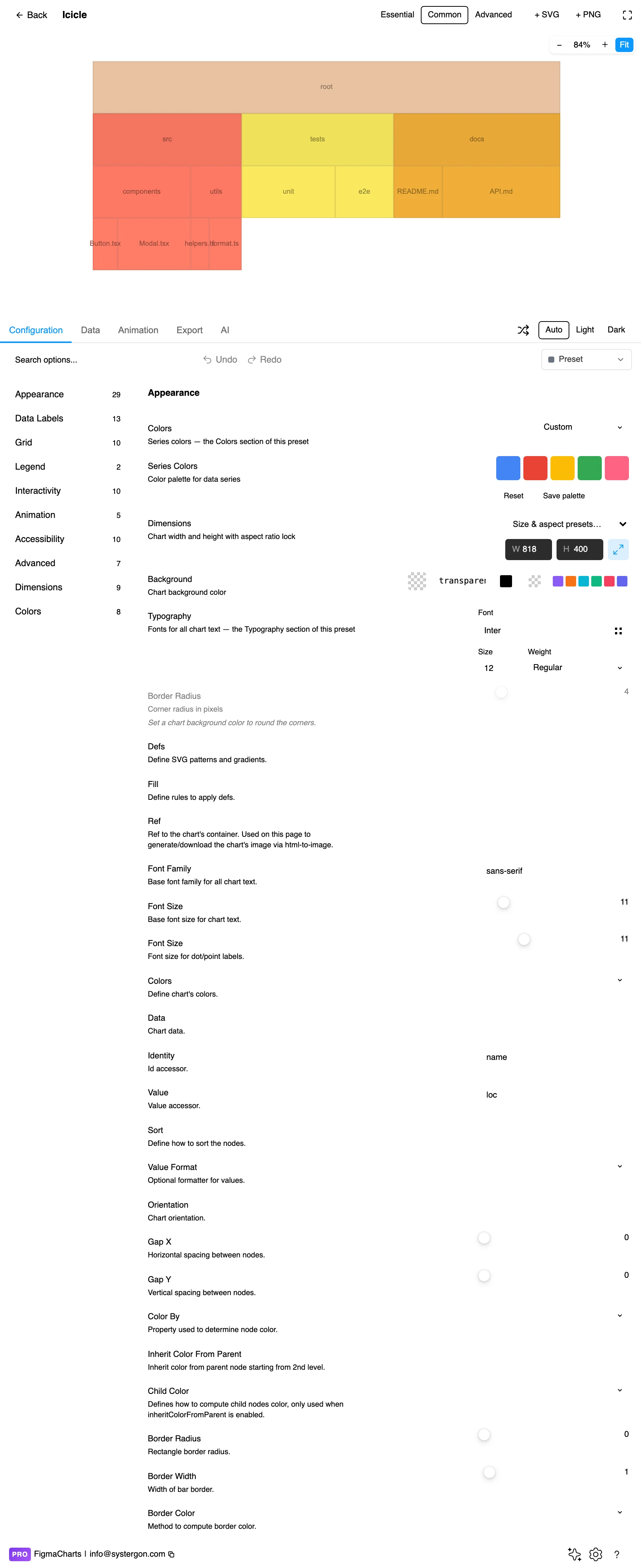
2. The editor. Live preview above, tabs below. Decide the orientation early: bands running down suit deep trees, bands running across suit long labels.
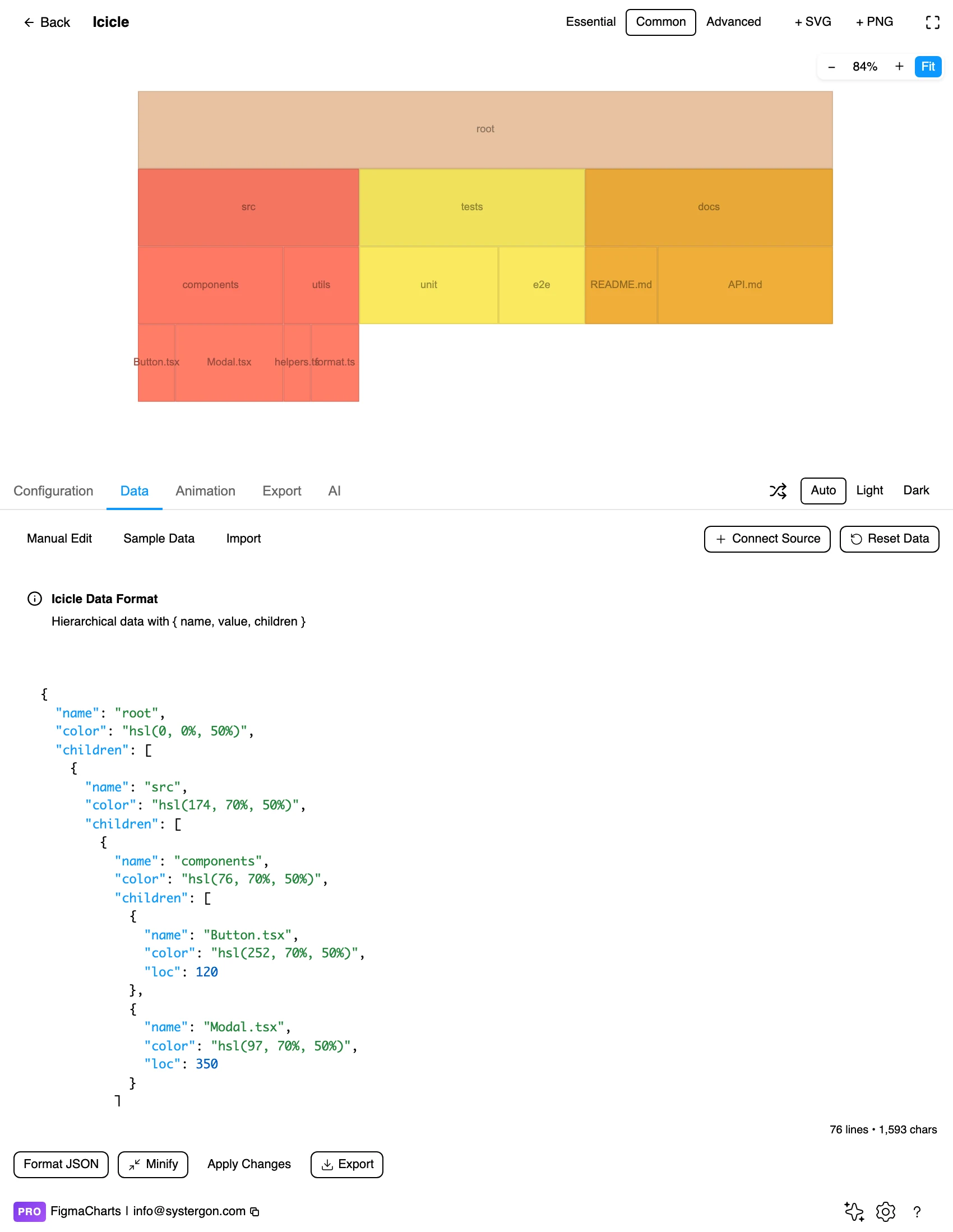
3. A hierarchy, as JSON. Nested name / value / children — the same structure treemaps and sunbursts take. Nivo edits it as JSON, because a flat table cannot express nesting.
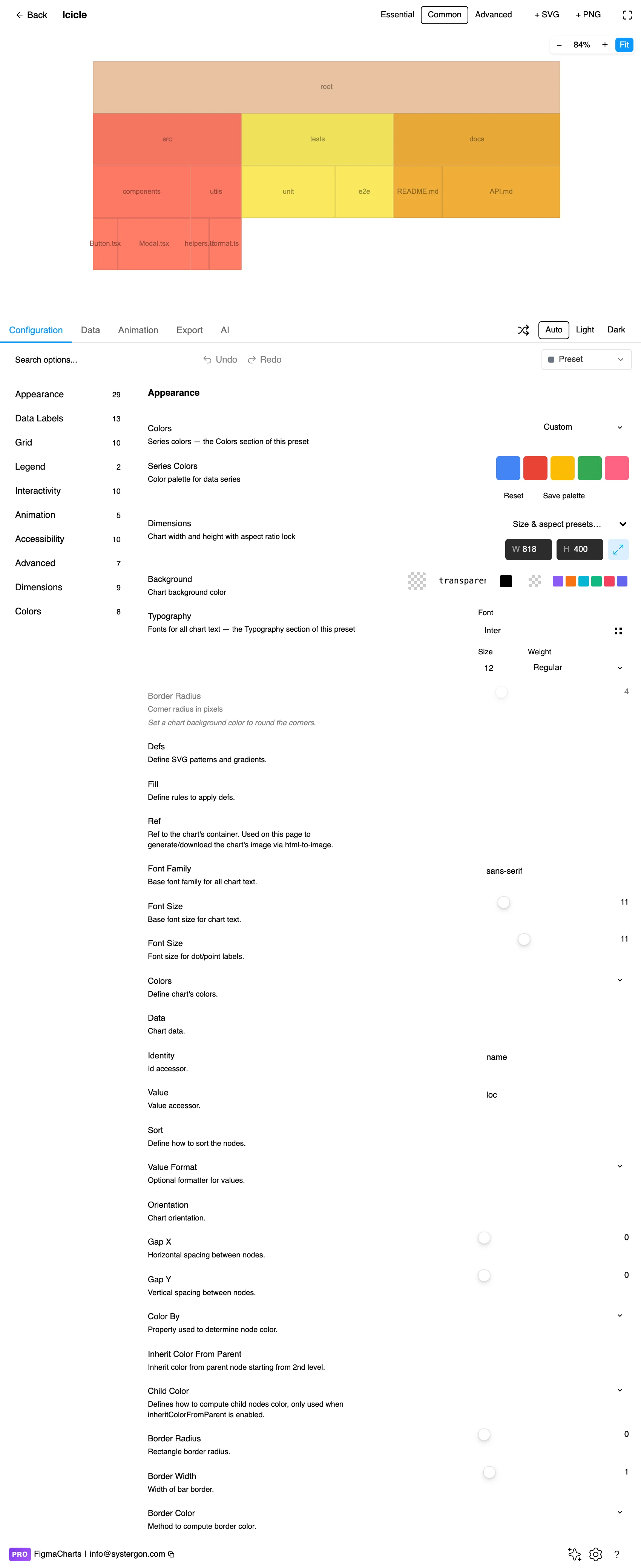
4. Configure. Orientation, band padding, label rules and colour inheritance. Padding between levels is what makes the structure legible rather than a solid block.
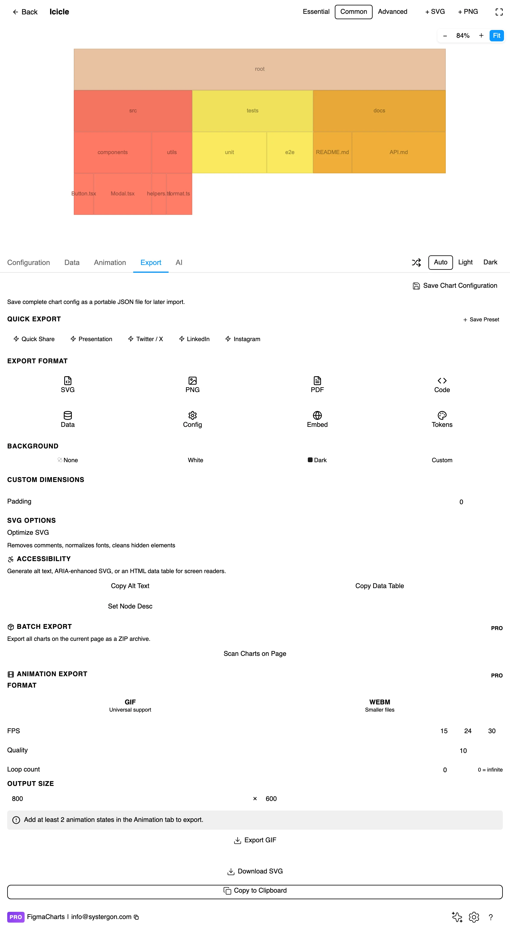
5. Export. Nivo exports to React, so for this chart the library choice constrains the handoff.

6. Insert. SVG gives you every band as a rectangle with real text — and because an icicle is rectangles and labels, an inserted one is straightforward to prune and re-space by hand.
Hierarchical: { name, value, children }, with values on the leaves so parents can sum them. In the plugin it is a JSON edit, and — as with every hierarchy chart here — it cannot bind a live data source: a connector cannot build a tree out of a flat range, so the plugin refuses rather than corrupting the structure.
Two things worth settling before you build. Consistent depth: branches that stop early leave empty space in the deeper bands, which reads as missing data rather than a shallower branch. And where the values live — leaves only, so nothing disagrees with its own children.
One practical note specific to this chart: because depth is cheap, it is tempting to include every level you have. Resist it. The right depth is the one where the deepest band still has labels, not the one your data happens to reach.
The Icicle category holds one example, in Nivo. The layout, however, is everywhere once you know what to look for.
A useful way to hold the family in mind: icicle = proportional + rectangular + directional. Drop “proportional” and you have a tree diagram; drop “directional” and you have a treemap; roll it up and you have a sunburst.
As always: design in whichever library your engineers already use, because the export then matches production exactly. Choosing the right chart library covers the trade-offs.
Inherit colour down the branches. Each top-level category gets a hue, descendants take tints. Because bands are adjacent rather than nested, colour is doing more work here than in a treemap — it is the main signal that two bands belong to the same branch.
Pad between levels, not within them. A gap between bands separates the levels; siblings within a band should touch or nearly touch, because they are dividing a parent’s width and the division should read as continuous.
Set a label threshold. Below a width, a label cannot fit and truncation is worse than absence. Decide the cut-off rather than letting the library ellipsis everything.
Orient for the data. Vertical (root at the top, bands descending) reads as a hierarchy and suits deep trees. Horizontal (root at the left) gives every label a full line of running text, which is the better choice when names are long — and names in technical hierarchies always are.
Give the root a band. A full-width band at the top labelled with the total anchors the chart and makes it obvious that everything below divides it.
For type and colour, bind them to your design system rather than picking by hand — covered in Your chart, your design system.
An icicle can run in four directions, and the choice is more than aesthetic.
Downward — root at the top, children below — is the default and reads as a hierarchy descending, which matches how people describe trees.
Upward is the flame-graph convention: the root at the bottom, stacks growing up like flames. It exists because profilers show the call stack that way round, and it is worth matching if your audience already reads flame graphs.
Left to right gives every node a full line of text and is the right choice for long names. It also lets the chart scroll vertically, which is how large hierarchies are actually browsed.
Right to left is rare and worth avoiding unless the reading direction of your audience calls for it.
Whichever you choose, keep it consistent across a set of charts. Readers build a mental model of “deeper is that way” quickly, and flipping it between figures costs more than the layout gains.
Band length is the value; band height is nothing. Every band in a level is the same height, so a tall-looking region is just a deep branch. Readers occasionally read the vertical extent as magnitude — it is not.
Ragged bottoms are structure, not gaps. A branch that ends at level two leaves empty space beneath it. That is the tree being shallower there, not data going missing, and it is worth saying in a caption when depths differ a lot.
Order within a band is a choice. Alphabetical, by size or by domain sequence — and readers infer meaning from left-to-right order. Sorting by value is usually right and always an argument.
Small leaves vanish, as everywhere. Aggregate the tail into an explicit “other” child rather than letting slivers accumulate.
Depth is not importance. A leaf five levels down is not less significant than one at level two; it is more finely classified. Deep trees invite that misreading, and a note is the cheapest fix.
Labels are the reason to choose this layout, so it is worth spending the effort where the payoff is.
Left-align inside the band. Centred labels drift as bands resize and make a column of names look ragged; left-aligned text with a small inset stays put and scans down the chart cleanly.
Truncate from the middle for paths. File paths and package names share long prefixes and differ at the end, so a trailing ellipsis removes the informative half. Middle truncation — keeping both ends — is the right rule for technical hierarchies.
Set the threshold in characters, not pixels. “Show the label if at least eight characters fit” is a rule that behaves consistently across levels; a pixel threshold produces labels that fit in one band and not the next for no visible reason.
Consider a second line for values. Where bands are deep enough, a name on one line and the value in a lighter weight beneath it turns the chart into something readable without a legend, tooltip or axis.
Rectangles are the accessible shape. Horizontal labels, straightforward contrast, no rotated text — this is the most accessible member of the hierarchy family by construction, which is a good reason to prefer it when the audience is broad.
Check text contrast against every band colour, since labels sit on the data. Switching label colour by band lightness is the reliable fix.
Do not put values only in tooltips. An inserted SVG has no hover.
Give it a text equivalent. The Export tab’s Copy Alt Text, Copy Data Table and Set Node Desc produce a description, a table of the numbers and a description written onto the Figma node — and an indented table is a near-perfect textual equivalent of an icicle, which is not true of a sunburst.
A hierarchy drawn as bands of rectangles, one band per level, with each node’s width proportional to its value and its children directly beneath it. It is a sunburst unrolled into a straight layout.
Icicle for deep hierarchies and readable labels; sunburst for a compact, striking overview of a shallow one; treemap for many items and size comparison. All three take identical data, so trying all three costs nothing.
Nivo has the only Icicle category. Highcharts’ treegraph (under Tree) is the same layout without proportional widths, and ECharts can approximate one with a directional treemap. Google Charts and ApexCharts have nothing comparable.
As deep as your frame is tall — each level is one more band, so depth costs linearly rather than exponentially. The practical limit is labels: stop where the deepest band can still hold text.
Because those branches are shallower. An icicle draws each node under its parent, so a branch that ends early leaves the deeper bands empty beneath it. It is structure, not missing data.
Vertically for deep trees, horizontally when labels are long — a horizontal layout gives each node a full line of text, which matters for file paths, package names and anything else technical.
No. Like every hierarchy chart in the plugin, it cannot bind a linked source, because a connector cannot construct a nested structure from a flat range.
Yes — a flame graph is an icicle chart of a call stack, with band width as time spent and children as the functions a function called. Conventionally it grows upward and an icicle grows downward, which is the only difference. It is also the best evidence for the layout: profiling tools chose it because call stacks are deep and function names are long.
Insert as SVG and every band is a rectangle with real text — the easiest hierarchy chart to prune, re-space and annotate by hand. Insert as PNG for a flat image at twice the pixel density.
Open the plugin, filter to Icicle, and put in the deepest hierarchy you have — the one that defeated your sunburst. If the bottom band still has readable labels, you have found the chart that hierarchy wanted, and the reason this unfashionable layout keeps turning up in tools built by people who look at trees all day.
Install Figma Charts — it’s free to try → Browse all 45 chart types →