
Install Figma Charts — it’s free to try → See the candlestick gallery →
A candlestick chart carries four numbers per period where a line chart carries one. Open, high, low and close, encoded as a body and two wicks, repeated across time — which makes it the densest standard chart in common use, and the only one most people learn to read by osmosis rather than instruction.
Real plugin output: a Highcharts candlestick captured from the editor. Every chart on this page is the library’s own drawing, not an illustration of one.
That density is the whole argument for it, and it comes with an unusual design problem: several members of the family look like price charts and are not — their bodies are derived, averaged or detached from time altogether. Knowing which is which is most of what a designer needs from this page.
Everything below happens inside Figma Charts, a Figma plugin. It runs the real JavaScript charting libraries — Google Charts, Highcharts, D3-based Nivo, ApexCharts and Apache ECharts — inside the plugin window, so the candles on your canvas are the library’s own geometry.
Install Figma Charts from the Figma Community →
Press ⌘/ (Ctrl / on Windows), type Figma Charts, hit Enter, and pick Candlestick from the category filter. There are 18 examples across four libraries.
Each candle is one period — a day, an hour, a minute — and it encodes four values with two shapes:
The reason this beats four line charts is that the relationship between the four numbers is the information. A small body with long wicks says the period was volatile and undecided; a long body with no wicks says it moved in one direction and held. Those are patterns a reader recognises as shapes, which is exactly what a chart should let them do.
One consequence worth stating early: a candlestick chart needs the reader to know the convention. Unlike a bar chart, nothing on the chart itself explains that the box is open-to-close. For a financial audience that is free; for a general audience it is a cost, and it is usually the deciding factor.

OHLC bars — the older notation: a vertical line for the range, a left tick for the open and a right tick for the close. Identical information to a candlestick, less visual weight, and it survives dense periods better because the bars are thinner. These are raw prices.

Heikin Ashi — and here is the first chart on this page that is not showing prices. Each candle is computed from averages of the current and previous periods, which smooths the series into cleaner runs of colour. It is a trend-reading tool, and its opens and closes are not values anything traded at. Never label these as prices.

Renko — a chart with no time axis at all. A new brick is drawn only when the price moves by a fixed amount, so the horizontal spacing is price movement, not elapsed time. Two bricks side by side may be minutes or weeks apart, and nothing in the chart says which.
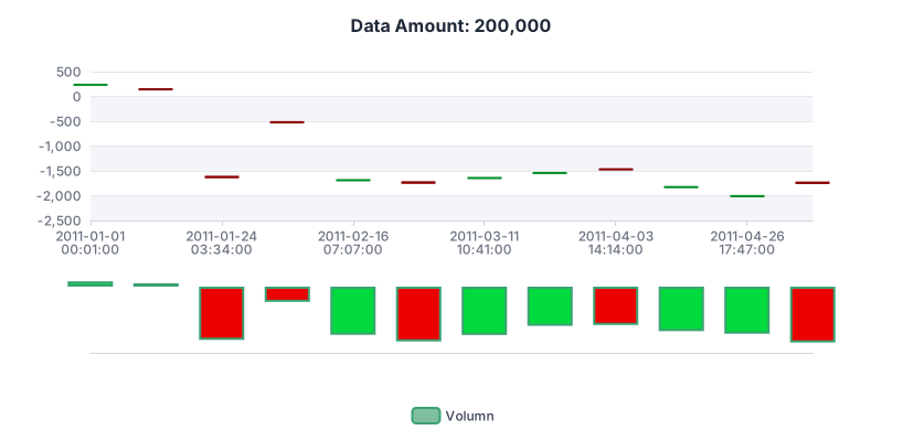
Large-scale — thousands of candles in one frame, from ECharts. At this density individual candles stop being readable and the chart becomes a texture of volatility, which is a legitimate thing to show as long as the reader is not being asked to read any single period.
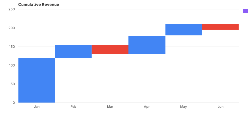
And a waterfall — which is in the Candlestick category because that is how Google Charts builds one. It is the clearest evidence that this chart type is really a range chart: give it a floating start and end per category and you get cumulative gains and losses instead of prices.
1. Only the close matters. If the reader’s question is “how did the value move?”, a line chart of closing values answers it with a quarter of the ink and no convention to learn. The candles earn their complexity only when the intra-period range is part of the story.
2. The audience is not financial. Outside markets, almost nobody reads open-high-low-close fluently. For a general audience showing ranges, a range area chart or a bar with error whiskers communicates the same spread without requiring the vocabulary.
3. You have fewer than about twenty periods. Candlesticks are pattern-reading instruments, and a pattern needs a run. Six candles is a table of twenty-four numbers drawn as boxes.
And a fourth that matters in design work: when the chart will be small. Below roughly 300px wide the bodies collapse and the wicks disappear into the strokes. If it must live in a card, use a line or a sparkline and keep the candles for the full-size view.
Candlestick charts come with a vocabulary of named patterns — doji, hammer, engulfing, morning star — and a designer building a financial interface will be asked to support them. Two things are worth knowing without taking a position on whether they predict anything.
They are shapes, and shapes need room. Every named pattern is a relationship between two or three adjacent candles: a body inside the previous body, a long lower wick with almost no body, two candles of opposite colour. That means the design has to preserve adjacency and proportion — anything that squeezes candles until bodies collapse destroys the patterns before the analysis starts. If pattern-reading is a use case, the minimum candle width is a hard requirement rather than a preference.
Annotation is where the product value is. Readers cannot be expected to spot a pattern in six hundred candles, so real interfaces mark them — a subtle band behind the candles, a small glyph above them, a label on hover. Design that layer explicitly, and keep it visually subordinate: the moment the annotation is louder than the data, the chart is asserting a conclusion rather than showing one.
The type is more general than its reputation. Anything with a start, an end and a range per period fits the encoding, and the plugin ships evidence of both directions: Google’s temperature-range candles, and its waterfall built on the same primitive.
Ranges over time. Daily temperature minimum and maximum, with the day’s first and last readings as the body. Response-time percentiles per hour. Shift start and end times per day. The reading is the same — where it sat and how far it roamed — without any financial vocabulary.
Where it stops being a good idea. The moment the four values are not naturally ordered as open, high, low and close, the encoding starts lying: the body assumes the first and last values bracket a period, and the wicks assume the extremes lie outside them. If your four numbers are four independent measures, that is a grouped bar chart or a box plot, not a candlestick — and a box plot is the better answer whenever the interior of the range matters more than its endpoints.
Six screens, start to finish, captured from the plugin.
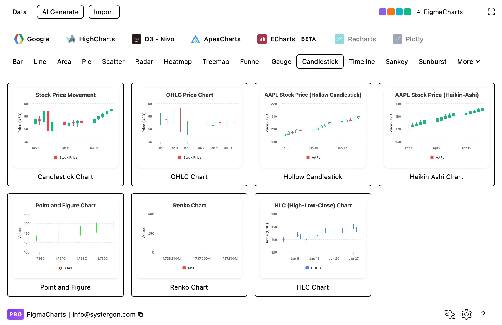
1. Filter to Candlestick. Four libraries have it — Highcharts with the deepest set, then ECharts, Google Charts and one ApexCharts example. Pick by variant, because OHLC, Heikin Ashi and Renko are different charts, not different styles.
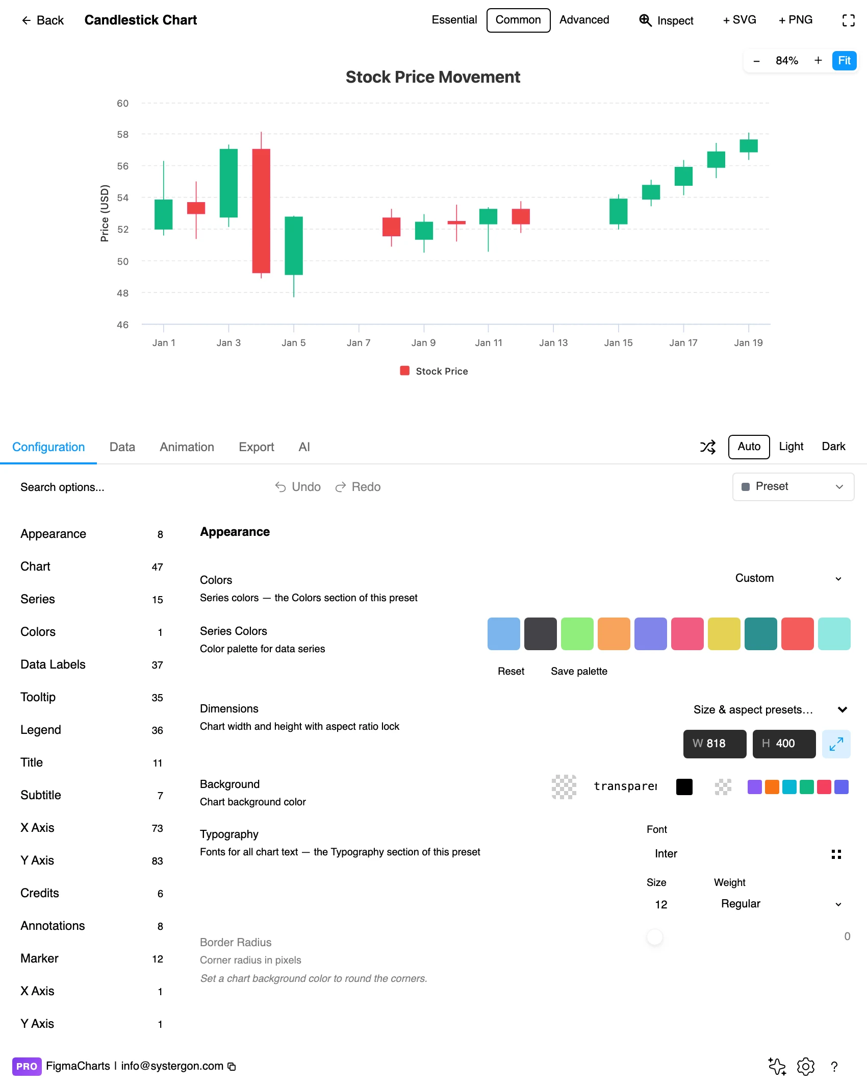
2. The editor. Live preview above, tabs below. Check the width early: candlesticks are the type most sensitive to final size, because the body has to stay wider than its own stroke.
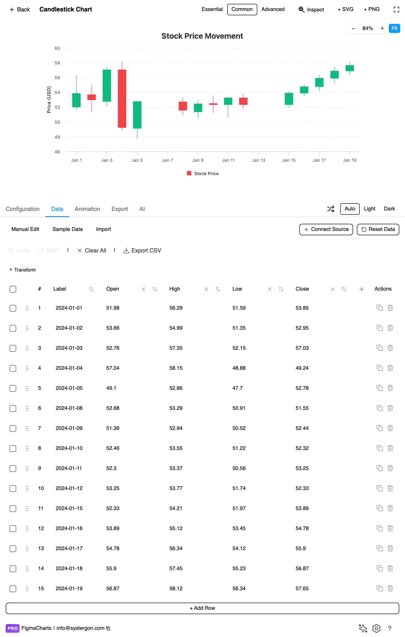
3. Four columns, not one. The data table shows the period label and then open, high, low and close as separate value columns — the plugin decomposes the library’s packed format into something you can actually edit.
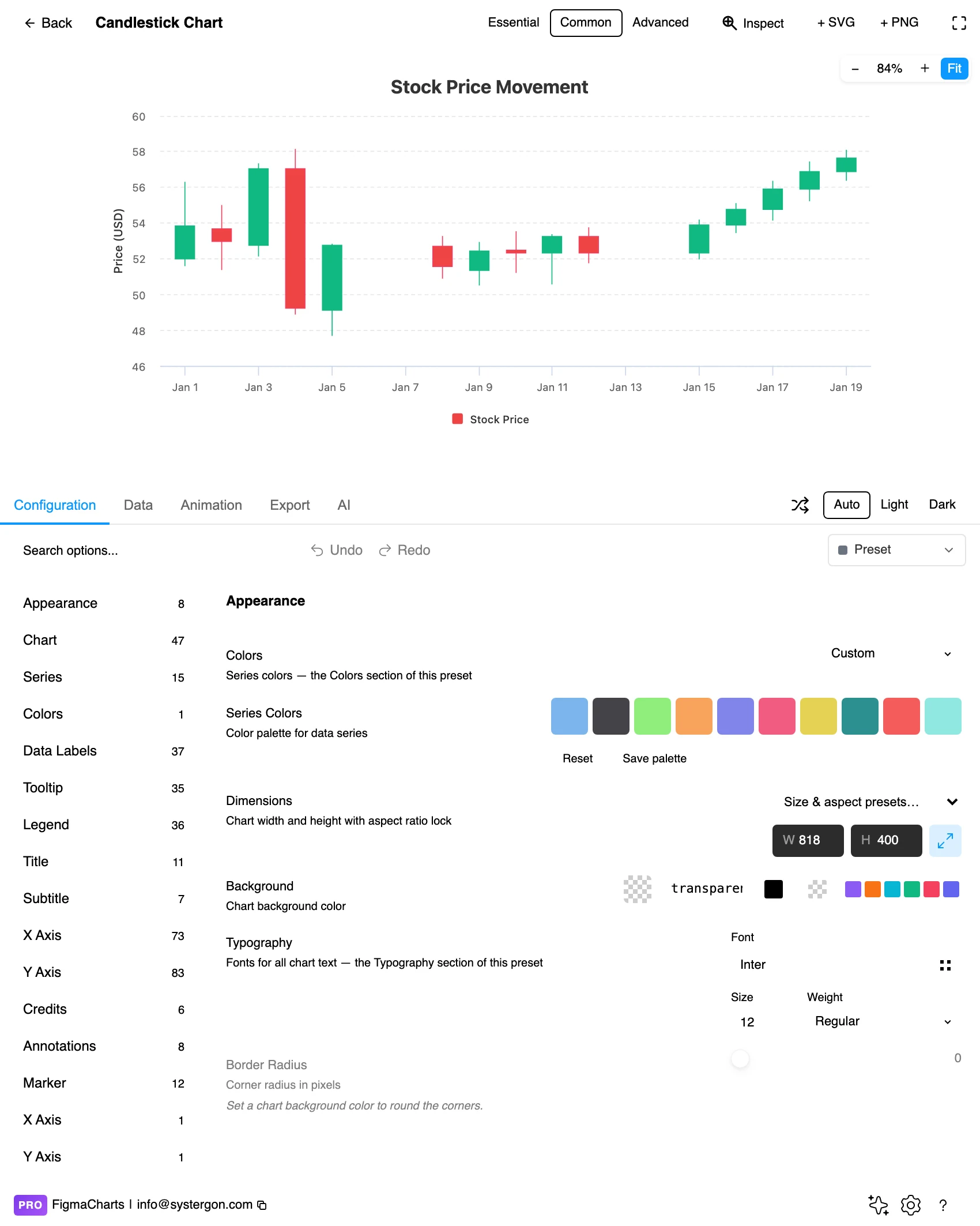
4. Configure. Up and down colours, body width, wick styling and the axis type. This is where you decide whether the axis treats missing days as gaps or closes them up — see the reading section below.
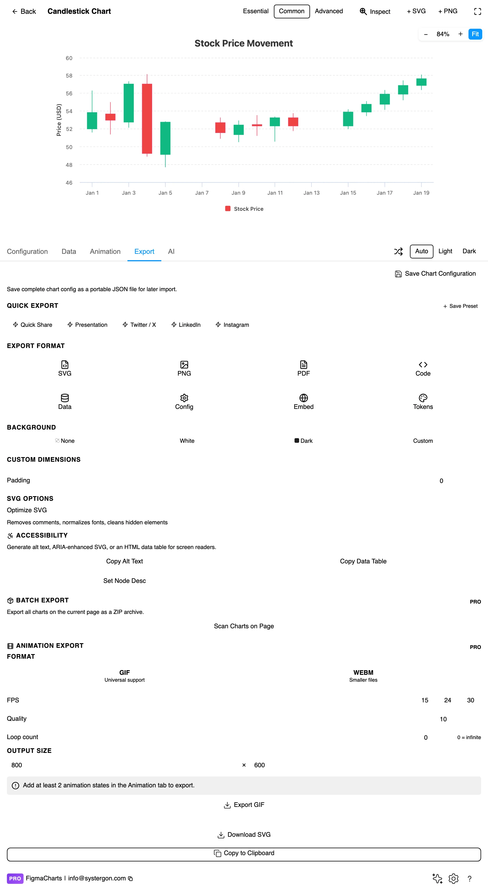
5. Export. A working component for React, Vue 3, Angular, Svelte or vanilla JavaScript, listing the library’s own npm packages at the version the plugin rendered with.
6. Insert. SVG keeps every candle as its own vector shape, which is what you want if a single period needs annotating on the canvas.
Candlestick is the plugin’s OHLC shape: a period label plus four numbers, in the order open, high, low, close. That is one row per candle and four value columns — the ordinary table, not a special editor.
Two properties are worth knowing. First, the plugin decomposes the packed library formats for you: charting libraries store OHLC data as tuples or arrays, and the data table splits them into four labelled columns so you can edit a single value without hand-editing an array. Second, candlesticks accept a linked data source in every library that draws them — no library is marked incompatible — so a Sheet or an API with four numeric columns can drive one directly. That is covered in live data from Google Sheets and APIs.
The usual numeric caution has teeth here: an unparseable cell becomes 0, and a zero in an OHLC row does not produce a gap — it produces a candle with a wick stretching to the axis, which reads as a catastrophic intra-period crash. Clean the source before binding it.
The 18 examples split Highcharts 7, ECharts 5, Google Charts 5, ApexCharts 1 — and Nivo has none.
As always: design in whichever library your engineers already use, because the export then matches production exactly. Choosing the right chart library covers the trade-offs.
Colour convention is regional, and getting it wrong inverts the meaning. In Western markets red means down and green means up. In China, Japan, Korea and Taiwan the convention is the opposite: red is up. A chart designed in London and shipped in Shanghai does not merely look unfamiliar — it reads backwards. If the audience spans both, use the second convention available: hollow for up, filled for down, which is unambiguous everywhere.
Body width is a legibility budget. Aim for bodies at least three or four times the stroke width, with a visible gap between candles. When the period count grows past what that allows, switch to OHLC bars, which stay readable much denser, or aggregate the periods.
Wicks thinner than bodies, in the same hue. A wick drawn in a neutral grey detaches from its candle at a glance; drawn at body weight it competes with the body it belongs to.
Gridlines horizontal only, and quiet. Price levels matter; period boundaries do not. Vertical gridlines between candles add clutter to the one chart type that already has the most marks per pixel.
Volume belongs below, not behind. The common financial layout puts a volume histogram in a short panel beneath the price panel, sharing the x axis. Overlaying volume bars behind the candles saves space and costs the reader the ability to read either cleanly.
For type and colour, bind them to your design system rather than picking by hand — the plugin can build a palette from your Figma colour variables, covered in Your chart, your design system.
Derived candles are not prices. Heikin Ashi bodies are averages of the current and previous periods. They are excellent at making a trend legible and they must never be labelled as open and close, quoted in a tooltip as though they were traded values, or used to place a marker at “the price”. This is the single most common factual error in charts of this family.
Renko and point-and-figure charts have no time axis. Their horizontal dimension is price movement: a new brick or column appears when the price has moved by a set amount, however long that took. Putting a date scale under one — or reading the width of a run as duration — is a misreading the chart invites and does not correct.
The gap between candles is a decision. Markets close; data has weekends and holidays. A datetime axis leaves visible gaps for the missing days (honest about elapsed time, ugly, and it compresses the candles); a category axis places the trading days adjacent (clean, and it silently removes the passage of time). Neither is wrong, and the choice changes how a trend looks.
The y axis rarely starts at zero, and that is correct here. A candlestick encodes position and range, not length from a baseline, so a zero-based axis on a price series between 180 and 220 wastes the entire plot. What it does mean is that the visible volatility is a function of the range you chose — the same caution as any line chart.
Aggregation changes the shape. The same data as daily candles and as weekly candles produces different patterns, because a week’s open, high, low and close are not the average of its days. If a pattern only appears at one aggregation, say which one.
Red versus green is the worst possible pairing. It is the classic red-green colour vision deficiency case and it is the default in half the world’s financial software. Use hollow-versus-filled bodies as the primary encoding — it is a shape difference, it survives every form of colour blindness and it prints — and treat colour as reinforcement.
Do not encode direction in colour alone at small sizes. Once a candle is a few pixels wide, hue is all that is left, and hue at that size is unreliable for everyone.
Give it a text equivalent. The Export tab’s Copy Alt Text, Copy Data Table and Set Node Desc produce a description, a table of the numbers and a description written onto the Figma node. For a candlestick the data table is the accessible version and it is a genuinely good one, because OHLC data is naturally tabular.
The body spans the open and the close; its colour or fill says which way the period moved. The wicks reach to the high and the low. Four numbers per period, encoded as one shape.
Notation only — both carry open, high, low and close. OHLC bars use a vertical line with left and right ticks, which stays readable at higher density; candlesticks use a filled body, which makes direction obvious at a glance. Highcharts ships both, plus an HLC variant.
No. Each Heikin Ashi candle is computed from averages of the current and previous periods, which smooths the series into cleaner trend runs. The values are derived, so they must not be labelled or quoted as traded prices.
Because it has no time axis. A Renko brick is drawn when the price moves by a fixed amount, so horizontal distance is price movement rather than elapsed time. The same applies to point-and-figure charts. Both are in the Highcharts set.
It depends on the audience. Western markets read red as down and green as up; markets in China, Japan, Korea and Taiwan use red for up. If your audience spans both, lead with hollow-versus-filled bodies, which mean the same thing everywhere, and use colour as reinforcement.
Four of the five: Highcharts (7 examples, including OHLC, Heikin Ashi, Renko and point and figure), ECharts (5, best at scale), Google Charts (5) and ApexCharts (1). Nivo has none.
Yes, and Google Charts demonstrates both directions: its waterfall chart and its temperature-range candles are built from the same primitive. Any measure with a floating start, end and range per period fits — daily temperature ranges, shift durations, min-max sensor readings.
Insert as SVG and every candle is a separate vector shape with real text on the axes, so a single period can be highlighted or annotated on the canvas. Insert as PNG for a flat image at twice the pixel density.
Open the plugin, filter to Candlestick, and put twenty or thirty real periods in — then ask whether the wicks are telling you anything. If the ranges are doing work, you have the right chart and the density is earning its keep. If every candle is a small body with negligible wicks, the close is the whole story, and a line chart will tell it to a wider audience without the vocabulary.
Install Figma Charts — it’s free to try → Browse all 45 chart types →