Install Figma Charts — it’s free to try → See the pictorial gallery →
A pictorial bar chart replaces the rectangle with a picture. The encoding is unchanged — length from a common baseline, the most accurate channel there is — and the mark becomes a tree, a car, a bottle, a person. Done properly it is a bar chart that tells you what it is about before you read the axis. Done carelessly it is the classic way charts lie.
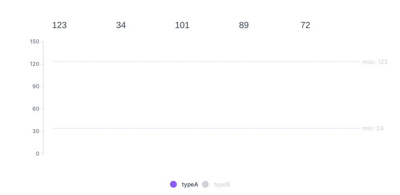
Real plugin output: an ECharts pictorial bar captured from the editor. Every chart on this page is the library’s own drawing.
The difference between the two is one rule about how the picture grows, and this page is mostly about that rule — plus the six shapes this technique actually takes, all of which are in the plugin.
Everything below happens inside Figma Charts, a Figma plugin. It runs the real JavaScript charting libraries — Google Charts, Highcharts, D3-based Nivo, ApexCharts and Apache ECharts — inside the plugin window, so the symbols on your canvas are the library’s own rendering.
Install Figma Charts from the Figma Community →
Press ⌘/ (Ctrl / on Windows), type Figma Charts, hit Enter, and pick Pictorial Bar from the category filter. Seven examples, all ECharts — the only library here with the type.
Three ways a picture can carry a value, and the difference is the whole subject:
The rule to carry away: repeat the symbol or clip it, never scale it in two dimensions. ECharts’ pictorial bar supports all three, so the honesty is a configuration choice rather than something the library enforces.
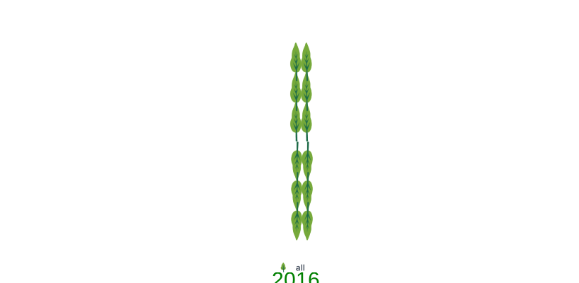
Repeated symbols — the isotype approach: each mark is one unit, so the bar is countable as well as measurable. This is the version to reach for by default.

Clipped fill — a single vessel filled to the value. The outline stays constant, which keeps the picture recognisable and the comparison fair, and it reads instantly as “how full”.
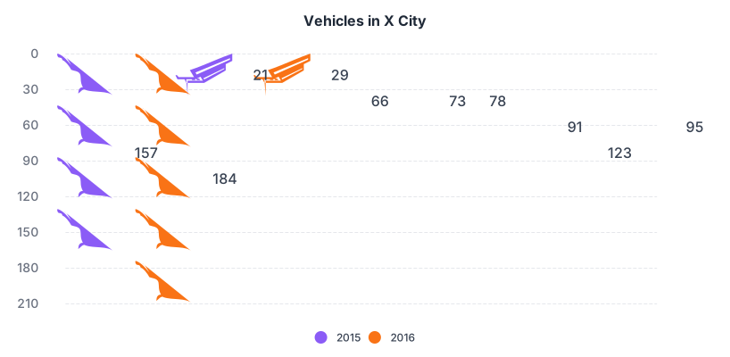
Symbol as the bar — the mark repeated along the bar’s length. Note that the height stays fixed while the length varies: a one-dimensional encoding, which is exactly what a bar chart is.
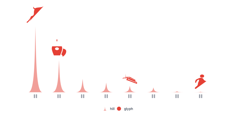
Symbol at the end — a plain bar with a picture as its cap. The cheapest version of the technique and often the best: full accuracy, plus one image that tells the reader what the chart is about.
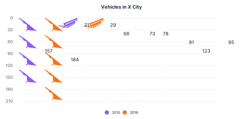
The transition example — pictorial and plain bars as two states of the same chart, which is the clearest demonstration that these are the same encoding with different marks. If the pictorial version looks different in any way that matters, something has been distorted.
Use it when the audience is general rather than analytical, the subject is concrete enough to picture, the number of categories is small, and the goal includes being looked at — public communication, editorial graphics, campaign material, a report cover.
Three cases where a plain bar wins:
1. The values are close together. Pictorial marks are visually noisy, and small differences that a plain bar shows clearly get lost against the texture of the symbols.
2. There are many categories. Twenty rows of repeated icons is a pattern rather than a chart. Above about eight, use rectangles.
3. The context is analytical. In a dashboard or a report that people work from, the pictures cost reading speed and add nothing that the axis label does not already say.
A fourth: when the icon is abstract. If the symbol needs explaining, it is worse than a rectangle — it occupies the same space and adds a decoding step.
Pictorial charts have a lineage worth knowing, because it produced the rule this whole page rests on.
In 1920s Vienna, a team led by Otto Neurath developed a picture-based system for communicating social statistics to a public that could not be assumed to read charts — later called Isotype. Its central principle was stated plainly: a greater quantity is shown by more symbols, never by a larger symbol.
The reasoning was perceptual rather than aesthetic. A doubled symbol occupies four times the area, and readers judge the ink rather than the dimension — so scaling misleads systematically while repetition does not. A century of research on graphical perception has done nothing but confirm it.
Two other Isotype conventions transfer directly to modern work. Symbols were designed as silhouettes, because detail disappears at the size repetition requires. And the unit was always stated — one figure equals so many people — because a countable chart invites counting.
Those three rules — repeat rather than scale, silhouette rather than illustration, state the unit — are the whole craft of this chart type, and they were settled before computers.
Six screens, start to finish, captured from the plugin.
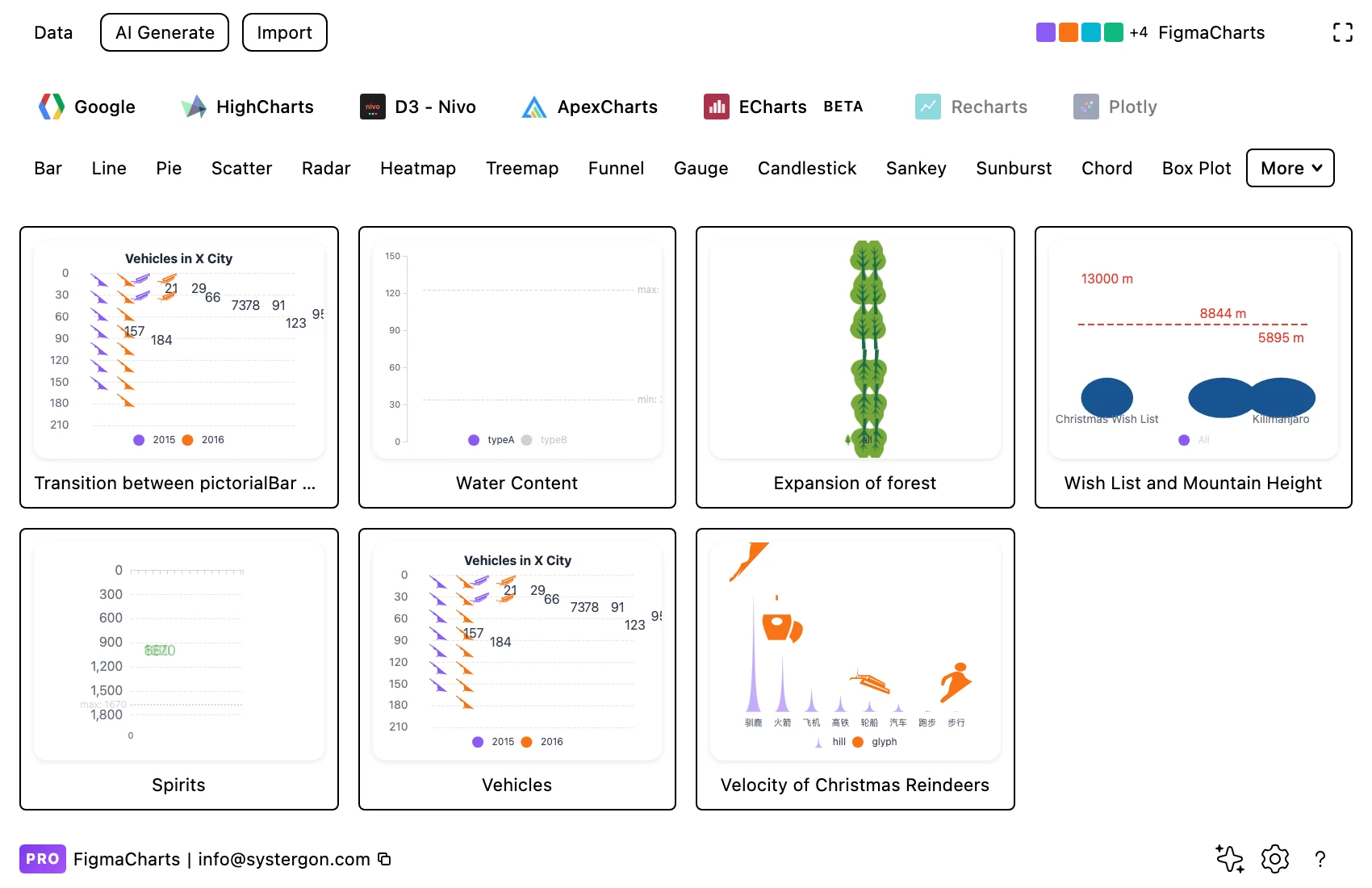
1. Filter to Pictorial Bar. Seven ECharts examples, covering repeated symbols, clipped fills, symbols as bars and symbols as caps.
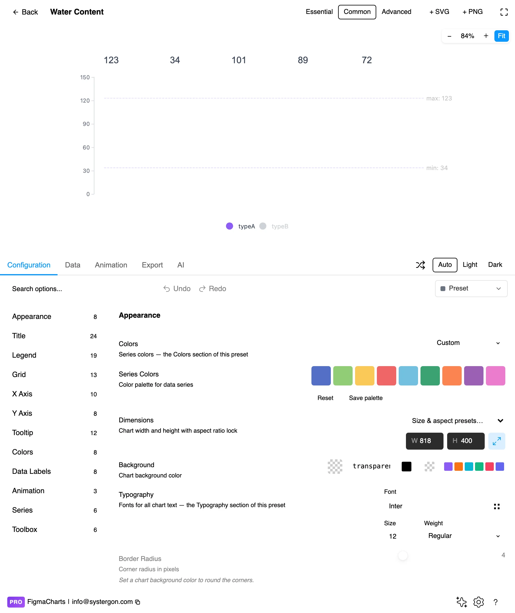
2. The editor. Live preview above, tabs below. Check the symbol at final size early: icons that read at 200px frequently become mush at 40px, and the chart is usually sized last.
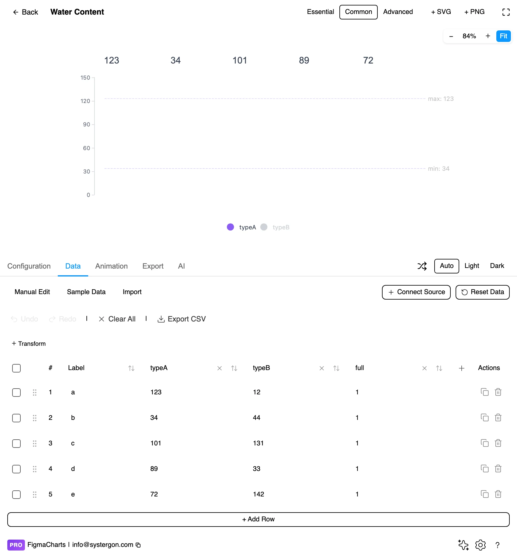
3. Categories and values. The ordinary cartesian table — a label and a number per row, exactly as a bar chart. The pictures are configuration, not data.
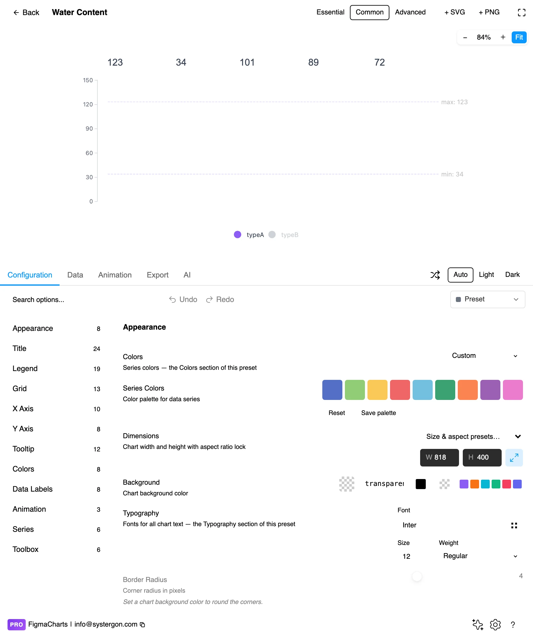
4. The symbol and its repeat mode. This is where the chart is decided: which symbol, whether it repeats, whether it clips, and how it is sized. The repeat setting is the honesty setting.
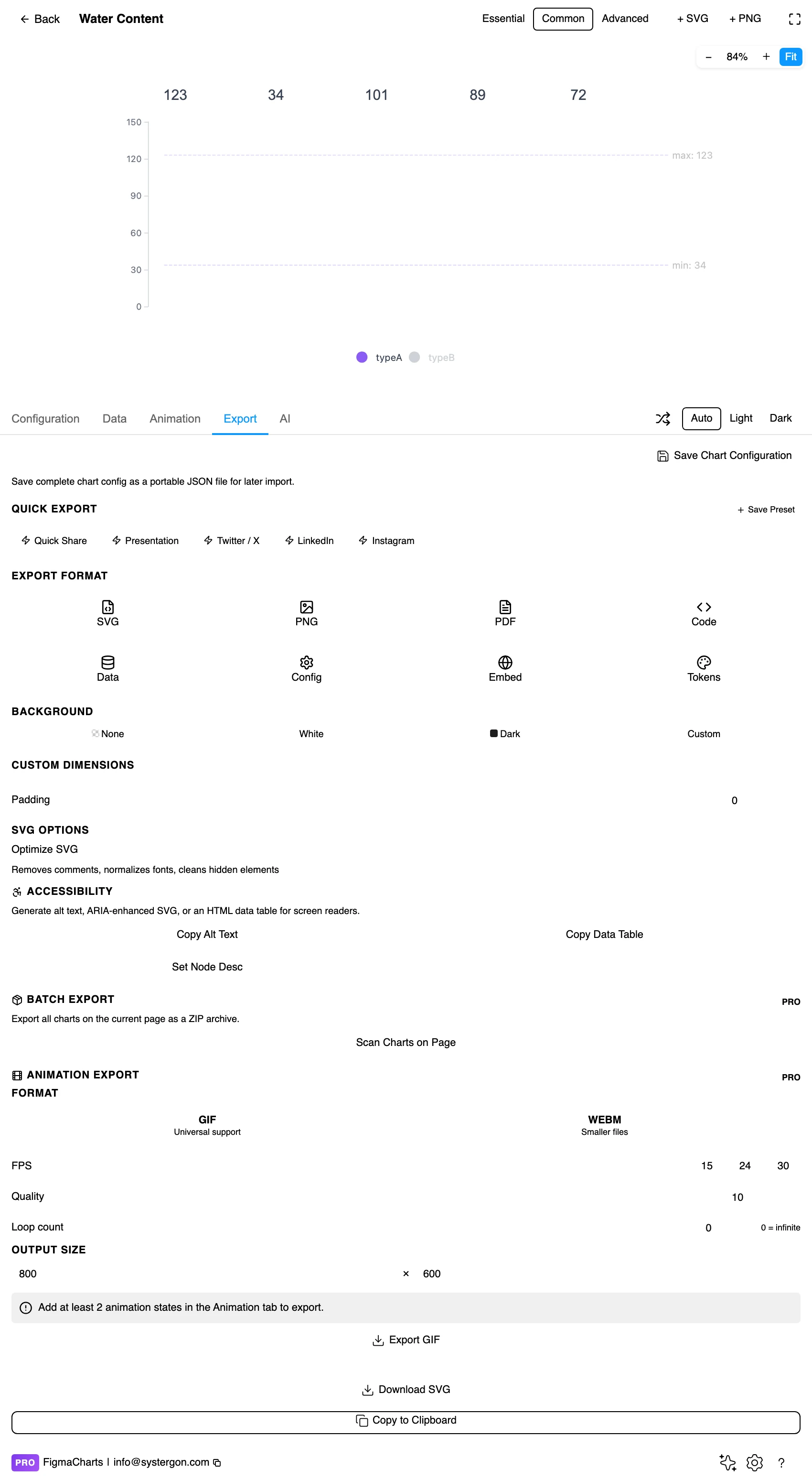
5. Export. A working component for React, Vue 3, Angular, Svelte or vanilla JavaScript — and the config carries the symbol path, which is the part that will otherwise be redrawn by hand in production.
6. Insert. SVG brings every symbol in as a vector shape, so swapping the library’s icon for your own component is a canvas operation — which is how most polished pictorial charts are actually finished.
Exactly a bar chart’s: a label column and one or more numeric columns. The pictures live in the configuration, which has a useful consequence — any bar chart can become pictorial and back again without touching the data, which is what the transition example demonstrates.
Pictorial bars have no registry restrictions in the plugin: the ordinary table editor, and a linked data source works. So a campaign chart can be driven from a live sheet while keeping its illustration.
The one thing to decide in the data is what one symbol represents when you use repeat mode. One tree per thousand hectares, one person per ten thousand people — and that unit belongs on the chart, because readers count symbols and will otherwise assume one each.
The Pictorial Bar category is ECharts only — seven examples, and it is a genuine capability difference rather than a filing one: pictorialBar is an ECharts series type with no direct equivalent elsewhere.
That second route is worth taking seriously even when ECharts is available: the library gets the geometry right, and Figma gets the icon right. Render the bars, insert as SVG, then swap in your own symbol component at the same dimensions.
As always: design in whichever library your engineers already use, because the export then matches production exactly. Choosing the right chart library covers the trade-offs.
One symbol, one meaning. Different icons for different categories is a legend the reader has to learn; the same icon in different colours keeps the comparison about length.
Keep the silhouette simple. Pictorial marks are repeated at small sizes, so detail disappears and only the outline survives. Test the symbol at the smallest size it will appear.
Baseline discipline still applies. This is a bar chart: the axis starts at zero, the bars share a baseline, and the pictures do not change that.
Partial symbols need a convention. In repeat mode the last unit is usually fractional. Clipping it is standard and readable; rounding to whole symbols is also fine if you say so; scaling the final one is not, because it reintroduces the size distortion the mode exists to avoid.
Give the symbols air. A gap between repeated marks keeps them countable. Touching symbols merge into a textured bar, which is a legitimate look and gives up the counting.
For type and colour, bind them to your design system rather than picking by hand — covered in Your chart, your design system.
The icon is doing two jobs — carrying the value and saying what the chart is about — and most pictorial charts fail on the second before they fail on the first.
Concrete beats abstract. A tree, a person, a car, a bottle. Anything that needs a legend to identify has taken the space of a rectangle and added a decoding step.
The silhouette is the design. At repeat sizes, interior detail vanishes; what survives is the outline. Test the icon at 16px before committing, because that is roughly what a repeated symbol gets.
Consistent visual weight across categories. If one category’s icon is a solid block and another’s is a thin outline, the solid one reads as larger at the same value. Where different icons per category are unavoidable, normalise their ink.
Watch the connotation. Human figures for casualties or displacement change how a number lands; that is a genuine rhetorical effect, well documented, and it should be a choice rather than a default.
Once you go past the presets, six settings do nearly all the work in this chart type, and they all appear in the plugin’s own examples.
symbolRepeat — whether the icon tiles along the bar or is drawn once and scaled. This is the single decision that separates an honest count from a stretched picture.
symbolSize — takes a pair, width and height, and percentages work: ['80%', '60%'] sizes each repeat relative to the category band rather than in pixels, so the chart survives being resized.
symbolMargin — the gap between repeats. Too tight and the icons read as one continuous shape; too loose and counting becomes deliberate work.
symbolClip — whether the last, partial symbol is cut to the exact value or drawn whole. Clipping is more accurate; whole symbols are easier to count. Pick by whether the reader is reading a number or a magnitude.
symbolBoundingData — pins the repeat grid to a fixed maximum rather than to each bar’s own value, so every row uses the same symbol pitch. Without it, rows can end up with subtly different icon sizes and the comparison quietly breaks.
symbolPosition and symbolOffset — where the symbol sits relative to the bar baseline, which is how the “icon standing on the axis” look is built.
You do not need to type any of these to use the chart — the presets set them — but knowing the names makes the difference between asking for “the icons a bit further apart” and asking for a symbolMargin change, which is a five-second edit rather than a conversation.
Scaled symbols square the impression. The central distortion: enlarging a picture in both dimensions makes a doubled value look four times bigger. It is the most common chart-lie in circulation and it happens by default in most drawing tools.
Icons carry their own weight. A visually heavy symbol reads as more than a light one at the same length — a solid car against a thin tree. Keep the visual weight consistent across categories.
Partial symbols invite over-reading. Half a person is a convention for half a unit; a quarter is beyond what anyone can judge, and readers will still try.
Pictures imply precision they do not have. A row of icons looks countable even when the last one has been rounded. State the unit, and say if you rounded.
And the subject matters. Repeated human figures for casualties, illness or displacement is a well-known device with a real effect on how the number is received. That is sometimes the intent and it should always be a decision.
The most practical way to use this chart type is a hybrid: let the library compute the geometry, then replace its symbol with yours on the canvas.
Render the structure first. Build the chart with any symbol — the default is fine — so that the bar lengths, spacing and repeat counts are computed from your data.
Insert as SVG. Every symbol arrives as a separate vector shape at the right position and size.
Swap by selecting all instances. Because the symbols are identical shapes, selecting one and using Figma’s select-same or a plugin gets you the rest, and replacing them with a component instance keeps every position.
Then check the smallest bar. Your icon has different proportions from the placeholder, so the shortest bar is where the substitution breaks first — a partial symbol that no longer reads as the object.
The result is a chart whose lengths came from data and whose marks came from your design system, which is what a published pictorial chart needs and neither tool produces alone.
Do not rely on the icon to identify the category. Text labels do that; the picture is reinforcement.
Check symbol contrast at final size. Thin-line icons at small sizes fail contrast in a way solid rectangles do not.
State the unit in text. “Each figure = 1,000 people” belongs on the chart, since counting is what the form invites.
Give it a text equivalent. The Export tab’s Copy Alt Text, Copy Data Table and Set Node Desc produce a description, a table of the numbers and a description written onto the Figma node — and here the table carries the exact values the rounded symbols do not.
A bar chart whose bars are drawn with pictures rather than rectangles — repeated symbols, a clipped fill, or an icon capping a plain bar. The encoding is unchanged; only the mark differs.
Legitimate, provided the symbol is repeated or clipped rather than scaled. Repetition keeps it countable and clipping keeps the frame constant; scaling a picture in two dimensions squares the impression and is the classic distortion.
ECharts only — seven examples, via its pictorialBar series. Elsewhere, the practical route is a plain bar chart inserted as SVG with the rectangles swapped for icon components in Figma, which is how most published pictorial charts are made anyway.
Repeat, or clip a fixed outline. Never stretch: a symbol scaled in both dimensions makes a doubled value look four times larger, and one stretched in a single dimension stops looking like the thing it depicts.
About eight. Beyond that the repeated marks become a texture and small differences disappear into it — and a plain bar chart handles twenty categories without complaint.
Whatever you define, and it must be stated. Readers count symbols, so “each figure = 1,000 people” on the chart is not optional once the unit is anything other than one.
Yes — it takes the ordinary cartesian table and accepts a linked source, so a campaign chart can be illustrated and live at the same time.
Render the chart with any symbol so the lengths and repeat counts are computed from your data, insert as SVG, then replace the symbol shapes with your own component instance — the positions are already correct. Check the shortest bar afterwards, since that is where a differently-proportioned icon breaks first.
Insert as SVG and every symbol is a vector shape — which is the main reason to build one here: keep the library’s geometry and swap in your own icon component. Insert as PNG for a flat image at twice the pixel density.
Open the plugin, filter to Pictorial Bar, and build the same data twice — once with repeated symbols, once as plain bars. If the pictorial version reads as clearly as the plain one, the pictures are free and you should use them. If anything got harder to compare, the decoration is costing accuracy, and a rectangle with an icon beside the label will give you both.
Install Figma Charts — it’s free to try → Browse all 45 chart types →