
Install Figma Charts — it’s free to try → See the org chart gallery →
An org chart is the one chart in this series that plots no quantity at all. Every other type encodes a number as length, angle, area or colour; an org chart encodes a relationship — who reports to whom — as position and connection, and the only measurement in it is the one you infer from how wide each level is.
Real plugin output: a Highcharts organization chart captured from the editor. Every chart on this page is the library’s own drawing.
That makes it a diagram with a chart engine behind it, and it comes with a design problem no other type has: an org chart is about people, so it will be read for status, and every layout decision you make — who sits higher, who sits left, whose box is bigger — is read as a claim about the organisation.
Everything below happens inside Figma Charts, a Figma plugin. It runs the real JavaScript charting libraries — Google Charts, Highcharts, D3-based Nivo, ApexCharts and Apache ECharts — inside the plugin window, so the boxes and connectors on your canvas are the library’s own layout.
Install Figma Charts from the Figma Community →
Press ⌘/ (Ctrl / on Windows), type Figma Charts, hit Enter, and pick Org Chart from the category filter — two examples, both Highcharts. A larger set of the same idea lives under a different name, which the library section covers.
Three things, and they are worth naming because people design around only the first.
The third of those is worth dwelling on, because it is the one people miss. A tree with a lopsided branch is telling you something structural about how the organisation is run, and it is visible without anyone computing a ratio — which is a rare thing for a chart that plots no numbers.
What it does not carry is any measure — headcount, budget, tenure — unless you deliberately add one. Which is the main opportunity in designing one: an org chart that also encodes team size or vacancy rate answers questions a plain box tree cannot.

Inverted — the same hierarchy running bottom-to-top. It is a rhetorical layout: the leadership at the bottom “supporting” the organisation. Nothing in the data changed and the reading did.
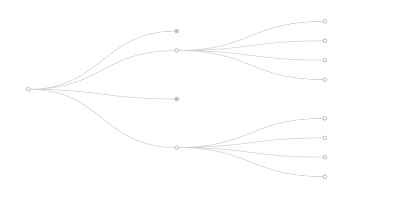
Left to right — ECharts’ tree layout, filed under Tree rather than Org Chart. Horizontal layouts are much kinder to long names, because each node gets a line of its own instead of a box-width.
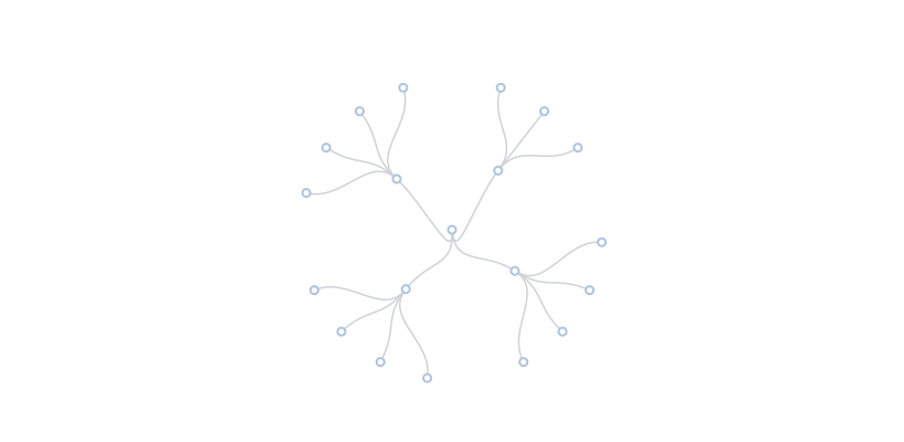
Radial — the root at the centre, levels as rings. It fits a large hierarchy into a square frame far better than a top-down tree, and it deliberately removes the vertical axis that readers translate into seniority.
1. The organisation is not a tree. Matrix reporting, dotted lines, people in two teams — a strict hierarchy cannot express any of it, and the usual bodge (a dotted connector) breaks the layout algorithm rather than extending it. If dual reporting is the point, a network diagram is the honest structure.
2. You have more than about fifty boxes. A full company chart is a poster: it exists to be printed and searched, not read on a slide. For a design, show two levels and a note, or make it navigable with collapsing.
3. The question is about numbers. Headcount by function, spans of control, vacancy rates — all of those are bar charts. The org chart shows structure; put the measurement next to it.
And a fifth situation worth naming: when the chart is a process, not an organisation. Approval flows, decision trees and escalation paths look like org charts and behave differently — they have conditions on the edges and often more than one route to the same node. A flowchart drawn in Figma handles that; a hierarchy chart does not.
A fourth, worth saying plainly: when it is a design artefact rather than a chart. Most org charts in decks are laid out by hand in Figma, with photos, brand colours and custom cards. That is a perfectly good decision — a chart engine gives you a correct tree, and hand layout gives you control over exactly the things an audience notices. Use the plugin when the hierarchy is large enough that automatic layout saves real time.
Because an org chart carries no quantity, the layout is doing all the rhetorical work. Four are available across the libraries here, and each says something different about the same organisation.
Top-down. The default and the most loaded: authority flows downward, the person at the top is the subject, and depth reads as distance from power. It is the right choice when the hierarchy genuinely is the message — a governance diagram, an escalation path.
Left-to-right. The same tree rotated, and much more practical: names get a full line each instead of a box width, deep hierarchies grow into a scrollable page rather than an unreadable strip, and the vertical status axis disappears. For any chart with more than three levels this is usually the better default.
Radial. Root at the centre, levels as rings. It fits far more nodes into a square frame and removes the up-and-down reading entirely — which is either a feature or a problem, depending on whether depth-as-seniority was information or noise.
Inverted. Leadership at the bottom, teams above. A deliberate statement about service rather than command, and one worth making only if the organisation behaves that way — a layout that contradicts everyone’s experience reads as spin rather than as design.
The most useful org charts answer a question beyond “who reports to whom”, and the chart has three spare channels to do it with.
Colour for function. Engineering, sales, operations. It answers “how is this org actually distributed?” at a glance, and it is the single highest-value addition because the tree structure alone cannot show it.
A number in the card. Team size under a manager’s name turns the chart into a headcount map: you can see instantly that one director covers eighty people and another covers nine. Spans of control are the finding people most often want from an org chart and least often get.
State on the node. Vacancies as dashed outlines, new hires as a marker, people leaving as a muted fill. A hiring plan overlaid on the structure is far more useful than either document separately — and it is a design job rather than a data one, which is why it usually happens on the canvas after inserting as SVG.
What to resist is encoding seniority as box size. Readers already read height as status; adding size compounds the two and produces a chart where a well-paid individual contributor looks like a manager of nobody.
Six screens, start to finish, captured from the plugin.
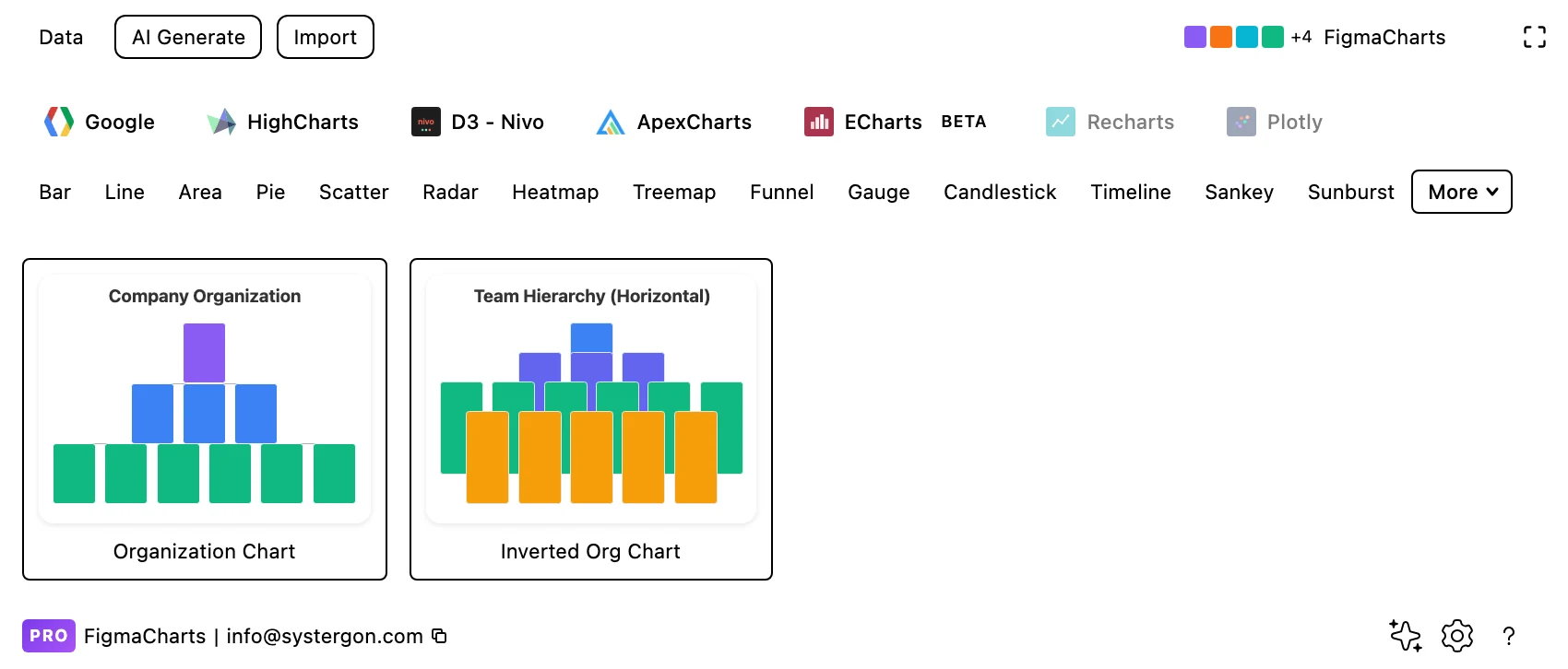
1. Filter to Org Chart. Highcharts is the only library with the category — a standard and an inverted layout.
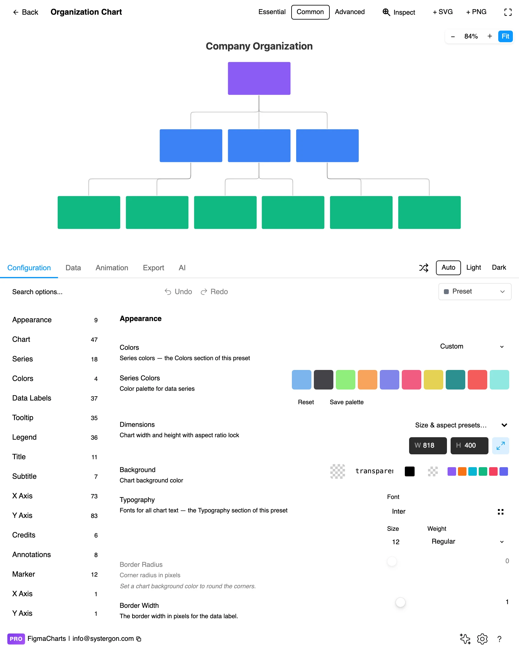
2. The editor. Live preview above, tabs below. Org charts grow sideways: check the width against your deepest level before styling, because that is what determines whether the boxes stay readable.
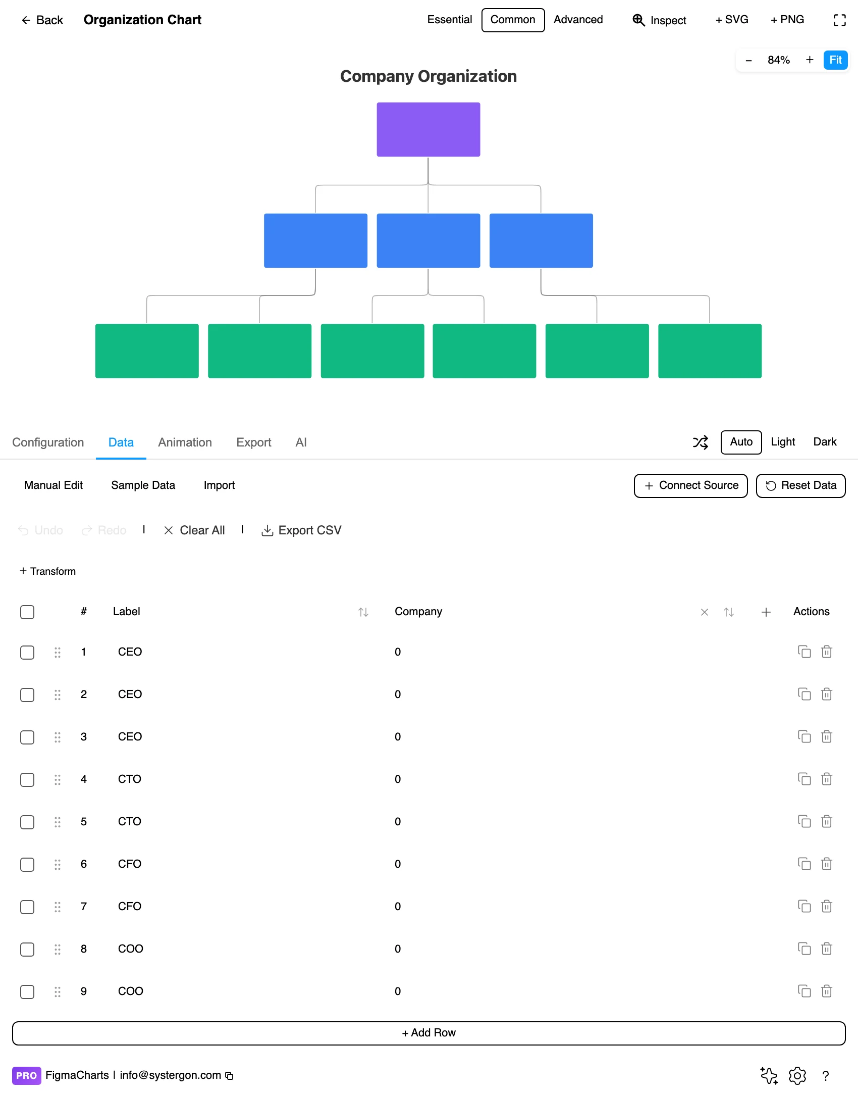
3. Parent and child. The data is a list of relationships — each row naming a person and their manager — plus per-node details such as title and image. It is the same shape an HR export produces.
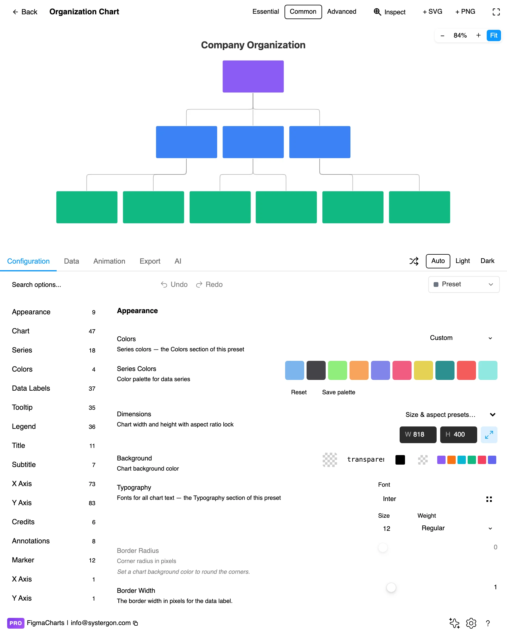
4. Configure. Node size, level styling, the connector shape and the layout direction. Level colouring is the setting worth spending time on: it is what makes depth legible without counting rows.
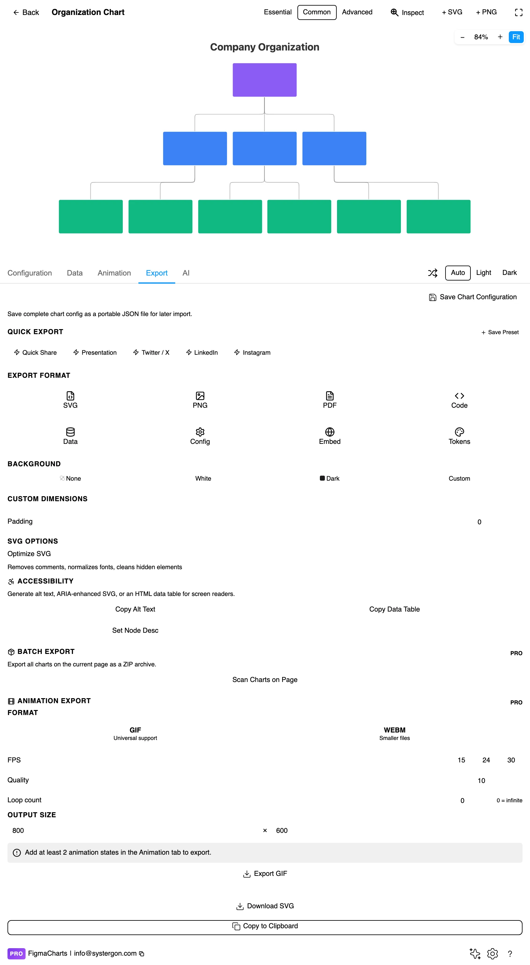
5. Export. A working component for React, Vue 3, Angular, Svelte or vanilla JavaScript, at the version the plugin rendered with.

6. Insert. SVG is the point for this type: every box, connector and label becomes a real Figma layer, so you can replace the boxes with your own components and keep the computed layout.
A list of parent-child relationships: each row names a node and its manager, with optional per-node attributes — title, description, image, colour. There is no special editor for this type in the plugin; it is the ordinary table, and it accepts a linked data source, which means an HR export in a Sheet can drive the chart directly.
Three data conditions to check before building:
And one privacy consideration that applies to no other chart in this series: an org chart is personal data. Names, reporting lines and photographs in a design file get shared more widely than the source system ever would. Use roles rather than names for anything leaving the company, and remember that an inserted SVG carries the text as real, searchable layers.
The Org Chart category holds two examples, both Highcharts — but the family is much better represented than that suggests, because a strict hierarchy of nodes and connectors is a tree, and trees have their own chip.
As always: design in whichever library your engineers already use, because the export then matches production exactly. Choosing the right chart library covers the trade-offs.
Colour by function, not by level. Levels are already encoded by position, so spending colour on them is redundant. Colouring by department, discipline or location adds a second dimension the layout cannot show — and instantly answers “where is engineering in this?”
Keep the boxes the same size. Box size reads as importance. Unless you are deliberately encoding something — team size, budget — equal boxes prevent an accidental hierarchy of prominence within a level.
Orthogonal connectors, thin and quiet. Right-angled connectors read as structure; curves read as flow, which is the wrong metaphor for reporting lines. Keep them light: the boxes are the content.
Two levels of type, no more. Name in medium weight, role in a lighter grey at a smaller size. Adding a third line to each card doubles the width and halves the number of boxes that fit.
Show vacancies honestly. An empty role is a real fact about an organisation. A dashed outline with the role title says more than omitting the box, which quietly under-counts the team.
For type and colour, bind them to your design system rather than picking by hand — covered in Your chart, your design system.
Height is read as status. Everyone reads the top of the chart as the most senior and each level down as less. In flat organisations, in matrixed ones, and anywhere with senior individual contributors, that mapping is wrong — and no amount of styling stops readers making it. If seniority does not track depth, say so in a note or use a layout without a vertical axis, such as a radial tree.
Left-to-right order is read as rank. Within a level, the leftmost box reads as first. The order is usually alphabetical or arbitrary; readers do not know that. Ordering deliberately — by team size, by tenure, by function — at least makes the implied ranking true.
An org chart is always out of date. It is a snapshot of something that changes weekly. Date it visibly, and prefer roles to names where the chart will outlive the people in it.
Dotted lines break the model. Matrix relationships added as secondary connectors turn a tree into a graph, and the layout algorithm will fight you. If those relationships matter as much as the solid ones, the structure is a network, not a hierarchy.
Missing levels flatten the picture. Data that skips a level — a person whose manager is absent from the export — attaches them further up, making a manager look like they have more direct reports than they do. Validate the tree before publishing it.
Keep the text as text. Inserting as SVG brings names and titles in as real text layers, which makes them selectable, searchable and available to assistive technology — and this is the chart type where that matters most, because the content is the text.
Do not encode anything in colour alone. Department colours need labels too; a legend of nine hues is a memory test, and the chart already has room for a word in each box.
Give it a text equivalent. The Export tab’s Copy Alt Text, Copy Data Table and Set Node Desc produce a description, a table of the underlying rows and a description written onto the Figma node. For an org chart the table — person, role, manager — is a complete and genuinely usable substitute, which is not true of most charts.
Highcharts has the only organization series in the plugin — two examples, including an inverted layout — with node cards carrying name, title, image and description. ECharts’ seven tree examples, under the Tree chip, cover the same job with more layout options and plainer nodes. Google Charts, Nivo and ApexCharts ship none here.
You cannot, cleanly. A tree layout has one parent per node, and adding secondary connectors turns it into a graph the algorithm was not designed for. If dual reporting is a central fact, use a network diagram; if it is an exception, annotate it in text rather than drawing it.
About fifty boxes before it becomes a poster rather than a chart. For a large organisation, show the top two levels with counts (“Engineering — 84”) and let the detail live in a separate view.
A list of parent-child relationships — each person and their manager — with optional title, image and description per node. Exactly one root, no cycles, and stable identifiers rather than names.
Roles for anything that will outlive the current team or leave the company; names for internal, dated documents. An inserted SVG carries the text as real, searchable layers, which is worth remembering before sharing a file.
Yes, and it is the biggest improvement available to this chart: colour, box size or a number in the card can carry a measure the structure cannot. Just pick one, and label it — box size especially is read as importance whether or not you meant it.
By hand when it is small and needs your own card design; with the plugin when the hierarchy is big enough that automatic layout saves real time. Inserting as SVG gives you a middle path: computed layout, then swap the boxes for your own components on the canvas.
Left-to-right. Each node gets a full line for its name instead of a box width, the chart grows down a scrollable page rather than across an unreadable strip, and the vertical status axis — which readers translate into seniority whether you meant it or not — disappears. ECharts’ tree examples include it, along with a radial layout that fits even more into a square frame.
Insert as SVG and every box, connector and label is a real layer — which for this type is the main event, because it lets you keep the computed tree and restyle every node. Insert as PNG for a flat image at twice the pixel density.
Open the plugin, filter to Org Chart, and load your reporting lines — then look at the widths before anything else. If one manager’s branch is three times wider than the rest, the chart has already told you something the headcount table did not, and that is usually the reason to draw one at all.
Install Figma Charts — it’s free to try → Browse all 45 chart types →