Install Figma Charts — it’s free to try → Read the help centre →
Every animated chart in a design review is a video. Someone recorded a screen, trimmed it, dropped it into the deck — and now the thing being reviewed cannot be clicked, cannot be paused on the frame anyone wants to discuss, cannot be dropped into the prototype next to the screen it belongs to, and cannot be handed to an engineer as anything more useful than “like that, but ours”.
Figma Charts does not produce a video. It produces a component set whose variants are wired to each other with Figma’s own prototype interactions — the same thing you would get by building the states by hand and connecting them in the Prototype panel, except the states are real charts and you did not draw them.
Which means the animation behaves like everything else in your file: you can rewire it, retime it, drop it into a bigger flow as an instance, and hand it over as a design rather than a recording.
Everything below happens inside Figma Charts, a Figma plugin. It runs the real JavaScript charting libraries — Google Charts, Highcharts, D3-based Nivo, ApexCharts and Apache ECharts — inside the plugin window, so each state you capture is the library’s own rendering rather than a drawing of one.
Install Figma Charts from the Figma Community →
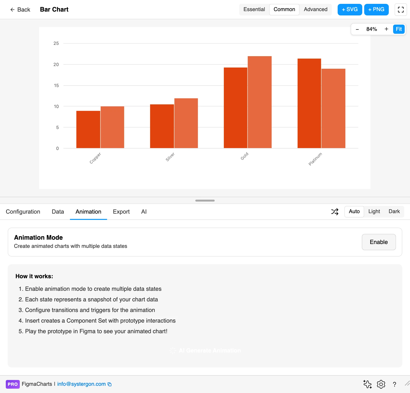
Press ⌘/ (Ctrl / on Windows), type Figma Charts, hit Enter, and open any chart. The Animation tab sits between Data and Export.
This is the part to understand before touching anything, because it is not the model most animation tools use.
You do not animate properties over time. You capture snapshots — complete states of the chart — and then describe how each one becomes the next. A snapshot holds the chart’s data and any option overrides, so “2023” and “2024” are two snapshots, and so are “before the campaign” and “after the campaign”.
The workflow is therefore:
You need at least two. A single snapshot has nothing to animate between, and the animation export will tell you so rather than producing an empty file. You can have up to twenty, which is far more than any chart animation should need.
Each snapshot carries a label, and that label is not cosmetic: it becomes the variant name in Figma, written as State=2023. So the component set arrives with a real State property in the properties panel, and anyone placing an instance can pick which state to show from a dropdown — without touching the prototype at all. Name your snapshots the way you would name variants, because that is what they become.
The consequence of the snapshot model is a discipline worth adopting early: change one thing between snapshots. Snapshots capture the whole chart, so two states that differ in data and palette and chart type produce a transition where three things happen at once and none of them reads. If you want the bars to grow and then the colour to shift, that is three snapshots, not two.
There are eight transitions, and in practice two of them matter: Smart animate and Dissolve. The rest — Scroll animate, Push, and the Move and Slide pairs — are Figma’s standard set, useful for moving between two charts as slides rather than for animating one chart’s data.
Smart animate matches layers between two states by name and interpolates them. It is what makes bars grow, points travel and a gauge needle sweep. It is also the reason animated charts sometimes look broken for no apparent reason, and the explanation is entirely mechanical:
Smart animate can only interpolate shapes that correspond. A bar is a rectangle in both states, so Figma can tween its height. A line is a single path whose point list differs between states — different number of points, different coordinates, no correspondence — so there is nothing to tween. Figma does the only thing it can and swaps one path for the other, which reads as a flicker.
The plugin knows this per chart type, and marks its choice (Recommended) in the transition list:
Nine and eight. The dividing line is not aesthetic — it is whether the SVG the library produced contains shapes that can be put in correspondence. Fighting it does not work; a line chart set to Smart animate does not draw itself, it stutters.
What to do instead for a line chart: animate something that is a shape. Cross-fade the line with Dissolve while a Smart-animated marker travels along it, or build the reveal as a sequence of snapshots with progressively more data points and accept the cross-fade between them. Both read better than a stuttering path.
It is worth a short detour into the mechanism, because it explains both why the plugin can do this and why the obvious do-it-yourself version does not work.
When Figma imports an SVG it uses each element’s id attribute as the layer name. And Smart Animate matches layers between two frames by name. Put those together and you get the requirement: for a bar in state one to tween into the corresponding bar in state two, both must arrive in Figma with the same layer name.
Chart libraries do not cooperate with that. They re-render from scratch on every data change and emit whatever ids they like — usually none, sometimes ones seeded from values that just changed. Export two states of a Highcharts bar chart by hand and Smart Animate has nothing to match: every layer in the second frame is, as far as Figma is concerned, a different object that has appeared from nowhere.
So the plugin post-processes the SVG before handing it to Figma, assigning deterministic ids to chart elements so they line up across states. It does this per library, because each one marks up its output differently — a bar is .highcharts-point rect in one and .apexcharts-bar-series rect in another — and it classifies elements semantically as bars, slices, points, lines, areas, gridlines, axis labels and legend labels, then names them by position within their series.
Two practical consequences fall out of that:
The default transition is Smart animate, 800ms, Ease out, and it is a good default for the reason all good motion defaults are good: it starts fast and settles, which reads as physical.
Duration runs from 100ms to 3000ms. For data animation the useful range is narrower than that suggests. Under about 300ms the eye cannot follow a bar to its new height and the change registers as a jump; over about 1200ms the viewer has finished reading before the motion has finished happening, and it starts to feel like waiting.
There are eleven easings, and they are Figma’s own:
A caution specific to charts: the overshooting curves lie. Ease out back and Bouncy carry a bar past its target and settle back, which means for a few frames the chart displays a value that is not in the data. On a marketing animation nobody cares. On a chart in a product, where the whole point is that the height means the number, it is a small dishonesty that a careful viewer will notice. Save the overshoot for entrances, where nothing is being misread — the bars arriving from zero — and keep the data-to-data transitions on Ease out.
Every step gets a trigger, and the choice decides whether you have built a playing animation or an interactive one.
The default is After delay at 800ms, which makes the whole thing play by itself as soon as you press Present — the right default, because that is what people expect an animated chart to do.
The others are Figma’s own set: On click, While hovering, While pressing, On drag, the four mouse triggers (Mouse enter, Mouse leave, Mouse down, Mouse up) and two media triggers.
Two are worth reaching for deliberately:
Triggers can be set per step, so a chart can auto-play its first transition and then wait for a click on the second.
The Animation tab has its own timeline and transport, so you do not have to insert to find out whether the timing works. Snapshots appear as cards along a timeline with a playhead; play and pause run the sequence in the plugin window, and a speed control at 0.5×, 1×, 1.5× and 2× lets you slow a transition down to see what it is actually doing.
Slowing to 0.5× is the single most useful habit here. At full speed a Smart Animate that is secretly cross-fading looks approximately fine; at half speed you can see that the bars are not moving, they are dissolving — which tells you the correspondence broke and the categories changed between snapshots.
Transitions and triggers can be set per step as well as globally, so a four-snapshot sequence can auto-play the first two steps, wait for a click on the third, and use a different easing on the last. The panel shows which steps are using the default and which are overridden.
Looping is on by default: the last variant wires back to the first, so the animation runs continuously in Present. Turn it off when the sequence tells a story with an ending — a build-up to a final state that should stay on screen is ruined by snapping back to the beginning.
Press + Insert Animated and the plugin renders each snapshot, turns each one into a component, and combines them into a component set named after your chart with [Animated] after it. Then it wires a prototype reaction from each variant to the next, looping back to the first if looping is on.
That output is the whole argument of this post, so it is worth being precise about what it buys you:
Nothing about it is a black box, which is the difference between a plugin output you can build on and one you have to redo whenever anything changes.
On the Animation tab there is an AI Generate Animation button, and what sits behind it is narrower and more useful than “AI makes an animation”: an agent that builds the timeline — the snapshots, the transitions, the triggers, the timing and the per-state overrides — from a description of what you want to show.
It is most useful for the fiddly part rather than the creative part. Describing “step through the four quarters, pause on the last one” and getting a four-snapshot timeline with sensible per-step triggers back is a good use of it; it applies the same Smart-animate-versus-Dissolve rules the transition list recommends, so it will not hand you a line chart set to morph.
Two requirements worth stating: the AI features need a paid plan and your own API key — you choose Claude, OpenAI or Gemini in AI settings and paste a key from that provider. The plugin has no model of its own; it talks to your account, so the cost and the data stay yours. If you have not set a key up, the button is there and the feature is not.
Sometimes the destination genuinely is a video — a release tweet, a slide for people who will never open Figma. The Export tab handles that: Animation Export produces a GIF (universal support) or a WEBM (smaller files), with FPS at 15, 24 or 30, a quality setting, a loop count where 0 means infinite, and an output size.
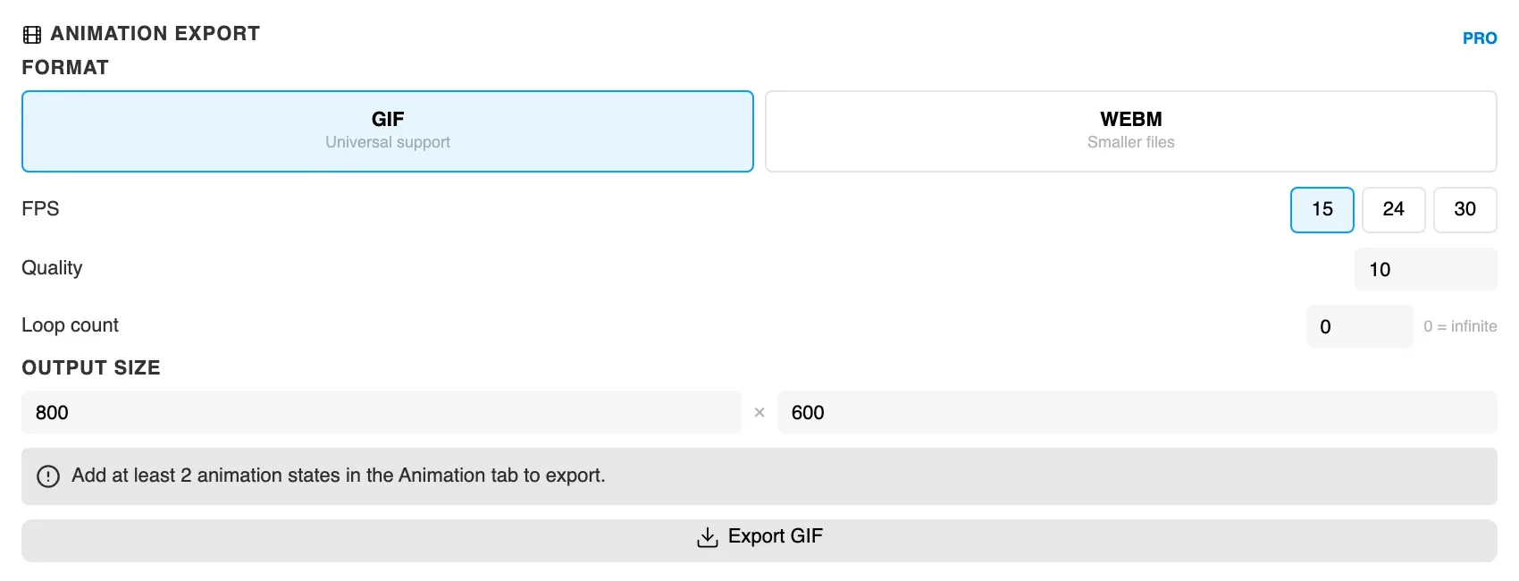
It requires at least two animation states captured on the Animation tab, which is the same requirement as the prototype and a reminder that the snapshots are the source of truth. Build the prototype first; the video falls out of it.
Animation export is PRO, as is the Animation tab itself.
Four things this does not do, worth knowing before you plan around it:
None of that argues against the approach. It argues for capturing the animation once the design has settled, rather than treating it as something you maintain alongside the chart.
Four cases where an animated chart earns its keep, rather than being motion for its own sake:
And one case where it does not: a dashboard mockup that will be screenshotted for a spec. If the deliverable is a still, the animation is work nobody will see. Capture it when the motion is the thing being decided, not by default.
The whole thing takes about five minutes, and at the end of it you have something you can hand to an engineer, drop into a prototype, and click — instead of a recording of something you used to have.
Install Figma Charts — it’s free to try → From Figma to code →